Category
Publishing
17 entries in this category | view all categories
Needle in a Haystack
Posted March 2015 in Advertising, Childhood Photography, Engraving, Publishing, Significant Photographers, Typography
Surreal would be a good word for it. On the evening of Friday, November 4, 1904, the touring company of the Broadway flop Eben Holden made its way to a performance at a building called the Auditorium on S. 2nd Street in downtown Newark, Ohio.
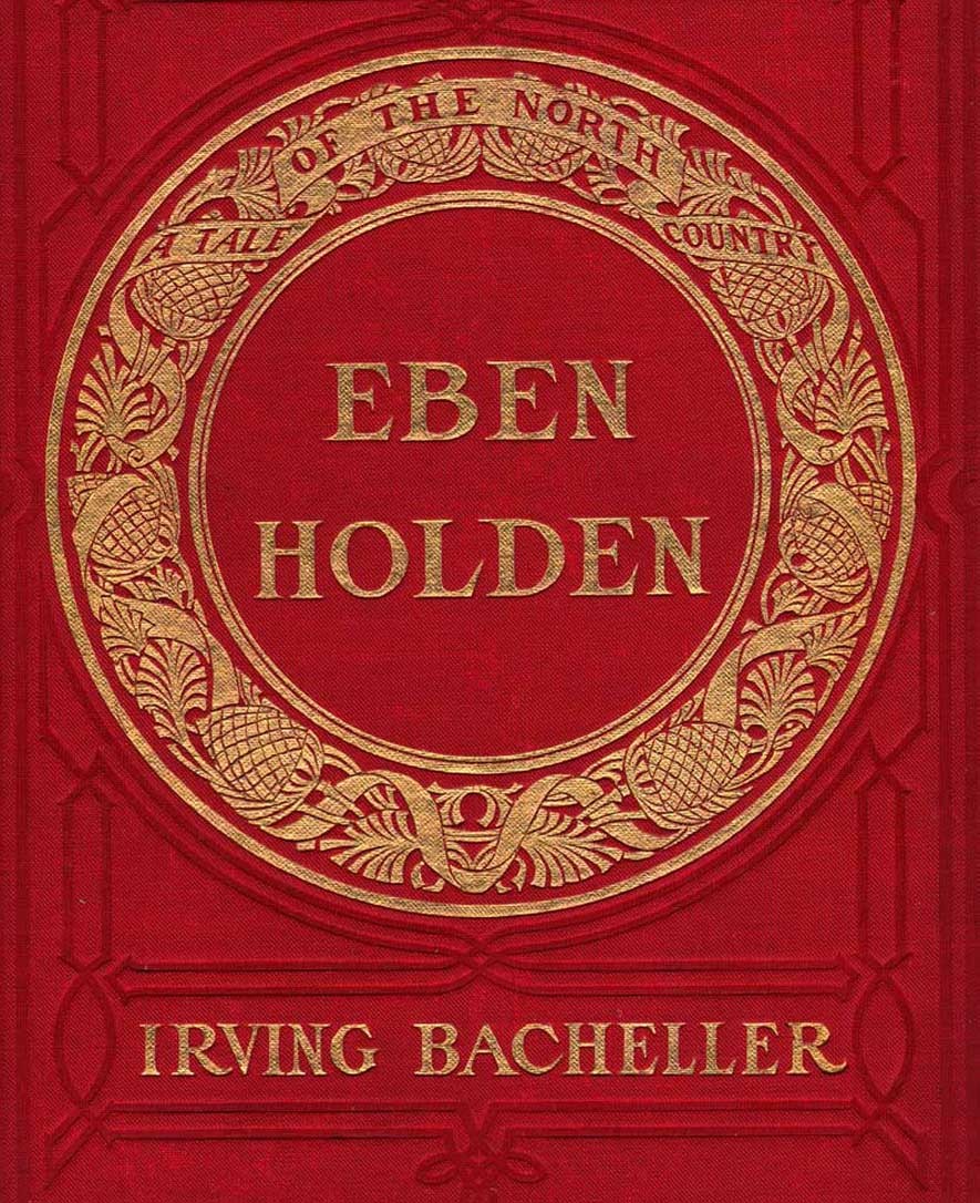 Detail: Cover for "Eben Holden: A Tale of The North Country": Edition de luxe by Irving Bacheller. Lothrop Publishing, Boston: 1903. Gilt-engraved decorative cloth with circular design featuring a design of a ribbon interlaced with pinecones and leaves: 21.0 x 14.2 cm: One of the best selling novels from the very beginning of the 20th Century, this edition features 12 photogravure plates by photographer Clarence Hudson White. from: PhotoSeed Archive
Most likely in attendance that night? Clarence Hudson White, (1871-1925) the world-renowned pictorialist photographer who was a recent founding member of the American Photo-Secession and current Newark resident. Only two years earlier, he had taken a series of photographs using his Newark neighbors as models for a special edition of Eben Holden that had been made into this very play.
Written by American journalist and author Irving Bacheller, (1859-1950) the story is a classic rags to riches tale that captivated the masses in the new American century when first published in July of 1900, eventually selling over 1 million copies. The setting at the beginning of the novel is the “North Country” of Northern Vermont , the Adirondack’s and St. Lawrence River Valley of the 1840’s and 1850’s. It tells the coming of age story of William Brower, orphaned at the age of six after his parents and older brother accidentally drowned as well as his relationship with Eben Holden, a farm hand who rescued “Willy” from the cruel fate of an orphanage
But this post is part collecting story, a kind of hunt for treasure, or “spondoolix” as “Uncle Eb” would say in one chapter-his country ways and lack of education brought into sharper focus for the reader by Bacheller’s liberal usage of Holden’s spoken dialect.
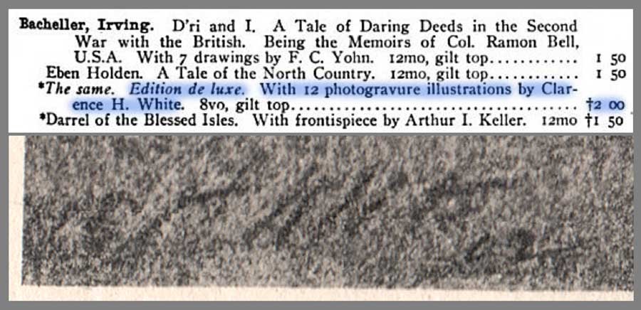 Detail: Top: listing for works by American author Irving Bacheller showing Edition de luxe of Eben Holden highlighted in blue: from: Illustrated Catalogue of Books Standard and Holiday 1903-1904: Chicago: A.C. McClurg and Company: 1903: p. 217 (the † denotes it is a work of fiction, published since November 1, 1902, under the rules of the American Publishers' Association. (from: Hathi Trust)Bottom: close-up detail showing autograph for CH White 02 at bottom left corner of representative photogravure plate from the Edition de luxe: from: PhotoSeed Archive
The Hunt is on
I consider myself a newbie collector, but one of the first things I put on my list 15 years ago when I first started out was one particular impression of Eben Holden rumored to have been illustrated by hand-pulled photogravures by White, the aforementioned famous photographer.
My curiosity had been piqued after seeing the volume listed in several bibliographies, typically stating the 1900 date. One such entry in author Christian A. Peterson’s Annotated Bibliography on Pictorial Photography did give me hope the work existed, even though finding one in the internet age would prove to be quite the challenge:
The Museum of Modern Art, New York, holds what is probably a unique copy of this book, comprised of the Lothrop text pages bound in leather, with an inscription by White and ten photogravure illustrations by him, including the portrait of Holden. (1.)
Because the novel had been such a success a century earlier, the reality of upwards of 500 vintage copies for sale on the web at any one time was daunting. My course of action however was simple, and eventually effective: send out a mass number of emails to every bookseller in the U.S. listing a copy from a suspect 1901 edition I had honed in on inquiring if it contained any photographic illustrations.
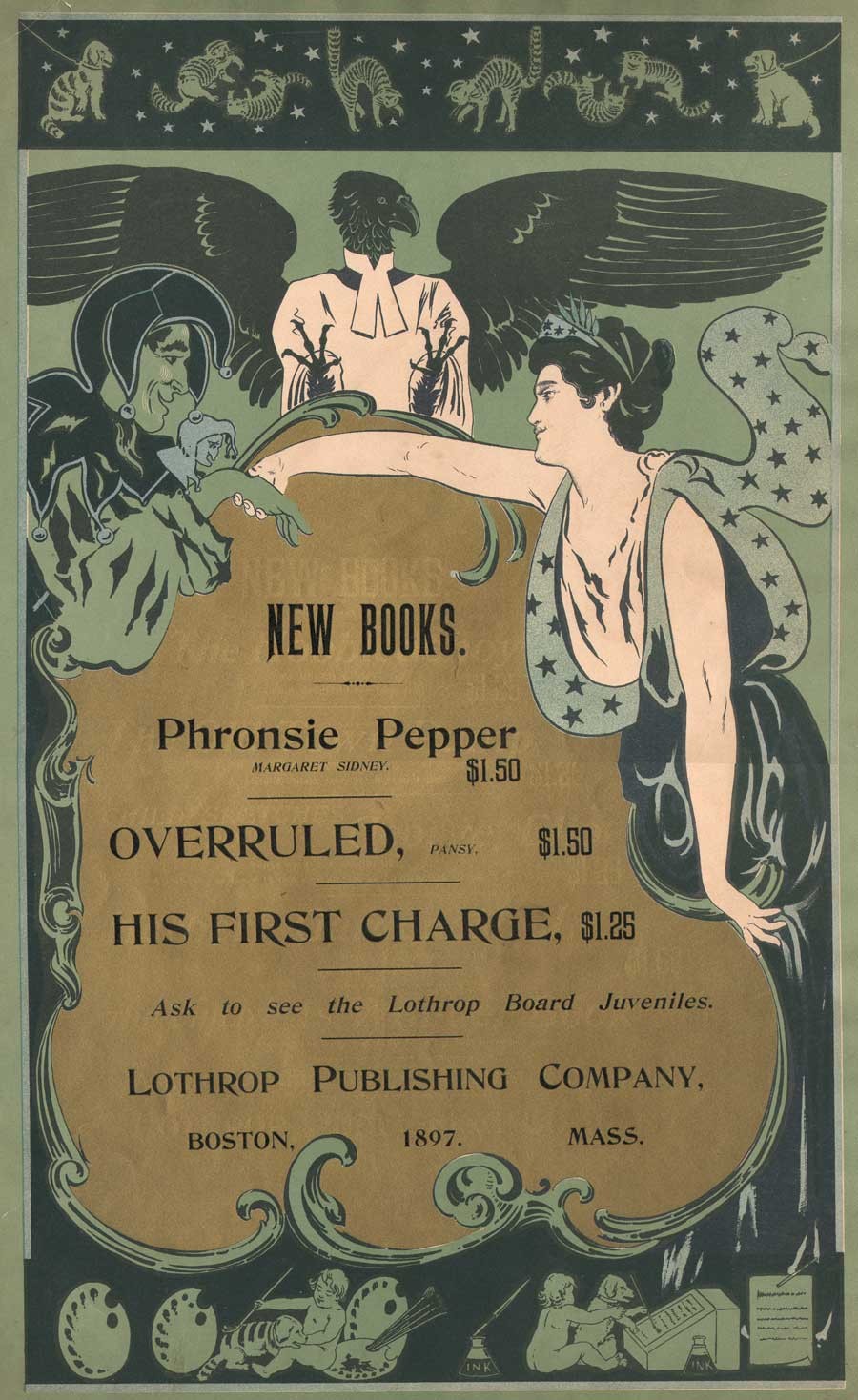 Broadside advertising poster for Lothrop Publishing Company of Boston: 1897: artist: William Schumacher: American: (1870-1931) multiple-color lithograph printed on wove paper: 52.7 x 34.0 cm. Speaking of the beginnings of Eben Holden in the year 1897, author Irving Bacheller said "had unsuccessfully offered the first 'Eben Holden' as it then stood to two juvenile publications; but as I happened to be just starting off on a vacation at that time, I determined myself to see the Boston firm, which was the Lothrop Publishing Company. I met the editor, Mr. Brooks, at the Parker House, and told him the story as I had written it. He immediately saw the possibilities in it and declared I had a big thing if I could carry it out as it should be." (excerpt: "The Critic": Oct. 1904) vintage broadside (trimmed) from: PhotoSeed Archive
And so eventually luck prevailed. In 2007, a bookseller in Idaho finally said yes, and a bucket item was now on my library shelf. But that was not the end of it, as Alice would say, things got Curiouser and Curiouser! Because collectors never stop looking, I soon stumbled upon a CT bookseller who knew exactly the significance of the White-illustrated impression, with an astronomical asking price. An excerpt from his description of the work stated:
Elusive and highly desirable work, absent from almost all museum and library collections devoted to photography, and one of only a very few photographically illustrated books produced by a leading member of the Stieglitz circle at the height of the Photo-Secession. (2.)
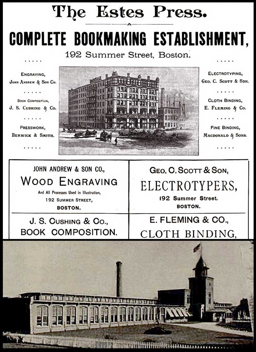 Top: detail: 1891 advertisement for The Estes Press (Dana Estes & Company) from "The American Bookmaker". The woodcut shows the brand new Estes Press Buildings located at 192 Summer St. in Boston first occupied around 1890. The firm housed many different companies involved in the bookmaking process, including: "The celebrated engravers, John Andrew & Son have their studios in the upper story…"; J.S. Cushing & Co., (book composition) Berwick & Smith, (presswork) and E. Fleming & Co. (binding). These last three firms left Estes in 1894 and became part of the Norwood Press. (from: Hathi Trust) Bottom: detail: exterior photograph of Norwood Press from the 1897 volume "Boston Massachusetts" by George W. Englehardt. The original caption noted the firm was located "Fourteen Miles from Boston, on the New England Road" and "as a whole employing nearly three hundred hands." This is where the Eben Holden Edition de luxe was printed. (from: Hathi Trust)
And so I sucked it in and didn’t purchase the second copy, which he told me he had originally purchased in Marlborough, NH. Eventually he sold it to a European collection, but I’ve since visited him several times and made a few purchases over the years, something I highly recommend rather than doing everything through e-commerce.
But then lighting struck again five years ago, when I purchased a second copy which had been personally inscribed by the author in 1911 to John A. Dix, then governor of New York state.
Curiouser? The first copy, fourth edition imprint stated Two Hundred and Sixty-fifth Thousand, March 12, 1901 and the second copy was for Two Hundred and Seventieth Thousand, September 18, 1903.
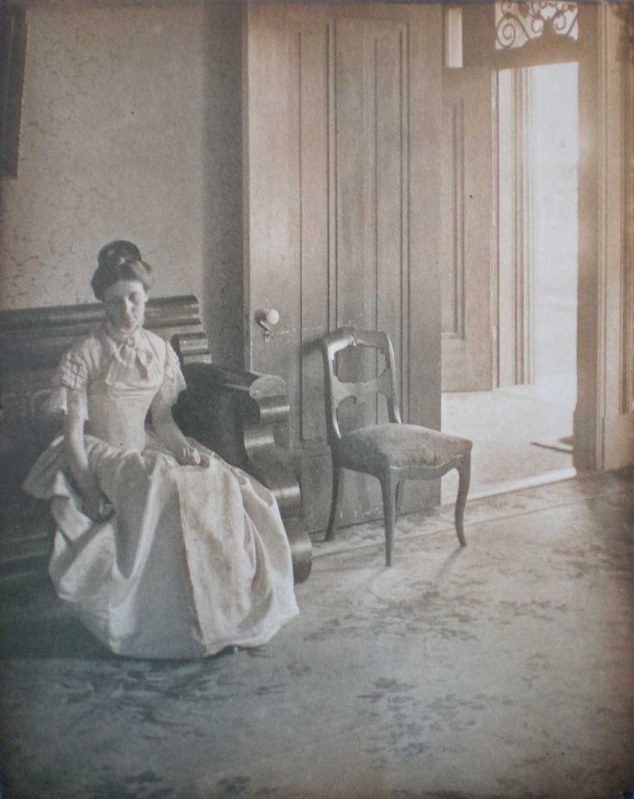
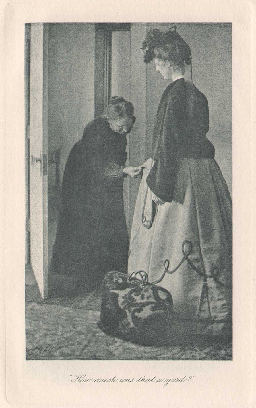 Detail: Clarence H. White: American: "How much was that a yard ?" Hand-pulled photogravure plate printed by John Andrew & Son (image: 12.2 x 7.5 cm | support: 20.0 x 14.0 cm ) from: Edition de luxe impression of Eben Holden: Lothrop Publishing, Boston: 1903. The Library of Congress states the model at right is Ann Fulton and the woman examining the dress is the photographer's mother Phoebe Billman White (1845-1920) : from: PhotoSeed Archive
Knowing the book now existed in multiple impressions with the Clarence White photogravures was perplexing to me at first, but I’m certain the inclusion of the White photographs was intended by the publisher Lothrop for a more discriminating audience, so its assumed they had the monetary incentive to publish more than the one impression-even with the fickleness and extra work necessary to bind an edition with hand-pulled gravures.
To this end, my research in preparing this post discovered 1901 to be the year Clarence White was first commissioned by the Boston publisher to illustrate a new edition of Eben Holden. The intended publication date of very late 1902 was designed to coincide with the lucrative holiday sales season. Even with the move to e-books in our modern age, publishers earn good money issuing ornate and extra-illustrated editions during this time of year catering to the once a year book buyer and bibliophile alike.
Known as the Edition de luxe, this edition of Eben Holden with the White photogravures priced at $2.00 somehow managed to miss the late 1902 holiday sales season. The curious fact of the inclusion of the imprint for March 12, 1901 on the limitation page and White’s signature including the year 02 on many of the 12 plates in the published work was basic economics for publisher Lothrop-they simply used existing leaves, including the old limitation pages from current stock when it was eventually released for sale to bookstores in 1903.
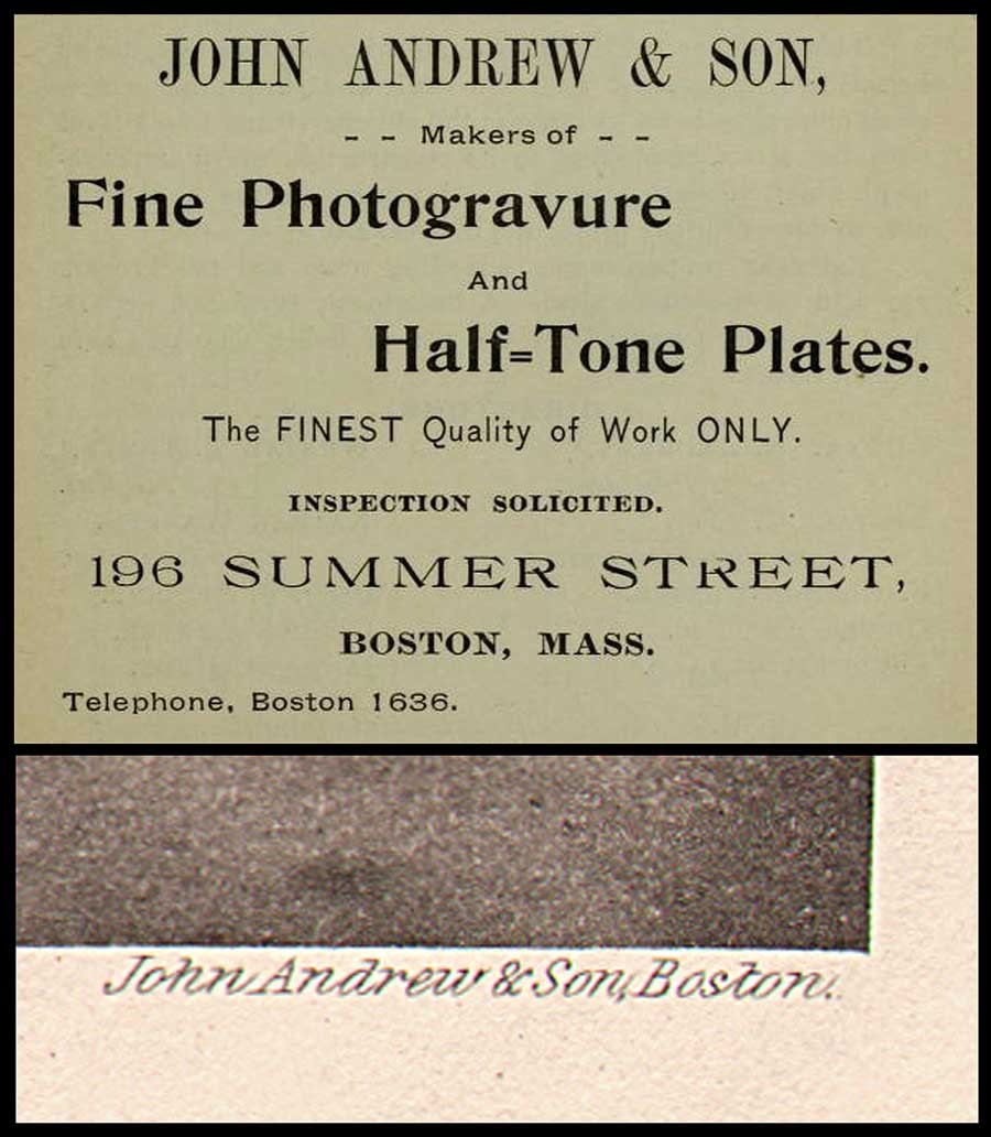 Top: detail: 1896: advertisement for John Andrew & Son from the "Boston Blue Book". (from: Hathi Trust) Bottom: detail: typical example of the firm's engraved credit appearing at lower right corner of image margin on plate recto from the 1903 Photographic Times-Bulletin. The John Andrew firm was established in Boston in 1852. from: PhotoSeed Archive
This was by no means unprecedented by Lothrop, or other large publishing houses of the era, as they would have set aside a certain number of unbound sheets from a best-selling work for limited impressions featuring artwork. The first illustrated edition of Eben Holden featured halftone photographs taken by Joseph Byron from the Broadway production of the same name hadn’t even debuted until Oct. 28 of 1901. This also used the March 12, 1901 imprint date. Known as the Dramatic Edition, it was described in the trade monthly The Bookseller:
”An illustrated edition of Eben Holden has been recently published called the Dramatic edition. It contains seven pictures of the play as it appeared in New York and a fine portrait of the author.” (3.)
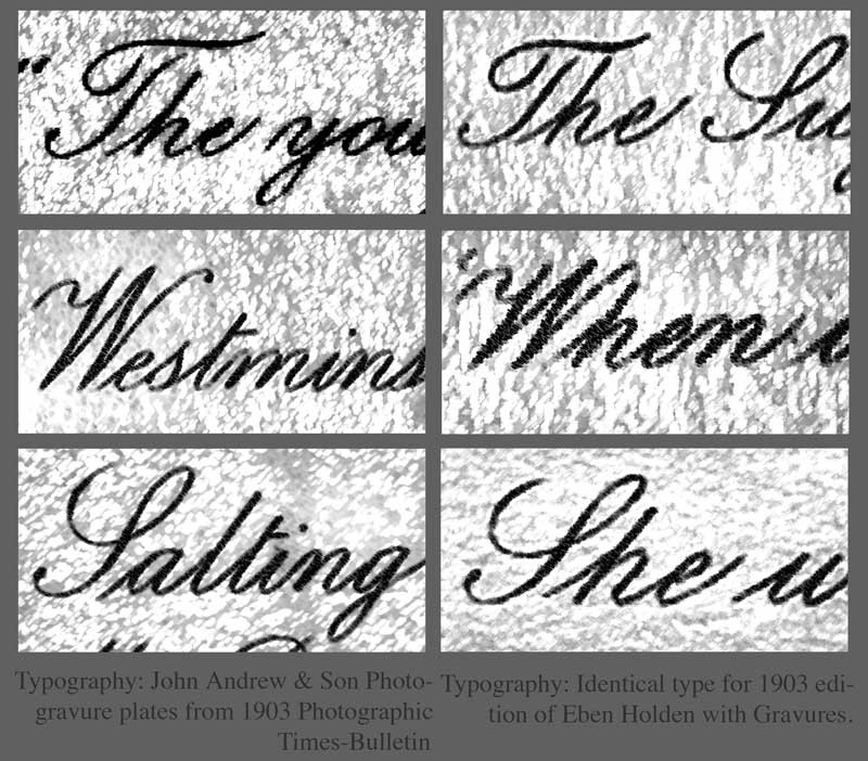 Details: with manipulations in PhotoShop to highlight typography: In order to show Boston's John Andrew & Son atelier printed the photogravure plates uncredited in the de luxe edition of Eben Holden, it is useful to analyze the script font typeface used for photographic plate titles. Column at left, top to bottom shows known examples from the Andrew atelier taken from the 1903 Photographic Times-Bulletin. Column at right shows plate titles from the Eben Holden volume. all from PhotoSeed Archive.
Published in 1903
Finally, with the eventual tenth imprint of the fourth edition stating Two Hundred and Seventieth Thousand, September 18, 1903, (6.) the makeup of the Edition de luxe was that of a small 8vo Octavo instead of the common edition, a 12mo Duodecimo. The inclusion of 12 fine, hand-pulled photogravure plates by White seen here is another matter altogether. For one, other than White’s autograph-appearing often (and faintly) in the lower left hand corner of each plate image as CH White 02, the Edition de luxe neglects to give him any printed credit for the photographs nor the atelier who printed them. This is very surprising for a special edition. Typically, there would at the very least be a separate illustrations page noting titles and page numbers at the front of a similar volume, but for whatever reason they were not included.
Stieglitz plays Go Between
With Eben Holden’s great success, the dramatization of the novel on the Broadway stage was logical for its day-especially since the Cinema was not an option because of the infancy of the medium. Lothrop’s piggy-backing of the work through this Dramatic edition, even by the “flop” standard of 49 performances, was but one way of keeping the work “fresh”- even a full year after initial publication. At some point late in 1901, a result perhaps of someone seeing the play on Broadway or believing White’s work would lend itself nicely to a series of photographic illustrations, the Boston publisher-perhaps through an association with Fred Holland Day (who lived in nearby Norwood where the Norwood Press printed books for Lothrop) or Alfred Stieglitz in New York-gave White the commission for its second illustrated edition of the novel.
 Clarence H. White: American: 1902: "She was still looking down at the fan": vintage Platinum or gelatin silver print: Showing typical retouching by White, the models are Alfred Dodge Cole, (1861-1928) a professor of Chemistry and Physics at Denison University and his wife Emily Downer Cole. (1865-1957) They play the roles of William Brower and Hope, whom Brower eventually marries in the novel Eben Holden. The photograph was reproduced as a photogravure plate and included in the Edition de luxe. Curators at the Robbins Hunter Museum where this and other White photographs are held stated the photographer had taken family photographs of the Downer family on the lawn of the home in the late 1890's and so he "would have been familiar with the house and furnishings from that commission. It was common for Clarence White to ask acquaintances to pose for photographs, often in costumes that he would provide. The photographs for Eben Holden were staged with costumes from the Civil War era." Photograph courtesy: Collection of the Robbins Hunter Museum in the Avery Downer House, Granville, OH.
Ultimately, Stieglitz’s publishing background, connections and established relationship with White through his editorship of Camera Notes, his new involvement with Camera Work, as well as his having his own work exhibited in an early salon of pictorial photography in Newark Ohio in late 1900 and other exhibitions made Stieglitz a believer in White’s potential as an illustrator:
“What is especially fascinating, however, is what occurs when White is commissioned, as he was in 1901, to take up literary illustration himself. Through the assistance of Stieglitz, White received the commission to illustrate a new edition of the novel Eben Holden by Irving Bacheller. ( 4. )
And much later, the photographer’s grandson Maynard Pressley White commented about a bit of reluctance on his grandfather’s part in dealing with Lothrop as part of his Ph.D. dissertation in 1975:
“The correspondence with Stieglitz concerning the illustrations for Eben Holden is revealing of his character as well as Stieglitz informed him that he suffered from no such timidity and would—and indeed did—handle the matter with the publishers, as it turned out, to the advantage of White.” (5.)
 Clarence H. White: American: 1902? : vintage untitled Platinum or gelatin silver print: The model Emily Downer Cole (1865-1957) poses wearing a different dress than seen in the published Eben Holden photogravure "She was still looking down at the fan" taken on the same settee in the front parlor of the Downer family home. This was likely an alternate study Clarence White took for consideration for his series of Eben Holden illustrations. Photograph courtesy: Collection of the Robbins Hunter Museum in the Avery Downer House, Granville, OH.
John Andrew & Son: founded in Boston: 1852
In giving credit to White and the firm that printed his photographs as gravures, a bit of elucidation seems in order to set things straight. Upon close inspection of these plates along with many others by Boston’s John Andrew & Son from the same time frame, I feel confident giving the Andrew firm credit for printing them. This is based on a near exact match in the script font used for the plate titles in the de luxe edition of Eben Holden as well as those plates credited to the firm appearing in the Photographic Times Bulletin from 1902-04.
I’ve included examples of the font as a comparison with this post. Another exact match is the same plate paper was used for both publications: this is very revealing especially on the plate verso where a very fine stipple pattern can be seen on the paper surface of the cream-colored plate paper. Perhaps the strongest association with the John Andrew atelier and the Norwood Press (which printed the de luxe edition) emerged in my research on business associations with some of the individual companies that came together in 1894 when that press was formed. These included J.S. Cushing & Co., (for composition and typesetting) Berwick & Smith Co., (for presswork) and E. Fleming & Co. (for binding). Beginning around 1890, all of these firms along with John Andrew were under one roof as part of the brand new Dana Estes & Company publishing house buildings on Summer Street in Boston.
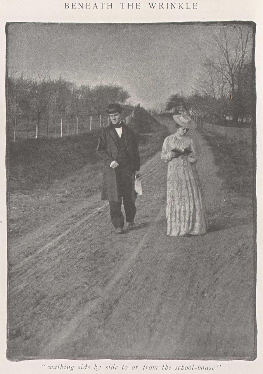 Clarence H. White: American: 1903: halftone: "Walking side by side to or from the school-house" was one of three photographs published to illustrate the Clara Morris story "Beneath the Wrinkle" published in the February, 1904 issue of McClure's Magazine. (12.8 x 9.5 cm) published: p. 430. From: PhotoSeed Archive
With the move to Norwood in 1894, the Andrew atelier stayed behind in Boston at 196 Summer St. but continued to provide fine photo engraving work to the major publishing houses in Boston and New York. Known today for printing many of the photogravure plates beginning in 1907 for the monumental Edward Sheriff Curtis work The North American Indian, the firm sometime in the first decade of the 20th Century became a department of the Suffolk Engraving & Electrotyping Co. of Boston with offices at 394 Atlantic Ave.
Named after John Andrew, (1815-1870) a wood engraver born in England who immigrated to Boston where he worked with fellow engraver Andrew Filmer, the firm eventually made the transition to photo engraving, including the half tone and photogravure processes. Andrew’s son George T. Andrew succeeded his father at the business, located at 196 Summer St. An 1892 overview of the firm from the volume Picturesque Hampden gives some background:
JOHN ANDREW & SON COMPANY.
ENGRAVERS AND MAKERS OF FINE BOOKS, BOSTON MASS.
If we go back a few years, we find that in illustrating books and magazines wood and steel engraving were about the only methods available. Nor could steel engraving have any wide use on account of the great expense of printing. Ever since its start, in 1852, the firm, now styled the John Andrew & Son Company, has held a prominent place among illustrators, especially in work of the finest grades. Their reputation was made in the first place as engravers on wood, but the discovery of delicate chemical and mechanical processes has in later years led them to also take the photo-engraving and half-tone work which has at present such wide use and popularity. In this field they do work for some of the best magazines and books published in this country. In what they undertake they strive not so much to do the cheapest work in price as the best work in quality. Quite recently the firm has taken up the photo-gravure process in addition to those spoken of above. The industry we describe is not located in Hampden county, but the mention here is not inappropriate as the engraving of our pen and ink pictures was done almost wholly by this firm. Their address is 196 Summer street, Boston.
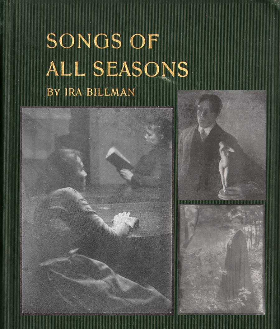 Detail: Cover for "Songs of All Seasons" by Ira Billman. The Hollenbeck Press, Indianapolis: 1904. Gilt-engraved stamped cloth: 20.4 x 13.6 cm: shown inset with representative photographs taken by Clarence White reproduced in halftone in the volume. Photo left: "The Book Lovers" (p. 181); top right: untitled man with statuette illustrating poem "The Twin Flower" (p.137); bottom right: "The Gloaming" (p. 199). Billman was Clarence White's uncle and was "one of his earliest artistic influences in his life": From: PhotoSeed Archive
Photographic Illustration: a New Outlet
A newspaper clipping, believed to be from the Newark Daily Advocate in the Clarence Hudson White clipping file at the Newark, OH public library, includes the following undated (but 1903) story discussing Eben Holden in passing while concentrating on a new commission that inevitably came from it: costume-piece photographs by White similar to those he did for Lothrop for author Clara Morris’s story published in McClure’s magazine in February, 1904 entitled “Beneath the Wrinkle”:
PICTURES From Real Life by Clarence White
Forwarded On Order to a New York Magazine-Local Artist’s Latest Work.
Mr. Clarence White received a command last fall from the art department of McClure’s Magazine to illustrate Clara Morris’ new story, entitled, “Beneath the Wrinkle,” that will appear in that magazine presumably in the near future. Mr. White was to have been given all the time he wanted, but in view of the change of art editors, Mr. White was notified about three weeks ago that the illustrations would be required immediately. Mr. White at once notified the publishers that he would use all his efforts to complete them immediately, and would forward them when completed. Today the set comprising six, were forwarded and as equaly as clever and well executed as the ones made for the illustrating of the holiday edition of Eben Holden that was to have made its appearance last Christmas, but was not completed in time for that season. The ones now in progress are all local personages, done in quaint, old-fashioned garb and surroundings, recalling vividly to mind the characteristics in dress and decorations then in vogue. They show the fine and beautiful artistic temperament of Mr. White in his striking correct interpretation of dress and customs of the period in which the characters live. Mr. White deserves the honor the illustrations will surely bring to him, as he is always conscientious and painstaking in whatever he undertakes in his profession.
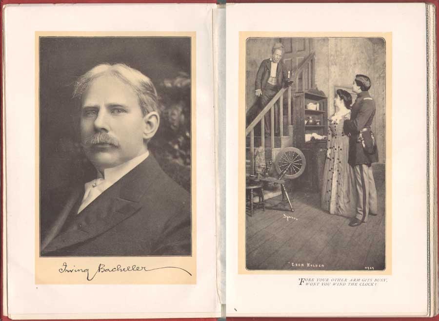 Left: Irving Bacheller, (1859-1950) American journalist and author, wrote the novel Eben Holden which sold over 1 million copies. This portrait with facsimile autograph by an unknown photographer appeared as the frontis (13.3 x 9.1 cm) to the Dramatic Edition of the book-the first illustrated edition featuring photographs of the Broadway stage production that debuted Oct. 28, 1901 and ran for only 49 performances. Right: " 'Fore your other arm gits busy, wont you wind the clock?" (14.1 x 8.4 cm) Actor E.M. Holland at left plays the role of Eben Holden, Lucille Flaven plays Hope and Earle Ryder as an American Civil War officer plays William Brower. The important New York commercial photographer Joseph Byron, (1847-1923) founder of the Byron Company (currently, the 7th & 8th generations runs Byron Photography) took stage photographs of the play at New York's Savoy Theatre with plates published in the Dramatic Edition. from: PhotoSeed Archive
White Family Connections: Songs of all Seasons
During the time he received the commission for illustrating Beneath the Wrinkle in 1903, a more intimate family connection developed which allowed White the opportunity to take another series of photographic illustrations, 42 in all, published in 1904 within a slim volume of poetry titled Songs of All Seasons.
The author was nationally known poet Ira Billman, Clarence White’s uncle, the brother of his mother Phoebe Billman White. In the volume Symbolism of Light: The Photographs of Clarence H. White published in 1977 which accompanied an exhibition of White’s work at the Delaware Art Museum and International Center of Photography, White’s grandson Maynard P. White, Jr. describes Ira Billman as a major influence on Clarence and Songs:
Among the gathering of aunts and uncles that gave meaning and context to the artist’s early life was Ira Billman, his mother’s brother. “Poetic” is the word most often used to describe White’s photography, and his Uncle Ira, a poet by avocation, was one of the earliest artistic influences in his life. …Billman’s work celebrates rural America; his poems are songs to people and to nature, and they are imbued with the deep religious sentiments of his Lutheran heritage, without being mawkish or even faintly cloying. What is important for the purpose of my discussion is that Clarence White made the photographic illustrations for Songs of All Seasons, and Billman dedicated the volume to him. (7.)
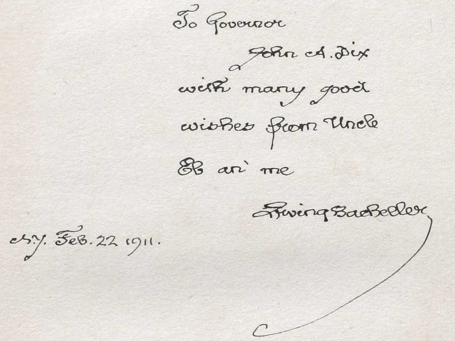 "To Governor John A. Dix with many good wishes from Uncle Eb an' me Irving Bacheller N.Y. Feb. 22 1911." This personal inscription by Bacheller to John A. Dix, then Governor of New York State, appears in a volume of Eben Holden with the imprint of Two Hundred and Seventieth Thousand, September 18, 1903, the actual year the novel was released for sale. In a 1901 newspaper article, Bacheller said the character Eben Holden was based on "a composite of my father and his hired man-a very jolly old fellow". from: PhotoSeed Archive
Ninety-one poems and sonnets are included in the volume. Here, The Test, a representative poem from the work:
The Test
Not what I felt will be the test
When song and fragrance filled the hour,
And all the sunshine of the blest
Unfolded me to perfect flower.
Not what I aid will be the test
When by sweet waters wound my way,
And white-haired, thoughtful hills all guessed
The word I was about to say.
Not what I did will be the test
When stunned by cry of human needs
I dreamed I was myself oppressed,
And woke to passion of great deeds.
Not what I chose will be the test
When first I saw one world in hand
Is worth two in the bush-the best
Of which it is to understand.
O! none of these will be the test,
But what God knows I would have done,
Had I been nurtured in the nest
Of one, I now condemn and shun. (8.)
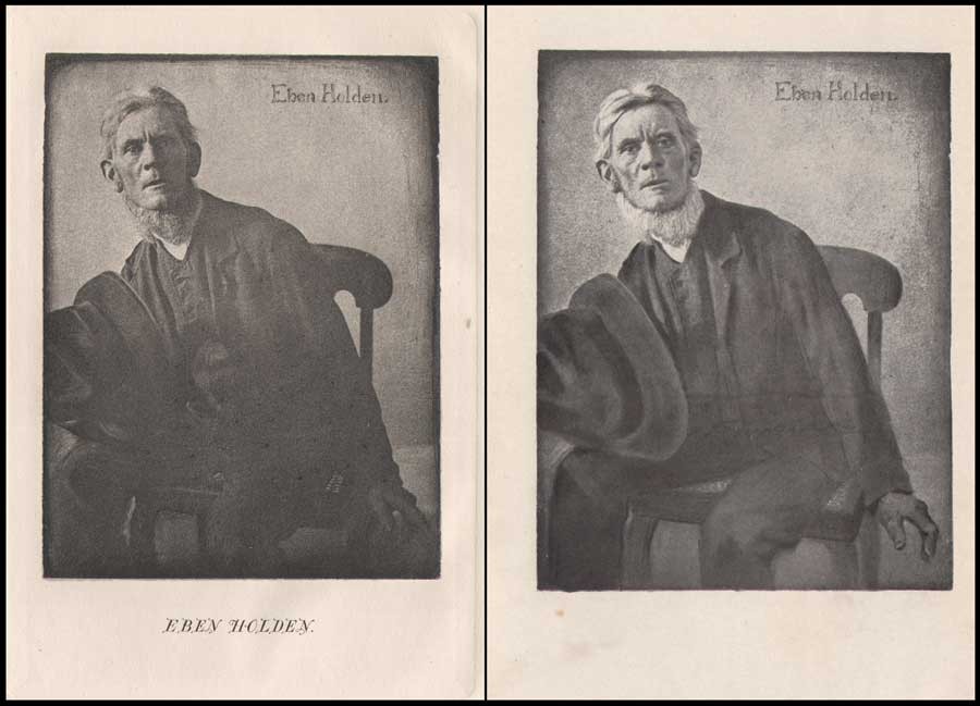 Left: Clarence H. White: American: 1902: hand-pulled photogravure: (9.7 x 7.3 cm) in: Eben Holden: A Tale of the North Country: Boston: Lothrop Publishing. (1903) Appearing as the frontis portrait in the Edition de luxe, this unknown subject was the novel's namesake: a fictional character who was a former farm-hand and main father figure for the newly orphaned William Brower serving as the narrator in the work. Right: Clarence H. White: American: 1902: halftone: (12.0 x 9.2 cm) in: Eben Holden: Harper & Brothers Publishers. (1914) Part of the Pine Tree Edition of Irving Bacheller's (Collected) Works. This heavily manipulated portrait from the original photograph by Clarence White of Eben Holden published 11 years earlier also appeared as the frontis for the first volume in the Pine Tree series. From: PhotoSeed Archive
Pictorial Illustration for Photography a Growing Field
By 1904, esteemed critic Sadakichi Hartman, writing in Leslie’s Weekly, weighed in on the growing use of photography for book illustration:
”…and Clarence H. White, of Newark, O., has found a new opening for photography in the illustration of books. His illustrations for “Eben Holden” have attracted wide and deserved attention.” (9.)
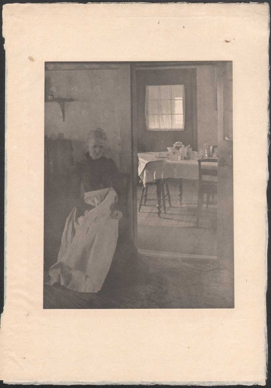 Clarence H. White: American: 1902: "Illustration to "Eben Holden"" (1903) hand-pulled photogravure: (tipped image:19.7 x 15.0 cm | Japan paper support: 30.5 x 21.0 cm) in: Camera Work III. (1903) Two plates in the Edition de luxe of Eben Holden: "How much was that a yard ?" (seen in this post-CW IX: 1905) and this one: "Mother was living in the old home alone"-an interior portrait of the photographer's mother Phoebe Billman White (1845-1920) were also published as photogravures in Camera Work. From: PhotoSeed Archive
And later that year, citing White’s involvement with Eben Holden while writing in the Photographic Times Bulletin, Hartman brought up the potential financial rewards possible for pictorial photographer in this new field:
“The only way to approximate a market value of pictorial prints is to investigate how much they might bring on the average, if offered for sale as illustrations. There is lately a decided demand for photographic illustrations, and consequently a certain standard price in vogue. The pictorialist, of course, and perhaps with some right, aspires to illustrator’s prices (i.e., $50-$100 for the full page of a magazine), but he has never reached it, with the one exception of Clarence H. White, who is said to have received several hundred dollars for his series of “Eben Holden” illustrations.” (10.)
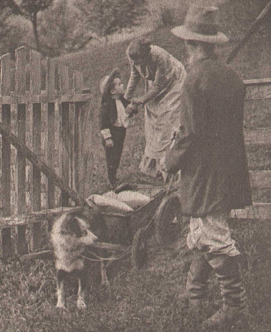 Detail: "Tucked some cookies into my pocket" : Clarence H. White: American: 1902: hand-pulled photogravure plate (11.9 x 7.3 cm) included with Edition de luxe of Eben Holden (1903): Lothrop Publishing, Boston. The young orphan William Brower is possibly modeled here by the photographer's son Maynard Pressley White (b. 1896) and his wife Jane Felix. (1869-1943) The scene shows Brower preparing to head out into the wilderness in a dog-pulled cart with Eben Holden at right. From the novel: "Our hostess met us at the gate and the look of her face when she bade us good-by and tucked some cookies into my pocket, has always lingered in my memory and put in me a mighty respect for all women." From: PhotoSeed Archive
This additional source of significant money to Clarence White and his young family through these illustration commissions invariably gave him additional confidence in his abilities as a photographer and financial peace of mind to eventually make his way to New York City, leaving Newark in 1906. It is also not a stretch to infer White’s own life mimicked the storyline of hard work that can earn the “American Dream” found between the pages of Eben Holden. Although the critic for the New York Times reviewing the play at New York’s Savoy theater didn’t care too much for the acting:
”As an exhibition of dramatic craft “Eben Holden” is hardly worth serious consideration“…
he did, a few paragraphs later, write the production had a few redeeming qualities:
But, despite its defects, the play is wholesome; it is redolent of the woods and the fields, and it provides the opportunity for an evening of entertainment that need not be looked back upon with regret. (11.)
No doubt Clarence White, had he been in attendance watching the play inside Newark’s Auditorium that 1904 November evening, would have agreed with these last sentiments of the big city critic, marveling and grinning to himself in the darkened hall while taking in the surreal juxtaposition that art imitating life can bring about.
Notes:
1. (White, Clarence H.) excerpt: An Annotated Bibliography on Pictorial Photography: Selected Books from the Library of Christian A. Peterson: Laurence McKinley Gould Library: Carleton College: Northfield, Minnesota: 2004
2. ABE listing: 120407. Besides multiple copies held by PhotoSeed, other known copies are in the Library of Congress, MOMA and Photogravure.com.
3. The Bookseller-Devoted to the Book and News Trade: Chicago: January, 1902: p. 28
4. Peter C. Bunnell: Inside the Photograph: writings on Twentieth-Century Photography: Aperture Foundation: 2006: p. 47
5. Clarence H. White : a personal portrait: Maynard Pressley White: Ph.D. dissertation, University of Delaware, 1975: pp. 79-80
6. see Beaumont Newhall’s Photography: A Short Critical History, from 1938, lists Eben Holden with the White illustrations as being published in 1903 on p. 215
7. excerpt: see Symbolism of Light: 1977: p. 7
8. Songs of All Seasons: Ira Billman: Indianapolis: The Hollenbeck Press: 1904: p. 65
9. excerpt: Advances in Artistic Photography: Sidney Allan: in: Leslie’s Weekly: April 28, 1904: New York: p. 388
10. excerpt: from: What is the Commercial Value of Pictorial Prints?: Sidney Allen: in: The Photographic Times Bulletin: December, 1904: p. 539
11. excerpt: review: “Eben Holden” at the Savoy: The New York Times, October 29, 1901
The Permanence of Disruption
Posted August 2014 in History of Photography, Painters|Photographers, Photography, Publishing, Significant Photographers
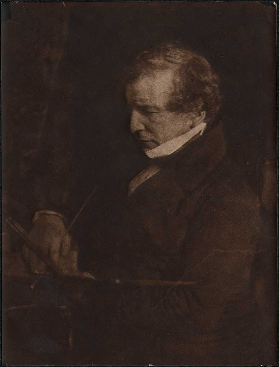
By all accounts, Scotsman David Octavius Hill, (1802-1870) Secretary of the Royal Scottish Academy of Fine Arts in Edinburgh, was an accomplished landscape painter. Thankfully, for the nascent medium of photography beginning around 1843, he is not remembered for that. Blame the Disruption, if you will.
 Detail: 1868: Artist David Octavius Hill with sketchpad at top; Photographer Robert Adamson behind wooden box camera at bottom. : Thomas Annan: vintage carbon copy photograph after D.O. Hill painting: "The Disruption of the Church of Scotland"completed 1866: original: (13.5 x 31.4 cm | 34.4 x 41.4 cm ) : from: PhotoSeed Archive
Disruption with a capitol D? He didn’t know it at the time, but when the freethinking Hill, a devout churchman seen above in detail in his own painting, sketchpad in hand, attended what became known as the Disruption: or, the historical occasion of Scottish religious free will known as the First General Assembly of the Free Church of Scotland signing the Act of Separation and Deed of Demission at Edinburgh’s Tanfield Hall, the artistic potential of photography would soon stake its’ own claim among the arts.
The Scots are Coming
Admittedly, the focus of this website doesn’t claim any great insights into the evolution of early photography, with the exception that certain photographers, those being the team of Hill and fellow Scotsman Robert Adamson, (1821-1848) popularly known as “Hill & Adamson”, are profoundly important to our understanding of artistic developments in relation to photography that came later in the 19th Century. Similar to the concept of how precedent by itself can build a case in the courtroom or in the more democratic court of public opinion, the reach of Hill & Adamson through their artistic achievement, especially in portraiture, impacted greatly the later working methods of many photographers and in particular, the eventual achievement of two fellow Scots who came into their orbit: Thomas Annan and his son James Craig Annan beginning around 1865 and in the early 1890’s.
As for that “Disruption” in relation to Hill’s completion 23 years later of an over-sized painting commemorating the event, the decision to separate from the accepted order gave former Church of Scotland congregations the freedom from central Church control to choose their own ministers, among other religious freedoms. For this alone, photography’s potential was nicely summed up in the London Art-Union journal in late 1869:
To photography Mr. Hill, soon after its discovery, about the year 1843, gave much attention, and we shall not be wrong in assigning him the credit of giving to the process its first artistic impetus; and, in conjunction with his friend, Mr. R. Adamson, of having produced many specimens of the Talbotype as yet unsurpassed for high artistic qualities. (1.)
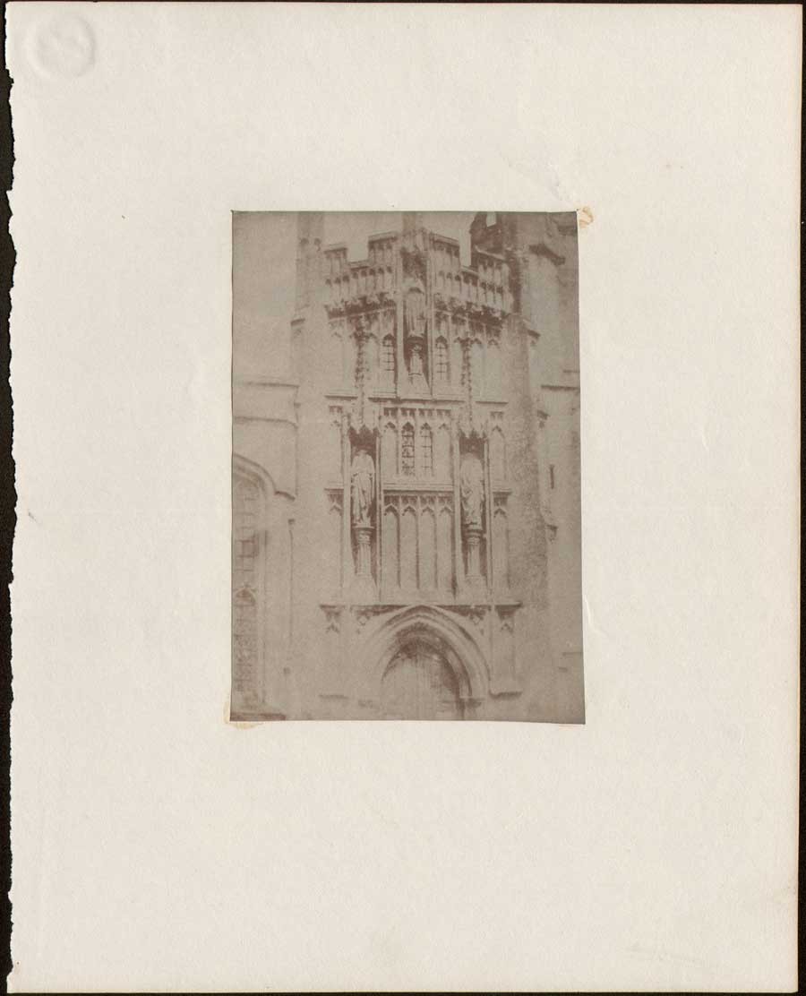 Example of vintage mounted salt print from calotype negative:(trimmed) : ca. 1845-1855: unknown photographer and location: detail from facade of English or Continental church building: ca. 1845-55: 12.8 x 8.8 | 24.9 x 19.9 cm: from PhotoSeed Archive
Thank the Calotype
Because the patent restricting Englishman William Henry Fox-Talbot’s 1841 invention of the Calotype process did not apply in Scotland, Hill & Adamson were able to exploit it to full potential. I’ve uploaded an example above, which in viewable form is technically known as a salted paper print from a calotype negative, for comparison. A survivor showing a bit of Gothic architectural detail, it was most likely done between 1845-1855 and found tucked between the pages of this archive’s copy of the aforementioned monthly Art-Union from 1846: the first magazine in history to publish (6000 copies) an example of a Talbotype “Sun Pictures” process calotype.
For a relatively clear understanding of what this early, yet cumbersome two-step process was, former George Eastman House Senior Curator of Photography William R. Stapp wrote in the pages of Image magazine from 1993 on the occasion of a seminal show of original Hill & Adamson calotypes held by the institution:
Calotypes are made on paper. The process requires the photographer to sensitize a sheet of good quality writing paper by brushing it with successive solutions of silver nitrate, potassium iodide, gallic acid, and silver nitrate. After being dried in the dark, the sensitized paper is loaded in the camera; after an exposure of several minutes, the negative is developed by brushing the paper with a solution of gallic acid and silver nitrate, fixed in a bath of sodium thiosulfate (“hypo”) to remove unexposed silver salts, and washed. When dried, this typically dense and contrasty negative is used to make a positive print on so called “salted paper,” which the photographer also has to prepare. This time a sheet of the same good quality writing paper is soaked first in a solution of sodium chloride (ordinary table salt, hence the term “salted paper”), then in a solution of silver nitrate, to produce the halide silver chloride. After it has been dried in the dark, the now light-sensitive salted paper is exposed to the negative in strong sunlight until the image is printed-out on it in deep orange hues. The resulting positive print is fixed in hypo, toned with gold chloride to a rich reddish-brown color, and washed to remove the residual chemistry. In all modern photographic materials, a transparent gelatin emulsion coated on the film or paper support contains the silver particles that form the image. Neither the calotype negative nor the calotype positive has an emulsion of any kind. The image resides literally within the fibers of the paper because the paper itself has been permeated with the photosensitive chemicals. A calotype print consequently incorporates the “tooth” (texture) of both the negative paper and the positive paper in its image. The print has a texture that is both visual and physical, which softens the image and mutes the rendition of detail. (2.)
 Pasted carbon print: ca. 1916: The Rev. Dr. Thomas Chalmers: (1780-1847) minister, social reformer, leader & first Moderator of the Free Church of Scotland Assembly, Principal of New College, Edinburgh.:15.2 x 11.1 cm: Jesse Bertram: after original ca. 1843 calotype by Hill & Adamson.: shown on opened, inside board cover to volume: "A Selection from the Correspondence of the late Thomas Chalmers, D.D. LL.D." : Edinburgh: Thomas Constable and Co. : 1853: from PhotoSeed Archive
Activism, and a bit of Fate
As fate would have it, one of those involved with the Scottish Free Church movement was Fox-Talbot correspondent Sir David Brewster. A friend of “Disruption” general assembly moderator, the Rev. Dr. Thomas Chalmers, (1780-1847) who was a minister, social reformer and evangelical orator of high renown chiefly responsible for the secession from the established Church, Brewster early on had learned the Calotype process from his friend Talbot. Teaming with Saint Andrews University chemistry professor John Adamson, they in turn taught it to Adamson’s younger brother Robert Adamson in 1842 after he had moved to Edinburgh.
And the rest they say is history. With Brewster also present at the assembly signing with Hill, he in turn suggested the new process to the painter as a way to solve the dilemma of accurately portraying the hundreds of clergy and others present at the “Disruption” for posterity.
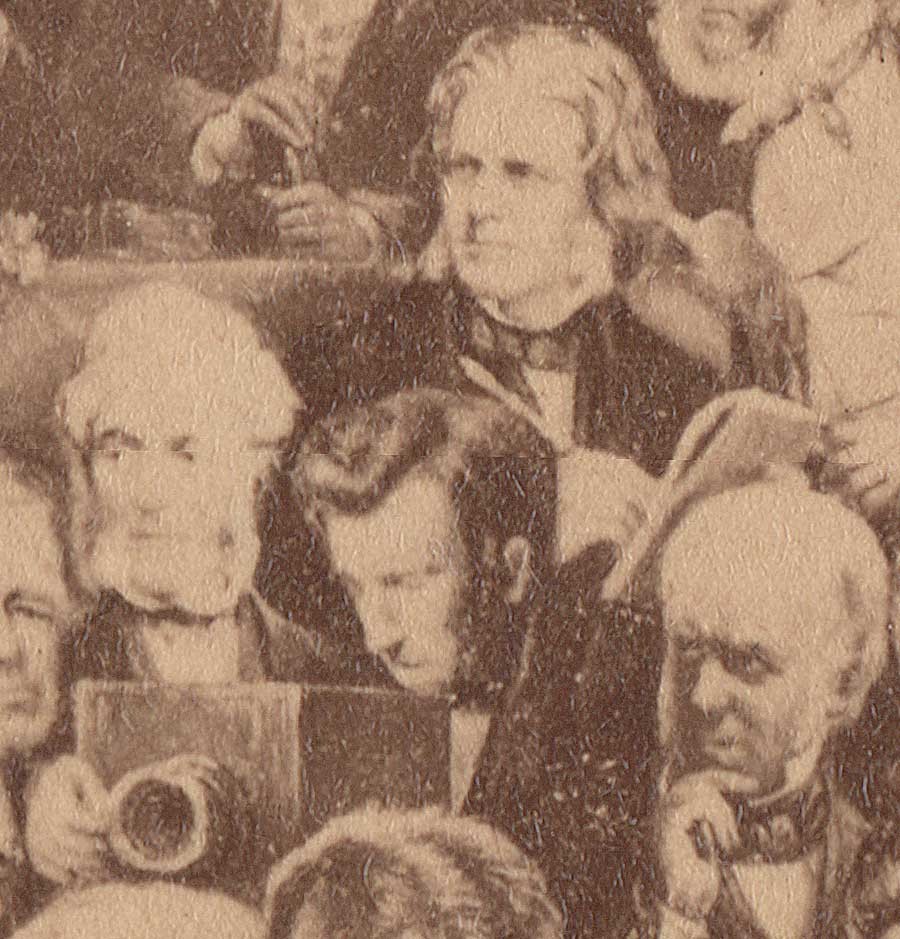
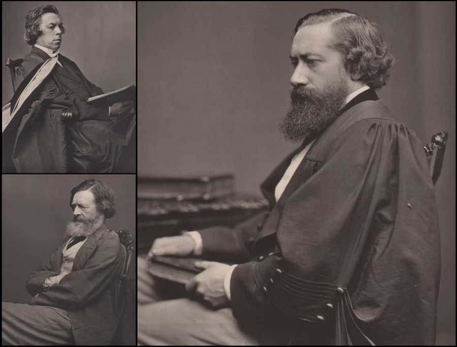
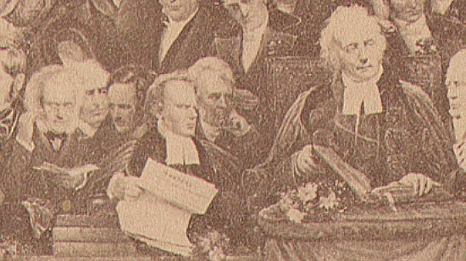 Detail: 1868: far right: Rev. Dr. Thomas Chalmers: Free Church of Scotland moderator along with major figures left to right: Scottish photography pioneer Sir David Brewster, (wearing spectacles looking down at book) Rev. Robert Lorimer, Rev. John Forbes, Dr. David Welsh: undivided Church of Scotland moderator holding a copy of May 18, 1843 church protest that was never answered, Dr. John Fleming, Chalmers. : Thomas Annan: vintage carbon copy photograph after D.O. Hill painting: "The Disruption of the Church of Scotland"completed 1866: original: (13.5 x 31.4 | 34.4 x 41.4 cm ) : from PhotoSeed Archive
Twenty-three years later, most likely with the help of Hill’s second wife Amelia Paton, (1820-1904) a sculptress, the Disruption painting, measuring in finished at over 11 feet by 5 feet, was ready for public display. And this is where it gets interesting for the career of Thomas Annan (1829–1887) and much later, his son James Craig Annan. (1864-1946) The decision to copy the painting for a mass audience was never in doubt for Hill, a man well-connected with the Scottish publishing trade who was born into it; his father being a bookseller and publisher. Hill had even learned the art of lithography from an early age, using it in the reproduction of his own work as a landscape painter for 20 years.
 Carbon print: ca. 1879 - 1881 : William Etty, R.A. (English painter: 1787-1849) : Thomas Annan or James Craig Annan: after original 1844 calotype paper negative by Hill & Adamson: 18.5 x 14.0 cm: former collection: Exeter Camera Club: from PhotoSeed Archive
In 1865, shortly before his masterwork was finished, Hill made the acquaintance of Annan by reputation through his brother Alexander’s art gallery in Edinburgh. Annan’s copy paintings had been displayed there, for he had already made a name for himself in this line of work as early as 1862, producing fine copies of artwork for the Glasgow Art Union. These Art Unions “were lotteries connected with the major art exhibitions; the successful subscribers won paintings, and every subscriber received an engraving.” (3)
A commission resulted between Hill and Annan to copy Hill’s Disruption masterwork, a canvas that unfortunately- as opposed to the hundreds of Hill & Adamson calotypes used for reference works in its’ creation and now considered masterpieces of the photographic art-did not equate it to a masterpiece itself. Annan employed for this task an improved permanent carbon photographic process, using Joseph Wilson Swan’s 1864 patent carbon tissue to reproduce copies of the “Disruption” after purchasing the Scottish rights from him in 1866. (4.)
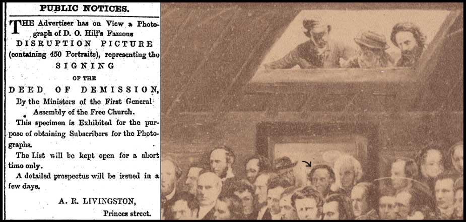 Left: 1868: advertisement: New Zealand bookseller A.R. Livingston's solicitation for Thomas Annan carbon photo of "Disruption Picture" completed 1866 by D.O. Hill: published in Otago Daily Times. Right: 1868: Detail: black arrow pointing to Thomas Annan standing in doorway painted as part of "Disruption" painting (another account states Annan is at left of this figure wearing hat) : Thomas Annan: vintage carbon copy photograph after D.O. Hill painting: "The Disruption of the Church of Scotland"completed 1866: original: (13.5 x 31.4 | 34.4 x 41.4 cm ) : from PhotoSeed Archive
In addition to several detail photos of the painting included with this post, a mounted carbon copy photograph by Annan published in 1868 for the 25th anniversary of the signing of the Act of Separation and Deed of Demission can be seen in our archive here. For those adventurous enough to decipher names and titles of some of those making up the sea of faces in the painting, partly seen below, a fascinating, yet tricky key to some of the major figures can be found here. This was published as part of the 1943 centenary volume The Disruption Picture: A Memorial of the First General Assembly of the Free Church of Scotland by Donald MacKinnon. (5.)
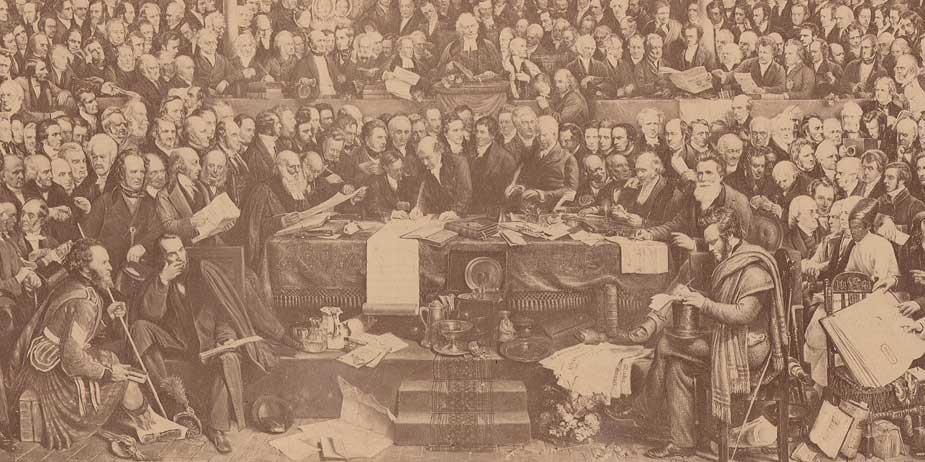 Detail: 1868: At center of table, the Rev. Dr. Patrick MacFarlan (1781-1849) of Greenock is first to sign the "Deed of Demission", "resigning the highest living in the Church of Scotland at the time", said to be £ 1000.00 annually, which commemorated the establishment of the Free Church of Scotland: Thomas Annan: vintage carbon copy photograph after D.O. Hill painting: "The Disruption of the Church of Scotland"completed 1866: original: (13.5 x 31.4 cm | 34.4 x 41.4 cm ) : from PhotoSeed Archive
Thomas Annan, Documentarian
With Hill’s work complete, Thomas Annan’s professional career was starting to hit full stride, especially after his success with the Disruption commission. In 1868, the same year a version of this carbon photo was published, (6.) Annan undertook a new commission from the City of Glasgow Improvements Trust that when first published as a series of around 35 albumen prints in 1872, became known as The Old Closes & Streets of Glasgow. As previously outlined in my essay written in 2006 for the Luminous Lint website, Annan’s photographs taken between 1868-1871 are among the earliest done specifically for a record of slum housing conditions prior to urban renewal and as such are an important milestone in the history of documentary photography. (7)
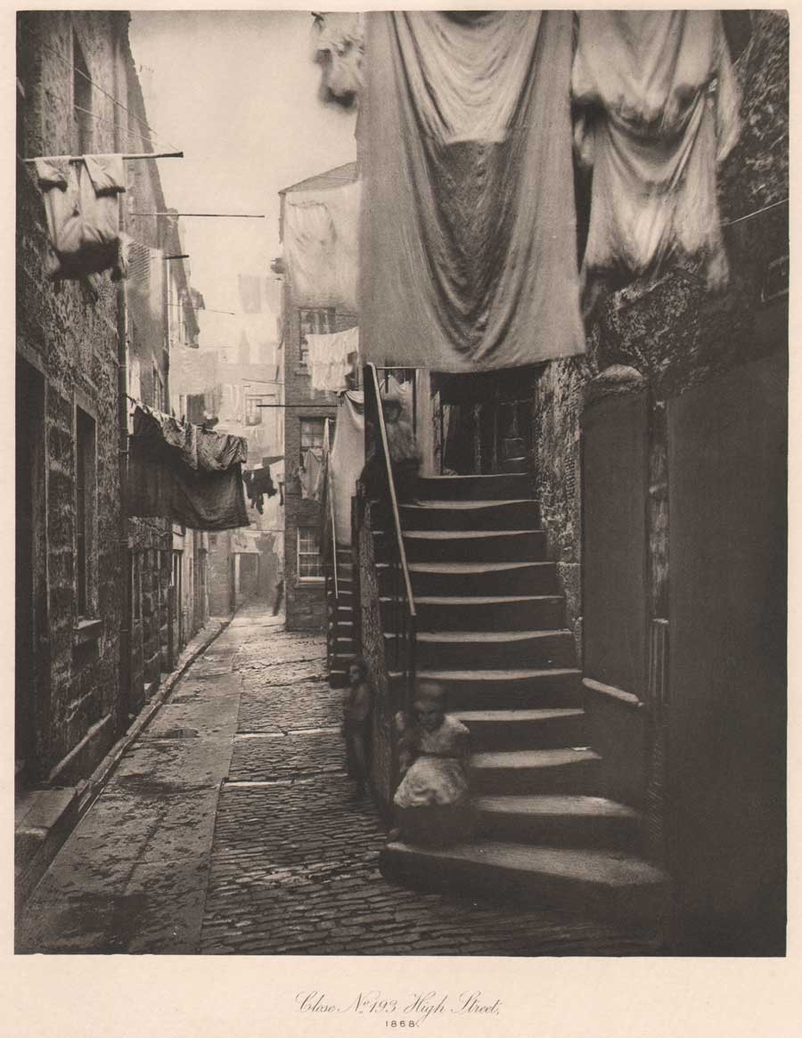 1868: vintage hand-pulled photogravure: "Close No. 193 High Street": Thomas Annan: from: "The Old Closes & Streets of Glasgow" - photographs taken for the City of Glasgow Improvements Trust : 22.2 x 18.1 | 38.0 x 28.5 cm: 1900: gravure from original collodion glass plate by James Craig Annan: Glasgow: plate #9 from James MacLehose & Sons limited edition of 100: from PhotoSeed Archive
Perhaps knowing her husband’s photographic legacy might be carried on, Amelia Paton bequeathed to Annan “a large collection of calotypes and the portrait lens used by Hill and Adamson” after Hill’s death in 1870. (8.) Speculation he used this very lens for portraits taken soon after for his illustrated volume the Memorials of the Old College of Glasgow, (1871) with examples seen in this post, are an intriguing insight raised by Sara Stevenson in her biography of Annan. (9.) Proportionally, individual portraits taken by Hill & Adamson in the 1840’s compared with those by Annan of the professors from the Glasgow volume and are very similar. However, Annan had the advantage of using the collodion process as opposed to calotype, with the increase of sensitivity of these plates lending a sharpness to his work not possible as movement was often the inevitable result of the slower 2-3 minute exposures required for the older process.
A comparison showing the softness, beauty and masterful composition of a later generation carbon print portrait of English painter William Etty (1787-1849) done ca. 1843 by Hill and Adamson can be seen with this post along with portraits by Annan taken around 1870. These include the striking portrait of professor and theologian John Caird (1820-1898) that reveal compositional similarities between the photographers nearly 30 years apart. With the archival benefit of Annan printing his efforts in permanent carbon, it’s also amusing to see exposure times, although shorter than calotype, did not prevent him in at least one case from seizing the moment in order to permanently memorialize his subject and another unwitting one: a rather large housefly clinging to academic robes worn by University of Glasgow English Language and Literature Professor John Nichol.
 1871: Thomas Annan: mounted carbon portraits from"Memorials of the Old College of Glasgow"(each cropped) : all portraits 21.5 x 16.4 | 36.5 26.0 : upper left: Professor of Divinity John Caird (1820-1898) : lower left: Professor of Greek Edmund Law Lushington (1811-1893) : right: Regius Professor of English Language and Literature John Nichol (1833-1894) (note housefly on academic robe at right below chair back) : from PhotoSeed Archive
Besides University professors, Annan did many fine portraits of Free Church of Scotland ministers in addition to ministers, elders and missionaries affiliated with the United Presbyterian Church. A unique album of these portraits, reproduced in Woodburytype, is held by this archive, with several appearing in the 1875 Annan published volume Historical Notices of the United Presbyterian Congregations in Glasgow. As a businessman running a commercial studio, Annan marketed many of these images, often as variants, in the carte de visite format. The following is a listing of Annan’s Scotland studios with dates supplied by Peter Stubbs of the EdinPhoto web site:
202 Hope Street, Glasgow: 1862-72
77 Sauchiehall St. Glasgow: 1873-74
153 Sauchiehall St. Glasgow: 1875-91
75 Princes St. Edinburgh: 1876-82
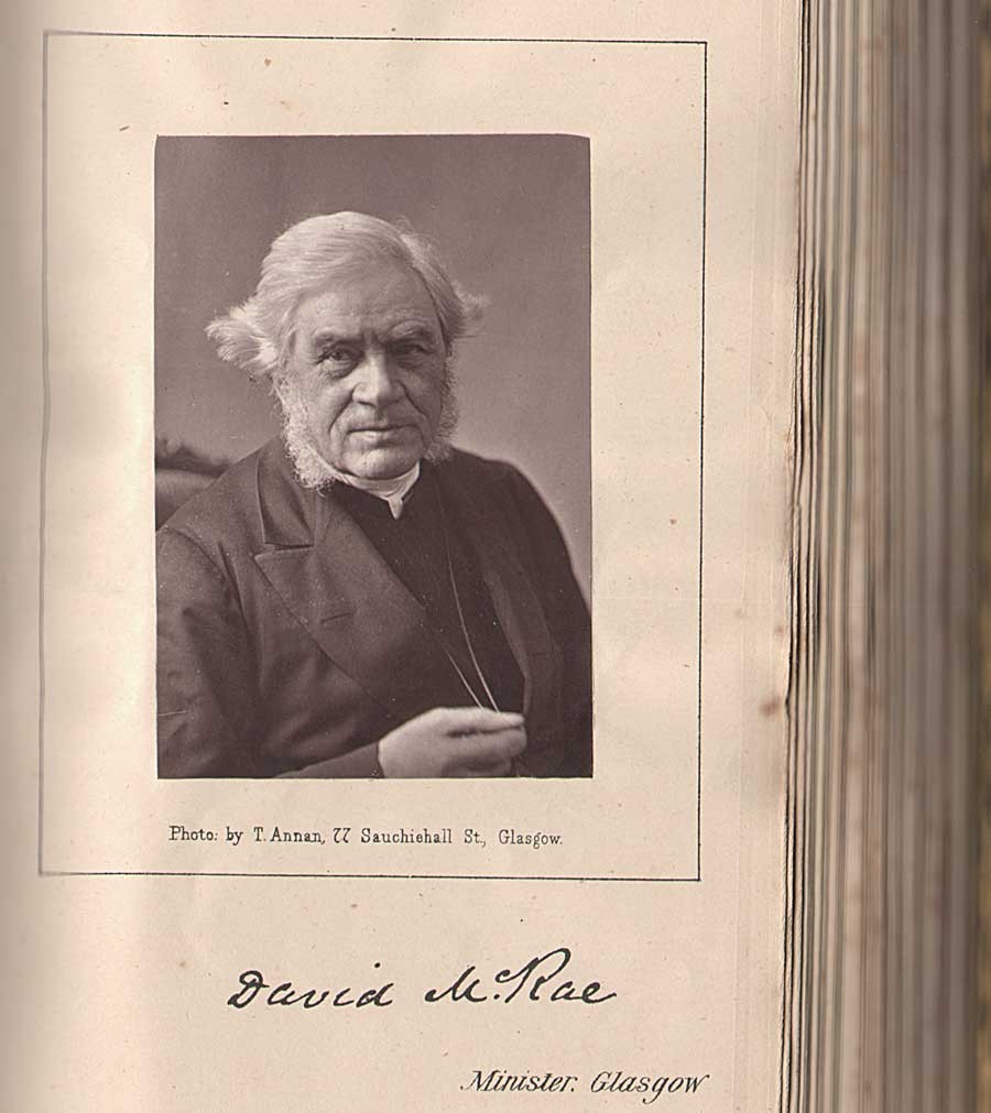 1873-74: Rev. David McRae of Glasgow: (a leading temperance movement leader from the 1850-70's) mounted Woodburytype portrait with facsimile autograph: Thomas Annan: 8.3 x 5.6 | 19.4 x 10.5 cm : from unique folio album of nearly 60 Woodburytype photographs taken ca. 1862-1882 by Thomas Annan and most likely John Annan of ministers, elders and missionaries affiliated with the United Presbyterian Church: from PhotoSeed Archive
Coming full-circle: Learning Photogravure
In 1883, after purchasing the British rights to a new process of Photogravure invented by Czech artist Karl Klíc, (1841-1926) Thomas Annan and son James Craig Annan traveled to Vienna in order to personally learn its intricacies. As defined by our good friends over at Photogravure.com, Klíc’s 1879 refined process of “reproducing a photograph by printing on paper from an inked and etched copper plate” was a vast improvement over that of William Henry Fox Talbot’s 1858 patented Photoglyphic Engraving process. Thomas Annan was so smitten he wrote Klíc the following appreciation:
“I beg to express my entire satisfaction with your gravure process… The process itself is very valuable to a fine art publisher because of the beauty of the work and the crafted manner in which the plates are executed. With many thanks to me and my son I remain, Dear Sir, yours very truly” - Thomas Annan March 11, 1883 (10.)
Fittingly renamed the Talbot-Klíc Dust Grain Photogravure by Klíc, the process was soon fully embraced by Annan’s publishing concerns, T. & R. Annan and Sons of Glasgow, Hamilton and Edinburgh, who utilized photogravure for high-quality, fade-resistant and archival plates, mostly copies of original works of art, an established specialty. Soon, the new process, which involved the individual hand-pulling of plates from a copper-plate press, was further exploited and refined by the budding photographer James Craig Annan in the early 1890’s, whose original photographic negatives “from nature” during his travels to the Continent, particularly North Holland and Italy, were directly reproduced in gravure after an ongoing period of great experimentation and refinement.
Like his father Thomas, who reproduced and exhibited some of the Hill & Adamson calotypes in carbon during the 1870’s and early 80’s using his own refinements of Swan’s process, (11.) James Craig Annan fully embraced Talbot-Klíc gravure printing to reinterpret their landmark achievements in early pictorial portraiture as well as other studies including the fisherfolk of Newhaven near Edinburgh. In this regard, beginning as early as 1890, Annan produced a series of hand-pulled gravures re-photographed from the original Hill & Adamson paper calotype “negatives in the possession of Andrew Elliott.” (12.) Later in 1905, working as part of the T & R Annan firm of Glasgow, he produced a further series of 20 plates printed on Japan tissue. (13.) These copper plates were then re-used for a series of gravures published in Alfred Stieglitz’s Camera Work XI, (1905) XXVIII, (1909) and XXXVII, (1912) thereby introducing new generations to the masterful legacy left by Hill & Adamson.
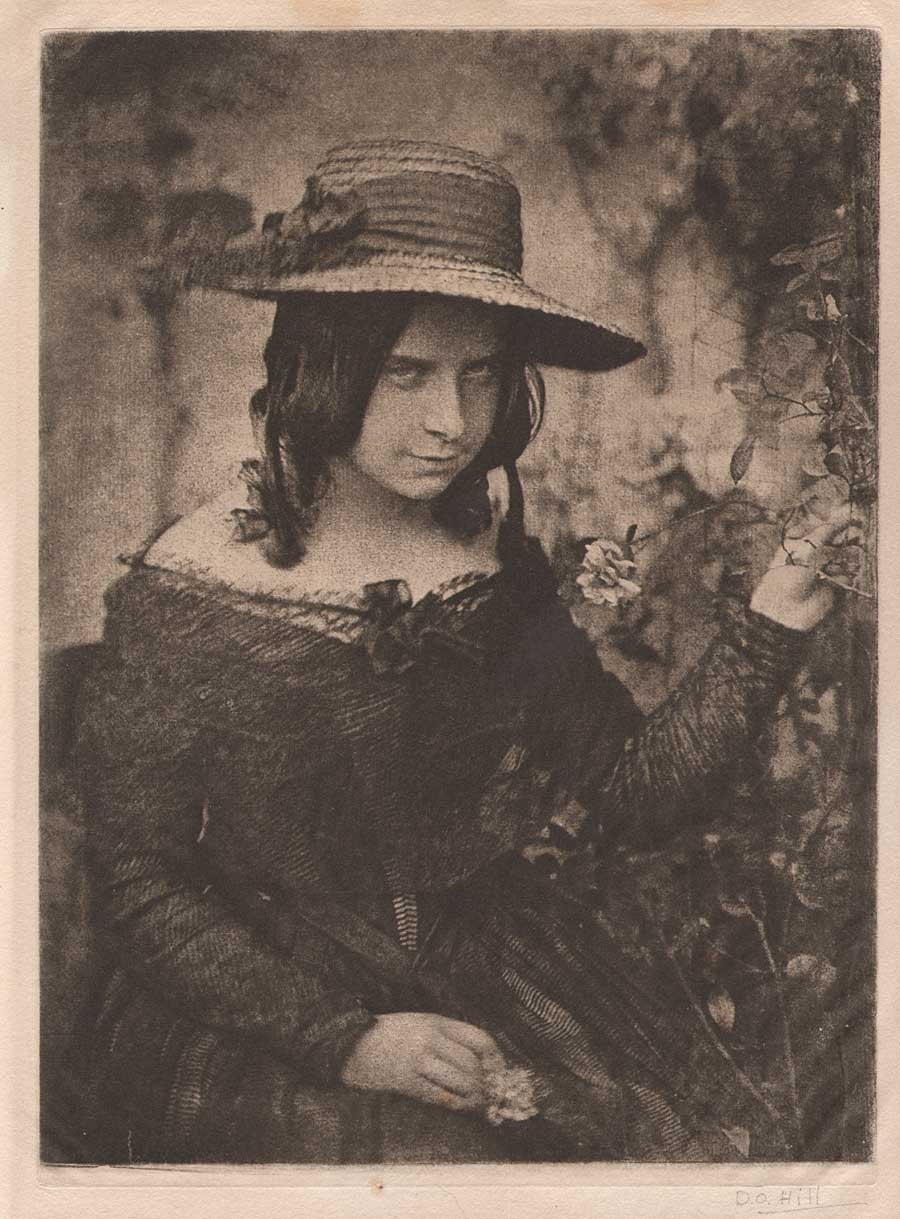 1890-1912: "Girl in Straw Hat" (Miss Mary McCandlish) : vintage hand-pulled photogravure trimmed and mounted within cream paper folder: possibly a 1912 Camera Work proof: 21.5 x 15.9 |25.5 x 19.0 cm: James Craig Annan after original paper calotype ca. 1843-47 by Hill & Adamson: reproduced in CW XXXVII: originally in Margaret Harker Collection: from PhotoSeed Archive
I’ll end this lengthy post with an excerpt from an appreciation of D.O. Hill by James Craig Annan, who was fortunate to have met and been inspired by the artist when he was only six years old- the result of his father being an intimate friend of Hill. This was included as part of a larger essay he wrote on the Scottish pioneer for Camera Work XI, and he makes the strong case their achievement was a direct result of their portrait collaborations for the Disruption painting:
“Thus the partnership began which was to produce the noble and extensive series of portraits which for powerful characterization and artistic quality of uniformly high excellence have certainly never been surpassed and possibly not even rivaled by any other photographer. This may seem an extravagant appreciation of Hill’s work, but it has been arrived at after mature deliberation.” (14.)
-David Spencer
Notes:
1. British Artists: Their Style and Character: With Engraved Illustrations. : David Octavius Hill, R.S.A.: in: The Art-Journal: London: October 1, 1869: p. 317
2. William F. Stapp.: Hill and Adamson: Artists of the Calotype: from: Image: George Eastman House: Spring/Summer: Vol. 36: No. 1-2: 1993: p. 55
3. Sara Stevenson: Scottish Masters 12: Thomas Annan: National Galleries of Scotland: 1990: p. 5
4. After discussions with Hill, the copy photograph of the “Disruption“canvas was taken by Thomas Annan after he had ordered “a large Photographic Camera of the latest and most perfect construction” from Dallmeyer: in: 1866 Disruption prospectus by Hill: published in: Scottish Masters 12: p. 7
5. Alan Newble has thoughtfully, and no doubt, painstakingly, compiled the key as part of his website, with further insights on the historical importance of the Rev. Dr. Thomas Chalmers.
6. In correspondence between Annan and Hill in late December, 1865, Hill stated he wanted the Disruption painting reproduced in thousands of photographs in 3 separate sizes. “He (Hill) was hoping for prints half the size of the painting, and suggested that Annan make them in three parts, joining them together around the figures rather than in an arbitrary straight line.” : from: Hill & Annan letters: quoted in: Scottish Masters 12: pp. 6-7. Alas, Hill’s desires were trumped by technical limitation, with carbon prints supplied by Annan printed in 1866 in 3 sizes, as stated in the Photographic News of London: “Photographs of the picture will be issued in three sizes, ranging from 24 inches by 9 inches to 48 inches by 21 1/4 inches, at prices ranging from a guinea and a half to twelve guineas.”
7. The carbon print edition of Old Closes first appeared in 1877, with two later photogravure editions featuring 50 plates each printed by James Craig Annan published in 1900. Fine examples of the albumen prints from Old Closes can be found along with superb background on their making at the University of Glasgow Library special collections department online resource found here.
8. cited in Scottish Masters 12: p. 8
9. Ibid: p. 13
10. from: Photogravure.com online resource accessed August, 2014. While in Vienna under Klíc’s watchful eye, the Annans had produced a photogravure of Noel Paton’s painting of The Fairy Raid.
11. Scottish Masters 12: p. 8
12. David Octavius Hill & Robert Adamson: in: The Collection of Alfred Stieglitz: Weston Naef: New York: The Metropolitan Museum of Art: p. 378. Elliott, (1830-1922) was a nephew of D.O. Hill
13. Ibid, p. 378
14. excerpt: David Octavius Hill, R.S.A. ⎯1802-1870.: J. Craig Annan: in: Camera Work XI: New York: edited and published by Alfred Stieglitz:1905: p. 18
Christmas Greetings
Posted December 2013 in Publishing
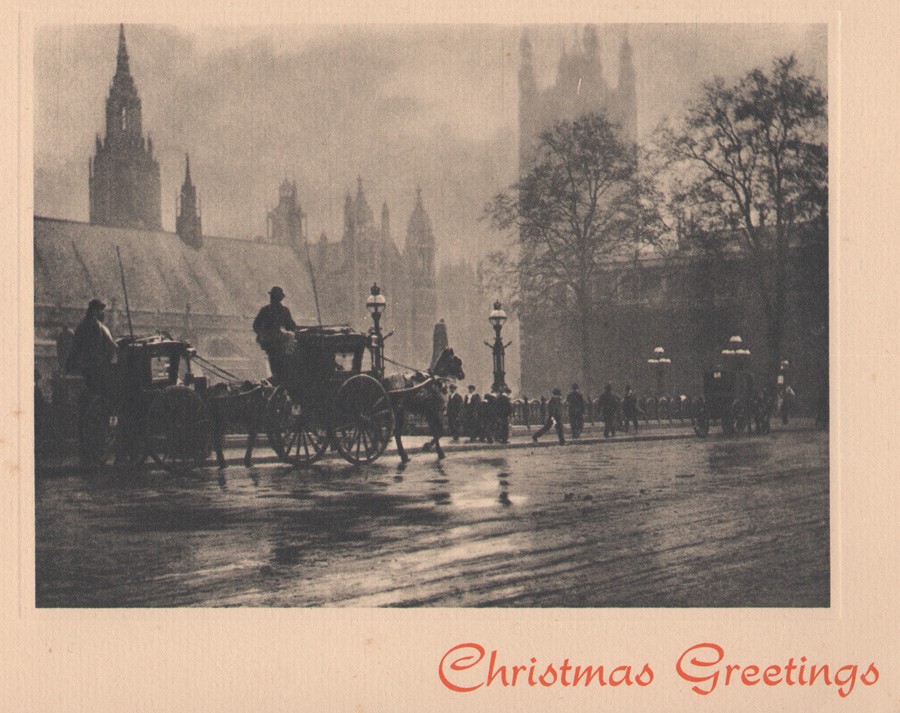 "Souvenir De Londres" From the Original Photograph by Leonard Misonne: vintage screen gravure four-fold holiday card: image: 10.5 x 14.2 cm: frame: 14.3 x 18.4 cm: sheet: 28.5 x 36.6 cm: atelier: J. Arthur Dixon | Isle of Wight: MXL /73 circa 1930-1940
Black, White and Blue all Over
Posted April 2013 in Photographic Postcards, Publishing, Texts
Beyond the Tweets, texts and messaging saturating our present-day social media culture-recently extending even to software giving a smartphone user the ability to view a photograph just once before it disappears into the ether forever, (Snapchat et al apps) the endurance, value and cultural importance of the printed word and photograph need be considered-indeed marveled at-for the historical record and of course for posterity itself.
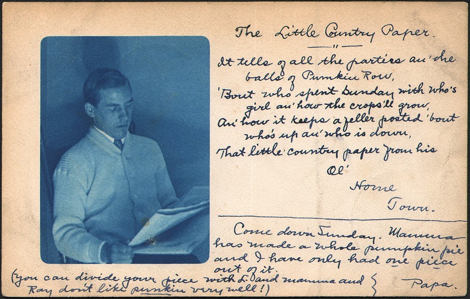 "The Little Country Paper": vintage cyanotype postcard (recto) with inked handwriting posted October, 1906 from Lisbon, New Hampshire to Littleton, N.H. by Arthur W. Buffington (b. 1868) to his son Harold A. Buffington (1886-1976) : 8.8 x 13.9 cm: image: 6.8 x 5.0 cm: PhotoSeed Archive
Consider today’s example, a postcard featuring an original cyanotype photograph of a well-dressed gentleman reading a newspaper. Addressed and posted to Harold A. Buffington of Littleton, New Hampshire in October, 1906, (1.) this simple and lasting form of communication is signed “Papa”, (2.) with the suggestion for his son to come over on Sunday for a visit in order to enjoy a slice of pumpkin pie.
Before getting to the nut graph as they say in newspaper lingo, “Papa”: aka Arthur W. Buffington, (b. 1868) begins his correspondence with a quote from a well known (at least for its time) story celebrating the importance of small town rags everywhere. It might not be surprising given his listed occupation as a printer for the 1900 U.S. Census. Owner of the Buffington Press in Littleton during this period, (they printed cookbooks among other volumes) he writes on the postcard:
The Little Country Paper
It tells of all the parties an’ the balls of Pumpkin Row ‘Bout who’s spent Sunday with who’s girl, an’ how the crops’ll grow. An’ how it keeps a feller posted ‘bout who’s up and who’s down. That little country paper from his ol’ Home Town.
This entire “story” seems to have originated around 1903 or before by someone writing for the Denver Post newspaper in Colorado. I’ve taken the liberty to include it in its entirety at the end of this post (as it originally appeared) along with another similarly titled “story” I discovered from the era . And the juicy part? “Papa” writes:
Come down Sunday. Mamma has made a whole pumpkin pie and I have only had one piece out of it. (you can divide your piece with L. O and mamma and Ray don’t like punkin very well!) Papa.
In addition to the slice of pie he presumably ate, the postcard might have even inspired Harold Buffington to get ink in his blood like his father, for he is listed in the 1940 U.S. Census as a printer for the Courier office, still known today as the Littleton Courier, a weekly newspaper published since 1889.
The Little Country Paper
When the evenin’ shades is fallin’ at the endin’ o’ the day,
An’ a feller rests from labor, smokin’ at his pipe o’ clay.
There’s nothin’ does him so much good, be fortune up or down,
As the little country paper from his O’l Home Town.
It ain’t a thing o’ beauty an’ its print ain’t always clean.
But it straightens out his temper when a feller’s feelin’ mean.
It takes the wrinkles off his face an’ brushes off the frown.
That little country paper from his Ol’ Home Town.
It tells of all the parties an’ the balls of Pumpkin Row.
‘Bout who spent Sunday with who’s girl an’ how th’ crops’ll grow.
An’ how it keeps a feller posted ‘bout who’s up an’ who is down.
That little country paper from his O’l Home Town.
Now, I like to read the dailies an’ the story papers too.
An’ at times the yaller novels an’ some other trash—don’t you?
But when I want some readin’ that’ll brush away a frown
I want that little paper from my O’l Home Town. (3.)
The following with the same title originated in the Baltimore (MD) American newspaper in 1900 or before, and may have inspired the Denver Post account of The Little Country Paper:
The Little Country Paper
It’s just a little paper-it isn’t up to date:
It hasn’t any supplement or colored fashion plate.
It comes out every Friday, unless the forms are pied;
The outside is home printed, with boiler-plate inside.
It hasn’t any cable direct from old Bombay,
But it says that “Colonel Braggins is in our midst to-day.”
It doesn’t seem to worry about affairs of state.
But tells that “Joseph Hawkins has painted his front gate.”
It never mentions Kruger or Joseph Chamberlain.
But says that “Thompson’s grocery has a new window pane.”
And that “the Mission Workers will give a festival.
And there’ll be a temperance lecture in William Hooper’s hall.”
It tells about the measles that Jimmy Hankins had.
And says that Israel Johnson “has become a happy dad.”
It says that “cider-making is shortly to commence.”
And cites the fact that Ira Todd is building a new fence.
It mentions Dewey’s coming in one brief paragraph, And says that “Charlie Trimble has sold a yearling calf.” And everything that happens within that little town The man who runs the paper has plainly jotted down.
Some people make fun of it, but, honestly, I like To learn that “work is booming upon the Jimtown pike.”
It’s just a little paper—it hasn’t much to say—
But as long as it is printed I hope it comes my way. (4.)
-30-
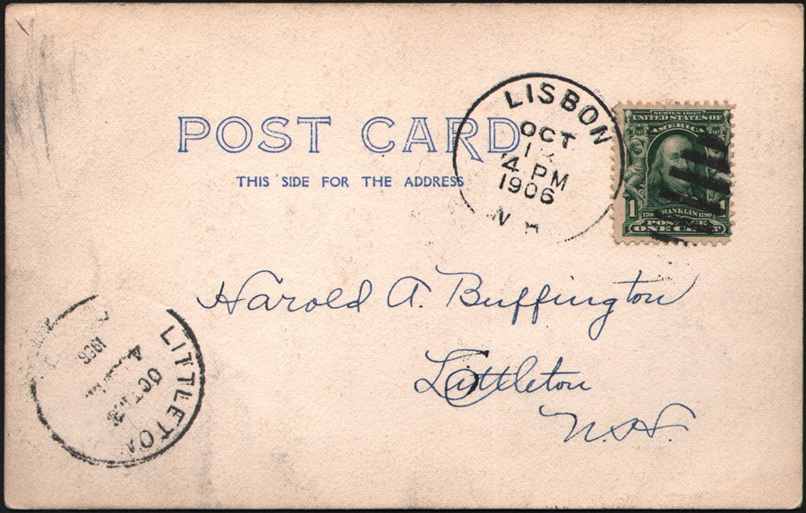 Printed postcard (verso) addressed to Harold A. Buffington, Littleton, New Hampshire: 8.8 x 13.9 cm: Posted: Lisbon, N.H., October 1906: PhotoSeed Archive
Notes
1. It is believed the gentleman in the cyanotype photograph reading the newspaper is also the recipient of the postcard: Harold A. Buffington, a student who would have been 20 years old in 1906. (b.: September 12, 1886 | d. March, 1976. source: Crestleaf)
2. “Papa” was Arthur W. Buffington (b. 1868) who lived in Lisbon, New Hampshire at the time he mailed this postcard
3. The Little Country Paper: Denver Post: reprinted in the Mansfield (OH) News: Saturday, October 24, 1903
4. Newspaper Verse: Selections Grave and Gay: Current Literature-A Magazine of Record and Review: New York: Vol. XXVIII: April-June, 1900: pp. 192-93
March of Trade's Harmonious Shades
Posted November 2012 in Advertising, History of Photography, Journals, Publishing
The Photographic Times (1871-1915) was one of America’s earliest and most important photographic journals. By 1880, its publisher declared it the highest circulating magazine of its type in the country and by December of 1893, the first edition was stated to be 5,000 copies a week, an extraordinary number considering the inclusion by that time of a hand-pulled photogravure or collotype frontis plate. As a researcher, it would be presumptuous of me to think it possible in the modern day to present a fully-formed history of this publication without more direct corroboration from those who made that history. But since those folks are all dead, someone had to take a stab at it.
 1871-1873: The Photographic Times was first published by The Scovill Manufacturing Company, which maintained offices in this building at 36 Park Row and 4 Beekman streets in lower Manhattan. Completed in 1857 and known as the Potter or World Building, it was the home of the New York World newspaper offices and many other publications. (an adjoining building for The New York Times is at far left of frame) The sign for the Scovill Manufacturing Co. has been highlighted in red for clarity on the Park Row side. Since rebuilt, this building and block was destroyed by a massive fire on January 31, 1882 that claimed 12 lives. This detail from a circa 1870 stereoscopic view in the collection of the New York Public Library: Image ID: G91F211_034F
Besides the written record, the important legacy left by the journal in my estimation are its hand-pulled photogravure plates which appeared regularly from 1889-1904, the latter being included in the combined but short-lived publication The Photographic Times-Bulletin. As a collector of this material for many years, it is surprising to me how little seems to have survived given the large circulation of the Times. My overview of the publication, which appears here in PhotoSeed Highlights, might very well put you to sleep due to length, or perhaps not. In tracing the history of this journal, my journey of discovery made me realize a fact of interest to all photographers, especially with respect to the United States: the first publisher of the Times, the Scovill Manufacturing Company of New York City, with a large factory complex in Waterbury, CT, was largely responsible for the birth and progress of photographic commerce in 19th century America.
 1871-1915 timeline: The Scovill company, publishers of The Photographic Times, did business at 9 different locations in New York City over 45 years. This Google street map with inset address key covers a walking distance today of approximately 4.6 miles. Arranged chronologically from A-I, the dates and addresses for the company are as follows: 1871-1873: 4 Beekman Street 1874-1884: 419-421 Broome Street 1884-1895: 423 Broome Street 1896-1900: 60-62 East 11th Street 1900 (Fall)-1902: 3-5 West 19th Street April 1902-1903: 122-124 Fifth Ave. 1904: 75-77 Eighth Ave. December, 1904-1908: 39 Union Square West 1909-1915: 135 West 14th Street
The following visual timeline is my attempt to show off the look of the publication over the 45 years it existed under its own imprint along with the principal men involved in editing it- part of the Photographic Times Publishing Association, one of the many business interests of the parent company. During this time, Scovill’s march of trade on the island of Manhattan involved eight separate business moves over a walkable distance today of roughly 4.6 miles. To this end, part of the mission statement issued by the Time’s editors to its many readers- from post American Civil War beginnings in January, 1871 to its 1915 demise remained true over the life of the journal:
we shall intersperse here and there delicate half-tones and harmonious shades from sources of information which shall do you good service in your manipulations, and add to your store of useful knowledge. We have engaged talent for this end, which is competent and able to instruct.
-David Spencer November, 2012
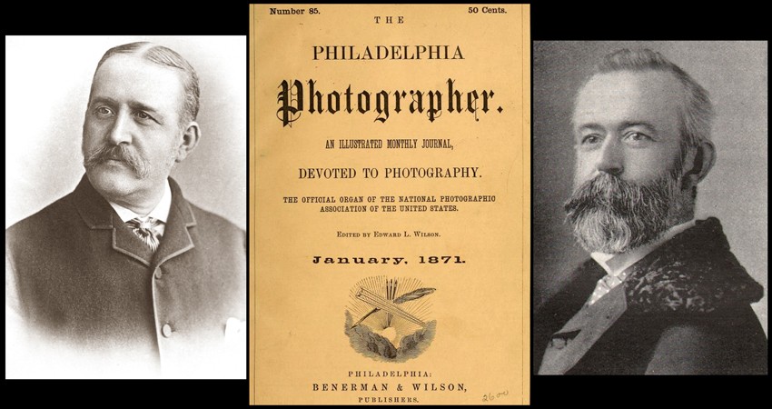 1870: The Times first appeared as a supplement incorporated within the pages of the monthly Philadelphia Photographer, center, one of the first journals devoted to photography published in America beginning in 1864. Washington Irving Adams, left, (1832-1896) came up with the idea for the Times during a working lunch attended in 1869 by men associated with the Scovill Manufacturing Company. Edward Wilson, right, (1838-1903) was the founder, editor and publisher of the Philadelphia Photographer, as well as good friend to Adams. Photo credits: portraits: PhotoSeed Archive; magazine cover: HathiTrust
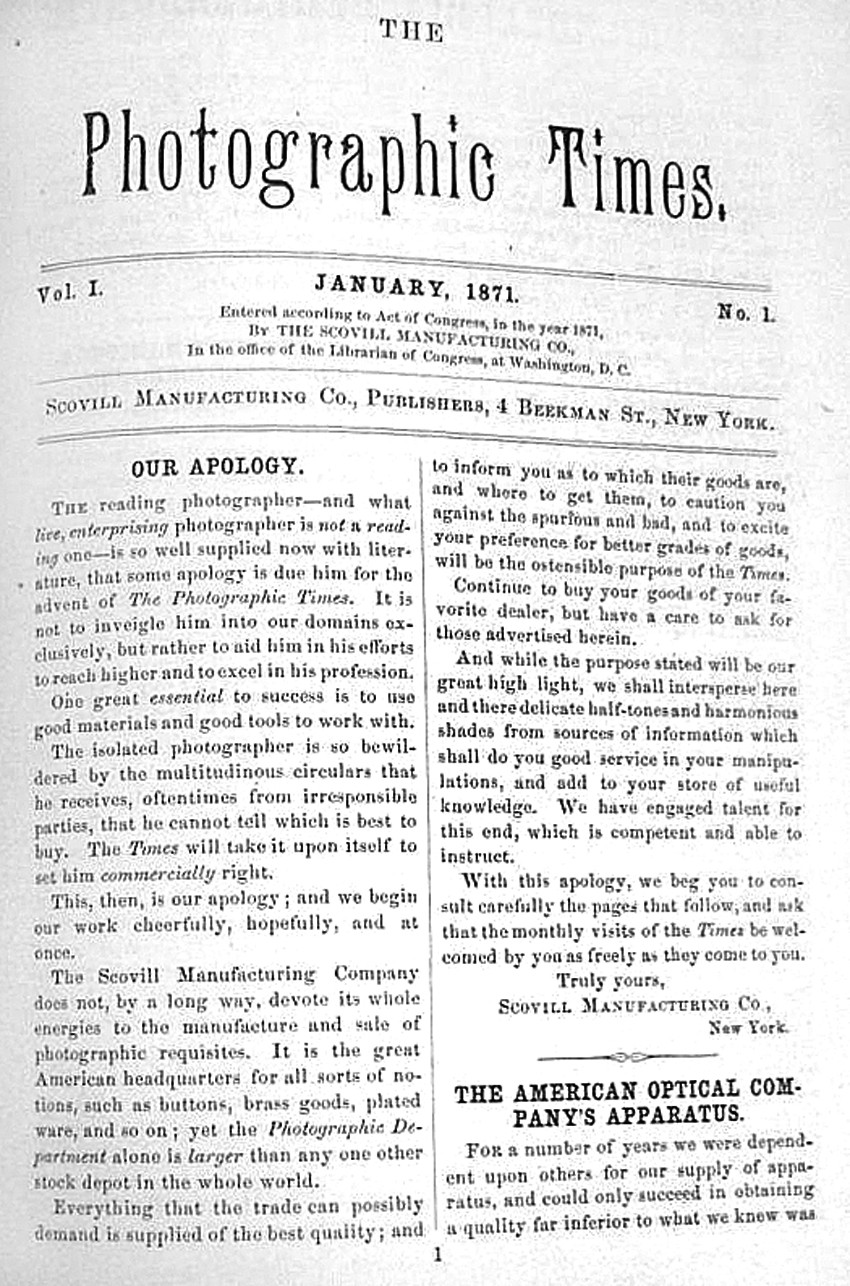 1871: The Photographic Times appeared for the first time under the imprint of the Scovill Manufacturing Company of 4 Beekman street in New York City beginning with the January, 1871 issue. The first page of the eight-page trade monthly included an "Apology", intended to "set the photographer commercially right.” It was sent out free of charge with Wilson's Philadelphia Photographer, The Photographic World, and Walzl’s Photographic Magazine, along with an additional 500 copies mailed each month from Scovill's New York offices. Photo credit: D. Richards, Bookman: Pittsburgh, PA
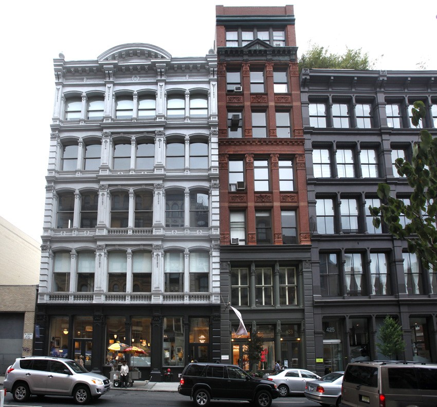 1874 | 1884: Because of "want of room and the march of trade", the Scovill company had moved to new quarters at 419-421 Broome street by January, 1874. Located in SoHo, the building as it stands today can be seen at left in a photograph taken in June, 2012. By May of 1884, another move for the Times and the Scovill company took place right next door: the building at center with the address of 423 Broome Street, built for the company by architectural firm D. & J. Jardine. Described as a warehouse building at the time, Times editor Washington Irving Adams commented on its many benefits: "This well appointed structure, embracing seven floors and a double basement, we have erected to meet the special requirements of our business. The building, with its improved interior arrangements, will greatly enlarge our facilities and enable us to respond to the wants of our patrons in a more expeditious and satisfactory manner than heretofore. For the accommodation of our friends, a well-constructed dark-room and sky-light have been added to the many other conveniences introduced, all of which will subserve in various ways the interests of our customers." PhotoSeed Archive photograph by David Spencer
 2012: Serendipity, coincidence or both? A modern day investigator peering through the front window of 419 Broome street is startled to learn the fine art of photography is alive and well nearly 140 years after this space occupied one of the leading mouthpieces of the photographic press. In the business space Aero LTD, a home furnishing store, professional photographer Michelle Arcila's work is framed and ready for sale. Her photographs "Present Tense" at left and "Olympia" share the reflected outside world of Broome street. PhotoSeed Archive photograph by David Spencer
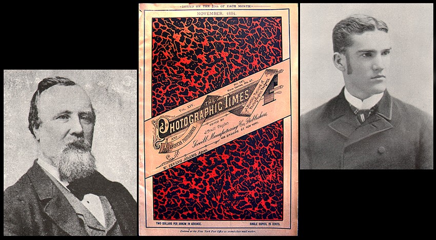 1881 | 1884 | 1885: Beginning in 1881, a new editorial direction was brought to the Times, renamed The Photographic Times and American Photographer, by Englishman John Traill Taylor, (1827-1895) left. A veteran of the British Journal of Photography, he was eventually succeeded as editor by Washington Irving Lincoln Adams, (1865-1946) right, son of the journal's founder, joining the editorial staff in 1885. At center is a rare surviving example of a Times cover from November, 1884. Photo credits: portraits: PhotoSeed Archive; magazine cover: Ebay
 2012: Besides being the king of Pop art, Andy Warhol (1928-1987) was also a passionate photographer, going everywhere with his Polaroid camera-seen here around his neck in the famous (since removed) chrome-plated "Andy Monument" by sculptor Rob Pruitt in Union Square. A parallel or association with the Photographic Times? You bet. Albeit sixty years later, Warhol’s second "Silver Factory" was established in 1968 and located around the corner from the statue at 33 Union Square West, just three doors down from 39 Union Square, one of the last home offices for the Times from 1904-1908. PhotoSeed Archive photograph (June) by David Spencer
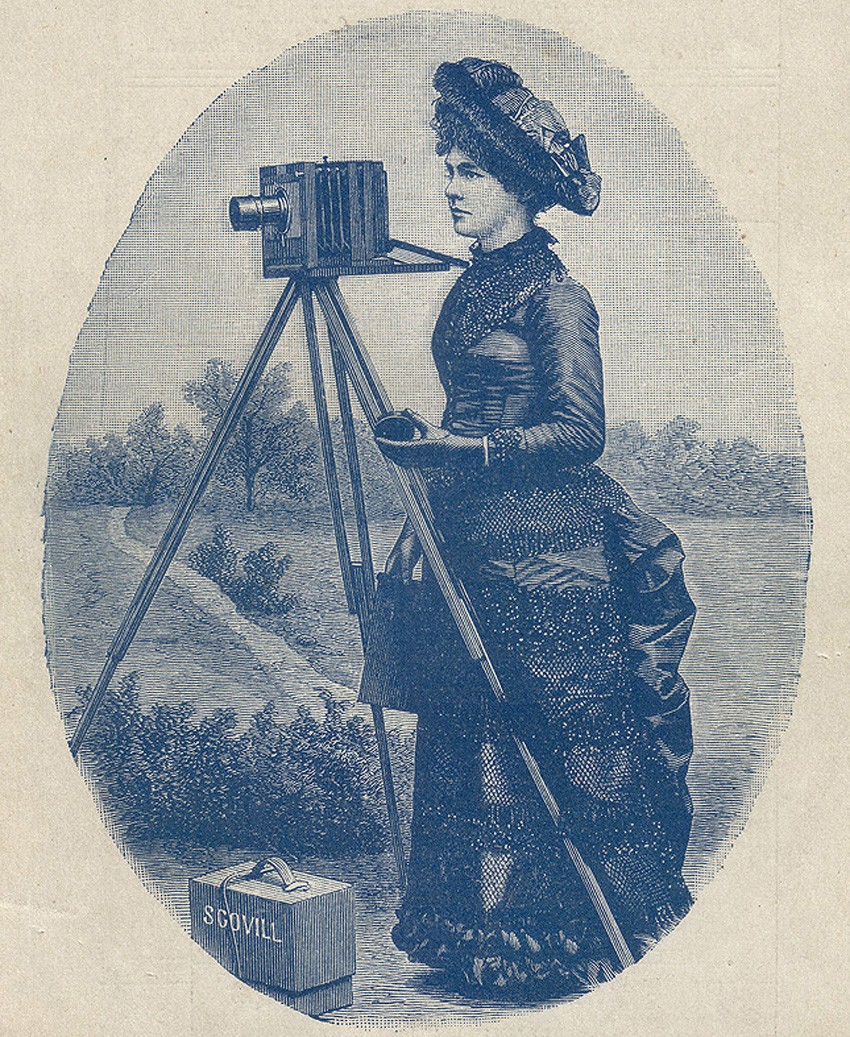 1883: With modern dry gelatin photographic plates replacing the cumbersome wet plate (collodion) process around 1881, the Scovill company through their publications including the Photographic Times began marketing in earnest complete and affordable amateur outfits to the masses. This fashionably dressed lady amateur, appearing as early as 1883 as a wood engraving in Scovill's catalogue: "How to Make Photographs", advertised their "Amateur Photographic Requisites". For the grand sum of $10.00, a photographer could obtain "Favorite Outfit A": an adjustable 4 x 5 Scovill plate camera, "Waterbury" achromatic nickel plated lens, a Taylor folding tripod, a double dry plate holder for the camera and carrying case. After becoming the Scovill & Adams company in 1889, the firm developed other popular mass market cameras including the Henry Clay and Solograph models as well as many others. 1889 engraving from Scovill catalogue courtesy of Larry Pierce.
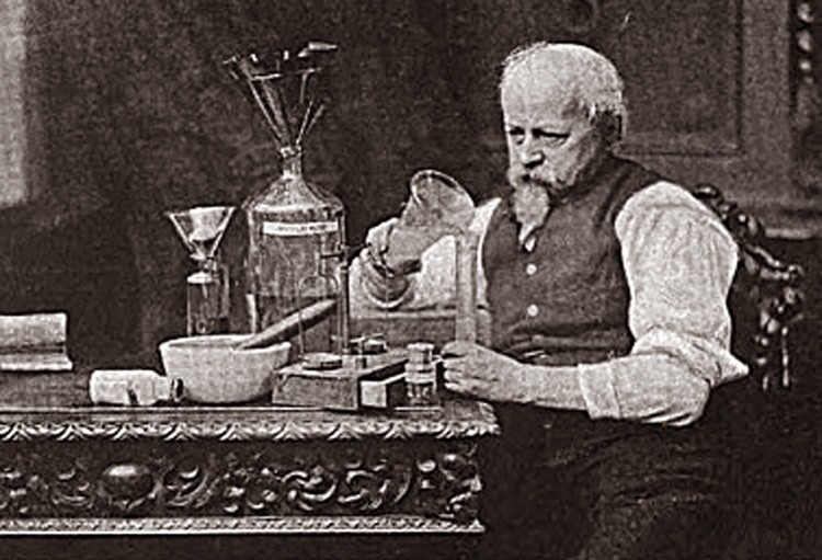 1886: Dr. Charles Ehrmann, (1822-1894) a pharmaceutical chemist by training at the University of Berlin, joined the Photographic Times as an assistant editor under John Traill Taylor beginning in 1881. His obituary penned by Frederick Beach in the American Amateur Photographer said he became the "guiding editorial spirit" for the Times after Taylor's retirement in 1886, even under Lincoln Adams, and was the journal's "chief experimentalist- investigating and writing in the pages of the Times the myriad processes then used in traditional wet darkroom photography. In the Fall of 1886, Ehrmann was named instructor in the newly established Chautauqua University School of Photography, chiefly a correspondence school, but also one where he gave hands-on instruction in photography with diplomas awarded from the summer home in upstate New York as well as the Broome street offices of the Times. This photograph of Ehrmann appeared as a full-page plate in the May 25, 1888 issue of the Times. Photo credit: HathiTrust
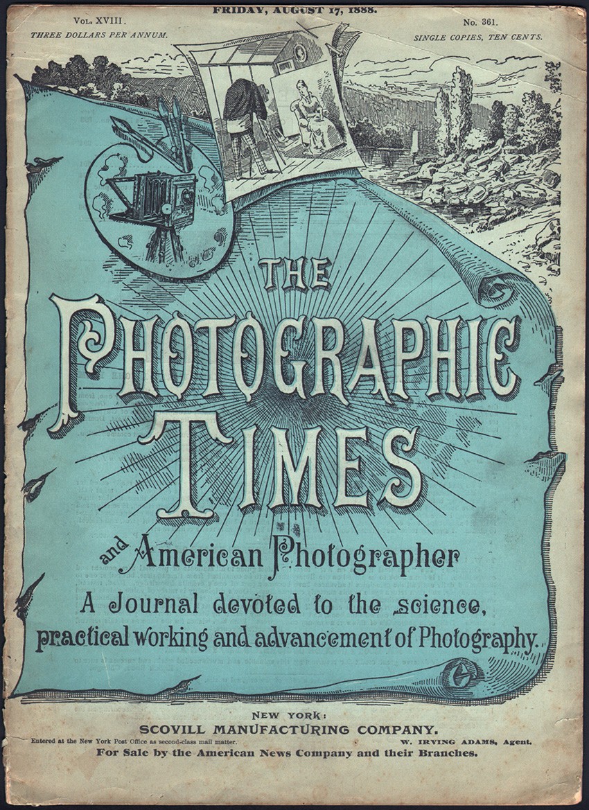 1887-1888: This is an example of a cover from The Photographic Times and American Photographer dated Friday, August 17, 1888. This was the same design used for the journal in 1887. (unknown if it was used before 1887) The quarto format journal was printed in blue and black with the artwork possibly being by the hand of Brooklyn artist William Mozart. From: PhotoSeed Archive
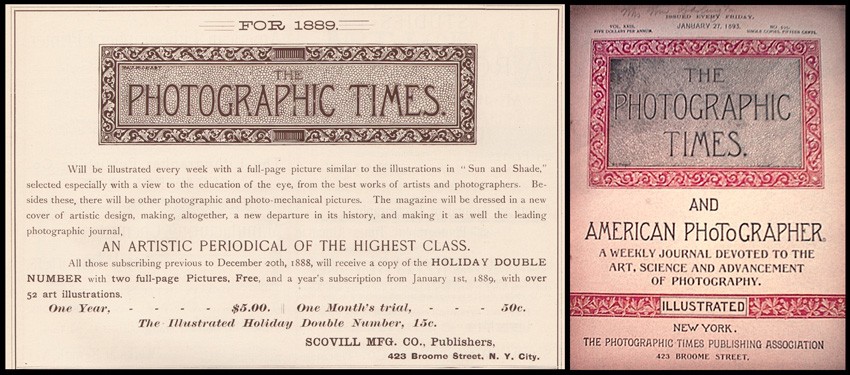 1889: This year brought a complete redesign to the look of the Times. Brooklyn artist and photographer William J. Mozart, (b. 1855) who had honed his skill first as a scene painter at a Boston museum beginning in 1878 came up with the logo seen here at left, incorporated within a January, 1889 advertisement for the Times in the periodical Sun and Shade. "The magazine will be dressed in a new cover of artistic design, making, altogether, a new departure in its history, and making it as well the leading photographic journal." The weekly would also for the first time feature in every issue a full-page illustration, typically a photogravure or fine process collotype. At right is an example of the new cover by Mozart. (this issue from January, 1893). Advertisement from PhotoSeed Archive; cover: Crown Antiques & Collectible
 1889: "Boys after Suckers" by Minnesota photographer Rev. Herbert Macy, was the photogravure frontis plate for the April 18, 1890 weekly issue of the Times. Image: 11.2 x 17.9 cm | Support: 20.5 x 28.7 cm Photogravures such as these were a major selling point for potential subscribers, with the cost of a yearly subscription being $5.00. In 1893, the editors wrote: "The PHOTOGRAPHIC TIMES had frequently brought out full-page pictorial illustrations, in addition to the cuts and diagrams which always brightened its reading columns; but beginning with 1889, it presented its readers regularly, each week, with a full-page pictorial frontispiece, reproduced by photogravure or other high grade process, and including an occasional photographic print on albumen or other sensitive paper. It thus became the first and continues to be the only photographic weekly publication in the world, containing a full-page picture with every issue." Photo: PhotoSeed Archive
 1889: With its new emphasis on high-grade illustrations that would be reproduced each week, other particulars and selling points, including the following quote, appeared in the 1889 Scovill & Adams company trade brochure "How to Make Photographs" : "The Editorials and Editorial Notes will be of greatest practical value, as they will be the result of actual practice and experiment, by the staff." Advertisement courtesy of Larry Pierce.
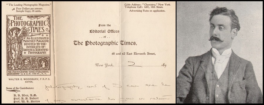 1893: In the Spring of this year, Walter Edward Woodbury, (1865-1905) seen at right around this time, joined the editorial staff of the Times, and before the end of 1894 was appointed editor by Lincoln Adams. A Fellow of the Royal Photographic Society and son of Englishman Walter Bentley Woodbury, (1834-1885) he oversaw major changes to the Times, including its transformation to a monthly and into a “high-class art magazine”. Perhaps the most noticeable change of this last aspect for a subscriber was the dramatic new cover design featuring Roman goddess Veritas holding out her lamp symbolically lighting the way for truth, designed by English bookplate artist George Richard Quested. The design was even incorporated into Woodbury's personalized Times letterhead, a detail of which can be seen here. Letterhead and portrait: PhotoSeed Archive
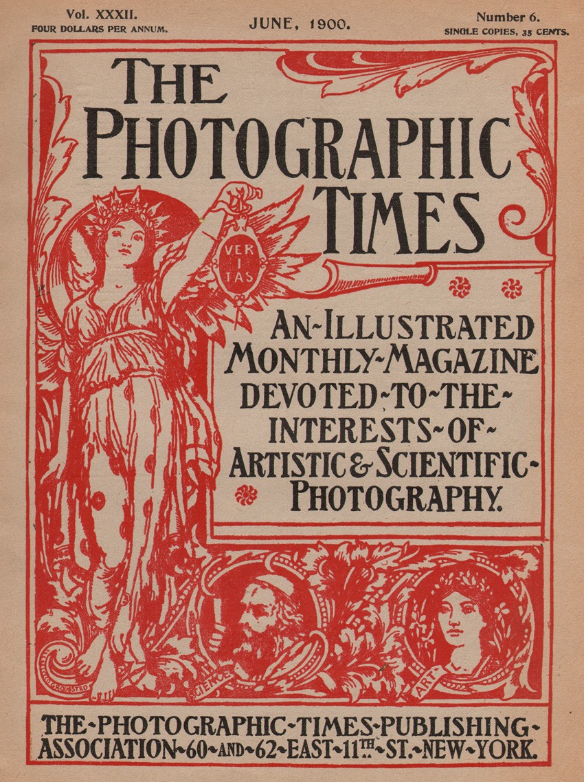 1895: The Veritas cover by Quested first used beginning in 1895 lasted through 1901, albeit in a smaller format that year. Printed in bold red ink, his design additionally featured inset portrait medallions of Science, represented by a bearded gentleman, and Art, by a fair maiden crowned by laurels. The previous weekly cover had stated: "A weekly journal devoted to the art, science and advancement of Photography" and the new monthly stated: "An illustrated monthly magazine devoted to the interests of Artistic & Scientific Photography." Sizes for cover- 1895-1900: (detail here eliminating part of borders) 29.3 x 22.5 cm; 1901: 25.0 x 17.5 cm. Cover, June, 1900: PhotoSeed Archive
 1896: Over-the-top reviews appeared frequently in various publications published by the Scovill & Adams firm in praise of the Times. One very widely-circulated volume for these praises was their annual published since 1887 titled “The American Annual of Photography and Photographic Times Almanac”, a compendium that had attained a circulation of over 20,000 copies by 1894. This advertisement of "unsolicited opinions" appeared in the advertising section of the 1896 annual. From: PhotoSeed Archive
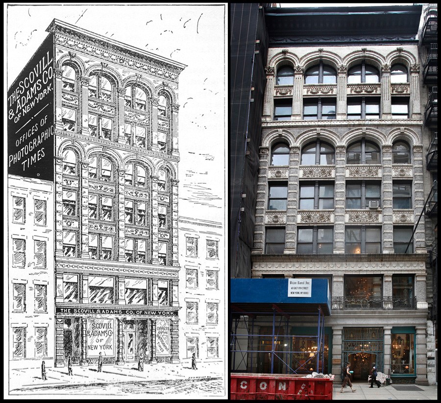 1896 | 2012: As stated early in this post, the Scovill company, known since 1889 as Scovill & Adams, moved many times on the island of Manhattan. In 1896, they vacated their headquarters at 423 Broome street and took occupancy of a brand new, seven-story building specifically built for the company off of Broadway at 60 and 62 East Eleventh Street. Seen in this artist's drawing at left published in the January, 1896 issue of the Times, the editors said: "Our New Offices will be in the same building. The editorial rooms and offices will be situated on the main floor of the building. A very complete photographic and reference library will be conveniently arranged in the editorial rooms, and on the roof will be erected a finely fitted up dark-room and skylight gallery. These will be at the disposal of all our subscribers and friends." Scovill would stay in the building until the Fall of 1900. The building, housing the company Bijan Royal Inc. on the ground floor, can be seen today at right photographed in June, 2012. PhotoSeed Archive, left; right: photograph by David Spencer
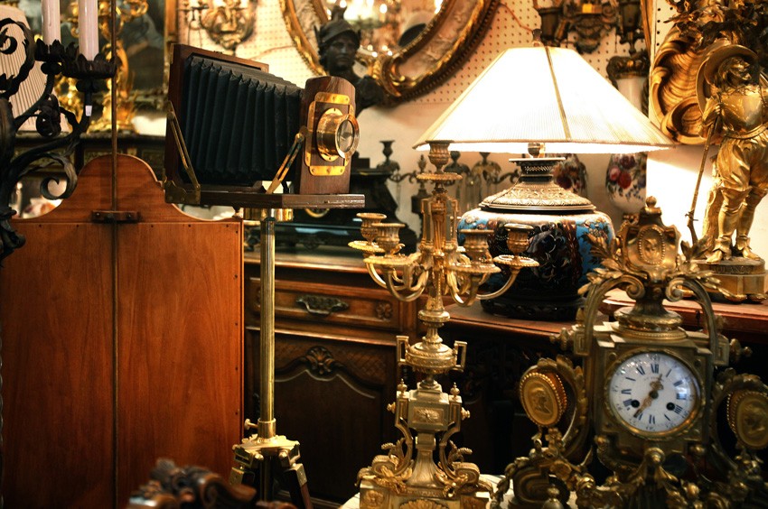 2012: More serendipity in the modern day or crazy fluke? A visit to the current first floor showroom space of antique dealer Bijan Royal at 60 East 11th street in June miraculously revealed on display this impressive looking, tripod-mounted plate camera. Quizzing a salesman produced no more details of its history however. Instead, he was keen on photo-copying the 1896 artist drawing of the building I showed him earlier while explaining my mission. Scovill & Adams in their day here made millions of dollars selling cameras like this one (even though it suspiciously appeared more ornamental than functional) as well as every conceivable photographic accessory known to man. For this space in its day formerly held one of the greatest photographic stock houses on the planet-with the Photographic Times offices in this space producing monthly the physical embodiment of the day's most important social media. PhotoSeed Archive photo by David Spencer
 2012: A view of the facade showing the top floors of 60-62 East 11th. "The lofts will be reserved for the storage of original cases and other unpacked goods. A specially constructed dark-room for the use of their patrons and friends will be conveniently situated, and on the roof of the building there will be a commodious skylight, with light facing north, for experimental and testing purposes." During my visit, I tried my best to talk my way up to the top floor of the building to see if the skylight still existed, but to no avail. A quick search on the web indicates creative folks inhabit the seventh floor: music agency Crush Talent Management- so hooray for that. PhotoSeed Archive photo by David Spencer
 1897: This extremely rare lithographic Photographic Times poster held and conserved by the Library of Congress in Washington D.C. was described in the April issue of the journal as follows: "We have had prepared for us a very attractive poster in seven colors. We give a half-tone reproduction of it herewith. Photographic dealers and newsagents will find this a valuable aid in obtaining subscriptions for this magazine. We will send one free on application and a promise that the same will be prominently displayed. The size of the poster is about 2x3 feet." Poster: Library of Congress
 1898: In keeping with the spirit of the re-designed monthly after 1895- a "64-page artistic and scientific magazine of the very highest order" in the words of Times advertising copy from the period- illustrator P.A. Schwarzenbach supplied these decorative, Art-Nouveau inspired woodcut designs used to delineate the various departments within the editorial copy section of the journal. These specific floral designs were used during 1898 (and some before) and later into the new century. Additional Schwarzenbach designs appearing later included "Our Monthly Digest" and "The Editor's Table". Various designs, enhanced for clarity, with each approximately 6.5 x 15.5 cm ( +/-) from: PhotoSeed Archive
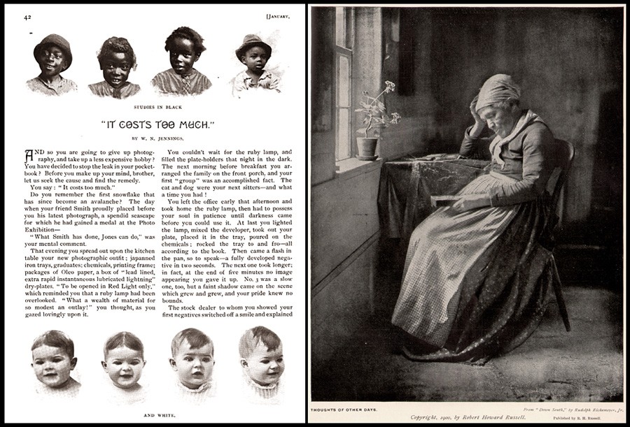 1900: A few thoughts on Times editorial and advertising matter having to do with race. Going through old issues from the late 19th and early 20th century, I've run into that proverbial "elephant in the room" on more than one occasion: unflattering depictions of African-Americans, typically children. Through word and image, there is plenty of reason to believe this usage was not limited to mass-market American photographic journals but extended to many imprints of the era. One case in point seen here. Through modern eyes, a Times page designer going for the cheap laugh in representing monetary decision making and its potential outcomes for the amateur photographer for an article on the conundrum of photography being an affordable hobby used a series of vignettes of children stripped along the top and bottom of a page. These expressive "studies in black… and white" conveniently featured skin colors of the opposite hue for the January, 1896 article "It Costs Too Much". A mild example perhaps but one that made me wince when I first came across it. On the other hand, photographic depictions of African-Americans showing merit and historical importance do show up in the pages of the Times-even when done in the period genre style favored by American Rudolph Eickemeyer, Jr. At right, a fine example: a full-page halftone study of an elderly former slave titled "Thoughts of Other Days" from the October, 1900 issue- itself an advertisement for his book "Down South" published that year. Dimensions for "Thoughts": 22.5 x 17.7 cm. Both images: PhotoSeed Archive
 1900-1902 | 2012: From the Fall of 1900 to May, 1902, some of the executive offices of the Scovill & Adams Company were behind this now unused door at 3 West 19th street, just around the corner from Fifth Avenue. A September, 1900 account in the Times said: "The Fifth Avenue number of the building is 142, and the entrance to the executive offices of the Scovill & Adams Co. of New York, is No. 3 and 5 West 19th Street. The business will be divided in Sectional Department, Wholesale Department, Publication Department, and Sample Room. The last will be a feature that will appeal to out-of-town buyers, who have a limited time to spend in New York and must necessarily inspect, in a short time, everything that is new in the photographic line." PhotoSeed Archive photo by David Spencer
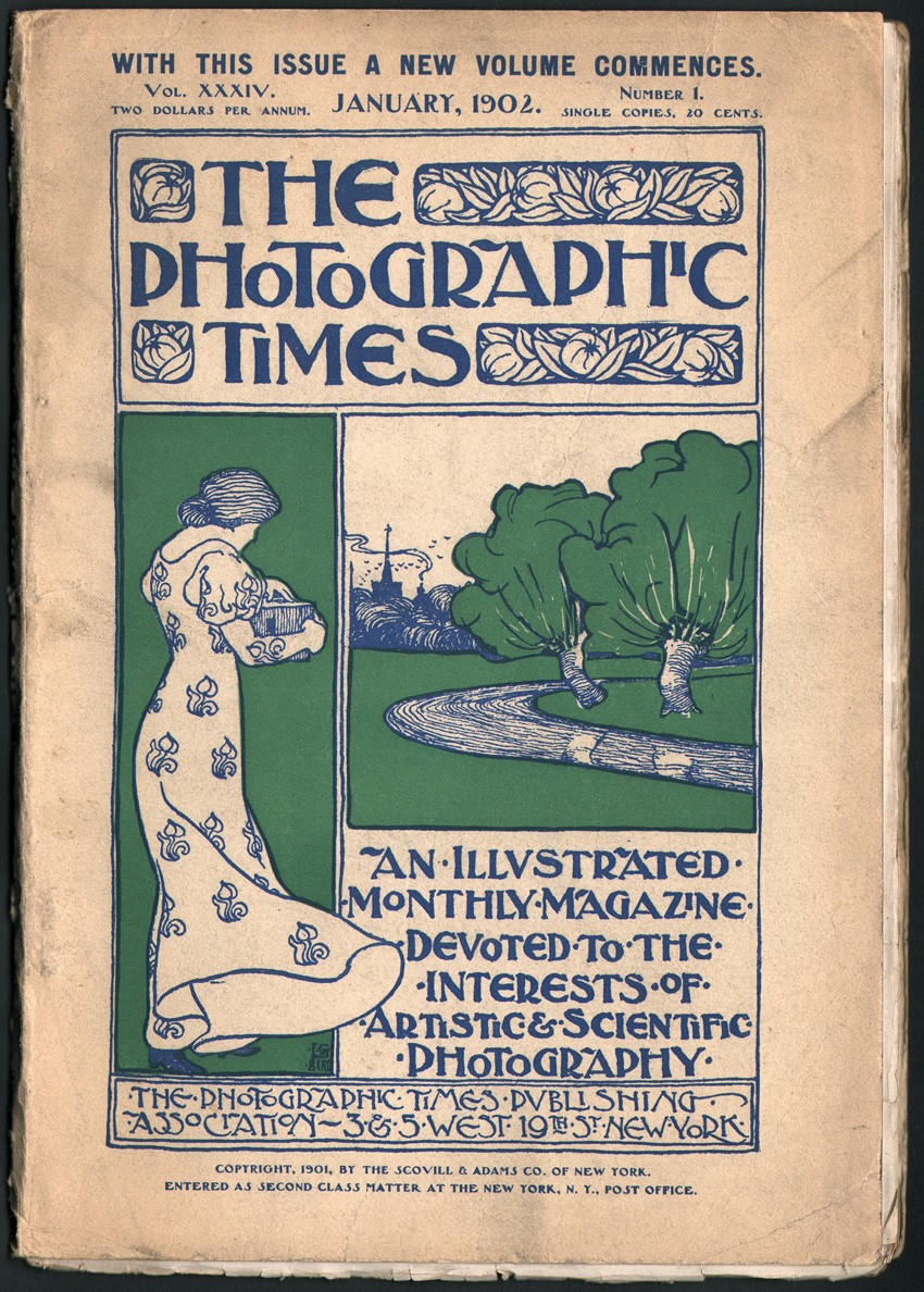 1902: A new cover design was introduced for The Photographic Times beginning with this issue in January, 1902. English artist Lennox G. Bird, who went by the professional moniker Curlew, (a playful association with his last name) had entered and won the Photographic Times silver medal competition the previous year. This design was used through at least January, 1903. Cover dimensions: 25.2 x 17.5 cm Cover: PhotoSeed Archive
 1902: Tissue-protected, hand-pulled photogravures like this example by American and later Welsh photographer Alvin Langdon Coburn (1882-1966) titled "Le Stryge; Notre Dame", continued to be featured in the Photographic Times, albeit in the smaller format beginning with the January, 1901 issue. Printed by the Photochrome Engraving Company of New York City, Coburn's photograph features two gargoyles watching over the city of Paris from a tower parapet of the Cathedral of Notre Dame. The image was inspired by French artist Charles Méryon's (1821-1868) 1853 etching of the gargoyle at center titled Le Stryge. (The Vampire) Plate dimensions: image: 10.0 x 16.4 cm | support:17.1 x 24.9 cm from: PhotoSeed Archive
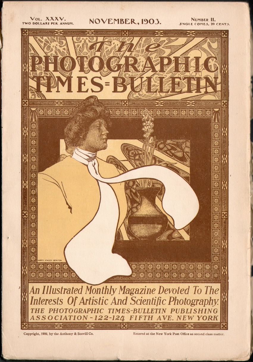 1902-1904: Beginning with the April, 1902 issue, the Photographic Times was renamed The Photographic Times-Bulletin, a combining of the Photographic Times and Anthony’s Photographic Bulletin, itself a result of the blockbuster December, 1901 business deal in which Scovill & Adams joined forces with the E. & H. T. Anthony & Company in order to fight off the mighty Kodak. Lennox G. Bird's cover design from 1902 carried over to the new publication until at least January, 1903, when this design by Chicago illustrator Harry Stacey Benton (b. 1876 or 1878) was used, most likely with the February issue. This was the final cover design for the Times-Bulletin which ceased publication under this name after the December, 1904 issue-reverting back to The Photographic Times in 1905. The wood-engraved, Art-Nouveau portrait of a woman with vase of flowers is set within an elaborate ornamental frame and printed in two colors. Cover dimensions: 25.2 x 17.5 cm. From: PhotoSeed Archive
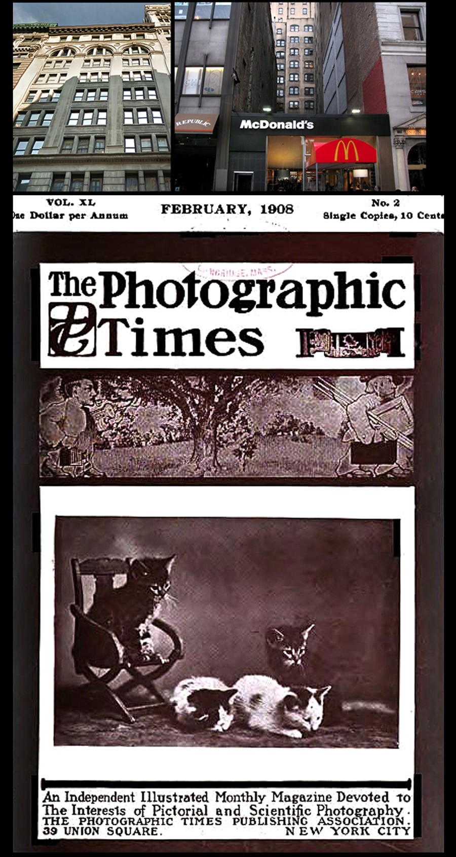 1902-1903 | 1904 | 1904-1908: Three address and two ownership changes took place for the Times-Bulletin and Photographic Times between 1902-1908. Upper left photo: from 1902-1903, the Times-Bulletin was published from this ornate building at 122-124 Fifth Ave.; the home of the combined firm of the Anthony & Scovill Company. By April of 1904, Lincoln Adams had bought out Anthony & Scovill's controlling interest in the journal, retaining the journal's name through the end of the year and moving the offices to Styles & Cash Printers at 75-77 Eighth Ave., a company he was president of. (this building no longer stands and is now occupied by an ornate bank building now turned into luxury condos) Upper right photo: from December, 1904 through 1908, the renamed Photographic Times (January, 1905) was published in a building that also no longer stands at 39 Union Square West, now the location of a McDonald's restaurant. Bottom cover: This is a representative cover of the Times from the Union Square years. Now priced at 10 cents, or a dollar a year, it featured a whimsical caricature of a photographer with camera in hand following an artist who holds his canvas and easel in pursuit of the next great vista anchored below the journal masthead. The February, 1908 cover art featured a large halftone photograph of decidedly "light" subject matter: a grouping of kittens. Reflecting this decidedly saccharine mass-market appeal, the Times guiding principal at bottom of cover also had changed to: "An Independent Illustrated Monthly Magazine Devoted to The Interests of Pictorial and Scientific Photography." Photo credits: Anthony & Scovill: Google Street View; Union Square: David Spencer/PhotoSeed Archive, cover: HathiTrust
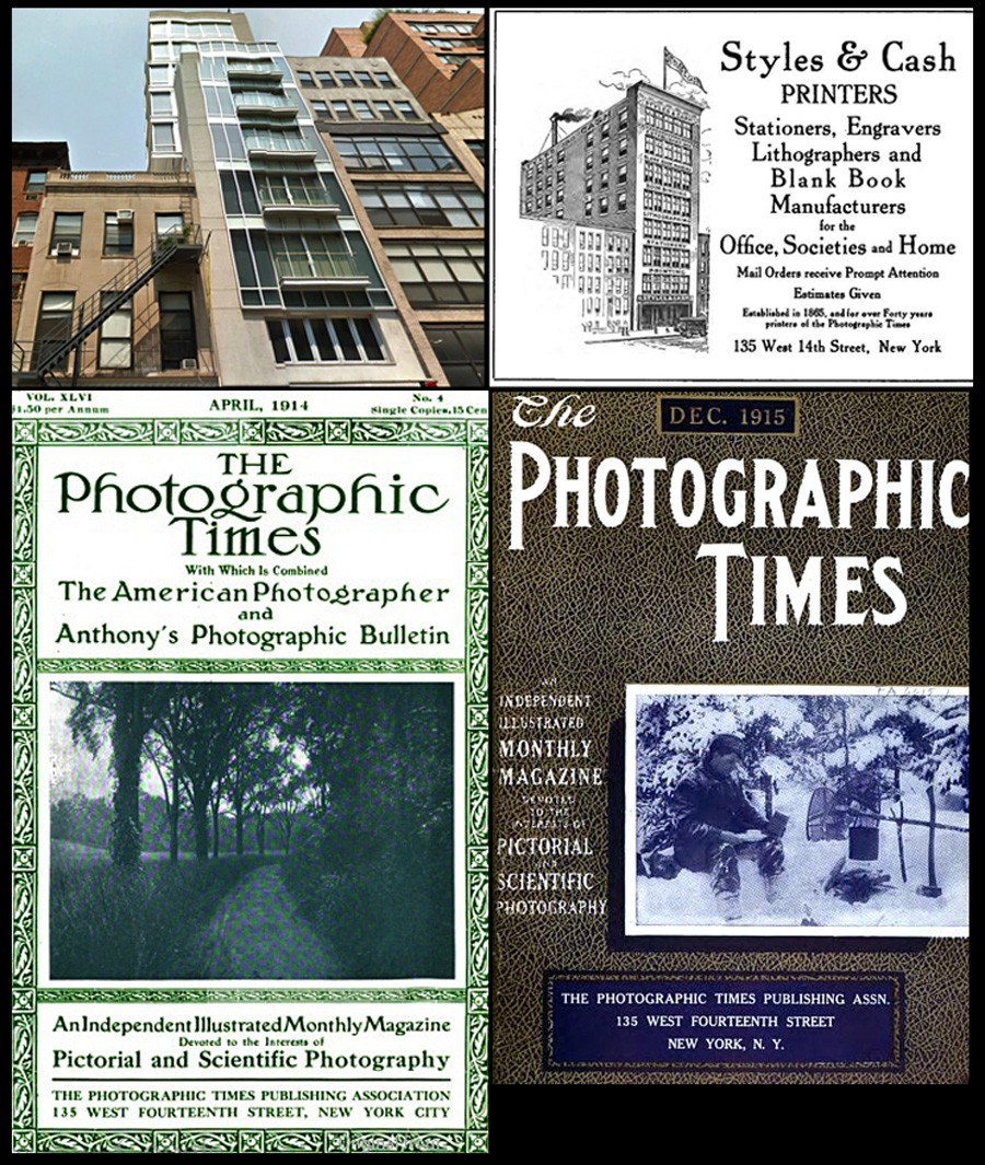 1909-1915: Under The Photographic Times Publishing Association, the Times was edited and published the final six years from this building at 135 West 14th street at top left: a ten-story building erected in 1906 by architect Charles Birge for the printing firm Styles & Cash. Since remade (2004) into condos on the upper floors with a hair salon at street level, a December, 1915 advertisement in the Times for the company is at top right. Two other cover design changes for the journal took place during this period. At lower left is the issue from April, 1914 and at lower right, the final cover for the December, 1915 issue. The Styles & Cash firm was in operation in New York from 1865-1920. Photo credits: Styles & Cash: Google Street View; ad & covers: HathiTrust
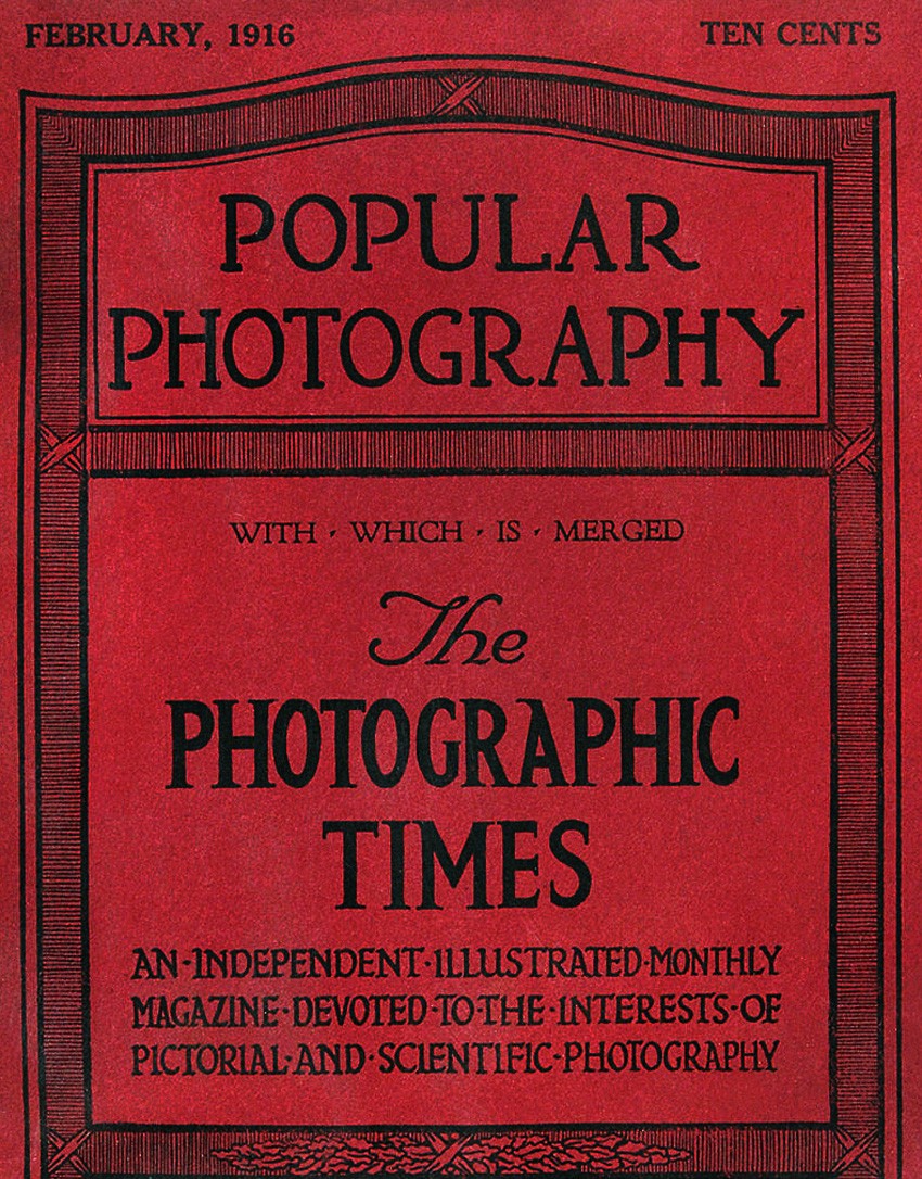 1916: With Which Is Merged: Beginning with the January, 1916 issue, the Times masthead was gone for good: absorbed into Popular Photography, a new journal published in Boston since October, 1912. Edited by Frank Roy Fraprie, W. I. Lincoln Adams was retained as an associate editor, although it is doubtful he had much of a hand with its affairs. Cover detail: February, 1916: Ebay
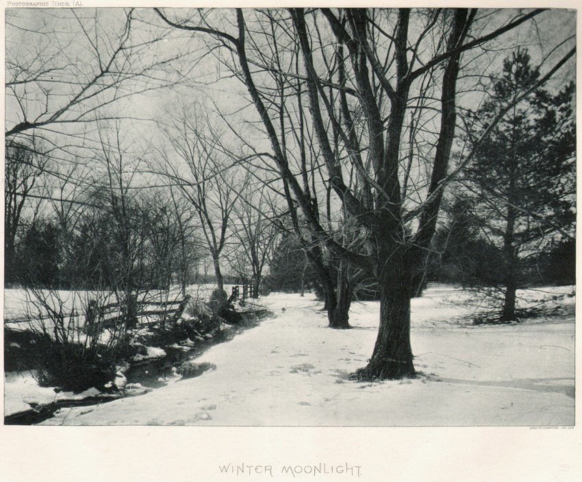 The Photographic Times was a labor of love for a father and son. Washington Irving Adams had the spark and drive to get the journal up and running beginning in 1870 and son W. I. Lincoln Adams dutifully took over the reigns of not only the journal but the Scovill & Adams firm upon his father's passing. In my view, the legacy they left in the form of the journal is invaluable, with their efforts along with many others giving enjoyment and continuing instruction on the art and science of photography from 1871-1915 we should continue to appreciate and investigate. This landscape study "Winter Moonlight" by Lincoln Adams was taken around 1885 and published in the Times in 1890. It is not especially memorable in my view, but does contain the kernel of adventure all photography has: "Let the landscape loving photographer of this city and neighborhood take a ramble with his camera" the Times copywriter (possibly Adams himself) declared as inspiration taken from the scene of this snow-blanketed wooded glade. Continuing the thought, "Mr. Adams is always eager to conduct a party, large or small, to the beautiful haunts about his picturesque home." As a young photographer myself, this was just the type of place I took my own camera to in search of what photography could accomplish and mean while learning most about my own self. My hunch is Adams own tramps in places like this shaped his thinking and outlook as well. Image: 14.4 x 19.7 cm | support: 20.5 x 28.7 cm. : photogravure in The Photographic Times, February 7, 1890 | issue No. 438: From: PhotoSeed Archive
Reverie
Posted February 2012 in Publishing, Significant Photographs, Texts
When photographer and photographic supply dealer Henry Greenwood Peabody of Boston compiled and self-published the oblong quarto volume The Coast of Maine: Campobello to the Isles of Shoals in 1889, he offered it for sale by subscription, advertising it along with the fact he was the sole American agent for Wray lenses in photographic journals including Anthonys.
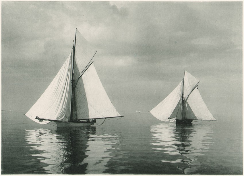 "Wing and Wing", (16.3 x 22.7 cm) one of fifty plates reproduced by the photo-gelatine (collotype) process by the Photogravure Company of New York in the volume: The Coast of Maine: 1889: published by Henry G. Peabody, 53 Boylston Street, Boston.
These lenses were first manufactured in London by a gentleman named William Wray beginning in 1850. Peabody, presumably using a Wray lens or lenses outfitted on his 8 x 10” view camera, had scoured the rocky Maine coastline the year before in search of the picturesque. The published results in The Coast of Maine included 50 full size plates, done using the very fine photo-gelatine process, (collotype) a specialty of Ernest Edward’s Photogravure Company of New York. These plates, most of which show the coastline in proximity to the ocean; multiple lighthouse views but surprisingly very few boats, (Peabody was an important photographer of sailboats on the high seas) are supplemented with poetry and prose by seven writers, including the American poet and writer Celia Thaxter. (1835-1894)
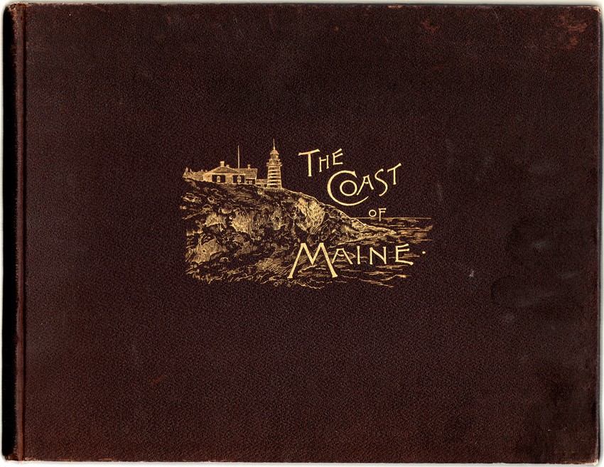 The artist J.E. Hill is credited as having done the drawings appearing in "The Coast of Maine: Campobello to the Isles of Shoals", published in 1889 by photographer and at the time, photographic supply house owner Henry Greenwood Peabody of Boston. Hill's work can be seen here embossed in gilt on the cover of the volume. (27.4 x 35.5 x 2.5 cm) Additional Hill drawings appear as vignettes opposite many of the plates in the book.
Her poem Reverie had been first copyrighted as early as 1878 and published in 1880 in her collection of poems titled Drift-Weed in Boston. Although this long-form poem predates the above photo Wing and Wing by at least ten years, Peabody paired it in double columns opposite this lone sailboat photograph (in full sail) appearing in the work.
Reverie
The white reflection of the sloop’s great sail
Sleeps trembling on the tide;
In scarlet trim her crew lean o’er the rail,
Lounging on either side.
Pale blue and streaked with pearl the waters lie
And glitter in the heat;
The distance gathers purple bloom where sky
And glimmering coast-line meet.
From the cove’s curving rim of sandy gray
The ebbing tide has drained,
Where, mournful, in the dusk of yesterday
The curlew’s voice complained.
Half lost in hot mirage the sails afar
Lie dreaming still and white;
No wave breaks, no wind breathes, the peace to mar:
Summer is at its height.
How many thousand summers thus have shone
Across the ocean waste,
Passing in swift succession, one by one,
By the fierce winter chased!
The gray rocks blushing soft at dawn and eve,
the green leaves at their feet,
The dreaming sails, the crying birds that grieve,
Ever themselves repeat.
And yet how dear and how forever fair
Is nature’s kindly face,
And how forever new and sweet and rare
Each old familiar grace!
What matters it that she will sing and smile
When we are dead and still?
Let us be happy in her beauty while
Our hearts have power to thrill.
Let us rejoice in every moment bright,
Grateful that it is ours;
Bask in her smiles with ever fresh delight,
And gather all her flowers;
For presently we part: what will avail
Her rosy fires of dawn,
Her noontide pomps, to us, who fade and fail,
Our hands from hers withdrawn?
Celia Thaxter.
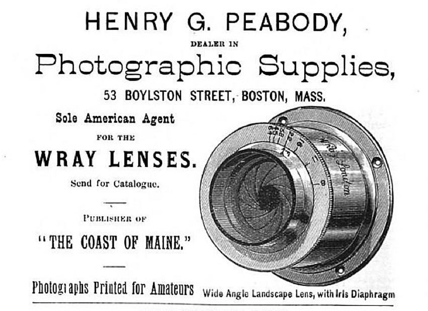 Advertisement showing wide angle Wray landscape lens with iris diaphragm manufactured in London from: "The International Annual of Anthonys Photographic Bulletin": New York: 1889: from p. 98 of the advertising section in the rear of the volume. Photographer Henry Peabody is believed to have used a similar Wray lens for photographs appearing in the volume "The Coast of Maine" published by him in 1889.
 This is an example of one of several lighthouse plates: "The Nubble : York, ME" (15.6 x 22.5 cm) taken by photographer Henry Peabody and published as a full-page photo-gelatine (collotype) plate in "The Coast of Maine" in 1889. The view shows the Cape Neddick "Nubble" Light near the entrance to the York River. The light continues to operate today.
Boraxologically Speaking
Posted December 2011 in Advertising, Publishing
Is logical. And I’ll tell you why. Because the Boraxologist told me so. How else to explain the 1906 publication of a small book featuring the work of American Photo-Secession founder members Clarence White and Gertrude Käsebier as a way to convince folks to open new savings accounts at a bank in Rochester, New York?
 Happiness is finding the work of American Photo-Secession founder member Clarence Hudson White's work in the tiny book "Homespun Essays" published late in 1906. Shown here is White's photograph "The Orchard".
I’m guessing you have no clue what I’m talking about, but if you happened to be alive in 1904 and flipping through your daily newspaper, chances are good you might have encountered a drawing of a wise old mule-named the Boraxologist—lauding the untold benefits of “20-Mule Team Brand Borax”—a water-softening agent used in the laundry. Today, Borax® is best known as a laundry “booster” and multi-purpose household cleaner. But thanks to the sayings of this mule a century ago, you may have believed the Fountain of Youth and Holy Grail were cleverly disguised in a box—humbly biding time on the general store shelf, awaiting your purchase to give new life to dirty clothes.
The mind that came up with the mule with the funny sounding name and that little book from the bank was from a gentleman by the name of Otis H. Kean. A book publisher and advertising agent by profession, Kean turned creeds and in his own words, “optimistic aphorisms” into advertising copy by the barrel. “Such things seem to please the people” he said in 1904, regarding his “wisdom” dished out as part of the borax campaign. While reading through much of his published copy in preparation for this post, the modern figure of Don Draper did cross my mind, but of course from the “kinder and gentler” era of the early 20th century. I have no doubt if Kean was given a client’s account with the challenge of selling the benefits of more snow to a group of Eskimos, he would have no hesitation with the challenge. In carrying this mindset forward, Kean’s contact with cutting edge artistic photography by Clarence White and Gertrude Käsebier was simply the opportunity to consummate a marriage: photographs as visual aphorisms if you will. Why just confine their work to a gallery he may have thought, when it could be the perfect foil in promoting the virtues of opening a new savings account at the just opened Rochester Trust & Safe Deposit Company’s new building?
 Examples of specialized publications and advertising work published and carried out by the firm of Otis H. Kean from 1897-1906: clockwise: brochure cover-"Glove Lore"-1897; gentleman's walking glove from Glove Lore; photograph of Dresden porcelain from book "The Art of Giving"-1902; advertising photograph showing Hygienic Soap Granulator in use from McClure's-1906; newspaper caricature advertisement of the "Boraxologist", a mule-1904; American Girl Picture No. 4 from Pacific Coast Borax Co. advertising campaign-1904.
Boraxologically speaking, how exactly did Mr. Kean persuade or convince this aforementioned gallery owner, none other than Alfred Stieglitz himself, that using White’s and Käsebier’s work was in his best interest? A moot point perhaps, because Kean succeeded in issuing this tiny book, titling it “Homespun Essays—Everyday Thoughts About Everyday Life”, which featured their work. Of course, their encounter may never have happened, but if it did, a conversation between this wisdom spouting advertising man and fierce guardian of the American Photo-Secession would have been amusing to say the least.
 This advertisement for the free book "Homespun Essays", arranged and printed by Otis H. Kean, was placed and appeared in at least 15 newspapers in and around Rochester, New York in late December 1906 by the Rochester Trust & Safe Deposit Company. The ad was a promotion for people to open up new savings accounts at their new bank.
My own take on Kean while preparing Homespun Essays for this site is this: a perfectionist with a heart. The specialized books he published in conjunction with his business concern, the Literary Print Shop, were high-class productions and in this regard, his possible saving grace in relation to any possible dealings he may have had with Stieglitz. It wasn’t as if he was opposed to all commerce of course, but you do have to consider Stieglitz was most definitely an anomaly in the gallery world when and if Kean crossed his threshold in pursuit of “business”. This is because his well documented and self-prescribed “fight” for photography in America took the form of fierce protector and champion of White’s and Käsebier’s photography at a time when the very concept of hanging artistic photographs on gallery walls was in itself a revolutionary act. Kean’s involvement with fine printing and his possible business relationship with the Quadri-Color Printing Company in New York City—a firm responsible for the first true, four-color printing in America beginning in 1904, would have also given both a healthy respect for each other and a way to start a meaningful conversation.
 The work of Clarence Hudson White and Gertrude Käsebier was one of the very first shows of artistic photography Alfred Stieglitz showed at his Little Galleries of the Photo-Secession from February 5-19, 1906. Advertising agent Otis H. Kean may have seen this show, which would have given him reason to print examples of their work in "Homespun Essays" in December of 1906. Photograph from halftone plate reproduced in Camera Work XIV: 1906.
 "Fruits of the Earth": (6.4 x 4.9 cm) by Gertrude Käsebier, a multiple-color halftone, is her sole photograph appearing in the book "Homespun Essays", accompanied by an essay written by Kean titled "The Farmer". Printed tissue guards, an example seen here, protect all book plates, and issued with red silk bookmark seen underneath guard. The photograph was previously reproduced as a photogravure by Stieglitz in "Camera Notes" from October, 1901.
Please visit our latest opus on Homespun Essays here, and prepare yourself to be “homespun” if you decide to read the posted essays along with the photographs, where you may smile and even laugh, especially after digesting this following tidbit from the book’s publisher: “The Trust Company never dies, never absconds and is immune from those possibilities of loss that may happen to every individual.” But then again, don’t cry too much when you find out they actually paid 4% interest back then on a savings account.