When researching this site’s new online gallery for a view album of Japanese tissue photogravures several months ago titled Life and Nature, (1889) I had no idea how important the American painter and amateur photographer George Bacon Wood Jr. (1832-1909) would figure in my respect for someone pursuing both disciplines equally well.
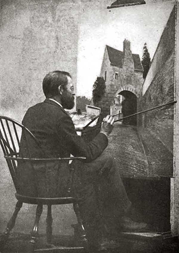
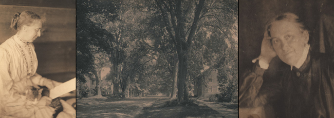
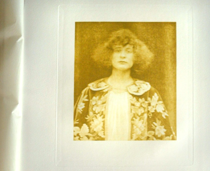
“My Father at his Easel”, a plate showing the Philadelphia artist and amateur photographer George Bacon Wood Jr. (1832-1909) included with the 1916 volume A Girl’s Life in Germantown, written by his youngest daughter Elizabeth.
With the introduction of the brand new dry-plate, the most advanced technology of its’ day invented by George Eastman and others and marketed to the masses beginning around 1880, the world of amateur photography soon opened to those who rejected the unforgiving and laborious wet-plate collodion process that preceded it. After reading about the break-through in his Philadelphia newspaper, Wood jumps into amateur photography with all the gusto, passion and creative problem solving he had long applied to his occupation as landscape painter.
In a short biography of Wood I’ve prepared along with the online material, I’ve included a humorous self-account of his 1882 inauguration into the medium. This includes his first efforts at exposing one of those new dry plates while stalking one very uncooperative cow in a field, a bovine that just would not stay still long enough for Wood to make a decent exposure. Being a perfectionist however meant not giving up so easily. A challenge for sure, but not insurmountable, and for his efforts, one of the least unheralded people in the history of photography I’ve since encountered who continued to make his livelihood with the brush.
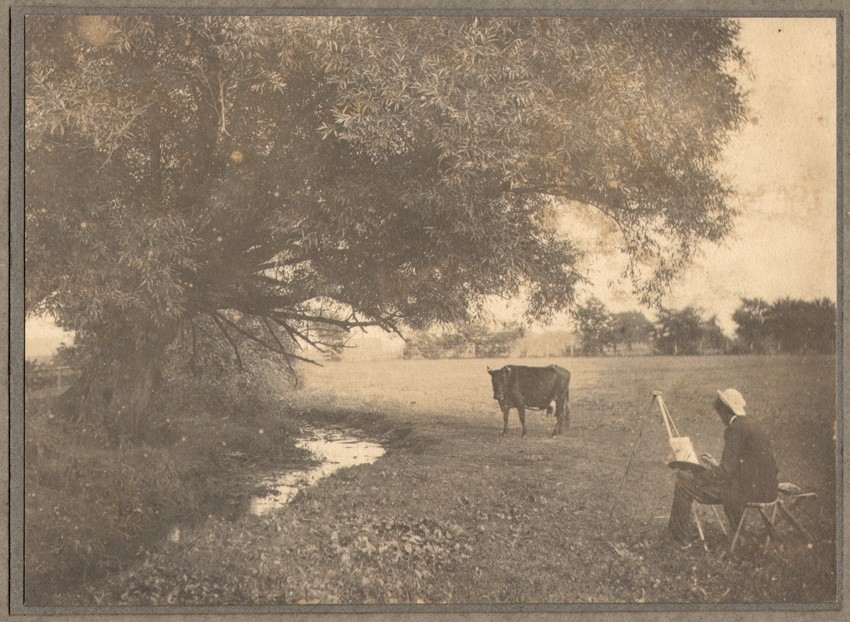
“Artist Painting Cow” : unknown American photographer: vintage mounted platinum photograph from PhotoSeed Archive circa 1905-10: (11.8 x 16.2 cm)
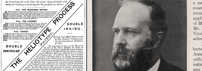
Life and Nature was originally purchased by this writer in late 2007 and squirreled away until a few months ago, when I started posting similar view albums whose gorgeous tissue gravure plates were done by Ernest Edward’s New York Photogravure Company. On first look, I had no idea Wood’s background was that of a painter, and I certainly had no clue what the “B” for the initial of his middle name stood for. I was also intrigued by the fact the album’s cover went so far as to omit reference to his full first name-shortening it to “Geo” instead of George. A period advertisement for the work included here does spell out his name, but neglects to include the fact he was a Jr.
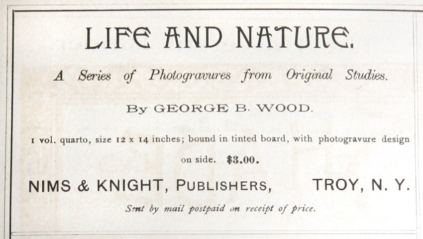
Period advertisement for the view album “Life and Nature” (1889) reproduced in Ernest Edwards’ periodical “Sun & Shade”: June, 1890: whole #22. The album features Japanese tissue photogravures by George Bacon Wood Jr. “From Original Studies”.
A complicated or simple soul this Wood chap? More research revealed an impressive amount of his photographic work held by The Library Company of Philadelphia, with the following exciting statement from their website:
In 1982, for example, we acquired more than 500 photographs by Philadelphia photographer and painter George Bacon Wood from a descendant. Additional gifts of Wood photographs throughout the 1980s increased the collection by about 300 more images. This body of photographic work along with paintings from other institutions and private collections will form the basis of a Library Company exhibition in 2014.
Timely to be sure, and more reason for me to hone in on some of Wood’s background. The majority of online sites, mostly art galleries who have handled his paintings in the past, with the exception of the Library Company, state he died in 1910. I have no idea how they got even some of the basics wrong, as his New York Times obituary clearly states his passing was actually June 17th, 1909:
Wood. — At Ipswich, Mass., June 17, George Bacon Wood, formerly of Staten Island and Philadelphia. Services Monday, June 21, at the residence of his daughter, Mrs. Bernard Hoopes, Germantown, Philadelphia.
Figuring the cause was also worth the shelling out of two bucks on my part, I purchased the September/October, 1979 issue of the defunct magazine American Art & Antiques, which seemed to contain one of the more important accounts of Wood’s working life. It not only helped, it lead me to another rich source in the form of a posthumous volume penned by Wood’s youngest daughter Elizabeth: A Girl’s Life In Germantown, published in 1916.
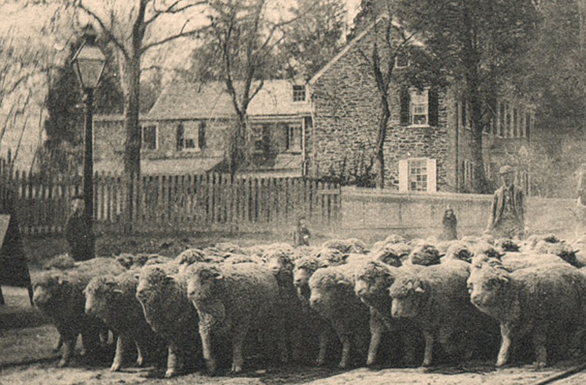
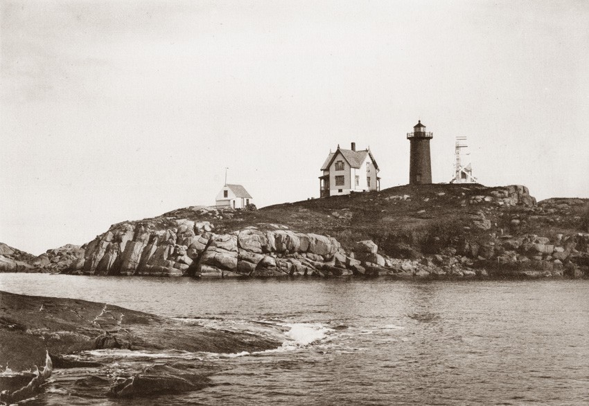
Detail: “Germantown Avenue” (12.4 x 20.5 cm): tissue gravure plate from the view album “Life and Nature”. (1889) Wood and his family, including his seven children, lived in this stone home located at 5502 Germantown Ave. in the city of Philadelphia. (later changed to 6708 Germantown)
Although the 1979 article dealt mostly with his career as a painter, the book itself revealed this gem concerning Wood’s embrace of photography:
“Above the woodshed, which was attached to the barn, my father had a studio built, with a north window, skylights, and an outside stairway. He had seen the announcement in a newspaper that the dry plate had been invented, and he immediately became interested in photography, since the dry plate made the process easier and more reliable.”
And yet, the volume also stated this sobering observation from the daughter on her father’s artistic endeavors:
“My parents were of Quaker origin, my father following this religion to the end of his life. His mother and father were very strict in their beliefs and this made the study of art a difficult one for him, for an artist in those days was looked upon by Quakers as almost predestined to the loss of his soul. My father’s aspirations doubtless caused much unhappiness to his parents, and his study of art under this disapproval was erratic and pursued almost entirely alone. Persistence, however, carried him to success.”
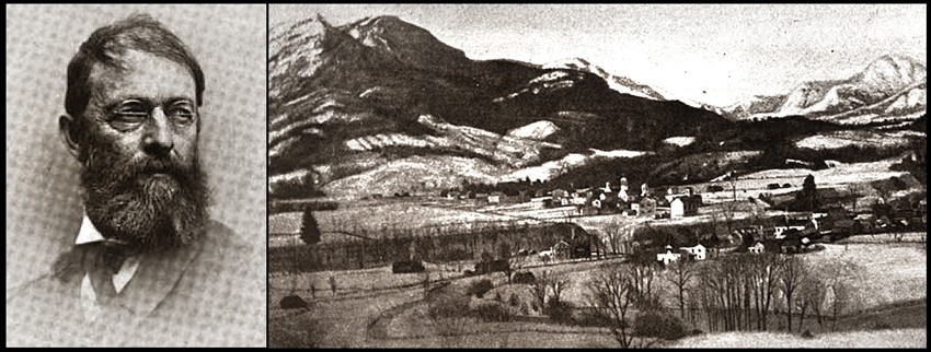
Left: portrait of George Bacon Wood Jr. from “Prominent Amateur Photographers”, a plate featuring Wood and others published in the November, 1893 issue of “The American Amateur Photographer”. Right: detail: “Elizabethtown, N.Y.” (From the original painting by George B. Wood” published as the frontis to “A Girl’s Life in Germantown” by his daughter Elizabeth W. Coffin. (1916) Wood spent much of his summers painting and taking photographs in this area of the Adirondack mountains located in the far northeastern corner of New York state’s Essex county.
Furthermore, Wood’s wife Julia, born Keim Reeve, was an Episcopalian, with the implication set forth by her youngest daughter in the 1916 book as being of a more tolerant persuasion, at least in relation to artistic pursuits . Mother of his seven children, (she married Wood in Oct. 1858) her last years before her untimely death in 1887 were spent as an invalid occupying a wheelchair in a room of their stone house on Philadelphia’s Germantown Avenue-surely a sad and ultimately tragic event for Wood to endure for his remaining life.
A Few Details on the Artist’s Background
George Bacon Wood Jr.’s parents: Horatio Curtis Wood (1803-1879) and Elizabeth Head Bacon (1807-1846) had ten children, of which he was the third born on January 8, 1832 at 150 N. Fifth St. in the city of Philadelphia.
In early 2017, a Bacon family descendant, working from a bible in their possession that once belonged to the artist’s maternal grandmother, Mary Ann Warder Bacon, kindly supplied PhotoSeed with the following details regarding George Bacon Wood Jr.:
Horatio Curtis Wood (1803-1879) and Elizabeth Head Bacon (1807-1846,) actually had two sons named George Bacon Wood. The first son died of scarlet fever just seven weeks before the second son was born, so he was also given the name George Bacon Wood, only with the Jr. suffix. … there were several tragedies in the Wood family when GBW Jr. was young. Just before GBW Jr.’s eighth birthday, his younger brother, John Bacon Wood, died from a respiratory ailment. When he was only 13, his mother, Elizabeth, died two hours after the delivery of her 10th child, and three years later, (in 1848-ed) GBW Jr.’s older brother, Richard, suffered horrific injuries in a train accident in Maryland, lingering for over a week before his death. (According to a newspaper article about the accident, a witness speculated that the injuries to Richard’s legs were severe enough to require amputation.)
Because he was a Quaker, (known as the Religious Society of Friends) George Bacon Wood Jr.’s moral compass precluded him from taking part in the American Civil War. (1861-1865) Before embracing photography, he continued his occupation as a landscape painter, with many fine studies done in New York state’s Adirondack mountain region while spending summers and even a winter in Elizabethtown. He was also a genre painter however, which revealed itself later on in his photographic studies-often featuring his own children in what we would perhaps consider today as being overly contrived situations.
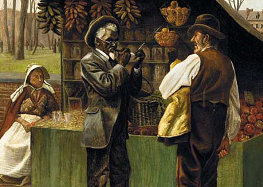
Detail: oil on canvas painting: “The Fifteenth Amendment” (Civil Rights) (73.9 x 65.4 cm.) by Philadelphia artist George Bacon Wood Jr. According to Christie’s Auction house of New York City, which last sold the work in late 2001, this painting was exhibited in the centennial 1876 exhibit at the Pennsylvania Academy of the Fine Arts.
A genre painting done by Wood sometime after 1870 titled The Fifteenth Amendment, or Civil Rights, is quite revealing with the additional knowledge that it’s creator was a Quaker. After Abraham Lincoln signed the Emancipation Proclamation, this American Constitutional amendment prohibited governmental bodies within the United States from denying voting rights to one “based on that citizen’s race, color, or previous condition of servitude”, otherwise known as slavery. Wood’s painting, formerly owned by art historian Donelson F. Hoopes, the great-great grandson of Wood and the aforementioned author of the 1979 article, is pictured along with it, described in the caption thus: “this whimsical genre scene conveys the artist’s observations of social change in America following the passage of the 15th Amendment in 1870”.
Showing two well-dressed patrons face to face at an outdoor market, one being white and the other an African American, with the latter presumably borrowing a clay pipe from the white gentleman in order to light his own, I would further argue the work shows Wood’s keen empathy for his fellow human being, and therefore a rebuttal of sorts to a later discovery instigated by none other than Alfred Stieglitz in 1900.
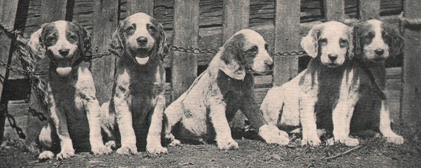
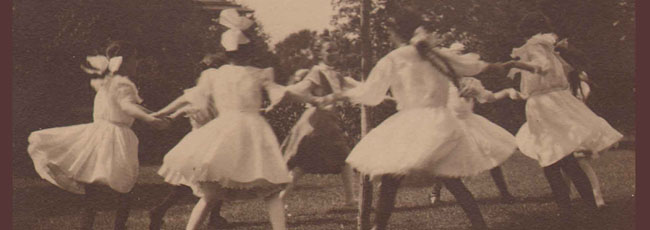
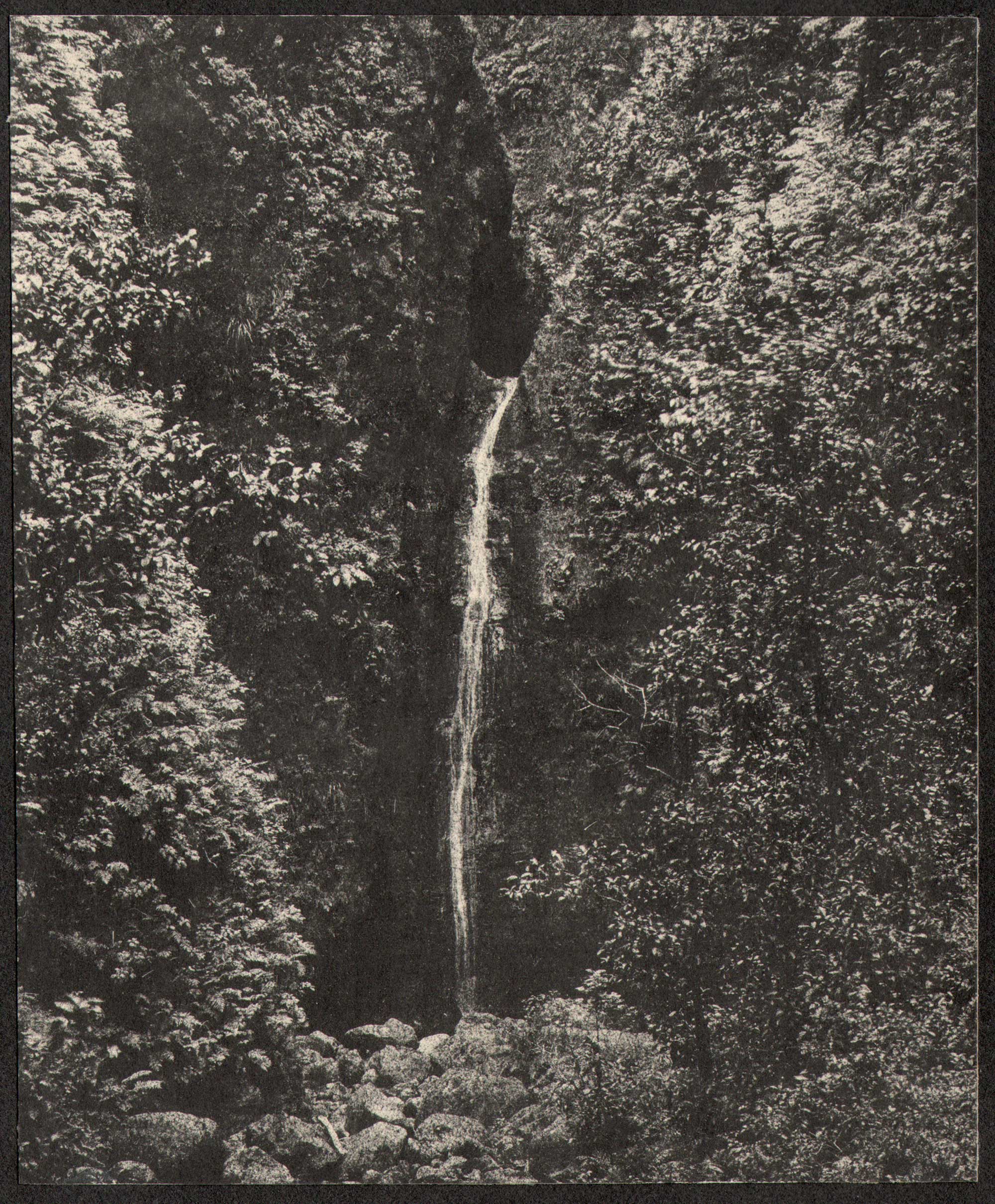
Detail: “Chain-Gang”: (8.5 x 18.8 cm) tissue photogravure plate from the view album “Life and Nature” (1889)
It was at this time that Wood gave a lantern slide lecture, “The Camera in the Hands of an Artist” before members of The New York Camera Club. A later critique of the talk signed by Stieglitz and published in an issue of Camera Notes revolved however around genre photographs most decidedly not whimsical in nature:
One of the Mouths of the Mississippi,” a young negro boy biting into a watermelon, will illustrate the general tone of the lecture. A.S.
For anyone who has spent time leafing through American mass-circulation photographic journals from over a century ago, these types of overtly racist genre photographs-often not limited to the work of amateurs but also appearing in period advertising-crop up with alarming frequency. In concurring with Stieglitz, these types of images and misappropriations personally make me wince, their only possible justification now serving as damning evidence worth saving as part of the historical record.
But Wood was human, so perfection can never be an option, even a century after his passing. One of the images included in Life and Nature, titled Chain-Gang, features a grouping of puppies chained together. Also a very sad photograph when seen by modern eyes, but almost certainly viewed in its’ day (1888) as downright cute by many. The loaded title to the work, with the connotation of shackled prisoners, doesn’t soften it. However, genre photography of this type practiced by Wood, as well as many others in his day, should not easily be pigeon-holed, type-cast, or set in stone in my estimation. The evidence? Pups as movable props for this one example. More than one photograph taken by Wood around this time-featuring the same or similar litter of puppies-surely brought smiles to many faces, and still has the power to do so. In conclusion, the following example, titled Dog Show, gives credible evidence Wood indeed had a heart, empathy, and most certainly, an enduring and intact soul. Please visit here to learn more and see Life and Nature.
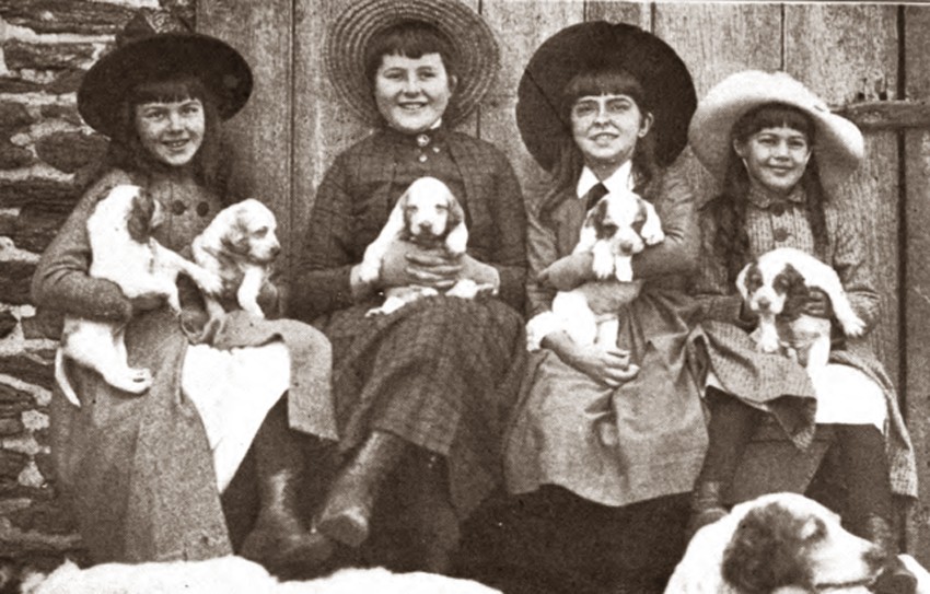
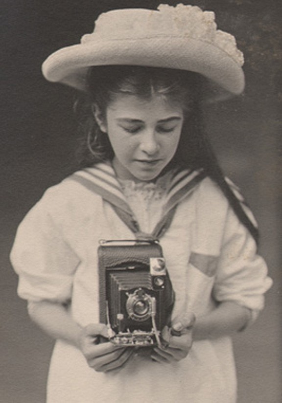
Detail: “Dog Show” : photographic plate by George B. Wood published in: “A Girl’s Life in Germantown” by his daughter Elizabeth W. Coffin. (1916)