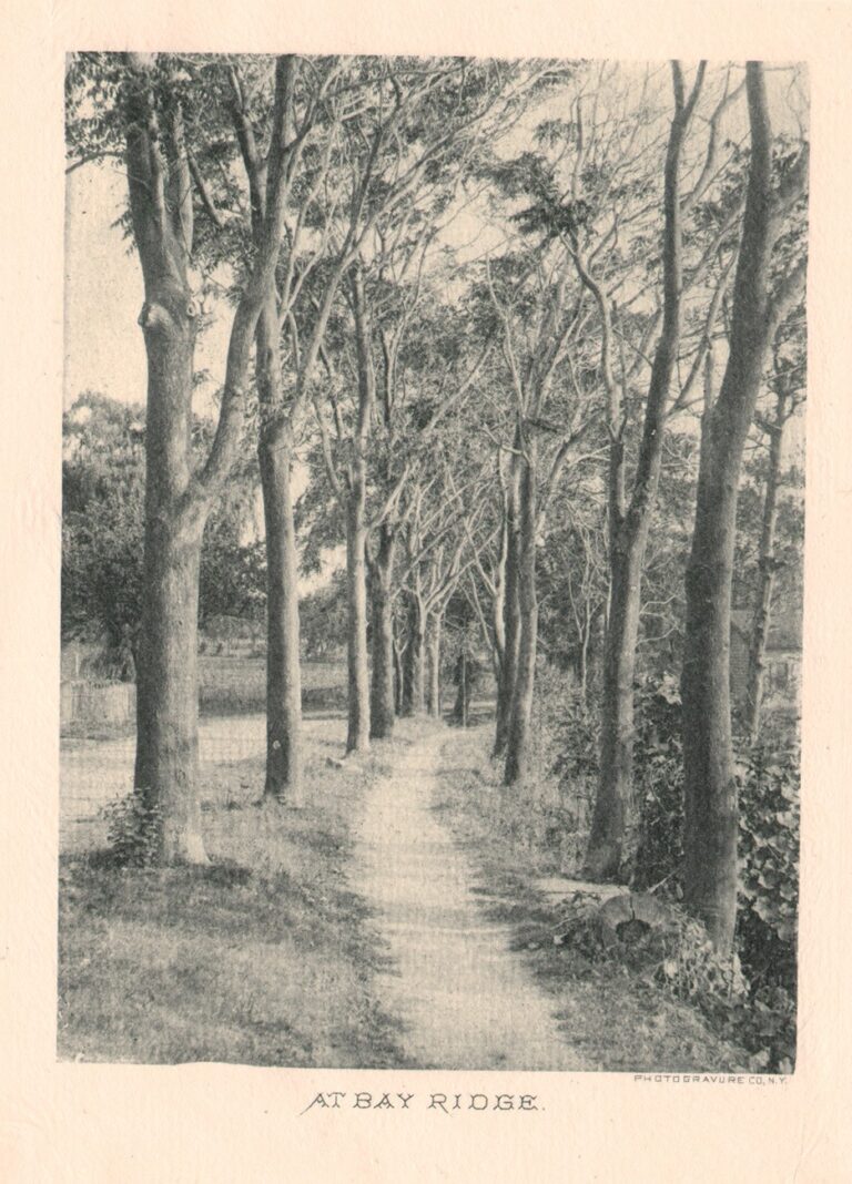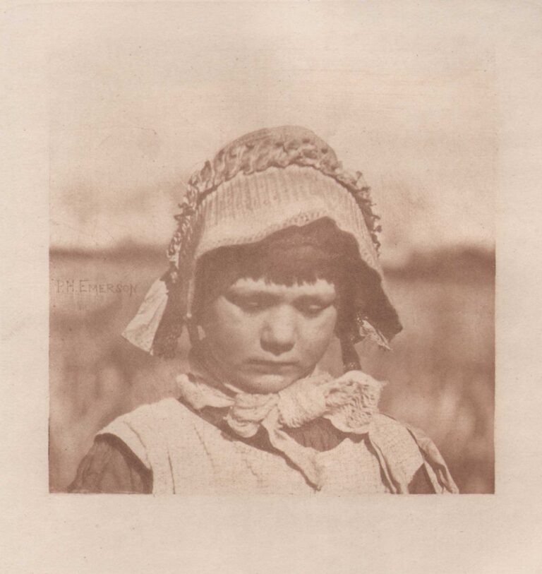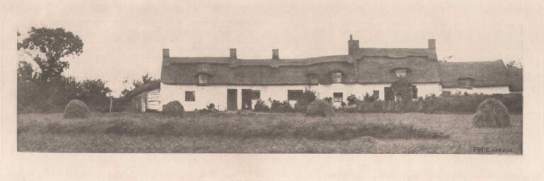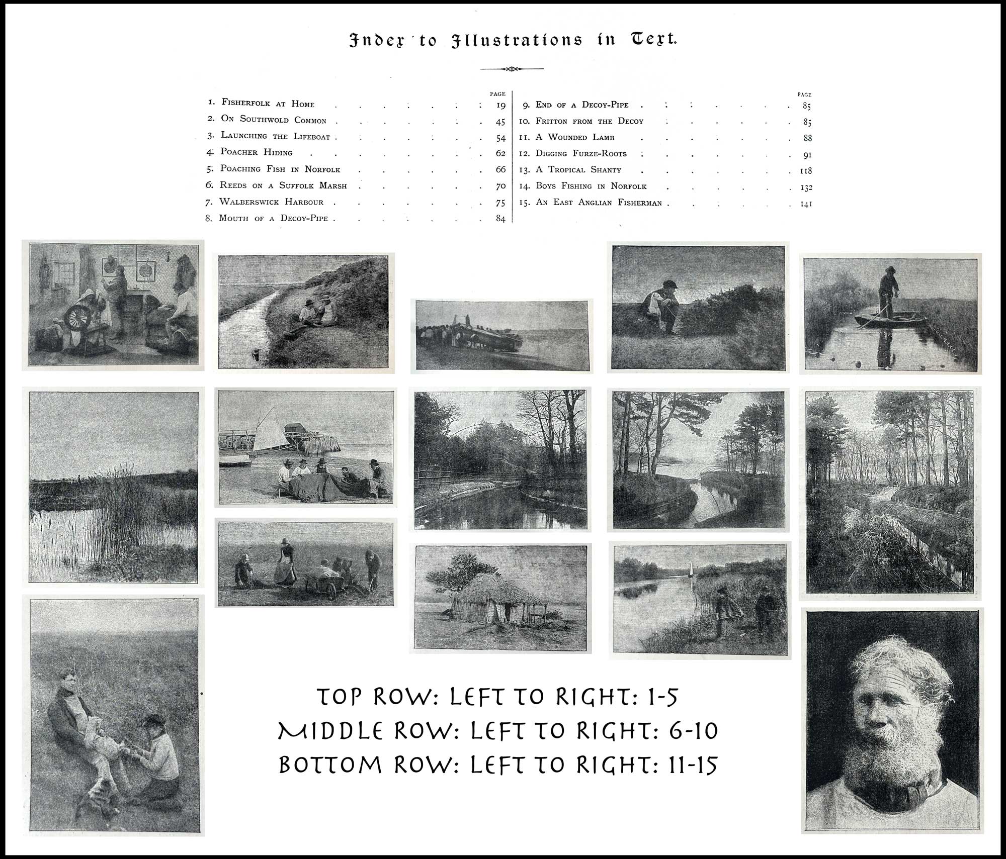
Typogravure Illustrations: Pictures of East Anglian Life
Shown above are the 15 typogravure halftones Emerson included within the letterpress to Pictures of East Anglian Life: “Fifteen further illustrations—photographs interspersed in the text—also appear in the folio: “reproduced from my original photographs by the Typographic-Etching Company.” But as he admitted to in his missive “To the Student”, they were complete failures:
“To begin with all the small blocks printed with the text must be classed amongst those ruined by the reproducers. To avoid the mechanically clear and crenellated blocks of certain well-known firms, and in the hope of obtaining something more delicate and artistic, I tried another process, which certainly gave a few good proofs, especially pulled on Indian paper. But when these blocks came to be used in the rough work of the printing press all delicacy of tone was lost in a smudge, and the results are alas of little value. A first-rate typogravure process is a great desideratum.The student must then pass over the small textual illustrations.”
Magnification of these small illustrations, as the artist refers to them, indicate not a traditional halftone screen employed as one might expect, but a pattern found in crude collotypes. (think squiggly grain pattern) Because the artist does not name it: “I tried another process”, he states, we can deduce in the present day these photomechanical images were printed using a grain Autotype halftone screen. Reproducing a magnified view from a period Alpine scene by Austrian landscape painter Robert Russ, (1847-1922) the chapter “Irregular and Special Halftone Screens” in a 2013 Getty Conservation Institute publication gives a near perfect match in figure 22, pp. 25-6. (1.)
- See: Irregular and Special Halftone Screens, pp. 25-6: Dusan C. Stulik | Art Kaplan, HALFTONE: The Atlas of Analytical Signatures of Photographic Processes, The Getty Conservation Institute, © 2013 J. Paul Getty Trust