Category
Advertising
13 entries in this category | view all categories
From the Trenches a Century On
Posted November 2018 in Advertising, History of Photography, Photography, Significant Photographs, Unknown Photographers
For your consideration, we offer a happier vision of patriotic leanings supporting the home-front on this milestone day in history marking the end of World War 1.
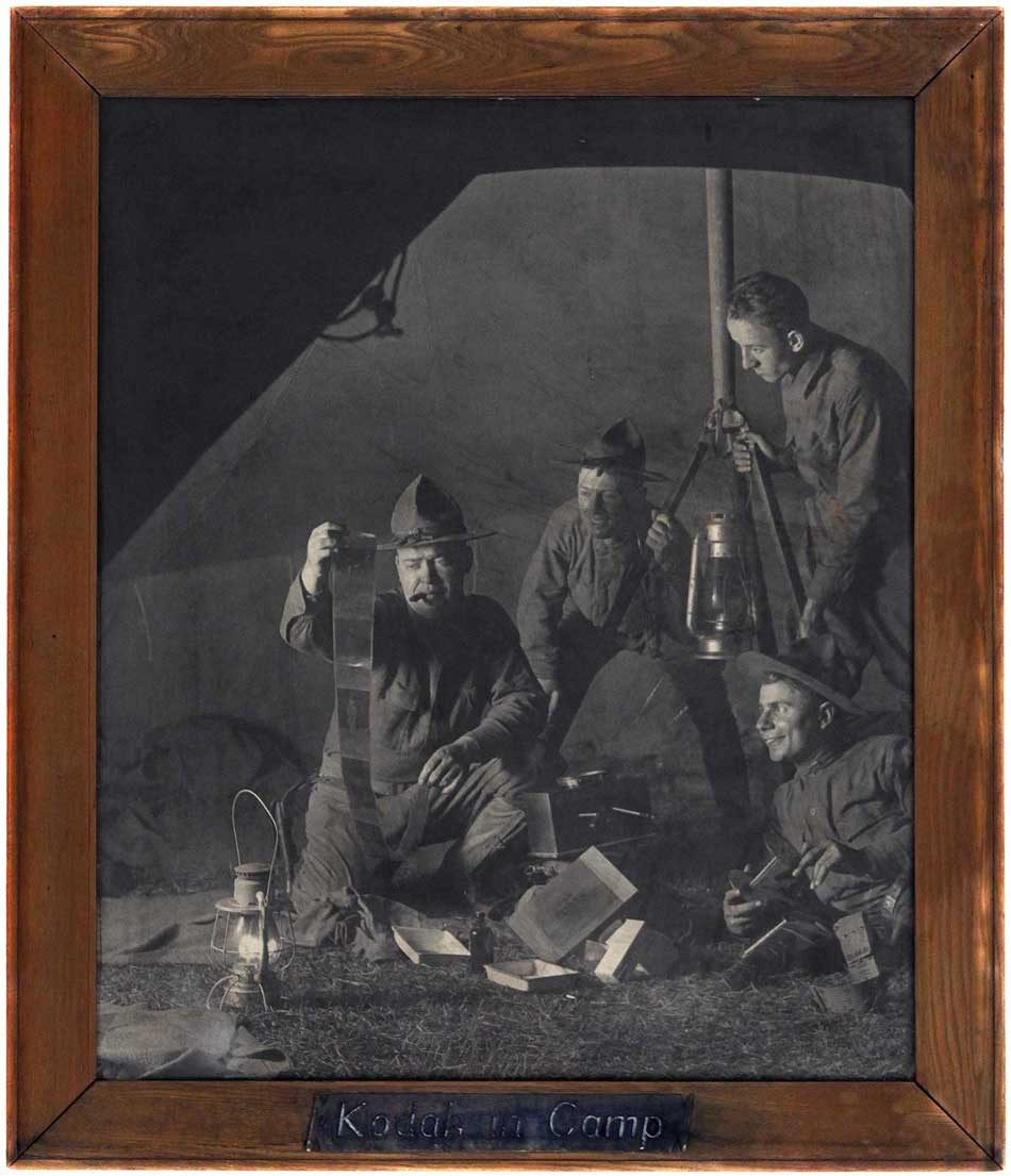 "Kodak in Camp": vintage framed bromide print ca. 1917 by unknown American photographer: Image Dimensions: 71.4 x 60.0 | cm 83.2 x 71.8 cm stained oak frame. This rare mammoth-sized Kodak advertising photograph featuring American “Doughboys” working together developing film in their tent at night was used by the Eastman company in their “Take a KODAK With You” advertising campaign. In late 1917, it appeared in publications including The Saturday Evening Post and The Independent (with which is incorporated Harpers Weekly) From: PhotoSeed Archive
On the Eleventh Hour of the Eleventh Day of the Eleventh Month- November 11, 1918, the signing of the Armistice ending the Great War took place 60 kilometers north of Paris inside a railway carriage parked in the Forest of Compiègne. It has now been 100 years since that fateful day, on that fateful month and on that fateful hour. Sadly, mankind seems doomed to repeat his failures.
But a pivoting to Photography in relation to these weighty issues will always be of interest to the historian.
In 1914, the role of the medium expanded greatly at the outset of World War 1. In addition to photography’s new found power through smaller cameras to document unspeakable human suffering and death by the millions brought about by trench warfare, aerial reconnaissance photography gave countries the ability to monitor troop movements and to devise strategy in nearly real time. And then there was the home-front. The Eastman Kodak Company was certainly not going to let a war get in the way in order to call attention to their brand and sell more product.
Retooling like other large concerns in order to become an essential military contractor, they saw American Doughboys entering the war late in the conflict as brand ambassadors. As proof, the Kodak Vest Pocket camera, which debuted in 1912, found its’ way onto the front lines and trenches of many battlefields-legally or otherwise, and advertising posters hawking the camera as well as this oversized framed bromide print of soldiers for darkroom supplies and film called Kodak in Camp prominently appeared displayed in camera shops throughout the country.
And Kodak went further. As part of their national print advertising campaign dubbed “Take a KODAK with you”, this photo of nighttime developing in camp appeared full page in the pages of the Saturday Evening Post magazine for their August 4, 1917 issue as well as other publications around that time.
But most importantly, we honor the memory today of all the fallen. In a tribute to just one, a Scottish photographer by the name of Nichol Elliot, whose 1917 death in wartime Belgium is memorialized by a volume of his pictorial photographs accompanied by poems written by his wife Alice Elliot, we give her final stanza from An Idyll of Peace:
How swift from summer idylls came the wrench
Of life flung thence, by war and manhood’s will,
To battle roar and glare, or deathly chill
Of watch and warfare in the nightmare trench!
For peace divine man paid diviner price ⎯
In world-wide idyll of high sacrifice.
-Paired with Nichol Elliot photograph: In the Island, Toronto
For additional background on photography and the Great War, check out this New York Times Lens blog post from 2014.
Camera Work: Back in Print
Posted May 2018 in Advertising, History of Photography, Journals, Significant Photographers
Like the mythological bird the Phoenix, the groundbreaking photography and art journal Camera Work edited and published by Alfred Stieglitz of New York from 1903-17 is now available for purchase as a full run after long being out of print.
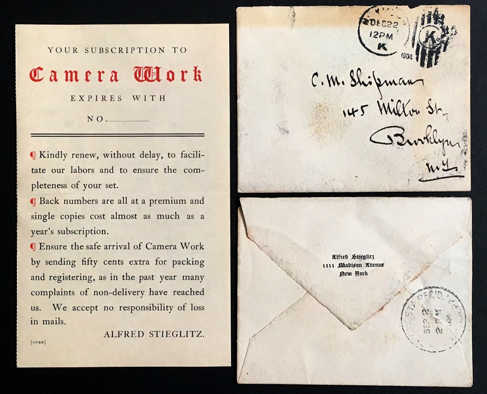 Rare Camera Work Ephemera: Left: This blank Camera Work subscription form for the year 1905 was mailed by publisher Alfred Stieglitz to photographer C.M. Shipman in Brooklyn, New York. (145 Milton St.) recto: 15.9 x 9.9 cm | opened: 9.9 x 19.8 cm | printed on Japan paper. Upper Right: The original mailing envelope (8.7 x 10.8 cm) addressed to Shipman in Stieglitz’s hand is stamped with a New York postmark of December 22, 1904. Lower Right: Another similar envelope addressed to photographer Adolph Petzold in Philadelphia and postmarked New York, September, 1904 is engraved on the verso: Alfred Stieglitz- 1111 Madison Avenue - New York. From: PhotoSeed Archive
Remarkably and metaphorically, this bird, capably guided by St. Louis resident Pierre Vreyen, has risen again even though its first creator, while acknowledging the passion it took to create it was a most admirable thing, nonetheless went on to dispose of at least one known full run of Camera Work by setting it alight in 1929 at his Lake George estate. In 1933, writing in a two-page letter on July 10 from there to writer and critic Lewis Mumford, Stieglitz outlines the emotional capital he expended on his involvement with and creation of Camera Work:
“Four years ago the complete set of Camera Work I had had up here for years I offered to the Evening Star. It was a wonderful sight to watch the volumes burn. As you know books burn slowly…What a continuous heartache Camera Work represented & what blood was spilled over each issue fighting printers & fighting engravers—fighting paper dealers & paper manufacturers—fighting ink manufacturers & binders—fighting those who did the packing—fighting the post office—every step I controlled personally—as I sat there & realized what passion it all represented—I had to smile at myself.—Ye gods what won’t passion do.” (1.)
Originally from Liege, Belgium and trained as an electrician and draftsman but more recently plying his trade as a commercial photographer, Pierre explained to me his inspiration for bringing Camera Work back to life, so to speak:
“It all started when Mark (Katzman) said he would love to have a digital copy of Camera Work so he could open it anytime without the fear of over-manipulating his set of originals. I told him I would give him a hand doing it and it took 2 years to make.”
With the establishment of his website cameraworkmagazine.com, which includes short videos of him leafing through each newly published issue of Camera Work, one can order the full run of the journal in facsimile: the most complete and faithful copy of the original ever published. The cost is $1200, which includes a separate index issue, plus shipping.
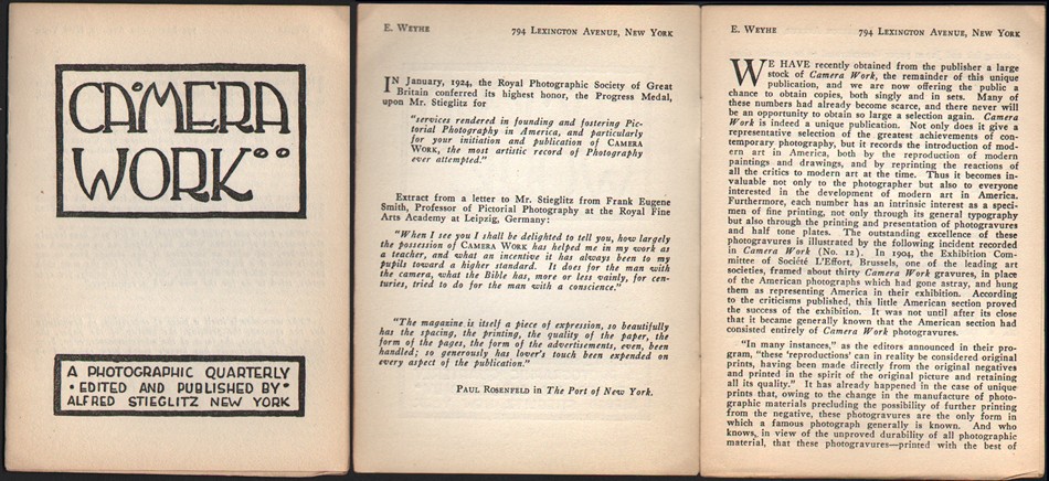 “Earliest known Camera Work Sales Catalogue” ( post publication): ca. 1924, uncoated paper: 13.8 x 10.1 cm (Cover). New York: E. Weyhe Gallery. This small pamphlet shows a facsimile of the CW cover at left while opened to the first gatefold at right. The prospectus by the E. Weyhe Gallery, located at 794 Lexington Avenue in New York City, reprinted press notices for CW along with a synopsis of available issues and prices, including the final Paul Strand double issue 49-50 from 1917 for $17.50: An excerpt: "We Have recently obtained from the publisher a large stock of Camera Work, the remainder of this unique chance to obtain copies, both singly and in sets. Many of these numbers had already become scarce, and there never will be an opportunity to obtain so large a selection again." From: PhotoSeed Archive
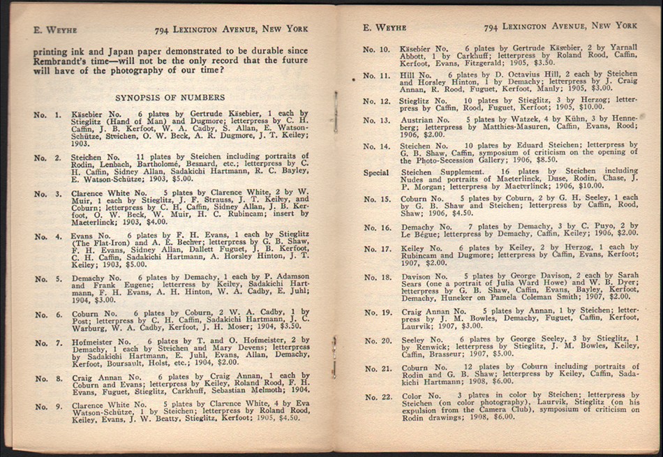 “Synopsis of Numbers: 1-22”: “Earliest known Camera Work Sales Catalogue” ( post publication): ca. 1924, uncoated paper: 13.8 x 20.1 cm (this gatefold). New York: E. Weyhe Gallery. The prospectus by the E. Weyhe Gallery, located at 794 Lexington Avenue in New York City, reprinted press notices for CW along with a synopsis of available issues and prices, including the final Paul Strand double issue 49-50 from 1917 for $17.50: An excerpt: "We Have recently obtained from the publisher a large stock of Camera Work, the remainder of this unique chance to obtain copies, both singly and in sets. Many of these numbers had already become scarce, and there never will be an opportunity to obtain so large a selection again." From: PhotoSeed Archive
 “Synopsis of Numbers: 23-48; 49-50; 2 special issues and special large plate gravure of The Steerage”: “Earliest known Camera Work Sales Catalogue” ( post publication): ca. 1924, uncoated paper: 13.8 x 20.1 cm (gatefold at left and back cover at right: 13.8 x 10.1 cm ). New York: E. Weyhe Gallery. The prospectus by the E. Weyhe Gallery, located at 794 Lexington Avenue in New York City, reprinted press notices for CW along with a synopsis of available issues and prices, including the final Paul Strand double issue 49-50 from 1917 for $17.50: An excerpt: "We Have recently obtained from the publisher a large stock of Camera Work, the remainder of this unique chance to obtain copies, both singly and in sets. Many of these numbers had already become scarce, and there never will be an opportunity to obtain so large a selection again." From: PhotoSeed Archive
Pierre says: “The aim of this project is to put (Camera Work) in the hands of schools, teachers, students, museums, libraries, collectors, appraisers, auction houses, individuals, etc… a high quality reproduction of the originals at a reasonable price.”
Intrigued, I asked him what some of the challenges were for pulling the project off, and I couldn’t help but think of parallels Stieglitz himself surely encountered, yet updated for the digital age:
“There were many challenges. At first was where to start? From what? Luckily I found the Modernist Journal Project online which has a digital copy of Camera Work. It is incomplete but we contacted them and they were kind enough to supply us with their raw files. I used their files for the text pages but not for the plates.
The text pages needed a lot of work in Photoshop to clean, resize, straighten, etc… and then we had to photograph many of the plate pages Mark (Katzman) had no high res files in his archive. I also had to align the often found ghost image present on the facing page of the plates. Look at the video clips I have on the website and you’ll see what I mean. Especially visible in number 49-50.”
Continuing, and with the knowledge he has put up a significant amount of his own money to complete 25 full sets of Camera Work, Pierre spoke of finding someone to print the issues, something that happens less and less in this digital age:
…“I had to find a printer. I first looked online but the choices are limited and it ends up getting expensive really quick when you want to use a print on demand service like blurb.com. So I looked locally.
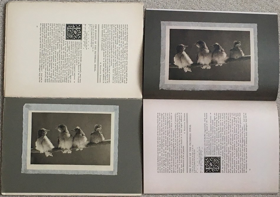
 International Camera Work Scholarship: With "The Red Man", a head study reproduced as a photogravure plate in Camera Work I by Gertrude Käsebier from 1903 projected on the screen at left, Professor Dr. Bettina Gockel, principal investigator for the project Camera Work: Inside/Out at the University of Zurich from 2015-18 delivers her paper: "More Than Genius: The Invention of Photographic Genius and the Importance of the Journal Camera Work" during the symposium Rethinking "Pictorialism": American Art and Photography, 1895 to 1925 at Princeton University in October, 2017. Photo by David Spencer for PhotoSeed Archive
I found a printer that was in St. Louis but after many, many weeks of proofs and tries, it did not work out. Back to square 1, I found another printer about 80 miles from St. Louis and this is the one I ended up using. All in all, it took me 6 months dealing with different printers to finally get what you saw in Rochester, the final product.”
As an added bonus, Pierre will also sell you a piece of history from the pages of Camera Work: approximately 180 individual advertising pages from the journal are listed on his site and can be ordered as 16 x 20” framable art prints for the bargain of $30 each.
Would the master Approve?
Not that my opinion matters, but here goes. It’s hard to guess if Alfred Stieglitz would have embraced the concept of digitization. My hunch says no, because I want to believe one of the most important legacies he left the world, Camera Work magazine, was something he would have been insistent be appreciated in its’ original form.
All well and good if you can get ahold of vintage copies, or have the tenacity and financial resources to acquire a full run of the 50 issues and supplements. But to those of us in the 21st century, the importance of the groundbreaking nature of the journal as well as the superb photogravure plates contained within give many of us ample reason to collect at least a few of the plates.
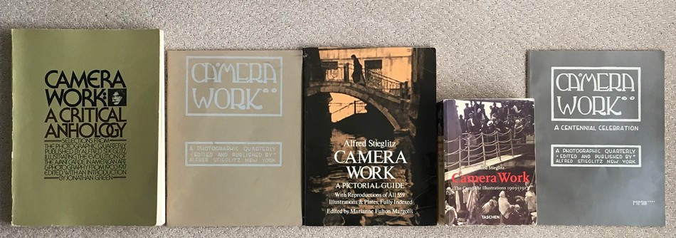 Published Literature: Camera Work: A chronological timeline of significant works are seen left to right: 1973: "Camera Work: A Critical Anthology" by Jonathan Green. This was the first significant evaluation of Camera Work, with an emphasis on the articles and text rather than the reproductions; 1973: "Camera Work: A Photographic Quarterly Edited and Published by Alfred Stieglitz, New York". Published by the Minneapolis Institute of Arts, this volume accompanied the exhibition, “I Am an American,” that traveled to more than a dozen towns in Minnesota on the Minneapolis Institute of Arts’ Artmobile; 1978: "Camera Work: A Pictorial Guide" by Marianne Fulton Margolis was the first instance all 559 plates from Camera Work were published in a single-volume reference; 1997: "Camera Work- The Complete Illustrations 1903-1917". Published by Benedikt Taschen with an essay by Pam Roberts additionally translated into German and French, it featured all plates taken from a complete set of the journal owned by the Royal Photographic Society, Bath; 2003: "Camera Work: A Centennial Celebration": In celebration of the 100th anniversary of the publication of Camera Work, a traveling exhibition was organized by Stephen Perloff, editor of The Photo Review and The Photograph Collector. From: PhotoSeed Archive
Speaking personally, a delicate japan tissue gravure of a collaborative effort by Stieglitz and Clarence White from Camera Work was one of my very first photographic purchases as a collector. I convinced myself I would frame that photograph and hang it on the wall, but it slowly drifted to the bottom of an acid-free case as I rapidly descended into the madness of collecting vintage photographs, never to look back.
For the sake of historical context, a timeline of the most notable publishing efforts promoting Camera Work scholarship, although certainly not exhaustive given the hundreds, perhaps thousands of citations for the journal not listed here, are necessary for the record, and reveal ample support and evidence for Pierre Vreyen’s efforts at getting it back in print. I’ve also included a few links at the end of this post for some exciting recent scholarship and digitization efforts.
Camera Work: Key Dates & published Literature
1903-1917:
Issued quarterly in New York by Alfred Stieglitz, (1864-1946) the journal featured a cover design by a young Edward Steichen who created the Craftsman inspired typeface logo anchored by an outlined box: “A Photographic Quarterly* Edited And Published By * Alfred Stieglitz New York”. Steichen’s efforts included the overall design aesthetic for the interior pages, which even extended to the advertising pages published in the back of each issue. Through primary sources, Camera Work is known to have had a larger subscriber base when it was first introduced in the first decade of the 20th Century but waned considerably with the outset of World War I in Europe. In a three page letter written by Stieglitz to the writer and critic Lewis Mumford dated October 15, 1935, he states the size of the edition for individual issues while giving other valuable information on the albatross Camera Work had become to him, along with the solution:
“Camera Work has gone off to you in 4 packages by parcel post…As for the missing Plates they were not torn out of the books but were never put into those copies. You see many of the gravures were tipped in my hand (by me) after the numbers had been printed & bound. And I only completed the number of copies as were subscribed for. The edition was always 1000 copies except 49–50—that was 350. When I destroyed about 10000 copies of Camera Work—they were smothering me—I destroyed virtually all the Plates that had not been used. That’s why I can’t complete your incomplete copies.” (2.)
 Vintage or Modern? Bottom Left: This mounted photogravure plate in Camera Work I from 1903 titled "A Study in Natural History" is by the American photographer A. Radclyffe Dugmore. This vintage example is opened to show it in relation to the opposing text page in an incomplete copy owned by the PhotoSeed Archive. Upper Right: The same page spread featuring the Dugmore plate in a new issue of Camera Work published as part of a set in May, 2018 and sold by Pierre Vreyen. Keen observers will notice the plates are flipped: this is because Alfred Stieglitz personally hand-tipped the gravure plates into each unique issue of Camera Work with the results sometimes being different in relation to placement on the plate pages. From: PhotoSeed Archive
1924: (ca.) After 1917, the first known marketing efforts for the journal appear by the E. Weyhe Gallery of New York City. They publish a small prospectus which served as a sales catalogue after buying up remaining copies from Alfred Stieglitz. Scans of an original prospectus owned by PhotoSeed can be seen above. In 2012, one was also included with the sale of a full leather-bound run of the journal by Sotheby’s. The auction house provided the following background on the Weyhe firm as part of the listing:
“New York art dealer and publisher Erhard Weyhe (1882-1972), whose gallery and bookshop on Lexington Avenue promoted not only prints and art books, but also photography. Weyhe and Stieglitz were friends who frequented each other’s gallery and worked with some of the same artists. Laid in the present set’s first volume is a prospectus issued by the Weyhe firm, announcing that ‘we have recently obtained from the publisher a large stock of Camera Work, the remainder of this unique publication, and we are now offering the public a chance to obtain copies, both singly and in sets.” (3.)
1969: The first attempt at a true duplication for the journal was undertaken by Kraus Reprint, (Nendeln/Liechtenstein) and is outlined by scholar Meredith A. Friedman for her 2009 master of arts thesis “Camera Work And The Alfred Stieglitz Collection At The Metropolitan Museum Of Art”:
“Camera Work was published in fifty volumes from 1903 to 1917. In 1969 Kraus Reprint reproduced all fifty issues of Camera Work in a six-volume set. The reprint is not a facsimile, but rather a duplication of the content (text and illustrations) of Camera Work page-by-page. The page size of the reprint editions is slightly smaller than the original issues. In an introductory note, the publishers explain that the reproduction was printed “as a service to scholars. It records the entire content of the original number, but does not attempt to reproduce its visual quality, nor the calibre of its plates.” (32) The Kraus Reprint edition of Camera Work seems to be the first time anyone acknowledged the value of Camera Work from a scholarly perspective.” (Editors note: Hathi Trust Digital Library currently has around 40 of the Kraus issues which can be accessed here.)
(32.) Alfred Stieglitz, Camera Work (Nendeln, Liechtenstein: Kraus Reprint, 1969), edition notice.
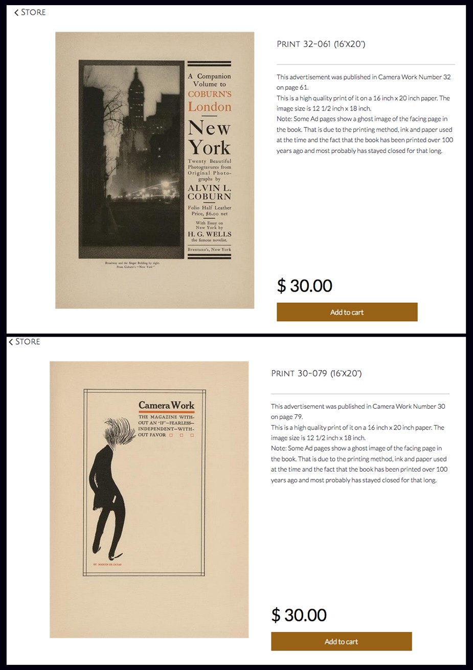 Ready for Framing: In addition to the full run of Camera Work along with a separate index issue, Pierre Vreyen's website cameraworkmagazine.com features approximately 180 individual advertising pages from the journal that can be ordered as 16 x 20" framable art prints for $30 each. At top, a vintage advertisement from Camera Work XXXII featured an actual photogravure from Alvin Langdon Coburn's volume New York. At bottom, an ad shows a full-length caricature of Alfred Stieglitz by the artist Marius De Zayas featured in Camera Work XXX. Courtesy: Pierre Vreyen
1973: Friedman continues with the journal’s literature survey:
“Jonathan Green’s Camera Work: A Critical Anthology (1973) is the first significant evaluation of Camera Work, particularly focusing on the articles and text rather than the reproductions. It describes the evolution of the photographic medium through the writing in Camera Work from issue to issue over the fifteen years of its publication. The volume is thoroughly organized with six indexes: biographical information each of the artists, photographers, and writers who contributed to Camera Work and that are featured in his text; a chronological bibliography of works relating to Camera Work and the Photo-Secession; an index of names and subjects appearing in Camera Work; a chronological list of articles published in Camera Work; an index of artists and the issues in which their works appear; and a chronological index of the plates, listing the process by which they were reproduced in Camera Work.”
1973: Scholar Christian Peterson notes the following title which featured a facsimile of the Camera Work cover logo and publishing attribution for Stieglitz in his online sales catalogue for the journal:
Camera Work: A Photographic Quarterly Edited and Published by Alfred Stieglitz, New York, Minneapolis Institute of Arts, 1973. Softcover, 11 x 8 ½ inches, 40 pages, 3 halftone illustrations. This uncommon publication accompanied the exhibition, “I Am an American,” that traveled to over a dozen Minnesota towns in 1973 on the Minneapolis Institute of Arts’ Artmobile. The show included photogravures from Camera Work, plus paintings, drawing, and watercolors by members of the Stieglitz circle. This item includes a facsimile cover of the magazine, brief text by curator Carroll T. Hartwell, and reprints of articles from Camera Work. Most importantly, it features images by James Craig Annan, Alvin Langdon Coburn, and Stieglitz, printed on translucent paper and tipped-in, in a modest effort to replicate the delicate nature of the original gravures. Fine condition. $25. (editor: note: the “gravures” are actually halftones)
1978: Friedman continues with her thesis survey:
“In 1978 Marianne Fulton Margolis published Camera Work: A Pictorial Guide, building upon the thorough indexing in Green’s publication, but instead focusing solely on the images in Camera Work. This was the first time all 559 images from Camera Work were published in a single-volume reference. The images leave much to be desired; all are printed the same size, four to a page, in black and white halftone. As a reference, though, the publication is invaluable. The main part of the book reproduces each image in Camera Work in their exact sequence as published. Like Green, Margolis lists the medium by which the image was reproduced in Camera Work, but she also provides the original medium of the work when known, and also indicates when the reproduction is known to have been created from the artist’s original negative. Further, Margolis provides the reproduction method for every illustration in each issue of Camera Work, whereas Green discussed the plates, and a number of graphics within the text (such as Steichen’s Photo-Secession poster in Camera Work Number 13) which Margolis has not included in her index. Much of this information comes directly from the text of Camera Work. Three additional indexes at the end of the book provide an alphabetical list of artists, titles and portrait sitters, each with corresponding number of the periodical.”
1985: Friedman survey continues:
“This same concern was raised again in 1985 in the exhibition Camera Work: Process and Image organized by the Minneapolis Institute of Arts and accompanied by a catalogue with an essay by Christian A. Peterson that chronicles the use of reproductions throughout the publication of Camera Work, and the response these images provoked in the photographers whose works were reproduced.”
1997: Camera Work- The Complete Illustrations 1903-1917 is published by Benedikt Taschen with an essay in English by Pam Roberts that was additionally translated into German and French for the volume. Along with a full index of all artists represented in the journal and selected texts printed in the rear of the volume, all of the plates are reproduced which were taken from a complete set of Camera Work owned by the Royal Photographic Society, Bath.
Roberts notes in her essay: “Camera Work fulfilled many functions. On one level, it began as the last outpost of the confluence of Symbolist art, photography and literature, and ended as a messenger of Modernism. On another level, it was a non-concurrent exhibition catalogue for 291 and the publicity machine for the Photo-Secession.”
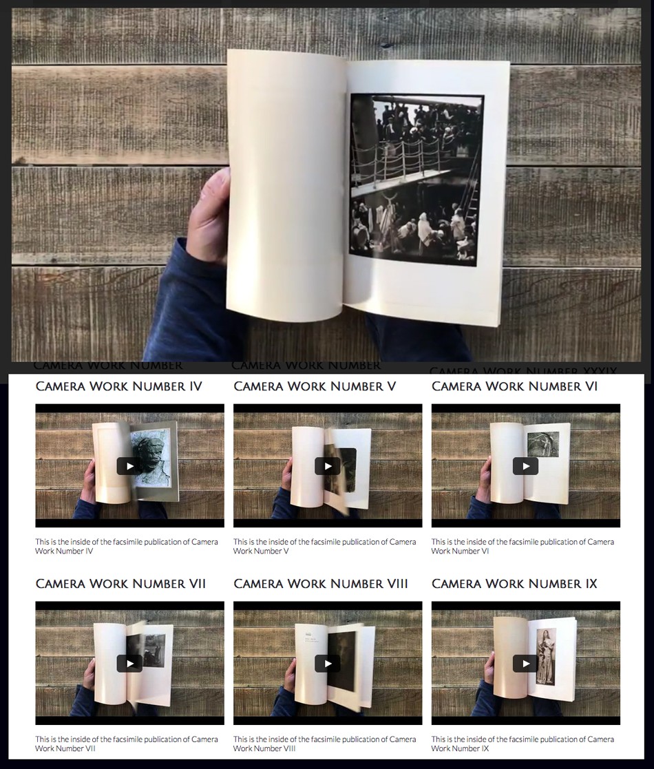 Pierre wears a Blue Shirt: Each issue of the full run of the newly re-issued Camera Work magazine plus a new separate index issue published in May, 2018 is featured in short video clips from back to front by Pierre Vreyen at his website cameraworkmagazine.com. At top, "The Steerage" by Alfred Stieglitz in Camera Work XXXVI. Courtesy Pierre Vreyen
Friedman’s thesis also comments on the 15th anniversary edition of this work: “An alternate version of this book, Camera Work: The Complete Photographs, published in 2008 for the l5th anniversary of Taschen, features reproductions of every photograph in Camera Work, but not every illustration as its predecessor does.”
2003: “Camera Work: A Centennial Celebration” is published. Friedman comments:
”In celebration of the 100th anniversary of the publication of Camera Work, a traveling exhibition was organized by Stephen Perloff, editor of The Photo Review and The Photograph Collector. A double issue of The Photo Review was published as a catalogue and featured essays by Perloff along with Peter C. Bunnell, Lucy Bowdich, Barbara L. Michaels, and Luis Nadeau.” (33.)
33. Perloff, Stephen, ed. “Camera Work: A Centennial Celebration.” Exhibition catalogue. The Photo Review 26, no. 1-2, 2003.
Camera Work Resources & Scholarship on the Web
- Wikipedia: always a good resource if you are just getting your feet wet in first learning about Camera Work. Link
- Modernist Journal Project: originally founded at Brown University in 1995 to create an online periodicals database, the entire run of Camera Work, using vintage copies from Princeton University, has been digitized in the last five years and posted online. Brown teamed with The University of Tulsa for the effort, which lacks only six photographic plates-Gertrude Käsebier’s “Portrait (Miss N)” and “Red Man” (CW 1: 11, 13), A. Radclyffe Dugmore’s “Study in Natural History” (CW 1: 55), Eduard Steichen’s “Solitude” and “Poster Lady” (CW 14s: 33, 35), and Steichen’s “The Photographer’s Best Model: G. Bernard Shaw” (CW 42-43: 39). Link
- Photogravure.com: Site owner and collector Mark Katzman has made all of the gorgeous photogravure plates (as well as most of the halftone plates) throughout the entire run of Camera Work accessible from his personal collection in the newly relaunched version of his site. Link
- Heidelberg University Library in conjunction with The University of Zurich launches their digitization efforts to the web in March, 2018: “all fifty regular and three special issues of Camera Work are digitized to the highest standards”. Link
- Camera Work: Inside/Out: Under the guidance of Professor Dr. Bettina Gockel, the principal investigator for the project, the University of Zurich from 2015-18 launches this research project in conjunction with the Institute of Art History at the university. Link
- Video: Camera Work – Institute of Art History University of Zurich: With a running length of about 5.5 minutes, this video produced as part of “Camera Work: Inside/Out” is a wonderful tribute to the enduring legacy and importance of the journal, and a fitting end to our post. Link
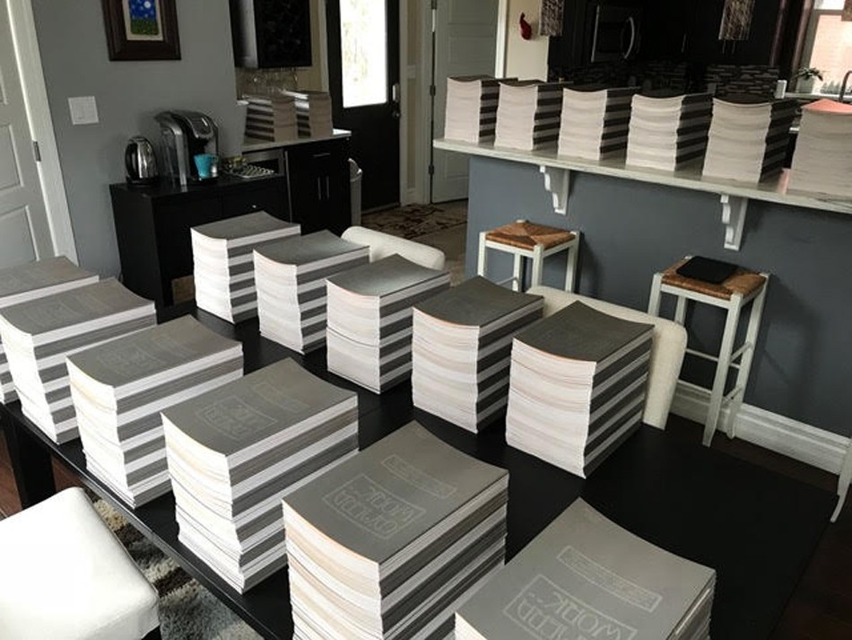 Editor, Publisher & Shipper: As seen here, St. Louis, MO resident Pierre Vreyen told PhotoSeed: "I picked up 25 sets of Camera Work from the printer yesterday. 1275 books!!! That’s a lot of books spread around my house. I am currently stacking them all in sets…" Well done, Pierre and good luck on your new endeavor I say! Courtesy Pierre Vreyen
Notes:
1. Letter excerpt: in auction listing by RR Auction, Amherst, NH April, 2018-lot passed- #0537. Additionally, the first two sentences of this letter cited in footnote #15 by Lori Cole for her essay “Camera Work: Forming Avant-Garde New York” published in the 2013 volume The Aesthetics of Matter: Modernism, the Avant-Garde and Material Exchange with cited source being the Alfred Stieglitz/Georgia O’Keeffe Archive at Yale University’s Beinecke Rare Book Library. (p. 186) (Note: the 2008 volume edited by Robert Wojtowicz titled Mumford on Modern Art in the 1930s states carbon copies of letters, believed to include this one sent by Stieglitz to Mumford, are contained within the Alfred Stieglitz correspondence files at the Beinecke.) The actual bonfire set by Stieglitz is corroborated somewhat in a description by Sue Davidson Lowe, the grandniece of Stieglitz, who writes in her volume: Stieglitz-A Memoir/Biography (1983) that in 1929, when Stieglitz was at Lake George and experiencing an emotional helplessness because he had not heard from Georgia O’Keeffe for several weeks, took to the cathartic act of burning: “an accumulation of papers-books and pamphlets, magazines (including many issues of Camera Work), negatives, and prints.” p. 294
2. ALS signed “Stieglitz,” three pages on two sheets, October 15, 1935, in part. (Stieglitz to Lewis Mumford) From auction listing: RR Auction, Amherst, NH April, 2018-lot passed- #0537.
3. ‘CAMERA WORK: A PHOTOGRAPHIC QUARTERLY’ Alfred Stieglitz, Editor: Sotheby’s: 03 OCTOBER 2012: Lot 55
Say It With Flowers . . . . Do It With Dishpans
Posted February 2018 in Advertising, Alternate Processes, Painters|Photographers, Publishing, Significant Portfolios, Typography
In 1926, Minnesota artist Cleora Clark Wheeler made the following observation in an article she wrote explaining her feat of photographing scores of fellow Kappa Kappa Gamma fraternity sisters by means of silhouette portraiture:
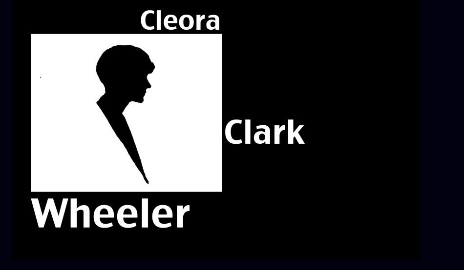 "Silhouette Self Portrait of Minnesota artist Cleora Clark Wheeler" ca. 1926. (typography added by this website) The photograph was used to illustrate an article written by her published in The Key, the quarterly magazine for Wheeler's fraternity Kappa Kappa Gamma in December, 1926. (p. 500)
“anyone who saw the interested crowd getting their pictures on banquet night just before we all parted, will be sure it proved there is a way to have one’s picture taken without having one’s head turned.”
Using said dishpans in the title to this post, procured from a nearby hardware store outside Oakland, California, Cleora, or Cleo as she was known, went on to secure these pans used as reflectors for the photo shoot using her mother’s wooden tomato supports, placed in the trunk of her car before heading to the annual convention that year at Mills College from her St. Paul, MN home, a journey of 2000 miles.
So we will say it with our own flowers here: on the occasion of PhotoSeed posting a rare surviving folio volume of 23 of her delicate Japan-tissue photogravures of California landscapes taken and printed by Wheeler used as a sales catalogue, some further context into the life of this fascinating and talented woman is necessary in order to fill in the historical record.
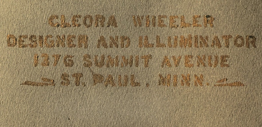 Detail: Title of California Sample Book by Cleora Clark Wheeler, American: 1882-1980: gilt hand-lettering: "Cleora Wheeler Designer And Illuminator 1376 Summit Avenue St. Paul, Minn." 33.0 x 50.0 cm: folded, olive-colored cardstock leaf used as album cover. From: PhotoSeed Archive
To be clear, photography was just one of the many talents American artist Cleora Wheeler employed in her 98 years. Although never married, it might be said her significant partner through life was her beloved fraternity, Kappa Kappa Gamma, which she was initiated into at the Chi chapter at the University of Minnesota on October 9, 1899. Graduating in 1903, she went on to serve Kappa her entire life.
A designer and illuminator, as she would often describe herself while working out of the third floor studio of her longtime St. Paul family home, often in the act of creating unique bookplates and greeting cards, Cleora wore many professional hats. Artist, poet, school teacher, women’s advocate, business manager, an expert in steel die stamping, photographer and tireless promoter of her fraternity both locally in Minnesota and around the country were but a few of her passions.
With the knowledge that “Miss Wheeler thinks of California as her second home” as noted in a follow-up article describing her hand-colored photographic work and bookplates on display in 1922 at the St. Paul Public Library, her love of place and record of spirit is evident in pictorial photographic work taken in the American West ca. 1914-1921: a reaffirmation of the cross-pollination taking place in the arts by unconventional practitioners.
 Left: "Redwoods": Cleora Clark Wheeler, American-1882-1980: ca. 1922: hand-pulled Japan-tissue photogravure: 10.7 x 6.2 | 20.8 x 15.1 Gampi | 25.0 x 38.0 off-white handmade paper (folded) | 33.0 x 25.0 cm olive-colored cardstock leaf. From: PhotoSeed Archive. Right: "Redwoods": ca. 1922: Cleora Clark Wheeler: hand-colored gelatin silver exhibition print from the artist's 1922 St. Paul exhibition Atmospheric Studies. A roadway in the Sierra Mountains leads to a stand of soaring redwood trees in this landscape study colored with Japanese dyes. Courtesy: Grapefruit Moon Gallery auction listing, Minneapolis MN.
The following timeline by year in the life of Cleora Wheeler is meant as a starting point for this remarkable artist. It begins with her birth in Austin, Minnesota in 1882 and concludes with a 1980 obituary printed in her alumni magazine. Although long-winded in some cases, I’ve decided to include some of the expanded background articles written by and about Wheeler in The Key, the Kappa Kappa Gamma quarterly. In addition to photographic work by Wheeler held by this archive, a link to 45 bookplates held in the Helen Brainerd Lay Bookplate Collection at Mount Holyoke College in South Hadley, Massachusetts can be found here, and a general search link to the Wheeler family archive at the Minnesota Historical Society Library catalogue is here. (type in “Cleora Clark Wheeler”) Further suggestions for inclusion are welcomed. Please contact me through the blog or at admin@photoseed.com.
David Spencer- February, 2018
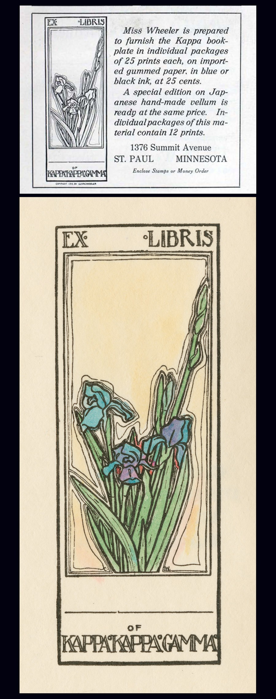 Top: December, 1910 advertisement for new Ex-Libris book plate designed the same year by Minnesota artist Cleora Clark Wheeler as it appeared in The Key, the quarterly magazine of her fraternity Kappa Kappa Gamma. Bottom: "Ex Libris of Kappa Kappa Gamma, by Cleora Clark Wheeler": (American: 1882-1980). Ca. 1920-30. Hand-colored book plate shows the fleur-de-lis iris, the fraternity flower, with the artist's initials CW appearing on opposite sides of the base of cut flowers. Courtesy: Helen Brainerd Lay Bookplate Collection, Mount Holyoke College Archives and Special Collections: Identifier: ms0048-s02-b02-f15-i001.
Timeline: Cleora Clark Wheeler: 1882-1980
1882: Wheeler is born in Austin, Minnesota. Her father, Rush Benjamin Wheeler, (1844-1930) was an East coast transplant who graduated from Yale. He was a lawyer involved in banking and real estate. Her mother Harriet Sophia Clark Wheeler (1853-1938) was a graduate of the University of Minnesota. Her siblings were two brothers: Frost Montaine Wheeler: 1878-1963 & Ross Clark Wheeler: 1886-1901. The family lived in St. Paul.
1903: Graduates from The University of Minnesota with a Bachelor of Arts degree in English. She later went on to earn certificates of proficiency in engineering drafting and advanced engineering drafting from U. M.
⎯ Moves to California and lives for a year: “Cleora Wheeler’s first work with the Young Women’s Christian Association was in California. Soon after her graduation from the University of Minnesota she was asked by Miss Louise Brooks of New York, national secretary of conventions and conferences, to be her assistant at the student conference at Capitola, Cal.” source: 1921 background on Wheeler in The Key.
⎯ “Miss Wheeler thinks of California as her second home, as she spent a year with Pi after graduating at Minnesota.” -The Key: 1926 (Pi chapter at the University of California, Berkeley)
1904: Named Grand Registrar for the Grand Council of Kappa Kappa Gamma, with offices at 301 Pioneer Press Building in St. Paul, MN. source: The Key, October.
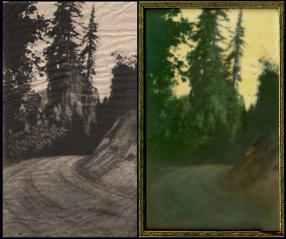
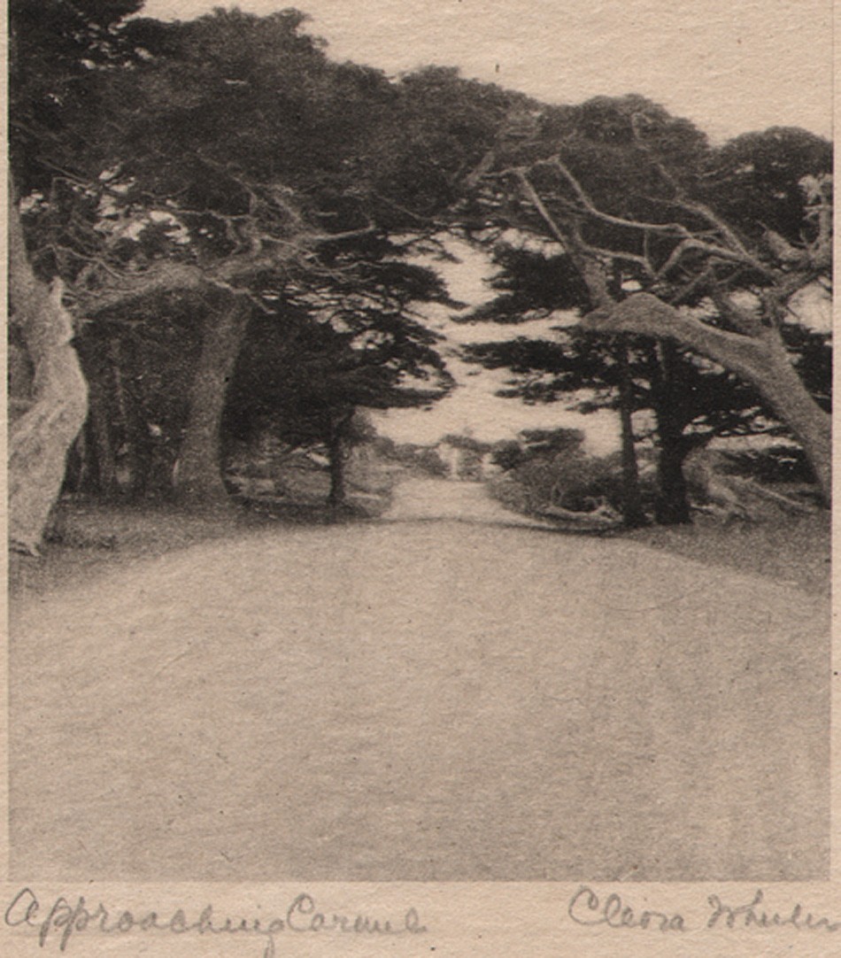 Detail: "Approaching Carmel": Cleora Clark Wheeler, American: 1882-1980. Hand-pulled Japan-tissue photogravure ca. 1922: 10.2 x 7.5 | 21.0 x 15.3 Gampi | 24.2 x 38.0 off-white handmade paper (folded) | 33.0 x 25.0 cm olive-colored cardstock leaf. An archway of cypress trees near Carmel, California frames the famed Seventeen-Mile Drive along the Monterey coastline. From: PhotoSeed Archive
1905: Wheeler’s love of nature, a major theme that would soon emerge in her art, makes an initial greeting as Grand Registrar:
To all in Kappa Kappa Gamma, greetings! The wild thing of the woods has its call; the brook, playing with the bits of forest light and shadow, murmurs to itself; the wind, sighing through the trees, croons its melody and dies away; all nature is at peace, and sings. Song is the outpouring of a soul that cannot contain itself for very joy. Friendship is the life of that soul; a happiness too often unappreciated until perchance it is snatched away, only to leave a memory in its place. May we be worthy of this name of friend, appreciating more fully with each day the fortune that is ours. May we know a courtesy among ourselves that shall unconsciously touch each life we meet. May personal responsibility and devotion broaden into mutual helpfulness, and interest, and charity, until it meet and grace the world of kindly sympathy. (The Key: January: p. 298)
⎯ Writes a poem in tribute to Anne Jones, a fellow Chi chapter member at the University of Minnesota, most likely a personal friend:
Jones. April 5, 1884-July 3, 1905. Initiated into Chi Chapter of Kappa Kappa Gamma October 16, 1902.
As breath of morning gently steals its way O’er sleeping valleys where the morning mist Half timidly awaits the smile of day, Gray mantled, ere the sun has kissed To gold the dim dew-crystaled haze, And gliding soft with footsteps all to fleet For ken of humankind, from out the maze Brings memories, intangible, replete With wonder-fancies, melodies akin To whisperings of heaven; thus she came, Her arms light laden with the green of springA radiance as summer showers win In afterglow, long held ere twilight claim A melody, low borne on evening wing.
-Cleora Clark Wheeler. (The Key: October: p. 534)
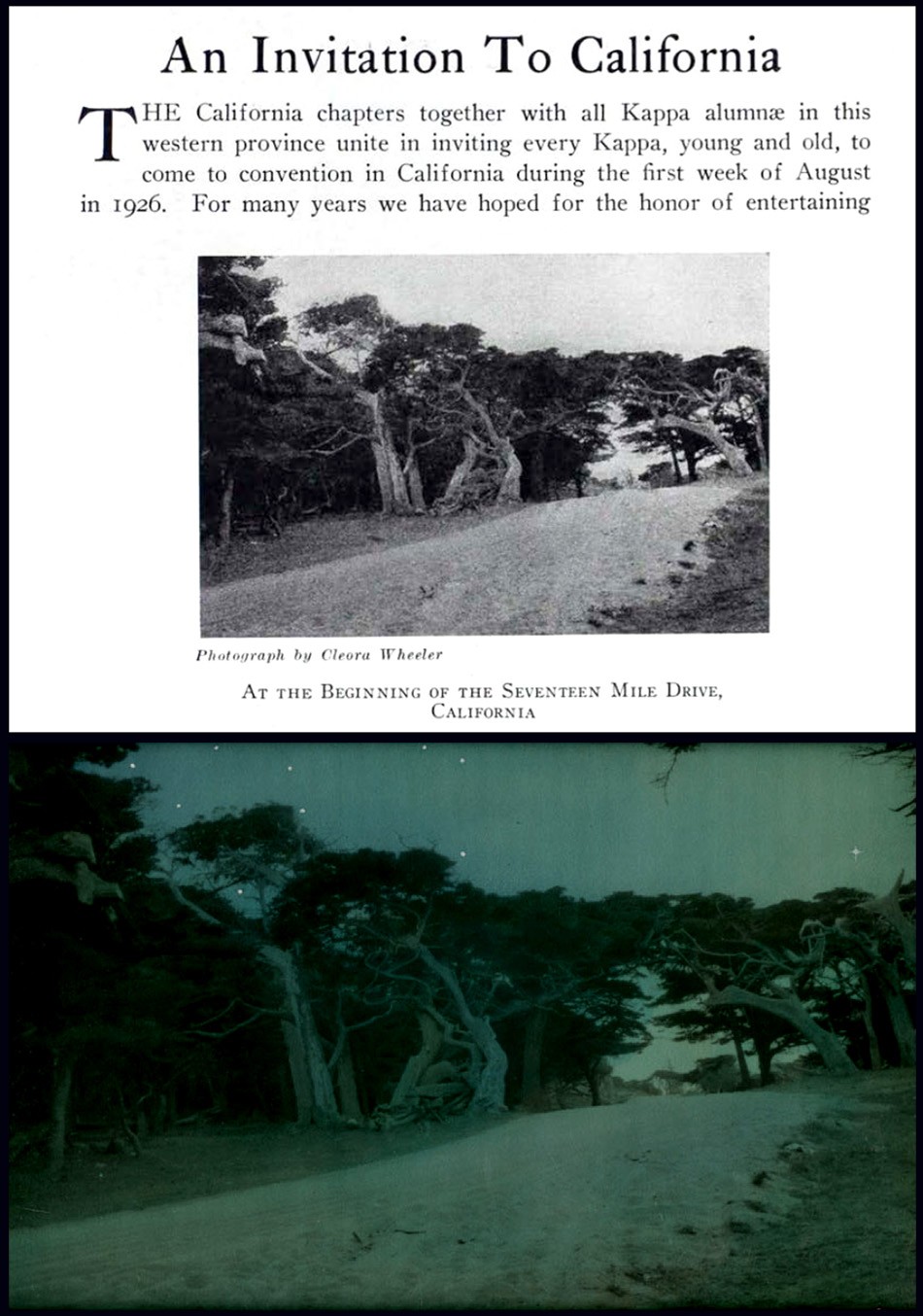 Top: "At the Beginning of The Seventeen Mile Drive": halftone photographic reproduction by Cleora Clark Wheeler used to illustrate article on annual convention for her fraternity Kappa Kappa Gamma. Taken from December, 1925 issue of The Key, the quarterly magazine of the fraternity. The photograph is a variant of her photo titled "Approaching Carmel" seen earlier in this post. Bottom: "After Nightfall": ca. 1922: Cleora Clark Wheeler: hand-colored gelatin silver exhibition print from the artist's 1922 St. Paul exhibition Atmospheric Studies. Another variant of the halftone seen above, Wheeler used Japanese dyes and hand-painted white stars in the sky for this landscape transformed into a nighttime view featuring a twilight blue sky. Courtesy: Grapefruit Moon Gallery auction listing, Minneapolis MN.
1906: Wheeler now living in Berkeley, CA, possibly for reasons of health, where she continue her duties as Grand Registrar: Notices:
“Record charts may be ordered by chapters or individuals at any time. One dollar, including postage; twenty-five cents in addition if backed with linen. Address care Corresponding Secretary of Pi chapter, Berkeley, California. Cleora Clark Wheeler.” (The Key: October: p. 262)
1907: Relinquishes her duties as Grand Registrar by January. In February, a confirmed report in The Key (p. 71) states health is the reason for her absence from MN:
“Cleora Wheeler, whom you all met at convention; is spending the winter in California. We miss her very much, but are glad to say that her health is greatly improved.”
1909: Takes up work again with the Young Women’s Christian Association, (YWCA) with a notice in the February issue of The Key that she is now the business secretary of the St. Paul Young Women’s Christian Association. (p. 72)
 "Sunlight thro' the Redwoods": Lindley Eddy, American: 1873-1946: ca. 1914. 14.0 x 8.5 cm. Tipped to page: 21.5 x 14.0 cm. Sepia gelatin silver print included in volume A Traveler's Prayer of California Mountains, photographs by Lindley Eddy with poems by Olive Hinds Simpson: Visalia, CA: Commercial Printing Co.- copyrighted 1914 by Olive A. Simpson. It would have undoubtedly appealed to the artistic sensibilities of Cleora Clark Wheeler had she come across this volume of poetry featuring ten photographs taken by Eddy in the Sequoia National Forest. The work was published the same year it is believed Wheeler first took up her series of western US photographs in Colorado. From: PhotoSeed Archive (volume for sale: please inquire)
1910: The first advertisement for Wheeler artwork appears in the October issue of The Key for what is believed to be her new book plate, although it’s described as a “plate book”. Showing her business savvy, earlier in August she had registered copyright in her own name for the design:
THE
Official Plate Book of the Fraternity
IN INDIVIDUAL PACKAGES
25 CENTS
Plan to Send Them at the Holidays
ORDER EARLY
Enclose Stamps or Money Order
1376 Summitt Ave. Cleora Wheeler St. Paul, Minn.
⎯ A notice in the December issue of The Key along with an accompanying photograph of the artist that Wheeler had indeed designed the official bookplate for her fraternity:
THE KAPPA BOOK-PLATE
There have been a number of inquiries as to the designer of the Kappa Kappa Gamma book-plate, which was adopted by the Grand Council at Convention Session as the official book-plate of the Fraternity. The plate was designed by Cleora Clark Wheeler, of Chi Chapter, who was Grand Registrar from 1904 to 1906. Miss Wheeler was particularly happy in her choice of the fraternity flower for decoration; for the fleur-de-lis with its long stem and heavy blossom lends itself with special effectiveness to composition. The Kappa bookplate should be an incentive to the growth of our chapter-house libraries; for the chapter name may be used in it, just as well as that of the individual owner.
(note: At the 1890 convention, the fraternity chose the fleur-de-lis “as the Kappa flower for its dignity and grace and because in it the two blues are combined.”)
 The senior portrait and entry for Minnesota artist Cleora Clark Wheeler as it appeared in her 1903 University of Minnesota Gopher yearbook. Wheeler, 1882-1980, graduated that year with a Bachelor of Arts degree in English and went on to earn certificates of proficiency in engineering drafting and advanced engineering drafting from U. M. Source: online pdf of The Gopher: Vol. 16, 1903: p. 78.
1911: With the rough design of a new Kappa crest duly recorded in a 1910 committee report, the intent of the adoption of an official coat-of-arms for Kappa was soon becoming reality. (discussions began in 1905) Because of this and given her proven design expertise on behalf of the fraternity, and with the aim of surely involving her in other design decisions regarding fraternity insignia, Wheeler is appointed by February as new Custodian of the Badge, an important oversight and secretarial role for the official fraternity Badge, a piece of jewelry in the shape of a golden key stamped with the Greek letters for Kappa and worn by chapter members. Wheeler’s role would have been to make sure changes to the key were permissible, and she held the position as Custodian through 1917.
⎯ In the October issue of The Key, two separate advertisements for Wheeler’s new book plate design featuring the fleur-de-lis iris appear. One, for correspondence cards, are stamped in gold and priced at 35 cents a dozen. Another is for her bookplate:
The KAPPA BOOK-PLATE
Several times the size
of this cut
In Individual Packages
of 25 Prints
Blue or black ink on English
gummed paper -25 cents
Black ink on Japanese handmade Vellum-50 cents
Tinted prints-50 cents a dozen
The design same size as the Book-Plate
adapted to Dinner Cards and Folders ⎯
Cards : Untinted, 30 cents a dozen
Tinted, 50 cents
Folders: Untinted, 50 cents a dozen
Tinted, 75 cents
Address: CLEORA WHEELER
1376 Summit Ave., St. Paul, Minn,
Enclose Stamps or Money Order
 An early triptych of halftone portraits of Minnesota artist Cleora Clark Wheeler. Left: Studying a book, perhaps taken while she was still an undergraduate at the University of Minnesota in the very early 20th Century. Photo by fellow Kappa Kappa Gamma Chi chapter member Margaret Craig published in a 1910 issue of the fraternity quarterly The Key. Middle: Portrait of Wheeler in a sailor-inspired tunic as it appeared in the February, 1913 issue of The Key illustrating an article she wrote titled "Character By Handwriting- And Otherwise." Right: a photograph of Wheeler taken ca. 1911-17 when she was Custodian of the Badge, an important oversight and secretarial role for the official fraternity Badge, a piece of jewelry in the shape of a golden key stamped with the Greek letters for Kappa and worn by chapter members. Photo reproduced in the Fall 1977 issue of The Key.
1912: Wheeler becomes artistically involved in creating metal dies for the new fraternity coat-of-arms (also referred to as the crest) after consulting with the British College of Arms. Earlier in 1910, A National Committee for Kappa, with Margaret Brown Moore appointed Chairman, produced the new coat-of-arms. Brown designed it with advice and help from Joanna Strange, BZ-Iowa, head of the reference department of the Carnegie Library in Pittsburgh, as well as from J. F. Hopkins, the designer of the Sigma Nu coat of arms. Moore’s design was then put on paper in the form of a watercolor sketch by Philadelphia heraldry expert Mark J. Rowe: “Margaret urged the Fraternity to protect the design so that “the technically perfect coat-of-arms will not be lost to us.” She expressed a wish that there should be perfect dies for stamping in gold and silver as well as plates for printing on documents and reports. Cleora Wheeler, Minnesota, prepared such plates and dies. The College of Arms in England was consulted before Cleora cut her die in filigree and it was made after the others that were modeled in the regulation way. When these were done, Margaret Moore declared that perfect reproductions had been made.” (1.)
 "Ex Libris Young Women's Christian Association of Saint Paul, by Cleora Clark Wheeler": (American: 1882-1980). Ca. 1915-25. Hand-colored book plate shows an archway of grape clusters with stems forming a pair of opposing columns. The YWCA organization is spelled out at center while the whole is surrounded by extracted Bible verses from Philippians 4:8: "Whatsoever Things Are True - Whatsoever Thing Are Lovely - Think On These Things". Wheeler first worked with the YWCA in California in late 1903 after her graduation from the University of Minnesota and in 1909 became business secretary for the St. Paul chapter. A 1921 article in The Key profiling Wheeler's accomplishments stated: "The national bookplate of the association used in all of the books at the National Training School, and in association libraries throughout the country is designed by Miss Wheeler". Courtesy: Helen Brainerd Lay Bookplate Collection, Mount Holyoke College Archives and Special Collections: Identifier: ms0048-s02-b02-f15-i011.
1912-13: Wheeler moves to New York City and attends classes at The School of Fine and Applied Art, (now Parsons School of Design) where she studied color harmony. Two folders of notes, including those by Wheeler made during lectures given by Frank Alvah Parsons, are held by the school in the present day, as well as a set of her bookplates in the Kellen Design Archives. Sources: WorldCat and Minnesota 1900: Art and Life on the Upper Mississippi, 1890-1915: 1994, Newark: University of Delaware Press.
⎯ An article in the October issue of The Key for 1912 states Wheeler issues the limited edition book “Kappas I Have Known” in 250 copies:
A novelty in college scrap books was presented at Convention by Cleora Wheeler, Chi, in “Kappas I Have Known, ” which can be used not only in college, but as a life time fraternity record. The book is divided into sections, under the heads, “My Chapter,” ” National Officers”, and “Kappas From Other Chapters;” and further space is provided for songs and other miscellaneous entries. The book is bound with stubs, so that clippings and snapshots may be pasted in to illustrate the careers of the notable Kappas therein enrolled. And a particularly pretty Kappa touch is added by the Fleur-de-lis design on each page, and the blue and blue binding. (p. 257)
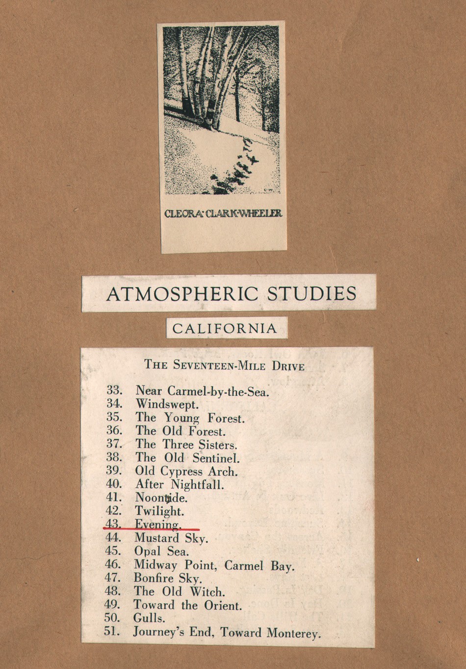 Detail: Frame verso: "Evening", by Cleora Clark Wheeler, American: 1882-1980. ca. 1922: 24.7 x 19.8 cm. The original series of framed photographs appearing in Wheeler's 1922 St. Paul photographic exhibition "Atmospheric Studies" (& also most likely the 1926 San Francisco Paul Elder exhibition) were each finished off on the frame verso with one of several trimmed and pasted book plates identifying Wheeler as author of the work seen at top. Below it is a pasted and engraved listing for photographs included in a separate subheading for the exhibition that were taken in a particular region. This example shows "Evening" held by this archive and listed as #43 in the overall exhibition under Monterey's famed Seventeen-Mile Drive subheading. From: PhotoSeed Archive
Further details are included about this book, illustrated by a photograph in the advertising section for the December issue of The Key:
Bound in two-tone blue cloth with gold stamping; page decorations and headings in gray-blue ink to harmonize. Sewed by hand. special attention being given to the reinforcement of the back by transverse tapes, and by stubs arranged to offset extra bulk of Kodak Prints and Clippings. In this way the book not only offers space for such additions, but also overcomes the possibility of having it stand open when only partially filled. Edition Limited to 250 copies. Price $1.50 net $1.65 by mail.
1914: This may have been the first year Wheeler undertook her series of Western U.S. photographs that would eventually appear in her 1922 St. Paul exhibit Atmospheric Studies, under the exhibition heading Out Where The West Begins : Colorado. Sometime in the Fall, Wheeler travels to Boulder as part of fraternity business as noted in the December issue of The Key:
“We were very glad to have Miss Cleora Wheeler with us for luncheon, on her way home from a visit with Beta Mu at Boulder. We enjoyed hearing of the rushing season there, and also the interesting convention news from Miss Wheeler and the five Sigma girls who attended.”
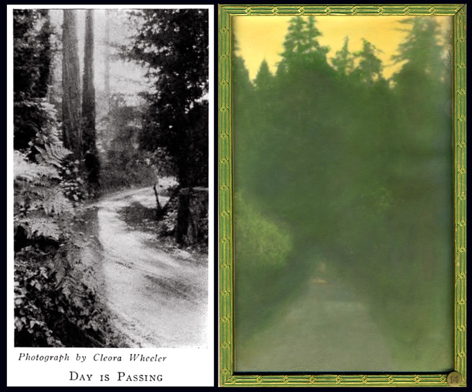 Two examples of photographs taken ca. 1914-1921 in the northern California Redwood region by Cleora Clark Wheeler were later first exhibited in her 1922 St. Paul, MN exhibition Atmospheric Studies. Listed under the subheading "At Call-Of-The-Wild, California", they are: Left: "Day Is Passing" (#19 in St. Paul): seen here as a halftone as it appeared in the February, 1926 issue of The Key. Right: "Sunshine Beyond" (#14 in St. Paul): ca. 1922: hand-colored gelatin silver exhibition print shows a roadway in the Sierra Mountains with a stand of Redwood trees in background all cast in a yellow glow. The effect was achieved with Japanese dyes. Courtesy: Grapefruit Moon Gallery auction listing, Minneapolis MN.
1915: Wheeler’s photographic skills come into play as she visits the U.S. states of Oklahoma, Kansas, Louisiana, Texas and Missouri while reporting on Kappa chapter houses for the article “Chapter Homes I Have Known”, accompanied by several halftones appearing in the December issue of The Key. (pp. 317-21)
⎯ The magazine cover design for The Key changes with the addition of a new hand-drawn crest (coat-of-arms) designed by recent Xi chapter graduate Ruth Anthony beginning with the May issue. This cover design was used through mid 1927 when it was replaced by a simplified navy blue crest against a gray background.
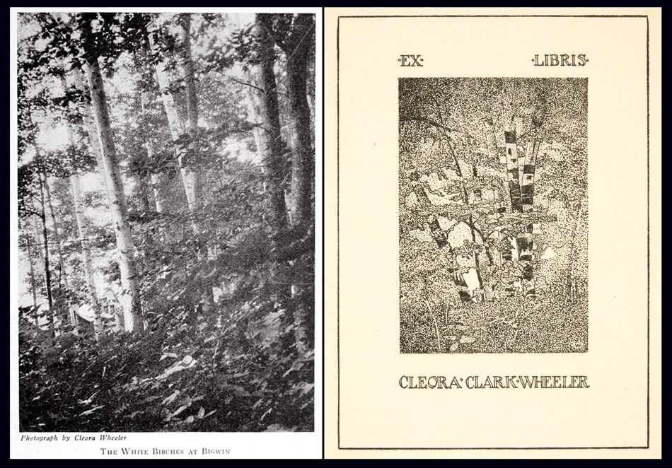 Several photographs by Cleora Clark Wheeler were most likely used as the basis for custom book plates engraved by the artist, as seen in this pairing. Left: "The White Birches At Bigwin" was a photograph taken in June, 1924 during the national Kappa Kappa Gamma convention held in Toronto, Canada at the Bigwin Inn and subsequently published as a halftone in the October, 1924 issue of fraternity quarterly, The Key. Right: "Ex Libris Cleora Clark Wheeler, by Cleora Clark Wheeler": This book plate drawn free-hand by the artist shows a similar grouping of White Birch trees. Examples of this book plate are known to have been pasted to the verso of more than one framed exhibition print included in Wheeler's 1922 exhibition Atmospheric Studies along with the additional designation of "California". This leads one to believe these frames were the ones shown in the 1926 Paul Elder Gallery exhibition in San Francisco. Courtesy: Helen Brainerd Lay Bookplate Collection, Mount Holyoke College Archives and Special Collections: Identifier: ms0048-s02-b02-f15-i029
1916: Wheeler expands her offering of Kappa designs in a full page advertisement for book plates, dinner cards, social stationary and other items appearing in the February issue of The Key.
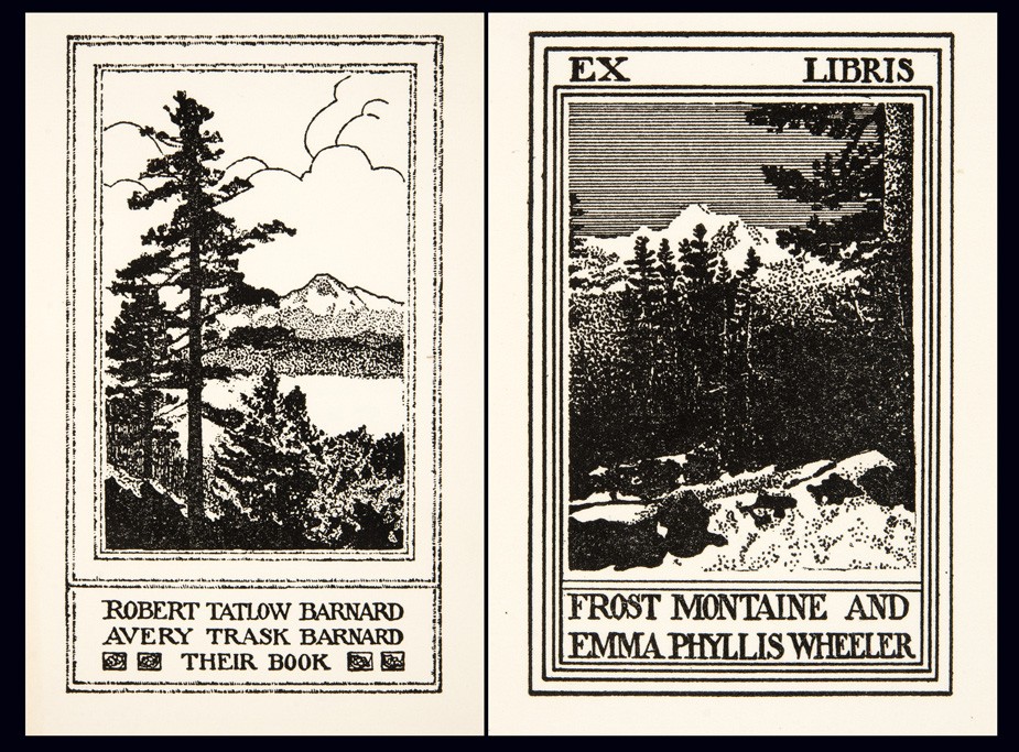 Believed to depict scenes in Colorado or California and may have been done from source photographs, examples of these bookplates by Cleora Clark Wheeler were exhibited at her 1922 St. Paul exhibition Atmospheric Studies. Left: "Robert Tatlow Barnard Avery Trask Barnard Their Book," by Cleora Clark Wheeler": ca. 1915-25. (Identifier ms0048-s02-b02-f15-i022). Right: "Ex Libris Frost Montaine and Emma Phyllis Wheeler," by Cleora Clark Wheeler": ca. 1915-25 (Identifier ms0048-s02-b02-f15-i021). Both courtesy Helen Brainerd Lay Bookplate Collection, Mount Holyoke College Archives and Special Collections.
1918: In May, Wheeler becomes Director for the newly formed St. Paul Vocational Bureau for Trained Women:
1015 Commerce Building, St. Paul
MISS CLEORA WHEELER, DIRECTOR
Backed by the Women’s College Clubs of the Twin Cities, a Bureau for Trained Women was opened in Minneapolis within the last six months. The original idea was to open a branch office in St. Paul, with Miss Cleora Wheeler of St. Paul in charge. It came to be realized, however, that the work in the two cities would be sufficient in importance and scope to warrant the opening of two independent bureaus, so on the morning of May 8 the St. Paul Vocational Bureau for Trained Women opened its office for business. It is conducted under the auspices of the St. Paul College Club, the Vocational Committee assuming the responsibility of its organization and management, while Miss Wheeler is in charge as director.
Miss Wheeler was for five years chairman of the Vocational section of the St. Paul Association of Collegiate Alumnae, and served on the Board of Directors of the Minneapolis bureau during its organization period and until joining their salaried staff as temporary assistant. She was their representative at the February convention of the Association for the Promotion of Industrial and Vocational Education in Philadelphia; and visited the Collegiate bureaus of Philadelphia, New York, Boston, Detroit and Chicago. She also visited the headquarters of Women’s Work in Washington that the St. Paul office might fully cooperate with them and with the government.
The St. Paul bureau is particularly fortunate in securing office accommodations with the Ramsey County Women’s War Organization, and it is fully expected that this arrangement will prove mutually beneficial. (2.)
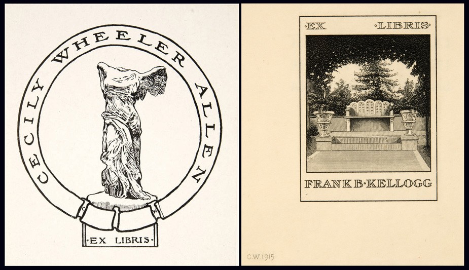 Examples of bookplates by Wheeler: Left: "Cecily Wheeler Allen Ex Libris, by Cleora Clark Wheeler" : ca. 1930-40. (Identifier ms0048-s02-b02-f15-i045). Right: "Ex Libris Frank B. Kellogg," by Cleora Clark Wheeler": 1915. This bookplate was shown at the artist's1922 St. Paul exhibition Atmospheric Studies. (Identifier ms0048-s02-b02-f15-i020). Both courtesy Helen Brainerd Lay Bookplate Collection, Mount Holyoke College Archives and Special Collections.
⎯ First publicized notice of Christmas cards designed by Wheeler appear in the February issue of The Key. They are sold to raise money for French orphans impacted by WWI: “Epsilon made twenty dollars for the French children by selling the Christmas cards designed by Cleora Wheeler.” (p. 56)
1921: Accompanied by a reflective portrait of the artist, the December issue of The Key publishes a lengthy professional background story on her:
Cleora Wheeler’s first work with the Young Women’s Christian Association was in California. Soon after her graduation from the University of Minnesota she was asked by Miss Louise Brooks of New York, national secretary of conventions and conferences, to be her assistant at the student conference at Capitola, Cal. Soon after this she was elected business secretary of the St. Paul Association which was just organizing.
In a city association the business secretary banks the money, issues the membership cards, registers the gymnasium and educational classes, inspects rooming houses, acts as hostess, and audits the money if the association raises $250,000 in a whirlwind campaign for a new building. After helping in this way in her own city for two years, Miss Wheeler did county organization work under the state committee, assisting in the organizing of Mower County, Minn., the third county to be organized in the United States. It meant riding on freight trains to little towns throughout the county, arranging mass meetings and then lecture places for the state nurse, domestic science teacher, and sewing teacher who were sent down by the Agricultural Department of the university to give a ten-weeks’ course of lectures, the university collaborating in extension work with the association.
The next year under the National Board of the Young Women’s Christian Association Miss Wheeler was one of the two business managers of the student and city conferences at Lake Geneva. The national bookplate of the association used in all of the books at the National Training School, and in association libraries throughout the country is designed by Miss Wheeler. (p. 292)
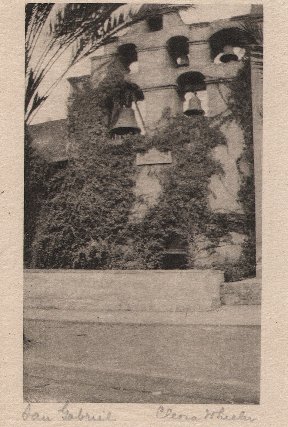 "San Gabriel": Cleora Clark Wheeler, American-1882-1980: ca. 1922: hand-pulled Japan-tissue photogravure: 10.5 x 6.3 | 21.0 x 15.2 Gampi | 24.2 x 38.0 off-white handmade paper (folded) | 33.0 x 25.0 cm olive-colored cardstock leaf. In California, the famous bell wall at the San Gabriel Spanish Mission is seen in this pictorial view by Wheeler. The California Missions Resource Center states: "Six bells occupy an espadaña or bell wall. The oldest bells were cast in Mexico City in 1795 by the famous bell maker, Paul Ruelas. The largest bell (dated 1830) weighs over a ton and was used for over a century to ring the Angelus, a prayer said at morning, noon, and evening in commemoration of the Incarnation." From: PhotoSeed Archive
1922: The May 20th issue of American Art News prints a notice of Wheeler’s exhibition Atmospheric Studies:
“A collection of more than eighty prints of western scenes by Miss Cleora Wheeler, St. Paul artist, have been on exhibition at the St. Paul Public Library. They show a wide range of color and subject matter, and were done on trips which extended from the eastern reaches of the Rockies through the mountains and as far south as the Mexican border of California. -G.E.P.” (p. 7)
⎯ In June, the artist’s first known public exhibition of hand-colored pictorial photographs as well as a smaller series of original bookplates takes place from June 1-15 at the Saint Paul Public Library under the auspices of the Saint Paul Institute. A slim eight-page exhibition brochure is printed listing the following sub-headings for the 76 exhibited photographs:
Out Where The West Begins : Colorado; California: At Call-Of-The-Wild, California; Pacific Grove; California: The Seventeen-Mile Drive; Santa Barbara; Farther South; La Jolla; Old Town; San Diego; Minnesota: Senator Kellog’s Garden, St. Paul & White Bear Lake. A separate section for 14 original bookplates is also listed, and the entire list with all titles can be found on this website at a link featuring the original framed exhibition print Evening.
Some of the work for the exhibit was for sale, and a price list was printed on the last page of the brochure:
PRICE LIST
The prints in this exhibition are not for sale.
Duplicates can be ordered as follows:
SEPIA PRINTS
Large size, mounted as shown………$10.00
Smaller size, mounted as shown……..7.50
COLORED PRINTS
No. 34 ……………………………….$12.50
No. 40 ……………………………….. 20.00
No. 43 …………………………………10.00
All others …………………………….7.50
These prices include frames.
MINIATURE PRINTS
Made by hand from copper plates.
See sample book at desk.
Prints on Japanese tissue ……$1.00
No. 50, No. 60, No. 63, colored ink, with
envelope …………………………… .50
Folders tinted to order, with envelope $.40 and .50
Same without tinting ………… .15
Card without tinting …………. .10
CHRISTMAS CARDS
See sample books at desk.
Folders with Christmas wording.
Per 100 ………………………………$35.00 to $50.00
These may be ordered for fall delivery.
BOOKPLATE PRICES
Design ………………………………$25.00 up
Metal plate and prints are extra, cost depend-
ing on material. Allow six months for book-
plate orders. Estimates given.
1376 Summit Avenue Midway 0234
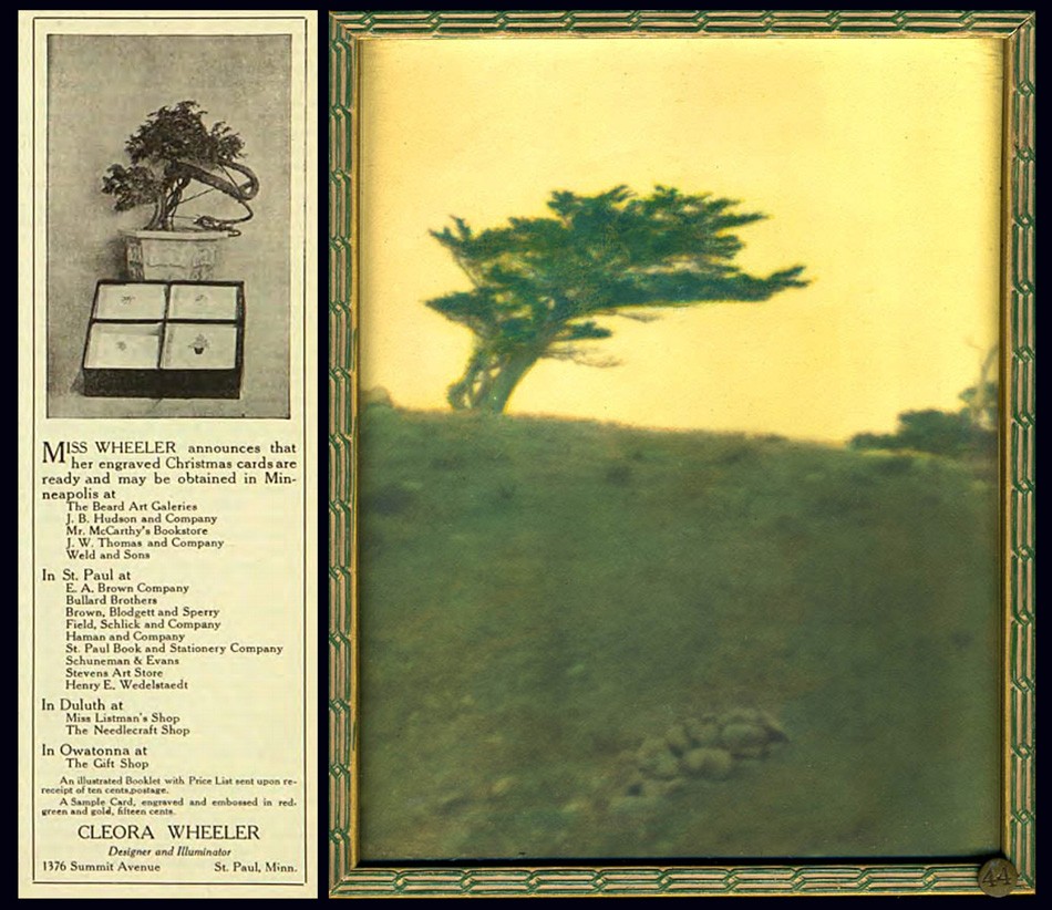 Left: Custom designed Christmas cards were a staple source of income for artist Cleora Wheeler as well as an important fund raiser for her fraternity. She produced them as early as 1915, when an advertisement similar to this one featuring a potted Bonsai tree was photographed alongside a box of cards featuring four different designs ran her Minnesota Alumni Weekly, (this ad from Dec. 1916) until the 1960's, when the cover of the December, 1963 issue of The Pen Woman magazine showcased card designs of Twin City churches. A 1944 article in the St. Cloud Daily Times newspaper of MN remarked: "Miss Wheeler has received nationwide recognition for her Christmas cards, hand-printed photogravures and hand stamped cards bearing her designs" Right: The Japanese inspired sensibility of Wheeler's design aesthetic can be seen carried over in this photographic landscape taken along California's Monterey coastline. In "Mustard Sky", a lone Cypress tree is shown atop an seaside ridge. This original hand-colored framed exhibition photograph was featured in her 1922 St. Paul, MN exhibition Atmospheric Studies, listed as #44 under the subheading "The Seventeen-Mile Drive". Courtesy: Grapefruit Moon Gallery auction listing, Minneapolis MN.
1924: In June, at the national Kappa convention held in Toronto, Canada at the Bigwin Inn, Wheeler makes 19 hand-cut silhouettes from black paper used as part of the Historical Pageant. The works were later reproduced in the October issue of The Key that year. (shown on pp. 250-253) Soon, Wheeler would take on the art of silhouette portraiture by means of photography. Additionally, a pictorial portrait of Kappa president May Whiting Westerman and Georgia Hayden Lloyd Jones, National Director of Provinces, appeared as a full page halftone in the issue and another pictorial photographic landscape: The White Birches of Bigwin, appeared on pages 248 and 255 respectively.
1925: Several California pictorial photographic works are published as halftones in the October issue of The Key with the following titles:
- Call-of-the-Wild, California
- San Juan Capistrano Mission-between Los Angeles and San Diego, California
 Left: Although Cleora Wheeler never held editorial positions for The Key, the quarterly magazine of Kappa Kappa Gamma, it featured notices of her progress as an artist, support of the fraternity's mission nationally via her election to various Kappa positions, including Grand Registrar in 1904 and Custodian of the Badge in 1911, and as a continual mouthpiece for advertisements in its' rear pages featuring original artwork for sale. This issue shows a new cover design which debuted in May, 1915 featuring a new crest (coat-of-arms) designed by recent Xi chapter graduate Ruth Anthony. Right: One large advertisement appearing in the October, 1930 issue of The Key showcased no less than 18 individual Kappa designs by Cleora Wheeler made into steel dies. These were used to emboss custom orders of stationary, all from the third floor studio of her St. Paul, MN home.
⎯ Three further California images appear in the December issue of The Key promoting the national convention that would be held at Mills College outside Oakland, CA the following summer. The frontis photograph for the issue featured a view of a lone cypress tree that had become Wheeler’s signature California image known as “Near Monterey” taken along the Seventeen Mile Drive and was darkened and hand-colored with a star placed in the sky and re-titled “Evening”.
The article published on pages 415-17 of the issue is titled:
An Invitation To California
“The California chapters together with all Kappa alumnae in this western province unite in inviting every Kappa, young and old, to come to convention in California during the first week of August in 1926.” …The convention will be held at Mills College, in the suburbs of Oakland, across the bay from San Francisco.”
The two additional halftones are titled:
- At the Beginning of The Seventeen Mile Drive
- The Cloister Stairway, San Gabriel Mission
 Left: "The Wraith": Cleora Clark Wheeler, American:1882-1980. Sepia gelatin silver print, ca. 1922. Courtesy: Grapefruit Moon Gallery auction listing, Minneapolis MN. Right: 'The Wraith": Hand-pulled Japan-tissue photogravure ca. 1922: 10.1 x 7.8 | 20.7 x 14.9 Gampi | 24.8 x 38.0 off-white handmade paper (folded) | 33.0 x 25.0 cm olive-colored cardstock leaf. Cypress trees, one living and the other dead, stand sentinel among a rock outcropping, with the Pacific Ocean beyond. The landscape was photographed by Wheeler along the famed Seventeen Mile Drive on the Monterey, California coastline. From: PhotoSeed Archive
1925: Working out of her St. Paul home, Wheeler produced an unknown number of original artworks for the Buzza Company of Minneapolis in this year or before, with lithographed motto art being a specialty. (see example pulled from the web along with this post) Minnesota Historical Society author Moira F. Harris comments on the artist’s working methods:
Her studio was on the third floor of the family home at 1376 Summit Avenue. There she designed and engraved the plates for her cards and bookplates. Some cards she printed herself on a hand press, while others were printed on handmade paper by Brown & Bigelow and sold through the St. Paul Book & Stationery firm. (3.)
The Hennepin History Museum in Minneapolis, MN supplied this short overview of the Buzza Company as part of their 2016 exhibit “Greetings”:
A History of the Buzza Company
During its prime, the Minneapolis-based Buzza Company (1907-1942) was one of the nation’s largest manufacturers of greeting cards, framed mottos, gift books, and party stationery. GREETINGS tells the story of the company’s rise and fall, its larger-than-life founder, and the hundreds of artists, poets, printers, and others who produced, sold, and shipped many millions of items from the company’s Lake Street headquarters each year. (George Earl Buzza: 1883-1957)
 Around 1925 or before, Cleora Wheeler created original artwork like this example for the Minneapolis-based Buzza Company, which between 1907-1942 was one of the nation's largest manufacturers of greeting cards, framed mottos, gift books, and party stationery. This framed motto print made into a chromolithograph posted to Pinterest bears a 1925 Buzza copyright ("WHEELER" printed in lower left corner of artwork) and is titled "A Friend Like You": optimistic lines penned by the English-born American poet Edgar Albert Guest: 1881-1959.
1926: Interestingly, a review of Wheelers 1922 exhibit Atmospheric Studies is published nearly four years later in the February issue of The Key, with insight stating the artist had “tramped the California mountains” “for two successive summers” to produce the views. This may indicate the entire body of California work was taken ca. 1920-21, as it’s known she made a Santa Barbara landscape dated 1921. The issue features a commercial portrait of Wheeler to accompany the article. Four additional halftones of California landscapes are further reproduced in the issue.
California Photographs by Kappa Artist
THE California photographs by Cleora Wheeler which are appearing in these issues of THE KEY are reproductions of a part of an exhibit of seventy or more prints in colors which were recently hung in the art gallery of the beautiful public library of St. Paul, under the auspices of the St. Paul Institute. This constituted the only exhibition during the year which filled this large gallery with the work of one person. The pictures are being reproduced for the first time in THE KEY, and as they are part of a professional record they bear the name of the member who made them. Miss Wheeler thinks of California as her second home, as she spent a year with Pi after graduating at Minnesota. For two successive summers she has tramped the California mountains, and as a result has produced the pictures which you are now enjoying at the request of Mrs. Westermann, and of which Arthur L. Wilhelm, the art critic, wrote the following:
UNUSUAL QUALITIES ARE DISPLAYED IN WORK OF MISS
CLEORA WHEELER; SUBJECT MATTER SELECTED
WITH VIEW OF UNUSUAL
BY ARTHUR L. WILHELM
There is on exhibition at the St. Paul Public library this week a collection of colored California prints by Cleora Wheeler, St. Paul artist and etcher. The St. Paul Institute is sponsoring the exhibit. In the collection of more than eighty prints are many that have unusual qualities. All are atmospheric studies and are colored, many of them with fine Japanese dyes, giving a wide color range and depth. Miss Wheeler has grasped the fine essentials of design in many of her studies. Many simple little prints take on glowing beauty under the touch of her brush. The subject matter is carefully selected with a· view of the unusual. Here, in one print, one sees a fine flowing rhythm. Again one feels the structure of design carried out to a fine point. Again there is quality of the color that charms. Always there is something unusual to attract.
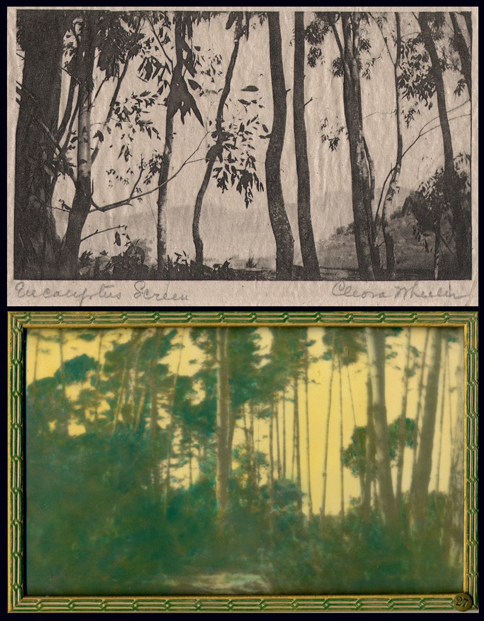 Top: "Eucalyptus Screen": Cleora Clark Wheeler, American: 1882-1980. Hand-pulled Japan-tissue photogravure ca. 1922: 6.3 x 10.5 cm | 14.9 x 20.4 Gampi | 38.0 x 24.5 cm off-white handmade paper (folded) | 33.0 x 25.0 cm olive-colored cardstock leaf. From: PhotoSeed Archive. Bottom: "A Forest Screen": ca. 1922: Cleora Clark Wheeler: hand-colored gelatin silver exhibition print from the artist's 1922 St. Paul exhibition Atmospheric Studies. "Screen-type" photographic landscapes by Wheeler show up frequently in her California work, with the latter print (#27 St. Paul) taken in the Pacific Grove region near Monterey and gravure believed to be from Santa Barbara. Courtesy: Grapefruit Moon Gallery auction listing, Minneapolis MN.
COLORADO-CALIFORNIA
Miss Wheeler has arranged the prints so that one follows her in her journey to the West, where the pictures were taken. First we see eight prints from Colorado, the first rampart range of the Rockies, a field of wild sunflowers with a great up-thrust of rock in the background, and others. Then we have what she terms the “Call of the Wild,” with a score of prints taken at random along the coast and in the big woods of the Sierras. There are many pictures that are romantic in feeling and others that have a rich poetic sentiment. The colors are soft and glowing or in the nocturnes are dimmed by the blue of night. There are ten prints taken at Pacific Grove which· include pictures of the woods and sea, pictures with the fog stealing in, and prints tinged with the sunset glow.
DRIVE PICTURES THE BEST
Perhaps the most charming group of the exhibition is that taken on the famous seventeen-mile drive at Monterey. Here the old cypresses are shown with all their varied forms. Also the rocks and the sea are most charmingly depicted. There are pictures of young eucalyptus groves with a bit of flaming sky showing through the foliage. One print, “The Old Witch,” is a portrait of a famous old tree which is known to the thousands of tourists who have made the trip. There is a group of prints from Santa Barbara and several from points farther South. The exhibition is enhanced by an oil painting, a landscape done by the mother of the artist, which has a fine feeling of harmony and color. The entire exhibition is both unusual and charming. (pp. 27-8)
1926: July. Fifteen silhouettes, this time by means of photography, are taken by Wheeler of Kappa members taking part in the Historical Pageant held as part of the California annual convention at Mills College. In addition, she takes scores of additional silhouettes of those attending the convention itself on banquet day. The silhouette photos of the pageant members are published in the October issue of The Key.
 These two sets of photographic silhouette portraits taken by Cleora Wheeler were done in July, 1926 as part of the Historical Pageant held during the annual Kappa Kappa Gamma national convention at Mills College outside Oakland, California. The studies here reproduced as halftones were published in the October issue of The Key. "So far as I was able to find out, this was the first time the Oakland, Berkeley or San Francisco photographers had seen the experiment of silhouettes by this method, and they were interested" said Wheeler, in the article titled "Say It With Flowers … . Do It With Dishpans" published in the December, 1926 issue of The Key. Kappa chapter members were credited in the publication but in an unknown order. The first four are at left followed by 5-8 at right: 1. Loretta Shea of Lambda as "Alpha, 1870." 2. Mabel Paul, as "Beta Nu, 1888." 3. Beatrice Peters, as "Beta Omega, 1913." 4. Dorothy Fulton, as "Gamma Alpha, 1916." 5. Dorothy Lewis, as "Beta Rho, 1885, 1914." 6. Thelma Scheider, as "Beta Tau, 1883." 7. Martha Bordwell, as "Gamma Rho, 1888." 8. Abigail Semans, as "Rho, 1880, 1925."
⎯ November. Calling Wheeler “a painter turned photographer”, partly referencing her motto work for the Buzza Company, an exhibition of her photographs-likely re-purposed from the 1922 Atmospheric Studies exhibition, are shown at Paul Elder & Company, a San Francisco bookseller & publisher. (1898-1968) The following notice for the show appeared in Bret Harte’s Overland Monthly and Out West Magazine that month:
A painter turned photographer will occupy the attention of the visitors at the Paul Elder Gallery October 25 to November 6. Miss Cleora Clark Wheeler, of St. Paul, Minnesota, gained a reputation as a painter before she took up photography as her medium. As a result, her prints have a feeling of conscious design and a quality of painting. Those exhibited at Paul Elder’s will be some of her atmospheric studies of California scenes and a group of miniature prints from copper plates.
⎯ December. In The Key, the artist describes how she made the silhouettes that year:
Say It With Flowers … . Do It With Dishpans
CLEORA WHEELER
So Many persons have been interested to know how the silhouettes which I made in California last summer were done, that 1 am very glad to tell. It was with two huge electric lights of a thousand watts each, set into two deep dishpans. After the dishpans had been located at a hardware store, and the sockets soldered into place, they were nailed to the top of two of Mother’s two-by-four tomato supports which I took to convention in my trunk. They in turn were nailed at base of two wooden boxes which the janitor at Olney Hall found for me, and before the lights were put into the sockets Mr. Gibson the head electrician at Mills College made some special fuses of thirty amperes each, one of which was installed in the switchboard where the electric wiring from the room ended. Without these special fuses not only all the lights at that end of Olney Hall, but the big lamps themselves would have gone out as soon as lighted. He even provided some fuses of forty amperes each, to be kept on hand for emergency, in case the big lamps should suddenly stop.
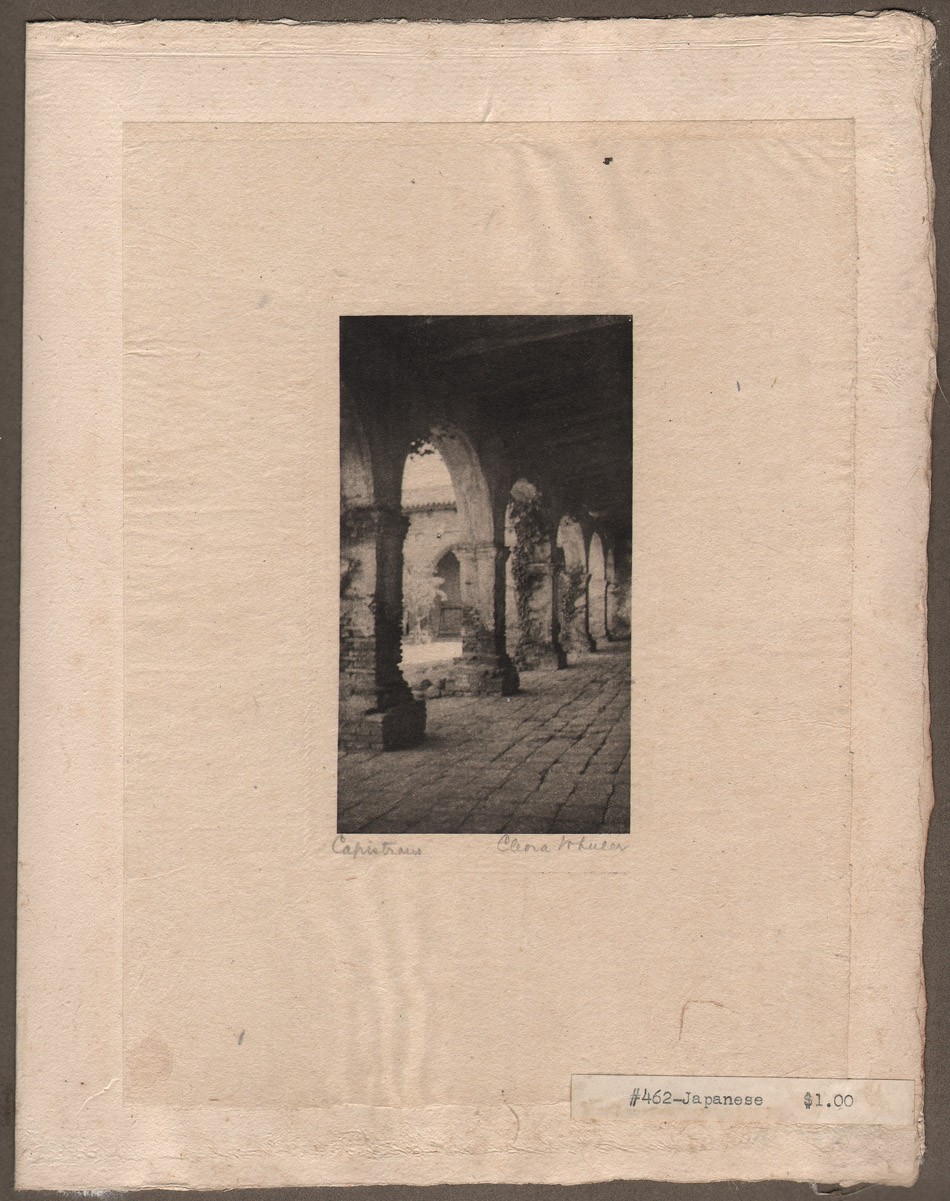 Arts & fine craftsmanship were integral to Cleora Wheeler's working methods, as evidenced by this representative leaf included in a California sample book she made featuring 23 hand-pulled, Japan-tissue photogravures individually mounted on hand-made paper contained within the ca. 1922 folio posted to PhotoSeed. This photograph is titled "Capistrano". Image and overall dimensions: 10.8 x 6.1 | 20.5 x 15.2 Gampi | 24.9 x 38.0 off-white handmade paper (folded) | 33.0 x 25.0 cm olive-colored cardstock leaf. The architectural study of archways was taken along the southern cloisters at the Capistrano Mission. From the missions online resource: "Mission San Juan Capistrano, became the seventh of twenty-one missions to be founded in Alta California. Like the previous six missions, San Juan Capistrano was established to expand the territorial boundaries of Spain, and to spread Christianity to the Native peoples of California." From: PhotoSeed Archive
A huge sheet was stretched across one end of the room, the two lights were focused on its center, from the front, and the person who was to have her silhouette, sat in the shadow between the lamps and the camera. The stool she sat upon was set upon a certain square, chalked upon the floor. The camera tripod stood on a triangle also chalked upon the floor as they had to be an exact number of inches apart. The camera was equipped with a special portrait lens which can be bought at any camera store for a dollar or two and added to the front of a camera lens. Regulation roll film was used which was very quick to operate. As a result the silhouettes were taken at the rate of two seconds each.
In order that there might be no reflection from walls, on the side of the person next the camera, black cloth was hung on one wall and an Oxford gown was hung over the looking glass on the other. Black oilcloth was fastened over the glass of the door leading into the hall, and over the transom above, so that no light from the hall lamps might enter. The girls lined up outside the door evenings, registered by number and the films were marked with the same numbers. · In that way each received her own negative and print in the end.
The developing solution was a special one, a formula which I brought with me. The photographer who prepared it for me on the coast had none of one of the ingredients. When it was located and added, it ate up the first roll of films, then when used one-tenth the strength, it blistered the second roll. After eight hours of experimenting in the darkroom I emerged with the mystery solved, and from that time on the negatives went through like magic. So far as I was able to find out, this was the first time the Oakland, Berkeley or San Francisco photographers had seen the experiment of silhouettes by this method, and they were interested. But they didn’t know what in the world to do when that first film was eaten up.
The silhouettes of Ruth Rochford (Mrs. George W. Schmitz of Berkeley) and her children were made by a reverse method, using the light back of the sheet, and directly back of the figure, the figure being the only thing to prevent its shining into the lens of the camera. The sheet was a piece of architect’s tracing paper, this time, wide enough and long enough to fasten over the entire area of an open doorway. Tracing paper (not tracing cloth) gives a more satisfactory light than a sheet. It is almost transparent and the light is suffused around the figure. Only one light could be used by this method, and as the amount was therefore cut in two, the length of exposure was necessarily to be doubled. It is impossible to expect a little child of two and a half years, as the youngest was here, to sit still more than one second, surely not four seconds. So a graflex camera was used as it has a very fast lens. The exposures were one second.
Frances Murphy of the Oklahoma chapter, whose silhouette appears at the top of the page, was the first delegate to brave the array of dishpans. Dozens followed her, and anyone who saw the interested crowd getting their pictures on banquet night just before we all parted, will be sure it proved there is a way to have one’s picture taken without having one’s head turned.
 Left: This commercial portrait of Cleora Wheeler dates to the mid 1920's. A cropped variant accompanied a review published on her California photographs in the February, 1926 issue of The Key written years earlier by Arthur L. Wilhelm on her 1922 St. Paul exhibition Atmospheric Studies. An excerpt: "There are many pictures that are romantic in feeling and others that have a rich poetic sentiment. The colors are soft and glowing or in the nocturnes are dimmed by the blue of night." Photographic halftone courtesy: Helen Brainerd Lay Bookplate Collection, Mount Holyoke College Archives and Special Collections: Identifier: ms0048-s02-b02-f15-i010. Middle: Variations of this single advertisement for products bearing designs by Wheeler: letter stationary, place cards and matching envelopes among other things, illustrated with a small photographic halftone of the artist working at an embossing machine inside her St. Paul home studio, continued to appear with regularity in the back pages of the Kappa quarterly, The Key. Right: At 95 years of age, Cleora Wheeler was still very active in her Kappa Kappa Gamma fraternity. Here she is seen looking at a Ritual volume during an annual convention display. The original caption in the Fall, 1977 issue of The Key pointing out "that the cover had been hand-made by her!".
1932: A historian at heart, Wheeler writes the chapter on Kappa insignia and compiles extensive illustrations included in the weighty volume: The History of Kappa Kappa Gamma Fraternity, 1870-1930 published this year.
1930-1940’s: Advertisements for products bearing designs by Wheeler: book plates, stationary, etc, continue to appear with regularity in the back pages of the Kappa quarterly, The Key.
1952: The artist receives Kappa’s Alumnae Achievement Award, with the following notice appearring in the October issue of The Key:
Cleora Clark Wheeler, former grand registrar and custodian of the badge for the Fraternity, also prepared the text and illustrations on insignia which appears in the History of Kappa Kappa Gamma. Miss Wheeler is listed in Who’s Who in America and also in Who’s Who in American Art. She has recently served as national chairman of design for the National League of American Pen Women and holds certificates of proficiency in engineering drafting and advanced engineering drafting from the University of Minnesota. As a designer and illuminator of books and other publications, Miss Wheeler has gained national recognition. Her bookplate designs are represented in many collections. Of her work Miss Wheeler says: “The public seems to be especially interested in the fact that I learned’ the trade of steel-die stamping. It is a highly specialized field in the factories of wholesale stationery companies. It usually takes a girl nine years, stamping 1000 impressions a day by hand, to become an expert.” (p. 244)
1967: The following article published in the Mid-Winter issue of The Key gives a good overview of Cleora Wheeler’s accomplishments later in life:
CLEORA WHEELER, X-Minnesota, is one of America’s most distinguished artists in the rare field of illumination and etching. Forty three of her exquisitely fine drawings prepared as steel engravings, copper intaglio plates, and etchings on zinc and copper are on file in the Library of Congress, and in 28 university, historical and city libraries. She is listed in Who’s Who of American Women, Who’s Who in America, Who’s Who in American Art, and Who’s Who in the MidWest.
She has long made book plates, plaques, dedicatory scrolls, and coats-of-arms for New York firms, on special order for customers so discriminating they realize the surpassing quality of her workmanship. She is an honored member of the National League of American Pen Women, serving as national chairman of design (1944-46), of Heraldic Art (1954-56), and of Inscriptions, Illumination and Heraldic Art (1964-66). The work of the print maker is a dedicated one, and Miss Wheeler has experimented with the quiet and esoteric medium (as did Durer and Rembrandt) until her form of expression is close to perfection. In 1960 she went to Santa Barbara to extract the secrets of an early artist named Monsen, who washed glass slides with purple color, using other colors on top, to bring out rich values of greens in mountain landscapes. Miss Wheeler does many fraternity designs, seals, book covers, and Christmas cards. Her work requires space, and the entire third floor of her home is her shop, with the basement used for storing supplies.
1950-1977: A single advertisement for products bearing designs by Wheeler: letter stationary, place cards and matching envelopes among other things, illustrated with a small photographic halftone of the artist working at an embossing machine inside her St. Paul home studio, continue to appear with regularity in the back pages of the Kappa quarterly, The Key.
1980: Wheeler dies. Her obituary appears in the Spring issue of The Key:
Cleora Wheeler Dies
Kappa records with sorrow the death of Cleora Clark Wheeler, Minnesota, at age 97. She died of pneumonia February 24, 1980. Her BA in engineering and engraving was from Minnesota and she studied color harmony at New York School of Fine and Applied Art now Parsons School of Art) and is listed in Who’s Who of American Women. She began her career as a designer of Christmas cards and illuminator of books and publications. Her bookplates are on file in Paris, the Library of Congress and in 30 other libraries. They were exhibited at the Smithsonian Institution from 1946-1964 and at the International Ex Libris Association of Congress, Elsinore, Denmark, in 1972. Miss Wheeler received numerous awards for her work and served as president, chairwoman and judge of several national art associations. She was a member of the National Society of Magna Charta Dames, a past president of the Minnesota branch of the National League of American Pen Women, a member of the International Bookplate Association, held various offices in the Daughters of the American Revolution and was a life member of the American Association of University Women. Born July 8, 1882, Cleora Wheeler was initiated October 9, 1899 and served Kappa her entire life. She was an active delegate to the 1902 convention and an alumnae delegate to the 1908 convention. She was Grand Registrar of the Fraternity 1904-1906 and Custodian of the Badge 1911-1918. She received Kappa’s Achievement Award in 1952 and was the recipient of her 75 year pin.
Addendum: Wheeler family History
Described as “one of the best preserved upper-class Victorian promenade boulevards in America”, the homes along Summit Avenue in St. Paul, Minnesota- including one owned by Cleora Clark Wheeler at 1376 Summit Ave. where she maintained her studio for decades, were individually described for their architectural significance as part of the 2003 online posting: Thursday Night Hikes: Western Summit Avenue Hike Architecture Notes, Part 2.
Significant biographical background for Clark, her mother, father and extended family are included with the summary. It was compiled from public sources as well as from the University of Minnesota, Northwest Architectural Archives by historian Lawrence A. Martin. The following is his summary. I have only confirmed and filled in several birth and death dates for Cleora’s mother and father that were missing and added a few paragraph breaks for purposes of style:
1376 Summit Avenue: Rush B. Wheeler House; Built in 1909 (Ramsey County property tax records and Sandeen; 1909-1910 according to Larson;) Early Modern Rectilinear in style; Clarence H. Johnston, Sr., architect.
The structure is a two story, 2496 square foot, eight room, five bedroom, two bathroom, one half-bathroom, stucco house, with a detached garage. The house was constructed at a cost of $5,500 (Sandeen; $6,000 according to Larson.) In 1916, Rush B. Wheeler was a member of the Minnesota Historical Society and resided at this address. The 1918 and 1924 city directories indicate that Mr. and Mrs. R. B. Wheeler and their daughter resided at this address. The 1930 city directory indicates that Mrs. Harriet S. Wheeler, the widow of Rush B. Wheeler, resided at this address. In 1934, Harriet Clark Wheeler, the widow of Rush Wheeler, and Cleora Clark Wheeler resided at this address.
Rush B. Wheeler (1844-1930,) the son of Orange H. Wheeler and Eve Tucker Wheeler, was born in South Butler, Wayne County, New York, graduated from the Cazenovia Seminary in New York in 1867, was a graduate of Yale University in 1871, moved to Minnesota in 1873, resided in Austin, Minnesota, from 1873 until 1888, read the law in 1876, was a member of the board of directors of the First National Bank of Austin, Minnesota, from 1880 until 1883, moved to St. Paul in 1883, practiced law, was engaged in real estate and loans, was a member of the St. Paul Chamber of Commerce from 1885 until 1900, was president of the Real Estate Exchange of St. Paul from 1894 until 1896, resided at 520 Summit Avenue in 1907, and officed at the Pioneer Press Building in 1907.
Rush Wheeler married Harriet S. L. Clark in 1876. Harriet Clark Wheeler was a graduate of the University of Minnesota. Harriet Clark Wheeler and Cleora Clark Wheeler were members of the American Association of University Women and the Women’s City Club of St. Paul.
Cleora Clark Wheeler (1882-1980) was born in Austin, Minnesota, graduated with honors from St. Paul Central High School and from the University of Minnesota, received art training at the New York School of Fine and Applied Art/Parsons School of Art, opened a studio at this address, was a renowned artist, a designer, and an illuminator of books and other publications who received certificates of proficiency in advanced engineering drafting from the University of Minnesota, was a well-known bookplate and Christmas card designer, was also an architectural photographer and poet, was a wedding invitation designer, and was an expert in steel-die stamping with widespread recognition.
Cleora Clark Wheeler received an Alumnae Achievement Award from the Kappa Kappa Gamma Fraternity in 1952, after she served as the Fraternity’s Grand Registrar from 1904 to 1906 and as its representative to National Panhellenic Conference from 1905 to 1906, after she prepared a Song Leaflet and Manual of Information for distribution at the 1914 Estes Park Convention, after she attended the Fourth Inter-Sorority Conference in Chicago, where she was instrumental in bringing about the decision that the fraternities had the power of vote on recommendations only, not the power to legislate and hold their entire membership to rules passed by single representatives, after she served for seven years as the Fraternity’s Custodian of the Badge, after she prepared the text and illustrations on insignia which appeared in the 1930 History of Kappa Kappa Gamma, and after she created an official bookplate of the Fraternity.
Cleora Clark Wheeler was a member of the National Society Magna Charta Dames and Barons, whose membership is based upon the existence of a direct lineal descent from one or more of the twenty-five Sureties for the Magna Charta or from a Baron, Prelate, Knight, or other influential person present on the field of Runnemede, England, in June, 1215, was a judge for national achievement awards and was National Chairman of Heraldic Art of the National League of American Pen Women, and was state curator of the Nathan Hale chapter of the Minnesota Daughters of the American Revolution.
Cleora Wheeler also was a substitute teacher in the St. Paul Public Schools. Cleora Wheeler had an exhibition of her bookplate work, entitled “Atmospheric studies,” at the St. Paul Public Library in 1922, under the auspices of the Saint Paul Institute. Cleora Clark Wheeler was a niece of Charles A. Clark (1865-1929,) who was a Spanish-American War veteran and was a resident of the Far East. Clark airfield in Honolulu, Hawaii, was named for Clark’s son, Harold Melville Clark (1890-1919,) who died in a airplane crash. Rush B. Wheeler (1844 -1930) and Harriet S. Wheeler (1853-1938) both died in Ramsey County. Cleora Clark Wheeler (1882-1980) was born in Minnesota, had a mother with a maiden name of Clark, and died in Ramsey County. (current owner information as of 2003 was also included but has been left out here) (4.)
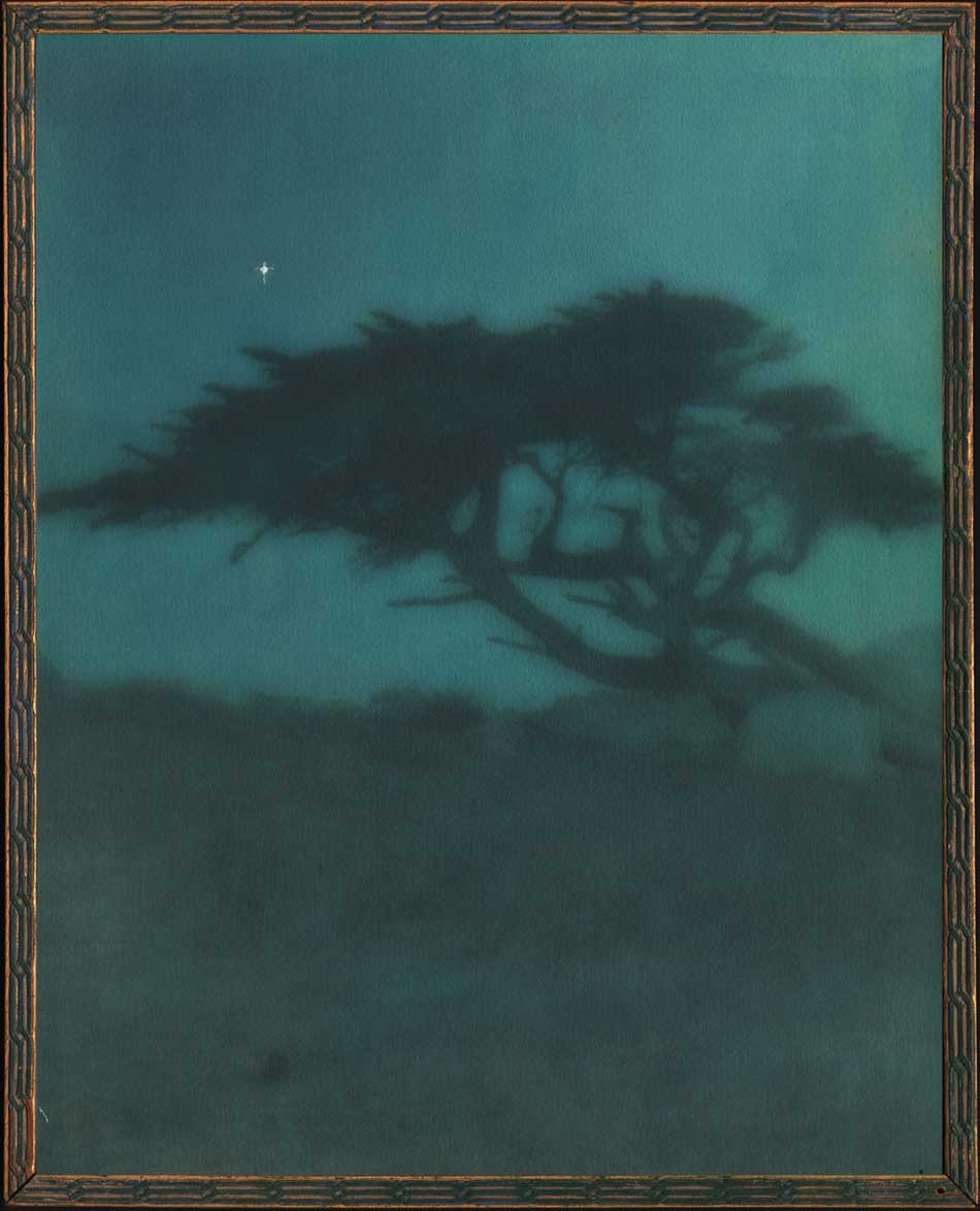 "Evening": Cleora Clark Wheeler, American: 1882-1980. Hand-colored gelatin silver print ca. 1922: image: 23.6 x 19.8 cm; frame: 24.7 x 19.8 cm: Believed to have been taken around 1920, the medium of fine Japanese dyes in hues of blue, green and yellow were used to color this double-weight, rough surface print, the view originally taken in daylight but manipulated as a much darker print in the artist's darkroom with the addition of a lone “twinkling” star added to the "night" sky. The variant daylight version is titled "Near Monterey", and a photogravure version pulled on Japanese tissue can be seen on this website. "Evening" was catalogued as #43, appearing under the sub-heading The Seventeen-Mile Drive as part of the artist's 1922 exhibit Atmospheric Studies: An Exhibition of the Work of Cleora Clark Wheeler, June 1-15, 1922. From: PhotoSeed Archive
Notes:
1. “All About the Fraternity Coat-of-Arms”, Excerpt from January 2006 Historically Speaking, by Kay Smith Larson, Washington, History Chairman 2002-2006, excerpted in This is Kappa blog: accessed January, 2018.
2. The Journal of the Association of Collegiate Alumnae: Ithaca, NY: June, 1918: pp. 704-05
3. Citation #19: St. Paul Pioneer Press, Jan. 2, 1967, p. 13; Crump, Minnesota Prints, 173. Moira F. Harris: Season’s Greetings from Minnesota: Minnesota Historical Society magazine Winter 2011-12
4. Excerpt: Thursday Night Hikes: Western Summit Avenue Hike Architecture Notes, Part 2: Observations on Architectural Styles: Western Summit Avenue Hike Assembled by Lawrence A. Martin. Webpage Creation: October 20, 2003.
Let the Children Selfie
Posted June 2017 in Advertising, Cameras, Childhood Photography, Photography
Cute and engaging as they are, these photographs showing a little boy posing with his then new No. 1A Kodak Jr. Autographic camera and Staten Island, N.Y. resident Dorothy Tucker with her model 3A Folding Pocket model are not known to have been singled out by judges in the annual Kodak Advertising Contests they were entered in.
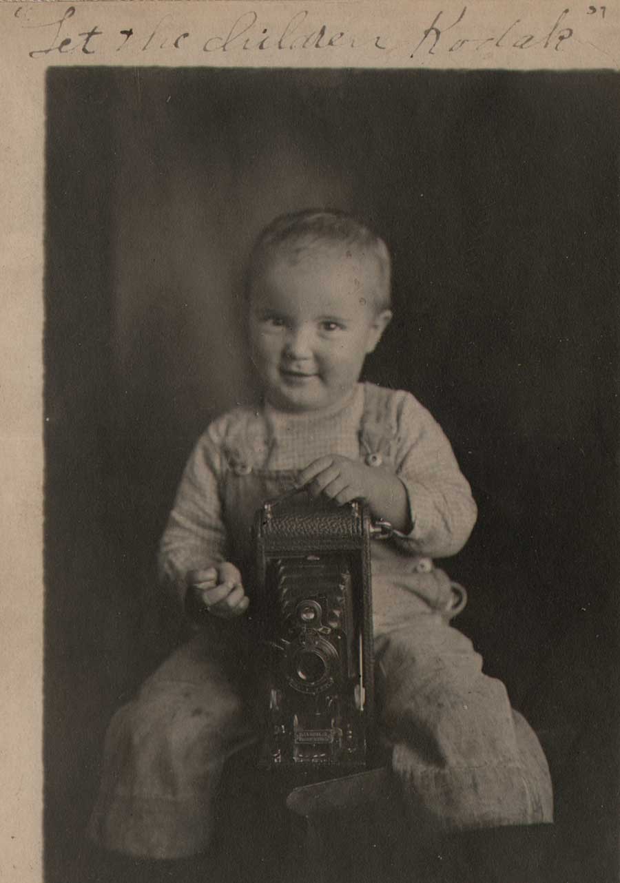 Detail: "Let the Children Kodak": Anonymous American Photographer: ca. 1915-20: Gelatin Silver print, mounted to vintage 1890's era cabinet card: 11.3 x 7.7 | 13.2 x 8.7 | 16.4 x 13.9 cm. This amateur photograph was submitted as part of Kodak's annual Advertising Contest around 1915. An unknown little boy in overalls is shown about to take a photograph using a pneumatic bulb shutter release in his right hand while posing behind a No. 1A Kodak Jr. (Autographic) camera. The camera was produced and sold by the Eastman Kodak Company of Rochester, New York from 1914-27. From: PhotoSeed Archive
But times do change, and so has the company that promoted their namesake as a verb, as in the following slogan used to promote themselves for advertising purposes: Let the Children Kodak.
Belatedly, it’s reassuring to know Eastman Kodak did re-emerge from 20 months of Chapter 11 bankruptcy protection on September 3, 2013. (1.)
For the record, Kodak now brands itself “a technology company focused on imaging”, with major divisions including separate Print and Enterprise Inkjet Systems, Flexographic Packaging, Software and Solutions, Consumer and Film, Advanced Materials and 3D Printing Technology.
 Detail: "Let the Children Kodak": Anonymous American Photographer: ca. 1915-20: Gelatin Silver print, mounted to vintage 1890's era cabinet card: 10.9 x 7.7 | 13.0 x 9.7 | 16.4 x 13.9 cm. This amateur photograph was submitted as part of Kodak's annual Advertising Contest around 1915. An unknown little boy in overalls is shown about to take a photograph using a pneumatic bulb shutter release in his right hand while standing and holding a No. 1A Kodak Jr. (Autographic) camera. The camera was produced and sold by the Eastman Kodak Company of Rochester, New York from 1914-27. From: PhotoSeed Archive
The Consumer and Film part of the above is what were interested in here, and happily, Kodak is at least trying to stay in the game, with an outside licensing agreement in place for their own branded PixPro series digital camera and camcorder line (manufactured in China) as well as a new Android™ based smartphone called the Ektra. The company does a good job in putting the Ektra in historical context with all the Kodak innovations going way back, with a company website copywriter pontificating a bit about how company founder George Eastman would …” totally understand the power of putting a camera into a smartphone, a device that everyone always carries.”
The reality however-and I do hope they push back given their rich heritage in photography-are plenty of negative reviews for the Ektra. (on CNET, among other sites) Luckily they have a few aces up their sleeves and are proactive and smart enough to diversify into smartphone accessories like wireless selfie sticks, vehicle dashboard mounts and mini tripods, among other things. Word in January, 2017 of the re-introduction of Ektachrome film for both motion picture cinematographers and still shooters scheduled for later this year has also made plenty of folks very happy indeed.
 Detail: "Dorothy Tucker with Kodak 3A Folding Pocket Camera": Charles Rollins Tucker, American (b. 1868): unmounted vintage platinum print ca. 1910-15: 23.6 x 15.0 cm: Dorothy Tucker, b. August, 1899, of Staten Island, N.Y., the photographer's daughter, is shown holding what is believed to be Kodak's first postcard format camera introduced in 1903 and manufactured until 1915. Wearing an elegant hat and overcoat, Dorothy posed for a series of photographs that were entered over successive years by her father in Kodak's annual Advertising contests. From: PhotoSeed Archive
So go out and buy that Kodak 40” Selfie Stick with Wireless Remote: impress your neighbors by taking photos and videos “to a whole new level of awesome” as the ad copy promotes, and don’t forget to take some ancient advice from a company that knew a thing or two about winning photo contests with cameras they once made themselves:
 Detail: "Dorothy Tucker with Kodak 3A Folding Pocket Camera": Charles Rollins Tucker, American (b. 1868): mounted vintage platinum print ca. 1910-15: 22.0 x 14.0 | 33.9 x 24.9 cm: Dorothy Tucker, b. August, 1899, of Staten Island, N.Y., the photographer's daughter, is shown holding and snuggling up to what is believed to be Kodak's first postcard format camera (shown in closed position) introduced in 1903 and manufactured until 1915. Over a period of successive years, Dorothy posed for a series of photographs taken by her father and entered in Kodak's annual Advertising contests. Scott's Photographica Collection online resource states the 3A was manufactured in seven different models over its' lifetime and that the "1912 Eastman Kodak catalog prices the 3A FPK with Kodak Ball Bearing shutter at 20 dollars, with Kodak Automatic shutter at 25 dollars and with Compound shutter and Zeiss Kodak anastigmat lens at 61.40 dollars." From: PhotoSeed Archive
Pretty pictures of pretty children will not sell Kodaks, but the picture of a pretty little girl photographing her playmates will make other children want Kodaks to photograph their playmates. Make an attractive picture of this sort and you have an entry for Class 4, which calls for pictures illustrating the slogan, “Let the children Kodak.” (2.)
1. see 2012 post on this website: “Kodak’s Work not Done”. A history of Kodak’s annual contests from this site can be found here.
2. excerpt: Thirty Days Left (Kodak Advertising Competition) in: Studio Light (publication of the Eastman Kodak Company): October, 1915, p. 20. A nice historical overview of George Eastman and the Kodak company can be found here on their website.
Support our Vision, Validate our Passion
Posted March 2017 in Advertising, Childhood Photography, Documentary Photography, PhotoSeed, PhotoSeed Gallery
Like what you see on PhotoSeed? Have you ever thought of collecting vintage photographs? It might seem strange for some in our modern age of digital connoisseurship, where family photo albums now reside, along with everything else, on your smartphones. But actual physical photographs, unlike their digital brothers and sisters, do actually stand the test of time. You can even hang them on your wall!
 Screengrab of the homepage for the PhotoSeed Gallery website hosted by Shopify e-commerce online platform: March, 2017
If you’ve arrived here by chance, or are a long-time visitor, you might have thought that some of these digital photographs are quite beautiful. Wouldn’t it be nice to…perhaps, acquire an original for yourself, a friend or loved one? Well today is your lucky day. After nearly two decades of collecting, I’m going in a new direction and launching PhotoSeed Gallery. The new venture is designed to give anyone in the world (we ship internationally) the opportunity to purchase vintage photographic works of art (never reproductions) created from roughly 1885-1920. Heck, you don’t even need to leave home to do it. A desktop computer will give you the best feel and display for the site, but if you insist, that aforementioned smartphone will also do the trick nicely from anywhere.
 Detail: Playing at Shops: Edgar G. Lee, English: (1860-1915) vintage exhibition lantern slide ca. 1895-1905: 8.2 x 8.2 cm. A portrait photographer by trade, Englishman Edgar Lee was an active exhibitor in the Royal Photographic Society Salons from 1890-1903. The body of work he is best remembered for however is documentary, with 300 of his lantern slides held in the Woodhorn Museum and Northumberland Archives chronicling the residents, mostly poor, of the Quayside area of Newcastle upon Tyne. PhotoSeed owns several examples of Lee's work, including this street view showing a group of little girls- with two clad in white aprons at front and left- pretending to sell what appears to be an assortment of rocks or broken tiles arranged on a table made from slate and rocks. Interestingly, a postcard of this image: "Playing at Shops: The Slums, Sandgate" was later published by his Newcastle firm Thompson and Lee, the work possibly part of his earlier documentary involvement with investigations conducted by the Royal Commission on the Poor Laws and Relief of Distress in England held from 1905-09. From: PhotoSeed Archive
Many websites solicit funding via one of those “donate here” buttons for their upkeep and survival. I can appreciate that, but somehow, in my humble estimation, it is so much better to support your love of photography by receiving something in return: in this case, tangible and real photographs. Going forward, gallery sales will be vital and necessary for maintaining PhotoSeed’s core mission of bringing attention to the often obscure and forgotten practitioners from photography’s past, as well as the critical and time-consuming scholarship their work demands in giving it the proper due it deserves for the larger historical record. And no worries, I’m a collector myself at heart, so our intent will always be the continual addition of rare and surprising examples to this record in the coming years.
Thanks for stopping by, and please consider a purchase to support our vision and validate our passion.
-David Spencer PhotoSeed Archive & Gallery owner and curator March, 2017
Needle in a Haystack
Posted March 2015 in Advertising, Childhood Photography, Engraving, Publishing, Significant Photographers, Typography
Surreal would be a good word for it. On the evening of Friday, November 4, 1904, the touring company of the Broadway flop Eben Holden made its way to a performance at a building called the Auditorium on S. 2nd Street in downtown Newark, Ohio.
 Detail: Cover for "Eben Holden: A Tale of The North Country": Edition de luxe by Irving Bacheller. Lothrop Publishing, Boston: 1903. Gilt-engraved decorative cloth with circular design featuring a design of a ribbon interlaced with pinecones and leaves: 21.0 x 14.2 cm: One of the best selling novels from the very beginning of the 20th Century, this edition features 12 photogravure plates by photographer Clarence Hudson White. from: PhotoSeed Archive
Most likely in attendance that night? Clarence Hudson White, (1871-1925) the world-renowned pictorialist photographer who was a recent founding member of the American Photo-Secession and current Newark resident. Only two years earlier, he had taken a series of photographs using his Newark neighbors as models for a special edition of Eben Holden that had been made into this very play.
Written by American journalist and author Irving Bacheller, (1859-1950) the story is a classic rags to riches tale that captivated the masses in the new American century when first published in July of 1900, eventually selling over 1 million copies. The setting at the beginning of the novel is the “North Country” of Northern Vermont , the Adirondack’s and St. Lawrence River Valley of the 1840’s and 1850’s. It tells the coming of age story of William Brower, orphaned at the age of six after his parents and older brother accidentally drowned as well as his relationship with Eben Holden, a farm hand who rescued “Willy” from the cruel fate of an orphanage
But this post is part collecting story, a kind of hunt for treasure, or “spondoolix” as “Uncle Eb” would say in one chapter-his country ways and lack of education brought into sharper focus for the reader by Bacheller’s liberal usage of Holden’s spoken dialect.
 Detail: Top: listing for works by American author Irving Bacheller showing Edition de luxe of Eben Holden highlighted in blue: from: Illustrated Catalogue of Books Standard and Holiday 1903-1904: Chicago: A.C. McClurg and Company: 1903: p. 217 (the † denotes it is a work of fiction, published since November 1, 1902, under the rules of the American Publishers' Association. (from: Hathi Trust)Bottom: close-up detail showing autograph for CH White 02 at bottom left corner of representative photogravure plate from the Edition de luxe: from: PhotoSeed Archive
The Hunt is on
I consider myself a newbie collector, but one of the first things I put on my list 15 years ago when I first started out was one particular impression of Eben Holden rumored to have been illustrated by hand-pulled photogravures by White, the aforementioned famous photographer.
My curiosity had been piqued after seeing the volume listed in several bibliographies, typically stating the 1900 date. One such entry in author Christian A. Peterson’s Annotated Bibliography on Pictorial Photography did give me hope the work existed, even though finding one in the internet age would prove to be quite the challenge:
The Museum of Modern Art, New York, holds what is probably a unique copy of this book, comprised of the Lothrop text pages bound in leather, with an inscription by White and ten photogravure illustrations by him, including the portrait of Holden. (1.)
Because the novel had been such a success a century earlier, the reality of upwards of 500 vintage copies for sale on the web at any one time was daunting. My course of action however was simple, and eventually effective: send out a mass number of emails to every bookseller in the U.S. listing a copy from a suspect 1901 edition I had honed in on inquiring if it contained any photographic illustrations.
 Broadside advertising poster for Lothrop Publishing Company of Boston: 1897: artist: William Schumacher: American: (1870-1931) multiple-color lithograph printed on wove paper: 52.7 x 34.0 cm. Speaking of the beginnings of Eben Holden in the year 1897, author Irving Bacheller said "had unsuccessfully offered the first 'Eben Holden' as it then stood to two juvenile publications; but as I happened to be just starting off on a vacation at that time, I determined myself to see the Boston firm, which was the Lothrop Publishing Company. I met the editor, Mr. Brooks, at the Parker House, and told him the story as I had written it. He immediately saw the possibilities in it and declared I had a big thing if I could carry it out as it should be." (excerpt: "The Critic": Oct. 1904) vintage broadside (trimmed) from: PhotoSeed Archive
And so eventually luck prevailed. In 2007, a bookseller in Idaho finally said yes, and a bucket item was now on my library shelf. But that was not the end of it, as Alice would say, things got Curiouser and Curiouser! Because collectors never stop looking, I soon stumbled upon a CT bookseller who knew exactly the significance of the White-illustrated impression, with an astronomical asking price. An excerpt from his description of the work stated:
Elusive and highly desirable work, absent from almost all museum and library collections devoted to photography, and one of only a very few photographically illustrated books produced by a leading member of the Stieglitz circle at the height of the Photo-Secession. (2.)
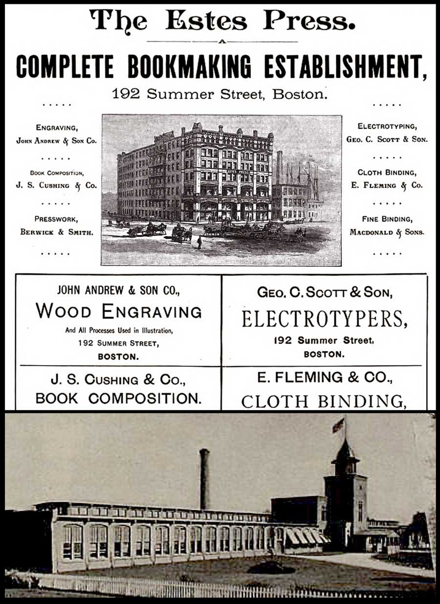 Top: detail: 1891 advertisement for The Estes Press (Dana Estes & Company) from "The American Bookmaker". The woodcut shows the brand new Estes Press Buildings located at 192 Summer St. in Boston first occupied around 1890. The firm housed many different companies involved in the bookmaking process, including: "The celebrated engravers, John Andrew & Son have their studios in the upper story…"; J.S. Cushing & Co., (book composition) Berwick & Smith, (presswork) and E. Fleming & Co. (binding). These last three firms left Estes in 1894 and became part of the Norwood Press. (from: Hathi Trust) Bottom: detail: exterior photograph of Norwood Press from the 1897 volume "Boston Massachusetts" by George W. Englehardt. The original caption noted the firm was located "Fourteen Miles from Boston, on the New England Road" and "as a whole employing nearly three hundred hands." This is where the Eben Holden Edition de luxe was printed. (from: Hathi Trust)
And so I sucked it in and didn’t purchase the second copy, which he told me he had originally purchased in Marlborough, NH. Eventually he sold it to a European collection, but I’ve since visited him several times and made a few purchases over the years, something I highly recommend rather than doing everything through e-commerce.
But then lighting struck again five years ago, when I purchased a second copy which had been personally inscribed by the author in 1911 to John A. Dix, then governor of New York state.
Curiouser? The first copy, fourth edition imprint stated Two Hundred and Sixty-fifth Thousand, March 12, 1901 and the second copy was for Two Hundred and Seventieth Thousand, September 18, 1903.
 Detail: Clarence H. White: American: "How much was that a yard ?" Hand-pulled photogravure plate printed by John Andrew & Son (image: 12.2 x 7.5 cm | support: 20.0 x 14.0 cm ) from: Edition de luxe impression of Eben Holden: Lothrop Publishing, Boston: 1903. The Library of Congress states the model at right is Ann Fulton and the woman examining the dress is the photographer's mother Phoebe Billman White (1845-1920) : from: PhotoSeed Archive
Knowing the book now existed in multiple impressions with the Clarence White photogravures was perplexing to me at first, but I’m certain the inclusion of the White photographs was intended by the publisher Lothrop for a more discriminating audience, so its assumed they had the monetary incentive to publish more than the one impression-even with the fickleness and extra work necessary to bind an edition with hand-pulled gravures.
To this end, my research in preparing this post discovered 1901 to be the year Clarence White was first commissioned by the Boston publisher to illustrate a new edition of Eben Holden. The intended publication date of very late 1902 was designed to coincide with the lucrative holiday sales season. Even with the move to e-books in our modern age, publishers earn good money issuing ornate and extra-illustrated editions during this time of year catering to the once a year book buyer and bibliophile alike.
Known as the Edition de luxe, this edition of Eben Holden with the White photogravures priced at $2.00 somehow managed to miss the late 1902 holiday sales season. The curious fact of the inclusion of the imprint for March 12, 1901 on the limitation page and White’s signature including the year 02 on many of the 12 plates in the published work was basic economics for publisher Lothrop-they simply used existing leaves, including the old limitation pages from current stock when it was eventually released for sale to bookstores in 1903.
 Top: detail: 1896: advertisement for John Andrew & Son from the "Boston Blue Book". (from: Hathi Trust) Bottom: detail: typical example of the firm's engraved credit appearing at lower right corner of image margin on plate recto from the 1903 Photographic Times-Bulletin. The John Andrew firm was established in Boston in 1852. from: PhotoSeed Archive
This was by no means unprecedented by Lothrop, or other large publishing houses of the era, as they would have set aside a certain number of unbound sheets from a best-selling work for limited impressions featuring artwork. The first illustrated edition of Eben Holden featured halftone photographs taken by Joseph Byron from the Broadway production of the same name hadn’t even debuted until Oct. 28 of 1901. This also used the March 12, 1901 imprint date. Known as the Dramatic Edition, it was described in the trade monthly The Bookseller:
”An illustrated edition of Eben Holden has been recently published called the Dramatic edition. It contains seven pictures of the play as it appeared in New York and a fine portrait of the author.” (3.)
 Details: with manipulations in PhotoShop to highlight typography: In order to show Boston's John Andrew & Son atelier printed the photogravure plates uncredited in the de luxe edition of Eben Holden, it is useful to analyze the script font typeface used for photographic plate titles. Column at left, top to bottom shows known examples from the Andrew atelier taken from the 1903 Photographic Times-Bulletin. Column at right shows plate titles from the Eben Holden volume. all from PhotoSeed Archive.
Published in 1903
Finally, with the eventual tenth imprint of the fourth edition stating Two Hundred and Seventieth Thousand, September 18, 1903, (6.) the makeup of the Edition de luxe was that of a small 8vo Octavo instead of the common edition, a 12mo Duodecimo. The inclusion of 12 fine, hand-pulled photogravure plates by White seen here is another matter altogether. For one, other than White’s autograph-appearing often (and faintly) in the lower left hand corner of each plate image as CH White 02, the Edition de luxe neglects to give him any printed credit for the photographs nor the atelier who printed them. This is very surprising for a special edition. Typically, there would at the very least be a separate illustrations page noting titles and page numbers at the front of a similar volume, but for whatever reason they were not included.
Stieglitz plays Go Between
With Eben Holden’s great success, the dramatization of the novel on the Broadway stage was logical for its day-especially since the Cinema was not an option because of the infancy of the medium. Lothrop’s piggy-backing of the work through this Dramatic edition, even by the “flop” standard of 49 performances, was but one way of keeping the work “fresh”- even a full year after initial publication. At some point late in 1901, a result perhaps of someone seeing the play on Broadway or believing White’s work would lend itself nicely to a series of photographic illustrations, the Boston publisher-perhaps through an association with Fred Holland Day (who lived in nearby Norwood where the Norwood Press printed books for Lothrop) or Alfred Stieglitz in New York-gave White the commission for its second illustrated edition of the novel.
 Clarence H. White: American: 1902: "She was still looking down at the fan": vintage Platinum or gelatin silver print: Showing typical retouching by White, the models are Alfred Dodge Cole, (1861-1928) a professor of Chemistry and Physics at Denison University and his wife Emily Downer Cole. (1865-1957) They play the roles of William Brower and Hope, whom Brower eventually marries in the novel Eben Holden. The photograph was reproduced as a photogravure plate and included in the Edition de luxe. Curators at the Robbins Hunter Museum where this and other White photographs are held stated the photographer had taken family photographs of the Downer family on the lawn of the home in the late 1890's and so he "would have been familiar with the house and furnishings from that commission. It was common for Clarence White to ask acquaintances to pose for photographs, often in costumes that he would provide. The photographs for Eben Holden were staged with costumes from the Civil War era." Photograph courtesy: Collection of the Robbins Hunter Museum in the Avery Downer House, Granville, OH.
Ultimately, Stieglitz’s publishing background, connections and established relationship with White through his editorship of Camera Notes, his new involvement with Camera Work, as well as his having his own work exhibited in an early salon of pictorial photography in Newark Ohio in late 1900 and other exhibitions made Stieglitz a believer in White’s potential as an illustrator:
“What is especially fascinating, however, is what occurs when White is commissioned, as he was in 1901, to take up literary illustration himself. Through the assistance of Stieglitz, White received the commission to illustrate a new edition of the novel Eben Holden by Irving Bacheller. ( 4. )
And much later, the photographer’s grandson Maynard Pressley White commented about a bit of reluctance on his grandfather’s part in dealing with Lothrop as part of his Ph.D. dissertation in 1975:
“The correspondence with Stieglitz concerning the illustrations for Eben Holden is revealing of his character as well as Stieglitz informed him that he suffered from no such timidity and would—and indeed did—handle the matter with the publishers, as it turned out, to the advantage of White.” (5.)
 Clarence H. White: American: 1902? : vintage untitled Platinum or gelatin silver print: The model Emily Downer Cole (1865-1957) poses wearing a different dress than seen in the published Eben Holden photogravure "She was still looking down at the fan" taken on the same settee in the front parlor of the Downer family home. This was likely an alternate study Clarence White took for consideration for his series of Eben Holden illustrations. Photograph courtesy: Collection of the Robbins Hunter Museum in the Avery Downer House, Granville, OH.
John Andrew & Son: founded in Boston: 1852
In giving credit to White and the firm that printed his photographs as gravures, a bit of elucidation seems in order to set things straight. Upon close inspection of these plates along with many others by Boston’s John Andrew & Son from the same time frame, I feel confident giving the Andrew firm credit for printing them. This is based on a near exact match in the script font used for the plate titles in the de luxe edition of Eben Holden as well as those plates credited to the firm appearing in the Photographic Times Bulletin from 1902-04.
I’ve included examples of the font as a comparison with this post. Another exact match is the same plate paper was used for both publications: this is very revealing especially on the plate verso where a very fine stipple pattern can be seen on the paper surface of the cream-colored plate paper. Perhaps the strongest association with the John Andrew atelier and the Norwood Press (which printed the de luxe edition) emerged in my research on business associations with some of the individual companies that came together in 1894 when that press was formed. These included J.S. Cushing & Co., (for composition and typesetting) Berwick & Smith Co., (for presswork) and E. Fleming & Co. (for binding). Beginning around 1890, all of these firms along with John Andrew were under one roof as part of the brand new Dana Estes & Company publishing house buildings on Summer Street in Boston.
 Clarence H. White: American: 1903: halftone: "Walking side by side to or from the school-house" was one of three photographs published to illustrate the Clara Morris story "Beneath the Wrinkle" published in the February, 1904 issue of McClure's Magazine. (12.8 x 9.5 cm) published: p. 430. From: PhotoSeed Archive
With the move to Norwood in 1894, the Andrew atelier stayed behind in Boston at 196 Summer St. but continued to provide fine photo engraving work to the major publishing houses in Boston and New York. Known today for printing many of the photogravure plates beginning in 1907 for the monumental Edward Sheriff Curtis work The North American Indian, the firm sometime in the first decade of the 20th Century became a department of the Suffolk Engraving & Electrotyping Co. of Boston with offices at 394 Atlantic Ave.
Named after John Andrew, (1815-1870) a wood engraver born in England who immigrated to Boston where he worked with fellow engraver Andrew Filmer, the firm eventually made the transition to photo engraving, including the half tone and photogravure processes. Andrew’s son George T. Andrew succeeded his father at the business, located at 196 Summer St. An 1892 overview of the firm from the volume Picturesque Hampden gives some background:
JOHN ANDREW & SON COMPANY.
ENGRAVERS AND MAKERS OF FINE BOOKS, BOSTON MASS.
If we go back a few years, we find that in illustrating books and magazines wood and steel engraving were about the only methods available. Nor could steel engraving have any wide use on account of the great expense of printing. Ever since its start, in 1852, the firm, now styled the John Andrew & Son Company, has held a prominent place among illustrators, especially in work of the finest grades. Their reputation was made in the first place as engravers on wood, but the discovery of delicate chemical and mechanical processes has in later years led them to also take the photo-engraving and half-tone work which has at present such wide use and popularity. In this field they do work for some of the best magazines and books published in this country. In what they undertake they strive not so much to do the cheapest work in price as the best work in quality. Quite recently the firm has taken up the photo-gravure process in addition to those spoken of above. The industry we describe is not located in Hampden county, but the mention here is not inappropriate as the engraving of our pen and ink pictures was done almost wholly by this firm. Their address is 196 Summer street, Boston.
 Detail: Cover for "Songs of All Seasons" by Ira Billman. The Hollenbeck Press, Indianapolis: 1904. Gilt-engraved stamped cloth: 20.4 x 13.6 cm: shown inset with representative photographs taken by Clarence White reproduced in halftone in the volume. Photo left: "The Book Lovers" (p. 181); top right: untitled man with statuette illustrating poem "The Twin Flower" (p.137); bottom right: "The Gloaming" (p. 199). Billman was Clarence White's uncle and was "one of his earliest artistic influences in his life": From: PhotoSeed Archive
Photographic Illustration: a New Outlet
A newspaper clipping, believed to be from the Newark Daily Advocate in the Clarence Hudson White clipping file at the Newark, OH public library, includes the following undated (but 1903) story discussing Eben Holden in passing while concentrating on a new commission that inevitably came from it: costume-piece photographs by White similar to those he did for Lothrop for author Clara Morris’s story published in McClure’s magazine in February, 1904 entitled “Beneath the Wrinkle”:
PICTURES From Real Life by Clarence White
Forwarded On Order to a New York Magazine-Local Artist’s Latest Work.
Mr. Clarence White received a command last fall from the art department of McClure’s Magazine to illustrate Clara Morris’ new story, entitled, “Beneath the Wrinkle,” that will appear in that magazine presumably in the near future. Mr. White was to have been given all the time he wanted, but in view of the change of art editors, Mr. White was notified about three weeks ago that the illustrations would be required immediately. Mr. White at once notified the publishers that he would use all his efforts to complete them immediately, and would forward them when completed. Today the set comprising six, were forwarded and as equaly as clever and well executed as the ones made for the illustrating of the holiday edition of Eben Holden that was to have made its appearance last Christmas, but was not completed in time for that season. The ones now in progress are all local personages, done in quaint, old-fashioned garb and surroundings, recalling vividly to mind the characteristics in dress and decorations then in vogue. They show the fine and beautiful artistic temperament of Mr. White in his striking correct interpretation of dress and customs of the period in which the characters live. Mr. White deserves the honor the illustrations will surely bring to him, as he is always conscientious and painstaking in whatever he undertakes in his profession.
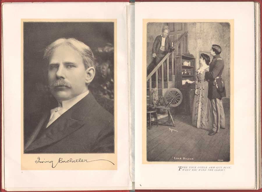 Left: Irving Bacheller, (1859-1950) American journalist and author, wrote the novel Eben Holden which sold over 1 million copies. This portrait with facsimile autograph by an unknown photographer appeared as the frontis (13.3 x 9.1 cm) to the Dramatic Edition of the book-the first illustrated edition featuring photographs of the Broadway stage production that debuted Oct. 28, 1901 and ran for only 49 performances. Right: " 'Fore your other arm gits busy, wont you wind the clock?" (14.1 x 8.4 cm) Actor E.M. Holland at left plays the role of Eben Holden, Lucille Flaven plays Hope and Earle Ryder as an American Civil War officer plays William Brower. The important New York commercial photographer Joseph Byron, (1847-1923) founder of the Byron Company (currently, the 7th & 8th generations runs Byron Photography) took stage photographs of the play at New York's Savoy Theatre with plates published in the Dramatic Edition. from: PhotoSeed Archive
White Family Connections: Songs of all Seasons
During the time he received the commission for illustrating Beneath the Wrinkle in 1903, a more intimate family connection developed which allowed White the opportunity to take another series of photographic illustrations, 42 in all, published in 1904 within a slim volume of poetry titled Songs of All Seasons.
The author was nationally known poet Ira Billman, Clarence White’s uncle, the brother of his mother Phoebe Billman White. In the volume Symbolism of Light: The Photographs of Clarence H. White published in 1977 which accompanied an exhibition of White’s work at the Delaware Art Museum and International Center of Photography, White’s grandson Maynard P. White, Jr. describes Ira Billman as a major influence on Clarence and Songs:
Among the gathering of aunts and uncles that gave meaning and context to the artist’s early life was Ira Billman, his mother’s brother. “Poetic” is the word most often used to describe White’s photography, and his Uncle Ira, a poet by avocation, was one of the earliest artistic influences in his life. …Billman’s work celebrates rural America; his poems are songs to people and to nature, and they are imbued with the deep religious sentiments of his Lutheran heritage, without being mawkish or even faintly cloying. What is important for the purpose of my discussion is that Clarence White made the photographic illustrations for Songs of All Seasons, and Billman dedicated the volume to him. (7.)
 "To Governor John A. Dix with many good wishes from Uncle Eb an' me Irving Bacheller N.Y. Feb. 22 1911." This personal inscription by Bacheller to John A. Dix, then Governor of New York State, appears in a volume of Eben Holden with the imprint of Two Hundred and Seventieth Thousand, September 18, 1903, the actual year the novel was released for sale. In a 1901 newspaper article, Bacheller said the character Eben Holden was based on "a composite of my father and his hired man-a very jolly old fellow". from: PhotoSeed Archive
Ninety-one poems and sonnets are included in the volume. Here, The Test, a representative poem from the work:
The Test
Not what I felt will be the test
When song and fragrance filled the hour,
And all the sunshine of the blest
Unfolded me to perfect flower.
Not what I aid will be the test
When by sweet waters wound my way,
And white-haired, thoughtful hills all guessed
The word I was about to say.
Not what I did will be the test
When stunned by cry of human needs
I dreamed I was myself oppressed,
And woke to passion of great deeds.
Not what I chose will be the test
When first I saw one world in hand
Is worth two in the bush-the best
Of which it is to understand.
O! none of these will be the test,
But what God knows I would have done,
Had I been nurtured in the nest
Of one, I now condemn and shun. (8.)
 Left: Clarence H. White: American: 1902: hand-pulled photogravure: (9.7 x 7.3 cm) in: Eben Holden: A Tale of the North Country: Boston: Lothrop Publishing. (1903) Appearing as the frontis portrait in the Edition de luxe, this unknown subject was the novel's namesake: a fictional character who was a former farm-hand and main father figure for the newly orphaned William Brower serving as the narrator in the work. Right: Clarence H. White: American: 1902: halftone: (12.0 x 9.2 cm) in: Eben Holden: Harper & Brothers Publishers. (1914) Part of the Pine Tree Edition of Irving Bacheller's (Collected) Works. This heavily manipulated portrait from the original photograph by Clarence White of Eben Holden published 11 years earlier also appeared as the frontis for the first volume in the Pine Tree series. From: PhotoSeed Archive
Pictorial Illustration for Photography a Growing Field
By 1904, esteemed critic Sadakichi Hartman, writing in Leslie’s Weekly, weighed in on the growing use of photography for book illustration:
”…and Clarence H. White, of Newark, O., has found a new opening for photography in the illustration of books. His illustrations for “Eben Holden” have attracted wide and deserved attention.” (9.)
 Clarence H. White: American: 1902: "Illustration to "Eben Holden"" (1903) hand-pulled photogravure: (tipped image:19.7 x 15.0 cm | Japan paper support: 30.5 x 21.0 cm) in: Camera Work III. (1903) Two plates in the Edition de luxe of Eben Holden: "How much was that a yard ?" (seen in this post-CW IX: 1905) and this one: "Mother was living in the old home alone"-an interior portrait of the photographer's mother Phoebe Billman White (1845-1920) were also published as photogravures in Camera Work. From: PhotoSeed Archive
And later that year, citing White’s involvement with Eben Holden while writing in the Photographic Times Bulletin, Hartman brought up the potential financial rewards possible for pictorial photographer in this new field:
“The only way to approximate a market value of pictorial prints is to investigate how much they might bring on the average, if offered for sale as illustrations. There is lately a decided demand for photographic illustrations, and consequently a certain standard price in vogue. The pictorialist, of course, and perhaps with some right, aspires to illustrator’s prices (i.e., $50-$100 for the full page of a magazine), but he has never reached it, with the one exception of Clarence H. White, who is said to have received several hundred dollars for his series of “Eben Holden” illustrations.” (10.)
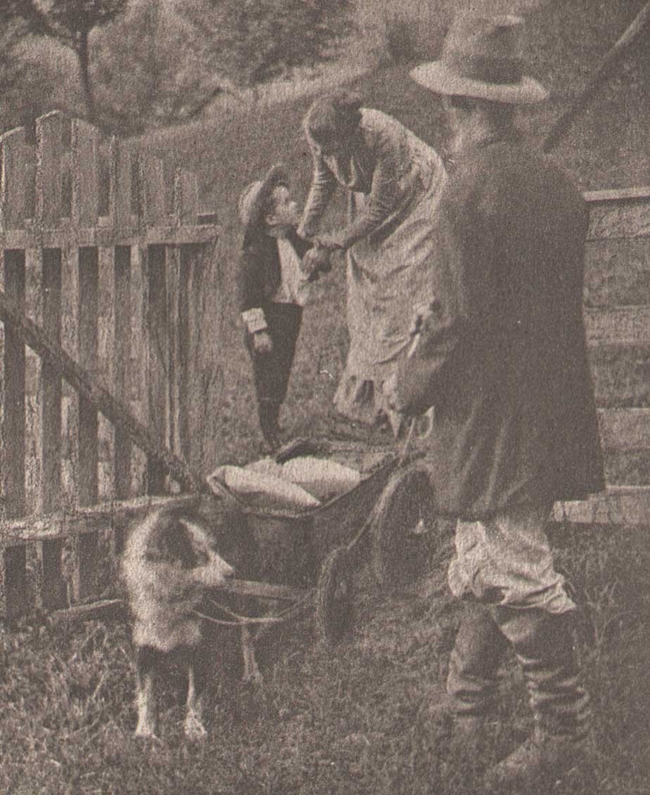 Detail: "Tucked some cookies into my pocket" : Clarence H. White: American: 1902: hand-pulled photogravure plate (11.9 x 7.3 cm) included with Edition de luxe of Eben Holden (1903): Lothrop Publishing, Boston. The young orphan William Brower is possibly modeled here by the photographer's son Maynard Pressley White (b. 1896) and his wife Jane Felix. (1869-1943) The scene shows Brower preparing to head out into the wilderness in a dog-pulled cart with Eben Holden at right. From the novel: "Our hostess met us at the gate and the look of her face when she bade us good-by and tucked some cookies into my pocket, has always lingered in my memory and put in me a mighty respect for all women." From: PhotoSeed Archive
This additional source of significant money to Clarence White and his young family through these illustration commissions invariably gave him additional confidence in his abilities as a photographer and financial peace of mind to eventually make his way to New York City, leaving Newark in 1906. It is also not a stretch to infer White’s own life mimicked the storyline of hard work that can earn the “American Dream” found between the pages of Eben Holden. Although the critic for the New York Times reviewing the play at New York’s Savoy theater didn’t care too much for the acting:
”As an exhibition of dramatic craft “Eben Holden” is hardly worth serious consideration“…
he did, a few paragraphs later, write the production had a few redeeming qualities:
But, despite its defects, the play is wholesome; it is redolent of the woods and the fields, and it provides the opportunity for an evening of entertainment that need not be looked back upon with regret. (11.)
No doubt Clarence White, had he been in attendance watching the play inside Newark’s Auditorium that 1904 November evening, would have agreed with these last sentiments of the big city critic, marveling and grinning to himself in the darkened hall while taking in the surreal juxtaposition that art imitating life can bring about.
Notes:
1. (White, Clarence H.) excerpt: An Annotated Bibliography on Pictorial Photography: Selected Books from the Library of Christian A. Peterson: Laurence McKinley Gould Library: Carleton College: Northfield, Minnesota: 2004
2. ABE listing: 120407. Besides multiple copies held by PhotoSeed, other known copies are in the Library of Congress, MOMA and Photogravure.com.
3. The Bookseller-Devoted to the Book and News Trade: Chicago: January, 1902: p. 28
4. Peter C. Bunnell: Inside the Photograph: writings on Twentieth-Century Photography: Aperture Foundation: 2006: p. 47
5. Clarence H. White : a personal portrait: Maynard Pressley White: Ph.D. dissertation, University of Delaware, 1975: pp. 79-80
6. see Beaumont Newhall’s Photography: A Short Critical History, from 1938, lists Eben Holden with the White illustrations as being published in 1903 on p. 215
7. excerpt: see Symbolism of Light: 1977: p. 7
8. Songs of All Seasons: Ira Billman: Indianapolis: The Hollenbeck Press: 1904: p. 65
9. excerpt: Advances in Artistic Photography: Sidney Allan: in: Leslie’s Weekly: April 28, 1904: New York: p. 388
10. excerpt: from: What is the Commercial Value of Pictorial Prints?: Sidney Allen: in: The Photographic Times Bulletin: December, 1904: p. 539
11. excerpt: review: “Eben Holden” at the Savoy: The New York Times, October 29, 1901
Sharp as Needles & Woolly as Mary's Lamb
Posted April 2013 in Advertising, Childhood Photography, Exhibitions
The 1905 Kodak Competition | Exhibition & Kodak Advertising Contests
The cryptic title of this post owes a debt to advertising. Seeing an opportunity to redefine their annual photographic contest for 1905 by marketing products to all kinds of photographers, the Eastman Kodak Company decided to embrace the two distinct schools of the period.
 Taken ca. 1903-05 and the subject of an extensive series of photographs by her amateur photographer father from infancy to late teens, Dorothy (b. August, 1899, of Staten Island, N.Y.) prepares to squeeze a bulb shutter while photographing her dolly. This photograph or variant was likely entered in one of the annual "Kodak Competitions" from the period, as it features the company’s products, including a tripod-mounted plate camera. (undetermined model) A camera and tripod case can be seen on floor along with a single plate holder and dark cloth. Dorothy holds the dark slide for the camera in her left hand while making the exposure. Mounted vintage gelatin silver print: 17.9 x 22.0 cm | 11.0 x 14.1 cm: from: PhotoSeed Archive (photographer details withheld pending further research)
The so-called “straight” shooters, whose intent was a picture sharply in focus and the “pictorialists”; those embracing the painterly concept of selective focus in their work.
 Letterpress detail from cover: (24.2 x 18.0 cm) "Souvenir Kodak Competition 1905". This souvenir book is believed to have been published sometime in 1906 or 1907, the culmination of one of the company’s annual contests which included public exhibitions in major American cities at the end of 1906 and through March of 1907. From PhotoSeed Archive
This inclusivity was emphasized after the company announced criteria for their selection of judges for the 1905 contest:
In the selection of a jury we have had two important points in mind. First, the selection of gentleman of high standing and unquestioned competency. Second, the selection of gentlemen affiliated with neither of the warring factions ⎯men who are broad-minded enough to recognize merit where it exists in a picture, no matter whether that picture be as sharp as a needle or as woolly as Mary’s little lamb. (1.)
 Left: Maine resident and amateur photographer Benjamin Wilder Guppy (1870-1960) won $10.00 and an honorable mention in the "1905 Kodak Competition" for this photograph: "The Passing Show", used as the cover photograph of the souvenir book: gelatin silver print: 6.6 x 5.2 cm. (PhotoSeed Archive) Right: the uncropped version of "The Passing Show" as it appeared in the Kodak exhibitions from 1906-07.: source: halftone from: "The Photographic Times": New York: December, 1906: p. 532
Rhetoric aside, these judges certainly had artistic ambitions. They were:
Charles Berg: (1856-1926) studied at the Ecole des Beaux Arts in Paris and London, opening an architectural practice in New York City in 1880, and later designing one of the city’s earliest skyscrapers, the Gillender Building. In 1896 he became a founding member of the Camera Club of New York, and his amateur work reflected his classical training-classically draped models often surrounded by architectural elements.
Arthur Radclyffe Dugmore: (1870-1955) at the time of the 1905 contest a pioneering nature photographer, he had the distinction in 1903 of one of his photographs, “A Study in Natural History”, a photogravure of baby birds, appearing in the first issue of Camera Work I. He later became a recognized painter and printmaker.
Henry Troth: (1863-1948) was an active member of the Photographic Society of Philadelphia, a pioneering artistic photography society in the United States. A professional photographer specializing in genre and the natural world, his work appeared in magazines and volume compilations of poetry and verse, often uncredited, such as Poetry of Nature. (1909)
 The 1905 Kodak Competition as well as the annual contests that followed were heavily promoted by the Eastman Kodak Company in their dealer trade circulars. This composite of editorial and advertising matter are taken from 1904-05. Left: first notice for the contest appeared in December, 1904. Right column, top: Kodak dealers are told of the Advantage they would receive (in increased sales) by "pushing" the contest on their customers. Middle: In January, dealers are alerted that "all beginners in the field should have their attention called to the Novice class that has been provided for their especial benefit." "This contest is simply one of the means we offer you for stirring up interest among your customers." Bottom: The term "Boom", an arcane word similar to "Shout" from the beginning of the 20th century, was used in an advertisement for the contest in the May, 1905 issue of the circular. Letterpress pages from Canadian Kodak Co., Limited Trade Circular: Toronto: online resource courtesy Ryerson University Library Special Collections
Particulars
In late 1904, Kodak announced they would break down and eliminate what they felt had been barriers for amateurs and professionals alike in regard to photographic contests up to that period:
A drawback to previous competitions has been the fact that many amateurs felt it useless to compete against their more experienced brothers while not a few of those who have become famous as photographers have been afraid to enter lest they might be awarded a forty-ninth prize and see, in the photographic publications, their famous names at the foot of a list of unknowns.
The terms of the 1905 Kodak Competition overcomes both of these difficulties. It provides separate classes for the novice and for those who have hitherto been successful and then bunches the prizes below fifth so that all such awards will be simply “Honorable Mention” together with a substantial prize. (2.)
 Ten original photographs printed on Kodak gelatin silver papers are featured in the souvenir book for the 1905 Kodak Competition. Top: "Lady and Child", (9.8 x 12.2 cm | 9.1 x 11.5 cm) likely from a copy negative or print, (as it includes a gray border) is by American master Edward Steichen. Printed on Portrait Velox paper, it is also known as Mother and Child — Sunlight, (published as a photogravure in Camera Work XIV) and won the $150.00 first prize for him in the Class A Open category, featuring negatives 3 ¼ x 4 ¼ or larger in size. Bottom: "La Moulin de Valcanville" (6.2 x 8.5 cm |5.4 x 7.8 cm) by Pierre Lejards of Paris, France is printed on Eastman's Sepia Paper. It was awarded honorable mention and earned him a No. 0 F.P. Kodak camera in the Class F Novice category. (Brownie Pictures) from: PhotoSeed Archive
A true marketing ploy, the company also made sure there would be plenty of time for those contemplating a submission for the contest. In America, entrants had up to November 1st to enter and in England, a month earlier, although this was changed to a later date to accommodate the mailing of the large amount of submissions, which totaled 28,000 entries worldwide. Particulars for the contest were printed in multiple publications, including the January 1905 issue of Camera & Dark-Room:
 The September, 1904 issue of the Kodak Trade Circular featured brand logos of various Kodak papers, including W-D Platinum, (water development) Mezzo-Tone, and Eastman's Sepia Paper. Along with Portrait and Velvet Velox, the papers were used to print winning entries for the 1905 Kodak Competition souvenir book. Composite letterpress advertisements: Canadian Kodak Co., Limited Trade Circular: Toronto: online resource courtesy Ryerson University Library Special Collections
The 1905 Kodak Competition.
We have pleasure in announcing that another great picture competition is to take place during the year. The Eastman Kodak Company offer $2,000 in prizes and have arranged for two classes of competitors, “Open” and “Novice.” The “open” class is for all who may care to enter, but the “novice” is open only to amateurs who have never won a prize in a photographic contest. This is a feature which will greatly please many who do good work but who do not care to compete against the regular pot hunters.
 "Sharp as a needle or as woolly as Mary's little lamb" : In announcing the three judges for the 1905 Competition, the April, 1905 issue of the Kodak Trade Circular let it be known the contest would be open to all schools of photography, as well as degrees of experience. from: Canadian Kodak Co., Limited Trade Circular: Toronto: online resource courtesy Ryerson University Library Special Collections
The classes and conditions are as follows:
Class A. Open to all. For Kodak pictures 3 ¼ x 4 ¼ or larger, including the Panoram Kodaks.
Class B. Open to all. For Kodak pictures 3 ½ x 3 ½ or smaller, including No. 1A Folding Pocket Kodak.
Class C. Open to all. For enlargements of any size from Kodak or Brownie negatives on Eastman. Nepera or Photo-Materials Bromide Paper.
Class D. Novice. Open only to amateurs who have never been awarded a prize in a photographic contest. For Kodak pictures 3 ¼ x 4 ¼ or larger, including the Panoram Kodaks.
Class E. Novice. Open only to amateurs who have never been awarded a prize in a photographic contest. For Kodak pictures 3 ½ x 3 ½ or smaller, including No. 1A Folding Pocket Kodak.
Class F. Novice. Open only to amateurs who have never been awarded a prize in a photographic contest. For Brownie pictures only.
All pictures sent in for competition must be from negatives made with a Kodak or Brownie on Kodak N. C. Film, and must be printed on papers manufactured or sold by us.
PRINTS ONLY are to be sent in; not negatives.
Prints must be mounted, but not framed.
The title of the picture, with the name and address of the competitor, class entered for, and the name of the printing paper used for the pictures, must be legibly written on the back of mount.
The films must have been exposed by the competitor, but it is not necessary that competitors finish their own pictures.
No competitor will be awarded more than one prize in a class.
Not more than one prize will be awarded to prints from one negative, except that all Velox Prints will be considered In the awarding of the Special Velox Prizes regardless of the prizes said prints may have received in the other classes.
Contact prints from the same negative cannot be entered in two classes.
This contest closes at Rochester. N. Y., on November 1, 1905; at Toronto. Canada, on October 20, 1905. and at London, Eng., on October 1, 1905.
All entries sent in from the United States and the possessions thereof and from South America should be addressed to EASTMAN KODAK CO..
Kodak Contest Dep’t. Rochester, N. Y. (3.)
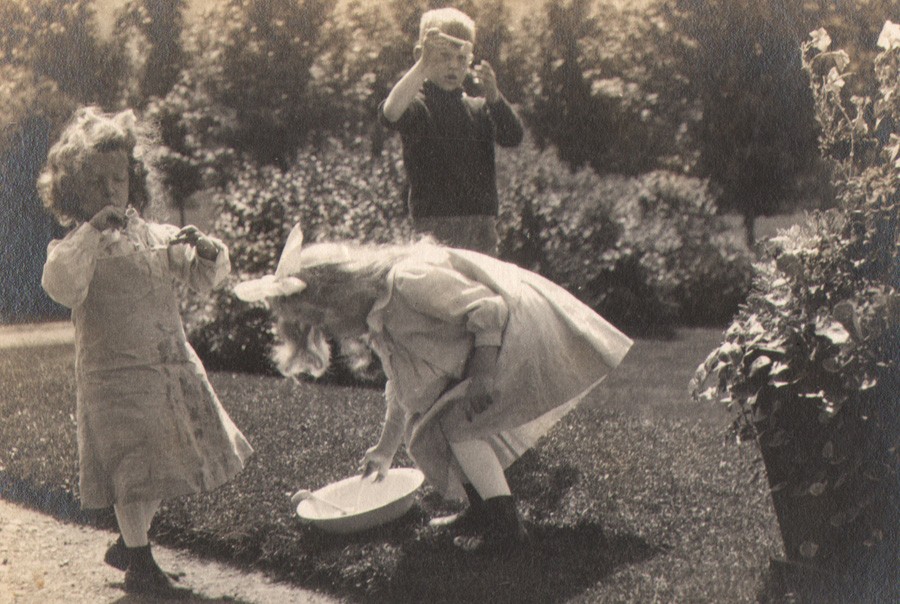 Detail: Alfred Stieglitz: "Soap Bubbles", from 1905 Kodak Competition Souvenir book. (8.8 x 14.4 cm | 8.0 x 13.7 cm) Printed on Velvet Velox and believed to be from the original negative, Stieglitz received an honorable mention and $20.00 in the Kodak contest in Class C Open category for Enlargements. from: PhotoSeed Archive
History of Kodak Competitions
Little scholarship seems to have been spent on the annual photographic competitions which in turn lead to public exhibitions sponsored by the Eastman Kodak Company in the early years of the late 19th and early 20th centuries. Besides accomplishing the desired result of brand recognition, they are undoubtedly a rich resource for understanding the changing aesthetic trends for primarily amateur photography during this period.
 Detail: letterpress: Awards for the 1905 Kodak Competition were announced and listed in March, 1906. Some of the results for the bigger names who competed in Class A, Open category, (negatives 3 ¼ x 4 ¼ or larger in size) are seen here. From: Canadian Kodak Co., Limited Trade Circular: Toronto: March, 1906: online resource courtesy Ryerson University Library Special Collections
Of the resulting exhibition which the 1905 competition spawned, a Photographic Times editor provided an overview but also gave it a veiled endorsement after it closed at Madison Square Garden Concert Hall in New York City in November, 1906:
While the Kodak Exhibition is prompted by commercial interests and is for the purpose of advertising the products of the Eastman Kodak Company, yet so skillfully is this concealed that each visitor comes away feeling indebted to the company.
 20 winning photographs printed as halftones (printed on coated manilla stock) are featured in the souvenir book for the 1905 Kodak Competition. This representative page spread features clockwise from top left: "Dream" by Annie W. Brigman, "Decorative Study" by E.B. Vignoles, "Hallowe'en" by Mrs. Myra A. Wiggins, "Kodaking" by Alfred Stieglitz, "Mountain Nymph" by Miss Jessie Willard. Dimensions of open book sans card cover: 23.5 x 34.5 cm from: PhotoSeed Archive
In 1897, one of the very first Kodak international competitions originated in England, which lead to a show known as the Eastman Photographic Exhibition.
Held at the New Gallery on Regent Street in London from October 27 to November 16, 1897, the exhibit drew 25,000 photographic entries from around the world, with $3000.00 in prize money. It was organized by amateur photographer George Davison, (1856-1930) a founding member of the British Linked Ring and Director of the Eastman Photographic Materials Company in England. In America, these annual competitions were promoted by Kodak advertising department manager Lewis Bunnell Jones. And with the known exception of the 1897 show traveling to America in 1898 where it was enlarged and displayed at The National Academy of Design in New York City in January, Jones’ hand became more evident beginning in 1905. At least five years of public exhibitions beginning in 1906, of which the Kodak Competition Souvenir of 1905 is one of the finest records of, was the result:
Under Jones’s autocratic supervision, Kodak’s advertising department devised some of the company’s most legendary campaigns and strategies, including the 1893 introduction of the Kodak Girl in magazine ads and posters; the Traveling Kodak Exhibitions that toured the country between 1905 and 1910; the famous “yellow box” packaging in 1905… “(4.)
 Edward Steichen won 2nd prize and $100.00 in the Class C open category for enlargements for this photo titled "Sheep Study". This halftone version from the enlarged exhibited print was reproduced in London's Amateur Photographer in August, 1907. Compared to the more commonly known version by Steichen's hand, a hand-toned photogravure published in Camera Work XIX, this image is practically "straight". The editors however make their feelings known it does no justice to his original intent: "In the second place, the pictures are not the original prize-winning prints, but enlargements made at the Company's English works; and however skilful the enlarger is, he cannot possibly always catch and elaborate the ideas of men like Steichen. Bearing this in mind, it is easy to imagine the beauty of Steichen's own enlargement of the "Sheep Study," No. 1, with the sheep blended into a soft mass of tones"…
Records from primary source material shed light on these competitions, which beginning in 1907 began to be annually known as the Kodak Advertising Contests:
1904:
Book of the £1,000 Kodak Exhibition.
This is the title, stamped in gold, on the cover of a handsome portfolio just issued by the Kodak Press. “To show something of the work that is being accomplished in pictorial photography by the devotees of the Kodak system.” The world-wide interest in the Kodak competition of 1904 naturally brought together much of the best work of the camera and the public exhibition of the competing pictures in London was an eye-opener to all who could attend. From this exhibition sixty or more prints were selected and have been reproduced in half-tone, which will enable photographers in the most remote localities to see the work of others and note the kind and quality of the work which finds favor with competition judges. (5.)
And from The Photographic Times:
A detailed report of the results of the £1,000 Kodak Competition has been received in this country, and the results cannot but prove gratifying to those who take an interest in the advancement of American photography. There were something over 20,000 entries received, of which about 12,000 were from the British Isles, 2,500 from France, 2,000 from the United States, 1,700 from Germany and 2,000 scattering. The British Isles received 229 prizes, the United States 85 prizes, France 28 and Germany 12. It will thus be seen that the British exhibitors received one prize to every 52 entries, the French one to every 89, the German one to every 141 and the American one to every 23 entries. Our American amateurs, in proportion to their entries, carried off over twice as much as their British cousins, three and a half times as much as the French competitors and did six times as well as the Germans—at least such was the opinion of the British judges who were no less personages than Sir William Abney, Mr. Craig Annan and Mr. Frank Sutcliffe. (6.)
 Detail: Edward Steichen: "Pastoral - Moonlight" (Camera Work XIX, 1907: 15.6 x 19.9 cm) This blue/green hand-toned photogravure better reflects the intent of Steichen as it is by his own hand- especially when compared to the "straight" version exhibited in London in 1906 as part of the 1905 Kodak Competition. from: PhotoSeed Archive
1905-06
The subject of this post concerns the 1905 Kodak Competition, which concluded the following year in 1906 with public exhibitions in America as well as London, England in 1907.
1907
The 1907 Advertising Contest of the Eastman Kodak Company possessed a far greater value than the securing of good pictures for use in advertising the products of the Eastman Company. Its value from an educational and artistic standpoint is exceedingly great, and of inestimable value to all photographers and illustrators who use other methods than photography. The results of this competition were a revelation as to the possibilities of graphic illustration by means of the camera when handled understandingly.
The pictures possess human interest far surpassing anything that could have been drawn or painted, for the subjects were real live people, and not the imaginative creations of some artistic brain. Such pictures grasp and hold the interest of the reader and, when their story is pleasingly told, are most convincing.
Glance over the advertising section of any of the popular magazines, and see how important a part the camera plays in illustrating and in pictorially clinching the advertiser’s argument. In many instances, the picture has been that of some charming bit of femininity and used often only to hold the attention in order that the accompanying text might be read. (7.)
1908
In 1908, the Eastman Kodak Company sponsored an advertising contest for professional as well as amateur photographers. $1600.00 was offered as cash prizes. Winning submissions would be used to advertise Kodak products. Mrs. W.W. Pearce, an active woman amateur photographer from Waukegan, IL, won first prize and $300.00 in the Class B Amateur class of the contest. The PhotoSeed Archive owns a vintage example of this winning print, and more background on the contest and results from 1908 can be found here.
1909
The contention that better pictures for advertising purposes could be produced by means of photography than by any other artistic method has been still further justified by the result of the 1909 Kodak Advertising Contest.
It is gratifying to note the continued interest of competitors in former contests, and also in highly artistic work submitted by newcomers in the field.
The jury which passed on the work was highly competent, consisting of Mr. Rudolph Eickemeyer, of Davis & Eickemeyer; Mr. A. F. Bradley, ex president of the P. P. S. of New York; Mr. Henry D. Wilson, advertising manager of Cosmopolitan; Mr. C. C. Vernam, general manager of the Smith & Street publications, and Mr. Walter R. Hine, vice-president and general manager of Frank Seaman, Incorporated, one of the largest, if not the largest advertising agency in the United States. Mr. Frank R. Barrows, president of the P. A. of A., was announced as one of the judges, but was unavoidably detained, Mr. Bradley acting in his place. (8.)
1910
THE Eastman Kodak Company, always a most generous patron of photographers, both professional and amateur, has just closed its advertising competition for 1910. This contest has become one of the most important fixtures of the photographic world, not only because of the remarkably large cash prizes awarded, but also because of the tremendous stimulus it has been to the application of photography to advertising. Photo-era has many times called attention to the increasing use of photographs by the general advertiser, and one has only to pick up almost any of the popular magazines and glance at the advertising pages (more interesting, oftentimes, than the body of the letter-press) to see how greatly the ad-writer depends on the halftone cut from a photograph to present his goods in an attractive manner. In this development, beyond question, the Eastman Company has had a large share, and the successful contestants in its contests have gained valuable experience which they can apply with profit, should they so desire, to photographic illustration-work. (9.)
1911
From our standpoint the previous Kodak Advertising Contests have been a distinct and growing success. They have supplied us with pictures that told interestingly of the charm and simplicity of Kodakery. But there has been one drawback. In the professional division (Class A), the prizes have gone so often to the same people that we fear other photographers are likely to be discouraged. In order to remove this possible objection to our contests, these former winners will be barred from participation in Class A in the 1911 competition. (10.)
1913
1913 Kodak Advertising Contest — $3,000.00 In Cash Prizes.— The Kodak Advertising Contests are not for the purpose of securing sample prints. They are for the purpose of securing illustrations to be used in our magazine advertising, for street car cards, for booklet covers and the like.
We prefer photographs to paintings, not only because they are more real, but also because it seems particularly fit that photographs should be used in preference to drawings in advertising the photographic business. The successful pictures are those that suggest the pleasures that are to be derived from the use of the kodak, or the simplicity of the kodak system of photography — pictures around which the advertising man can write a simple and convincing story. Of course the subject is an old one — therefore the more value in the picture that tells the old story in a new way. Originality, simplicity, interest, beauty—and with these good technique —are all qualities that appeal to the judges.
In addition to the prize pictures we often purchase several of the less successful pictures for future use in our advertising. So it will be seen that in reality our prize money is even bigger than we advertise.
There is a big future for the camera in the illustrative field. There’s a growing use of photographs in magazine and book illustrations, to say nothing of the rapid advance along the same lines in advertising work. There’s a constant demand for pictures that are full of human interest. Such are the pictures that we need, that others need. The Kodak Advertising Contests offer an opportunity for your entry into this growing field of photographic work. (11.)
 Detail: platinum print: "Threading the Needle", (12.4 x 9.9 cm | 11.7 x 9.2 cm) by Nancy Ford Cones (American,1869-1962) This photograph, printed on Kodak's WD Platinum (water-development) paper, and featured in the 1905 Competition Souvenir book, won the $100.00 second prize for Cones in the Class A Open category, featuring negatives 3 ¼ x 4 ¼ or larger in size. Cones was born in Milan, Ohio but is listed as being from Covington, Kentucky when the photo was taken. from: PhotoSeed Archive
The 1905 Competition might certainly be considered key in launching the careers of many serious amateurs, and it undoubtedly gave others the opportunity to pursue photography professionally as a career:
The Kodak Competitions which have been held during the past six or seven years have been something of a revelation in that they have shown that a very large proportion of those amateurs who take photography seriously are frequent users of the Kodak. The same names that appear as Salon Exhibitors have appeared in the Kodak prize lists and often times the pictures that have hung on the Salon walls were from the same negative that won cash and honor in the Kodak competition. (12.)
Doing the Rest
Similar to celebrity endorsement today, Kodak had the uncanny ability to associate the big photographic names of the early 20th century; including Stieglitz, Steichen and Brigman, with the idea amateur photographers using their products could become as skilled or famous. The often mocked Kodak mantra of “you press the button and we do the rest”-acknowledged even by someone as famous as Stieglitz himself -is ironically shot down when it is learned Kodak made the enlarged prints from competitor’s negatives for exhibition purposes for the 1905 competition and those following it:
THE Kodak Exhibition, at No. 40, Strand, W.C, will come as a surprise to persons who are only accustomed to the ordinary enlargements of prize-winning photographs which are displayed in dealers’ windows; it will come as a decided shock to those who are wont to ridicule the “you press the button, and we do the rest” method of photography. Out of some twenty-eight thousand prints and enlargements which were submitted to the judges at the latest Kodak competition, some sixty were adjudged prizes varying from one to thirty pounds; and the negatives of these prints, which have become the property of the Kodak Company, have been enlarged into huge enlargements at the Kodak works, and are now on view for all to see.
There are many well-known names amongst the prizewinners—Steichen, Stieglitz, Harold Baker, Mrs. Barton, Miss Annie Brigman—but these only made the exposures and developed the negatives, Kodak has done the rest, and, as a rule, Kodak has done it uncommonly well. It is not, of course, to be imagined that the Company’s enlargements of negatives by such individual workers as Steichen and Stieglitz are similar to the results that these men would have themselves obtained, but the wonder is that the work has been done so well. The enlargements of Stieglitz’s negatives are particularly good, especially that of “Soap Bubbles,” No. 7, in which the feeling of light and atmosphere has been successfully maintained; and those subjects in which the figures are lit from behind, and, so to speak, silhouetted against the light, are not easy to handle. …
In considering the question of the awards, two facts must be borne in mind: in the first place, the judges in this particular competition belonged to the American school of photography, and the present tendency of this school is to ascribe great merit to original and beautiful schemes of natural outdoor lighting; and therefore we find Steichen’s tour de force, “Mother and Child,” No. 60, awarded the first prize in Class A; and photographs taken against the light have scored throughout. However, such subjects are undoubtedly beautiful, and the rendering of true values in such subjects is exceedingly difficult, and therefore the attitude of the judges is comprehensible. In the second place, the pictures are not the original prize-winning prints, but enlargements made at the Company’s English works; and however skilful the enlarger is, he cannot possibly always catch and elaborate the ideas of men like Steichen.
Bearing this in mind, it is easy to imagine the beauty of Steichen’s own enlargement of the “Sheep Study,” No. 60, with the sheep blended into a soft mass of tones; and the above-mentioned “Mother and Child” (with the imperfections in the values of the child’s hand corrected during the enlargement) must have been quite good in the original; Stieglitz’s “Bubbles,” No. 7, however, has lost but little through enlargement, and although Stieglitz would probably have rendered the subject in a higher key, the Kodak work is excellent.
Why has not Miss Annie Brigman’s “Melody” (15) secured a first prize? It is certainly one of the gems of the collection, and it is good throughout, from the posing and lighting of the hand which holds the mandolin, to the subdued lighting of the music illuminated only by the light reflected from the face of “Melody.” Possibly the judges may have considered the lighting, which might have been arranged by Rembrandt himself, somewhat artificial; but there is no doubt that European judges would have thought differently. This picture, taken with a Kodak, enlarged on Kodak bromide paper, by the Kodak Company, is one of the finest pictures ever rendered by the camera. (13.)
 Detail: gelatin silver print: "Melody", (16.4 x 11.2 cm | 15.7 x 10.6 cm) by Anne Brigman (American, 1869-1950) This photograph, which a critic in London's Amateur Photographer journal in 1907 proclaimed "One of the finest pictures ever rendered by the camera" is printed on Kodak's Carbon Velox paper, and featured in the 1905 Competition Souvenir book. It won an honorable mention and $20.00 for Brigman in the Class C Open category for Enlargements. The photo is also known as "Woman with Mandolin" from: PhotoSeed Archive
Notes
1. excerpt: Judges for the Kodak Contest: Kodak Trade Circular: Toronto, Canada: April, 1905
2. Ibid: Kodak Trade Circular: December, 1904
3. Camera & Dark-Room: Edited by J.P. Chalmers: New York: January, 1905: p. 30
4. excerpt: A Short History of Kodak Advertising 1888-1932: Kodak and the Lens of Nostalgia: Nancy Martha West: The University Press of Virginia: 2000: p. 27
5. excerpt: Book of the £1,000 Kodak Exhibition: The Camera and Dark-Room: New York: January, 1905: pp. 29-30
6. excerpt: £1,000 Kodak Exhibition: Notes, News & Extracts: The Photographic Times: New York: September, 1904: p. 426
7. excerpt: The Kodak Advertising Contest: The Photographic Times: May, 1908: p. 154. The top prize of $1000.00 was awarded to E. Donald Roberts of Detroit.
8. excerpt: AWARDS, PROFESSIONAL CLASS, 1909 KODAK ADVERTISING CONTEST: Wilson’s Photographic Magazine: New York: January, 1910: p. 46
9. excerpt: The Eastman Advertising-Competition: Malcolm Dean Miller: Photo-Era: Boston: January, 1911: p. 73
10. excerpt: With the Trade: 1911 Kodak Advertising-Contest: Photo-Era: Boston: March, 1911: p. 157
11. excerpt: Our Table: American Photography: Boston: May, 1913: pp. 311-312
12. Advertisements: Eastman Kodak Company: excerpt: The New Competition: The American Amateur Photographer: New York: Jan-Dec. 1905
13. excerpt: The Kodak Picture Exhibition: The Amateur Photographer: London: August 27, 1907: pp. 200-01
Unskilled & Unacquainted with Photography
Posted February 2013 in Advertising, New Additions
Perhaps as a final swan song to its illustrious editor, the final issue of the American Amateur Photographer in which Alfred Stieglitz was associated-December 1895-featured an actual gelatin-silver photograph by the American master. (1.)
 Detail: Alfred Stieglitz: "At Lake Como": matt surface Velox (silver-chloride) print: 15.5 x 22.8 cm | 12.75 x 18.5 cm: from: "The American Amateur Photographer": December, 1895: A Velox "Nepera Chemical Company" blindstamp can be seen at far right margin of print: from PhotoSeed Archive
But don’t get too excited. Unlike the exacting standards Stieglitz made in creating master prints from one of his own negatives, (often not exceeding one example) At Lake Como taken in 1887 was reproduced in several thousand examples for the issue. In fact, copy supplied by the paper manufacturer, the Nepera Chemical Company, inferred the simplicity involved in exposing the Velox paper it was printed on: “exposures were made by a boy unskilled or unacquainted with photography”.
From the collecting standpoint, especially by one of the medium’s greats, the print however is extremely rare, and is a continuation of the fascinating history of photographic marketing in which original prints were bound inside journals for the purpose of selling product, in this case the Velox brand. You can read more about the process of making this print here, and see the uncropped version.
For myself, the artist’s intent for At Lake Como is more fully realized- and unfaded- in another version seen below: a hand-pulled gravure reproduced in 1893.
 "At Lake Como": 1893: hand-pulled photogravure by N.Y. Photogravure Company: 12.8 x 18.8 cm: which appeared in the December 1, 1893 issue of The Photographic Times: from PhotoSeed Archive
1. Stieglitz however did appear as co-editor on the masthead of the American Amateur Photographer along with F.C. Beach for the final issue of January, 1896.
Famous Kodak Girl?
Posted December 2012 in Advertising, Fashion Photography
Recognize the face? A teen model aiming her Kodak in a sheep field? If yes, please do tell. With her mystery my acknowledgment, I can say without hesitation it’s a snap getting sucked into the world of early Kodak advertising.
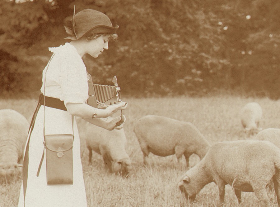 Detail: "Kodak Girl in Sheep Field" : vintage silver gelatin print: (8.7 x 11.6 cm) : ca: 1900-1920: by American (Philadelphia) photographer Edwin H. Fait: from: PhotoSeed Archive
As noted in this site’s previous post of their colorization of an early 1908 advertising contest winner by Marian Pearce of Waukegan, IL, Kodak’s marketing genius often took the form of “candid” views of models using cameras in the field: children taking pictures with a Brownie box variety, in the case of the Pearce winning photograph, or this silver gelatin print in the PhotoSeed Archive featuring a fashionably-dressed girl releasing the bulb shutter of what appears to be a model 3A Folding Pocket Kodak. (1.)
Similar to my discovery of the Pearce image used later in an advertisement, I’ve spent more than a few hours trying to decipher if this girl with chapeau was also published, but with no luck. Among multiple sources in the search process, I’ve come across a few notable online sites including the smile-inducing KodakGirl Collection (German publishing house Steidl releases this month their marvelous addition to Kodak scholarship: Kodak Girl: from the Martha Cooper Collection ) and revisited many pages from Duke University Libraries resource Emergence of Advertising in America currently showing 550 early Kodak advertisements.
 Detail: verso: "Kodak Girl in Sheep Field": graphite in unknown hand: "By Edwin H. Fait" | "Phila" | "Well known": from: PhotoSeed Archive
But getting back to that face. I’ve tentatively dated this photograph from 1900-1920, and the commercial nature of the image suggests deliberate posing, with the model seen in profile holding her Kodak camera to nice effect. The carrying case is also stylishly displayed-consistent with vintage advertisements from this era- slung over her shoulder and resting on her hip. I may of course be wrong, but in addition to this young lady sharing a striking resemblance to very early known photos of her, (2.) and the intriguing abbreviated reference to the city of Philadelphia on the back of the photograph, Kodak Girl in Sheep Field may very well show American silent film actress and Philadelphia native Eleanor Boardman. (1898-1991)
The photographer, as I decipher on the back of the photo, was Edwin H. Fait. (see detail above) Boardman is acknowledged to have been one of the famous Kodak Girls, appearing in color on the cover of the 1921 Kodak catalogue, but perhaps not surprisingly when it comes to celebrity, research inconsistencies are rife. She is first believed to have begun modeling in 1913-1914, when she would have been 15 or 16 years of age-consistent with the dating for this photograph. A 1931 newspaper account stated:
About the time she finished art school, Miss Boardman began posing for commercial photographers. She became famous as the Kodak Girl and was the central figure in an advertising campaign which portrayed her snapping pictures in many localities. (3.)
Whatever her mysterious identity, this Kodak girl undoubtedly inspired others from the era to pick up a camera of their own.
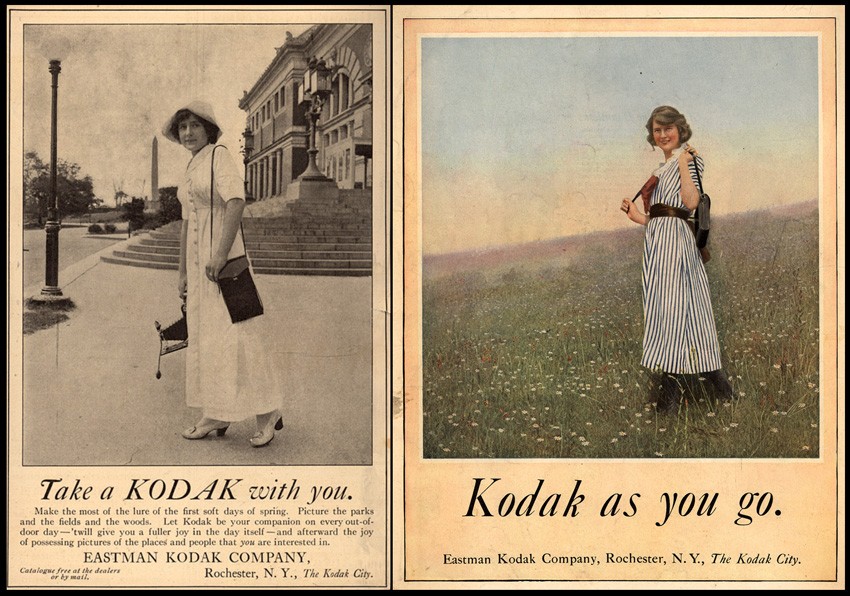 Left: "Take a Kodak with you" : vintage advertisement from unknown 1912 issue of "Ladies Home Journal": | Right: vintage advertisement: "Kodak as you go" : from: unknown source here published in 1921 but also used as cover art same year for annual Kodak catalogue: both: online resource: Emergence of Advertising in America: 1850-1920: Duke University David M. Rubenstein Rare Book & Manuscript Library
1. The 3A Folding Pocket Kodak was first introduced in 1903. Another possibility is that she holds a model 1A Special Kodak, which first came out in 1912.
2. Due to copyright considerations, I’ve elected not to show these here, although early portraits of Eleanor Boardman can be found doing common search engine image searches.
3. “Eleanor Boardman was Kodak Girl”: from: The Lewiston (ME) Daily Sun: October 15, 1931
The Beauty of Color
Posted December 2012 in Advertising, Color Photography
It is always a pleasure to run across vintage advertising featuring photographs from this archive. Marian Pearce, an amateur from Waukegan, IL, was the grand prize winner in 1908 for this original platinum photograph in the Eastman Kodak Company’s annual advertising contest. Her winning entry, featuring a young girl snapping a photo of her (presumed) younger sister with a Brownie camera appeared in the Ladies Home Journal the following year.
 Composite illustration: top: Mrs. W.W. Pearce: black & white detail: from original platinum print: "1908 Kodak Photographic Advertising Contest First Prize Winner, Amateur Class": 15.3 x 19.3 cm | bottom: detail: 3-color halftone: from "Let the Children Kodak", by the Eastman Kodak Company reproduced in June, 1909 issue of the American magazine "Ladies Home Journal"
What was unexpected was seeing the photograph in the ad published in color. Eastman Kodak advertising manager L.B. Jones oversaw this campaign, with the theme of “Let the Children Kodak.” The three-color halftone process used to reproduce the photo in the June, 1909 issue of the magazine may have been the result of a hand-colored version of the Pearce photograph.
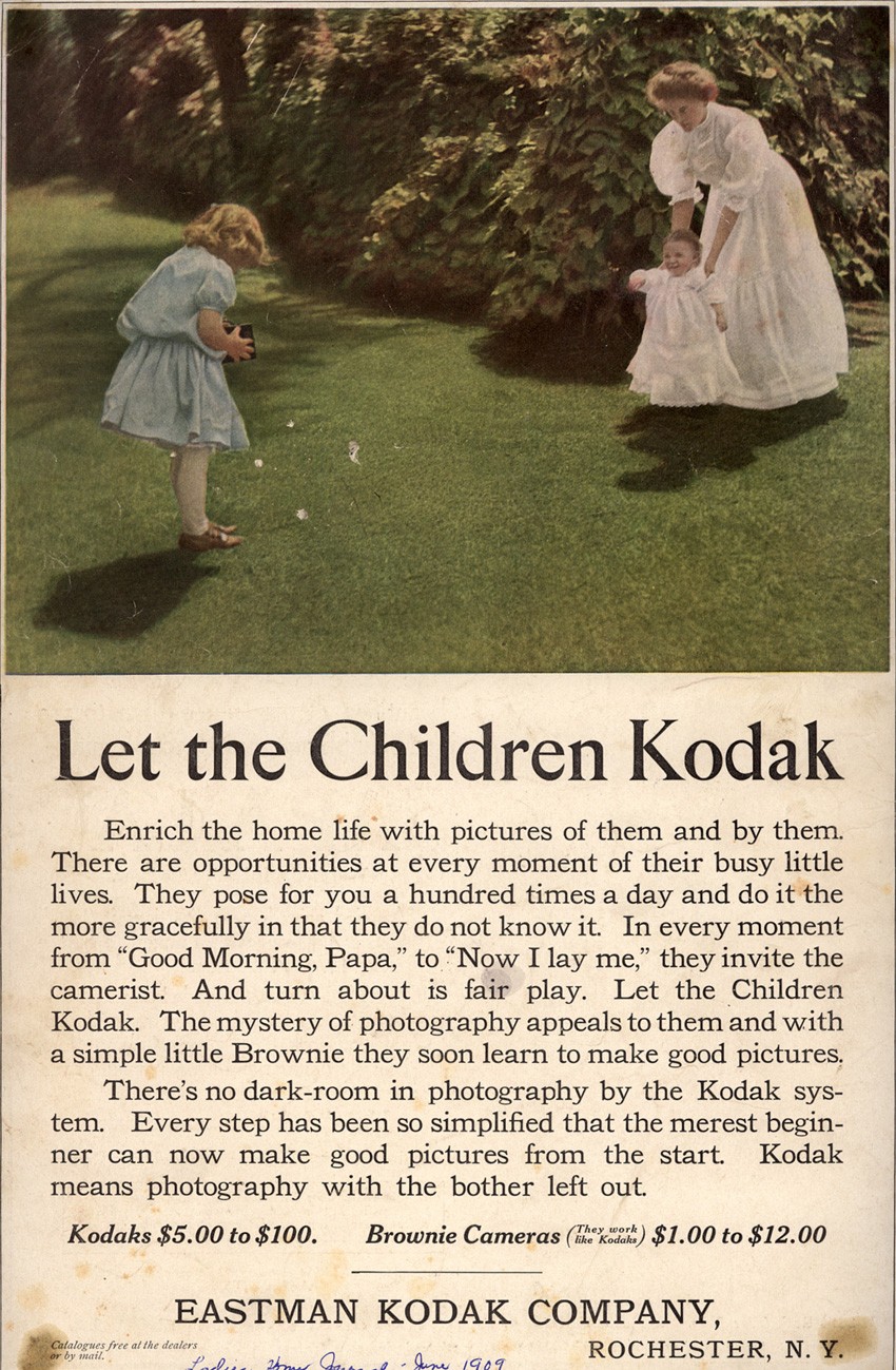 "Let the Children Kodak" : vintage advertisement in June, 1909 issue of "Ladies Home Journal": from: online resource: Emergence of Advertising in America: 1850-1920: Duke University David M. Rubenstein Rare Book & Manuscript Library
Sadly, Mrs. Pearce is not given credit for the photo in the ad, which is of course still common today, although her grand prize of $300.00 she earned in the amateur category of the 1908 contest was a king’s ransom for the time.