Category
Typography
10 entries in this category | view all categories
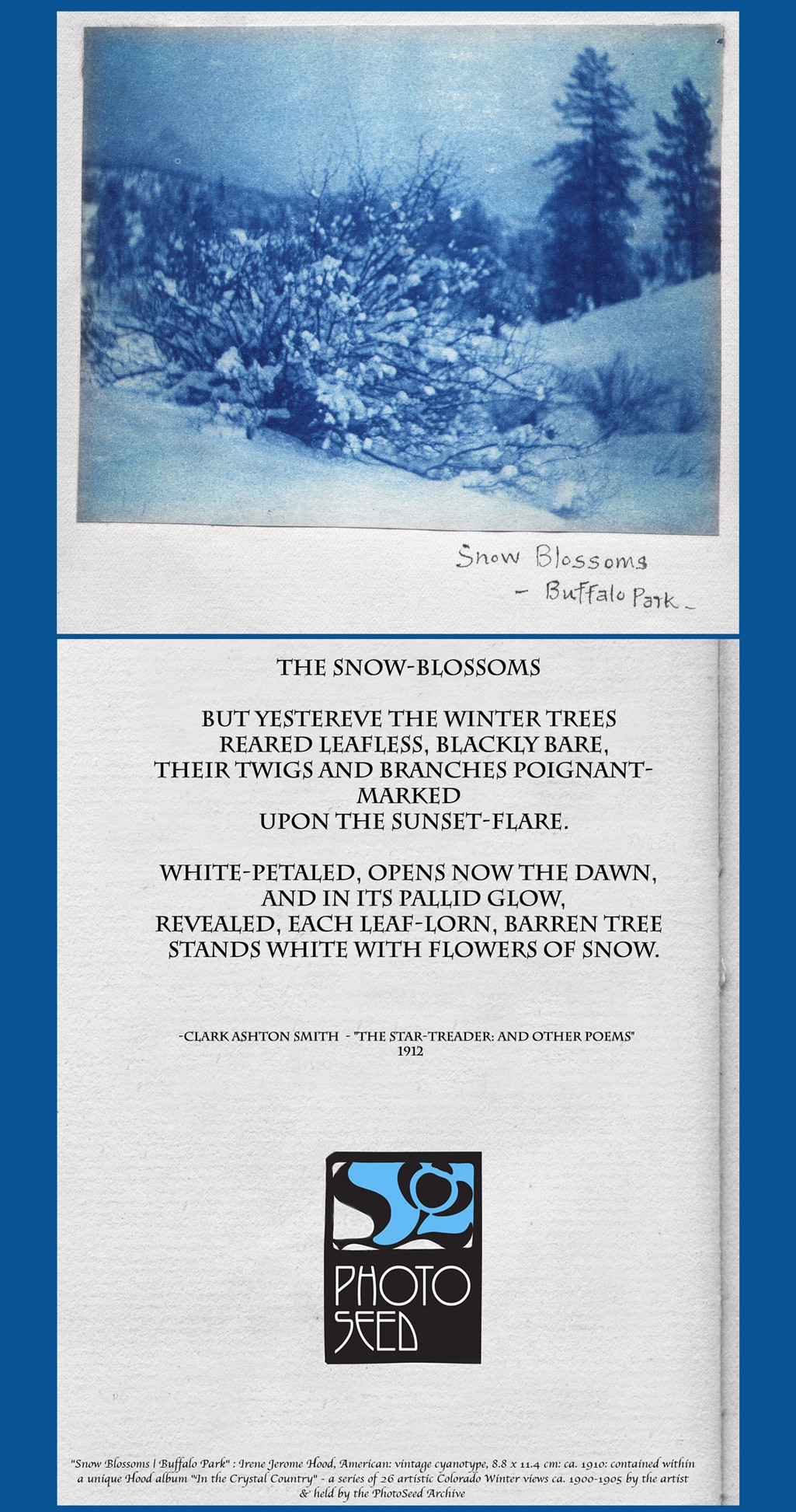
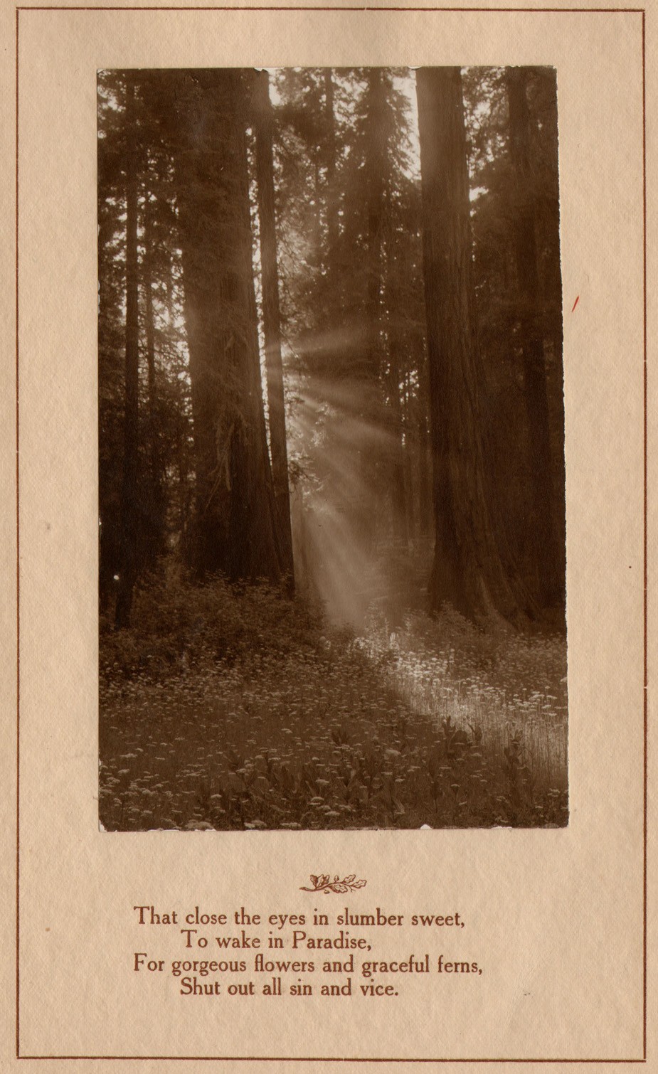
Winter Poem
Posted January 2023 in Alternate Processes, Color Photography, Painters|Photographers, PhotoSeed, Texts, Typography
New Year in New England
Posted January 2019 in New Additions, Significant Photographers, Typography
Happy New Year!
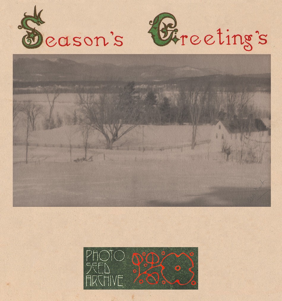 Detail: “White Mountains, N.H. from Rivercroft Farm”: By William Boyd Post, American (1857-1921): vintage platinum print ca. 1900-10 (12.7 x 23.7 | 16.0 x 25.9 cm) Showing a mountainside farmstead in foreground neatly framed by the peaks of New Hampshire's White Mountains in background, the photographer framed this view from an overlook in Fryeburg, Maine on the present-day Rivercroft Farm, first established in 1799 and located at 48 River Street. (ME Route 113) W.B. Post specialized in snow scenes first beginning around 1895, and more so after he retired to his family’s summer home in Fryeburg, Maine permanently in 1898. Ornamental initials and hand lettered greeting on upper margin taken from 1933 folio of colored collotype views issued by an American tea merchant living in Japan. From: PhotoSeed Archive
Say It With Flowers . . . . Do It With Dishpans
Posted February 2018 in Advertising, Alternate Processes, Painters|Photographers, Publishing, Significant Portfolios, Typography
In 1926, Minnesota artist Cleora Clark Wheeler made the following observation in an article she wrote explaining her feat of photographing scores of fellow Kappa Kappa Gamma fraternity sisters by means of silhouette portraiture:
 "Silhouette Self Portrait of Minnesota artist Cleora Clark Wheeler" ca. 1926. (typography added by this website) The photograph was used to illustrate an article written by her published in The Key, the quarterly magazine for Wheeler's fraternity Kappa Kappa Gamma in December, 1926. (p. 500)
“anyone who saw the interested crowd getting their pictures on banquet night just before we all parted, will be sure it proved there is a way to have one’s picture taken without having one’s head turned.”
Using said dishpans in the title to this post, procured from a nearby hardware store outside Oakland, California, Cleora, or Cleo as she was known, went on to secure these pans used as reflectors for the photo shoot using her mother’s wooden tomato supports, placed in the trunk of her car before heading to the annual convention that year at Mills College from her St. Paul, MN home, a journey of 2000 miles.
So we will say it with our own flowers here: on the occasion of PhotoSeed posting a rare surviving folio volume of 23 of her delicate Japan-tissue photogravures of California landscapes taken and printed by Wheeler used as a sales catalogue, some further context into the life of this fascinating and talented woman is necessary in order to fill in the historical record.
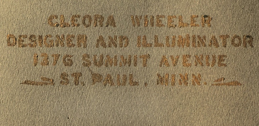 Detail: Title of California Sample Book by Cleora Clark Wheeler, American: 1882-1980: gilt hand-lettering: "Cleora Wheeler Designer And Illuminator 1376 Summit Avenue St. Paul, Minn." 33.0 x 50.0 cm: folded, olive-colored cardstock leaf used as album cover. From: PhotoSeed Archive
To be clear, photography was just one of the many talents American artist Cleora Wheeler employed in her 98 years. Although never married, it might be said her significant partner through life was her beloved fraternity, Kappa Kappa Gamma, which she was initiated into at the Chi chapter at the University of Minnesota on October 9, 1899. Graduating in 1903, she went on to serve Kappa her entire life.
A designer and illuminator, as she would often describe herself while working out of the third floor studio of her longtime St. Paul family home, often in the act of creating unique bookplates and greeting cards, Cleora wore many professional hats. Artist, poet, school teacher, women’s advocate, business manager, an expert in steel die stamping, photographer and tireless promoter of her fraternity both locally in Minnesota and around the country were but a few of her passions.
With the knowledge that “Miss Wheeler thinks of California as her second home” as noted in a follow-up article describing her hand-colored photographic work and bookplates on display in 1922 at the St. Paul Public Library, her love of place and record of spirit is evident in pictorial photographic work taken in the American West ca. 1914-1921: a reaffirmation of the cross-pollination taking place in the arts by unconventional practitioners.
 Left: "Redwoods": Cleora Clark Wheeler, American-1882-1980: ca. 1922: hand-pulled Japan-tissue photogravure: 10.7 x 6.2 | 20.8 x 15.1 Gampi | 25.0 x 38.0 off-white handmade paper (folded) | 33.0 x 25.0 cm olive-colored cardstock leaf. From: PhotoSeed Archive. Right: "Redwoods": ca. 1922: Cleora Clark Wheeler: hand-colored gelatin silver exhibition print from the artist's 1922 St. Paul exhibition Atmospheric Studies. A roadway in the Sierra Mountains leads to a stand of soaring redwood trees in this landscape study colored with Japanese dyes. Courtesy: Grapefruit Moon Gallery auction listing, Minneapolis MN.
The following timeline by year in the life of Cleora Wheeler is meant as a starting point for this remarkable artist. It begins with her birth in Austin, Minnesota in 1882 and concludes with a 1980 obituary printed in her alumni magazine. Although long-winded in some cases, I’ve decided to include some of the expanded background articles written by and about Wheeler in The Key, the Kappa Kappa Gamma quarterly. In addition to photographic work by Wheeler held by this archive, a link to 45 bookplates held in the Helen Brainerd Lay Bookplate Collection at Mount Holyoke College in South Hadley, Massachusetts can be found here, and a general search link to the Wheeler family archive at the Minnesota Historical Society Library catalogue is here. (type in “Cleora Clark Wheeler”) Further suggestions for inclusion are welcomed. Please contact me through the blog or at admin@photoseed.com.
David Spencer- February, 2018
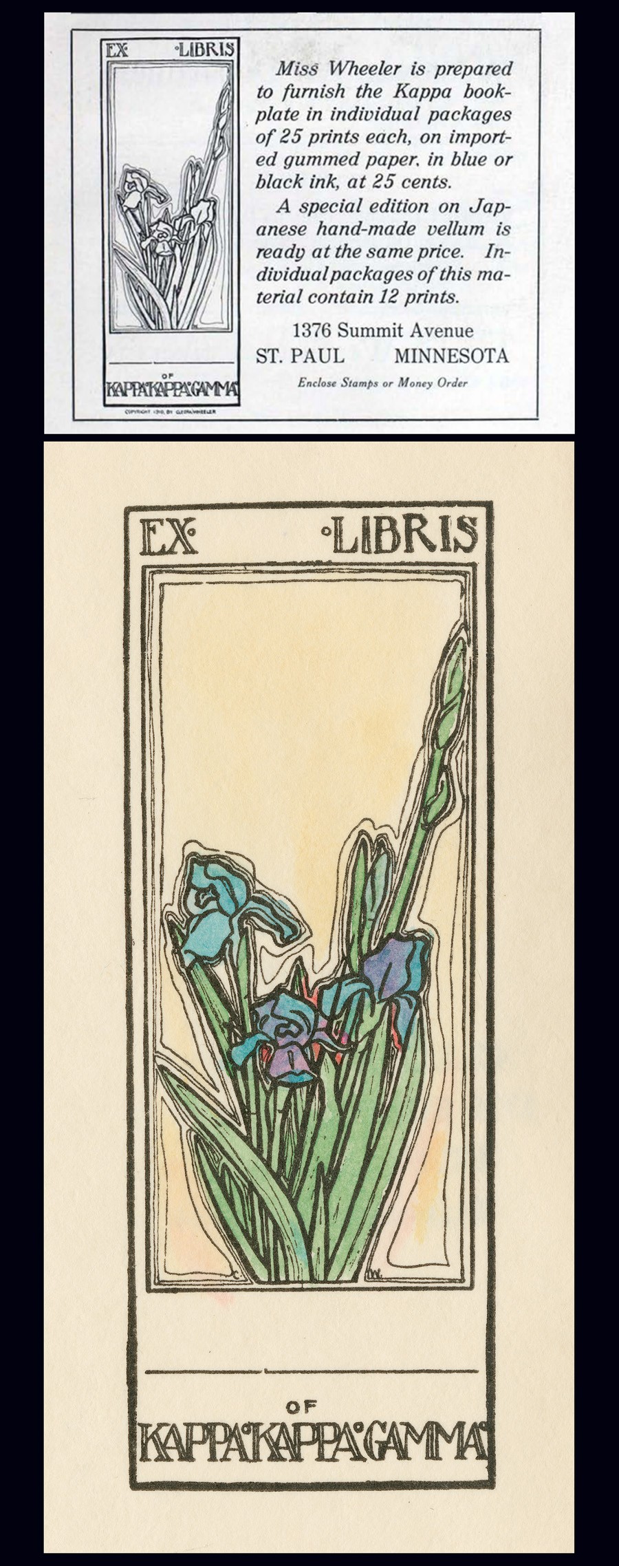 Top: December, 1910 advertisement for new Ex-Libris book plate designed the same year by Minnesota artist Cleora Clark Wheeler as it appeared in The Key, the quarterly magazine of her fraternity Kappa Kappa Gamma. Bottom: "Ex Libris of Kappa Kappa Gamma, by Cleora Clark Wheeler": (American: 1882-1980). Ca. 1920-30. Hand-colored book plate shows the fleur-de-lis iris, the fraternity flower, with the artist's initials CW appearing on opposite sides of the base of cut flowers. Courtesy: Helen Brainerd Lay Bookplate Collection, Mount Holyoke College Archives and Special Collections: Identifier: ms0048-s02-b02-f15-i001.
Timeline: Cleora Clark Wheeler: 1882-1980
1882: Wheeler is born in Austin, Minnesota. Her father, Rush Benjamin Wheeler, (1844-1930) was an East coast transplant who graduated from Yale. He was a lawyer involved in banking and real estate. Her mother Harriet Sophia Clark Wheeler (1853-1938) was a graduate of the University of Minnesota. Her siblings were two brothers: Frost Montaine Wheeler: 1878-1963 & Ross Clark Wheeler: 1886-1901. The family lived in St. Paul.
1903: Graduates from The University of Minnesota with a Bachelor of Arts degree in English. She later went on to earn certificates of proficiency in engineering drafting and advanced engineering drafting from U. M.
⎯ Moves to California and lives for a year: “Cleora Wheeler’s first work with the Young Women’s Christian Association was in California. Soon after her graduation from the University of Minnesota she was asked by Miss Louise Brooks of New York, national secretary of conventions and conferences, to be her assistant at the student conference at Capitola, Cal.” source: 1921 background on Wheeler in The Key.
⎯ “Miss Wheeler thinks of California as her second home, as she spent a year with Pi after graduating at Minnesota.” -The Key: 1926 (Pi chapter at the University of California, Berkeley)
1904: Named Grand Registrar for the Grand Council of Kappa Kappa Gamma, with offices at 301 Pioneer Press Building in St. Paul, MN. source: The Key, October.
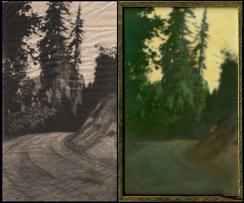
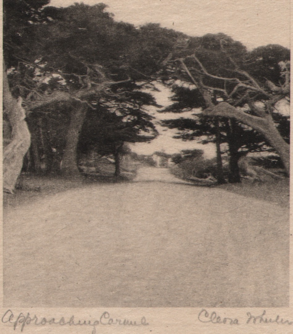 Detail: "Approaching Carmel": Cleora Clark Wheeler, American: 1882-1980. Hand-pulled Japan-tissue photogravure ca. 1922: 10.2 x 7.5 | 21.0 x 15.3 Gampi | 24.2 x 38.0 off-white handmade paper (folded) | 33.0 x 25.0 cm olive-colored cardstock leaf. An archway of cypress trees near Carmel, California frames the famed Seventeen-Mile Drive along the Monterey coastline. From: PhotoSeed Archive
1905: Wheeler’s love of nature, a major theme that would soon emerge in her art, makes an initial greeting as Grand Registrar:
To all in Kappa Kappa Gamma, greetings! The wild thing of the woods has its call; the brook, playing with the bits of forest light and shadow, murmurs to itself; the wind, sighing through the trees, croons its melody and dies away; all nature is at peace, and sings. Song is the outpouring of a soul that cannot contain itself for very joy. Friendship is the life of that soul; a happiness too often unappreciated until perchance it is snatched away, only to leave a memory in its place. May we be worthy of this name of friend, appreciating more fully with each day the fortune that is ours. May we know a courtesy among ourselves that shall unconsciously touch each life we meet. May personal responsibility and devotion broaden into mutual helpfulness, and interest, and charity, until it meet and grace the world of kindly sympathy. (The Key: January: p. 298)
⎯ Writes a poem in tribute to Anne Jones, a fellow Chi chapter member at the University of Minnesota, most likely a personal friend:
Jones. April 5, 1884-July 3, 1905. Initiated into Chi Chapter of Kappa Kappa Gamma October 16, 1902.
As breath of morning gently steals its way O’er sleeping valleys where the morning mist Half timidly awaits the smile of day, Gray mantled, ere the sun has kissed To gold the dim dew-crystaled haze, And gliding soft with footsteps all to fleet For ken of humankind, from out the maze Brings memories, intangible, replete With wonder-fancies, melodies akin To whisperings of heaven; thus she came, Her arms light laden with the green of springA radiance as summer showers win In afterglow, long held ere twilight claim A melody, low borne on evening wing.
-Cleora Clark Wheeler. (The Key: October: p. 534)
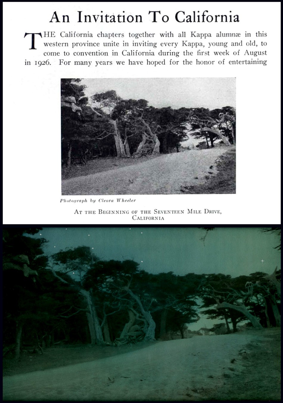 Top: "At the Beginning of The Seventeen Mile Drive": halftone photographic reproduction by Cleora Clark Wheeler used to illustrate article on annual convention for her fraternity Kappa Kappa Gamma. Taken from December, 1925 issue of The Key, the quarterly magazine of the fraternity. The photograph is a variant of her photo titled "Approaching Carmel" seen earlier in this post. Bottom: "After Nightfall": ca. 1922: Cleora Clark Wheeler: hand-colored gelatin silver exhibition print from the artist's 1922 St. Paul exhibition Atmospheric Studies. Another variant of the halftone seen above, Wheeler used Japanese dyes and hand-painted white stars in the sky for this landscape transformed into a nighttime view featuring a twilight blue sky. Courtesy: Grapefruit Moon Gallery auction listing, Minneapolis MN.
1906: Wheeler now living in Berkeley, CA, possibly for reasons of health, where she continue her duties as Grand Registrar: Notices:
“Record charts may be ordered by chapters or individuals at any time. One dollar, including postage; twenty-five cents in addition if backed with linen. Address care Corresponding Secretary of Pi chapter, Berkeley, California. Cleora Clark Wheeler.” (The Key: October: p. 262)
1907: Relinquishes her duties as Grand Registrar by January. In February, a confirmed report in The Key (p. 71) states health is the reason for her absence from MN:
“Cleora Wheeler, whom you all met at convention; is spending the winter in California. We miss her very much, but are glad to say that her health is greatly improved.”
1909: Takes up work again with the Young Women’s Christian Association, (YWCA) with a notice in the February issue of The Key that she is now the business secretary of the St. Paul Young Women’s Christian Association. (p. 72)
 "Sunlight thro' the Redwoods": Lindley Eddy, American: 1873-1946: ca. 1914. 14.0 x 8.5 cm. Tipped to page: 21.5 x 14.0 cm. Sepia gelatin silver print included in volume A Traveler's Prayer of California Mountains, photographs by Lindley Eddy with poems by Olive Hinds Simpson: Visalia, CA: Commercial Printing Co.- copyrighted 1914 by Olive A. Simpson. It would have undoubtedly appealed to the artistic sensibilities of Cleora Clark Wheeler had she come across this volume of poetry featuring ten photographs taken by Eddy in the Sequoia National Forest. The work was published the same year it is believed Wheeler first took up her series of western US photographs in Colorado. From: PhotoSeed Archive (volume for sale: please inquire)
1910: The first advertisement for Wheeler artwork appears in the October issue of The Key for what is believed to be her new book plate, although it’s described as a “plate book”. Showing her business savvy, earlier in August she had registered copyright in her own name for the design:
THE
Official Plate Book of the Fraternity
IN INDIVIDUAL PACKAGES
25 CENTS
Plan to Send Them at the Holidays
ORDER EARLY
Enclose Stamps or Money Order
1376 Summitt Ave. Cleora Wheeler St. Paul, Minn.
⎯ A notice in the December issue of The Key along with an accompanying photograph of the artist that Wheeler had indeed designed the official bookplate for her fraternity:
THE KAPPA BOOK-PLATE
There have been a number of inquiries as to the designer of the Kappa Kappa Gamma book-plate, which was adopted by the Grand Council at Convention Session as the official book-plate of the Fraternity. The plate was designed by Cleora Clark Wheeler, of Chi Chapter, who was Grand Registrar from 1904 to 1906. Miss Wheeler was particularly happy in her choice of the fraternity flower for decoration; for the fleur-de-lis with its long stem and heavy blossom lends itself with special effectiveness to composition. The Kappa bookplate should be an incentive to the growth of our chapter-house libraries; for the chapter name may be used in it, just as well as that of the individual owner.
(note: At the 1890 convention, the fraternity chose the fleur-de-lis “as the Kappa flower for its dignity and grace and because in it the two blues are combined.”)
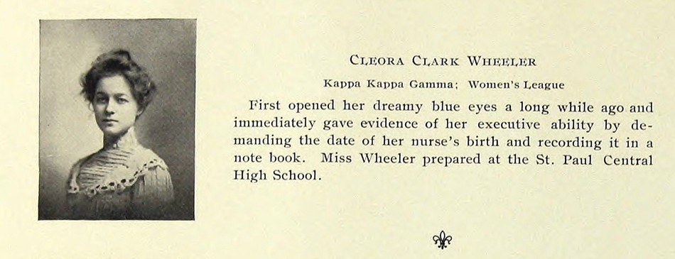 The senior portrait and entry for Minnesota artist Cleora Clark Wheeler as it appeared in her 1903 University of Minnesota Gopher yearbook. Wheeler, 1882-1980, graduated that year with a Bachelor of Arts degree in English and went on to earn certificates of proficiency in engineering drafting and advanced engineering drafting from U. M. Source: online pdf of The Gopher: Vol. 16, 1903: p. 78.
1911: With the rough design of a new Kappa crest duly recorded in a 1910 committee report, the intent of the adoption of an official coat-of-arms for Kappa was soon becoming reality. (discussions began in 1905) Because of this and given her proven design expertise on behalf of the fraternity, and with the aim of surely involving her in other design decisions regarding fraternity insignia, Wheeler is appointed by February as new Custodian of the Badge, an important oversight and secretarial role for the official fraternity Badge, a piece of jewelry in the shape of a golden key stamped with the Greek letters for Kappa and worn by chapter members. Wheeler’s role would have been to make sure changes to the key were permissible, and she held the position as Custodian through 1917.
⎯ In the October issue of The Key, two separate advertisements for Wheeler’s new book plate design featuring the fleur-de-lis iris appear. One, for correspondence cards, are stamped in gold and priced at 35 cents a dozen. Another is for her bookplate:
The KAPPA BOOK-PLATE
Several times the size
of this cut
In Individual Packages
of 25 Prints
Blue or black ink on English
gummed paper -25 cents
Black ink on Japanese handmade Vellum-50 cents
Tinted prints-50 cents a dozen
The design same size as the Book-Plate
adapted to Dinner Cards and Folders ⎯
Cards : Untinted, 30 cents a dozen
Tinted, 50 cents
Folders: Untinted, 50 cents a dozen
Tinted, 75 cents
Address: CLEORA WHEELER
1376 Summit Ave., St. Paul, Minn,
Enclose Stamps or Money Order
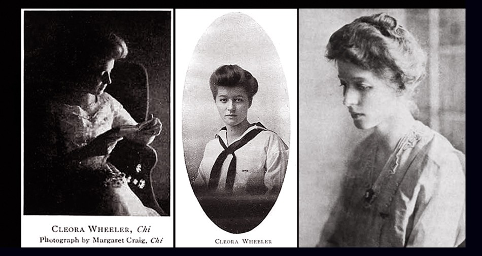 An early triptych of halftone portraits of Minnesota artist Cleora Clark Wheeler. Left: Studying a book, perhaps taken while she was still an undergraduate at the University of Minnesota in the very early 20th Century. Photo by fellow Kappa Kappa Gamma Chi chapter member Margaret Craig published in a 1910 issue of the fraternity quarterly The Key. Middle: Portrait of Wheeler in a sailor-inspired tunic as it appeared in the February, 1913 issue of The Key illustrating an article she wrote titled "Character By Handwriting- And Otherwise." Right: a photograph of Wheeler taken ca. 1911-17 when she was Custodian of the Badge, an important oversight and secretarial role for the official fraternity Badge, a piece of jewelry in the shape of a golden key stamped with the Greek letters for Kappa and worn by chapter members. Photo reproduced in the Fall 1977 issue of The Key.
1912: Wheeler becomes artistically involved in creating metal dies for the new fraternity coat-of-arms (also referred to as the crest) after consulting with the British College of Arms. Earlier in 1910, A National Committee for Kappa, with Margaret Brown Moore appointed Chairman, produced the new coat-of-arms. Brown designed it with advice and help from Joanna Strange, BZ-Iowa, head of the reference department of the Carnegie Library in Pittsburgh, as well as from J. F. Hopkins, the designer of the Sigma Nu coat of arms. Moore’s design was then put on paper in the form of a watercolor sketch by Philadelphia heraldry expert Mark J. Rowe: “Margaret urged the Fraternity to protect the design so that “the technically perfect coat-of-arms will not be lost to us.” She expressed a wish that there should be perfect dies for stamping in gold and silver as well as plates for printing on documents and reports. Cleora Wheeler, Minnesota, prepared such plates and dies. The College of Arms in England was consulted before Cleora cut her die in filigree and it was made after the others that were modeled in the regulation way. When these were done, Margaret Moore declared that perfect reproductions had been made.” (1.)
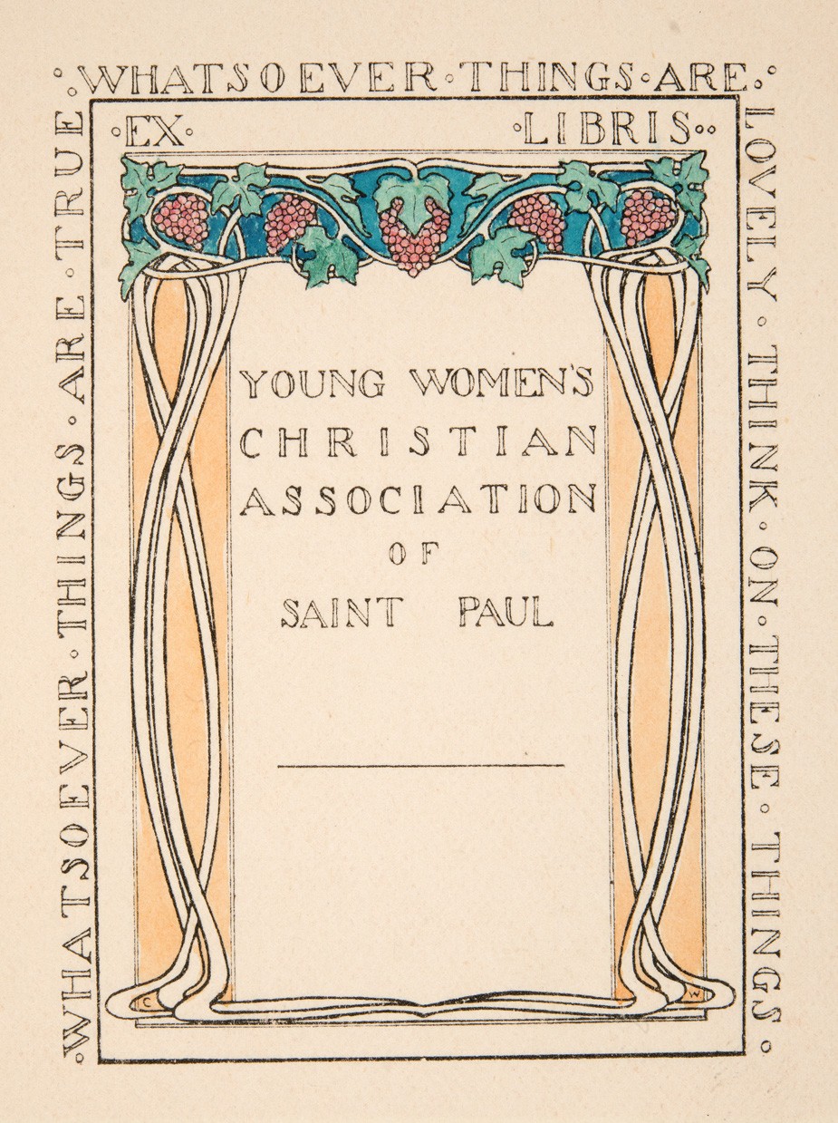 "Ex Libris Young Women's Christian Association of Saint Paul, by Cleora Clark Wheeler": (American: 1882-1980). Ca. 1915-25. Hand-colored book plate shows an archway of grape clusters with stems forming a pair of opposing columns. The YWCA organization is spelled out at center while the whole is surrounded by extracted Bible verses from Philippians 4:8: "Whatsoever Things Are True - Whatsoever Thing Are Lovely - Think On These Things". Wheeler first worked with the YWCA in California in late 1903 after her graduation from the University of Minnesota and in 1909 became business secretary for the St. Paul chapter. A 1921 article in The Key profiling Wheeler's accomplishments stated: "The national bookplate of the association used in all of the books at the National Training School, and in association libraries throughout the country is designed by Miss Wheeler". Courtesy: Helen Brainerd Lay Bookplate Collection, Mount Holyoke College Archives and Special Collections: Identifier: ms0048-s02-b02-f15-i011.
1912-13: Wheeler moves to New York City and attends classes at The School of Fine and Applied Art, (now Parsons School of Design) where she studied color harmony. Two folders of notes, including those by Wheeler made during lectures given by Frank Alvah Parsons, are held by the school in the present day, as well as a set of her bookplates in the Kellen Design Archives. Sources: WorldCat and Minnesota 1900: Art and Life on the Upper Mississippi, 1890-1915: 1994, Newark: University of Delaware Press.
⎯ An article in the October issue of The Key for 1912 states Wheeler issues the limited edition book “Kappas I Have Known” in 250 copies:
A novelty in college scrap books was presented at Convention by Cleora Wheeler, Chi, in “Kappas I Have Known, ” which can be used not only in college, but as a life time fraternity record. The book is divided into sections, under the heads, “My Chapter,” ” National Officers”, and “Kappas From Other Chapters;” and further space is provided for songs and other miscellaneous entries. The book is bound with stubs, so that clippings and snapshots may be pasted in to illustrate the careers of the notable Kappas therein enrolled. And a particularly pretty Kappa touch is added by the Fleur-de-lis design on each page, and the blue and blue binding. (p. 257)
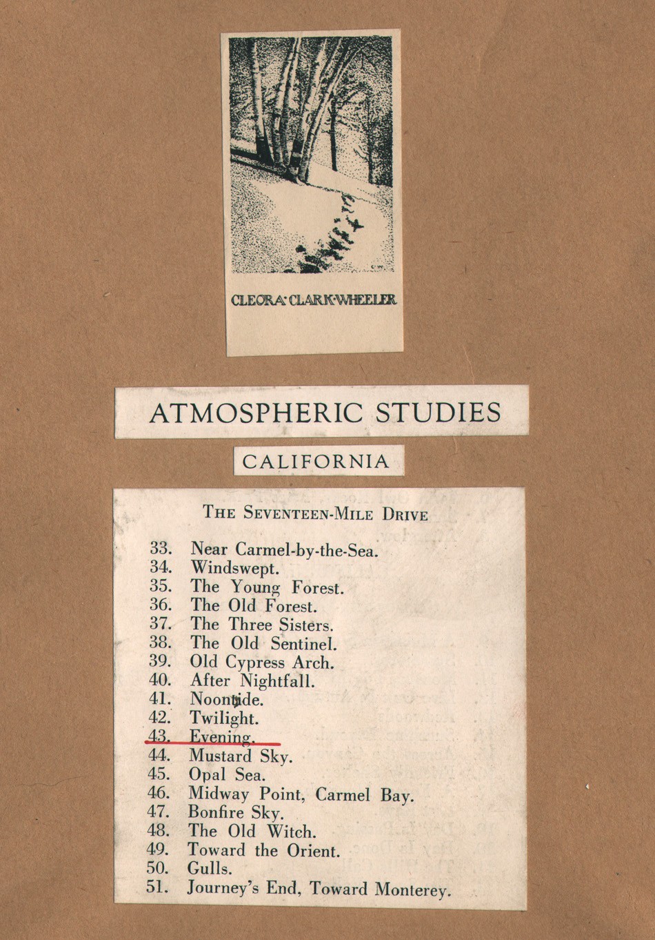 Detail: Frame verso: "Evening", by Cleora Clark Wheeler, American: 1882-1980. ca. 1922: 24.7 x 19.8 cm. The original series of framed photographs appearing in Wheeler's 1922 St. Paul photographic exhibition "Atmospheric Studies" (& also most likely the 1926 San Francisco Paul Elder exhibition) were each finished off on the frame verso with one of several trimmed and pasted book plates identifying Wheeler as author of the work seen at top. Below it is a pasted and engraved listing for photographs included in a separate subheading for the exhibition that were taken in a particular region. This example shows "Evening" held by this archive and listed as #43 in the overall exhibition under Monterey's famed Seventeen-Mile Drive subheading. From: PhotoSeed Archive
Further details are included about this book, illustrated by a photograph in the advertising section for the December issue of The Key:
Bound in two-tone blue cloth with gold stamping; page decorations and headings in gray-blue ink to harmonize. Sewed by hand. special attention being given to the reinforcement of the back by transverse tapes, and by stubs arranged to offset extra bulk of Kodak Prints and Clippings. In this way the book not only offers space for such additions, but also overcomes the possibility of having it stand open when only partially filled. Edition Limited to 250 copies. Price $1.50 net $1.65 by mail.
1914: This may have been the first year Wheeler undertook her series of Western U.S. photographs that would eventually appear in her 1922 St. Paul exhibit Atmospheric Studies, under the exhibition heading Out Where The West Begins : Colorado. Sometime in the Fall, Wheeler travels to Boulder as part of fraternity business as noted in the December issue of The Key:
“We were very glad to have Miss Cleora Wheeler with us for luncheon, on her way home from a visit with Beta Mu at Boulder. We enjoyed hearing of the rushing season there, and also the interesting convention news from Miss Wheeler and the five Sigma girls who attended.”
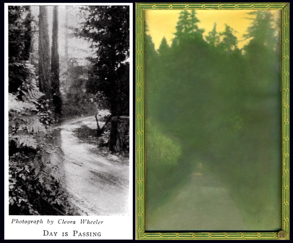 Two examples of photographs taken ca. 1914-1921 in the northern California Redwood region by Cleora Clark Wheeler were later first exhibited in her 1922 St. Paul, MN exhibition Atmospheric Studies. Listed under the subheading "At Call-Of-The-Wild, California", they are: Left: "Day Is Passing" (#19 in St. Paul): seen here as a halftone as it appeared in the February, 1926 issue of The Key. Right: "Sunshine Beyond" (#14 in St. Paul): ca. 1922: hand-colored gelatin silver exhibition print shows a roadway in the Sierra Mountains with a stand of Redwood trees in background all cast in a yellow glow. The effect was achieved with Japanese dyes. Courtesy: Grapefruit Moon Gallery auction listing, Minneapolis MN.
1915: Wheeler’s photographic skills come into play as she visits the U.S. states of Oklahoma, Kansas, Louisiana, Texas and Missouri while reporting on Kappa chapter houses for the article “Chapter Homes I Have Known”, accompanied by several halftones appearing in the December issue of The Key. (pp. 317-21)
⎯ The magazine cover design for The Key changes with the addition of a new hand-drawn crest (coat-of-arms) designed by recent Xi chapter graduate Ruth Anthony beginning with the May issue. This cover design was used through mid 1927 when it was replaced by a simplified navy blue crest against a gray background.
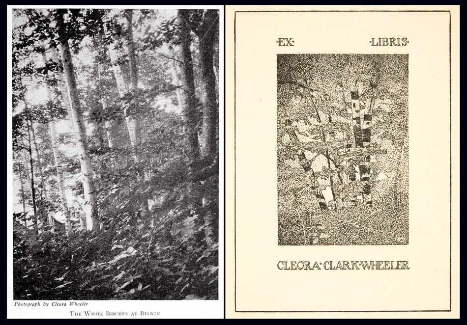 Several photographs by Cleora Clark Wheeler were most likely used as the basis for custom book plates engraved by the artist, as seen in this pairing. Left: "The White Birches At Bigwin" was a photograph taken in June, 1924 during the national Kappa Kappa Gamma convention held in Toronto, Canada at the Bigwin Inn and subsequently published as a halftone in the October, 1924 issue of fraternity quarterly, The Key. Right: "Ex Libris Cleora Clark Wheeler, by Cleora Clark Wheeler": This book plate drawn free-hand by the artist shows a similar grouping of White Birch trees. Examples of this book plate are known to have been pasted to the verso of more than one framed exhibition print included in Wheeler's 1922 exhibition Atmospheric Studies along with the additional designation of "California". This leads one to believe these frames were the ones shown in the 1926 Paul Elder Gallery exhibition in San Francisco. Courtesy: Helen Brainerd Lay Bookplate Collection, Mount Holyoke College Archives and Special Collections: Identifier: ms0048-s02-b02-f15-i029
1916: Wheeler expands her offering of Kappa designs in a full page advertisement for book plates, dinner cards, social stationary and other items appearing in the February issue of The Key.
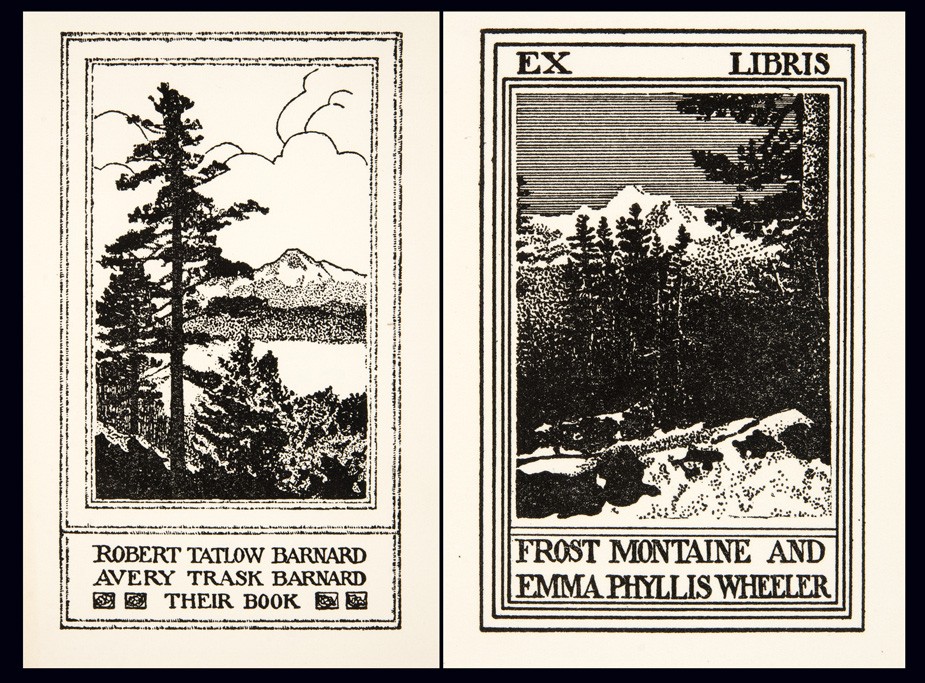 Believed to depict scenes in Colorado or California and may have been done from source photographs, examples of these bookplates by Cleora Clark Wheeler were exhibited at her 1922 St. Paul exhibition Atmospheric Studies. Left: "Robert Tatlow Barnard Avery Trask Barnard Their Book," by Cleora Clark Wheeler": ca. 1915-25. (Identifier ms0048-s02-b02-f15-i022). Right: "Ex Libris Frost Montaine and Emma Phyllis Wheeler," by Cleora Clark Wheeler": ca. 1915-25 (Identifier ms0048-s02-b02-f15-i021). Both courtesy Helen Brainerd Lay Bookplate Collection, Mount Holyoke College Archives and Special Collections.
1918: In May, Wheeler becomes Director for the newly formed St. Paul Vocational Bureau for Trained Women:
1015 Commerce Building, St. Paul
MISS CLEORA WHEELER, DIRECTOR
Backed by the Women’s College Clubs of the Twin Cities, a Bureau for Trained Women was opened in Minneapolis within the last six months. The original idea was to open a branch office in St. Paul, with Miss Cleora Wheeler of St. Paul in charge. It came to be realized, however, that the work in the two cities would be sufficient in importance and scope to warrant the opening of two independent bureaus, so on the morning of May 8 the St. Paul Vocational Bureau for Trained Women opened its office for business. It is conducted under the auspices of the St. Paul College Club, the Vocational Committee assuming the responsibility of its organization and management, while Miss Wheeler is in charge as director.
Miss Wheeler was for five years chairman of the Vocational section of the St. Paul Association of Collegiate Alumnae, and served on the Board of Directors of the Minneapolis bureau during its organization period and until joining their salaried staff as temporary assistant. She was their representative at the February convention of the Association for the Promotion of Industrial and Vocational Education in Philadelphia; and visited the Collegiate bureaus of Philadelphia, New York, Boston, Detroit and Chicago. She also visited the headquarters of Women’s Work in Washington that the St. Paul office might fully cooperate with them and with the government.
The St. Paul bureau is particularly fortunate in securing office accommodations with the Ramsey County Women’s War Organization, and it is fully expected that this arrangement will prove mutually beneficial. (2.)
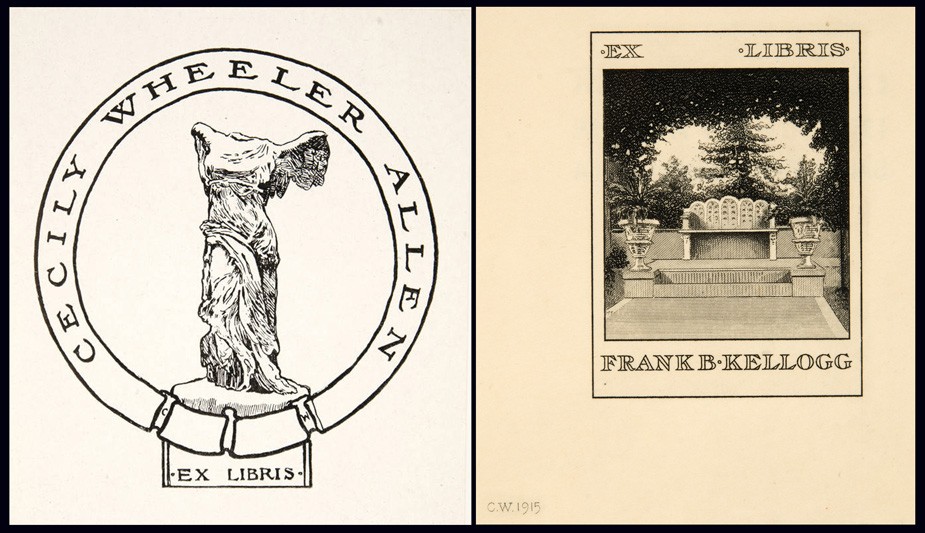 Examples of bookplates by Wheeler: Left: "Cecily Wheeler Allen Ex Libris, by Cleora Clark Wheeler" : ca. 1930-40. (Identifier ms0048-s02-b02-f15-i045). Right: "Ex Libris Frank B. Kellogg," by Cleora Clark Wheeler": 1915. This bookplate was shown at the artist's1922 St. Paul exhibition Atmospheric Studies. (Identifier ms0048-s02-b02-f15-i020). Both courtesy Helen Brainerd Lay Bookplate Collection, Mount Holyoke College Archives and Special Collections.
⎯ First publicized notice of Christmas cards designed by Wheeler appear in the February issue of The Key. They are sold to raise money for French orphans impacted by WWI: “Epsilon made twenty dollars for the French children by selling the Christmas cards designed by Cleora Wheeler.” (p. 56)
1921: Accompanied by a reflective portrait of the artist, the December issue of The Key publishes a lengthy professional background story on her:
Cleora Wheeler’s first work with the Young Women’s Christian Association was in California. Soon after her graduation from the University of Minnesota she was asked by Miss Louise Brooks of New York, national secretary of conventions and conferences, to be her assistant at the student conference at Capitola, Cal. Soon after this she was elected business secretary of the St. Paul Association which was just organizing.
In a city association the business secretary banks the money, issues the membership cards, registers the gymnasium and educational classes, inspects rooming houses, acts as hostess, and audits the money if the association raises $250,000 in a whirlwind campaign for a new building. After helping in this way in her own city for two years, Miss Wheeler did county organization work under the state committee, assisting in the organizing of Mower County, Minn., the third county to be organized in the United States. It meant riding on freight trains to little towns throughout the county, arranging mass meetings and then lecture places for the state nurse, domestic science teacher, and sewing teacher who were sent down by the Agricultural Department of the university to give a ten-weeks’ course of lectures, the university collaborating in extension work with the association.
The next year under the National Board of the Young Women’s Christian Association Miss Wheeler was one of the two business managers of the student and city conferences at Lake Geneva. The national bookplate of the association used in all of the books at the National Training School, and in association libraries throughout the country is designed by Miss Wheeler. (p. 292)
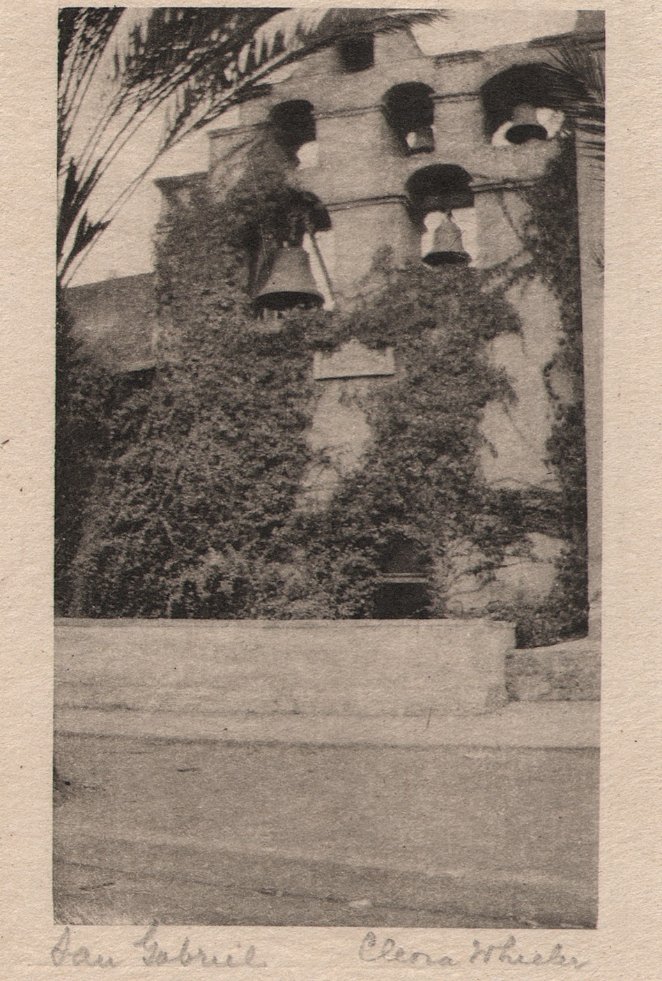 "San Gabriel": Cleora Clark Wheeler, American-1882-1980: ca. 1922: hand-pulled Japan-tissue photogravure: 10.5 x 6.3 | 21.0 x 15.2 Gampi | 24.2 x 38.0 off-white handmade paper (folded) | 33.0 x 25.0 cm olive-colored cardstock leaf. In California, the famous bell wall at the San Gabriel Spanish Mission is seen in this pictorial view by Wheeler. The California Missions Resource Center states: "Six bells occupy an espadaña or bell wall. The oldest bells were cast in Mexico City in 1795 by the famous bell maker, Paul Ruelas. The largest bell (dated 1830) weighs over a ton and was used for over a century to ring the Angelus, a prayer said at morning, noon, and evening in commemoration of the Incarnation." From: PhotoSeed Archive
1922: The May 20th issue of American Art News prints a notice of Wheeler’s exhibition Atmospheric Studies:
“A collection of more than eighty prints of western scenes by Miss Cleora Wheeler, St. Paul artist, have been on exhibition at the St. Paul Public Library. They show a wide range of color and subject matter, and were done on trips which extended from the eastern reaches of the Rockies through the mountains and as far south as the Mexican border of California. -G.E.P.” (p. 7)
⎯ In June, the artist’s first known public exhibition of hand-colored pictorial photographs as well as a smaller series of original bookplates takes place from June 1-15 at the Saint Paul Public Library under the auspices of the Saint Paul Institute. A slim eight-page exhibition brochure is printed listing the following sub-headings for the 76 exhibited photographs:
Out Where The West Begins : Colorado; California: At Call-Of-The-Wild, California; Pacific Grove; California: The Seventeen-Mile Drive; Santa Barbara; Farther South; La Jolla; Old Town; San Diego; Minnesota: Senator Kellog’s Garden, St. Paul & White Bear Lake. A separate section for 14 original bookplates is also listed, and the entire list with all titles can be found on this website at a link featuring the original framed exhibition print Evening.
Some of the work for the exhibit was for sale, and a price list was printed on the last page of the brochure:
PRICE LIST
The prints in this exhibition are not for sale.
Duplicates can be ordered as follows:
SEPIA PRINTS
Large size, mounted as shown………$10.00
Smaller size, mounted as shown……..7.50
COLORED PRINTS
No. 34 ……………………………….$12.50
No. 40 ……………………………….. 20.00
No. 43 …………………………………10.00
All others …………………………….7.50
These prices include frames.
MINIATURE PRINTS
Made by hand from copper plates.
See sample book at desk.
Prints on Japanese tissue ……$1.00
No. 50, No. 60, No. 63, colored ink, with
envelope …………………………… .50
Folders tinted to order, with envelope $.40 and .50
Same without tinting ………… .15
Card without tinting …………. .10
CHRISTMAS CARDS
See sample books at desk.
Folders with Christmas wording.
Per 100 ………………………………$35.00 to $50.00
These may be ordered for fall delivery.
BOOKPLATE PRICES
Design ………………………………$25.00 up
Metal plate and prints are extra, cost depend-
ing on material. Allow six months for book-
plate orders. Estimates given.
1376 Summit Avenue Midway 0234
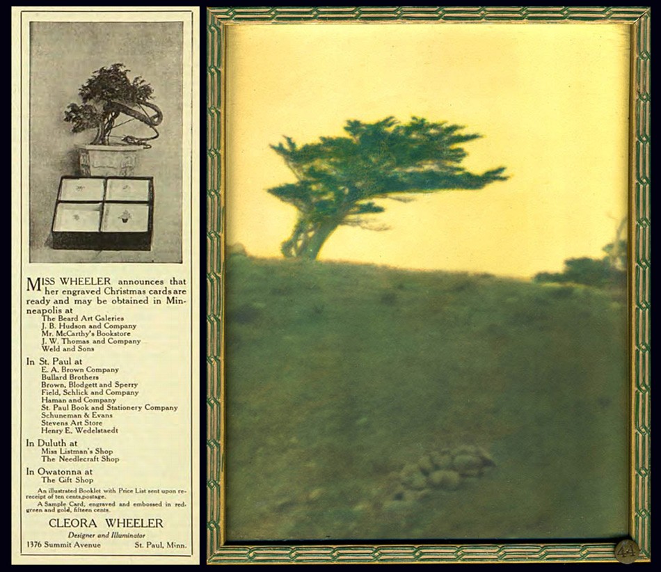 Left: Custom designed Christmas cards were a staple source of income for artist Cleora Wheeler as well as an important fund raiser for her fraternity. She produced them as early as 1915, when an advertisement similar to this one featuring a potted Bonsai tree was photographed alongside a box of cards featuring four different designs ran her Minnesota Alumni Weekly, (this ad from Dec. 1916) until the 1960's, when the cover of the December, 1963 issue of The Pen Woman magazine showcased card designs of Twin City churches. A 1944 article in the St. Cloud Daily Times newspaper of MN remarked: "Miss Wheeler has received nationwide recognition for her Christmas cards, hand-printed photogravures and hand stamped cards bearing her designs" Right: The Japanese inspired sensibility of Wheeler's design aesthetic can be seen carried over in this photographic landscape taken along California's Monterey coastline. In "Mustard Sky", a lone Cypress tree is shown atop an seaside ridge. This original hand-colored framed exhibition photograph was featured in her 1922 St. Paul, MN exhibition Atmospheric Studies, listed as #44 under the subheading "The Seventeen-Mile Drive". Courtesy: Grapefruit Moon Gallery auction listing, Minneapolis MN.
1924: In June, at the national Kappa convention held in Toronto, Canada at the Bigwin Inn, Wheeler makes 19 hand-cut silhouettes from black paper used as part of the Historical Pageant. The works were later reproduced in the October issue of The Key that year. (shown on pp. 250-253) Soon, Wheeler would take on the art of silhouette portraiture by means of photography. Additionally, a pictorial portrait of Kappa president May Whiting Westerman and Georgia Hayden Lloyd Jones, National Director of Provinces, appeared as a full page halftone in the issue and another pictorial photographic landscape: The White Birches of Bigwin, appeared on pages 248 and 255 respectively.
1925: Several California pictorial photographic works are published as halftones in the October issue of The Key with the following titles:
- Call-of-the-Wild, California
- San Juan Capistrano Mission-between Los Angeles and San Diego, California
 Left: Although Cleora Wheeler never held editorial positions for The Key, the quarterly magazine of Kappa Kappa Gamma, it featured notices of her progress as an artist, support of the fraternity's mission nationally via her election to various Kappa positions, including Grand Registrar in 1904 and Custodian of the Badge in 1911, and as a continual mouthpiece for advertisements in its' rear pages featuring original artwork for sale. This issue shows a new cover design which debuted in May, 1915 featuring a new crest (coat-of-arms) designed by recent Xi chapter graduate Ruth Anthony. Right: One large advertisement appearing in the October, 1930 issue of The Key showcased no less than 18 individual Kappa designs by Cleora Wheeler made into steel dies. These were used to emboss custom orders of stationary, all from the third floor studio of her St. Paul, MN home.
⎯ Three further California images appear in the December issue of The Key promoting the national convention that would be held at Mills College outside Oakland, CA the following summer. The frontis photograph for the issue featured a view of a lone cypress tree that had become Wheeler’s signature California image known as “Near Monterey” taken along the Seventeen Mile Drive and was darkened and hand-colored with a star placed in the sky and re-titled “Evening”.
The article published on pages 415-17 of the issue is titled:
An Invitation To California
“The California chapters together with all Kappa alumnae in this western province unite in inviting every Kappa, young and old, to come to convention in California during the first week of August in 1926.” …The convention will be held at Mills College, in the suburbs of Oakland, across the bay from San Francisco.”
The two additional halftones are titled:
- At the Beginning of The Seventeen Mile Drive
- The Cloister Stairway, San Gabriel Mission
 Left: "The Wraith": Cleora Clark Wheeler, American:1882-1980. Sepia gelatin silver print, ca. 1922. Courtesy: Grapefruit Moon Gallery auction listing, Minneapolis MN. Right: 'The Wraith": Hand-pulled Japan-tissue photogravure ca. 1922: 10.1 x 7.8 | 20.7 x 14.9 Gampi | 24.8 x 38.0 off-white handmade paper (folded) | 33.0 x 25.0 cm olive-colored cardstock leaf. Cypress trees, one living and the other dead, stand sentinel among a rock outcropping, with the Pacific Ocean beyond. The landscape was photographed by Wheeler along the famed Seventeen Mile Drive on the Monterey, California coastline. From: PhotoSeed Archive
1925: Working out of her St. Paul home, Wheeler produced an unknown number of original artworks for the Buzza Company of Minneapolis in this year or before, with lithographed motto art being a specialty. (see example pulled from the web along with this post) Minnesota Historical Society author Moira F. Harris comments on the artist’s working methods:
Her studio was on the third floor of the family home at 1376 Summit Avenue. There she designed and engraved the plates for her cards and bookplates. Some cards she printed herself on a hand press, while others were printed on handmade paper by Brown & Bigelow and sold through the St. Paul Book & Stationery firm. (3.)
The Hennepin History Museum in Minneapolis, MN supplied this short overview of the Buzza Company as part of their 2016 exhibit “Greetings”:
A History of the Buzza Company
During its prime, the Minneapolis-based Buzza Company (1907-1942) was one of the nation’s largest manufacturers of greeting cards, framed mottos, gift books, and party stationery. GREETINGS tells the story of the company’s rise and fall, its larger-than-life founder, and the hundreds of artists, poets, printers, and others who produced, sold, and shipped many millions of items from the company’s Lake Street headquarters each year. (George Earl Buzza: 1883-1957)
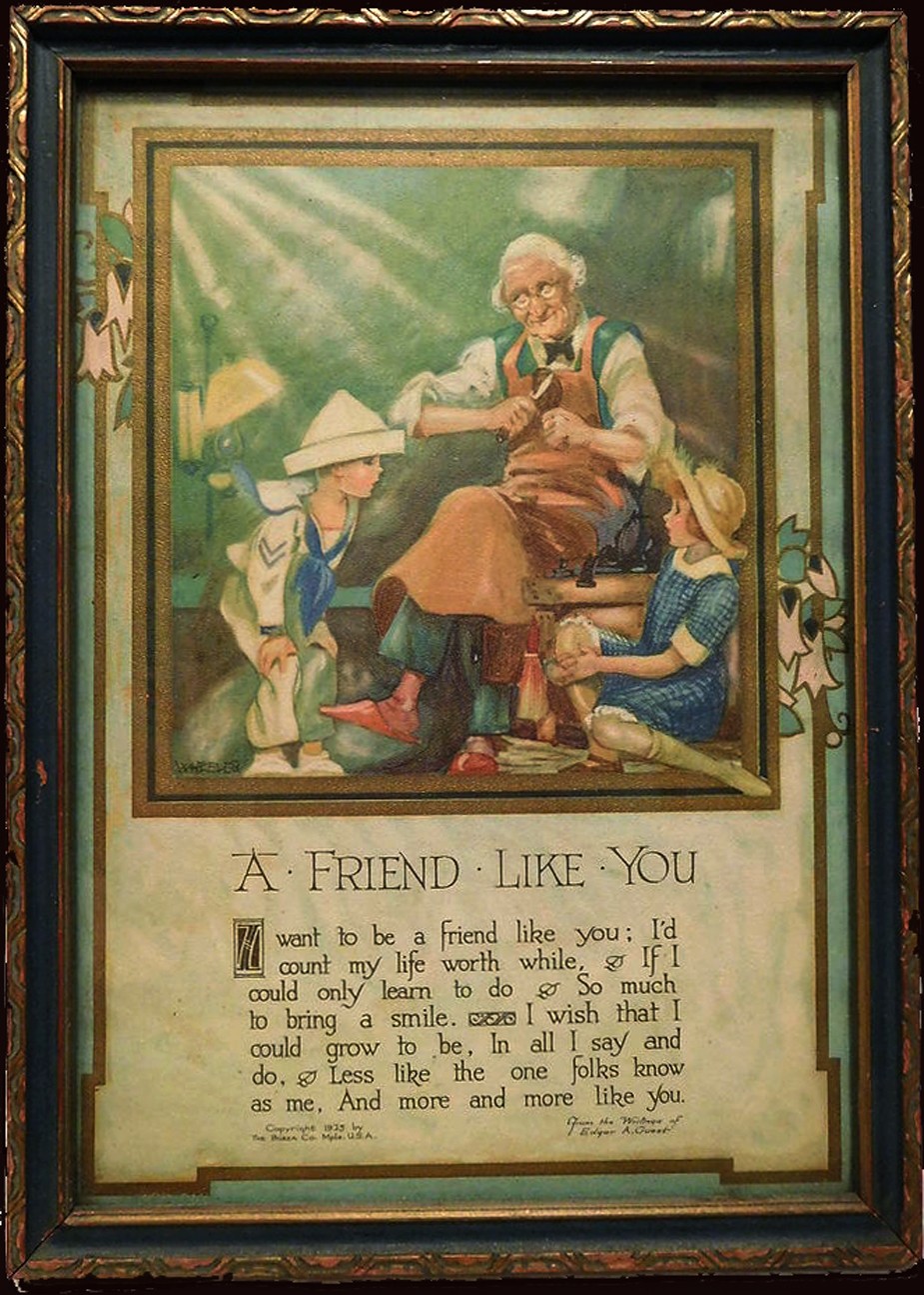 Around 1925 or before, Cleora Wheeler created original artwork like this example for the Minneapolis-based Buzza Company, which between 1907-1942 was one of the nation's largest manufacturers of greeting cards, framed mottos, gift books, and party stationery. This framed motto print made into a chromolithograph posted to Pinterest bears a 1925 Buzza copyright ("WHEELER" printed in lower left corner of artwork) and is titled "A Friend Like You": optimistic lines penned by the English-born American poet Edgar Albert Guest: 1881-1959.
1926: Interestingly, a review of Wheelers 1922 exhibit Atmospheric Studies is published nearly four years later in the February issue of The Key, with insight stating the artist had “tramped the California mountains” “for two successive summers” to produce the views. This may indicate the entire body of California work was taken ca. 1920-21, as it’s known she made a Santa Barbara landscape dated 1921. The issue features a commercial portrait of Wheeler to accompany the article. Four additional halftones of California landscapes are further reproduced in the issue.
California Photographs by Kappa Artist
THE California photographs by Cleora Wheeler which are appearing in these issues of THE KEY are reproductions of a part of an exhibit of seventy or more prints in colors which were recently hung in the art gallery of the beautiful public library of St. Paul, under the auspices of the St. Paul Institute. This constituted the only exhibition during the year which filled this large gallery with the work of one person. The pictures are being reproduced for the first time in THE KEY, and as they are part of a professional record they bear the name of the member who made them. Miss Wheeler thinks of California as her second home, as she spent a year with Pi after graduating at Minnesota. For two successive summers she has tramped the California mountains, and as a result has produced the pictures which you are now enjoying at the request of Mrs. Westermann, and of which Arthur L. Wilhelm, the art critic, wrote the following:
UNUSUAL QUALITIES ARE DISPLAYED IN WORK OF MISS
CLEORA WHEELER; SUBJECT MATTER SELECTED
WITH VIEW OF UNUSUAL
BY ARTHUR L. WILHELM
There is on exhibition at the St. Paul Public library this week a collection of colored California prints by Cleora Wheeler, St. Paul artist and etcher. The St. Paul Institute is sponsoring the exhibit. In the collection of more than eighty prints are many that have unusual qualities. All are atmospheric studies and are colored, many of them with fine Japanese dyes, giving a wide color range and depth. Miss Wheeler has grasped the fine essentials of design in many of her studies. Many simple little prints take on glowing beauty under the touch of her brush. The subject matter is carefully selected with a· view of the unusual. Here, in one print, one sees a fine flowing rhythm. Again one feels the structure of design carried out to a fine point. Again there is quality of the color that charms. Always there is something unusual to attract.
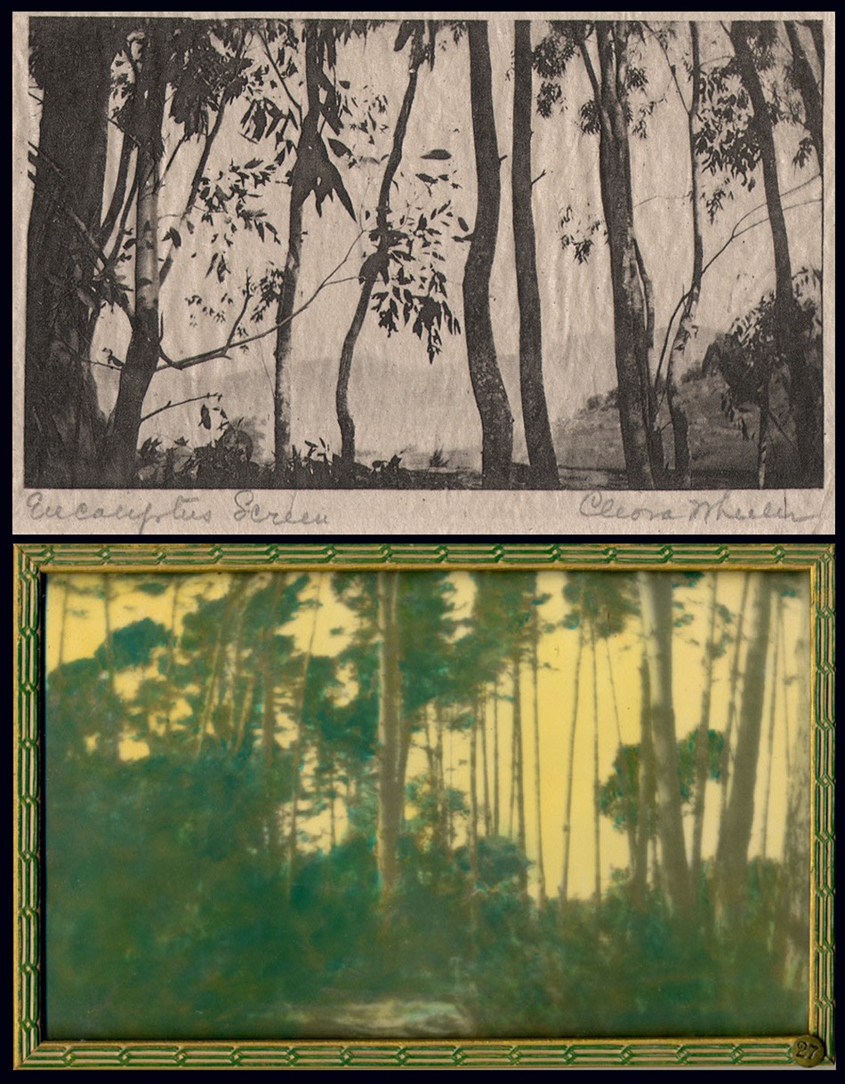 Top: "Eucalyptus Screen": Cleora Clark Wheeler, American: 1882-1980. Hand-pulled Japan-tissue photogravure ca. 1922: 6.3 x 10.5 cm | 14.9 x 20.4 Gampi | 38.0 x 24.5 cm off-white handmade paper (folded) | 33.0 x 25.0 cm olive-colored cardstock leaf. From: PhotoSeed Archive. Bottom: "A Forest Screen": ca. 1922: Cleora Clark Wheeler: hand-colored gelatin silver exhibition print from the artist's 1922 St. Paul exhibition Atmospheric Studies. "Screen-type" photographic landscapes by Wheeler show up frequently in her California work, with the latter print (#27 St. Paul) taken in the Pacific Grove region near Monterey and gravure believed to be from Santa Barbara. Courtesy: Grapefruit Moon Gallery auction listing, Minneapolis MN.
COLORADO-CALIFORNIA
Miss Wheeler has arranged the prints so that one follows her in her journey to the West, where the pictures were taken. First we see eight prints from Colorado, the first rampart range of the Rockies, a field of wild sunflowers with a great up-thrust of rock in the background, and others. Then we have what she terms the “Call of the Wild,” with a score of prints taken at random along the coast and in the big woods of the Sierras. There are many pictures that are romantic in feeling and others that have a rich poetic sentiment. The colors are soft and glowing or in the nocturnes are dimmed by the blue of night. There are ten prints taken at Pacific Grove which· include pictures of the woods and sea, pictures with the fog stealing in, and prints tinged with the sunset glow.
DRIVE PICTURES THE BEST
Perhaps the most charming group of the exhibition is that taken on the famous seventeen-mile drive at Monterey. Here the old cypresses are shown with all their varied forms. Also the rocks and the sea are most charmingly depicted. There are pictures of young eucalyptus groves with a bit of flaming sky showing through the foliage. One print, “The Old Witch,” is a portrait of a famous old tree which is known to the thousands of tourists who have made the trip. There is a group of prints from Santa Barbara and several from points farther South. The exhibition is enhanced by an oil painting, a landscape done by the mother of the artist, which has a fine feeling of harmony and color. The entire exhibition is both unusual and charming. (pp. 27-8)
1926: July. Fifteen silhouettes, this time by means of photography, are taken by Wheeler of Kappa members taking part in the Historical Pageant held as part of the California annual convention at Mills College. In addition, she takes scores of additional silhouettes of those attending the convention itself on banquet day. The silhouette photos of the pageant members are published in the October issue of The Key.
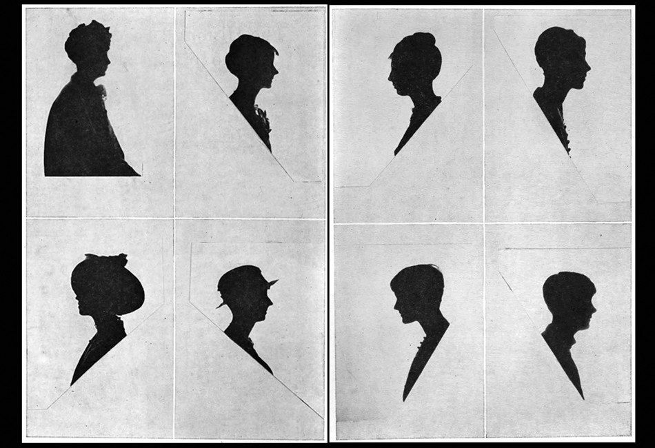 These two sets of photographic silhouette portraits taken by Cleora Wheeler were done in July, 1926 as part of the Historical Pageant held during the annual Kappa Kappa Gamma national convention at Mills College outside Oakland, California. The studies here reproduced as halftones were published in the October issue of The Key. "So far as I was able to find out, this was the first time the Oakland, Berkeley or San Francisco photographers had seen the experiment of silhouettes by this method, and they were interested" said Wheeler, in the article titled "Say It With Flowers … . Do It With Dishpans" published in the December, 1926 issue of The Key. Kappa chapter members were credited in the publication but in an unknown order. The first four are at left followed by 5-8 at right: 1. Loretta Shea of Lambda as "Alpha, 1870." 2. Mabel Paul, as "Beta Nu, 1888." 3. Beatrice Peters, as "Beta Omega, 1913." 4. Dorothy Fulton, as "Gamma Alpha, 1916." 5. Dorothy Lewis, as "Beta Rho, 1885, 1914." 6. Thelma Scheider, as "Beta Tau, 1883." 7. Martha Bordwell, as "Gamma Rho, 1888." 8. Abigail Semans, as "Rho, 1880, 1925."
⎯ November. Calling Wheeler “a painter turned photographer”, partly referencing her motto work for the Buzza Company, an exhibition of her photographs-likely re-purposed from the 1922 Atmospheric Studies exhibition, are shown at Paul Elder & Company, a San Francisco bookseller & publisher. (1898-1968) The following notice for the show appeared in Bret Harte’s Overland Monthly and Out West Magazine that month:
A painter turned photographer will occupy the attention of the visitors at the Paul Elder Gallery October 25 to November 6. Miss Cleora Clark Wheeler, of St. Paul, Minnesota, gained a reputation as a painter before she took up photography as her medium. As a result, her prints have a feeling of conscious design and a quality of painting. Those exhibited at Paul Elder’s will be some of her atmospheric studies of California scenes and a group of miniature prints from copper plates.
⎯ December. In The Key, the artist describes how she made the silhouettes that year:
Say It With Flowers … . Do It With Dishpans
CLEORA WHEELER
So Many persons have been interested to know how the silhouettes which I made in California last summer were done, that 1 am very glad to tell. It was with two huge electric lights of a thousand watts each, set into two deep dishpans. After the dishpans had been located at a hardware store, and the sockets soldered into place, they were nailed to the top of two of Mother’s two-by-four tomato supports which I took to convention in my trunk. They in turn were nailed at base of two wooden boxes which the janitor at Olney Hall found for me, and before the lights were put into the sockets Mr. Gibson the head electrician at Mills College made some special fuses of thirty amperes each, one of which was installed in the switchboard where the electric wiring from the room ended. Without these special fuses not only all the lights at that end of Olney Hall, but the big lamps themselves would have gone out as soon as lighted. He even provided some fuses of forty amperes each, to be kept on hand for emergency, in case the big lamps should suddenly stop.
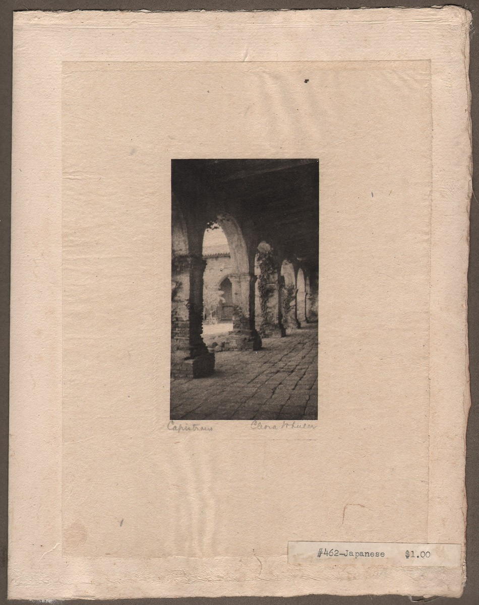 Arts & fine craftsmanship were integral to Cleora Wheeler's working methods, as evidenced by this representative leaf included in a California sample book she made featuring 23 hand-pulled, Japan-tissue photogravures individually mounted on hand-made paper contained within the ca. 1922 folio posted to PhotoSeed. This photograph is titled "Capistrano". Image and overall dimensions: 10.8 x 6.1 | 20.5 x 15.2 Gampi | 24.9 x 38.0 off-white handmade paper (folded) | 33.0 x 25.0 cm olive-colored cardstock leaf. The architectural study of archways was taken along the southern cloisters at the Capistrano Mission. From the missions online resource: "Mission San Juan Capistrano, became the seventh of twenty-one missions to be founded in Alta California. Like the previous six missions, San Juan Capistrano was established to expand the territorial boundaries of Spain, and to spread Christianity to the Native peoples of California." From: PhotoSeed Archive
A huge sheet was stretched across one end of the room, the two lights were focused on its center, from the front, and the person who was to have her silhouette, sat in the shadow between the lamps and the camera. The stool she sat upon was set upon a certain square, chalked upon the floor. The camera tripod stood on a triangle also chalked upon the floor as they had to be an exact number of inches apart. The camera was equipped with a special portrait lens which can be bought at any camera store for a dollar or two and added to the front of a camera lens. Regulation roll film was used which was very quick to operate. As a result the silhouettes were taken at the rate of two seconds each.
In order that there might be no reflection from walls, on the side of the person next the camera, black cloth was hung on one wall and an Oxford gown was hung over the looking glass on the other. Black oilcloth was fastened over the glass of the door leading into the hall, and over the transom above, so that no light from the hall lamps might enter. The girls lined up outside the door evenings, registered by number and the films were marked with the same numbers. · In that way each received her own negative and print in the end.
The developing solution was a special one, a formula which I brought with me. The photographer who prepared it for me on the coast had none of one of the ingredients. When it was located and added, it ate up the first roll of films, then when used one-tenth the strength, it blistered the second roll. After eight hours of experimenting in the darkroom I emerged with the mystery solved, and from that time on the negatives went through like magic. So far as I was able to find out, this was the first time the Oakland, Berkeley or San Francisco photographers had seen the experiment of silhouettes by this method, and they were interested. But they didn’t know what in the world to do when that first film was eaten up.
The silhouettes of Ruth Rochford (Mrs. George W. Schmitz of Berkeley) and her children were made by a reverse method, using the light back of the sheet, and directly back of the figure, the figure being the only thing to prevent its shining into the lens of the camera. The sheet was a piece of architect’s tracing paper, this time, wide enough and long enough to fasten over the entire area of an open doorway. Tracing paper (not tracing cloth) gives a more satisfactory light than a sheet. It is almost transparent and the light is suffused around the figure. Only one light could be used by this method, and as the amount was therefore cut in two, the length of exposure was necessarily to be doubled. It is impossible to expect a little child of two and a half years, as the youngest was here, to sit still more than one second, surely not four seconds. So a graflex camera was used as it has a very fast lens. The exposures were one second.
Frances Murphy of the Oklahoma chapter, whose silhouette appears at the top of the page, was the first delegate to brave the array of dishpans. Dozens followed her, and anyone who saw the interested crowd getting their pictures on banquet night just before we all parted, will be sure it proved there is a way to have one’s picture taken without having one’s head turned.
 Left: This commercial portrait of Cleora Wheeler dates to the mid 1920's. A cropped variant accompanied a review published on her California photographs in the February, 1926 issue of The Key written years earlier by Arthur L. Wilhelm on her 1922 St. Paul exhibition Atmospheric Studies. An excerpt: "There are many pictures that are romantic in feeling and others that have a rich poetic sentiment. The colors are soft and glowing or in the nocturnes are dimmed by the blue of night." Photographic halftone courtesy: Helen Brainerd Lay Bookplate Collection, Mount Holyoke College Archives and Special Collections: Identifier: ms0048-s02-b02-f15-i010. Middle: Variations of this single advertisement for products bearing designs by Wheeler: letter stationary, place cards and matching envelopes among other things, illustrated with a small photographic halftone of the artist working at an embossing machine inside her St. Paul home studio, continued to appear with regularity in the back pages of the Kappa quarterly, The Key. Right: At 95 years of age, Cleora Wheeler was still very active in her Kappa Kappa Gamma fraternity. Here she is seen looking at a Ritual volume during an annual convention display. The original caption in the Fall, 1977 issue of The Key pointing out "that the cover had been hand-made by her!".
1932: A historian at heart, Wheeler writes the chapter on Kappa insignia and compiles extensive illustrations included in the weighty volume: The History of Kappa Kappa Gamma Fraternity, 1870-1930 published this year.
1930-1940’s: Advertisements for products bearing designs by Wheeler: book plates, stationary, etc, continue to appear with regularity in the back pages of the Kappa quarterly, The Key.
1952: The artist receives Kappa’s Alumnae Achievement Award, with the following notice appearring in the October issue of The Key:
Cleora Clark Wheeler, former grand registrar and custodian of the badge for the Fraternity, also prepared the text and illustrations on insignia which appears in the History of Kappa Kappa Gamma. Miss Wheeler is listed in Who’s Who in America and also in Who’s Who in American Art. She has recently served as national chairman of design for the National League of American Pen Women and holds certificates of proficiency in engineering drafting and advanced engineering drafting from the University of Minnesota. As a designer and illuminator of books and other publications, Miss Wheeler has gained national recognition. Her bookplate designs are represented in many collections. Of her work Miss Wheeler says: “The public seems to be especially interested in the fact that I learned’ the trade of steel-die stamping. It is a highly specialized field in the factories of wholesale stationery companies. It usually takes a girl nine years, stamping 1000 impressions a day by hand, to become an expert.” (p. 244)
1967: The following article published in the Mid-Winter issue of The Key gives a good overview of Cleora Wheeler’s accomplishments later in life:
CLEORA WHEELER, X-Minnesota, is one of America’s most distinguished artists in the rare field of illumination and etching. Forty three of her exquisitely fine drawings prepared as steel engravings, copper intaglio plates, and etchings on zinc and copper are on file in the Library of Congress, and in 28 university, historical and city libraries. She is listed in Who’s Who of American Women, Who’s Who in America, Who’s Who in American Art, and Who’s Who in the MidWest.
She has long made book plates, plaques, dedicatory scrolls, and coats-of-arms for New York firms, on special order for customers so discriminating they realize the surpassing quality of her workmanship. She is an honored member of the National League of American Pen Women, serving as national chairman of design (1944-46), of Heraldic Art (1954-56), and of Inscriptions, Illumination and Heraldic Art (1964-66). The work of the print maker is a dedicated one, and Miss Wheeler has experimented with the quiet and esoteric medium (as did Durer and Rembrandt) until her form of expression is close to perfection. In 1960 she went to Santa Barbara to extract the secrets of an early artist named Monsen, who washed glass slides with purple color, using other colors on top, to bring out rich values of greens in mountain landscapes. Miss Wheeler does many fraternity designs, seals, book covers, and Christmas cards. Her work requires space, and the entire third floor of her home is her shop, with the basement used for storing supplies.
1950-1977: A single advertisement for products bearing designs by Wheeler: letter stationary, place cards and matching envelopes among other things, illustrated with a small photographic halftone of the artist working at an embossing machine inside her St. Paul home studio, continue to appear with regularity in the back pages of the Kappa quarterly, The Key.
1980: Wheeler dies. Her obituary appears in the Spring issue of The Key:
Cleora Wheeler Dies
Kappa records with sorrow the death of Cleora Clark Wheeler, Minnesota, at age 97. She died of pneumonia February 24, 1980. Her BA in engineering and engraving was from Minnesota and she studied color harmony at New York School of Fine and Applied Art now Parsons School of Art) and is listed in Who’s Who of American Women. She began her career as a designer of Christmas cards and illuminator of books and publications. Her bookplates are on file in Paris, the Library of Congress and in 30 other libraries. They were exhibited at the Smithsonian Institution from 1946-1964 and at the International Ex Libris Association of Congress, Elsinore, Denmark, in 1972. Miss Wheeler received numerous awards for her work and served as president, chairwoman and judge of several national art associations. She was a member of the National Society of Magna Charta Dames, a past president of the Minnesota branch of the National League of American Pen Women, a member of the International Bookplate Association, held various offices in the Daughters of the American Revolution and was a life member of the American Association of University Women. Born July 8, 1882, Cleora Wheeler was initiated October 9, 1899 and served Kappa her entire life. She was an active delegate to the 1902 convention and an alumnae delegate to the 1908 convention. She was Grand Registrar of the Fraternity 1904-1906 and Custodian of the Badge 1911-1918. She received Kappa’s Achievement Award in 1952 and was the recipient of her 75 year pin.
Addendum: Wheeler family History
Described as “one of the best preserved upper-class Victorian promenade boulevards in America”, the homes along Summit Avenue in St. Paul, Minnesota- including one owned by Cleora Clark Wheeler at 1376 Summit Ave. where she maintained her studio for decades, were individually described for their architectural significance as part of the 2003 online posting: Thursday Night Hikes: Western Summit Avenue Hike Architecture Notes, Part 2.
Significant biographical background for Clark, her mother, father and extended family are included with the summary. It was compiled from public sources as well as from the University of Minnesota, Northwest Architectural Archives by historian Lawrence A. Martin. The following is his summary. I have only confirmed and filled in several birth and death dates for Cleora’s mother and father that were missing and added a few paragraph breaks for purposes of style:
1376 Summit Avenue: Rush B. Wheeler House; Built in 1909 (Ramsey County property tax records and Sandeen; 1909-1910 according to Larson;) Early Modern Rectilinear in style; Clarence H. Johnston, Sr., architect.
The structure is a two story, 2496 square foot, eight room, five bedroom, two bathroom, one half-bathroom, stucco house, with a detached garage. The house was constructed at a cost of $5,500 (Sandeen; $6,000 according to Larson.) In 1916, Rush B. Wheeler was a member of the Minnesota Historical Society and resided at this address. The 1918 and 1924 city directories indicate that Mr. and Mrs. R. B. Wheeler and their daughter resided at this address. The 1930 city directory indicates that Mrs. Harriet S. Wheeler, the widow of Rush B. Wheeler, resided at this address. In 1934, Harriet Clark Wheeler, the widow of Rush Wheeler, and Cleora Clark Wheeler resided at this address.
Rush B. Wheeler (1844-1930,) the son of Orange H. Wheeler and Eve Tucker Wheeler, was born in South Butler, Wayne County, New York, graduated from the Cazenovia Seminary in New York in 1867, was a graduate of Yale University in 1871, moved to Minnesota in 1873, resided in Austin, Minnesota, from 1873 until 1888, read the law in 1876, was a member of the board of directors of the First National Bank of Austin, Minnesota, from 1880 until 1883, moved to St. Paul in 1883, practiced law, was engaged in real estate and loans, was a member of the St. Paul Chamber of Commerce from 1885 until 1900, was president of the Real Estate Exchange of St. Paul from 1894 until 1896, resided at 520 Summit Avenue in 1907, and officed at the Pioneer Press Building in 1907.
Rush Wheeler married Harriet S. L. Clark in 1876. Harriet Clark Wheeler was a graduate of the University of Minnesota. Harriet Clark Wheeler and Cleora Clark Wheeler were members of the American Association of University Women and the Women’s City Club of St. Paul.
Cleora Clark Wheeler (1882-1980) was born in Austin, Minnesota, graduated with honors from St. Paul Central High School and from the University of Minnesota, received art training at the New York School of Fine and Applied Art/Parsons School of Art, opened a studio at this address, was a renowned artist, a designer, and an illuminator of books and other publications who received certificates of proficiency in advanced engineering drafting from the University of Minnesota, was a well-known bookplate and Christmas card designer, was also an architectural photographer and poet, was a wedding invitation designer, and was an expert in steel-die stamping with widespread recognition.
Cleora Clark Wheeler received an Alumnae Achievement Award from the Kappa Kappa Gamma Fraternity in 1952, after she served as the Fraternity’s Grand Registrar from 1904 to 1906 and as its representative to National Panhellenic Conference from 1905 to 1906, after she prepared a Song Leaflet and Manual of Information for distribution at the 1914 Estes Park Convention, after she attended the Fourth Inter-Sorority Conference in Chicago, where she was instrumental in bringing about the decision that the fraternities had the power of vote on recommendations only, not the power to legislate and hold their entire membership to rules passed by single representatives, after she served for seven years as the Fraternity’s Custodian of the Badge, after she prepared the text and illustrations on insignia which appeared in the 1930 History of Kappa Kappa Gamma, and after she created an official bookplate of the Fraternity.
Cleora Clark Wheeler was a member of the National Society Magna Charta Dames and Barons, whose membership is based upon the existence of a direct lineal descent from one or more of the twenty-five Sureties for the Magna Charta or from a Baron, Prelate, Knight, or other influential person present on the field of Runnemede, England, in June, 1215, was a judge for national achievement awards and was National Chairman of Heraldic Art of the National League of American Pen Women, and was state curator of the Nathan Hale chapter of the Minnesota Daughters of the American Revolution.
Cleora Wheeler also was a substitute teacher in the St. Paul Public Schools. Cleora Wheeler had an exhibition of her bookplate work, entitled “Atmospheric studies,” at the St. Paul Public Library in 1922, under the auspices of the Saint Paul Institute. Cleora Clark Wheeler was a niece of Charles A. Clark (1865-1929,) who was a Spanish-American War veteran and was a resident of the Far East. Clark airfield in Honolulu, Hawaii, was named for Clark’s son, Harold Melville Clark (1890-1919,) who died in a airplane crash. Rush B. Wheeler (1844 -1930) and Harriet S. Wheeler (1853-1938) both died in Ramsey County. Cleora Clark Wheeler (1882-1980) was born in Minnesota, had a mother with a maiden name of Clark, and died in Ramsey County. (current owner information as of 2003 was also included but has been left out here) (4.)
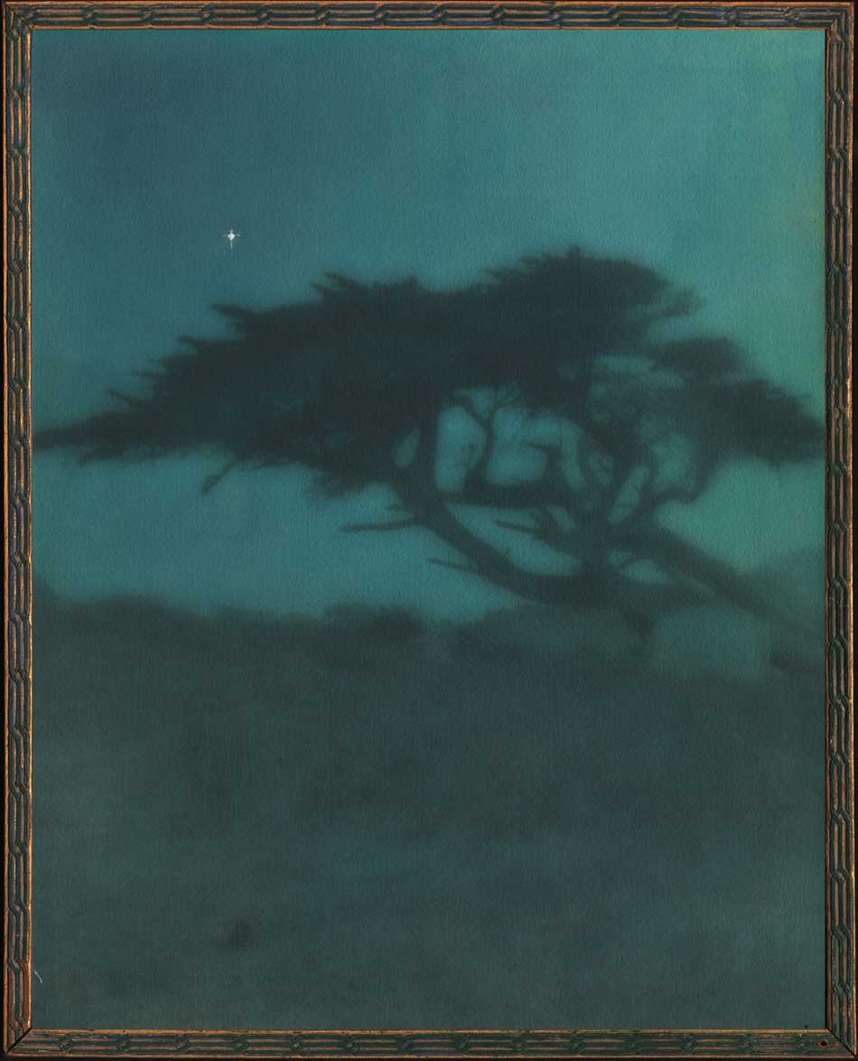 "Evening": Cleora Clark Wheeler, American: 1882-1980. Hand-colored gelatin silver print ca. 1922: image: 23.6 x 19.8 cm; frame: 24.7 x 19.8 cm: Believed to have been taken around 1920, the medium of fine Japanese dyes in hues of blue, green and yellow were used to color this double-weight, rough surface print, the view originally taken in daylight but manipulated as a much darker print in the artist's darkroom with the addition of a lone “twinkling” star added to the "night" sky. The variant daylight version is titled "Near Monterey", and a photogravure version pulled on Japanese tissue can be seen on this website. "Evening" was catalogued as #43, appearing under the sub-heading The Seventeen-Mile Drive as part of the artist's 1922 exhibit Atmospheric Studies: An Exhibition of the Work of Cleora Clark Wheeler, June 1-15, 1922. From: PhotoSeed Archive
Notes:
1. “All About the Fraternity Coat-of-Arms”, Excerpt from January 2006 Historically Speaking, by Kay Smith Larson, Washington, History Chairman 2002-2006, excerpted in This is Kappa blog: accessed January, 2018.
2. The Journal of the Association of Collegiate Alumnae: Ithaca, NY: June, 1918: pp. 704-05
3. Citation #19: St. Paul Pioneer Press, Jan. 2, 1967, p. 13; Crump, Minnesota Prints, 173. Moira F. Harris: Season’s Greetings from Minnesota: Minnesota Historical Society magazine Winter 2011-12
4. Excerpt: Thursday Night Hikes: Western Summit Avenue Hike Architecture Notes, Part 2: Observations on Architectural Styles: Western Summit Avenue Hike Assembled by Lawrence A. Martin. Webpage Creation: October 20, 2003.
In with the New
Posted January 2016 in New Additions, PhotoSeed, Typography, Unknown Photographers
.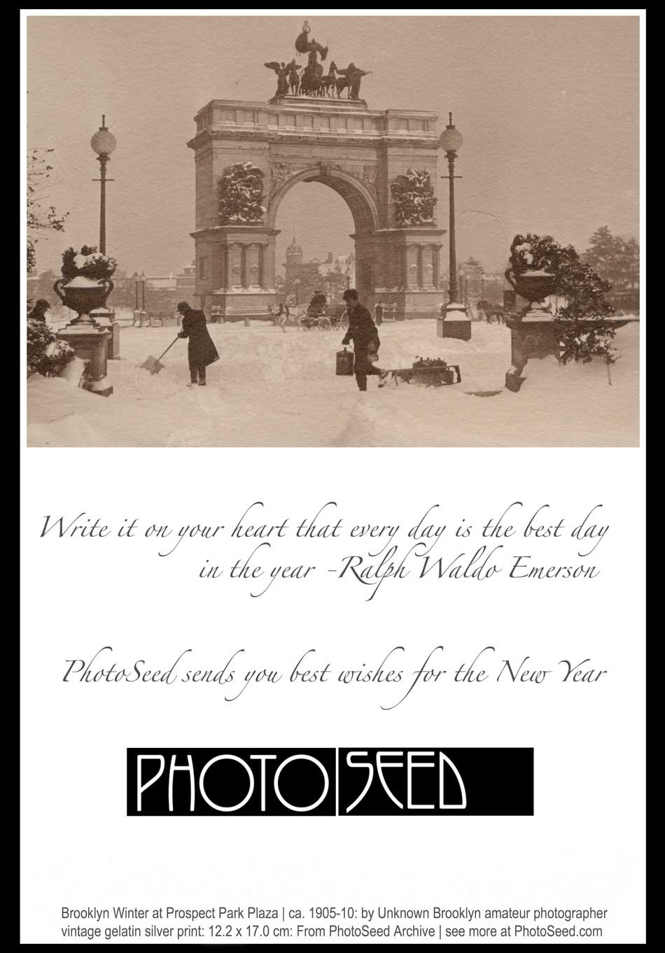
A Merry Christmas to All
Posted December 2015 in Engraving, Painters|Photographers, PhotoSeed, Publishing, Typography
 Detail: "Phoebus": by George Wharton Edwards: American 1859-1950: multiple-color woodcut used as part of cover illustration for periodical "Sun & Shade": New York: December, 1890: whole #28: N.Y. Photo-Gravure Co.: 32.1 x 25.3 cm | 35.3 x 28.0 cm: from: PhotoSeed Archive
 "Christmas Eve": by Sir John Everett Millais: English 1829-1896: photogravure published in periodical "Sun & Shade": New York: December, 1890: whole #28: N.Y. Photo-Gravure Co.: 19.2 x 15.7 cm | 34.9 x 27.2 cm: from: PhotoSeed Archive
 Detail: "A Merry Christmas": Emilie V. Clarkson: American 1863-1946: photogravure published in periodical "Sun & Shade": New York: December, 1890: whole #28: N.Y. Photo-Gravure Co.: 20.1 x 14.5 cm | 34.9 x 27.2 cm: from: PhotoSeed Archive
 Detail: "We Praise Thee O Lord" ("Sang with many a change Christmas carols until morn.": Emilie V. Clarkson: American 1863-1946: photogravure published in periodical "Sun & Shade": New York: December, 1890: whole #28: N.Y. Photo-Gravure Co.: 20.0 x 15.5 cm | 34.9 x 27.2 cm: from: PhotoSeed Archive
 Detail: "Christmas Morning by the Sea" (alt: Winter's Touch on Land And Sea": Mrs. J.M. Appleton: American: photogravure published in periodical "Sun & Shade": New York: December, 1890: whole #28: N.Y. Photo-Gravure Co.: 10.5 x 16.1 cm | 34.9 x 27.2 cm: from: PhotoSeed Archive
The Idea of Hawaii
Posted April 2015 in History of Photography, New Additions, Typography
In the public consciousness at least, Hawaii has probably not changed too much in the past 100 years. By this I mean an island chain of magnificent tropical beauty, mystery, and earthly delights with a strong emphasis on the natural world being the preferred vision for this place for many of us; with the realities of crime, squalor and all the other maladies undoubtedly present on some scale cast aside for the sake of bliss. You see, in this chaotic world, people need and want to believe utopia by the name Hawaii must exist.
 Detail: A.R. Gurrey Jr., American: "In measured tones subdued and low…" ca. 1910-20: vintage gelatin silver print from leaf included in volume "Idyls of Hawaii" (10.2 x 11.6 | 25.0 x 19.8 cm) Native Hawaiians are seen steering an outrigger canoe, possibly on Kaneohe Bay off the coast of Oʻahu. : From: PhotoSeed Archive
 Left: first published version of A.R. Gurrey Jr. monogram from 1902 advertisement for his Honolulu store from "The Friend" magazine of that city. Middle: portrait of Gurrey Jr. published in "Men of Hawaii" from 1917. His WWI draft registration from 1918 listed his occupation as art dealer with his physical features being short, of medium build with gray eyes and brown hair. He lived with wife Caroline Haskins Gurrey, an accomplished portrait photographer, at 2512 Upper Manoa in Honolulu. Right: this circular logo for Gurrey's Ltd. located at 1066 Fort St. in Honolulu featured Duke Paoa Kahanamoku riding a surfboard. Open from late 1909 to 1923, the shop in a 1912 mention in Mid-Pacific magazine stated: "This Art and Photo Shop is the home of the Hawaiian Roycroftes, where you can see the work of the leading artists of the Islands, small views, native types and surfriders and other objects of art. Besides being the leading art shop, they are agents for the Ansco Cameras and Cyko Paper, with a developing and printing department that cannot be excelled." all images from: Hathi Trust.
 Detail: A.R. Gurrey Jr., American: "Old ocean singing a psalm of delight…" (ocean view of Diamond Head in silhouette) ca. 1910-20: vintage gelatin silver print from leaf included in volume "Idyls of Hawaii" (7.8 x 11.5 | 25.0 x 19.8 cm) : From: PhotoSeed Archive
 For the first issue of The Mid-Pacific Magazine in Jan., 1911, A.R.Gurrey Jr.'s photo from 1910 of Duke Kahanamoku riding a surfboard in Waikiki was published as part of the front color cover designed by artist Stuart S. Tabor. Acknowledged today as the father of surfing photography, Gurrey Jr.'s working methods in a 1912 article stated: "It necessitated going right out against the incoming surf, right at its height and meant invariably a swamping of the canoe and soaking for all in it. Mr. Gurrey felt amply repaid for his day's outing if at the end of the day he returned with his camera and one unspoiled negative out of twelve." from: Hathi Trust
 Detail: A.R. Gurrey Jr., American: photo-transfer of calligraphic text from poem "A Psalm for Hawaii" by Anna Cate Dole published in "Idyls of Hawaii" ca. 1910-20. Calligraphy was an important art-form practiced by Gurrey; so much so he often signed this work in "Idyls" using his stylized monogram seen above at lower left corner. from: PhotoSeed Archive
 A.R. Gurrey Jr., American: "Fair is she in the morning light…" ca. 1910-20: vintage gelatin silver print used as frontis leaf included in volume "Idyls of Hawaii" (11.5 x 11.2 | 25.0 x 19.8 cm) Illustrating lines from the Anna Cate Dole poem "A Psalm for Hawaii" written ca. 1909, Gurrey's photograph of a mountainous Hawaiian landscape with her peaks and lake reflection shrouded in clouds confirms this place as idyllic. From: PhotoSeed Archive
Photographer Alfred Richard Gurrey Jr. believed in that place. A Hawaiian transplant from San Francisco at the turn of the 20th Century, his beautiful photographs of the islands included in the self-published book Idyls of Hawaii ca. 1910-1920 now on this website is aptly titled, even if idyll is now spelled with two ls in the 21st. A truly renaissance man of the arts, his vision of beauty for a place we may never visit but hope to someday cannot help but give us all the hope we need in this hectic and often indifferent world- one where the idea of Hawaii can always be within reach. -David Spencer
Want to see more of this special place from long ago? click here
Needle in a Haystack
Posted March 2015 in Advertising, Childhood Photography, Engraving, Publishing, Significant Photographers, Typography
Surreal would be a good word for it. On the evening of Friday, November 4, 1904, the touring company of the Broadway flop Eben Holden made its way to a performance at a building called the Auditorium on S. 2nd Street in downtown Newark, Ohio.
 Detail: Cover for "Eben Holden: A Tale of The North Country": Edition de luxe by Irving Bacheller. Lothrop Publishing, Boston: 1903. Gilt-engraved decorative cloth with circular design featuring a design of a ribbon interlaced with pinecones and leaves: 21.0 x 14.2 cm: One of the best selling novels from the very beginning of the 20th Century, this edition features 12 photogravure plates by photographer Clarence Hudson White. from: PhotoSeed Archive
Most likely in attendance that night? Clarence Hudson White, (1871-1925) the world-renowned pictorialist photographer who was a recent founding member of the American Photo-Secession and current Newark resident. Only two years earlier, he had taken a series of photographs using his Newark neighbors as models for a special edition of Eben Holden that had been made into this very play.
Written by American journalist and author Irving Bacheller, (1859-1950) the story is a classic rags to riches tale that captivated the masses in the new American century when first published in July of 1900, eventually selling over 1 million copies. The setting at the beginning of the novel is the “North Country” of Northern Vermont , the Adirondack’s and St. Lawrence River Valley of the 1840’s and 1850’s. It tells the coming of age story of William Brower, orphaned at the age of six after his parents and older brother accidentally drowned as well as his relationship with Eben Holden, a farm hand who rescued “Willy” from the cruel fate of an orphanage
But this post is part collecting story, a kind of hunt for treasure, or “spondoolix” as “Uncle Eb” would say in one chapter-his country ways and lack of education brought into sharper focus for the reader by Bacheller’s liberal usage of Holden’s spoken dialect.
 Detail: Top: listing for works by American author Irving Bacheller showing Edition de luxe of Eben Holden highlighted in blue: from: Illustrated Catalogue of Books Standard and Holiday 1903-1904: Chicago: A.C. McClurg and Company: 1903: p. 217 (the † denotes it is a work of fiction, published since November 1, 1902, under the rules of the American Publishers' Association. (from: Hathi Trust)Bottom: close-up detail showing autograph for CH White 02 at bottom left corner of representative photogravure plate from the Edition de luxe: from: PhotoSeed Archive
The Hunt is on
I consider myself a newbie collector, but one of the first things I put on my list 15 years ago when I first started out was one particular impression of Eben Holden rumored to have been illustrated by hand-pulled photogravures by White, the aforementioned famous photographer.
My curiosity had been piqued after seeing the volume listed in several bibliographies, typically stating the 1900 date. One such entry in author Christian A. Peterson’s Annotated Bibliography on Pictorial Photography did give me hope the work existed, even though finding one in the internet age would prove to be quite the challenge:
The Museum of Modern Art, New York, holds what is probably a unique copy of this book, comprised of the Lothrop text pages bound in leather, with an inscription by White and ten photogravure illustrations by him, including the portrait of Holden. (1.)
Because the novel had been such a success a century earlier, the reality of upwards of 500 vintage copies for sale on the web at any one time was daunting. My course of action however was simple, and eventually effective: send out a mass number of emails to every bookseller in the U.S. listing a copy from a suspect 1901 edition I had honed in on inquiring if it contained any photographic illustrations.
 Broadside advertising poster for Lothrop Publishing Company of Boston: 1897: artist: William Schumacher: American: (1870-1931) multiple-color lithograph printed on wove paper: 52.7 x 34.0 cm. Speaking of the beginnings of Eben Holden in the year 1897, author Irving Bacheller said "had unsuccessfully offered the first 'Eben Holden' as it then stood to two juvenile publications; but as I happened to be just starting off on a vacation at that time, I determined myself to see the Boston firm, which was the Lothrop Publishing Company. I met the editor, Mr. Brooks, at the Parker House, and told him the story as I had written it. He immediately saw the possibilities in it and declared I had a big thing if I could carry it out as it should be." (excerpt: "The Critic": Oct. 1904) vintage broadside (trimmed) from: PhotoSeed Archive
And so eventually luck prevailed. In 2007, a bookseller in Idaho finally said yes, and a bucket item was now on my library shelf. But that was not the end of it, as Alice would say, things got Curiouser and Curiouser! Because collectors never stop looking, I soon stumbled upon a CT bookseller who knew exactly the significance of the White-illustrated impression, with an astronomical asking price. An excerpt from his description of the work stated:
Elusive and highly desirable work, absent from almost all museum and library collections devoted to photography, and one of only a very few photographically illustrated books produced by a leading member of the Stieglitz circle at the height of the Photo-Secession. (2.)
 Top: detail: 1891 advertisement for The Estes Press (Dana Estes & Company) from "The American Bookmaker". The woodcut shows the brand new Estes Press Buildings located at 192 Summer St. in Boston first occupied around 1890. The firm housed many different companies involved in the bookmaking process, including: "The celebrated engravers, John Andrew & Son have their studios in the upper story…"; J.S. Cushing & Co., (book composition) Berwick & Smith, (presswork) and E. Fleming & Co. (binding). These last three firms left Estes in 1894 and became part of the Norwood Press. (from: Hathi Trust) Bottom: detail: exterior photograph of Norwood Press from the 1897 volume "Boston Massachusetts" by George W. Englehardt. The original caption noted the firm was located "Fourteen Miles from Boston, on the New England Road" and "as a whole employing nearly three hundred hands." This is where the Eben Holden Edition de luxe was printed. (from: Hathi Trust)
And so I sucked it in and didn’t purchase the second copy, which he told me he had originally purchased in Marlborough, NH. Eventually he sold it to a European collection, but I’ve since visited him several times and made a few purchases over the years, something I highly recommend rather than doing everything through e-commerce.
But then lighting struck again five years ago, when I purchased a second copy which had been personally inscribed by the author in 1911 to John A. Dix, then governor of New York state.
Curiouser? The first copy, fourth edition imprint stated Two Hundred and Sixty-fifth Thousand, March 12, 1901 and the second copy was for Two Hundred and Seventieth Thousand, September 18, 1903.
 Detail: Clarence H. White: American: "How much was that a yard ?" Hand-pulled photogravure plate printed by John Andrew & Son (image: 12.2 x 7.5 cm | support: 20.0 x 14.0 cm ) from: Edition de luxe impression of Eben Holden: Lothrop Publishing, Boston: 1903. The Library of Congress states the model at right is Ann Fulton and the woman examining the dress is the photographer's mother Phoebe Billman White (1845-1920) : from: PhotoSeed Archive
Knowing the book now existed in multiple impressions with the Clarence White photogravures was perplexing to me at first, but I’m certain the inclusion of the White photographs was intended by the publisher Lothrop for a more discriminating audience, so its assumed they had the monetary incentive to publish more than the one impression-even with the fickleness and extra work necessary to bind an edition with hand-pulled gravures.
To this end, my research in preparing this post discovered 1901 to be the year Clarence White was first commissioned by the Boston publisher to illustrate a new edition of Eben Holden. The intended publication date of very late 1902 was designed to coincide with the lucrative holiday sales season. Even with the move to e-books in our modern age, publishers earn good money issuing ornate and extra-illustrated editions during this time of year catering to the once a year book buyer and bibliophile alike.
Known as the Edition de luxe, this edition of Eben Holden with the White photogravures priced at $2.00 somehow managed to miss the late 1902 holiday sales season. The curious fact of the inclusion of the imprint for March 12, 1901 on the limitation page and White’s signature including the year 02 on many of the 12 plates in the published work was basic economics for publisher Lothrop-they simply used existing leaves, including the old limitation pages from current stock when it was eventually released for sale to bookstores in 1903.
 Top: detail: 1896: advertisement for John Andrew & Son from the "Boston Blue Book". (from: Hathi Trust) Bottom: detail: typical example of the firm's engraved credit appearing at lower right corner of image margin on plate recto from the 1903 Photographic Times-Bulletin. The John Andrew firm was established in Boston in 1852. from: PhotoSeed Archive
This was by no means unprecedented by Lothrop, or other large publishing houses of the era, as they would have set aside a certain number of unbound sheets from a best-selling work for limited impressions featuring artwork. The first illustrated edition of Eben Holden featured halftone photographs taken by Joseph Byron from the Broadway production of the same name hadn’t even debuted until Oct. 28 of 1901. This also used the March 12, 1901 imprint date. Known as the Dramatic Edition, it was described in the trade monthly The Bookseller:
”An illustrated edition of Eben Holden has been recently published called the Dramatic edition. It contains seven pictures of the play as it appeared in New York and a fine portrait of the author.” (3.)
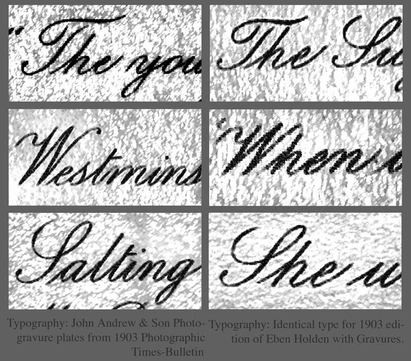 Details: with manipulations in PhotoShop to highlight typography: In order to show Boston's John Andrew & Son atelier printed the photogravure plates uncredited in the de luxe edition of Eben Holden, it is useful to analyze the script font typeface used for photographic plate titles. Column at left, top to bottom shows known examples from the Andrew atelier taken from the 1903 Photographic Times-Bulletin. Column at right shows plate titles from the Eben Holden volume. all from PhotoSeed Archive.
Published in 1903
Finally, with the eventual tenth imprint of the fourth edition stating Two Hundred and Seventieth Thousand, September 18, 1903, (6.) the makeup of the Edition de luxe was that of a small 8vo Octavo instead of the common edition, a 12mo Duodecimo. The inclusion of 12 fine, hand-pulled photogravure plates by White seen here is another matter altogether. For one, other than White’s autograph-appearing often (and faintly) in the lower left hand corner of each plate image as CH White 02, the Edition de luxe neglects to give him any printed credit for the photographs nor the atelier who printed them. This is very surprising for a special edition. Typically, there would at the very least be a separate illustrations page noting titles and page numbers at the front of a similar volume, but for whatever reason they were not included.
Stieglitz plays Go Between
With Eben Holden’s great success, the dramatization of the novel on the Broadway stage was logical for its day-especially since the Cinema was not an option because of the infancy of the medium. Lothrop’s piggy-backing of the work through this Dramatic edition, even by the “flop” standard of 49 performances, was but one way of keeping the work “fresh”- even a full year after initial publication. At some point late in 1901, a result perhaps of someone seeing the play on Broadway or believing White’s work would lend itself nicely to a series of photographic illustrations, the Boston publisher-perhaps through an association with Fred Holland Day (who lived in nearby Norwood where the Norwood Press printed books for Lothrop) or Alfred Stieglitz in New York-gave White the commission for its second illustrated edition of the novel.
 Clarence H. White: American: 1902: "She was still looking down at the fan": vintage Platinum or gelatin silver print: Showing typical retouching by White, the models are Alfred Dodge Cole, (1861-1928) a professor of Chemistry and Physics at Denison University and his wife Emily Downer Cole. (1865-1957) They play the roles of William Brower and Hope, whom Brower eventually marries in the novel Eben Holden. The photograph was reproduced as a photogravure plate and included in the Edition de luxe. Curators at the Robbins Hunter Museum where this and other White photographs are held stated the photographer had taken family photographs of the Downer family on the lawn of the home in the late 1890's and so he "would have been familiar with the house and furnishings from that commission. It was common for Clarence White to ask acquaintances to pose for photographs, often in costumes that he would provide. The photographs for Eben Holden were staged with costumes from the Civil War era." Photograph courtesy: Collection of the Robbins Hunter Museum in the Avery Downer House, Granville, OH.
Ultimately, Stieglitz’s publishing background, connections and established relationship with White through his editorship of Camera Notes, his new involvement with Camera Work, as well as his having his own work exhibited in an early salon of pictorial photography in Newark Ohio in late 1900 and other exhibitions made Stieglitz a believer in White’s potential as an illustrator:
“What is especially fascinating, however, is what occurs when White is commissioned, as he was in 1901, to take up literary illustration himself. Through the assistance of Stieglitz, White received the commission to illustrate a new edition of the novel Eben Holden by Irving Bacheller. ( 4. )
And much later, the photographer’s grandson Maynard Pressley White commented about a bit of reluctance on his grandfather’s part in dealing with Lothrop as part of his Ph.D. dissertation in 1975:
“The correspondence with Stieglitz concerning the illustrations for Eben Holden is revealing of his character as well as Stieglitz informed him that he suffered from no such timidity and would—and indeed did—handle the matter with the publishers, as it turned out, to the advantage of White.” (5.)
 Clarence H. White: American: 1902? : vintage untitled Platinum or gelatin silver print: The model Emily Downer Cole (1865-1957) poses wearing a different dress than seen in the published Eben Holden photogravure "She was still looking down at the fan" taken on the same settee in the front parlor of the Downer family home. This was likely an alternate study Clarence White took for consideration for his series of Eben Holden illustrations. Photograph courtesy: Collection of the Robbins Hunter Museum in the Avery Downer House, Granville, OH.
John Andrew & Son: founded in Boston: 1852
In giving credit to White and the firm that printed his photographs as gravures, a bit of elucidation seems in order to set things straight. Upon close inspection of these plates along with many others by Boston’s John Andrew & Son from the same time frame, I feel confident giving the Andrew firm credit for printing them. This is based on a near exact match in the script font used for the plate titles in the de luxe edition of Eben Holden as well as those plates credited to the firm appearing in the Photographic Times Bulletin from 1902-04.
I’ve included examples of the font as a comparison with this post. Another exact match is the same plate paper was used for both publications: this is very revealing especially on the plate verso where a very fine stipple pattern can be seen on the paper surface of the cream-colored plate paper. Perhaps the strongest association with the John Andrew atelier and the Norwood Press (which printed the de luxe edition) emerged in my research on business associations with some of the individual companies that came together in 1894 when that press was formed. These included J.S. Cushing & Co., (for composition and typesetting) Berwick & Smith Co., (for presswork) and E. Fleming & Co. (for binding). Beginning around 1890, all of these firms along with John Andrew were under one roof as part of the brand new Dana Estes & Company publishing house buildings on Summer Street in Boston.
 Clarence H. White: American: 1903: halftone: "Walking side by side to or from the school-house" was one of three photographs published to illustrate the Clara Morris story "Beneath the Wrinkle" published in the February, 1904 issue of McClure's Magazine. (12.8 x 9.5 cm) published: p. 430. From: PhotoSeed Archive
With the move to Norwood in 1894, the Andrew atelier stayed behind in Boston at 196 Summer St. but continued to provide fine photo engraving work to the major publishing houses in Boston and New York. Known today for printing many of the photogravure plates beginning in 1907 for the monumental Edward Sheriff Curtis work The North American Indian, the firm sometime in the first decade of the 20th Century became a department of the Suffolk Engraving & Electrotyping Co. of Boston with offices at 394 Atlantic Ave.
Named after John Andrew, (1815-1870) a wood engraver born in England who immigrated to Boston where he worked with fellow engraver Andrew Filmer, the firm eventually made the transition to photo engraving, including the half tone and photogravure processes. Andrew’s son George T. Andrew succeeded his father at the business, located at 196 Summer St. An 1892 overview of the firm from the volume Picturesque Hampden gives some background:
JOHN ANDREW & SON COMPANY.
ENGRAVERS AND MAKERS OF FINE BOOKS, BOSTON MASS.
If we go back a few years, we find that in illustrating books and magazines wood and steel engraving were about the only methods available. Nor could steel engraving have any wide use on account of the great expense of printing. Ever since its start, in 1852, the firm, now styled the John Andrew & Son Company, has held a prominent place among illustrators, especially in work of the finest grades. Their reputation was made in the first place as engravers on wood, but the discovery of delicate chemical and mechanical processes has in later years led them to also take the photo-engraving and half-tone work which has at present such wide use and popularity. In this field they do work for some of the best magazines and books published in this country. In what they undertake they strive not so much to do the cheapest work in price as the best work in quality. Quite recently the firm has taken up the photo-gravure process in addition to those spoken of above. The industry we describe is not located in Hampden county, but the mention here is not inappropriate as the engraving of our pen and ink pictures was done almost wholly by this firm. Their address is 196 Summer street, Boston.
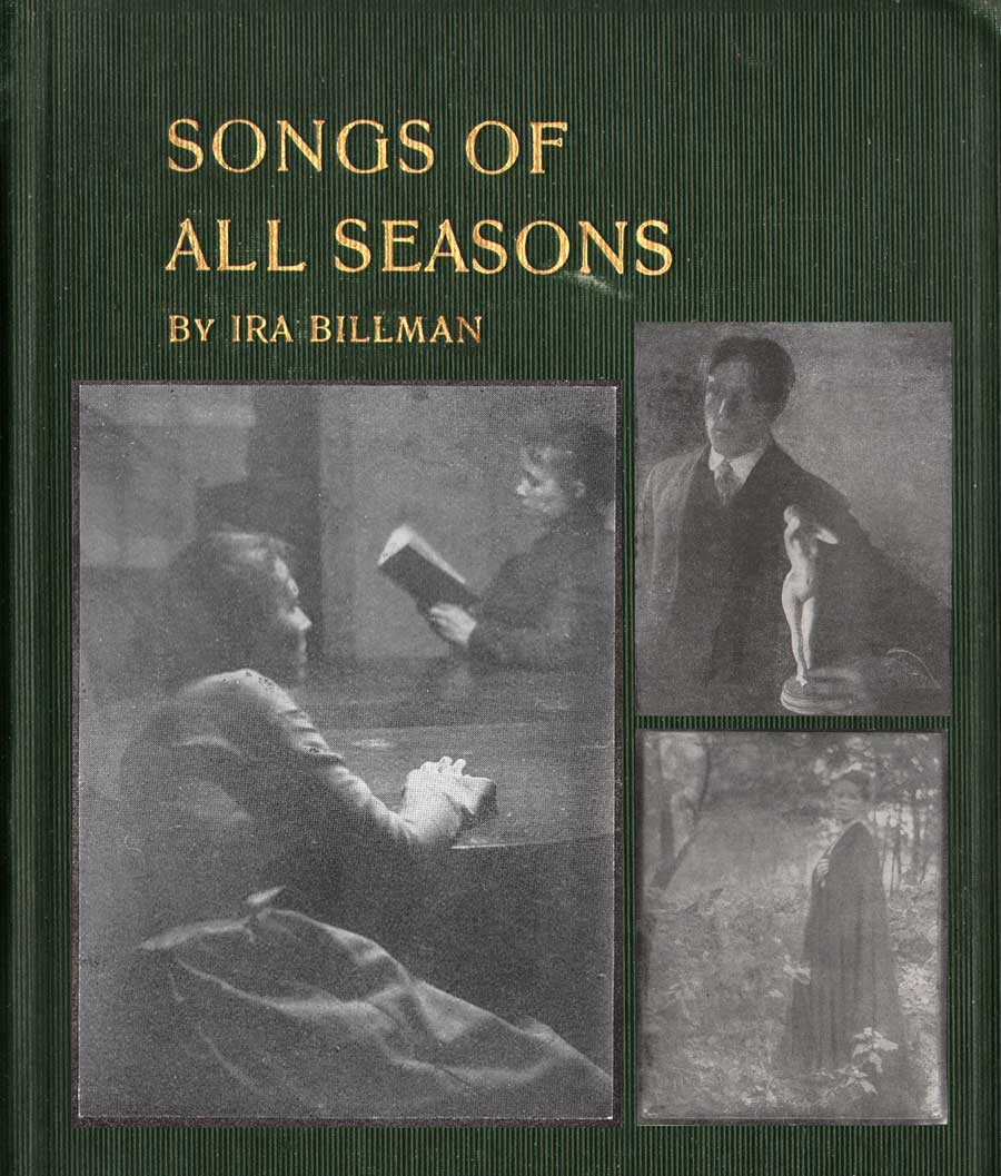 Detail: Cover for "Songs of All Seasons" by Ira Billman. The Hollenbeck Press, Indianapolis: 1904. Gilt-engraved stamped cloth: 20.4 x 13.6 cm: shown inset with representative photographs taken by Clarence White reproduced in halftone in the volume. Photo left: "The Book Lovers" (p. 181); top right: untitled man with statuette illustrating poem "The Twin Flower" (p.137); bottom right: "The Gloaming" (p. 199). Billman was Clarence White's uncle and was "one of his earliest artistic influences in his life": From: PhotoSeed Archive
Photographic Illustration: a New Outlet
A newspaper clipping, believed to be from the Newark Daily Advocate in the Clarence Hudson White clipping file at the Newark, OH public library, includes the following undated (but 1903) story discussing Eben Holden in passing while concentrating on a new commission that inevitably came from it: costume-piece photographs by White similar to those he did for Lothrop for author Clara Morris’s story published in McClure’s magazine in February, 1904 entitled “Beneath the Wrinkle”:
PICTURES From Real Life by Clarence White
Forwarded On Order to a New York Magazine-Local Artist’s Latest Work.
Mr. Clarence White received a command last fall from the art department of McClure’s Magazine to illustrate Clara Morris’ new story, entitled, “Beneath the Wrinkle,” that will appear in that magazine presumably in the near future. Mr. White was to have been given all the time he wanted, but in view of the change of art editors, Mr. White was notified about three weeks ago that the illustrations would be required immediately. Mr. White at once notified the publishers that he would use all his efforts to complete them immediately, and would forward them when completed. Today the set comprising six, were forwarded and as equaly as clever and well executed as the ones made for the illustrating of the holiday edition of Eben Holden that was to have made its appearance last Christmas, but was not completed in time for that season. The ones now in progress are all local personages, done in quaint, old-fashioned garb and surroundings, recalling vividly to mind the characteristics in dress and decorations then in vogue. They show the fine and beautiful artistic temperament of Mr. White in his striking correct interpretation of dress and customs of the period in which the characters live. Mr. White deserves the honor the illustrations will surely bring to him, as he is always conscientious and painstaking in whatever he undertakes in his profession.
 Left: Irving Bacheller, (1859-1950) American journalist and author, wrote the novel Eben Holden which sold over 1 million copies. This portrait with facsimile autograph by an unknown photographer appeared as the frontis (13.3 x 9.1 cm) to the Dramatic Edition of the book-the first illustrated edition featuring photographs of the Broadway stage production that debuted Oct. 28, 1901 and ran for only 49 performances. Right: " 'Fore your other arm gits busy, wont you wind the clock?" (14.1 x 8.4 cm) Actor E.M. Holland at left plays the role of Eben Holden, Lucille Flaven plays Hope and Earle Ryder as an American Civil War officer plays William Brower. The important New York commercial photographer Joseph Byron, (1847-1923) founder of the Byron Company (currently, the 7th & 8th generations runs Byron Photography) took stage photographs of the play at New York's Savoy Theatre with plates published in the Dramatic Edition. from: PhotoSeed Archive
White Family Connections: Songs of all Seasons
During the time he received the commission for illustrating Beneath the Wrinkle in 1903, a more intimate family connection developed which allowed White the opportunity to take another series of photographic illustrations, 42 in all, published in 1904 within a slim volume of poetry titled Songs of All Seasons.
The author was nationally known poet Ira Billman, Clarence White’s uncle, the brother of his mother Phoebe Billman White. In the volume Symbolism of Light: The Photographs of Clarence H. White published in 1977 which accompanied an exhibition of White’s work at the Delaware Art Museum and International Center of Photography, White’s grandson Maynard P. White, Jr. describes Ira Billman as a major influence on Clarence and Songs:
Among the gathering of aunts and uncles that gave meaning and context to the artist’s early life was Ira Billman, his mother’s brother. “Poetic” is the word most often used to describe White’s photography, and his Uncle Ira, a poet by avocation, was one of the earliest artistic influences in his life. …Billman’s work celebrates rural America; his poems are songs to people and to nature, and they are imbued with the deep religious sentiments of his Lutheran heritage, without being mawkish or even faintly cloying. What is important for the purpose of my discussion is that Clarence White made the photographic illustrations for Songs of All Seasons, and Billman dedicated the volume to him. (7.)
 "To Governor John A. Dix with many good wishes from Uncle Eb an' me Irving Bacheller N.Y. Feb. 22 1911." This personal inscription by Bacheller to John A. Dix, then Governor of New York State, appears in a volume of Eben Holden with the imprint of Two Hundred and Seventieth Thousand, September 18, 1903, the actual year the novel was released for sale. In a 1901 newspaper article, Bacheller said the character Eben Holden was based on "a composite of my father and his hired man-a very jolly old fellow". from: PhotoSeed Archive
Ninety-one poems and sonnets are included in the volume. Here, The Test, a representative poem from the work:
The Test
Not what I felt will be the test
When song and fragrance filled the hour,
And all the sunshine of the blest
Unfolded me to perfect flower.
Not what I aid will be the test
When by sweet waters wound my way,
And white-haired, thoughtful hills all guessed
The word I was about to say.
Not what I did will be the test
When stunned by cry of human needs
I dreamed I was myself oppressed,
And woke to passion of great deeds.
Not what I chose will be the test
When first I saw one world in hand
Is worth two in the bush-the best
Of which it is to understand.
O! none of these will be the test,
But what God knows I would have done,
Had I been nurtured in the nest
Of one, I now condemn and shun. (8.)
 Left: Clarence H. White: American: 1902: hand-pulled photogravure: (9.7 x 7.3 cm) in: Eben Holden: A Tale of the North Country: Boston: Lothrop Publishing. (1903) Appearing as the frontis portrait in the Edition de luxe, this unknown subject was the novel's namesake: a fictional character who was a former farm-hand and main father figure for the newly orphaned William Brower serving as the narrator in the work. Right: Clarence H. White: American: 1902: halftone: (12.0 x 9.2 cm) in: Eben Holden: Harper & Brothers Publishers. (1914) Part of the Pine Tree Edition of Irving Bacheller's (Collected) Works. This heavily manipulated portrait from the original photograph by Clarence White of Eben Holden published 11 years earlier also appeared as the frontis for the first volume in the Pine Tree series. From: PhotoSeed Archive
Pictorial Illustration for Photography a Growing Field
By 1904, esteemed critic Sadakichi Hartman, writing in Leslie’s Weekly, weighed in on the growing use of photography for book illustration:
”…and Clarence H. White, of Newark, O., has found a new opening for photography in the illustration of books. His illustrations for “Eben Holden” have attracted wide and deserved attention.” (9.)
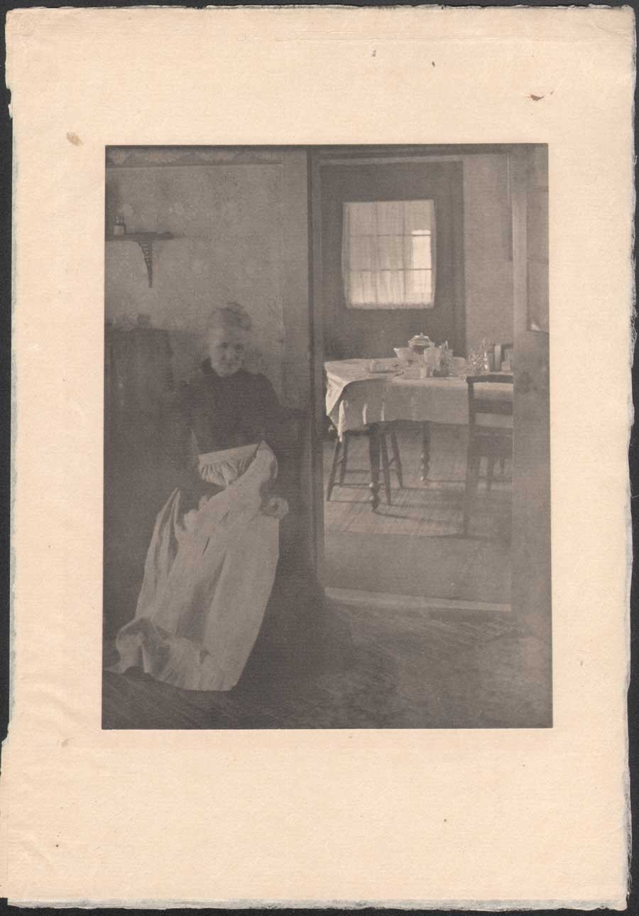 Clarence H. White: American: 1902: "Illustration to "Eben Holden"" (1903) hand-pulled photogravure: (tipped image:19.7 x 15.0 cm | Japan paper support: 30.5 x 21.0 cm) in: Camera Work III. (1903) Two plates in the Edition de luxe of Eben Holden: "How much was that a yard ?" (seen in this post-CW IX: 1905) and this one: "Mother was living in the old home alone"-an interior portrait of the photographer's mother Phoebe Billman White (1845-1920) were also published as photogravures in Camera Work. From: PhotoSeed Archive
And later that year, citing White’s involvement with Eben Holden while writing in the Photographic Times Bulletin, Hartman brought up the potential financial rewards possible for pictorial photographer in this new field:
“The only way to approximate a market value of pictorial prints is to investigate how much they might bring on the average, if offered for sale as illustrations. There is lately a decided demand for photographic illustrations, and consequently a certain standard price in vogue. The pictorialist, of course, and perhaps with some right, aspires to illustrator’s prices (i.e., $50-$100 for the full page of a magazine), but he has never reached it, with the one exception of Clarence H. White, who is said to have received several hundred dollars for his series of “Eben Holden” illustrations.” (10.)
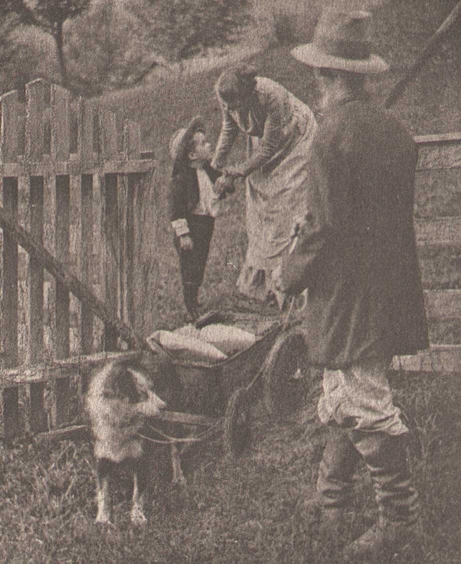 Detail: "Tucked some cookies into my pocket" : Clarence H. White: American: 1902: hand-pulled photogravure plate (11.9 x 7.3 cm) included with Edition de luxe of Eben Holden (1903): Lothrop Publishing, Boston. The young orphan William Brower is possibly modeled here by the photographer's son Maynard Pressley White (b. 1896) and his wife Jane Felix. (1869-1943) The scene shows Brower preparing to head out into the wilderness in a dog-pulled cart with Eben Holden at right. From the novel: "Our hostess met us at the gate and the look of her face when she bade us good-by and tucked some cookies into my pocket, has always lingered in my memory and put in me a mighty respect for all women." From: PhotoSeed Archive
This additional source of significant money to Clarence White and his young family through these illustration commissions invariably gave him additional confidence in his abilities as a photographer and financial peace of mind to eventually make his way to New York City, leaving Newark in 1906. It is also not a stretch to infer White’s own life mimicked the storyline of hard work that can earn the “American Dream” found between the pages of Eben Holden. Although the critic for the New York Times reviewing the play at New York’s Savoy theater didn’t care too much for the acting:
”As an exhibition of dramatic craft “Eben Holden” is hardly worth serious consideration“…
he did, a few paragraphs later, write the production had a few redeeming qualities:
But, despite its defects, the play is wholesome; it is redolent of the woods and the fields, and it provides the opportunity for an evening of entertainment that need not be looked back upon with regret. (11.)
No doubt Clarence White, had he been in attendance watching the play inside Newark’s Auditorium that 1904 November evening, would have agreed with these last sentiments of the big city critic, marveling and grinning to himself in the darkened hall while taking in the surreal juxtaposition that art imitating life can bring about.
Notes:
1. (White, Clarence H.) excerpt: An Annotated Bibliography on Pictorial Photography: Selected Books from the Library of Christian A. Peterson: Laurence McKinley Gould Library: Carleton College: Northfield, Minnesota: 2004
2. ABE listing: 120407. Besides multiple copies held by PhotoSeed, other known copies are in the Library of Congress, MOMA and Photogravure.com.
3. The Bookseller-Devoted to the Book and News Trade: Chicago: January, 1902: p. 28
4. Peter C. Bunnell: Inside the Photograph: writings on Twentieth-Century Photography: Aperture Foundation: 2006: p. 47
5. Clarence H. White : a personal portrait: Maynard Pressley White: Ph.D. dissertation, University of Delaware, 1975: pp. 79-80
6. see Beaumont Newhall’s Photography: A Short Critical History, from 1938, lists Eben Holden with the White illustrations as being published in 1903 on p. 215
7. excerpt: see Symbolism of Light: 1977: p. 7
8. Songs of All Seasons: Ira Billman: Indianapolis: The Hollenbeck Press: 1904: p. 65
9. excerpt: Advances in Artistic Photography: Sidney Allan: in: Leslie’s Weekly: April 28, 1904: New York: p. 388
10. excerpt: from: What is the Commercial Value of Pictorial Prints?: Sidney Allen: in: The Photographic Times Bulletin: December, 1904: p. 539
11. excerpt: review: “Eben Holden” at the Savoy: The New York Times, October 29, 1901
New Year Salute
Posted January 2015 in PhotoSeed, Significant Photographers, Significant Photographs, Typography
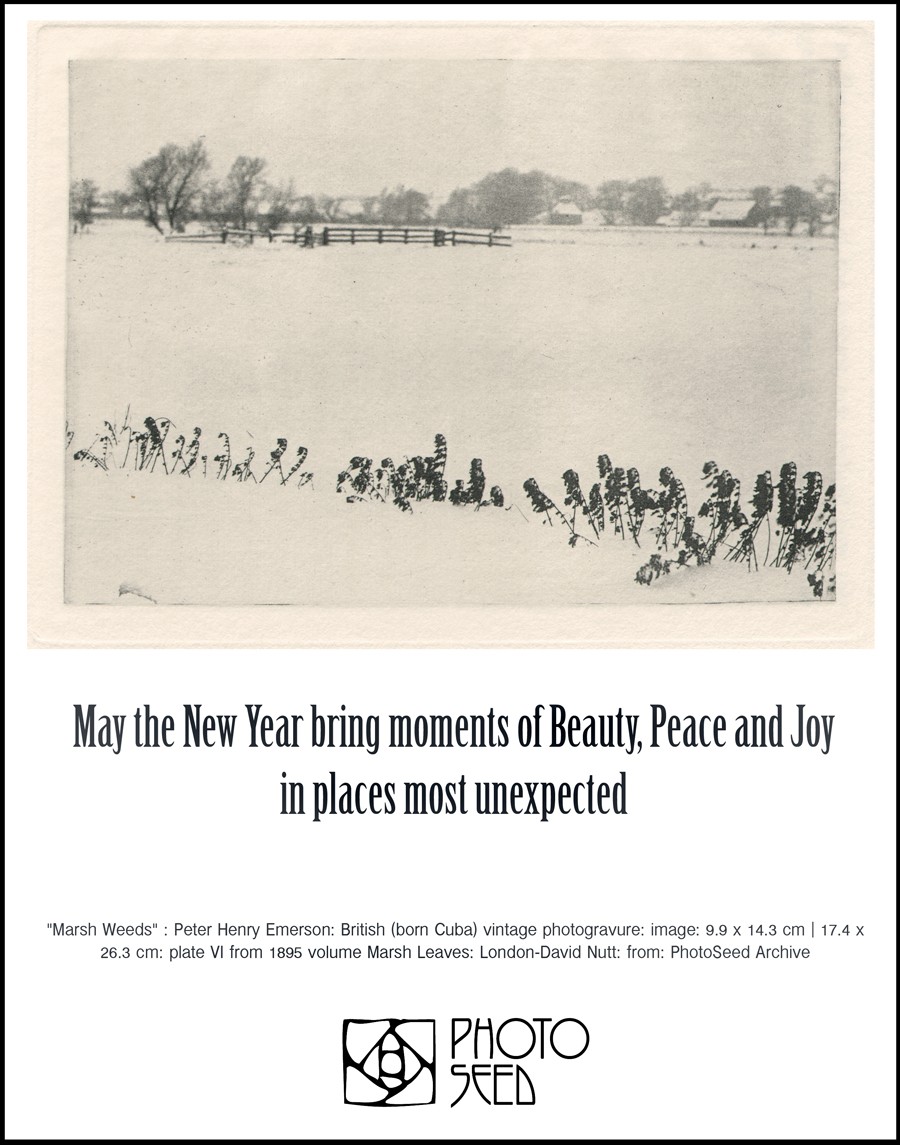
.
Genre meets Genius
Posted November 2014 in Engraving, New Additions, Painters|Photographers, Significant Photographers, Typography
Although long forgotten, amateur photographer John E. Dumont (1856-1944) figures prominently in the early years of American pictorial photography. However, a professional and better known acquaintance of his may change our understanding after my discovery of a small label on the back of a Dumont print made its’ way into the archive.
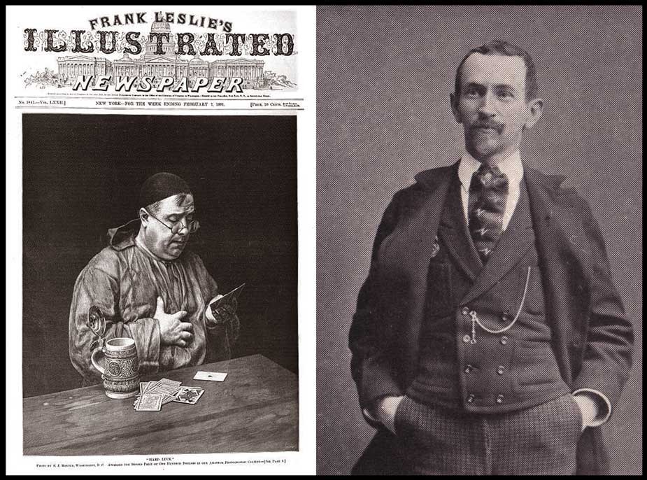 Left: "Hard Luck", showing a monk playing a losing hand of cards, was most likely taken by John E. Dumont in 1890. Shown here as the cover illustration of Frank Leslie's Illustrated Newspaper for Feb. 7, 1891, it is reproduced as a wood engraving from the original photograph, and earned Dumont a second place award and $100.00 in Leslie's Amateur Photographic Contest which closed in January, 1891. Dumont went on to copyright "Hard Luck" in 1892. (original from Pennsylvania State University) Right: Halftone portrait of photographer John E. Dumont of Rochester, New York by unknown photographer. 6.3 x 4.7 cm. Reproduced as part of a series of portraits of "Prominent Amateur Photographers" in the Nov., 1893 issue of the American Amateur Photographer journal. (p. 513) : from: PhotoSeed Archive
Established in business beginning in 1881 in Rochester, New York as a wholesale merchandise and grocery broker specializing in items like sugars, teas, and coffees, Dumont took up photography in 1884 and was soon entering and winning awards in photographic salons around the world.
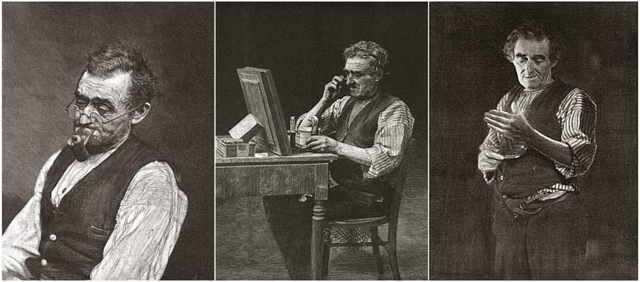 Taken in 1887, photographer John E. Dumont of Rochester, New York made this series of genre portrait photographs of a gentleman he described as "an old man who used to peddle oranges around the streets and offices in this city". Left: "A Quite Pipe": woodcut engraved from a copyright photograph from Leslie's Illustrated Newspaper Amateur Photographic Contest: published Jan., 17, 1891. Middle: "The Old Shaver": woodcut engraved from a copyright photograph from Leslie's Illustrated Newspaper Amateur Photographic Contest: published Jan., 24, 1891. Right: "The Toiler's Good-Night" : woodcut engraved from a copyright photograph illustrating a poem from Leslie's Illustrated Weekly: published Dec., 14, 1893: originals from Pennsylvania State University
Specializing in genre scenes, his photographs were published frequently, reaching a high point when his well known study of a monk playing a losing hand of cards titled Hard Luck was published as the cover illustration (converted to a wood engraving) for Frank Leslie’s Illustrated Newspaper in early 1891, the same year he won a grand diploma at the groundbreaking Vienna Salon of Photographic Art, the highest accolade awarded for the very few American entrants whose work was even accepted, including the now venerable Alfred Stieglitz, who had only come back to America from Europe the year before.
 Artist: Harvey Ellis, American: 1897: medium: wood engraving: subject: copyright label for amateur American photographer John Eignas Dumont. Plate intended to represent "the genius of photography surrounded by the accessories of the "dark room." Design: 3.4 x 1.3 cm | Label: 7.0 x 4.5 cm. Label is a variant of an ex libris bookplate Ellis designed for Dumont. from: PhotoSeed Archive
It was therefore a delightful discovery which took place for me recently after a signed Dumont carbon print of The Dice Players exhibited in the Royal Photographic Societies’ annual salon the same year as the Vienna exhibition was acquired for the archive. But what makes it special for the confluence of art photography and evidence a new incarnation of the English Arts & Crafts movement had taken hold after arriving on American shores was a later 1897 copyright label affixed to the rear of the mounted print. A design featuring an Art-Nouveau style woodcut engraving of a woman in a darkroom holding up a glass plate, I soon discovered it was the work of noted American artist, architect and designer Harvey Ellis. (1852-1904)
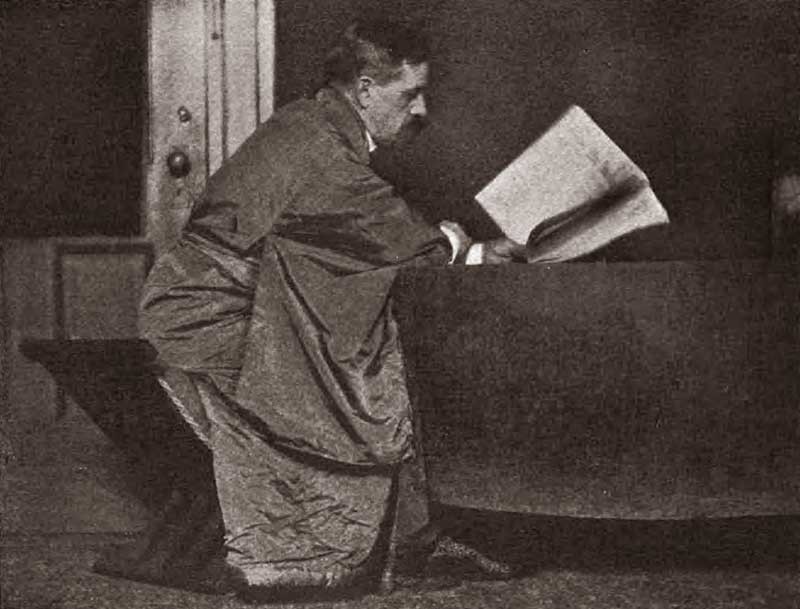 Photographic portrait of American artist, architect and designer Harvey Ellis. (1852-1904) unknown photographer: reproduced as halftone and published in the Dec., 1908 issue of The Architectural Review illustrating article on Ellis by Claude Bragdon titled Harvey Ellis: A Portrait Sketch: p. 173. Original from The University of Michigan
Never heard of him? Today, Ellis seems only to be remembered for the brief work he did in the last months of his life in 1903 for among other things, designing mission-style furniture and interior renderings of Craftsman homes in the Syracuse, New York-based architecture department for his American employer, Gustav Stickley, (1858-1942) the leader of the nascent American Arts and Crafts movement. But this is far from a full portrait of Ellis. A contemporary- architect, author, and theater designer Claude Bragdon- (1866-1946) gave a fuller account of Harvey Ellis in a posthumous outline for the December, 1908 issue of The Architectural Review. A few excerpts:
HARVEY ELLIS was a genius. This is a statement which may excite only incredulity in the minds of the many who never heard his name or knew him only by his published drawings, but it will have the instant concurrence of the few who knew well the man himself. There is the genius which achieves, and the genius which inspires others to achievement. Had it not been for the evil fairy (alcohol-editor) which presided at his birth and ruled his destiny, Harvey Ellis might have been numbered among the former; that is, he might have been a prominent, instead of an obscure, figure in that aesthetic awakening of America, now going on, of which he was among the pioneers; but even so he exercised an influence more potent than some whose names are better remembered. (p. 173)
 Although many designs by Harvey Ellis were never realized in the physical form, there are notable exceptions. The Compton Hill Water Tower in Reservoir Park, St. Louis, MO, is one landmark still standing. Topping out at 179 feet, (55 m) the structure was designed by Ellis in 1896 or 97 while employed by the St. Louis architectural firm of George R. Mann and Edmond J. Eckel, and built in 1898 in the French Romanesque style of rusticated limestone and buff brick and finished in terra cotta. The tower was decommissioned in 1929 and placed on the National Register of Historic Places in 1972. Photographer: Leo Kraft, American: ca. 1915: gelatin silver prints pasted in album: left: 12.1 x 6.9 cm | right: 9.8 x 6.3 cm : support: 17.6 x 25.2 cm. from: PhotoSeed Archive
… “There’s one type of mind,” Harvey remarked, “which would discover a symbol of the Trinity in three angles of a rail fence; and another which would criticize the detail of the Great White Throne itself.” Symmetry (the love of which is a sure index of the Classic mind) was his particular abhorrence. “Not symmetry, but balance,” he used to say. (p. 175)
Transient, and an unconventional architect and designer for his day, Ellis moved about the country working for firms in Minneapolis and St. Louis before returning to his native Rochester in 1893. It was sometime after this period that he most likely encountered and made the friendship of Dumont. In 1897, both became founding members of the Rochester Arts and Crafts Society, with Ellis serving as first president. That year, Dumont commissioned Ellis to design an ex libris book plate for him which was reworked slightly and reduced in size for use as a photographic copyright label-an example of which I found affixed to the verso of The Dice Players.
 Details: Harvey Ellis: 1897: wood engraving: Ex Libris bookplate and Copyright label for American amateur photographer John Eignas Dumont : Left: bookplate: 9.4 x 4.1 cm: Jensen Tusch Collection- Frederikshavn Kunstmuseum & Exlibrissamling- Denmark: Right: copyright label: 3.4 x 1.3 cm | 7.0 x 4.5 cm : from: PhotoSeed Archive
In 1899, the original bookplate was described in the pages of the London Journal of the Ex Libris Society:
DUMONT BOOK-PLATES.
By the kindness of a member we are enabled to give an illustration of the book-plate of Mr. John E. Dumont, of Rochester, N.Y., designed by Mr. Harvey Ellis, of the same city. Mr. Dumont is a leading photographer in America, and his works are well known in England. The plate represents the genius of photography surrounded by the accessories of the “dark room.” Mr. Ellis, the designer, is a prominent architect and a water-colour artist of repute. The plate, here given, is graceful in design and execution. (p. 128)
The friendship between Dumont and Ellis extended to 1903. Now serving as president of the Rochester Camera Club, (founded 1889) Dumont was joined by Ellis and future American Photo-Secession member and club member Albert Boursalt while acting as judges for the club’s inaugural photographic exhibition in the newly erected Eastman Building on the campus of the Mechanics Institute. (which became RIT) From March 30 to April 11, over 200 framed photographs were displayed in a building made possible by Rochester philanthropist and Kodak head George Eastman. An account of the exhibition was published, along with the role of Ellis as judge, in the May, 1903 issue of the American Amateur Photographer. An excerpt:
It is stated by Mr. Dumont, who is most familiar with all of the photographic exhibits ever held here, that this of the Rochester Camera Club is by far the best, largest and most meritorious of any ever held in Rochester. Harvey Ellis, whose ability as an art critic is recognized by all, says that there are just as good pictures shown by the local exhibitions as any from out of the city, and that more than one half of the pictures hung are as good as those shown in any of the salons in the country, not excepting New York and Philadelphia, which rank among the highest in merit. (pp. 223-24)
 Detail: "The Dice Players": 1891: print ca. 1897 or later: John E. Dumont: carbon print: 29.2 x 25.1 cm (flush mounted to board) : This classic genre photograph by Dumont showing a group of men playing dice (possibly the con game "chuck-a-luck") was first shown in the annual exhibition of the Royal Photographic Society in 1891 and further earned him a gold medal in another contest the same year sponsored by the English journal the Amateur Photographer. From: PhotoSeed Archive
But what immediately followed in the new Eastman Building from April 15-25, 1903: an “Exhibition of Art Craftsmanship”, featuring work from Gustav Stickley’s Craftsman Workshops, (1.) would turn out to be more significant in the overall advancement of the American Arts and Crafts movement compared to the photographic exhibition. A motivating factor perhaps? As it turned out, Harvey Ellis organized the Craftsman show, joining the Stickley firm a month later where he finished a remarkable career.
1. Historical Background: R.I.T. online resource accessed Nov., 2014: “In 1902 the Department of Decorative Arts and Crafts was established at Mechanics Institute under the leadership of Theodore Hanford Pond. An “Exhibition of Art Craftsmanship”, featuring the work of Gustav Stickley’s Craftsman Workshops, was presented in the Mechanics Institute’s Eastman Building, 15-25 April 1903.”
Voici la Blog! | Here is the Blog!
Posted September 2011 in Significant Portfolios, Typography
The process of preparing material for this website has been a real education for me. In picking apart and studying the components making up the two latest French portfolios added: L’Épreuve Photographique (The Photographic Print) for 1904 and 1905, knowledge has come in both large waves and tiny revelations. One of these waves has been some of the poetic, profound, and often humorous writing of French art historian and critic Émile Dacier.
 This stunning woodcut initial, designed by the French artist and type designer George Auriol , (1863-1938) begins the preface to the 1904 First Series portfolio of L’Épreuve Photographique, written by Émile Dacier, 1876-1952.
 Photographer J. Petitot found a high vantage point to photograph Paris, The City of Light, for the Second Series, 1905 portfolio of L’Épreuve Photographique. Petitot was a member of Société D’Excursions des Amateurs de Photographie in this magnificent city.
Here is an example of him speaking of his perceptions on the artistic photographic plates-included in his preface to the 1904 portfolio:
“These are the memories of distant lands, these are the tragedies and comedies of the street where chance is the great director, and here the pressure of crowds, the galloping squadrons, the shock waves on the breakers…”
And earlier, his delightful account of Photography and photographers in the dark ages-before their creative impulse was set free:
“Photographers! These terrifying figures to children that their souls have kept long stubborn grudges! …To visit these murderers as children we had to dress up-like the condemned. After the mandatory cutting of the hair, torture ensued by the shaking of the neck yoke…”
 The First Series (1904) cover to L’Épreuve Photographique. Type designer George Auriol designed the floral vignettes and other typographic elements that were integrated into the cover as well as for the half-title, title, preface pages (1904 only), plate tissue-guards, and separate “Table” index page (listing titles of photographs to corresponding photographer) found in the collected yearly portfolios for 1904 and 1905.
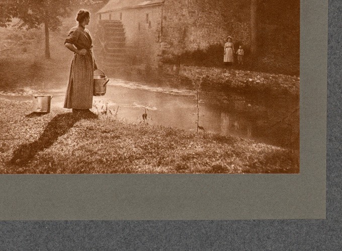 Photographic plates, like this detail by Belgian photographer Léonard Misonne, are reproduced for the portfolios from original source prints as hand-pulled, Taille-Douce (copper plate) screen photogravures. They are often double mounted, as shown, to a larger colored support measuring 44 x 32 cm and covered with a tissue-guard.
Tiny revelations: the editor of L’Épreuve Photographique, Roger Aubry, was not only a photographer and inventor, but a passionate balloonist who survived a crash into the Grand Palais in 1905 while taking photographs above Paris. And another: the very typeface that survives in some of the signage used in the Paris Métro train stations- Auriol, was designed by namesake George Auriol, a French artist, type and graphic designer who used his new typeface as well as other Art Nouveau elements in his commission of L’Épreuve Photographique by the Paris publisher Librairie Plon.
 The Annuaire Général et International de la Photographie. (General and International Directory of Photography) published this advertisement for the Second Series, 1905 portfolio of L’Épreuve Photographique .
 This burin-enhanced portrait, "Etude", by French photographer Robert Demachy, was used as the frontis plate to the 1905 Annuaire Général-reproduced as a hand-pulled photogravure by the Rembrandt Intaglio Printing Company of London. Dimensions to work: 13.8 x 12.0 cm.
 The humorous and sly observations of French writer and critic Émile Dacier, who wrote the preface to L’Épreuve Photographique in 1904, also extended to a much larger, illustrated history of perceived photographic mishaps, included in the 1905 edition of the Annuaire Général and titled "La Photographie à Travers L'Image". (Photography Through the Image) This drawing titled "Partie de Tennis: Étrange résultat d'une photographie instantanée" (Game of Tennis: Strange result of a snapshot) by the artist Meunier was included. (this example from source-Le Rire: June 22, 1901)
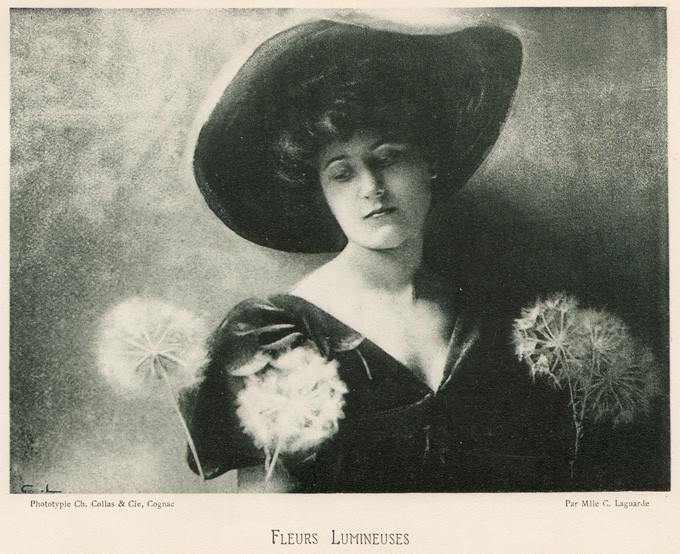 Auriol's relationship with the Annuaire Général is subtle, considering he was largely responsible for the design of L’Épreuve Photographique. The annual uses the Auriol typeface for the working titles of select plates, including this example: "Fleurs Lumineuses", taken by French woman photographer Mlle. Céline Laguarde and published as a collotype plate by Ch. Collas & Cie of Cognac (Charente). (dimensions: 10.8 x 14.7 cm)
 I'm not here to check in, I just want to use your Chambres Noires……and for the traveling photographer roaming France in 1905, a subscription to the Annuaire Général would even include this list (detail shown) of available darkrooms at the disposal of amateurs compiled by the Société des amateurs photographes du Touring-Club.
 George Auriol- designed floral vignettes like this one grace several of the letterpress pages of L’Épreuve Photographique, adding elegance to this sumptious portfolio work.
In 1903, Aubry had taken over the editorship of the Librairie Plon’s Annuaire Général et International de la Photographie. (General and International Directory of Photography) Published in Paris, this was an annual encompassing a little bit of everything photographic, but with a more scientific focus in keeping with the tradition of the publication. I was fortunate to have bought a copy of the 1905 edition many years ago, and used it as a reference work when preparing these galleries. “Directeur”, another way of saying “Editor”, is the title assigned Aubry for this publication as well as for L’Épreuve Photographique. My respect for his work in compiling these portfolios keeps in step with the tradition of the enlightened city of Paris, their place of publication. We have additionally prepared a PhotoSeed Highlight for this work here, with a further link to all 96 plates making up the portfolios.