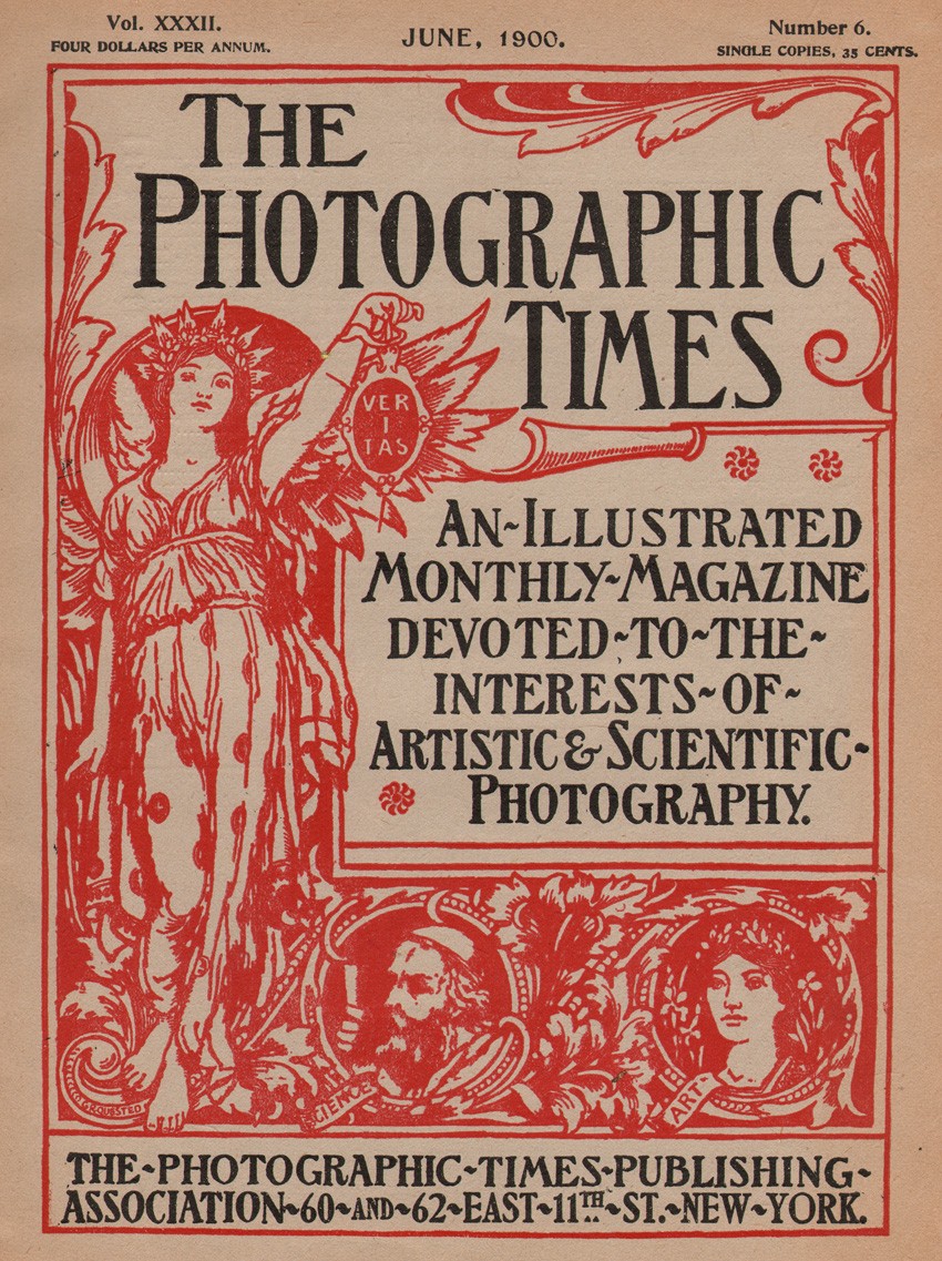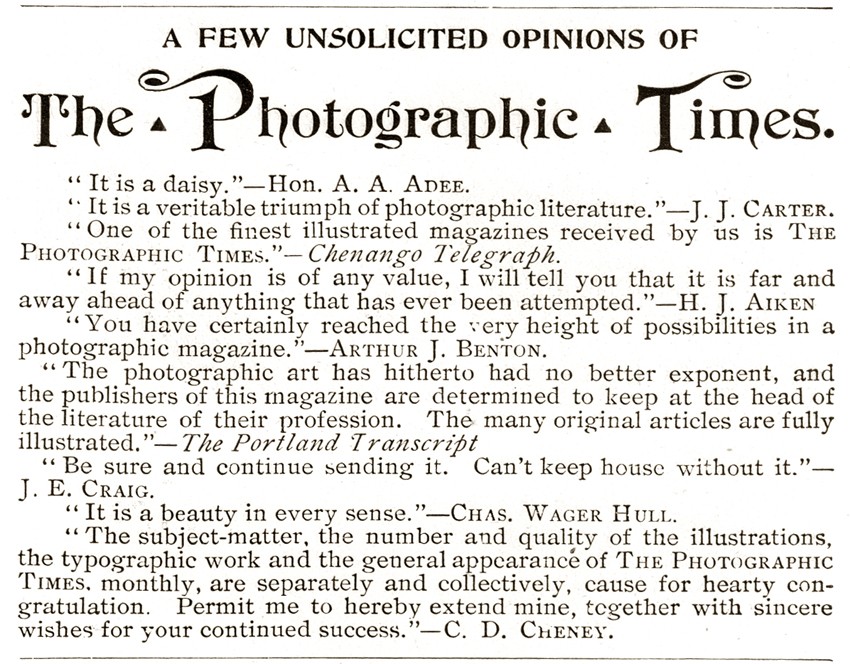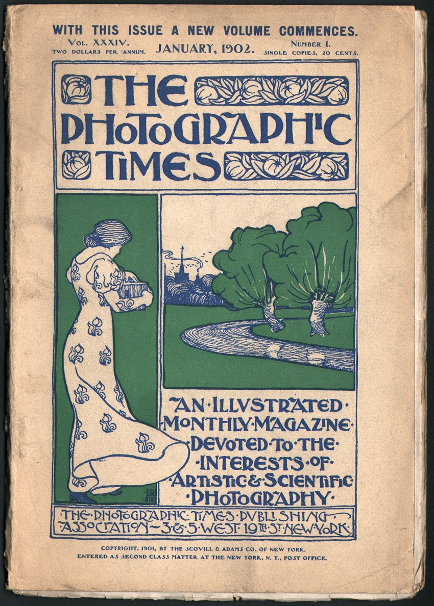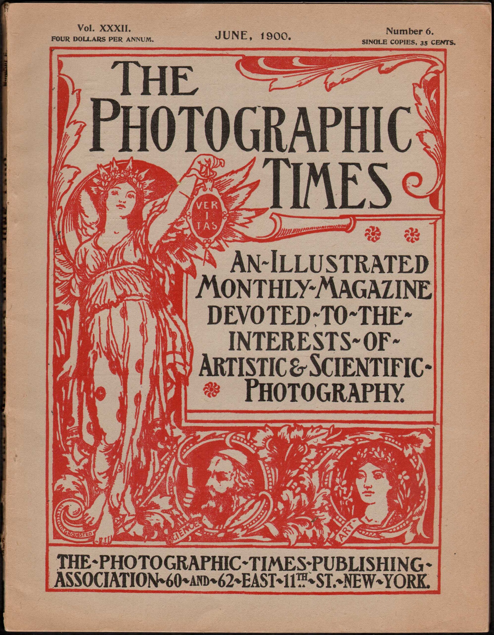
The cover to the American photographic journal “The Photographic Times”, featuring Roman goddess Veritas holding her lamp while symbolically lighting the way for truth, was designed by English bookplate artist George Richard Quested and used from 1895-1901. This issue from June, 1900. Dimensions: 29.0 x 22.3 cm
The Story: 1871-1915
© 2012 by David Spencer- PhotoSeed owner|curator
Like many business ventures in the United States, the idea for a new photographic publication that would eventually become known as The Photographic Times came about during a working lunch. One attended in 1869 by men associated with the Scovill Manufacturing Company of New York City. (1.)
Wish to skip this?- Check a timeline post with photos: March of Trade’s Harmonious Shades
At the time, Washington Irving Adams, (1832-1896) who joined the Scovill company in 1858 and was its manager in charge of the photographic department, part of the first American manufacturer that made the silver-plated sheets of copper used for Daguerreotypes beginning in 1842, (2.) made the suggestion for a new trade monthly that would eventually grow into becoming America’s most important and widely-circulated photographic journal, one that appeared under its’ own name from 1871-1915. Besides being a thorough documentation of all aspects of the state of photography as practiced commercially and by the majority of their amateur readership during this period, this quintessential of all American photographic journals is extremely valuable for the art historical record it presented from 1889-1904 in the form of hand-pulled, photogravure plates and collotypes, some of which have been compiled here on the PhotoSeed website. Showcasing the high ideals of photographic art for their day, these plates both represent some of the finest work cast off in history’s dustbin as well as examples by acknowledged masters of the lens whose work is continually studied and displayed on museum walls today.
In late 1893, after The Photographic Times had been published for over 20 years, a recounting of the history of the publication appeared in its pages. The promotional article is valuable for the time it was written in relation to the progress of photographic history, and I have endeavored here to fill in details and high-points that occurred throughout the entire life of the journal, as well as an overview of the progress of the Scovill company which published it, giving context of its’ importance to modern readers. Back then, the Times was described as follows:
It was at first merely a little eight-page monthly, designed, as its “Apology” stated, to “set the photographer commercially right.” It was then virtually edited by Mr. Adams, who supplied all the material for the trade notes, and directed its policy, though Dr. E.L. Wilson furnished most of the literary matter and superintended the printing. (3.)
Philadelphia Connection
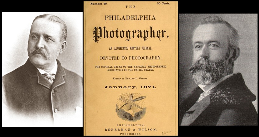
Dr. Edward L. Wilson, (1838-1903) founder, editor, and publisher of The Philadelphia Photographer, a journal he began in 1864 near the end of the American Civil War, had up to that point set the standard for a monthly independent journal of photography, with Adams and the Scovill Company fashioning the Times after it and initially issuing it free as a supplement to the Philadelphia Photographer in 1870 as way to further market and capitalize on its growing line of manufactured photographic products. It was also in step with Wilson’s ideals when it stated in the first January, 1871 issue that it was on a mission to break the cycle of collusion which had permeated the photographic establishment for decades- one that had stifled progress in photography in the United States whenever a new photographic process was discovered by someone intent on making money. In their New Year’s greetings to readers, the Times wrote:
A few years ago we could not do this thing heartily. Then it used to be like this: Judas Brown of Cincinnati, or may be New York, would by some hook or crook blunder into a discovery of some nature or other in his manipulations, that aided him in his work. Excited over it, he would close his gallery, or place it under the care of his help, and forthwith go about the country and tell of his good fortune. But would he give it to you, or to us, or to any of our friends? Not he. If you chanced to ask him for it, he would extend his hand towards you, the back of it downwards, stiffen out his thumb, and then rub the index finger against it back and forth in a manner very peculiar, but very similar to that of testing the quality of a piece of cloth or the coarseness of a sample of snuff. You know what it means. We need not explain. Happily that thing is almost ended. Photographers read live, elevating journals now, and they have such to read. They also attend conventions and exhibitions; and such things are supported by them. They are becoming enlightened, and have things to enlighten them. They are throwing aside all their old prejudices, and understand that the members of their craft are human beings, and so do the public understand this. (4.)
The business relationship between Wilson’s Philadelphia Photographer, published by Benerman & Wilson in Philadelphia and the Scovill company in New York was further highlighted with the purpose of showing the new publication as indispensable. This is born out in the following query by a Canadian photographer reprinted in the same issue:
Gentlemen: I am a subscriber to the Philadelphia Photographer, and as such am greatly obliged to you for sending me, as well as to the fraternity at large, your invaluable Times. But, unfortunately, I have never been favored with the first two (January and February) numbers.
Now, as it is my intention to have the Times neatly and richly bound, before New Year, I would be greatly obliged to you if you could spare those two numbers, and send them down to me, with the cost of them; for in the Times I find not only “Little Grains of Silver,” but large drops of gold.
Truly, yours obliged,
L. A. Derome, Photographer.
P. S. As soon as I get your bill for the two numbers I shall send you the cash. Please don’t forget my request. L. A. D.
And the following response, with the point of confirming the new publication’s free status to its readers appeared right after:
We desire that Mr. Derome should understand that we make no charge for the Times. We are glad to send it to any photographer who will receive it and pay the postage. The readers of the Philadelphia Photographer and Photographic World need not even pay that much for it, as, through Messrs. Benerman & Wilson, gentlemen who always, as is well known, stand ready to aid in any good way of informing their readers, we are enabled to present the Times to all of their readers free of charge.
The Times for 1872 we hope to make just what we agreed it should be, and worth reading from one end to the other, entire. (5.)
More early details concerning circulation of the new publication emerge in the aforementioned 1893 history of the Times:
It was sent out with Doctor Wilson’s Philadelphia Photographer, The Photographic World, and Walzl’s Photographic Magazine, in addition to the 500 copies which were mailed each month from the office of The Scovill Manufacturing Company, then at number four Beekman Street, New York. The Photographic Times therefore, in its first number, secured a circulation greater than any other photographic periodical of its time, for it sent out, in addition to the copies which went with the three publications acknowledged to have the largest circulation of their time, 500 additional copies, as stated. This position, secured with its first number, the magazine has never abandoned, and it is to-day, as it was then, the most extensively circulated photographic periodical in America. The first edition of the present number is 5,000 copies. This represents an actual circulation much larger, of course, than that figure indicates; probably at least three or four times that amount, as usually estimated and claimed by publishers. (6.)
Behind & Ahead of the Times: Washington Irving Adams
Born in New York City on March 25, 1832, Washington Irving Adams, the force behind the founding of the Times, was a descendant of Henry Adams of Braintree, Mass: “from whom the Adams’s of Presidential fame were likewise descended.” (7.) At 25 or 26 years of age, in 1858, Adams went to work for the Scovill company, which had first opened a branch office in 1846 (8.) at 57 Maiden Lane in New York City. An 1857 advertisement for the firm in Trow’s commercial New York directory stated:
Manufacturers and Importers of Daguerreotype Plates, Cases, Mattings, Preservers, Cameras, Plate Glass, and every variety of goods adapted to the Daguerreotype, Photographic, and Glass processes. (9.)
By all accounts, Adams was industrious at Scovill, and “worked as a general helper, entry clerk, salesman, stockholder and manager of the photographic department.” (10.) Certainly, he was ambitious, his drive eventually leading him to become President, Treasurer and half namesake of the newly formed Scovill & Adams company in 1889:
Under his able management the business of the company has grown, until the Scovill and Adams Company has become the largest and most influential manufacturing firm of photographic apparatus in the world. (11.)
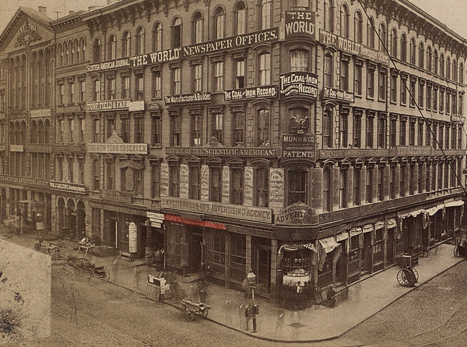
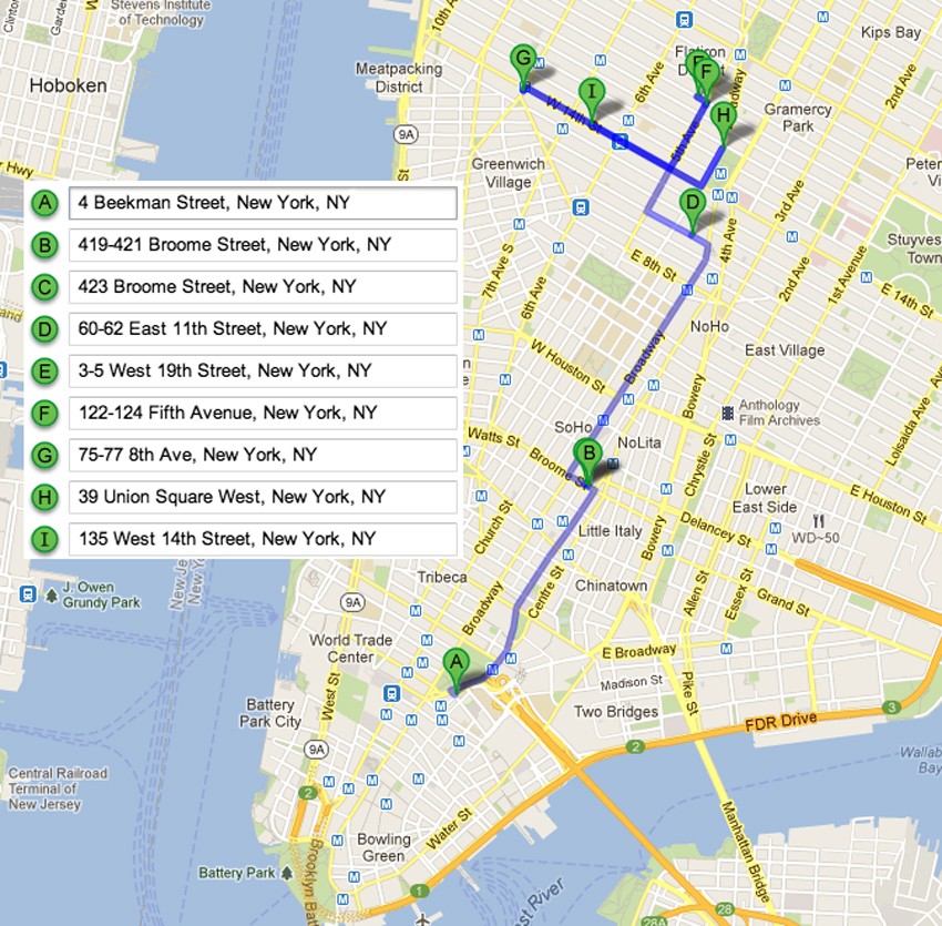
By 1859, Scovill had established two new stores in the city, both on the ground floor of the newly-built Potter, or World newspaper Building at 36 Park Row and 4 Beekman Street, (12.) the latter being listed as home base for The Photographic Times when it was first published under the Scovill imprint in 1871.
1871: Delicate Half-Tones & Harmonious Shades
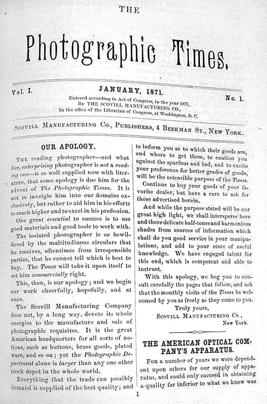
In the first issue of the Times dated January, 1871, readers were confronted with a bit of reverse psychology in the form of a signed proclamation titled “Our Apology.” In it, the Scovill Manufacturing Company stated they made no apologies in describing the underlying commercial nature of their mission for the new publication:
The reading photographer-and what live, enterprising photographer is not a reading one-is so well supplied now with literature, that some apology is due him for the advent of The Photographic Times. It is not to inveigle him into our domains exclusively, but rather to aid him in his efforts to reach higher and to excel in his profession.
One great essential to success is to use good materials and good tools to work with.
The isolated photographer is so bewildered by the multitudinous circulars that he receives, oftentimes from irresponsible parties, that he cannot tell which is best to buy. The Times will take it upon itself to set him commercially right.
This, then, is our apology; and we begin our work cheerfully, hopefully, and at once.
The Scovill Manufacturing Company does not, by a long way, devote its whole energies to the manufacture and sale of photographic requisites. It is the great American headquarters for all sorts of notions, such as buttons, brass goods, plated ware, and so on; yet the Photographic Department alone is larger than any one other stock depot in the whole world.
Everything that the trade can possibly demand is supplied of the best quality; and to inform you as to which their goods are, and where to get them, to caution you against the spurious and bad, and to excite your preference for better grades of goods, will be the ostensible purpose of the Times.
Continue to buy your goods of your favorite dealer, but have a care to ask for those advertised herein. And while the purpose stated will be our great high light, we shall intersperse here and there delicate half-tones and harmonious shades from sources of information which shall do you good service in your manipulations, and add to your store of useful knowledge. We have engaged talent for this end, which is competent and able to instruct.
With this apology, we beg you to consult carefully the pages that follow, and ask that the monthly visits of the Times be welcomed by you as freely as they come to you. Truly yours,
Scovill Manufacturing Co., New York (13.)
1874: Moving on up to SoHo
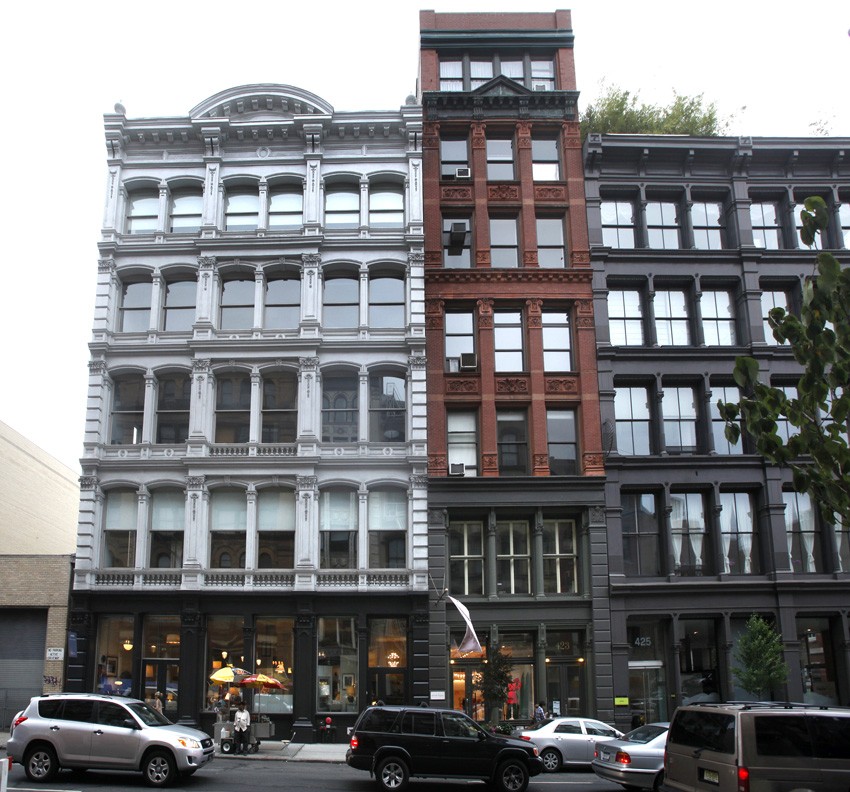
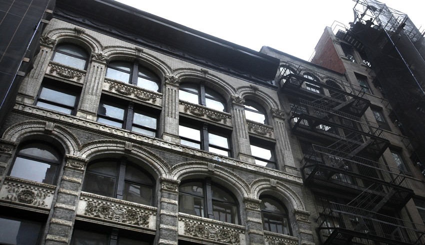
By January of 1874, the Scovill Company had grown to the point where they needed much larger warehouse and sale facilities to house their chief enterprise as a merchant of brass goods and photographic supplies as well as offices for their new publishing venture The Photographic Times. Vacating their offices in The World newspaper building across from Park Row, the Scovill company relocated over a mile uptown, to a newly built, five-story, cast-iron Italianate store and loft building designed in 1873 by Griffith Thomas for owner Henry J. Newman. The Scovill company leased the new space from Newman at a time when the SoHo area: was experiencing a rapid transformation from a residential neighborhood to a commercial district as New York City established itself as the commercial and financial center of the country. (14.)
A notice that month in the Times declared of their new headquarters, now at 419-421 Broome Street:
If our readers discover any shortcomings in the Times this month, it is owing to the fact that it was prepared during the hurry and confusion incident upon the removal of our stock to our new establishment, No. 419 and 421 Broome Street, near Broadway.
Want of room and the march of trade to the upper portion of the city, have compelled us to vacate our old quarters, where we have been so many years, and where we have grown and advanced with the growth and advance of photography. But we have no regrets on the subject. We are going to more convenient and much more elegant and spacious quarters, and before the 15th proximo we hope to be in full operation there. After we are settled and fixed we shall have more to say on the subject. We shall not say more now, lest we say too much—for we do not know ourselves how we shall look until we are fixed—except that pending our next issue, we invite you one and all to come and see us, and the finest display of photographic goods in the whole world.
☞Nos. 419 and 421 Broome Street. (15.)
Later in March, more details about the new offices were supplied to Times readers:
The above we want photographers everywhere to remember is now the headquarters of the Scovill Manufacturing Company, and we intend to make it the headquarters of the photographic fraternity as well. Things are assuming form and place, and order is coming out of chaos. We believe our business has not suffered during the transition period, and we are happy to promise well for the future. With unrivaled facilities for displaying goods, and a department for each of the various kinds, we expect the advantages to those who buy as well as to us who sell will be such as to render frequent the visits of all our old friends, and bring us besides hosts of new ones.
As we become more and more familiar with our new quarters, and approach nearer to a settled condition, we cannot resist the feeling that we would like all our friends to come and see us; and we hereby invite one and all to make us a visit whenever they find it convenient.
We intend soon to give a more extended description with full details. In the meantime we may be found at 419 and 421 Broome Street. (16.)
From 1871-1874, the Times was a free monthly publication, being issued along with The Philadelphia Photographer. Others could receive it for ¢.50 a year-the cost of postage. By 1872, the publication had increased in size from 8 to 16 pages, which included advertisements. In 1875, the Times had gained a larger readership and increased to 24 pages. Still sent out free along with the Philadelphia Photographer, other subscribers could receive it for $1.00 a year- the increased price for postage:
We give it to all the readers of the Philadelphia Photographer free, and to those who subscribe outside, the price hereafter will be $1 per annum, which includes postage. We are sure that no more literature for a dollar can be had in the world than this. Watch the Times. (17.)
1880: Decade of Progress
An update on the progress of the Times ten years out was included with several articles in the January, 1880 issue. Several excerpts:
The Times has now become an influential leader in our art, and grows annually more popular. Our German and French translations are especially selected with care and judgment by our own staff, and such as are given by no other magazines.
The Times will hereafter supply all the home and foreign photographic news of any real service to American photographers, and you should carefully read it. It contains twenty-four pages of useful matter, and we shall endeavor to make it better and better, and more useful each month, and thus keep you all up with the times.
Subscription price, $1 per annum, postage paid, including one copy Photographic Mosaics for 1880 as a premium.
By arrangement with Mr. Edward L. Wilson, the Photographic Times regularly forms a part of the Philadelphia Photographer each month. It has also a long list of independent subscribers, and it is now a conceded fact that its circulation is much larger than that of any photographic journal in the country, thus making the advantages to advertisers very apparent. (18.)
And on the following page:
The Photographic Times, we need scarcely state, is a semi-commercial journal, and we particularly desire it to be understood that while this role will still be maintained, and special notices of all our own novelties or manufactures will be given as before, all novelties in manufactures, apparatus, or appliances which inventors or agents may deem worthy of being brought before the public, and which shall be sent to us for that purpose, shall receive a full and fair descriptive and critical notice.
Books, photographs, or artistic works will also be received for review, and shall be noticed in the promptest manner.
We embrace this opportunity of requesting our numerous friends in the various operative departments of galleries, to favor us with letters or notes (no matter how brief) for publication, describing anything unusual or of interest to brother photographers which they may meet with in course of their practice. As “iron sharpeneth iron,” so does the description of a difficulty successfully overcome, or even not overcame, elicit from others interesting and often valuable information concerning the same or similar difficulties. (19.)
It eventually broke free of the Philadelphia Photographer and was sent out independently. The 1893 History of the Times recounting these years states:
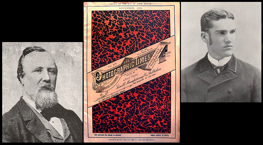
The little monthly grew rapidly in popularity and influence. From being sent out at first gratis, its subscription price was made 50 cents per annum, and later $1.00. It was soon sent out independently of the other photographic publications, though Doctor Wilson continued to give editorial attention to its make-up until 1881, when Mr. J. Traill Taylor, formerly editor of The British Journal of Photography, was engaged to edit The Photographic Times, with the assistance of many well-known American photographic writers. Its subscription price was increased to $2.00 and very son the publishers had on their books more names at that rate than they had previously had at $1.00. (20.)
1881: Taylor takes the Helm
Beginning in 1881, the experienced John Traill Taylor, (1827-1895) whose previous editorship of the high-circulation British Journal, brought new ideas to the Times. One of them may have been to include the new masthead imprint of the American Photographer to the journal-most likely a further way to “brand” it to a larger potential audience along with The Photographic Times. (21.) A lengthy publishers announcement greeted readers in the January issue, which indicated Taylor’s new mission and more independent direction for it, and one that professed a more arms-length relationship to photographic commerce:
It has often been alleged by photographers throughout the United States that it is a disgrace to our boasted state of advancement that there is not in New York an independent photographic journal of a practical and scientific character, and removed from the trammels of trade.
After due consideration we have resolved upon supplying the want thus indicated, and have decided upon reconstructing the Photographic Times and launching it into the new channel indicated, as a practical, scientific, live journal of photographic progress, a reflex of the times in which we live, a record of what is transpiring among us.
To this end we have secured the services of the ablest scientific, literary, and operative talent possible, so as to insure for our journal in its reconstructed form the position of being inferior to no other photographic publication in the world.
The Photographic Times And American Photographer will be issued on the 15th of each month, under the able editorship of J. Traill Taylor, so well and favorably known everywhere as having been for fifteen years editor-in-chief of the British Journal of Photography, then the leading photographic journal in the world. The mere mention of the name of this gentleman as editor relieves the publishers of the necessity of saying a word as to the able and energetic way in which the editorial duties will be performed. (22.)
1884: Another move next Door
1884 was the next important milestone for the Scovill company and the Photographic Times. By May of that year, the firm had moved into their brand-new, Queen Anne style, brick and terra-cotta seven-floor store and loft building which had been constructed next door to their offices at 419-421 Broome street at #423. Designed by the architectural firm of D. & J. Jardine, the new building was described in the July issue by Washington Irving Adams:
On the first day of May, 1884, we completed the removal of our stock of merchandise to our
NEW WAREHOUSE,
No. 423 Broome Street.
This well appointed structure, embracing seven floors and a double basement, we have erected to meet the special requirements of our business. The building, with its improved interior arrangements, will greatly enlarge our facilities and enable us to respond to the wants of our patrons in a more expeditious and satisfactory manner than heretofore. For the accommodation of our friends, a well-constructed dark-room and sky-light have been added to the many other conveniences introduced, all of which will subserve in various ways the interests of our customers.
Thanking you for past favors, and soliciting your continued patronage, we are
Very truly yours,
SCOVILL MFG. CO.
W. Irving Adams, Agent (23.)
In the fall of 1884 other major changes came to the journal. It changed from a monthly to a weekly, and W.I. Adam’s son Lincoln Adams joined the staff in 1885:
In the fall of 1884 the magazine became a weekly, with the subscription price $3 per year, though a monthly edition was continued as theretofore at $2 per annum. With the beginning of the next year (1885) the weekly Photographic Times enlarged its pages to large quarto; and W.J. Stillman and Charles Ehrmann became regularly associated with Mr. Taylor in the editorial conduct of the magazine, and Mr. W.I. Lincoln Adams was added to the staff as an assistant editor. (24.)
1886-1889: The Chautauqua School of Photography & Photographic Times Publishing Association are Born
By the fall of 1886, Lincoln Adams had succeeded J. Traill Taylor as managing editor. At the time, the Times was a 12-page weekly and cost $3.00 for a yearly subscription. The editorial flavor was enhanced by a new stable of authors from England and Europe as well. From England, some of the new contributors included Henry Peach Robinson, W. Jerome Harrison, Andrew Pringle and F.C. Lambert. From Europe, Dr. Josef Maria Eder, Henry Wilhelm Vogel, Carl Srna, and Dr. Federico Mallman. New American contributors included the voices of photographers J.M. Mora, John Carbutt, J.R. Swain, Rev. Clarence E. Woodman, George R. Sinclair and Frederic Beach.
A brand new venture that would play a larger future role in the pages of the journal was born the same year in the form of photographic instruction. Dr. Charles Ehrmann, a regular contributor since 1881 who took on a broader editorial role under Taylor, was named instructor in the fall of 1886 for the newly established Chautauqua University School of Photography. Conveniently, the Times took on the role as the school’s “authorized organ”, with Ehrmann in charge. In the 1893 History of the Times it was stated:
Since then, our magazine has maintained a regular department devoted to the Chautauqua School of Photography, and has found it a popular feature of the paper with all its readers. The School has grown in numbers, until it is now probably the largest School of Photography in the world. (25.)
1887 was the first year for a new publishing venture associated with the Times, an annual called “The American Annual of Photography and Photographic Times Almanac” whose first edition numbered 3000 copies. By 1894, the first edition had increased to a remarkable 20,200 copies, with over 16,000 sold on December 1, the first day of publication. (26.)
In 1889, the Times came for the first time under the umbrella of the newly formed Photographic Times Publishing Association, which grew out of Scovill’s Photographic Department as part of that year’s newly incorporated Scovill & Adams Company, with Washington Irving Adams named president. As a result, the Times was now sub-titled as declared in the 1893 History:
“a thoroughly independent periodical devoted exclusively to “the art, science and advancement of photography”.
Ambitious changes were also instituted, especially as a showcase for its photographic plates, one of the remarkable legacies of this publication. The 1893 History continues:
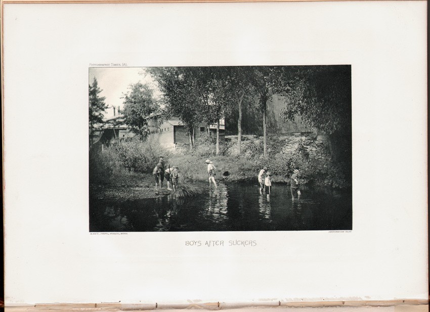
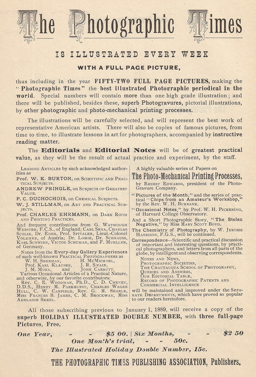
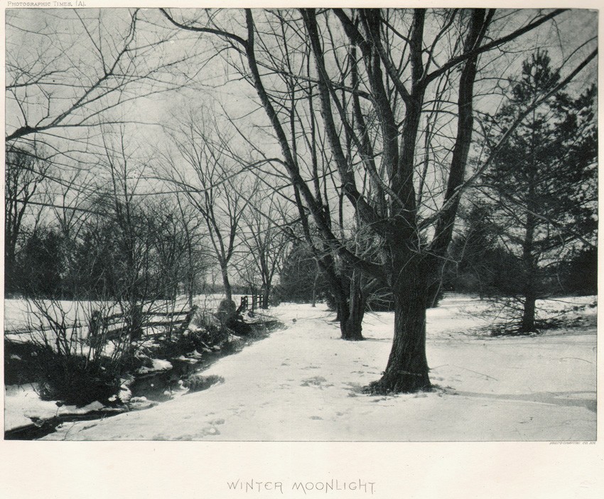
The PHOTOGRAPHIC TIMES had frequently brought out full-page pictorial illustrations, in addition to the cuts and diagrams which always brightened its reading columns; but beginning with 1889, it presented its readers regularly, each week, with a full-page pictorial frontispiece, reproduced by photogravure or other high grade process, and including an occasional photographic print on albumen or other sensitive paper. It thus became the first and continues to be the only photographic weekly publication in the world, containing a full-page picture with every issue. Its Convention, Holiday, and other special numbers often contained double and triple the amount of reading matter of an ordinary issue, and several full-page pictures. With the beginning of the 1889 the subscription price was made $5.00. (27.)
Furthermore, the editors stated:
The paper attains, in its present number, a higher standard of excellence, both from its mechanical, artistic and literary standpoints, than has ever before been approached even by any photographic periodical in the world. (28.)
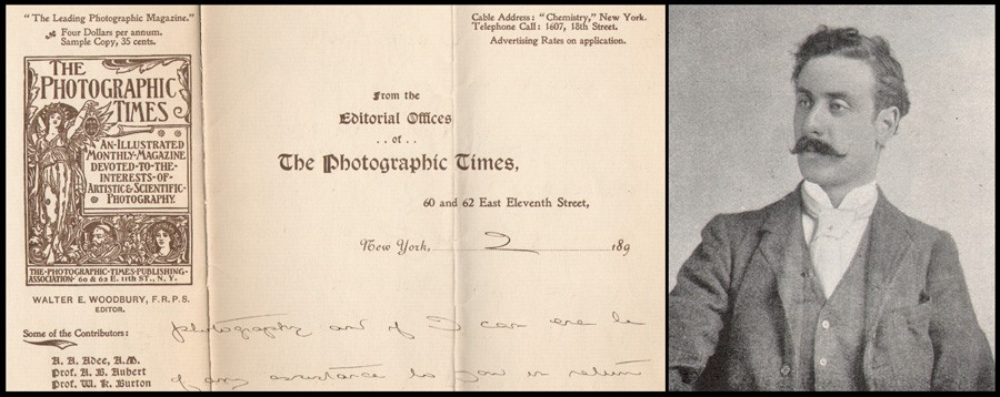
In the summer of 1893, the weekly Times increased the editorial content to 16 pages from 12. Earlier that spring, Walter Edward Woodbury, (1865-1905) a Fellow of the Royal Photographic Society and son of Englishman Walter Bentley Woodbury- (1834-1885) whose namesake had been the invention of the woodburytype photographic process- joined the editorial staff. By late 1894, he had become editor of the magazine. (29.)
1895: A High-Class Art Periodical
With Woodbury’s leadership, more radical changes took place. In the issue for December 21, 1894, the news the Times would soon become a monthly in 1895 and position itself as a “high-class art magazine” was spelled out to readers as part of An Important Announcement:
When our periodical became a weekly with sixteen pages of reading matter, a full-page frontispiece illustration, and numerous photoengraved pictures throughout the letterpress, it was thought that our magazine had attained its zenith. But there is still a greater step forward, which we have contemplated during the past year, and which we are now prepared to make; and that is, to concentrate the energy and money expended in publishing a journal each week in bringing out a high-class monthly magazine, quadrupled in reading pages and with more than four times the number of pictures, while the advertising pages are reduced to less than one-half that number; so that, in a word, by this change, our weekly periodical with one picture and a limited number of reading pages develops into a high-class art magazine many times more attractive and valuable to the reader than a weekly could possibly be and in a more convenient form. (30.)
1896: Another new home & passing of W. I. Adams
The popularity of the Times was of course tied to the financial success of the Scovill & Adams company, and with it, the decision to move uptown yet again, 15 blocks north into a brand-new building on East 11th street-one still standing today. Although it is a bit unclear if the move took place in 1896 or 1897 due to the misplaced word “next”, it is believed the firm took occupancy of the new building in early 1896. The following description was duly reported in the January, 1896 issue:
The New Home of The Scovill & Adams Co. of New York—About the 1st of January next the Scovill & Adams Company of New York will remove to their new home at 60 and 62 East Eleventh Street, a magnificent seven-story and basement building, a few doors from Broadway.
It is of extra heavy construction, 42 feet front by 95 feet deep. The front is of granite, terra cotta and brick, and the entrance portico is very spacious. The cut shown on this page gives a good idea of the appearance of this handsome building. The main hallway is large, easy of access, and leads to two of the latest improved, fast running freight and passenger elevators. The building is furnished with complete and improved steam-heating plant, and equipped with all modern improvements. The lofts have light on four sides, and the inside finish of the building is of hardwood cabinet finish.
The executive offices and salesrooms will be on the ground floor, while a spacious and well-lighted basement will be reserved for receiving and distributing goods, packing, and for the storage of the heavier merchandise. A fire-proof vault under the sidewalk will contain all chemicals of an explosive nature. The lofts will be reserved for the storage of original cases and other unpacked goods.
A specially constructed dark-room for the use of their patrons and friends will be conveniently situated, and on the roof of the building there will be a commodious skylight, with light facing north, for experimental and testing purposes.
Their stock will, of course, be very complete, embracing every requisite of the photographer, whether he be professional or amateur. They state that they will keep a full line of all makes of apparatus, all brands of dry plates, the various brands of printing-out and other sensitive papers, chemicals, accessories, etc., etc. In short, they propose to be in readiness, at all times, to supply patrons with anything photographic which they may require, and in any quantity.
They extend to all photographers, professional and amateur, a cordial invitation to visit them in their new home, whether they are in need of any photographic article or not.
Our New Offices will be in the same building. The editorial rooms and offices will be situated on the main floor of the building. A very complete photographic and reference library will be conveniently arranged in the editorial rooms, and on the roof will be erected a finely fitted up dark-room and skylight gallery. These will be at the disposal of all our subscribers and friends. (31.)
By February, the date for move in had been officially moved to January 15th, 1896 as reported in this republished excerpt in the Times by The Mercantile and Financial Times:
There is hardly any line of business that can be mentioned as being represented in this city at the present day but what is affected to a less or greater extent by what is called “the uptown march of trade.” Retail houses form, as it were, the advance line to the North, and behind them come the wholesale, manufacturing and importing concerns of every class. Where the frontier will be in twenty years from now no human being can foresee.
A most notable illustration of this tendency of the times is to be found in the removal of the old and famous Scovill & Adams Company of New York, from their old headquarters at 423 Broome Street, to their own new seven-story and basement building at Nos. 60 and 62 East Eleventh Street, five doors from Broadway. The formal date of the change was set for January 1, 1896, but as a matter of fact the company will not move in until about January 15th. They will then have the largest, finest and most complete establishment in the United States devoted to the handling of what may be designated as the pharaphernalia (sic) of photography—the fit home for the oldest and largest concern in the United States in its line. (32.)
1896 would be a sorrowful one for the Times and the Scovill & Adams Company. In February, the death on January 2 of Washington Irving Adams was announced and with it, the man who had inspired the very existence of the Photographic Times. Additional details of his remarkable life as well as his complete obituary as printed in the Times can be seen through this site at the following link.
The new Editor: Walter E. Woodbury
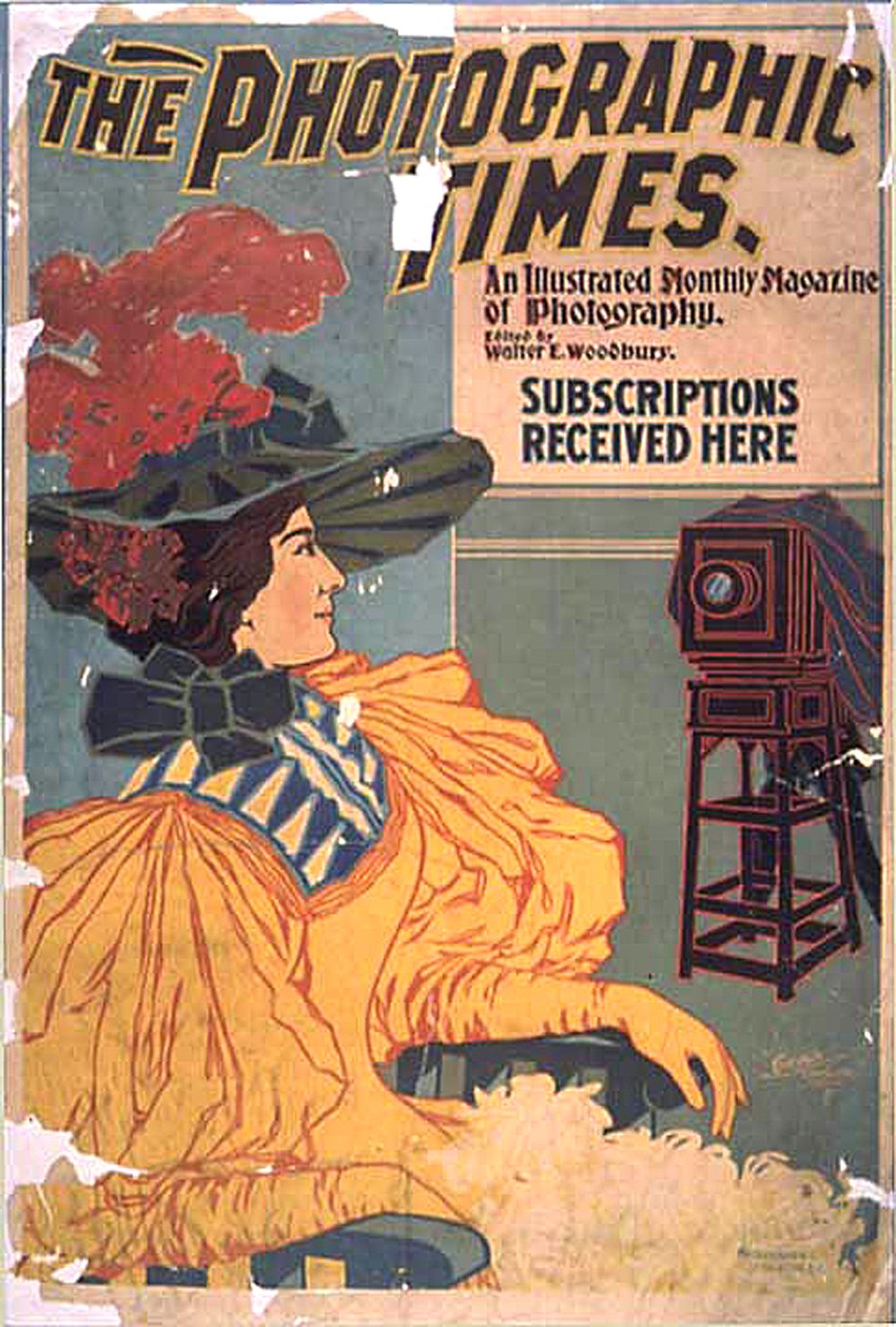
Like J. Traill Taylor before him, Times editor Walter E. Woodbury was also on a mission. He wasted little time in transforming the journal into a “high-class art magazine”. Now published on the 15th of each month beginning in 1895, the magazine featured a dramatic new cover designed by English bookplate artist George Richard Quested. Gone was the simple and uninspiring former cover credited to Brooklyn artist William Mozart which merely showcased the title within a simple frame and in was Quested’s distinctive wood engraving of the Roman goddess Veritas holding out her lamp symbolically lighting the way for truth. Smaller portrait medallions of Science, represented by a bearded gentleman and Art, by a fair maiden crowned by laurels, complimented the new look, printed in bold red ink. A newly enforced arsenal of writers-many being distinguished photographers in their own right, were soon featured in the pages as well. Surviving Times letterhead from 1896 as well as advertisement copy that year in the exhibition program of the fourth English (Linked Ring) Photographic Salon– “Articles By All The Best Writers“-gave proper notice. Some of the more prominent authors included Peter Henry Emerson, Alfred Horsley Hinton, and Henry Peach Robinson from England and in America-Alfred Stieglitz, Dr. John Nicol, Rudolph Eickemeyer Jr. and John Carbutt. In all, 41 contributors to the journal, but not all, were listed on the letterhead.
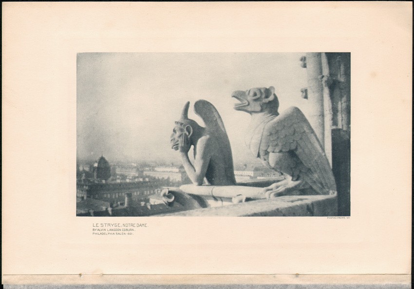
The second component, and perhaps most important legacy in terms of a historical document surviving today, was the new push by Woodbury to feature cutting edge artistic photography within the pages of the Times. Coming after the commitment by management of reproducing a hand-pulled photogravure (sometimes a collotype) as a frontispiece in each monthly issue, the quality of these plates improved on Woodbury’s watch as well. For ten years, beginning in 1895 and lasting until the end of 1904, (33.) when gravures were no longer reproduced, Pictorialism as practiced by leading lights included plates in gravure by Stieglitz, Eickemeyer, Frances Benjamin Johnston, Charles Berg, Alfred Clements, William Fraser, John Dumont, Robert Demachy, James Breese, Joseph Keiley, and Zaida Ben-Yúsuf -to name only a few.
The previously mentioned Times 1896 Linked Ring program advertisement brought specific attention to this legacy, emphasizing in large type: ..EACH ISSUE.. CONTAINS A MAGNIFICENT Photogravure Frontispiece. It also pointed out that from:
50 to 100 Photographic Reproductions Including the works of , and then a hash list of some of these aforementioned photographers were included in each issue. Finally, the following notice reprinted from the English journal Photography from April 30, 1896 appeared within the advertisement:
The Photographic Times is the brightest and best illustrated of any of the photographic magazines which reach us from across the water, and leaves nothing to be desired in the way of printing and get up. There is only one English illustrated monthly which is of the same price-the Pall Mall Magazine-and though that is lavishly illustrated, the photographic journal, pictorially, holds its own.
Woodbury’s tenure as editor lasted through 1899, when he left for unknown reasons. However, along with so-called “radical” changes (34.) planned for 1901, he returned as editor that year to a much smaller journal with the reduced annual subscription price of $2.00 a year:
As announced elsewhere, we shall make several important changes and improvements in this magazine. The numerous complaints we have received of the unwieldiness of the publication and the manner in which it was damaged during transmission through the mails has induced us to reduce its size to regular magazine dimensions. While the size will be reduced the number of pages will be the same, although the number of these will be increased provided we receive your support and assistance. This you can easily do by recommending The Photographic Times to those of your friends interested in photography. Perhaps to the subscriber, however, the most important change is in the reduction in price from four dollars to two, thus placing a high-class, artistic magazine within the reach of all. (35.)
Kodak’s Reach & Impact
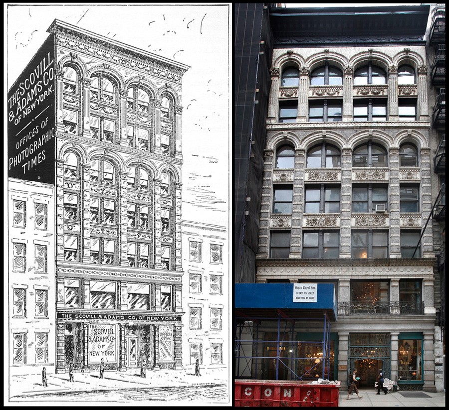
Some of these radical changes were affecting the firm itself. By the fall of 1900, the Scovill & Adams company was on the move again, this time another eight blocks uptown to 142 Fifth Ave.:
NEW HOME AND ENLARGED HEADQUARTERS FOR THE OLDEST PHOTOGRAPHIC HOUSE IN AMERICA.
The Scovill & Adams Co. of New York, have moved their executive offices, salesrooms, and warehouse to the large twelve story building at Fifth Avenue, corner of 19th Street. The Fifth Avenue number of the building is 142, and the entrance to the executive offices of the Scovill & Adams Co. of New York, is No. 3 and 5 West 19th Street.
The business will be divided in Sectional Department, Wholesale Department, Publication Department, and Sample Room. The last will be a feature that will appeal to out-of-town buyers, who have a limited time to spend in New York and must necessarily inspect, in a short time, everything that is new in the photographic line. (36.)
But the most radical changes were impacting the photographic industry itself, and in turn, photographic publishing as well. At the turn of the 20th century, the Eastman Kodak Company, based in Rochester, New York, was becoming monopolistic in how they selectively purchased companies. In February, 1900, the Times reprinted a notice: “Facts About the Combine” which had appeared in the Christmas issue of the Boston Herald newspaper two months earlier:
The photographic world is, as a matter of fact, in a state of considerable excitement. It has witnessed the gradual growth of the kodak business under the management of George Eastman, during the past decade, with pride mingled with some apprehension, as one corporation after another was absorbed under Mr. Eastman’s personal control. Last summer the principal photographic paper manufacturers were combined in a photographic paper trust, in which it was known that Mr. Eastman had a large, if not a controlling, interest. It was therefore natural for the trade to assume, when the recent camera trust was formed in Rochester, that Mr. Eastman was also at the bottom of that combination as well.
The subject of this so called camera trust-although debunked at the time in the pages of the Times as being the work of George Eastman, gave the push and reason enough for the Scovill & Adams company under president W. I. Lincoln Adams to be combined itself in late December, 1901 with the E. & H.T. Anthony & Co. In an about-face reflecting the new reality the Scovill company found itself in- as an island left out of the new Rochester camera trust- (along with several other large plate camera manufacturers)- Adams reply to the Boston Herald in the pages of the Times of February 1900 is especially ironic:
As a matter of fact,” he said, “I am opposed to trusts and combinations. I do not think that any one is benefitted by them, as a rule, except the promoters.
A virtuous defender of his companies legacy perhaps, or simply naive, Adams was a man of character to the end of the article discussing the effects of the march of the Kodak brand:
“Were you invited to join the camera trust?” Mr. Adams was asked.
“Yes,” he replied. “but we declined to put a price on our business. We do not want to sell out or go out of business. We have been identified with photography since the days of the daguerreotype, in the forties, and,” he added, smiling,”we expect to remain in it a few years longer.” (37.)
The Photographic Times-Bulletin: 1902-1904
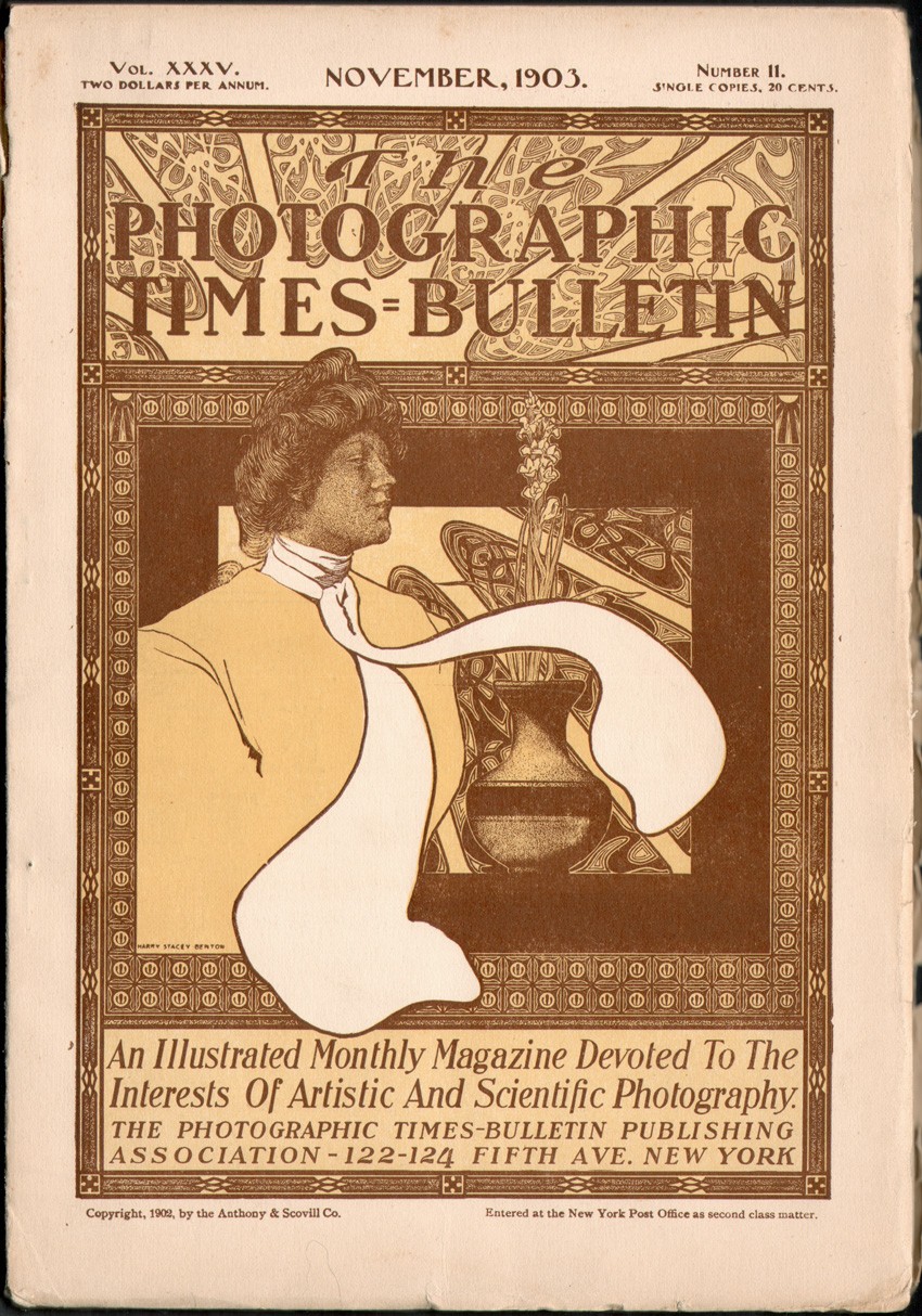
Woodbury’s rejoining as head editor of the Times in 1901 lasted until April of 1902, when the new combine of the Anthony & Scovill companies-which became known as ANSCO– gave birth in turn to a combined publication renamed The Photographic Times-Bulletin-a joining of the Photographic Times and Anthony’s Photographic Bulletin. The editorial offices of the journal, now under control of the Photographic Times-Bulletin Publishing Association, moved yet again, one block south to the new Anthony & Scovill offices at 122-124 Fifth Ave. Beginning with the May issue, Woodbury shared co-editorship of the Times-Bulletin with Professor Charles F. Chandler.
For less than two years, the new publication survived, but did not thrive, even though it faithfully presented a photogravure frontispiece with each monthly issue. By the end of 1902, Woodbury had left, turning up in Panama by 1905 where he was employed editing the English section of the Panama Star and Herald and Inter-Ocean Critic newspaper before his death late that year, succumbing to yellow fever.
Although in all intents and purposes a continuation of The Photographic Times, with Lincoln Adams holding control behind the scenes over its editorial and business direction, the Times-Bulletin in name ceased to exist by the end of 1904. And once again, another interim relocation for the Photographic Times-Bulletin Publishing Association editorial offices that year took place. Hop-scotch moves, from Fifth Ave. to the building and company of which Adams was president- the journal’s printers Styles & Cash-at 75-77 Eighth Ave., lead to yet another move by December of 1904 to rented quarters at 39 Union Square. In January 1905, the journal was now back to being called The Photographic Times, with The Photographic Times Publishing Association name restored as well. Weighing in about the change in the December, 1904 Times-Bulletin, editors said:
In the interests of brevity and simplicity, it will be observed we have dropped the rather cumbersome title which has characterized our publication since it united with itself Anthony’s Photographic Bulletin, several years ago, and it will henceforth be known, as it was for so many years previously, simply as The Photographic Times. (38.)
Later, in the January, 1905 Photographic Times, the remade Times was referred to as a new dress:
We wish you a most happy and prosperous New Year. By the way, speaking of new things, how do you like our new dress? We think its pretty nice, thank you, and will use our best endeavors to make the inside keep up to the outside. For nearly a year we have been considering the changes in this publication that have now assumed definite form.
The old name “The Photographic Times Bulletin ” used since the consolidation of the Photographic Times and Anthony’s Bulletin has been discarded in the interest of simplicity and The Photographic Times will henceforth be the title of this publication.
The old Photographic Times was recognized for many years as the leading American photographic publication, and it is our intention to make the new Photographic Times far in advance of the old one in every respect.
At two dollars per year this publication enjoyed a circulation equalled by few class publications, and at the reduced price of one dollar per year and the many new features within, The Photographic Times is bound to have the largest circulation of any photographic magazine in America. (39.)
A Ten-Cent Magazine
The changes at this time concerned money of course, but progress in the form of cheap photographic halftones flooding the newsstand marketplace were giving rise to many competing publications for the Photographic Times. A specialized magazine devoted to photography that at its zenith of power and influence (1889-1900) was priced at the significant sum of $5.00 and eventually $4.00 a year was being pushed aside in this new market by what was known in 1905 as the “Ten Cent Magazine” :
This is the age of Pictures, especially of pictures based upon photography in some form or other. Photo-Engraving Processes have revolutionized modern magazine and book illustration, and the most sought after publications now are those which contain the best and greatest number of photographic reproductions.”…”What can be more fitting, therefore, than that The Photographic Times, which has been a leading organ of photography in the English-speaking world for more than a quarter of a century, should amplify and popularize more than it has ever been able to do in the past, its illustrative and pictorial features. (40.)
Independent of any Cult
Indeed, the task of selling the soon-to-be cheaper version of the journal was already taking place. In the November, 1904 issue of the Times-Bulletin, the following in-house advertisement appeared:
IT AFFORDS US PLEASURE
To announce that the price of
The Photographic Times For 1905
will be
ONE DOLLAR PER YEAR
____________________________
Also that The Photographic Times will be better than ever.
Forty-eight (“count ‘em”) good solid pages of information
and entertainment each month, and a wealth of illustrations by
THE LEADING PICTORIALISTS
throughout the world :: :: :: :: :: :: :: ::::
The reduction in price from Two Dollars means but one
thing; we are determined to be the leading American Photo-
graphic Journal from every standpoint, and to be read by every
photographer, we have made the popular price—One Dollar
EVERYTHING PHOTOGRAPHIC
That is new, timely or entertaining will be fully described
and our readers will be in touch up to the minute ::::
WE HAVE PLENTY OF MONEY
And are absolutely independent of any trade interest, school
or cult, our only obligation being to give you the biggest
possible return for your dollar :: :: :: :: :: :::
Yours for success,
The Photographic Times Publishing Association
☞ NOTE OUR NEW ADDRESS
39 Union Square :: :: :: New York, U.S.A.
Just tell them that you saw it in “The Photographic Times-Bulletin.”
1905-1915: Final Decade
By 1905, Charles Chandler had left as editor of the Times-Bulletin and W. I. Lincoln Adams and Spencer Hord assumed all editing duties of the resurrected Photographic Times. With Adams acting as editor until it ceased to be published at the end of 1915, the following chronology of editors joined him by year:
1906: Charles Plump. Hord gone.
1909: Clarence Usher. Plump gone.
1911: Wilson Adams, (b. 1890) joins his father. Usher remains assistant editor.
1912: Wilson Adams named Managing editor. Milton Ford gone. Usher leaves by end of year to become Secretary-Treasurer & Business Manager.
1914: The American Photographer journal absorbed into the Times.
1915: Ford gone. The Times edited solely by father and son Lincoln & Wilson Adams.
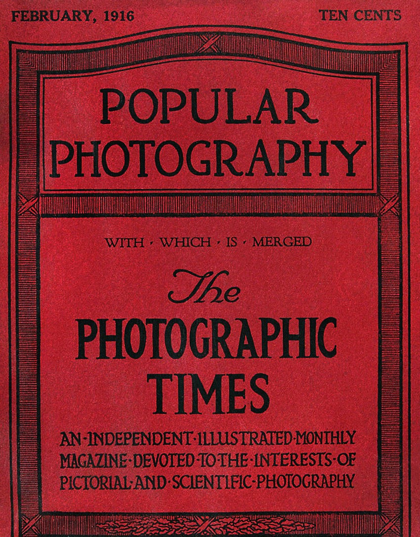
1916: Absorbed into Popular Photography
Beginning with the January, 1916 issue, the Times had been absorbed into Popular Photography, a new journal published in Boston since October, 1912. Edited by Frank Roy Fraprie, W. I. Lincoln Adams was retained as an associate editor, although it is doubtful he had much of a hand with its affairs. The following Publisher’s Announcement appeared that month:
THE publishers of THE PHOTOGRAPHIC TIMES, with one exception the
oldest independent photographic magazine published in the United
States, and the publishers of POPULAR PHOTOGRAPHY, almost the
youngest periodical of this class, have decided that merging the two
publications will result in the production of a magazine which shall be a greater
power for good to all photographic interests than either has been while standing
alone. Therefore, the present issue, for January, 1916, is a continuation of both
THE PHOTOGRAPHIC TIMES and POPULAR PHOTOGRAPHY. Owing to the lateness
of the date at which the decision to combine interests was reached, the present
number has mainly the form of POPULAR PHOTOGRAPHY, but succeeding issues
will endeavor to retain some of the physical features of special interest of THE
PHOTOGRAPHIC TIMES, as well as of POPULAR PHOTOGRAPHY, the intention of the
editors and publishers being to produce a magazine which shall give its readers all
that has been of value in the editorial policy of each of its predecessors. (41.)
The Father weighs in on the Son
It is perhaps fitting to end this overview of The Photographic Times with commentary appearing in the January, 1916 issue of The Photographic Journal of America, itself a continuation of the Philadelphia Photographer and Wilson’s Photographic Magazine published by the Edward L. Wilson Company, Inc. of New York:
Arrangements have been made by the publishers of Popular Photography and The Photographic Times to merge these two magazines, beginning with the issue of January, 1916, and the combined magazines will appear under the title of Popular Photography. The Photographic Times is the second oldest photographic magazine published in the United States and a “child” of Wilson’s, having been a supplement to our Journal in 1870. The following year it was published separately by the Scovill Manufacturing Co., and has since remained a prominent factor for the amateur. While we are sorry to see the passing of this well-known publication, the combination is expected to produce a magazine which will be useful in the photographic field and it has our best wishes for added success.
The magazine formed by the combination will be published in Boston by the American Photographic Publishing Company, at the subscription price of $1.00 a year. (42.)
Final Thoughts
It can only be reasoned arguments by this author pointing to factors leading to the demise of the Photographic Times by the end of 1915. Certainly, world events and market realities at the time must have given Washington Irving Lincoln Adams-a gifted and published amateur photographer himself in his younger days- pause and insight enough to fold his cards on this enterprise, even one that had enjoyed a world-wide reputation and 45-year run. (43.) With only a high school education, his birthright, and a hardworking, capable demeanor, he first succeeded his own father in 1894 as president of the Scovill & Adams Company-of which the Times was only a small component. By 1902, his business acumen had been honed further still when this former concern’s combining with the Anthony Company as well as his other responsibilities that year as president of the Styles & Cash printing firm-printers of the Times from the very beginning-were added to his resume. Soon, his energies also became more focused in his own hometown of New Jersey, where he was an organizer of the new Montclair Trust Company, becoming president by 1905. And these are only a few of the professional commitments and interests taking up his time as recounted in a 1918 biography. (44.)
Finally, with World War I looming overseas (45.) and a hefty settlement paid him for his being a major shareholder of the Ansco Company which finally settled the Goodwin roll film patent infringement suit brought twelve years earlier against the mighty Eastman Kodak in 1914, (46.) Adams most certainly didn’t need the money or headaches to stay in the game of publishing a monthly photographic journal any longer.
Notes:
1. THE STORY OF THE PHOTOGRAPHIC TIMES: IN: THE PHOTOGRAPHIC TIMES: W.I. LINCOLN ADAMS, EDITOR: NEW YORK: DECEMBER 15, 1893: P. 725. : “THE PHOTOGRAPHIC TIMES GREW OUT OF A SUGGESTION MADE BY MR. W. IRVING ADAMS AT LUNCH ONE DAY OVER TWENTY-FOUR YEARS AGO”…: THE FIRST ISSUE OF THE TIMES UNDER THE SCOVILL IMPRINT APPEARED IN JANUARY, 18712. EXCERPT: JAMES MITCHELL LAMSON SCOVILL: IN: THE HISTORY OF WATERBURY, CONNECTICUT: HENRY BRONSON, M.D.: WATERBURY: BRONSON BROTHERS: 1858: P. 430: THE SCOVILL FIRM TRACES ITS’ ROOTS BACK TO 1802 IN WATERBURY, AND BECAME KNOWN AS SCOVILL & CO. IN 1840, MAKING A NAME FOR THEMSELVES PRINCIPALLY AS A MANUFACTURER OF BRASS BUTTONS. 3. THE STORY OF THE PHOTOGRAPHIC TIMES: IN: THE PHOTOGRAPHIC TIMES: W.I. LINCOLN ADAMS, EDITOR: NEW YORK: DECEMBER 15, 1893: P. 725. THE FIRST ISSUE APPEARED IN JANUARY, 1871. AT THIS TIME, WILSON AND ADAMS WERE FRATERNAL AND BUSINESS COLLEAGUES, WITH BOTH HOLDING MAJOR OFFICE-HOLDING POSITIONS FOR THE NATIONAL PHOTOGRAPHIC ASSOCIATION: (1868–1880) FORMED “FOR THE PURPOSE OF ELEVATING AND ADVANCING THE ART OF PHOTOGRAPHY, AND FOR THE PROTECTION AND FURTHERING THE INTERESTS OF THOSE WHO MAKE THEIR LIVING BY IT.”
4. HAPPY NEW YEAR: IN: THE PHOTOGRAPHIC TIMES: SCOVILL MANUFACTURING CO. : PUBLISHERS: NEW YORK: JANUARY, 1872: P. 1
5. GRATIFYING: IN: THE PHOTOGRAPHIC TIMES: SCOVILL MANUFACTURING CO. : PUBLISHERS: NEW YORK: JANUARY, 1872: PP. 2-3
6. IBID: THE STORY OF THE PHOTOGRAPHIC TIMES
7. OUR FOUNDER GONE: IN: THE PHOTOGRAPHIC TIMES: NEW YORK: FEBRUARY, 1896: PP. 65-66: HENRY ADAMS WAS THE COMMON ANCESTOR OF THE AMERICAN PATRIOT SAMUEL ADAMS AND JOHN ADAMS, THE SECOND PRESIDENT OF THE U.S.
8. ANTHONY, THE MAN, THE COMPANY, THE CAMERAS: AN AMERICAN PHOTOGRAPHIC PIONEER : 140 YEAR HISTORY OF A COMPANY FROM ANTHONY TO ANSCO, TO GAF: WILLIAM & ESTELLE MARDER: PINE RIDGE PUBLISHING: FT. LAUDERDALE: 1982: P. 218. AT THE TIME, SCOVILL WAS KNOWN AS SCOVILL & CO. AND LATER BECAME IN 1850 THE SCOVILL MANUFACTURING COMPANY.
9. IN: WILSON’S NEW-YORK COMMERCIAL REGISTER, TO ACCOMPANY TROW’S NEW YORK CITY DIRECTORY: MAY 1, 1857: NEW YORK: P. 9
10. IN: DOCTORAL DISSERTATION: MONTCLAIR, NEW JERSEY: THE DEVELOPMENT OF A SUBURBAN TOWN AND ITS ARCHITECTURE: SUSAN A. NOWICKI: 2008: P. 258: PLEASE SEE: WILLIAM AND ESTELLE MARDER: “PIONEERS OF PHOTOGRAPHY”: MONTCLAIR PUBLIC LIBRARY: LOCAL HISTORY COLLECTION: 3-4.
11. THE ADAMS FAMILY: IN: HISTORY OF MONTCLAIR TOWNSHIP: HENRY WHITTEMORE: NEW YORK: THE SUBURBAN PUBLISHING COMPNAY: 1894: P. 223
12. NOWICKI: IBID
13. OUR APOLOGY: IN: THE PHOTOGRAPHIC TIMES: SCOVILL MANUFACTURING CO., PUBLISHERS: NEW YORK: VOL. 1, NO. 1: JANUARY, 1871
14.FROM: SOHO-CAST IRON HISTORIC DISTRICT EXTENSION DESIGNATION REPORT: NEW YORK: MAY 11, 2010
15. REMOVAL: IN: THE PHOTOGRAPHIC TIMES: NEW YORK: JANUARY, 1874: P. 1
16. NOS. 419 AND 421 BROOME STREET: IN: THE PHOTOGRAPHIC TIMES: NEW YORK: MARCH, 1874
17. EXCERPT: THE TIMES ENLARGED: IN: THE PHOTOGRAPHIC TIMES: NEW YORK: JANUARY, 1875
18. THE PHOTOGRAPHIC TIMES: IN: THE PHOTOGRAPHIC TIMES: NEW YORK: JANUARY, 1880: P. 1
19. EXCERPT: ANNOUNCEMENT: IN: THE PHOTOGRAPHIC TIMES: NEW YORK: JANUARY, 1880: P.2
20. EXCERPT: THE STORY OF THE PHOTOGRAPHIC TIMES: IN: THE PHOTOGRAPHIC TIMES: NEW YORK: DECEMBER 15, 1893: PP. 725-26
21. ALTHOUGH IT IS DOUBTFUL ANY PUBLICATION PREVIOUSLY KNOWN AS THE AMERICAN PHOTOGRAPHER ACTUALLY EXISTED, SEVERAL REFERENCES ON THE WEB INDICATE IT HAD BEEN ACQUIRED BY THE TIMES IN 1879 OR 1880, YET THE COMBINED NAME OF “THE PHOTOGRAPHIC TIMES AND AMERICAN PHOTOGRAPHER” DID NOT RESURFACE IN PRINT UNTIL THE JAN. 1881 ISSUE. THIS EDITOR’S SPECULATION IS THAT THE NEW “AMERICAN PHOTOGRAPHER” REFERENCE IN THE TITLE OF THE JOURNAL WAS ACTUALLY A WAY FOR TAYLOR TO SUBTLY BRAND THE TIMES AS A TRULY AMERICAN PUBLICATION IN ORDER TO GAIN A LARGER AUDIENCE.
22. PUBLISHER’S ANNOUNCEMENT: IN: THE PHOTOGRAPHIC TIMES AND AMERICAN PHOTOGRAPHER: SCOVILL MANUFACTURING CO.: NEW YORK: JANUARY, 1881: P. 1
23. IN: THE PHOTOGRAPHIC TIMES AND AMERICAN PHOTOGRAPHER: NEW YORK: JULY, 1884: P. 397 (THE PUBLICATION COUNTED 55 PAGES OF EDITORIAL AND ADVERTISING MATTER BY THIS ISSUE)
24. EXCERPT: THE STORY OF THE PHOTOGRAPHIC TIMES: IN: THE PHOTOGRAPHIC TIMES: NEW YORK: DECEMBER 15, 1893: P. 726
25. IBID: P. 727
26. IBID
27. IBID: PP. 727-28
28. IBID: P. 728
29. SEE: THE PHOTOGRAPHIC TIMES: NOVEMBER 30, 1894: P. 358
30. EXCERPT: AN IMPORTANT ANNOUNCEMENT: IN: THE PHOTOGRAPHIC TIMES: NEW YORK: DECEMBER 21, 1894: P. 393
31. NOTES: IN: THE PHOTOGRAPHIC TIMES: NEW YORK: JANUARY, 1896: P. 59
32. EXCERPT: INTO NEW PREMISES: FROM: THE PHOTOGRAPHIC TIMES: NEW YORK: FEBRUARY, 1896: P. 105
33. FROM 1902-1904, THE TIMES ALONG WITH ANTHONY’S HAD BEEN A COMBINED PUBLICATION KNOWN AS THE PHOTOGRAPHIC TIMES-BULLETIN
34. “BEGINNING WITH THE JANUARY NUMBER, 1901, RADICAL CHANGES WILL BE MADE IN THE PHOTOGRAPHIC TIMES, PARTICULARS OF WHICH WILL BE ANNOUNCED LATER.” FROM: EDITORIAL NOTES: IN: THE PHOTOGRAPHIC TIMES: NEW YORK: OCTOBER, 1900: P. 472
35. FROM: EDITORIAL NOTES: IN: THE PHOTOGRAPHIC TIMES: NEW YORK: DECEMBER, 1900: P. 568
36. OUR NEW HOME: IN: THE PHOTOGRAPHIC TIMES: NEW YORK: SEPTEMBER, 1900: P. 417
37. EXCERPT: FROM: FACTS ABOUT THE COMBINE: IN: THE PHOTOGRAPHIC TIMES: NEW YORK: FEBRUARY, 1900: P. 94. AS AN EPILOGUE, THE ANSCO COMPANY, OF WHICH THE SCOVILL & ADAMS COMPANY HAD BEEN LATER COMBINED WITH ALONG WITH THE ANTHONY COMPANY IN DECEMBER, 1901, SUCCESSFULLY DEFENDED THEIR GOODWIN FILM PATENT IN 1914 FIRST BROUGHT IN 1902 AGAINST THE EASTMAN KODAK COMPANY-EARNING ANSCO AND ADAMS VERY LARGE SUM OF MONEY. SEE: “EASTMAN CO. SETTLES CASE”: IN: THE NEW YORK TIMES: MARCH 27, 1914
38. EXCERPT: THE PHOTOGRAPHIC TIMES FOR 1905: IN: THE PHOTOGRAPHIC TIMES-BULLETIN: NEW YORK: DECEMBER, 1904: P. 563
39. EXCERPT: EDITORIAL NOTES: IN: THE PHOTOGRAPHIC TIMES: NEW YORK: JANUARY, 1905: P. 40
40. EXCERPT: THE PHOTOGRAPHIC TIMES FOR 1905: IN: THE PHOTOGRAPHIC TIMES-BULLETIN: NEW YORK: DECEMBER, 1904: P. 562
41. EXCERPT: PUBLISHER’S ANNOUNCEMENT: IN: POPULAR PHOTOGRAPHY: BOSTON: VOL. IV, NO. 4: JANUARY, 1916
42. NOTES AND NEWS: IN: THE PHOTOGRAPHIC JOURNAL OF AMERICA: NEW YORK: EDWARD L. WILSON COMPANY, INC. : VOL. LIII: FEBRUARY, 1916: P. 81
43. IBID: AS STATED, BUT NOT MENTIONED IN, THE PHOTOGRAPHIC TIMES WAS FIRST PUBLISHED AS A SUPPLEMENT WITH EDWARD WILSON’S PHILADELPHIA PHOTOGRAPHER IN 1870 BEFORE IT WAS OFFICIALLY PUBLISHED AS THE PHOTOGRAPHIC TIMES UNDER THE SCOVILL MANUFACTURING COMPANY IMPRINT IN NEW YORK STARTING IN JANUARY, 1871. ITS FINAL ISSUE WAS DECEMBER, 1915.
44. PLEASE SEE: BIOGRAPHY: WASHINGTON IRVING LINCOLN ADAMS-MONTCLAIR: IN: SCANNELL’S NEW JERSEY’S FIRST CITIZENS- 1917-1918: J. J. SCANNELL: EDITOR & PUBLISHER: PATERSON, NEW JERSEY: PP. 6-8
45. IBID: “IN THE SPRING OF 1916 HE WAS ACTIVE IN ORGANIZING THE MONTCLAIR BATTALION OF CITIZEN SOLDIERS…” SADLY, OF HIS FIVE CHILDREN, HIS THIRD BORN, BRIGGS KILBURN ADAMS, AN AVIATOR IN WORLD WAR I AND 1917 HARVARD GRADUATE, DIED IN 1918 OVER FRANCE DURING A BOMBING RUN.
46. PLEASE SEE CITATION #34: THE NEW YORK TIMES: MARCH 27, 1914.