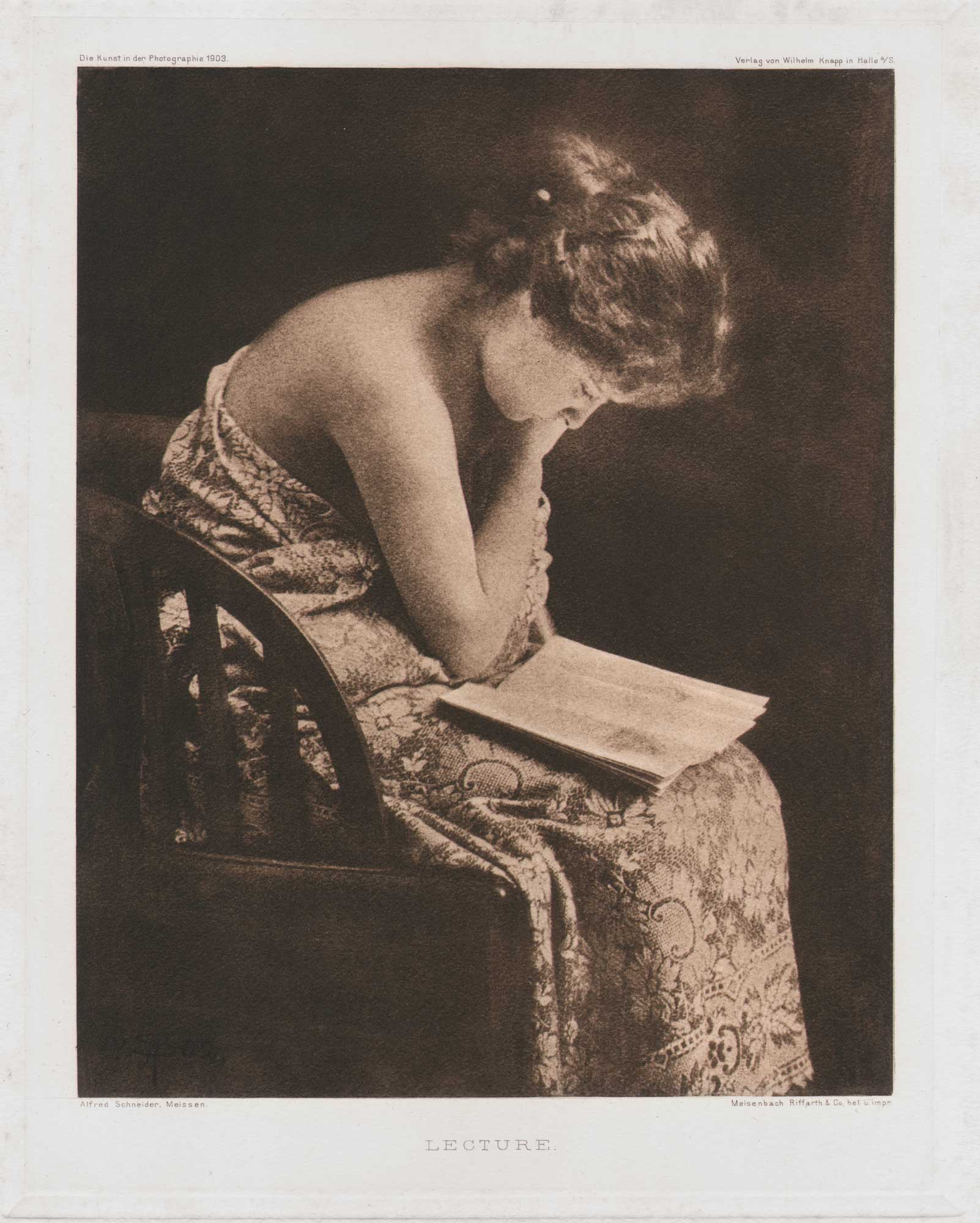
Lecture
Our panel of the seated girl may show the amateur how well, with a little skill, an ordinary coffee tablecloth can be used as a very effective drapery. (1.)
Photographische Mitteilungen picture editor Fritz Loescher made the above observation other amateurs could also achieve good results- while commenting on Alfred Schneider’s model apparently wearing a tablecloth in this photograph “Lecture“. His attempt at humor? Probably not. Read his entire commentary about a series of reproduced photographs by Alfred Schneider in the June, 1903 issue.
To our Pictures | Zu unseren Bildern
Alfred Schneider, Meissen, shows himself to be equally gifted at landscape and portrait in the pictures we have of him today. Skilled photographers can almost always be found capable of both areas of representation if they want to, a symptom that in turn marks a certain contrast to the painters, whose talents are usually more personal and differentiated. Anyone who can see an attractive and pictorial arrangement in nature – and in principle all photography is based on this – will be able to apply this ability to the human figure as well as to the landscape without difficulty. And since the expression of special emotional moods in photography is at least unusual and very difficult, the photographer would do well to expand his field as widely as possible in order not to fall victim to the defect of one-sidedness. Schneider clearly has a great sense for skilful image detail and beautiful arrangement. He does not let nature speak to us as easily as we have previously come to know from other photographers; he always tries to arrange them in a pleasing way and in doing so shows a great deal of painterly sense and a touch of French grace. Although his pictures may lack the great pull, they still show many fine, specifically photographic charms that we can enjoy without any problems.
The picture we have reproduced in heliogravure clearly shows that Schneider also strives to express his sense of beautiful, moving lines in the landscape. The lines of the birch trees leaning towards each other in the foreground and the path winding gently towards the middle ground are interrupted by a light, straight stripe running diagonally across the whole picture, which the author has manually moved more to the right and by covering the sides with strips of cardboard, he has created a straight picture section again, so we can see immediately how much the picture has gained in impact through the supposed shifting of the section.
The portraits also show how much Schneider likes to work with original picture sections. There is nothing wrong with a particularly interesting head, whose appeal lies in the expression of the face, being cut out closely. The picture of the gypsy boy reproduced in the text shows how this can contribute to increasing the characteristics of an expressive face. Hardly anyone will object to the fact that parts of the head and hair have been cut out because of the cut-out, because it is clear that the peculiarly melancholy facial expression has been given greater emphasis by this close cutting. — The female head, which is cut just as closely, is more likely to be open to objection. Here one has the feeling that the close cut is intended to conceal an unfavourable posture, and as expressive as the face is, the high back line caused by the position does not look particularly favourable. The portrait of Sascha Schneider (whose brother a friendly error in the Hamburg exhibition report had made our photographer) brings us closer to the human side, so to speak, of the well-known imaginative artist with his dressing gown and short pipe. Schneider’s studies of the naked female body are usually very skilful and have a piquant charm, but are free of any doubt. Our panel of the seated girl may show the amateur how well, with a little skill, an ordinary coffee tablecloth can be used as a very effective drapery. The second panel shows an expressive head in a briskly moving pose, whereas the body in this picture appears a little bulky.
The author has sent us the following data regarding his preferred rubber technique (gum printing-editor): My original photograph is always 9:12 cm. I enlarge this to 40:50 cm. After many years of testing, the enlarged plate is the only one that is correct, clear and normally strong. When copying, I take the heavy print first and then fit the thin prints under the negative onto it when it is clear and transparent. As a photometer I use several different small negatives, which have the same density as the enlarged negative, and place the same colour coating underneath, copy them all at the same time in the sun, but remove the small negatives at intervals and develop these test strips one after the other until I get the large negative. In my opinion this is the most practical method.” F.L. (Fritz Loescher)
- Fritz Loescher: excerpt: Zu unseren Bildern: Photographische Mitteilungen, June, 1903, pp. 168-70
