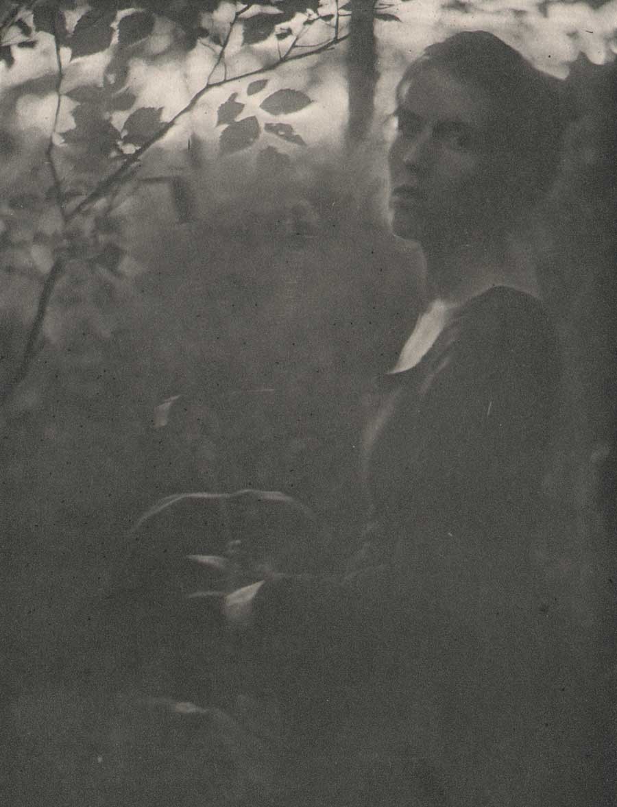
In 1926, Minnesota artist Cleora Clark Wheeler made the following observation in an article she wrote explaining her feat of photographing scores of fellow Kappa Kappa Gamma fraternity sisters by means of silhouette portraiture:

“Silhouette Self Portrait of Minnesota artist Cleora Clark Wheeler” ca. 1926. (typography added by this website) The photograph was used to illustrate an article written by her published in The Key, the quarterly magazine for Wheeler’s fraternity Kappa Kappa Gamma in December, 1926. (p. 500)
“anyone who saw the interested crowd getting their pictures on banquet night just before we all parted, will be sure it proved there is a way to have one’s picture taken without having one’s head turned.”
Using said dishpans in the title to this post, procured from a nearby hardware store outside Oakland, California, Cleora, or Cleo as she was known, went on to secure these pans used as reflectors for the photo shoot using her mother’s wooden tomato supports, placed in the trunk of her car before heading to the annual convention that year at Mills College from her St. Paul, MN home, a journey of 2000 miles.
So we will say it with our own flowers here: on the occasion of PhotoSeed posting a rare surviving folio volume of 23 of her delicate Japan-tissue photogravures of California landscapes taken and printed by Wheeler used as a sales catalogue, some further context into the life of this fascinating and talented woman is necessary in order to fill in the historical record.
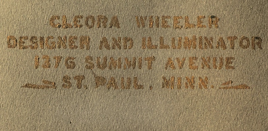
Detail: Title of California Sample Book by Cleora Clark Wheeler, American: 1882-1980: gilt hand-lettering: “Cleora Wheeler Designer And Illuminator 1376 Summit Avenue St. Paul, Minn.” 33.0 x 50.0 cm: folded, olive-colored cardstock leaf used as album cover. From: PhotoSeed Archive
To be clear, photography was just one of the many talents American artist Cleora Wheeler employed in her 98 years. Although never married, it might be said her significant partner through life was her beloved fraternity, Kappa Kappa Gamma, which she was initiated into at the Chi chapter at the University of Minnesota on October 9, 1899. Graduating in 1903, she went on to serve Kappa her entire life.
A designer and illuminator, as she would often describe herself while working out of the third floor studio of her longtime St. Paul family home, often in the act of creating unique bookplates and greeting cards, Cleora wore many professional hats. Artist, poet, school teacher, women’s advocate, business manager, an expert in steel die stamping, photographer and tireless promoter of her fraternity both locally in Minnesota and around the country were but a few of her passions.
With the knowledge that “Miss Wheeler thinks of California as her second home” as noted in a follow-up article describing her hand-colored photographic work and bookplates on display in 1922 at the St. Paul Public Library, her love of place and record of spirit is evident in pictorial photographic work taken in the American West ca. 1914-1921: a reaffirmation of the cross-pollination taking place in the arts by unconventional practitioners.
Left: “Redwoods”: Cleora Clark Wheeler, American-1882-1980: ca. 1922: hand-pulled Japan-tissue photogravure: 10.7 x 6.2 | 20.8 x 15.1 Gampi | 25.0 x 38.0 off-white handmade paper (folded) | 33.0 x 25.0 cm olive-colored cardstock leaf. From: PhotoSeed Archive. Right: “Redwoods”: ca. 1922: Cleora Clark Wheeler: hand-colored gelatin silver exhibition print from the artist’s 1922 St. Paul exhibition Atmospheric Studies. A roadway in the Sierra Mountains leads to a stand of soaring redwood trees in this landscape study colored with Japanese dyes. Courtesy: Grapefruit Moon Gallery auction listing, Minneapolis MN.
The following timeline by year in the life of Cleora Wheeler is meant as a starting point for this remarkable artist. It begins with her birth in Austin, Minnesota in 1882 and concludes with a 1980 obituary printed in her alumni magazine. Although long-winded in some cases, I’ve decided to include some of the expanded background articles written by and about Wheeler in The Key, the Kappa Kappa Gamma quarterly. In addition to photographic work by Wheeler held by this archive, a link to 45 bookplates held in the Helen Brainerd Lay Bookplate Collection at Mount Holyoke College in South Hadley, Massachusetts can be found here, and a general search link to the Wheeler family archive at the Minnesota Historical Society Library catalogue is here. (type in “Cleora Clark Wheeler”) Further suggestions for inclusion are welcomed. Please contact me through the blog or at admin@photoseed.com.
David Spencer- February, 2018
Top: December, 1910 advertisement for new Ex-Libris book plate designed the same year by Minnesota artist Cleora Clark Wheeler as it appeared in The Key, the quarterly magazine of her fraternity Kappa Kappa Gamma. Bottom: “Ex Libris of Kappa Kappa Gamma, by Cleora Clark Wheeler”: (American: 1882-1980). Ca. 1920-30. Hand-colored book plate shows the fleur-de-lis iris, the fraternity flower, with the artist’s initials CW appearing on opposite sides of the base of cut flowers. Courtesy: Helen Brainerd Lay Bookplate Collection, Mount Holyoke College Archives and Special Collections: Identifier: ms0048-s02-b02-f15-i001.
Timeline: Cleora Clark Wheeler: 1882-1980
1882: Wheeler is born in Austin, Minnesota. Her father, Rush Benjamin Wheeler, (1844-1930) was an East coast transplant who graduated from Yale. He was a lawyer involved in banking and real estate. Her mother Harriet Sophia Clark Wheeler (1853-1938) was a graduate of the University of Minnesota. Her siblings were two brothers: Frost Montaine Wheeler: 1878-1963 & Ross Clark Wheeler: 1886-1901. The family lived in St. Paul.
1903: Graduates from The University of Minnesota with a Bachelor of Arts degree in English. She later went on to earn certificates of proficiency in engineering drafting and advanced engineering drafting from U. M.
Moves to California and lives for a year: “Cleora Wheeler’s first work with the Young Women’s Christian Association was in California. Soon after her graduation from the University of Minnesota she was asked by Miss Louise Brooks of New York, national secretary of conventions and conferences, to be her assistant at the student conference at Capitola, Cal.” source: 1921 background on Wheeler in The Key.
“Miss Wheeler thinks of California as her second home, as she spent a year with Pi after graduating at Minnesota.” –The Key: 1926 (Pi chapter at the University of California, Berkeley)
1904: Named Grand Registrar for the Grand Council of Kappa Kappa Gamma, with offices at 301 Pioneer Press Building in St. Paul, MN. source: The Key, October.
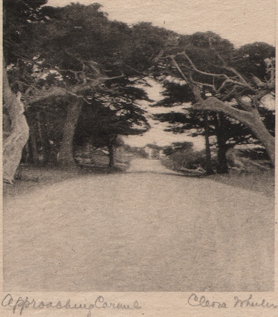
Detail: “Approaching Carmel”: Cleora Clark Wheeler, American: 1882-1980. Hand-pulled Japan-tissue photogravure ca. 1922: 10.2 x 7.5 | 21.0 x 15.3 Gampi | 24.2 x 38.0 off-white handmade paper (folded) | 33.0 x 25.0 cm olive-colored cardstock leaf. An archway of cypress trees near Carmel, California frames the famed Seventeen-Mile Drive along the Monterey coastline. From: PhotoSeed Archive
1905: Wheeler’s love of nature, a major theme that would soon emerge in her art, makes an initial greeting as Grand Registrar:
To all in Kappa Kappa Gamma, greetings! The wild thing of the woods has its call; the brook, playing with the bits of forest light and shadow, murmurs to itself; the wind, sighing through the trees, croons its melody and dies away; all nature is at peace, and sings. Song is the outpouring of a soul that cannot contain itself for very joy. Friendship is the life of that soul; a happiness too often unappreciated until perchance it is snatched away, only to leave a memory in its place. May we be worthy of this name of friend, appreciating more fully with each day the fortune that is ours. May we know a courtesy among ourselves that shall unconsciously touch each life we meet. May personal responsibility and devotion broaden into mutual helpfulness, and interest, and charity, until it meet and grace the world of kindly sympathy. (The Key: January: p. 298)
Writes a poem in tribute to Anne Jones, a fellow Chi chapter member at the University of Minnesota, most likely a personal friend:
Jones. April 5, 1884-July 3, 1905. Initiated into Chi Chapter of Kappa Kappa Gamma October 16, 1902.
As breath of morning gently steals its way O’er sleeping valleys where the morning mist Half timidly awaits the smile of day, Gray mantled, ere the sun has kissed To gold the dim dew-crystaled haze, And gliding soft with footsteps all to fleet For ken of humankind, from out the maze Brings memories, intangible, replete With wonder-fancies, melodies akin To whisperings of heaven; thus she came, Her arms light laden with the green of springA radiance as summer showers win In afterglow, long held ere twilight claim A melody, low borne on evening wing.
-Cleora Clark Wheeler. (The Key: October: p. 534)
Top: “At the Beginning of The Seventeen Mile Drive”: halftone photographic reproduction by Cleora Clark Wheeler used to illustrate article on annual convention for her fraternity Kappa Kappa Gamma. Taken from December, 1925 issue of The Key, the quarterly magazine of the fraternity. The photograph is a variant of her photo titled “Approaching Carmel” seen earlier in this post. Bottom: “After Nightfall”: ca. 1922: Cleora Clark Wheeler: hand-colored gelatin silver exhibition print from the artist’s 1922 St. Paul exhibition Atmospheric Studies. Another variant of the halftone seen above, Wheeler used Japanese dyes and hand-painted white stars in the sky for this landscape transformed into a nighttime view featuring a twilight blue sky. Courtesy: Grapefruit Moon Gallery auction listing, Minneapolis MN.
1906: Wheeler now living in Berkeley, CA, possibly for reasons of health, where she continue her duties as Grand Registrar: Notices:
“Record charts may be ordered by chapters or individuals at any time. One dollar, including postage; twenty-five cents in addition if backed with linen. Address care Corresponding Secretary of Pi chapter, Berkeley, California. Cleora Clark Wheeler.” (The Key: October: p. 262)
1907: Relinquishes her duties as Grand Registrar by January. In February, a confirmed report in The Key (p. 71) states health is the reason for her absence from MN:
“Cleora Wheeler, whom you all met at convention; is spending the winter in California. We miss her very much, but are glad to say that her health is greatly improved.”
1909: Takes up work again with the Young Women’s Christian Association, (YWCA) with a notice in the February issue of The Key that she is now the business secretary of the St. Paul Young Women’s Christian Association. (p. 72)

“Sunlight thro’ the Redwoods”: Lindley Eddy, American: 1873-1946: ca. 1914. 14.0 x 8.5 cm. Tipped to page: 21.5 x 14.0 cm. Sepia gelatin silver print included in volume A Traveler’s Prayer of California Mountains, photographs by Lindley Eddy with poems by Olive Hinds Simpson: Visalia, CA: Commercial Printing Co.- copyrighted 1914 by Olive A. Simpson. It would have undoubtedly appealed to the artistic sensibilities of Cleora Clark Wheeler had she come across this volume of poetry featuring ten photographs taken by Eddy in the Sequoia National Forest. The work was published the same year it is believed Wheeler first took up her series of western US photographs in Colorado. From: PhotoSeed Archive (volume for sale: please inquire)
1910: The first advertisement for Wheeler artwork appears in the October issue of The Key for what is believed to be her new book plate, although it’s described as a “plate book”. Showing her business savvy, earlier in August she had registered copyright in her own name for the design:
THE
Official Plate Book of the Fraternity
IN INDIVIDUAL PACKAGES
25 CENTS
Plan to Send Them at the Holidays
ORDER EARLY
Enclose Stamps or Money Order
1376 Summitt Ave. Cleora Wheeler St. Paul, Minn.
A notice in the December issue of The Key along with an accompanying photograph of the artist that Wheeler had indeed designed the official bookplate for her fraternity:
THE KAPPA BOOK-PLATE
There have been a number of inquiries as to the designer of the Kappa Kappa Gamma book-plate, which was adopted by the Grand Council at Convention Session as the official book-plate of the Fraternity. The plate was designed by Cleora Clark Wheeler, of Chi Chapter, who was Grand Registrar from 1904 to 1906. Miss Wheeler was particularly happy in her choice of the fraternity flower for decoration; for the fleur-de-lis with its long stem and heavy blossom lends itself with special effectiveness to composition. The Kappa bookplate should be an incentive to the growth of our chapter-house libraries; for the chapter name may be used in it, just as well as that of the individual owner.
(note: At the 1890 convention, the fraternity chose the fleur-de-lis “as the Kappa flower for its dignity and grace and because in it the two blues are combined.“)
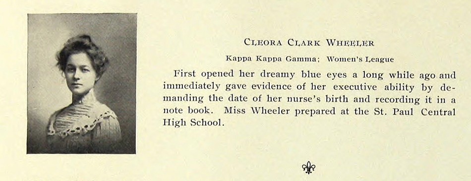
The senior portrait and entry for Minnesota artist Cleora Clark Wheeler as it appeared in her 1903 University of Minnesota Gopher yearbook. Wheeler, 1882-1980, graduated that year with a Bachelor of Arts degree in English and went on to earn certificates of proficiency in engineering drafting and advanced engineering drafting from U. M. Source: online pdf of The Gopher: Vol. 16, 1903: p. 78.
1911: With the rough design of a new Kappa crest duly recorded in a 1910 committee report, the intent of the adoption of an official coat-of-arms for Kappa was soon becoming reality. (discussions began in 1905) Because of this and given her proven design expertise on behalf of the fraternity, and with the aim of surely involving her in other design decisions regarding fraternity insignia, Wheeler is appointed by February as new Custodian of the Badge, an important oversight and secretarial role for the official fraternity Badge, a piece of jewelry in the shape of a golden key stamped with the Greek letters for Kappa and worn by chapter members. Wheeler’s role would have been to make sure changes to the key were permissible, and she held the position as Custodian through 1917.
In the October issue of The Key, two separate advertisements for Wheeler’s new book plate design featuring the fleur-de-lis iris appear. One, for correspondence cards, are stamped in gold and priced at 35 cents a dozen. Another is for her bookplate:
The KAPPA BOOK-PLATE
Several times the size
of this cut
In Individual Packages
of 25 Prints
Blue or black ink on English
gummed paper -25 cents
Black ink on Japanese handmade Vellum-50 cents
Tinted prints-50 cents a dozen
The design same size as the Book-Plate
adapted to Dinner Cards and Folders
Cards : Untinted, 30 cents a dozen
Tinted, 50 cents
Folders: Untinted, 50 cents a dozen
Tinted, 75 cents
Address: CLEORA WHEELER
1376 Summit Ave., St. Paul, Minn,
Enclose Stamps or Money Order
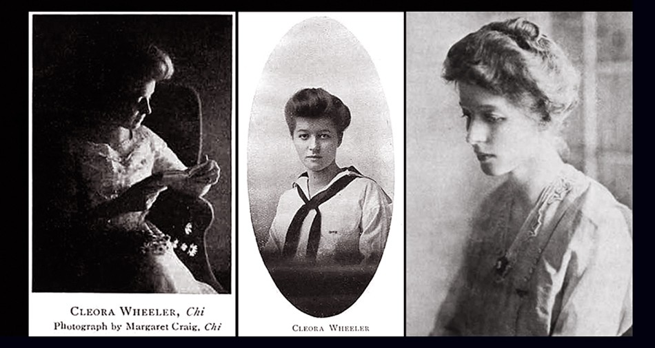
An early triptych of halftone portraits of Minnesota artist Cleora Clark Wheeler. Left: Studying a book, perhaps taken while she was still an undergraduate at the University of Minnesota in the very early 20th Century. Photo by fellow Kappa Kappa Gamma Chi chapter member Margaret Craig published in a 1910 issue of the fraternity quarterly The Key. Middle: Portrait of Wheeler in a sailor-inspired tunic as it appeared in the February, 1913 issue of The Key illustrating an article she wrote titled “Character By Handwriting- And Otherwise.” Right: a photograph of Wheeler taken ca. 1911-17 when she was Custodian of the Badge, an important oversight and secretarial role for the official fraternity Badge, a piece of jewelry in the shape of a golden key stamped with the Greek letters for Kappa and worn by chapter members. Photo reproduced in the Fall 1977 issue of The Key.
1912: Wheeler becomes artistically involved in creating metal dies for the new fraternity coat-of-arms (also referred to as the crest) after consulting with the British College of Arms. Earlier in 1910, A National Committee for Kappa, with Margaret Brown Moore appointed Chairman, produced the new coat-of-arms. Brown designed it with advice and help from Joanna Strange, BZ-Iowa, head of the reference department of the Carnegie Library in Pittsburgh, as well as from J. F. Hopkins, the designer of the Sigma Nu coat of arms. Moore’s design was then put on paper in the form of a watercolor sketch by Philadelphia heraldry expert Mark J. Rowe: “Margaret urged the Fraternity to protect the design so that “the technically perfect coat-of-arms will not be lost to us.” She expressed a wish that there should be perfect dies for stamping in gold and silver as well as plates for printing on documents and reports. Cleora Wheeler, Minnesota, prepared such plates and dies. The College of Arms in England was consulted before Cleora cut her die in filigree and it was made after the others that were modeled in the regulation way. When these were done, Margaret Moore declared that perfect reproductions had been made.” (1.)
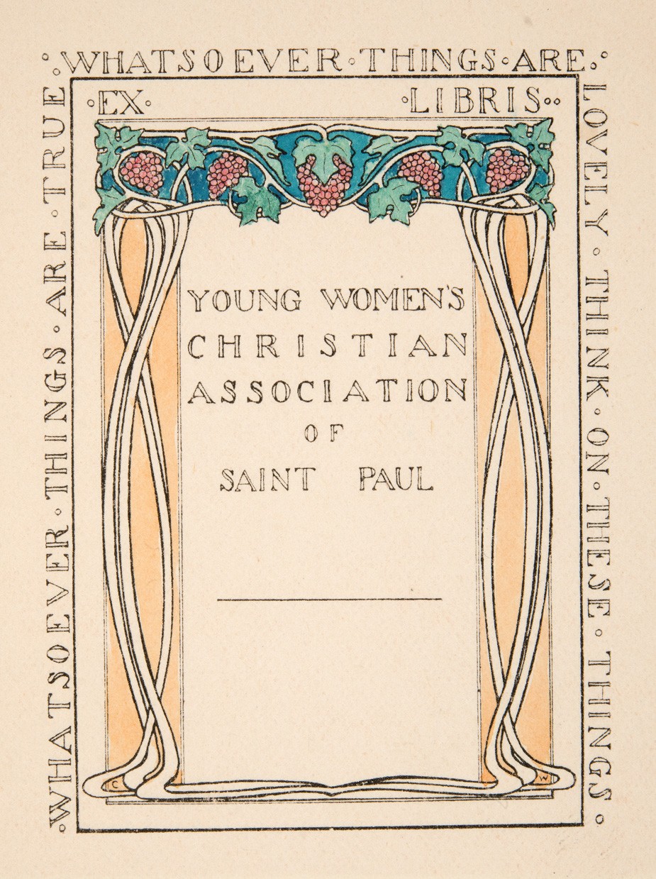
“Ex Libris Young Women’s Christian Association of Saint Paul, by Cleora Clark Wheeler”: (American: 1882-1980). Ca. 1915-25. Hand-colored book plate shows an archway of grape clusters with stems forming a pair of opposing columns. The YWCA organization is spelled out at center while the whole is surrounded by extracted Bible verses from Philippians 4:8: “Whatsoever Things Are True – Whatsoever Thing Are Lovely – Think On These Things”. Wheeler first worked with the YWCA in California in late 1903 after her graduation from the University of Minnesota and in 1909 became business secretary for the St. Paul chapter. A 1921 article in The Key profiling Wheeler’s accomplishments stated: “The national bookplate of the association used in all of the books at the National Training School, and in association libraries throughout the country is designed by Miss Wheeler”. Courtesy: Helen Brainerd Lay Bookplate Collection, Mount Holyoke College Archives and Special Collections: Identifier: ms0048-s02-b02-f15-i011.
1912-13: Wheeler moves to New York City and attends classes at The School of Fine and Applied Art, (now Parsons School of Design) where she studied color harmony. Two folders of notes, including those by Wheeler made during lectures given by Frank Alvah Parsons, are held by the school in the present day, as well as a set of her bookplates in the Kellen Design Archives. Sources: WorldCat and Minnesota 1900: Art and Life on the Upper Mississippi, 1890-1915: 1994, Newark: University of Delaware Press.
An article in the October issue of The Key for 1912 states Wheeler issues the limited edition book “Kappas I Have Known” in 250 copies:
A novelty in college scrap books was presented at Convention by Cleora Wheeler, Chi, in “Kappas I Have Known, ” which can be used not only in college, but as a life time fraternity record. The book is divided into sections, under the heads, “My Chapter,” ” National Officers”, and “Kappas From Other Chapters;” and further space is provided for songs and other miscellaneous entries. The book is bound with stubs, so that clippings and snapshots may be pasted in to illustrate the careers of the notable Kappas therein enrolled. And a particularly pretty Kappa touch is added by the Fleur-de-lis design on each page, and the blue and blue binding. (p. 257)

Detail: Frame verso: “Evening”, by Cleora Clark Wheeler, American: 1882-1980. ca. 1922: 24.7 x 19.8 cm. The original series of framed photographs appearing in Wheeler’s 1922 St. Paul photographic exhibition “Atmospheric Studies” (& also most likely the 1926 San Francisco Paul Elder exhibition) were each finished off on the frame verso with one of several trimmed and pasted book plates identifying Wheeler as author of the work seen at top. Below it is a pasted and engraved listing for photographs included in a separate subheading for the exhibition that were taken in a particular region. This example shows “Evening” held by this archive and listed as #43 in the overall exhibition under Monterey’s famed Seventeen-Mile Drive subheading. From: PhotoSeed Archive
Further details are included about this book, illustrated by a photograph in the advertising section for the December issue of The Key:
Bound in two-tone blue cloth with gold stamping; page decorations and headings in gray-blue ink to harmonize. Sewed by hand. special attention being given to the reinforcement of the back by transverse tapes, and by stubs arranged to offset extra bulk of Kodak Prints and Clippings. In this way the book not only offers space for such additions, but also overcomes the possibility of having it stand open when only partially filled. Edition Limited to 250 copies. Price $1.50 net $1.65 by mail.
1914: This may have been the first year Wheeler undertook her series of Western U.S. photographs that would eventually appear in her 1922 St. Paul exhibit Atmospheric Studies, under the exhibition heading Out Where The West Begins : Colorado. Sometime in the Fall, Wheeler travels to Boulder as part of fraternity business as noted in the December issue of The Key:
“We were very glad to have Miss Cleora Wheeler with us for luncheon, on her way home from a visit with Beta Mu at Boulder. We enjoyed hearing of the rushing season there, and also the interesting convention news from Miss Wheeler and the five Sigma girls who attended.”
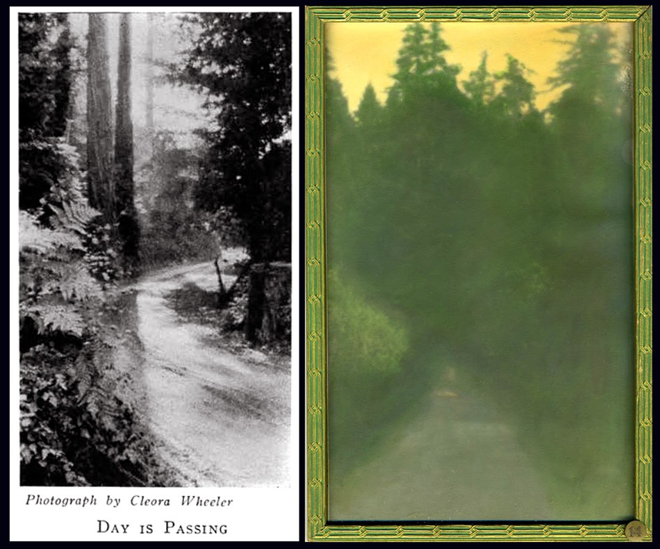
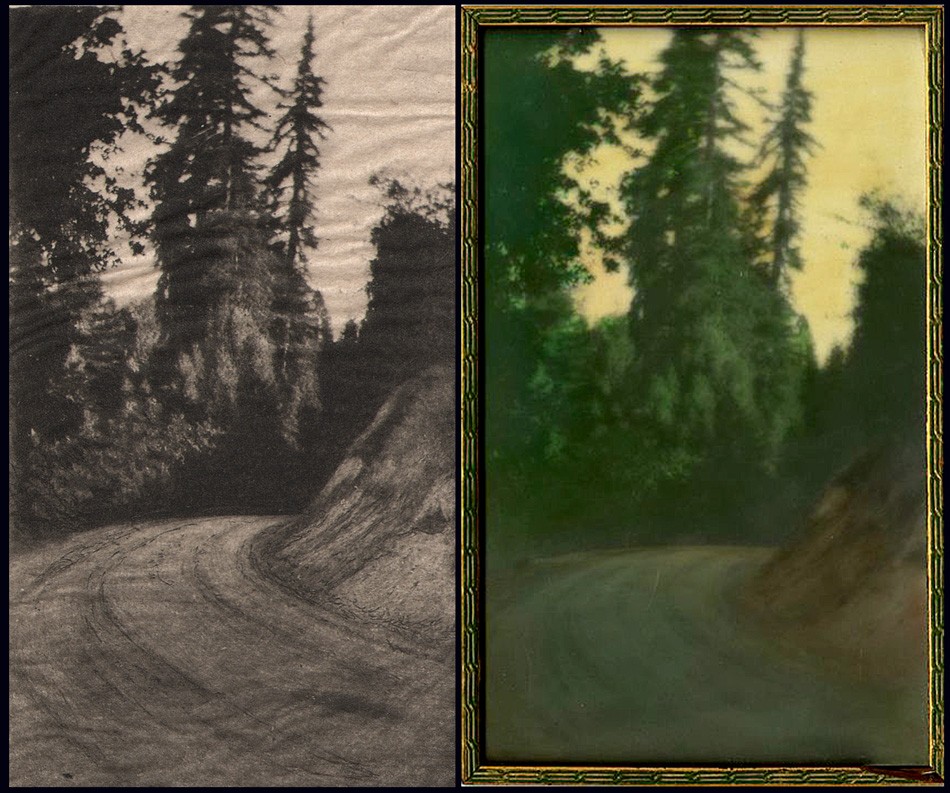
Two examples of photographs taken ca. 1914-1921 in the northern California Redwood region by Cleora Clark Wheeler were later first exhibited in her 1922 St. Paul, MN exhibition Atmospheric Studies. Listed under the subheading “At Call-Of-The-Wild, California”, they are: Left: “Day Is Passing” (#19 in St. Paul): seen here as a halftone as it appeared in the February, 1926 issue of The Key. Right: “Sunshine Beyond” (#14 in St. Paul): ca. 1922: hand-colored gelatin silver exhibition print shows a roadway in the Sierra Mountains with a stand of Redwood trees in background all cast in a yellow glow. The effect was achieved with Japanese dyes. Courtesy: Grapefruit Moon Gallery auction listing, Minneapolis MN.
1915: Wheeler’s photographic skills come into play as she visits the U.S. states of Oklahoma, Kansas, Louisiana, Texas and Missouri while reporting on Kappa chapter houses for the article “Chapter Homes I Have Known“, accompanied by several halftones appearing in the December issue of The Key. (pp. 317-21)
The magazine cover design for The Key changes with the addition of a new hand-drawn crest (coat-of-arms) designed by recent Xi chapter graduate Ruth Anthony beginning with the May issue. This cover design was used through mid 1927 when it was replaced by a simplified navy blue crest against a gray background.

Several photographs by Cleora Clark Wheeler were most likely used as the basis for custom book plates engraved by the artist, as seen in this pairing. Left: “The White Birches At Bigwin” was a photograph taken in June, 1924 during the national Kappa Kappa Gamma convention held in Toronto, Canada at the Bigwin Inn and subsequently published as a halftone in the October, 1924 issue of fraternity quarterly, The Key. Right: “Ex Libris Cleora Clark Wheeler, by Cleora Clark Wheeler”: This book plate drawn free-hand by the artist shows a similar grouping of White Birch trees. Examples of this book plate are known to have been pasted to the verso of more than one framed exhibition print included in Wheeler’s 1922 exhibition Atmospheric Studies along with the additional designation of “California”. This leads one to believe these frames were the ones shown in the 1926 Paul Elder Gallery exhibition in San Francisco. Courtesy: Helen Brainerd Lay Bookplate Collection, Mount Holyoke College Archives and Special Collections: Identifier: ms0048-s02-b02-f15-i029
1916: Wheeler expands her offering of Kappa designs in a full page advertisement for book plates, dinner cards, social stationary and other items appearing in the February issue of The Key.

Believed to depict scenes in Colorado or California and may have been done from source photographs, examples of these bookplates by Cleora Clark Wheeler were exhibited at her 1922 St. Paul exhibition Atmospheric Studies. Left: “Robert Tatlow Barnard Avery Trask Barnard Their Book,” by Cleora Clark Wheeler”: ca. 1915-25. (Identifier ms0048-s02-b02-f15-i022). Right: “Ex Libris Frost Montaine and Emma Phyllis Wheeler,” by Cleora Clark Wheeler”: ca. 1915-25 (Identifier ms0048-s02-b02-f15-i021). Both courtesy Helen Brainerd Lay Bookplate Collection, Mount Holyoke College Archives and Special Collections.
1918: In May, Wheeler becomes Director for the newly formed St. Paul Vocational Bureau for Trained Women:
1015 Commerce Building, St. Paul
MISS CLEORA WHEELER, DIRECTOR
Backed by the Women’s College Clubs of the Twin Cities, a Bureau for Trained Women was opened in Minneapolis within the last six months. The original idea was to open a branch office in St. Paul, with Miss Cleora Wheeler of St. Paul in charge. It came to be realized, however, that the work in the two cities would be sufficient in importance and scope to warrant the opening of two independent bureaus, so on the morning of May 8 the St. Paul Vocational Bureau for Trained Women opened its office for business. It is conducted under the auspices of the St. Paul College Club, the Vocational Committee assuming the responsibility of its organization and management, while Miss Wheeler is in charge as director.
Miss Wheeler was for five years chairman of the Vocational section of the St. Paul Association of Collegiate Alumnae, and served on the Board of Directors of the Minneapolis bureau during its organization period and until joining their salaried staff as temporary assistant. She was their representative at the February convention of the Association for the Promotion of Industrial and Vocational Education in Philadelphia; and visited the Collegiate bureaus of Philadelphia, New York, Boston, Detroit and Chicago. She also visited the headquarters of Women’s Work in Washington that the St. Paul office might fully cooperate with them and with the government.
The St. Paul bureau is particularly fortunate in securing office accommodations with the Ramsey County Women’s War Organization, and it is fully expected that this arrangement will prove mutually beneficial. (2.)

Examples of bookplates by Wheeler: Left: “Cecily Wheeler Allen Ex Libris, by Cleora Clark Wheeler” : ca. 1930-40. (Identifier ms0048-s02-b02-f15-i045). Right: “Ex Libris Frank B. Kellogg,” by Cleora Clark Wheeler”: 1915. This bookplate was shown at the artist’s1922 St. Paul exhibition Atmospheric Studies. (Identifier ms0048-s02-b02-f15-i020). Both courtesy Helen Brainerd Lay Bookplate Collection, Mount Holyoke College Archives and Special Collections.
First publicized notice of Christmas cards designed by Wheeler appear in the February issue of The Key. They are sold to raise money for French orphans impacted by WWI: “Epsilon made twenty dollars for the French children by selling the Christmas cards designed by Cleora Wheeler.” (p. 56)
1921: Accompanied by a reflective portrait of the artist, the December issue of The Key publishes a lengthy professional background story on her:
Cleora Wheeler’s first work with the Young Women’s Christian Association was in California. Soon after her graduation from the University of Minnesota she was asked by Miss Louise Brooks of New York, national secretary of conventions and conferences, to be her assistant at the student conference at Capitola, Cal. Soon after this she was elected business secretary of the St. Paul Association which was just organizing.
In a city association the business secretary banks the money, issues the membership cards, registers the gymnasium and educational classes, inspects rooming houses, acts as hostess, and audits the money if the association raises $250,000 in a whirlwind campaign for a new building. After helping in this way in her own city for two years, Miss Wheeler did county organization work under the state committee, assisting in the organizing of Mower County, Minn., the third county to be organized in the United States. It meant riding on freight trains to little towns throughout the county, arranging mass meetings and then lecture places for the state nurse, domestic science teacher, and sewing teacher who were sent down by the Agricultural Department of the university to give a ten-weeks’ course of lectures, the university collaborating in extension work with the association.
The next year under the National Board of the Young Women’s Christian Association Miss Wheeler was one of the two business managers of the student and city conferences at Lake Geneva. The national bookplate of the association used in all of the books at the National Training School, and in association libraries throughout the country is designed by Miss Wheeler. (p. 292)
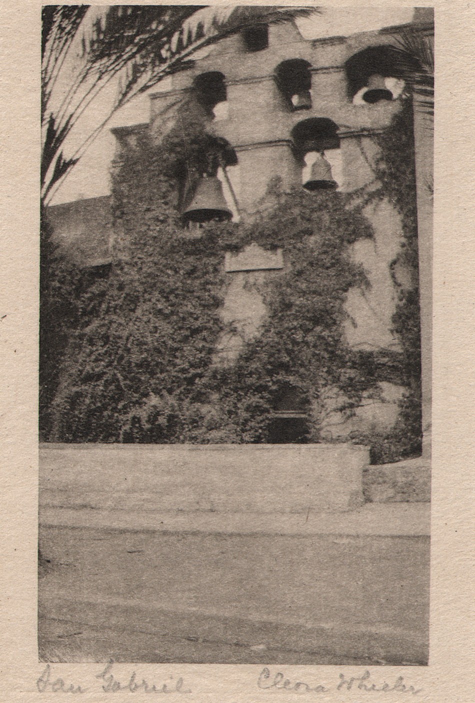
“San Gabriel”: Cleora Clark Wheeler, American-1882-1980: ca. 1922: hand-pulled Japan-tissue photogravure: 10.5 x 6.3 | 21.0 x 15.2 Gampi | 24.2 x 38.0 off-white handmade paper (folded) | 33.0 x 25.0 cm olive-colored cardstock leaf. In California, the famous bell wall at the San Gabriel Spanish Mission is seen in this pictorial view by Wheeler. The California Missions Resource Center states: “Six bells occupy an espadaña or bell wall. The oldest bells were cast in Mexico City in 1795 by the famous bell maker, Paul Ruelas. The largest bell (dated 1830) weighs over a ton and was used for over a century to ring the Angelus, a prayer said at morning, noon, and evening in commemoration of the Incarnation.” From: PhotoSeed Archive
1922: The May 20th issue of American Art News prints a notice of Wheeler’s exhibition Atmospheric Studies:
“A collection of more than eighty prints of western scenes by Miss Cleora Wheeler, St. Paul artist, have been on exhibition at the St. Paul Public Library. They show a wide range of color and subject matter, and were done on trips which extended from the eastern reaches of the Rockies through the mountains and as far south as the Mexican border of California. -G.E.P.” (p. 7)
In June, the artist’s first known public exhibition of hand-colored pictorial photographs as well as a smaller series of original bookplates takes place from June 1-15 at the Saint Paul Public Library under the auspices of the Saint Paul Institute. A slim eight-page exhibition brochure is printed listing the following sub-headings for the 76 exhibited photographs:
Out Where The West Begins : Colorado; California: At Call-Of-The-Wild, California; Pacific Grove; California: The Seventeen-Mile Drive; Santa Barbara; Farther South; La Jolla; Old Town; San Diego; Minnesota: Senator Kellog’s Garden, St. Paul & White Bear Lake. A separate section for 14 original bookplates is also listed, and the entire list with all titles can be found on this website at a link featuring the original framed exhibition print Evening.
Some of the work for the exhibit was for sale, and a price list was printed on the last page of the brochure:
PRICE LIST
The prints in this exhibition are not for sale.
Duplicates can be ordered as follows:
SEPIA PRINTS
Large size, mounted as shown………$10.00
Smaller size, mounted as shown……..7.50
COLORED PRINTS
No. 34 ……………………………….$12.50
No. 40 ……………………………….. 20.00
No. 43 …………………………………10.00
All others …………………………….7.50
These prices include frames.
MINIATURE PRINTS
Made by hand from copper plates.
See sample book at desk.
Prints on Japanese tissue ……$1.00
No. 50, No. 60, No. 63, colored ink, with
envelope …………………………… .50
Folders tinted to order, with envelope $.40 and .50
Same without tinting ………… .15
Card without tinting …………. .10
CHRISTMAS CARDS
See sample books at desk.
Folders with Christmas wording.
Per 100 ………………………………$35.00 to $50.00
These may be ordered for fall delivery.
BOOKPLATE PRICES
Design ………………………………$25.00 up
Metal plate and prints are extra, cost depend-
ing on material. Allow six months for book-
plate orders. Estimates given.
1376 Summit Avenue Midway 0234
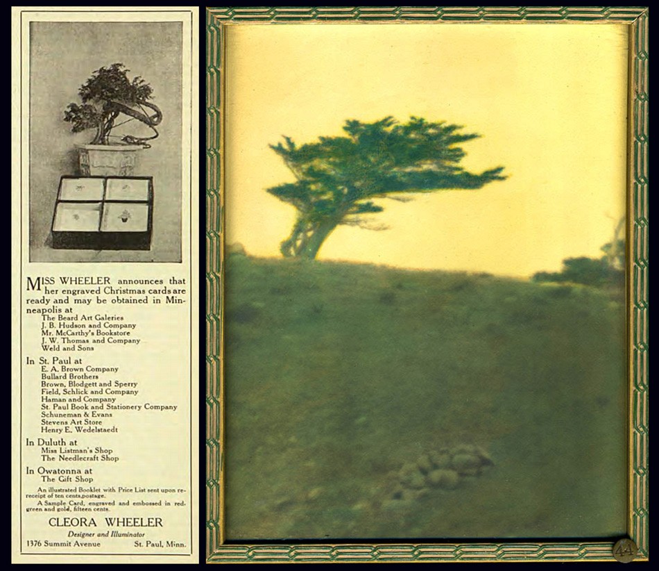
Left: Custom designed Christmas cards were a staple source of income for artist Cleora Wheeler as well as an important fund raiser for her fraternity. She produced them as early as 1915, when an advertisement similar to this one featuring a potted Bonsai tree was photographed alongside a box of cards featuring four different designs ran her Minnesota Alumni Weekly, (this ad from Dec. 1916) until the 1960’s, when the cover of the December, 1963 issue of The Pen Woman magazine showcased card designs of Twin City churches. A 1944 article in the St. Cloud Daily Times newspaper of MN remarked: “Miss Wheeler has received nationwide recognition for her Christmas cards, hand-printed photogravures and hand stamped cards bearing her designs” Right: The Japanese inspired sensibility of Wheeler’s design aesthetic can be seen carried over in this photographic landscape taken along California’s Monterey coastline. In “Mustard Sky”, a lone Cypress tree is shown atop an seaside ridge. This original hand-colored framed exhibition photograph was featured in her 1922 St. Paul, MN exhibition Atmospheric Studies, listed as #44 under the subheading “The Seventeen-Mile Drive”. Courtesy: Grapefruit Moon Gallery auction listing, Minneapolis MN.
1924: In June, at the national Kappa convention held in Toronto, Canada at the Bigwin Inn, Wheeler makes 19 hand-cut silhouettes from black paper used as part of the Historical Pageant. The works were later reproduced in the October issue of The Key that year. (shown on pp. 250-253) Soon, Wheeler would take on the art of silhouette portraiture by means of photography. Additionally, a pictorial portrait of Kappa president May Whiting Westerman and Georgia Hayden Lloyd Jones, National Director of Provinces, appeared as a full page halftone in the issue and another pictorial photographic landscape: The White Birches of Bigwin, appeared on pages 248 and 255 respectively.
1925: Several California pictorial photographic works are published as halftones in the October issue of The Key with the following titles:
– Call-of-the-Wild, California
– San Juan Capistrano Mission-between Los Angeles and San Diego, California

Left: Although Cleora Wheeler never held editorial positions for The Key, the quarterly magazine of Kappa Kappa Gamma, it featured notices of her progress as an artist, support of the fraternity’s mission nationally via her election to various Kappa positions, including Grand Registrar in 1904 and Custodian of the Badge in 1911, and as a continual mouthpiece for advertisements in its’ rear pages featuring original artwork for sale. This issue shows a new cover design which debuted in May, 1915 featuring a new crest (coat-of-arms) designed by recent Xi chapter graduate Ruth Anthony. Right: One large advertisement appearing in the October, 1930 issue of The Key showcased no less than 18 individual Kappa designs by Cleora Wheeler made into steel dies. These were used to emboss custom orders of stationary, all from the third floor studio of her St. Paul, MN home.
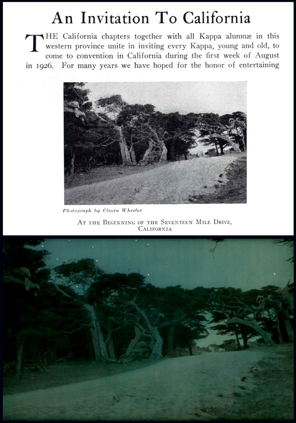
Three further California images appear in the December issue of The Key promoting the national convention that would be held at Mills College outside Oakland, CA the following summer. The frontis photograph for the issue featured a view of a lone cypress tree that had become Wheeler’s signature California image known as “Near Monterey” taken along the Seventeen Mile Drive and was darkened and hand-colored with a star placed in the sky and re-titled “Evening“.
The article published on pages 415-17 of the issue is titled:
An Invitation To California
“The California chapters together with all Kappa alumnae in this western province unite in inviting every Kappa, young and old, to come to convention in California during the first week of August in 1926.” …The convention will be held at Mills College, in the suburbs of Oakland, across the bay from San Francisco.”
The two additional halftones are titled:
– At the Beginning of The Seventeen Mile Drive
– The Cloister Stairway, San Gabriel Mission
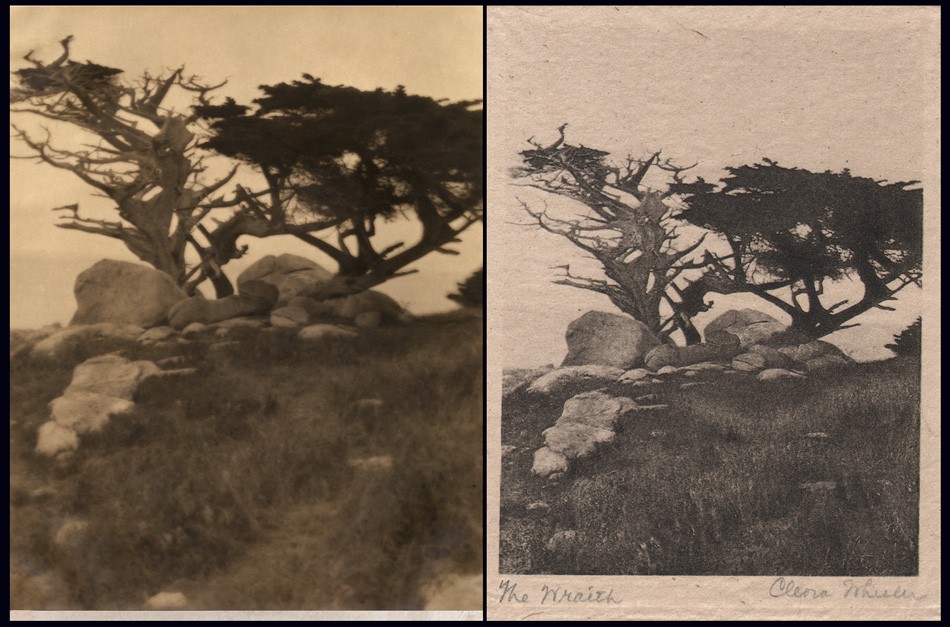
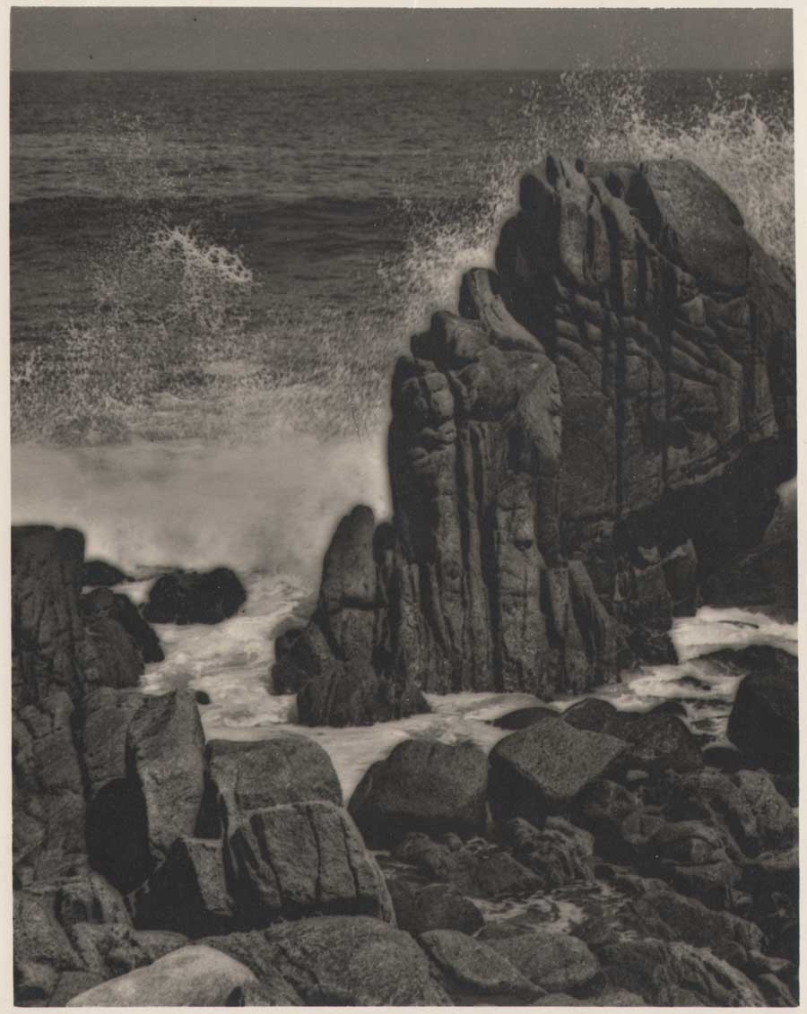
Left: “The Wraith”: Cleora Clark Wheeler, American:1882-1980. Sepia gelatin silver print, ca. 1922. Courtesy: Grapefruit Moon Gallery auction listing, Minneapolis MN. Right: ‘The Wraith”: Hand-pulled Japan-tissue photogravure ca. 1922: 10.1 x 7.8 | 20.7 x 14.9 Gampi | 24.8 x 38.0 off-white handmade paper (folded) | 33.0 x 25.0 cm olive-colored cardstock leaf. Cypress trees, one living and the other dead, stand sentinel among a rock outcropping, with the Pacific Ocean beyond. The landscape was photographed by Wheeler along the famed Seventeen Mile Drive on the Monterey, California coastline. From: PhotoSeed Archive
1925: Working out of her St. Paul home, Wheeler produced an unknown number of original artworks for the Buzza Company of Minneapolis in this year or before, with lithographed motto art being a specialty. (see example pulled from the web along with this post) Minnesota Historical Society author Moira F. Harris comments on the artist’s working methods:
Her studio was on the third floor of the family home at 1376 Summit Avenue. There she designed and engraved the plates for her cards and bookplates. Some cards she printed herself on a hand press, while others were printed on handmade paper by Brown & Bigelow and sold through the St. Paul Book & Stationery firm. (3.)
The Hennepin History Museum in Minneapolis, MN supplied this short overview of the Buzza Company as part of their 2016 exhibit “Greetings“:
A History of the Buzza Company
During its prime, the Minneapolis-based Buzza Company (1907-1942) was one of the nation’s largest manufacturers of greeting cards, framed mottos, gift books, and party stationery. GREETINGS tells the story of the company’s rise and fall, its larger-than-life founder, and the hundreds of artists, poets, printers, and others who produced, sold, and shipped many millions of items from the company’s Lake Street headquarters each year. (George Earl Buzza: 1883-1957)
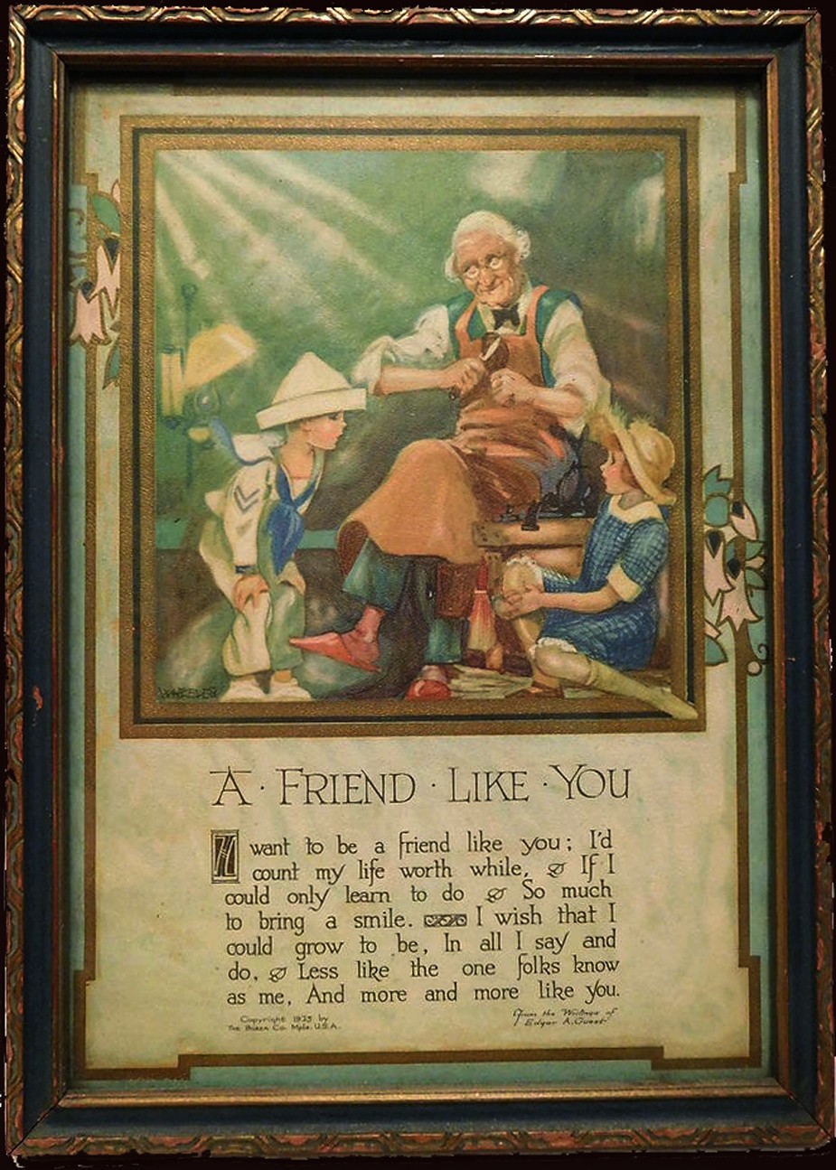
Around 1925 or before, Cleora Wheeler created original artwork like this example for the Minneapolis-based Buzza Company, which between 1907-1942 was one of the nation’s largest manufacturers of greeting cards, framed mottos, gift books, and party stationery. This framed motto print made into a chromolithograph posted to Pinterest bears a 1925 Buzza copyright (“WHEELER” printed in lower left corner of artwork) and is titled “A Friend Like You”: optimistic lines penned by the English-born American poet Edgar Albert Guest: 1881-1959.
1926: Interestingly, a review of Wheelers 1922 exhibit Atmospheric Studies is published nearly four years later in the February issue of The Key, with insight stating the artist had “tramped the California mountains” “for two successive summers” to produce the views. This may indicate the entire body of California work was taken ca. 1920-21, as it’s known she made a Santa Barbara landscape dated 1921. The issue features a commercial portrait of Wheeler to accompany the article. Four additional halftones of California landscapes are further reproduced in the issue.
California Photographs by Kappa Artist
THE California photographs by Cleora Wheeler which are appearing in these issues of THE KEY are reproductions of a part of an exhibit of seventy or more prints in colors which were recently hung in the art gallery of the beautiful public library of St. Paul, under the auspices of the St. Paul Institute. This constituted the only exhibition during the year which filled this large gallery with the work of one person. The pictures are being reproduced for the first time in THE KEY, and as they are part of a professional record they bear the name of the member who made them. Miss Wheeler thinks of California as her second home, as she spent a year with Pi after graduating at Minnesota. For two successive summers she has tramped the California mountains, and as a result has produced the pictures which you are now enjoying at the request of Mrs. Westermann, and of which Arthur L. Wilhelm, the art critic, wrote the following:
UNUSUAL QUALITIES ARE DISPLAYED IN WORK OF MISS
CLEORA WHEELER; SUBJECT MATTER SELECTED
WITH VIEW OF UNUSUAL
BY ARTHUR L. WILHELM
There is on exhibition at the St. Paul Public library this week a collection of colored California prints by Cleora Wheeler, St. Paul artist and etcher. The St. Paul Institute is sponsoring the exhibit. In the collection of more than eighty prints are many that have unusual qualities. All are atmospheric studies and are colored, many of them with fine Japanese dyes, giving a wide color range and depth. Miss Wheeler has grasped the fine essentials of design in many of her studies. Many simple little prints take on glowing beauty under the touch of her brush. The subject matter is carefully selected with a· view of the unusual. Here, in one print, one sees a fine flowing rhythm. Again one feels the structure of design carried out to a fine point. Again there is quality of the color that charms. Always there is something unusual to attract.

Top: “Eucalyptus Screen”: Cleora Clark Wheeler, American: 1882-1980. Hand-pulled Japan-tissue photogravure ca. 1922: 6.3 x 10.5 cm | 14.9 x 20.4 Gampi | 38.0 x 24.5 cm off-white handmade paper (folded) | 33.0 x 25.0 cm olive-colored cardstock leaf. From: PhotoSeed Archive. Bottom: “A Forest Screen”: ca. 1922: Cleora Clark Wheeler: hand-colored gelatin silver exhibition print from the artist’s 1922 St. Paul exhibition Atmospheric Studies. “Screen-type” photographic landscapes by Wheeler show up frequently in her California work, with the latter print (#27 St. Paul) taken in the Pacific Grove region near Monterey and gravure believed to be from Santa Barbara. Courtesy: Grapefruit Moon Gallery auction listing, Minneapolis MN.
COLORADO-CALIFORNIA
Miss Wheeler has arranged the prints so that one follows her in her journey to the West, where the pictures were taken. First we see eight prints from Colorado, the first rampart range of the Rockies, a field of wild sunflowers with a great up-thrust of rock in the background, and others. Then we have what she terms the “Call of the Wild,” with a score of prints taken at random along the coast and in the big woods of the Sierras. There are many pictures that are romantic in feeling and others that have a rich poetic sentiment. The colors are soft and glowing or in the nocturnes are dimmed by the blue of night. There are ten prints taken at Pacific Grove which· include pictures of the woods and sea, pictures with the fog stealing in, and prints tinged with the sunset glow.
DRIVE PICTURES THE BEST
Perhaps the most charming group of the exhibition is that taken on the famous seventeen-mile drive at Monterey. Here the old cypresses are shown with all their varied forms. Also the rocks and the sea are most charmingly depicted. There are pictures of young eucalyptus groves with a bit of flaming sky showing through the foliage. One print, “The Old Witch,” is a portrait of a famous old tree which is known to the thousands of tourists who have made the trip. There is a group of prints from Santa Barbara and several from points farther South. The exhibition is enhanced by an oil painting, a landscape done by the mother of the artist, which has a fine feeling of harmony and color. The entire exhibition is both unusual and charming. (pp. 27-8)
1926: July. Fifteen silhouettes, this time by means of photography, are taken by Wheeler of Kappa members taking part in the Historical Pageant held as part of the California annual convention at Mills College. In addition, she takes scores of additional silhouettes of those attending the convention itself on banquet day. The silhouette photos of the pageant members are published in the October issue of The Key.
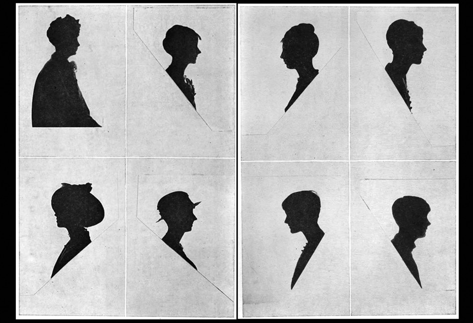
These two sets of photographic silhouette portraits taken by Cleora Wheeler were done in July, 1926 as part of the Historical Pageant held during the annual Kappa Kappa Gamma national convention at Mills College outside Oakland, California. The studies here reproduced as halftones were published in the October issue of The Key. “So far as I was able to find out, this was the first time the Oakland, Berkeley or San Francisco photographers had seen the experiment of silhouettes by this method, and they were interested” said Wheeler, in the article titled “Say It With Flowers . . . . Do It With Dishpans” published in the December, 1926 issue of The Key. Kappa chapter members were credited in the publication but in an unknown order. The first four are at left followed by 5-8 at right: 1. Loretta Shea of Lambda as “Alpha, 1870.” 2. Mabel Paul, as “Beta Nu, 1888.” 3. Beatrice Peters, as “Beta Omega, 1913.” 4. Dorothy Fulton, as “Gamma Alpha, 1916.” 5. Dorothy Lewis, as “Beta Rho, 1885, 1914.” 6. Thelma Scheider, as “Beta Tau, 1883.” 7. Martha Bordwell, as “Gamma Rho, 1888.” 8. Abigail Semans, as “Rho, 1880, 1925.”
November. Calling Wheeler “a painter turned photographer“, partly referencing her motto work for the Buzza Company, an exhibition of her photographs-likely re-purposed from the 1922 Atmospheric Studies exhibition, are shown at Paul Elder & Company, a San Francisco bookseller & publisher. (1898-1968) The following notice for the show appeared in Bret Harte’s Overland Monthly and Out West Magazine that month:
A painter turned photographer will occupy the attention of the visitors at the Paul Elder Gallery October 25 to November 6. Miss Cleora Clark Wheeler, of St. Paul, Minnesota, gained a reputation as a painter before she took up photography as her medium. As a result, her prints have a feeling of conscious design and a quality of painting. Those exhibited at Paul Elder’s will be some of her atmospheric studies of California scenes and a group of miniature prints from copper plates.
December. In The Key, the artist describes how she made the silhouettes that year:
Say It With Flowers . . . . Do It With Dishpans
CLEORA WHEELER
So Many persons have been interested to know how the silhouettes which I made in California last summer were done, that 1 am very glad to tell. It was with two huge electric lights of a thousand watts each, set into two deep dishpans. After the dishpans had been located at a hardware store, and the sockets soldered into place, they were nailed to the top of two of Mother’s two-by-four tomato supports which I took to convention in my trunk. They in turn were nailed at base of two wooden boxes which the janitor at Olney Hall found for me, and before the lights were put into the sockets Mr. Gibson the head electrician at Mills College made some special fuses of thirty amperes each, one of which was installed in the switchboard where the electric wiring from the room ended. Without these special fuses not only all the lights at that end of Olney Hall, but the big lamps themselves would have gone out as soon as lighted. He even provided some fuses of forty amperes each, to be kept on hand for emergency, in case the big lamps should suddenly stop.

Arts & fine craftsmanship were integral to Cleora Wheeler’s working methods, as evidenced by this representative leaf included in a California sample book she made featuring 23 hand-pulled, Japan-tissue photogravures individually mounted on hand-made paper contained within the ca. 1922 folio posted to PhotoSeed. This photograph is titled “Capistrano”. Image and overall dimensions: 10.8 x 6.1 | 20.5 x 15.2 Gampi | 24.9 x 38.0 off-white handmade paper (folded) | 33.0 x 25.0 cm olive-colored cardstock leaf. The architectural study of archways was taken along the southern cloisters at the Capistrano Mission. From the missions online resource: “Mission San Juan Capistrano, became the seventh of twenty-one missions to be founded in Alta California. Like the previous six missions, San Juan Capistrano was established to expand the territorial boundaries of Spain, and to spread Christianity to the Native peoples of California.” From: PhotoSeed Archive
A huge sheet was stretched across one end of the room, the two lights were focused on its center, from the front, and the person who was to have her silhouette, sat in the shadow between the lamps and the camera. The stool she sat upon was set upon a certain square, chalked upon the floor. The camera tripod stood on a triangle also chalked upon the floor as they had to be an exact number of inches apart. The camera was equipped with a special portrait lens which can be bought at any camera store for a dollar or two and added to the front of a camera lens. Regulation roll film was used which was very quick to operate. As a result the silhouettes were taken at the rate of two seconds each.
In order that there might be no reflection from walls, on the side of the person next the camera, black cloth was hung on one wall and an Oxford gown was hung over the looking glass on the other. Black oilcloth was fastened over the glass of the door leading into the hall, and over the transom above, so that no light from the hall lamps might enter. The girls lined up outside the door evenings, registered by number and the films were marked with the same numbers. · In that way each received her own negative and print in the end.
The developing solution was a special one, a formula which I brought with me. The photographer who prepared it for me on the coast had none of one of the ingredients. When it was located and added, it ate up the first roll of films, then when used one-tenth the strength, it blistered the second roll. After eight hours of experimenting in the darkroom I emerged with the mystery solved, and from that time on the negatives went through like magic. So far as I was able to find out, this was the first time the Oakland, Berkeley or San Francisco photographers had seen the experiment of silhouettes by this method, and they were interested. But they didn’t know what in the world to do when that first film was eaten up.
The silhouettes of Ruth Rochford (Mrs. George W. Schmitz of Berkeley) and her children were made by a reverse method, using the light back of the sheet, and directly back of the figure, the figure being the only thing to prevent its shining into the lens of the camera. The sheet was a piece of architect’s tracing paper, this time, wide enough and long enough to fasten over the entire area of an open doorway. Tracing paper (not tracing cloth) gives a more satisfactory light than a sheet. It is almost transparent and the light is suffused around the figure. Only one light could be used by this method, and as the amount was therefore cut in two, the length of exposure was necessarily to be doubled. It is impossible to expect a little child of two and a half years, as the youngest was here, to sit still more than one second, surely not four seconds. So a graflex camera was used as it has a very fast lens. The exposures were one second.
Frances Murphy of the Oklahoma chapter, whose silhouette appears at the top of the page, was the first delegate to brave the array of dishpans. Dozens followed her, and anyone who saw the interested crowd getting their pictures on banquet night just before we all parted, will be sure it proved there is a way to have one’s picture taken without having one’s head turned.
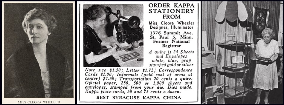
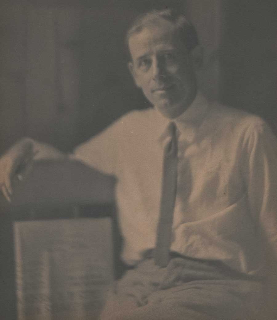
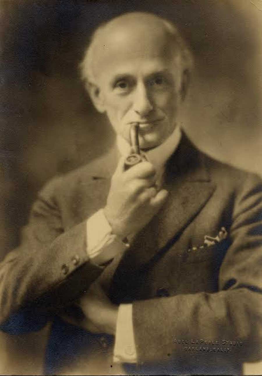
Left: This commercial portrait of Cleora Wheeler dates to the mid 1920’s. A cropped variant accompanied a review published on her California photographs in the February, 1926 issue of The Key written years earlier by Arthur L. Wilhelm on her 1922 St. Paul exhibition Atmospheric Studies. An excerpt: “There are many pictures that are romantic in feeling and others that have a rich poetic sentiment. The colors are soft and glowing or in the nocturnes are dimmed by the blue of night.” Photographic halftone courtesy: Helen Brainerd Lay Bookplate Collection, Mount Holyoke College Archives and Special Collections: Identifier: ms0048-s02-b02-f15-i010. Middle: Variations of this single advertisement for products bearing designs by Wheeler: letter stationary, place cards and matching envelopes among other things, illustrated with a small photographic halftone of the artist working at an embossing machine inside her St. Paul home studio, continued to appear with regularity in the back pages of the Kappa quarterly, The Key. Right: At 95 years of age, Cleora Wheeler was still very active in her Kappa Kappa Gamma fraternity. Here she is seen looking at a Ritual volume during an annual convention display. The original caption in the Fall, 1977 issue of The Key pointing out “that the cover had been hand-made by her!”.
1932: A historian at heart, Wheeler writes the chapter on Kappa insignia and compiles extensive illustrations included in the weighty volume: The History of Kappa Kappa Gamma Fraternity, 1870-1930 published this year.
1930-1940’s: Advertisements for products bearing designs by Wheeler: book plates, stationary, etc, continue to appear with regularity in the back pages of the Kappa quarterly, The Key.
1952: The artist receives Kappa’s Alumnae Achievement Award, with the following notice appearring in the October issue of The Key:
Cleora Clark Wheeler, former grand registrar and custodian of the badge for the Fraternity, also prepared the text and illustrations on insignia which appears in the History of Kappa Kappa Gamma. Miss Wheeler is listed in Who’s Who in America and also in Who’s Who in American Art. She has recently served as national chairman of design for the National League of American Pen Women and holds certificates of proficiency in engineering drafting and advanced engineering drafting from the University of Minnesota. As a designer and illuminator of books and other publications, Miss Wheeler has gained national recognition. Her bookplate designs are represented in many collections. Of her work Miss Wheeler says: “The public seems to be especially interested in the fact that I learned’ the trade of steel-die stamping. It is a highly specialized field in the factories of wholesale stationery companies. It usually takes a girl nine years, stamping 1000 impressions a day by hand, to become an expert.” (p. 244)
1967: The following article published in the Mid-Winter issue of The Key gives a good overview of Cleora Wheeler’s accomplishments later in life:
CLEORA WHEELER, X-Minnesota, is one of America’s most distinguished artists in the rare field of illumination and etching. Forty three of her exquisitely fine drawings prepared as steel engravings, copper intaglio plates, and etchings on zinc and copper are on file in the Library of Congress, and in 28 university, historical and city libraries. She is listed in Who’s Who of American Women, Who’s Who in America, Who’s Who in American Art, and Who’s Who in the MidWest.
She has long made book plates, plaques, dedicatory scrolls, and coats-of-arms for New York firms, on special order for customers so discriminating they realize the surpassing quality of her workmanship. She is an honored member of the National League of American Pen Women, serving as national chairman of design (1944-46), of Heraldic Art (1954-56), and of Inscriptions, Illumination and Heraldic Art (1964-66). The work of the print maker is a dedicated one, and Miss Wheeler has experimented with the quiet and esoteric medium (as did Durer and Rembrandt) until her form of expression is close to perfection. In 1960 she went to Santa Barbara to extract the secrets of an early artist named Monsen, who washed glass slides with purple color, using other colors on top, to bring out rich values of greens in mountain landscapes. Miss Wheeler does many fraternity designs, seals, book covers, and Christmas cards. Her work requires space, and the entire third floor of her home is her shop, with the basement used for storing supplies.
1950-1977: A single advertisement for products bearing designs by Wheeler: letter stationary, place cards and matching envelopes among other things, illustrated with a small photographic halftone of the artist working at an embossing machine inside her St. Paul home studio, continue to appear with regularity in the back pages of the Kappa quarterly, The Key.
1980: Wheeler dies. Her obituary appears in the Spring issue of The Key:
Cleora Wheeler Dies
Kappa records with sorrow the death of Cleora Clark Wheeler, Minnesota, at age 97. She died of pneumonia February 24, 1980. Her BA in engineering and engraving was from Minnesota and she studied color harmony at New York School of Fine and Applied Art now Parsons School of Art) and is listed in Who’s Who of American Women. She began her career as a designer of Christmas cards and illuminator of books and publications. Her bookplates are on file in Paris, the Library of Congress and in 30 other libraries. They were exhibited at the Smithsonian Institution from 1946-1964 and at the International Ex Libris Association of Congress, Elsinore, Denmark, in 1972. Miss Wheeler received numerous awards for her work and served as president, chairwoman and judge of several national art associations. She was a member of the National Society of Magna Charta Dames, a past president of the Minnesota branch of the National League of American Pen Women, a member of the International Bookplate Association, held various offices in the Daughters of the American Revolution and was a life member of the American Association of University Women. Born July 8, 1882, Cleora Wheeler was initiated October 9, 1899 and served Kappa her entire life. She was an active delegate to the 1902 convention and an alumnae delegate to the 1908 convention. She was Grand Registrar of the Fraternity 1904-1906 and Custodian of the Badge 1911-1918. She received Kappa’s Achievement Award in 1952 and was the recipient of her 75 year pin.
Addendum: Wheeler family History
Described as “one of the best preserved upper-class Victorian promenade boulevards in America“, the homes along Summit Avenue in St. Paul, Minnesota- including one owned by Cleora Clark Wheeler at 1376 Summit Ave. where she maintained her studio for decades, were individually described for their architectural significance as part of the 2003 online posting: Thursday Night Hikes: Western Summit Avenue Hike Architecture Notes, Part 2.
Significant biographical background for Clark, her mother, father and extended family are included with the summary. It was compiled from public sources as well as from the University of Minnesota, Northwest Architectural Archives by historian Lawrence A. Martin. The following is his summary. I have only confirmed and filled in several birth and death dates for Cleora’s mother and father that were missing and added a few paragraph breaks for purposes of style:
1376 Summit Avenue: Rush B. Wheeler House; Built in 1909 (Ramsey County property tax records and Sandeen; 1909-1910 according to Larson;) Early Modern Rectilinear in style; Clarence H. Johnston, Sr., architect.
The structure is a two story, 2496 square foot, eight room, five bedroom, two bathroom, one half-bathroom, stucco house, with a detached garage. The house was constructed at a cost of $5,500 (Sandeen; $6,000 according to Larson.) In 1916, Rush B. Wheeler was a member of the Minnesota Historical Society and resided at this address. The 1918 and 1924 city directories indicate that Mr. and Mrs. R. B. Wheeler and their daughter resided at this address. The 1930 city directory indicates that Mrs. Harriet S. Wheeler, the widow of Rush B. Wheeler, resided at this address. In 1934, Harriet Clark Wheeler, the widow of Rush Wheeler, and Cleora Clark Wheeler resided at this address.
Rush B. Wheeler (1844-1930,) the son of Orange H. Wheeler and Eve Tucker Wheeler, was born in South Butler, Wayne County, New York, graduated from the Cazenovia Seminary in New York in 1867, was a graduate of Yale University in 1871, moved to Minnesota in 1873, resided in Austin, Minnesota, from 1873 until 1888, read the law in 1876, was a member of the board of directors of the First National Bank of Austin, Minnesota, from 1880 until 1883, moved to St. Paul in 1883, practiced law, was engaged in real estate and loans, was a member of the St. Paul Chamber of Commerce from 1885 until 1900, was president of the Real Estate Exchange of St. Paul from 1894 until 1896, resided at 520 Summit Avenue in 1907, and officed at the Pioneer Press Building in 1907.
Rush Wheeler married Harriet S. L. Clark in 1876. Harriet Clark Wheeler was a graduate of the University of Minnesota. Harriet Clark Wheeler and Cleora Clark Wheeler were members of the American Association of University Women and the Women’s City Club of St. Paul.
Cleora Clark Wheeler (1882-1980) was born in Austin, Minnesota, graduated with honors from St. Paul Central High School and from the University of Minnesota, received art training at the New York School of Fine and Applied Art/Parsons School of Art, opened a studio at this address, was a renowned artist, a designer, and an illuminator of books and other publications who received certificates of proficiency in advanced engineering drafting from the University of Minnesota, was a well-known bookplate and Christmas card designer, was also an architectural photographer and poet, was a wedding invitation designer, and was an expert in steel-die stamping with widespread recognition.
Cleora Clark Wheeler received an Alumnae Achievement Award from the Kappa Kappa Gamma Fraternity in 1952, after she served as the Fraternity’s Grand Registrar from 1904 to 1906 and as its representative to National Panhellenic Conference from 1905 to 1906, after she prepared a Song Leaflet and Manual of Information for distribution at the 1914 Estes Park Convention, after she attended the Fourth Inter-Sorority Conference in Chicago, where she was instrumental in bringing about the decision that the fraternities had the power of vote on recommendations only, not the power to legislate and hold their entire membership to rules passed by single representatives, after she served for seven years as the Fraternity’s Custodian of the Badge, after she prepared the text and illustrations on insignia which appeared in the 1930 History of Kappa Kappa Gamma, and after she created an official bookplate of the Fraternity.
Cleora Clark Wheeler was a member of the National Society Magna Charta Dames and Barons, whose membership is based upon the existence of a direct lineal descent from one or more of the twenty-five Sureties for the Magna Charta or from a Baron, Prelate, Knight, or other influential person present on the field of Runnemede, England, in June, 1215, was a judge for national achievement awards and was National Chairman of Heraldic Art of the National League of American Pen Women, and was state curator of the Nathan Hale chapter of the Minnesota Daughters of the American Revolution.
Cleora Wheeler also was a substitute teacher in the St. Paul Public Schools. Cleora Wheeler had an exhibition of her bookplate work, entitled “Atmospheric studies,” at the St. Paul Public Library in 1922, under the auspices of the Saint Paul Institute. Cleora Clark Wheeler was a niece of Charles A. Clark (1865-1929,) who was a Spanish-American War veteran and was a resident of the Far East. Clark airfield in Honolulu, Hawaii, was named for Clark’s son, Harold Melville Clark (1890-1919,) who died in a airplane crash. Rush B. Wheeler (1844 -1930) and Harriet S. Wheeler (1853-1938) both died in Ramsey County. Cleora Clark Wheeler (1882-1980) was born in Minnesota, had a mother with a maiden name of Clark, and died in Ramsey County. (current owner information as of 2003 was also included but has been left out here) (4.)
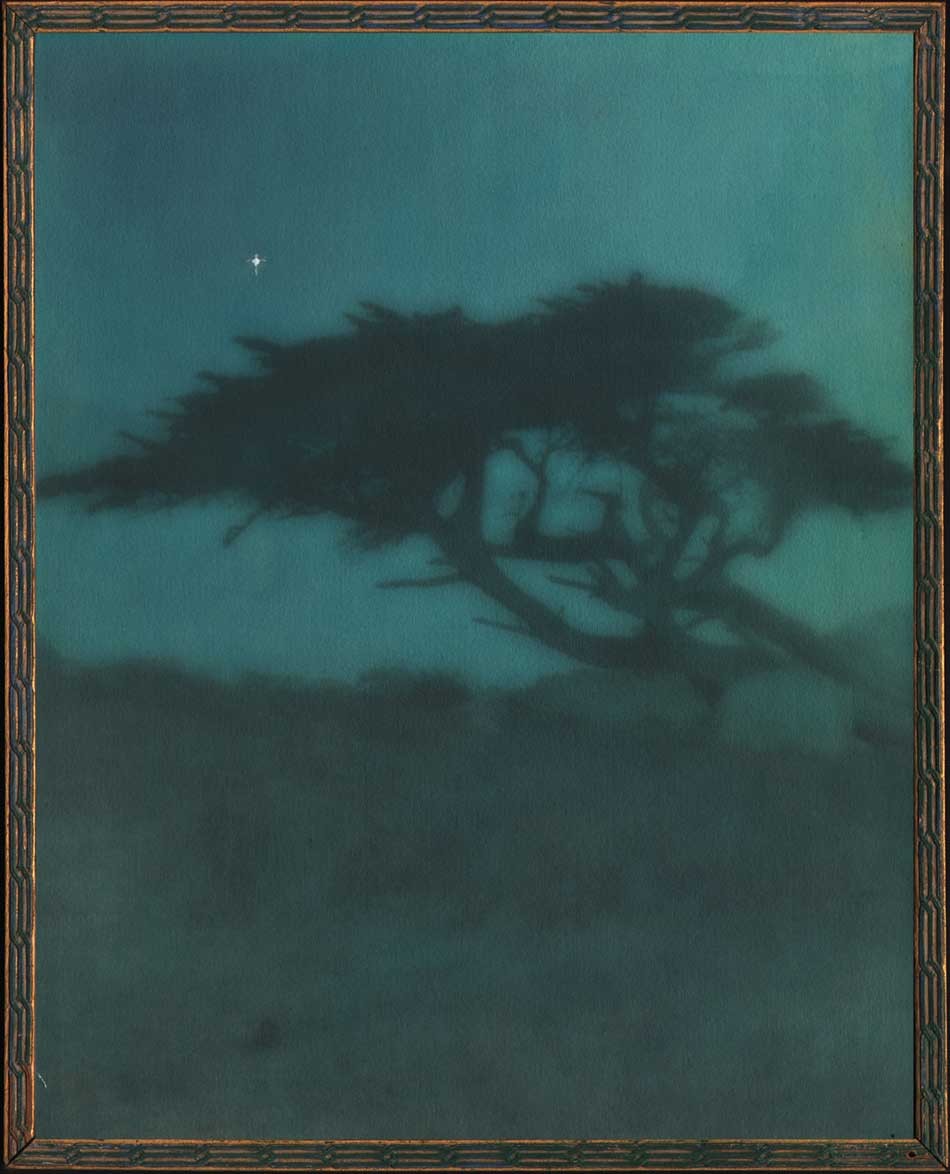
“Evening”: Cleora Clark Wheeler, American: 1882-1980. Hand-colored gelatin silver print ca. 1922: image: 23.6 x 19.8 cm; frame: 24.7 x 19.8 cm: Believed to have been taken around 1920, the medium of fine Japanese dyes in hues of blue, green and yellow were used to color this double-weight, rough surface print, the view originally taken in daylight but manipulated as a much darker print in the artist’s darkroom with the addition of a lone “twinkling” star added to the “night” sky. The variant daylight version is titled “Near Monterey”, and a photogravure version pulled on Japanese tissue can be seen on this website. “Evening” was catalogued as #43, appearing under the sub-heading The Seventeen-Mile Drive as part of the artist’s 1922 exhibit Atmospheric Studies: An Exhibition of the Work of Cleora Clark Wheeler, June 1-15, 1922. From: PhotoSeed Archive
Notes:
1. “All About the Fraternity Coat-of-Arms“, Excerpt from January 2006 Historically Speaking, by Kay Smith Larson, Washington, History Chairman 2002-2006, excerpted in This is Kappa blog: accessed January, 2018.
2. The Journal of the Association of Collegiate Alumnae: Ithaca, NY: June, 1918: pp. 704-05
3. Citation #19: St. Paul Pioneer Press, Jan. 2, 1967, p. 13; Crump, Minnesota Prints, 173. Moira F. Harris: Season’s Greetings from Minnesota: Minnesota Historical Society magazine Winter 2011-12
4. Excerpt: Thursday Night Hikes: Western Summit Avenue Hike Architecture Notes, Part 2: Observations on Architectural Styles: Western Summit Avenue Hike Assembled by Lawrence A. Martin. Webpage Creation: October 20, 2003.