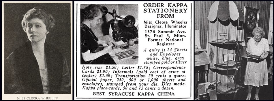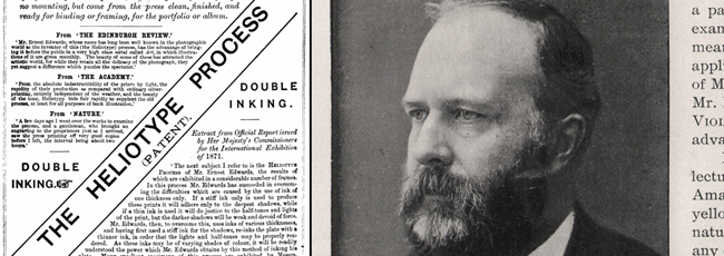
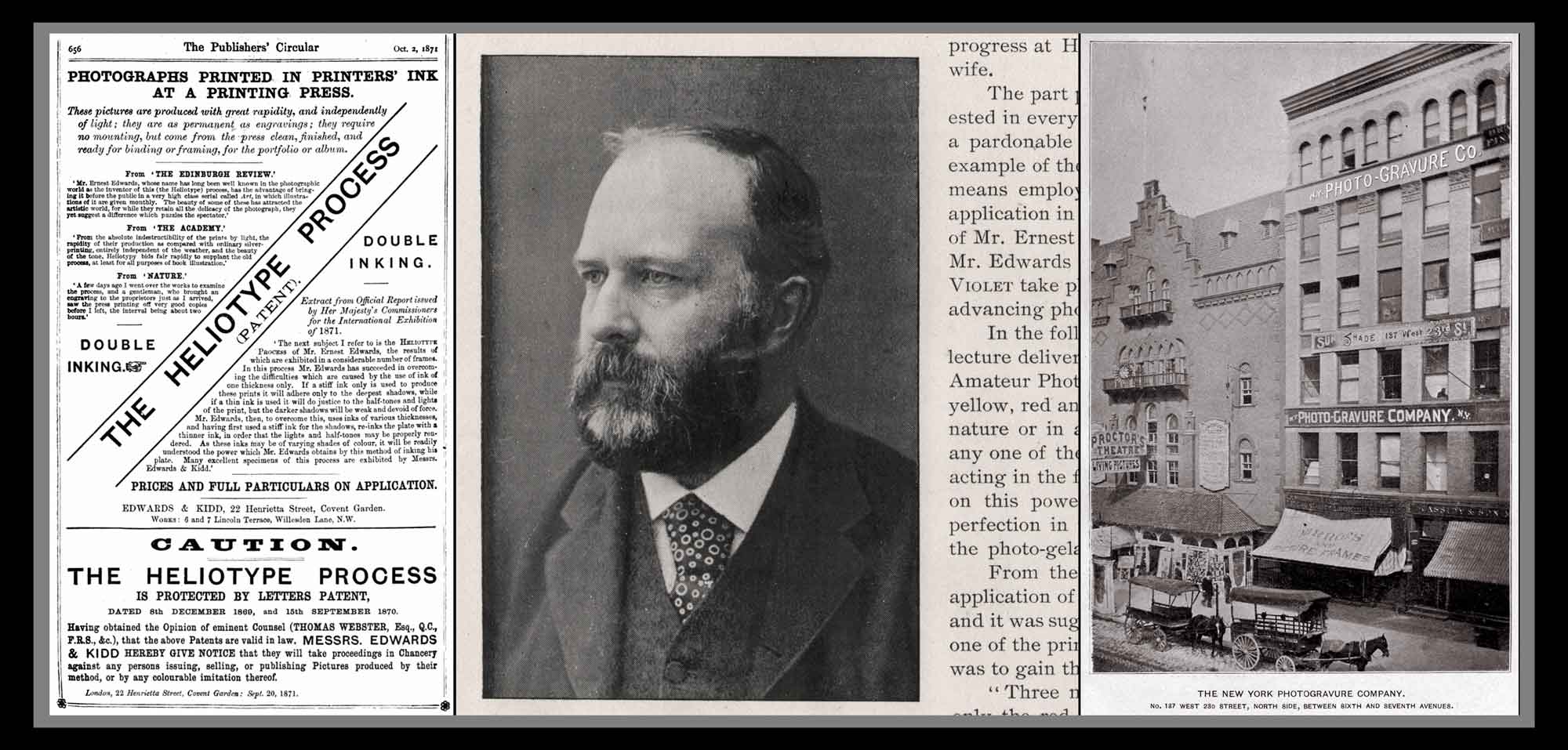
Meet Ernest Edwards, Unsung Pioneer of 19th Century Photo-Mechanical Printing: L: Advertisement in The Publisher’s Circular, Oct. 1871 for The Heliotype Process, an important collotype variant invented by Ernest Edwards in 1869. (web) M: Portrait of Ernest Edwards from the 1896 New York University Violet yearbook. (PhotoSeed Archive) R: Edward’s N.Y. Photo-Gravure Company, located at 137 West 23rd Street, New York City, opened in late 1889. Located next to Proctor’s Theatre, it occupied the top five floors of the six-story building. (web) Born in England, Ernest Edwards (1836-1903) was an important printer, publisher & photographer. He succeeded in commercializing a variant of the collotype printing process he called the Heliotype after inventing & patenting it in 1869. He brought the process to America in 1872 when the rights were purchased by Boston publisher James Osgood. He later went to New York City where he founded the N.Y. Photo-Gravure Co. in 1885. The company in different forms lasted until 1896, succeeded by Edwards as the Photogravure and Color Company. Others took the reins after his 1903 passing, and would continue to print fine art plates into the 1960’s.
I’ve been interested in Englishman Ernest Edwards (1836-1903) from my early years of collecting photography. A printer, publisher, inventor and most certainly a photographer throughout his remarkable life, Edwards and his many printing firms— from England to America—are responsible for elevating the public interest in photography as an art form in the latter 19th Century.
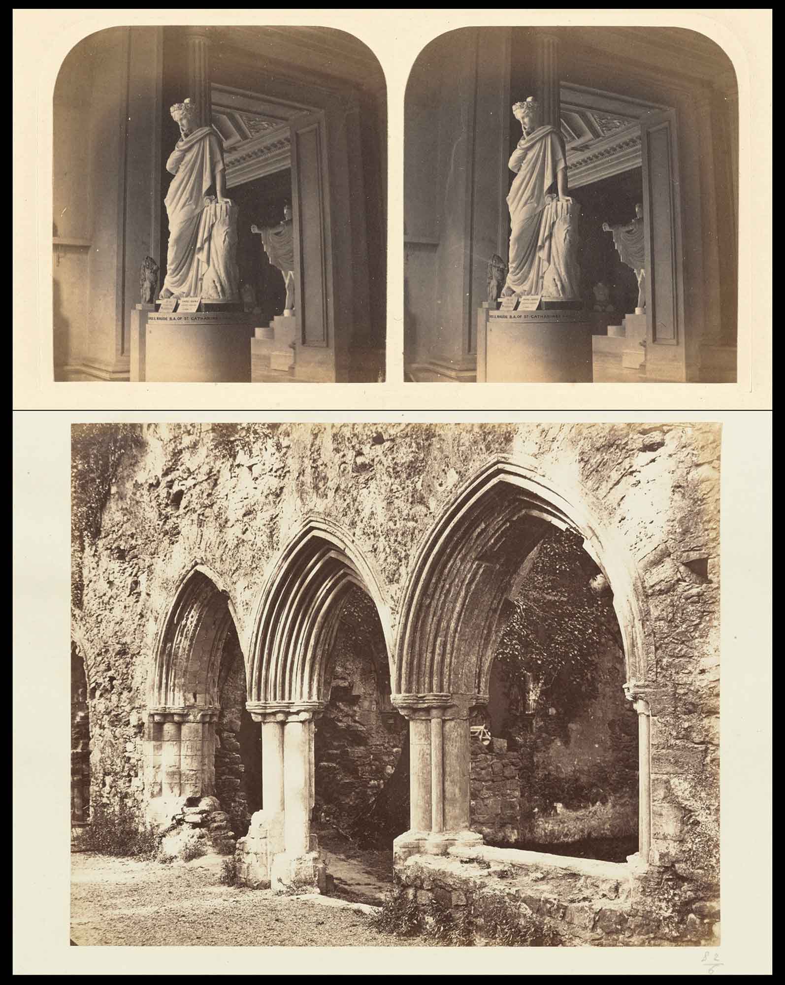
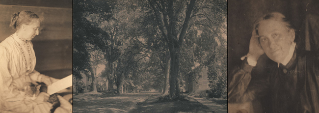
Scenes from a University: Edwards Comes into his own as Photographer: Top: Statuary was one subject Ernest Edwards trained his camera at after matriculating at the University of Cambridge in 1856. This albumen silver stereograph titled: Statue of Silence, was included in The Stereoscopic Magazine, 1859–1862. It also appeared in the 1862 publication “Photographs of Various Views” published for the Amateur Photographic Association. Featuring 109 works by Edwards, the editors commented: “A statue of Silence,” in the Fitzwilliam Museum, is a charming photograph of a charming piece of sculpture. It is illuminated chiefly by a side light, and in the point of view selected, the camera is directed to the shadowed side of the figure; the attempt is a dangerous one, but the result is very beautiful when it is successful, as it is here. The vignetting is very judiciously managed.” (Getty Museum) Bottom: Elected a member of the London Photographic Society late in 1862, The Photographic News said of this photo, a view of Netley Abbey: “Mr. Ernest Edwards sends some exceedingly fine pictures, of which we may mention one of King’s College Cambridge, and another of Netley Abbey, as especially fine and worthy of attention.” (Getty Museum collection: albumen silver print: “View of Arches and Courtyard”)
But let history speak loudest. After leaving England and relocating to Boston in 1872 to set up and run The Heliotype Printing Company, he would spend the final 31 years of his life in America, and it’s here where he left his biggest legacy. The argument I can make for this are the many thousands of photographs—the majority photo-mechanically printed in ink—which can still be found in books, and the many collections of printed photographs found elsewhere published during this time. The collectors who continue to seek out this material in the present are testament to its continuing historical relevance.
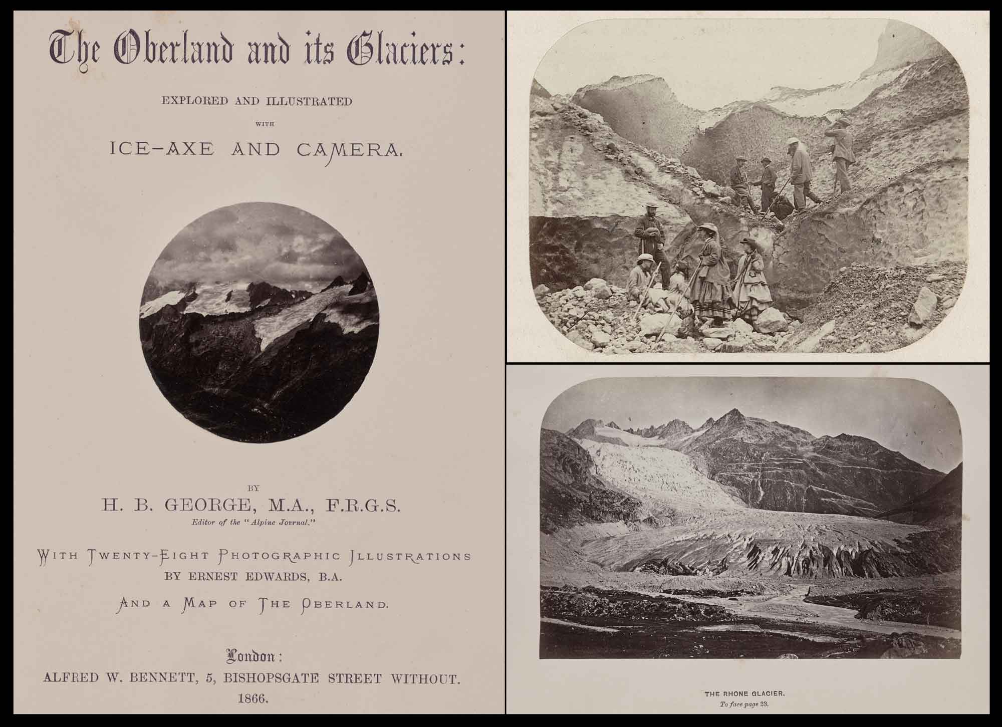
Edwards, the Alpine Photographer: Original photographs by Edwards illustrated several volumes from the 1860’s, including “The Oberland and its Glaciers: Explored and Illustrated with Ice-Axe and Camera” published in 1866. Alpine scenes of the Bernese Alps in Switzerland. L: Title page with inset photo: Peaks on a Cloudy Day. Top R: On the Unter Grindelwald Glacier. Bottom R: The Rhone Glacier. (All albumen silver prints: Getty Museum)
But even with this evidence, Edward’s earns only a single mention in Joseph Maria Eder’s landmark 1945 book, the History of Photography, the same volume photographic historian David A. Hanson describes as “the most extensive history of photomechanical printing published”. With this post, I’m hoping to finally give Ernest Edwards the proper credit he’s due in the history of 19th Century photomechanical printing: permanent ink photographs—the majority being gelatine and photogravures— produced by his ground-breaking printing establishments on both sides of the Atlantic.
As it turned out, his last publishing venture, the Photogravure and Color Company, incorporated in 1897 after his New York Photo-Gravure Company went bankrupt in 1896, would outlive Edwards into the sixth decade of the 20th Century. That enterprise, first under the leadership of Karl Arvidson (1859-1922) and then Austrian immigrant Charles Furth, (1872-1942) continued to set higher standards in hand-pulled photogravure and color printing, with the highlight being the plates Furth printed for Paul Strand’s Photographs of Mexico in 1940.
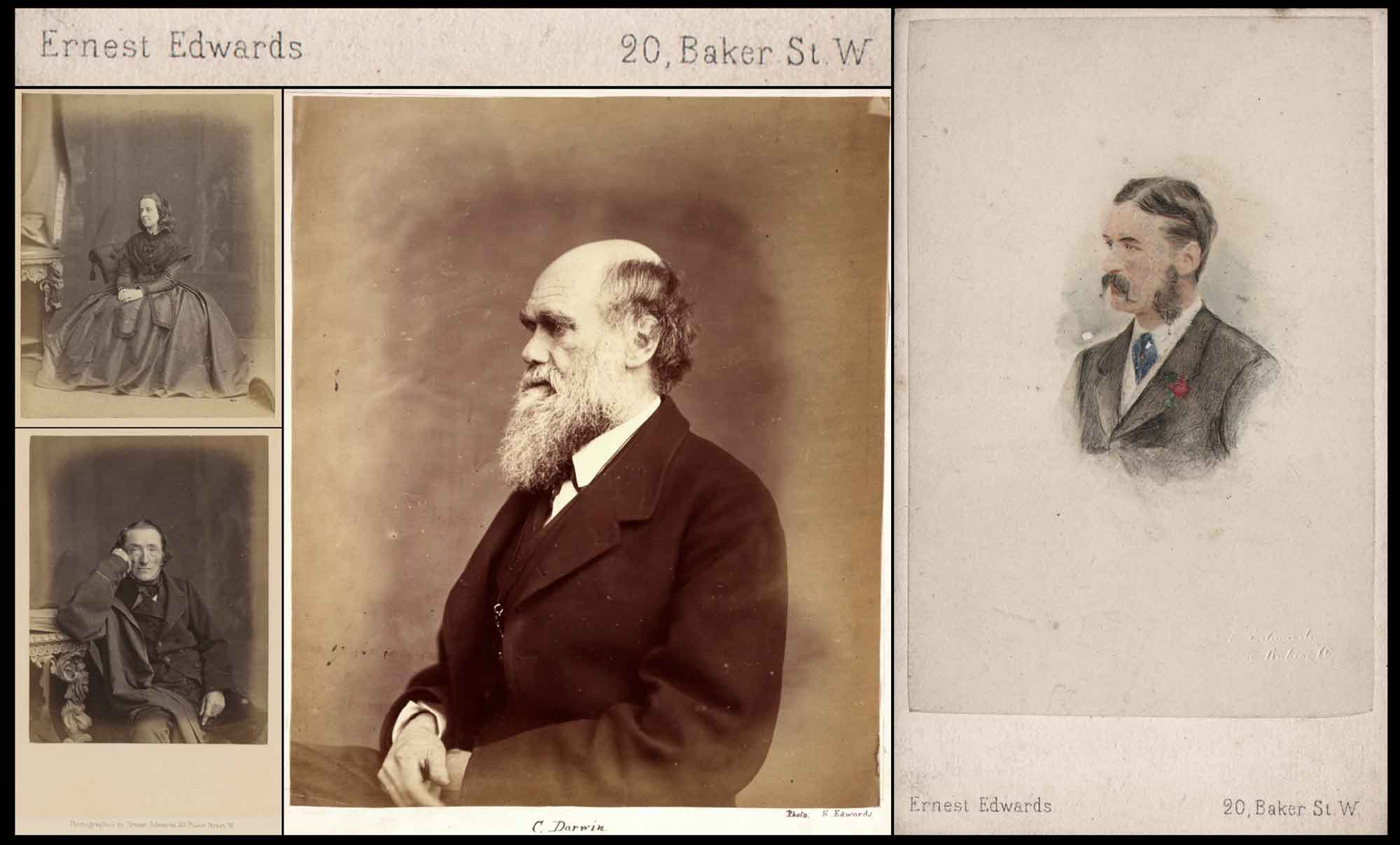
Studio Work: Men & Women of Eminence: After completing his B.A. degree from the University of Cambridge in 1863, Edwards established his first photo studio in London, at 20 Baker Street. In 1867, the studio continued as a partnership with Cyril Mangin Bult (1842-1911)— “Edwards & Bult” until 1869. TL: Bessie Rayner Parkes: 1829-1925, prominent English feminist, campaigner, poet & advocate for women’s rights in the Victorian era. Albumen print published in 1866: published: Portraits of Men of Eminence in Literature, Science, and Art, with Biographical Memoirs, vol. 5. BL: John Edmund Reade, 1800-1870, English poet and novelist, albumen print published in 1867: (same: vol. 6) (both: Rijkmuseum, Amsterdam). Middle: Charles Darwin: 1809-1882, English naturalist, geologist, and biologist, widely known for his contributions to evolutionary biology. Albumen print by Ernest Edwards, 1865-1866. (National Portrait Gallery, London) R: This hand-colored cdv portrait by Edwards of an unknown gentleman bears his London, Baker St. studio imprint. Could it show the artist himself? Mounted albumen-silver print 8.7 x 5.8 cm on 10.4 x 6.2 cm card, blindstamp in lr image area. (PhotoSeed Archive)
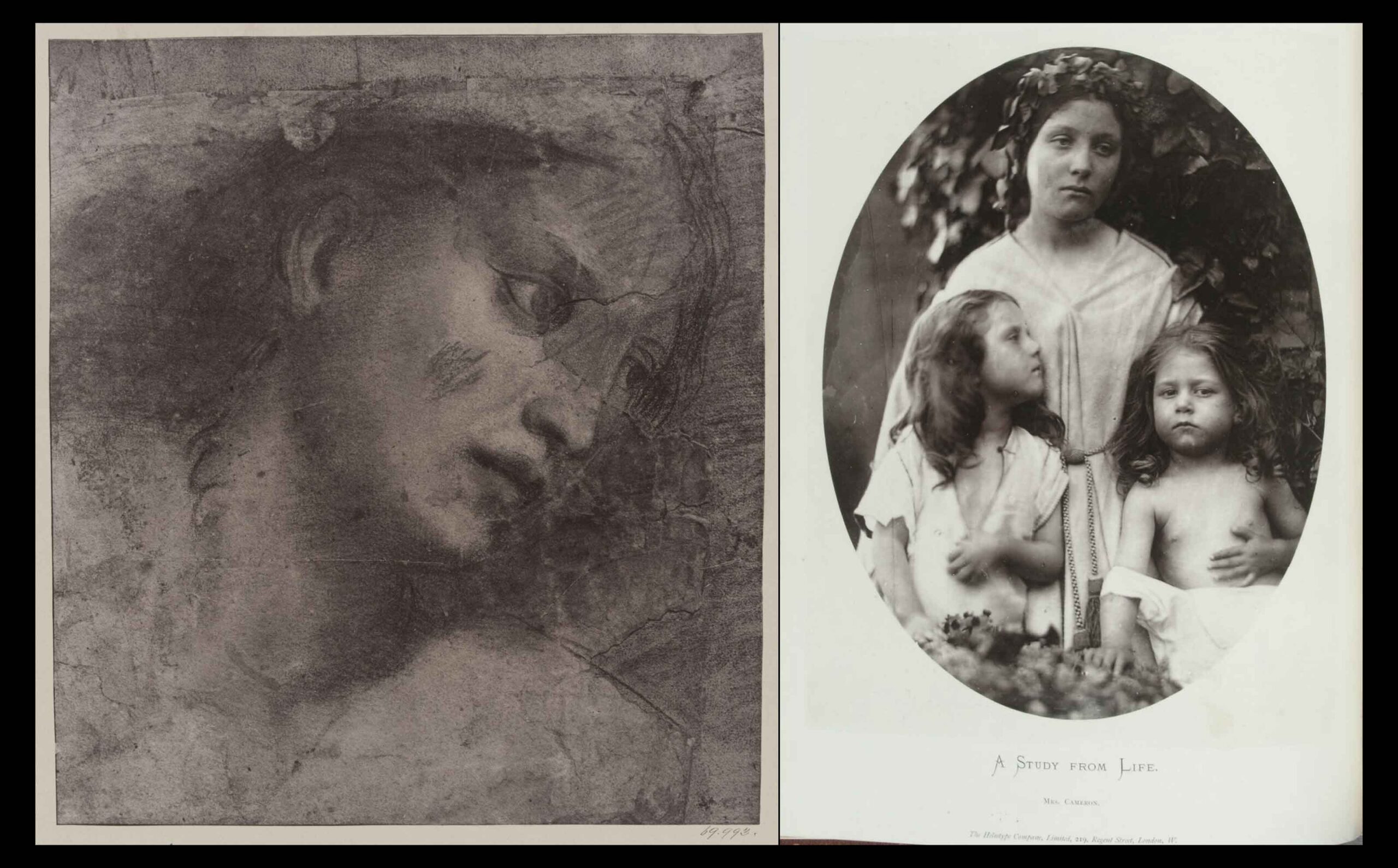
Carbon & Heliotype Masterpieces: In 1868 Edwards & others established the Autotype Printing and Publishing Co. in London after purchasing the patent to this permanent carbon transfer process from Joseph W. Swan. Edward’s later refinements to autotype brought about his own patent: a variation of collotype he called the Heliotype, in late 1869. Left: Carbon print by Edwards & Kidd titled “Head of a Woman” credited to Raphael (1483-1520) from a set of photographs from the University Galleries at Oxford, 1870. (V&A Museum, London) Right: Heliotype plate, February, 1872: From: Art, Pictorial and Industrial, Vol. II: “A Study From Life“, Julia Margaret Cameron, published by The Heliotype Company, Limited, London. (David A. Hanson Collection of the History of Photomechanical Reproduction | Clark Art Institute)
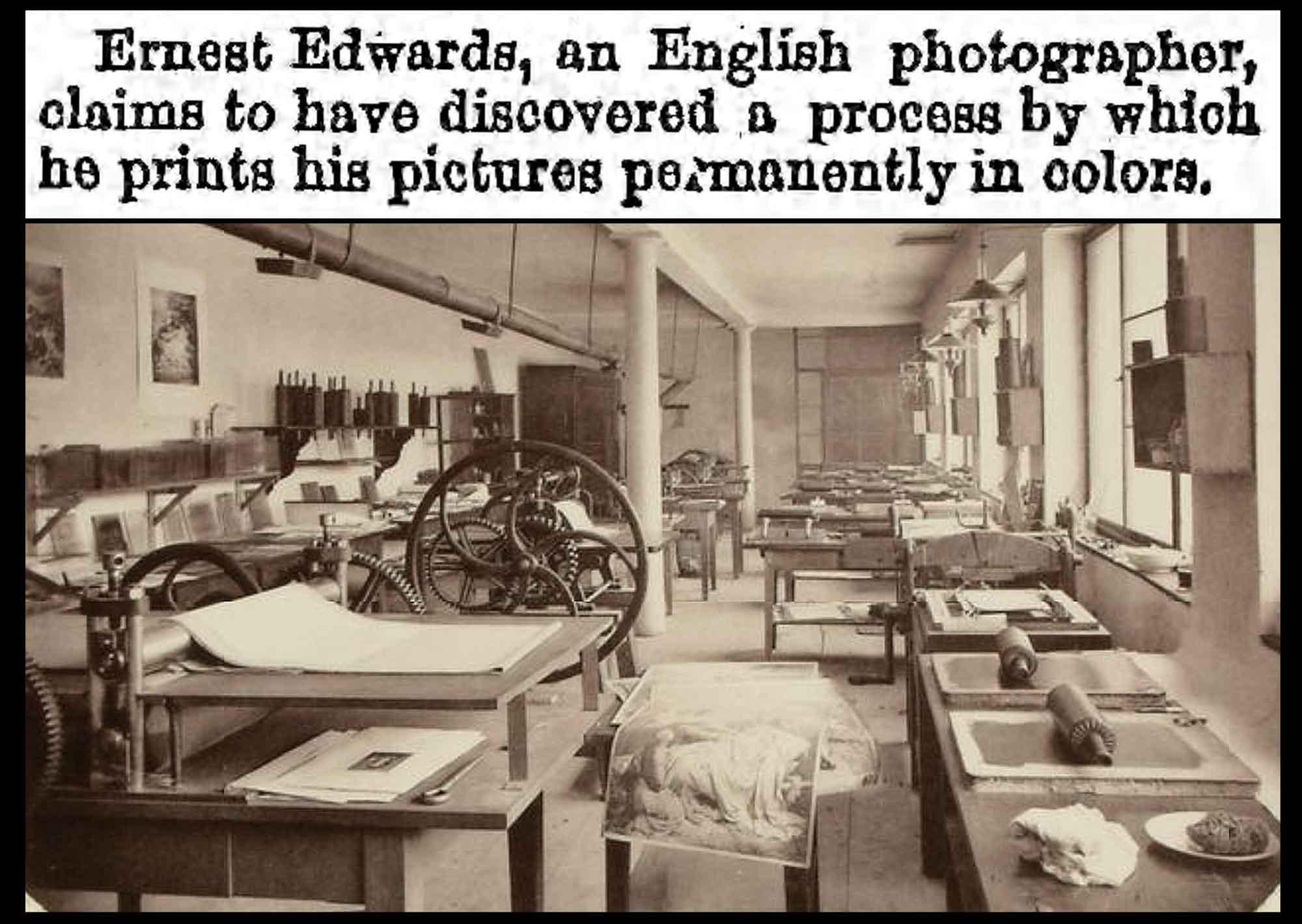
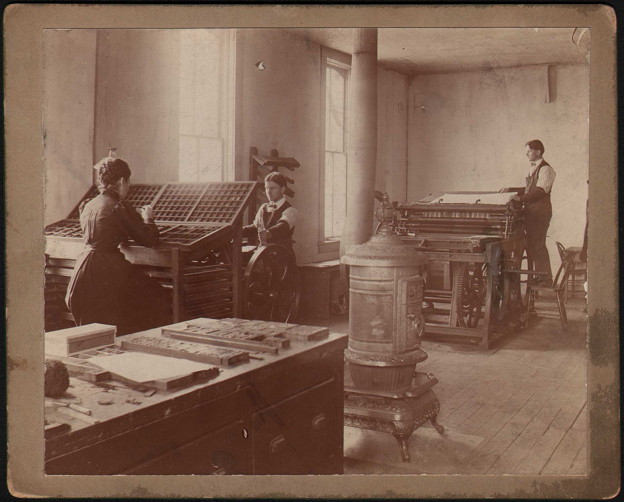
A Working Collotype Atelier: Top: On June 7, 1869, The Brooklyn Daily Eagle carried this small notice that Edwards had “discovered a process by which he prints his pictures permanently in colors.” Subsequently named the Heliotype, the notice most likely originated for Edwards U.S. patent on May 25, 1869 for: Improvement in Photographic Printing. (see timeline) Bottom: Vintage photographs showing working spaces (ateliers) for photo-mechanical processes are rare. This example shows some of the same equipment that might have been found in his London printing firm, the Heliotype Company. (1870-2) Title: ALBERT-TYPE, A New Photo-Mechanical Printing Process: this example of Herr Albert’s new process, showing the interior of his printing establishment, is presented to the readers of the Photographic News, June 24, 1870. (Hanson Collection Catalog)
With this archive’s focus on artistic photography, I will be concentrating on those so-called works “from life” & “from nature”—largely 19th Century terms— captured by photographers in the field and elsewhere. The reality for Edwards however was these types of photomechanically printed photographs were only a small portion of his business. Photographs of artwork and paintings meanwhile, economically printed in various processes but also in his company’s namesake process of hand-pulled photogravure, were a larger part of his business, in addition to the job printing which paid most of the bills. An 1894 house advertisement in Sun & Shade, Edward’s lavish magazine subtitled by the firm as an Artistic Periodical, called attention to these as SPECIALTIES published by the New York Photogravure Co.: Menus, Souvenirs, Calendars, Works of Art, Book Illustrations, High Class Catalogues. (1.)
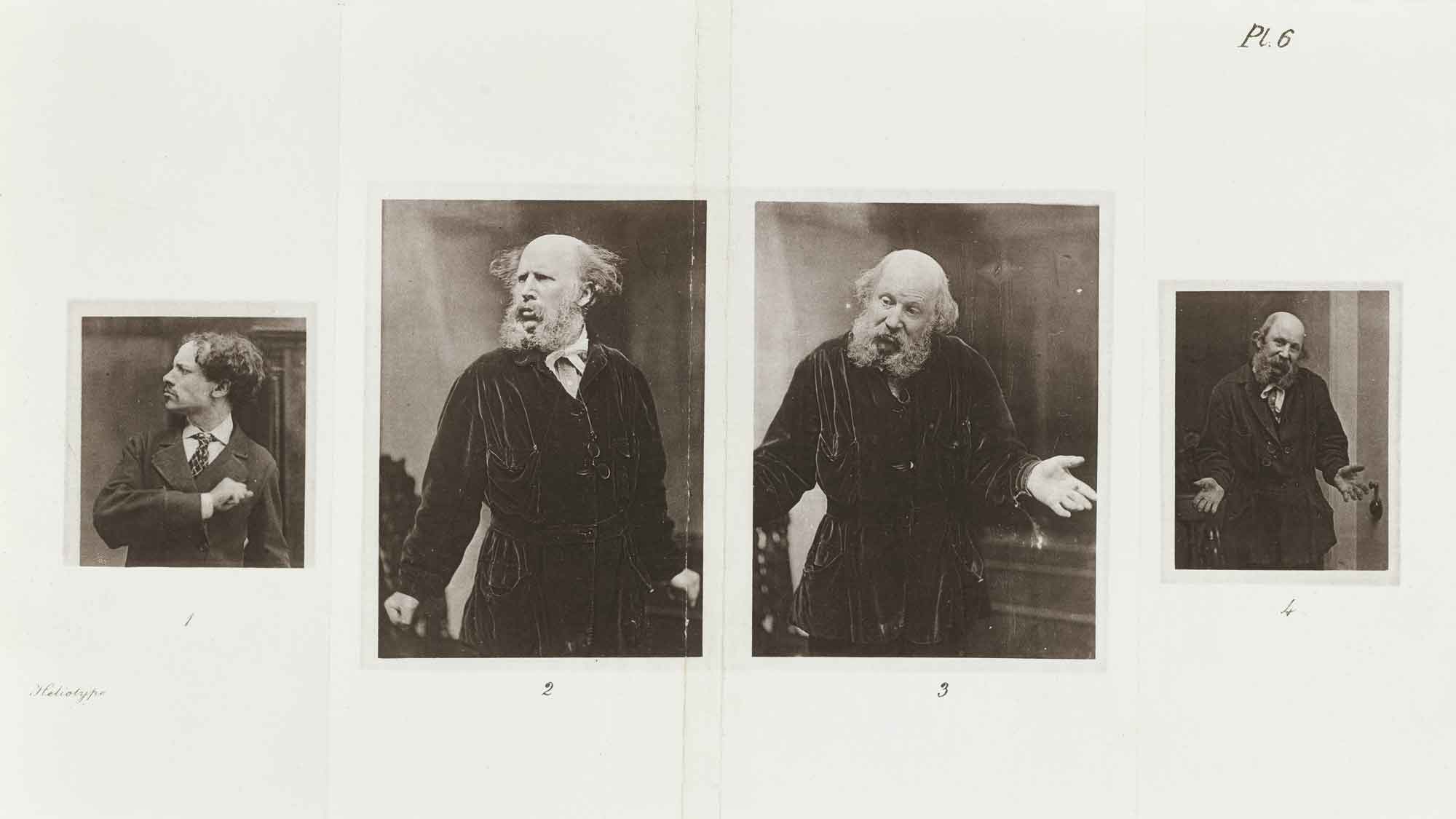
Heliotype Expressions: For the 1872 volume The Expressions of Emotions in Man and Animals, by Charles Darwin, Heliotype was used for the printing of 30 photographs gathered as composite page spreads. Victorian photographer Oscar Gustave Rejlander (1813-1875) contributed 19 of these photographs, including six self portraits: three of which are seen in this spread at middle and right. (2. 3. 4.) This landmark work has been described by American psychologist Paul Ekman (1934-2025) as “the first pioneering study of emotion and in my view should be considered the book that began the science of psychology.” When the first edition of 7000 copies appeared in late 1872, the great success of the volume gave credibility to the Heliotype process for book publishers. (credit: web)
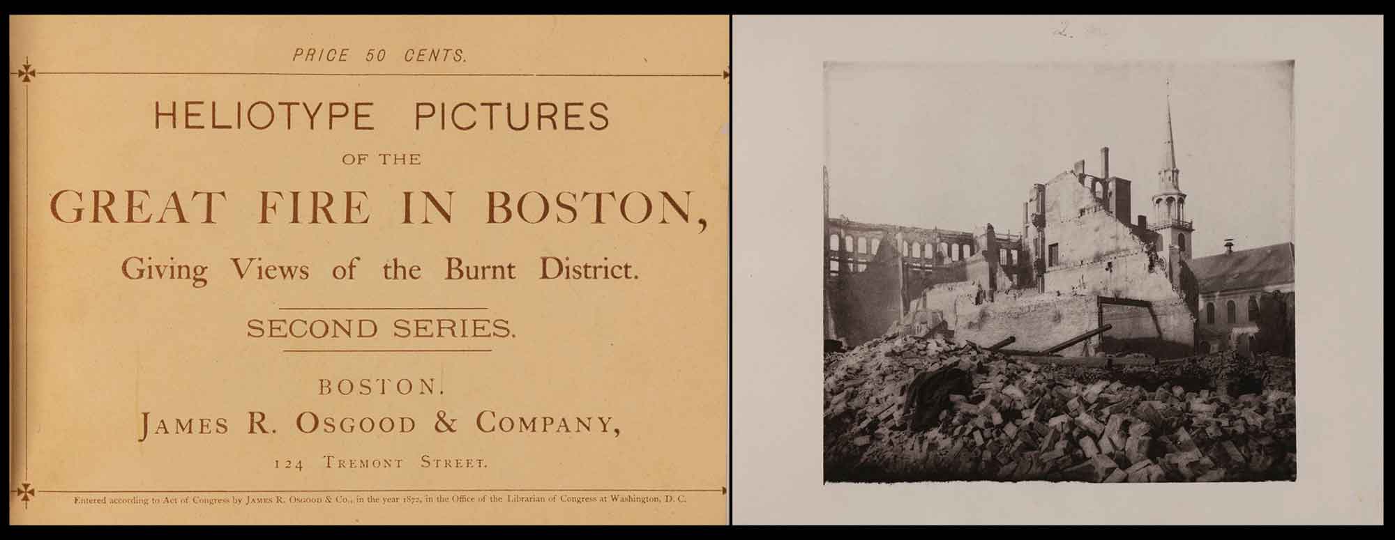
Edwards First Heliotype Publication Printed in America: Ernest Edwards and wife Charlotte immigrated to America from England, arriving in Boston on October 16, 1872. Boston publisher James R. Osgood had purchased the rights to Heliotype for America, with the understanding Edwards would set up a print shop for him and work the process. Although the Osgood firm would escape the flames, the largest fire in the history of Boston struck three weeks later, on November 9. Edwards, writing in 1876: “notwithstanding the interruptions to business caused by the great fire and subsequently by the panic”, had set up the new Heliotype Company “in one room, with one press” at 124 Tremont street. His first publication later that year being a bound collection of plates priced at 50 cents titled: HELIOTYPE PICTURES of the GREAT FIRE IN BOSTON, Giving Views of the Burnt District. Left: Title Page. Middle: “The Transcript Office and the Old South, From Hawley Street.” (Heliotype plate by unknown photographer-possibly Edwards) (Credit: Gardner Museum, Boston)
To succeed in business, Edwards was foremost a shrewd marketer who advertised extensively in the trades and was not hesitant in defending his interests in court. These were particularly good attributes to have in order to survive the competitive and ever-changing 19th Century publishing industry, although indebtedness combined with the general lack of trade would bankrupt his Photogravure Company by 1896. A contributing factor was his 1895 lawsuit against English photographic pioneer Eadweard Muybridge for nearly $5,000 after not receiving contractual payment for work performed in the wake of his famous 1887 Animal Locomotion series.
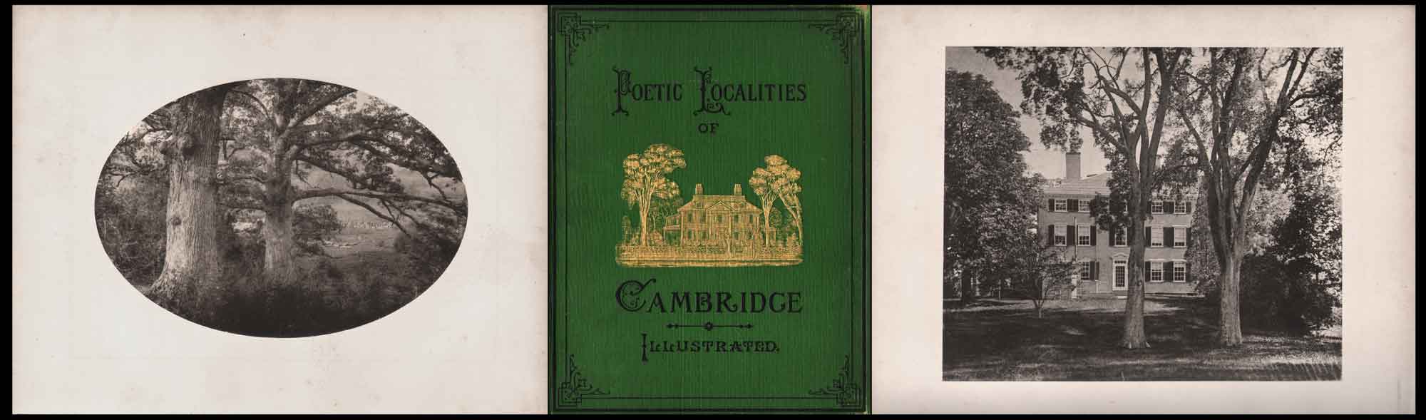
Poetic Localities of Cambridge, published in 1876 by James R. Osgood And Company in Boston, was edited by William James Stillman, 1828-1901, an American painter, journalist, art critic, and photographer. Stillman’s photographs had first appeared printed in Autotype (carbon) by Edwards in the 1870 folio The Acropolis of Athens. Poetic Localities features 12 Heliotype plates from photographs of Cambridge, MA scenery. Left: “The Oaks, Waverley”, heliotype facing p. 29, 11.8 x 17.0 | 19.5 x 24.5 cm. Middle: The green cloth book cover features an illustration of Henry Wadsworth Longfellow’s Cambridge home embossed in gilt. Today, the home is known as Longfellow House–Washington’s Headquarters National Historic Site. Right: “Al Fresco”, heliotype illustrating poem “From “AL FRESCO.” facing p. 39 by James Russell Lowell, 15.0 x 17.9 | 19.5 x 24.5 cm. Depicting Elmwood, built about 1767, it was the home of Lowell, born here in 1819. From: PhotoSeed Archive
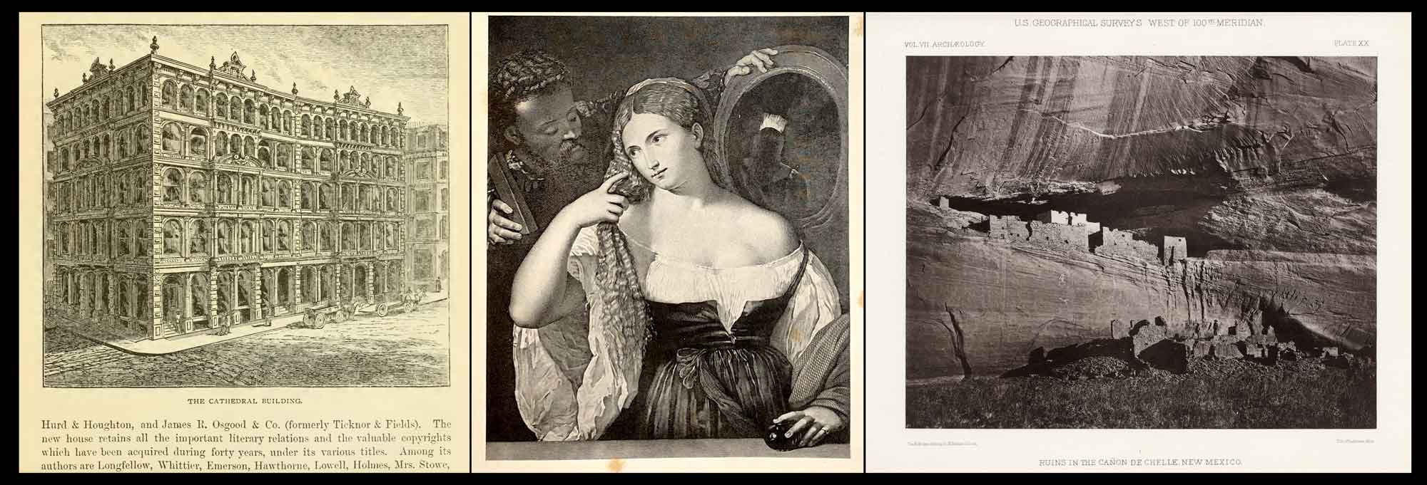
A Boston Home for Heliotype: Left: The Cathedral Building, at 220 Devonshire Street in Boston, was described in 1878 as “a large and handsome iron structure on Winthrop Square, occupying the consecrated site of the ancient Cathedral of the Holy Cross,”. The third location for Edward’s Heliotype Company, it occupied the upper floor of the building from 1876 to Dec. 28, 1879, when fire completely destroyed it. The American Bookseller in early 1880 said: “The loss of the Heliotype Printing Company is complete, their valuable negatives, plates, stones, and presses being all destroyed; yet they are ready to receive orders for new work.” (credit: Boston Illustrated, 1875) Middle: Reproduction of artwork in Heliotype was a specialty of the Boston company. This example: Woman with Mirror, is from an original 1837 engraving: “La Maîtresse du Titien”, by François Forster. It derived from Titian’s original oil painting, ca. 1515. Reproduced: The Titian Gallery; A Series of Twenty-Four of the Most Renowned Works of Titian, Reproduced in Heliotype; With a Sketch of the Life and Works of the Artist, Boston: James R. Osgood and Company, 1877. (credit: web) Right: Originally an 1873 albumen print by American photographer Timothy O’Sullivan, (1840-1882) the heliotype RUINS IN THE CAÑON DE CHELLE, NEW MEXICO, (known as the Casa Blanca) was published by the Heliotype Company and appeared as plate XX in Vol. VII of the U.S. Geographical Surveys West of 100th Meridian, published in Washington, D.C. in 1879 by the Government Printing Office. (credit: David Rumsey Historical Map Collection)
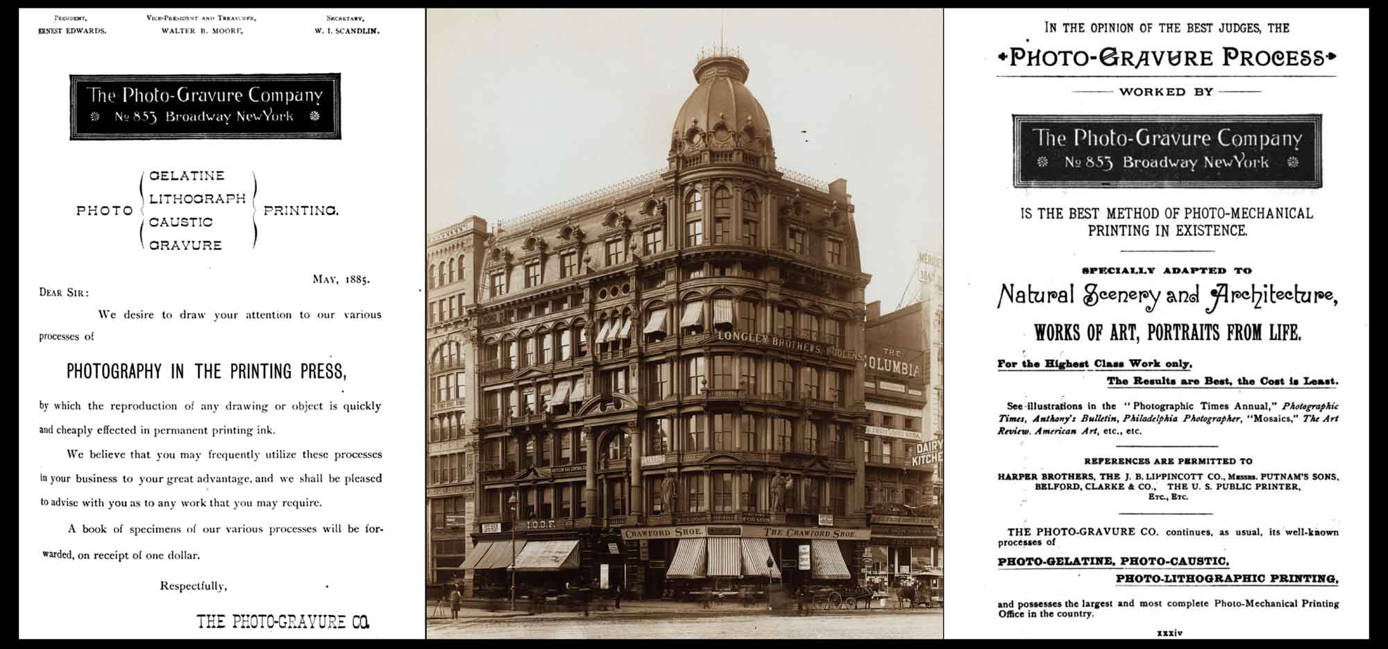
Reinvention: The Photo-Gravure Company, New York City: Middle: Showing the Domestic Sewing Machine Building at 853 Broadway ca. 1898, this was the first location for the offices and “art parlors” of The Photo-Gravure Company when first opened in March, 1885. An early 1888 ad stated the parlors could be “easily and quickly reached by elevator from the Broadway entrance of the building. A collection of Photo-Gravures and representations of all the newest and best works of art and current events of interest will be found here in a variety of forms,”…(credit: New York Public Library) Left: This early business solicitation dated May, 1885 for the Photo-Gravure Company appeared in Anthony’s Photographic Bulletin. Interestingly, it calls out “PHOTOGRAPHY IN THE PRINTING PRESS”, language Edwards first used to promote his own invention, the Heliotype process, when introduced in England around 1870: “by which the reproduction of any drawing or object is quickly and cheaply effected in permanent printing ink.” Right: After several years in business, a new ad appeared in Anthony’s and other publications drawing attention to illustrations published in The Photographic Times, Anthony’s Bulletin, the Philadelphia Photographer and others: “In The Opinion of The Best Judges, the PHOTO-GRAVURE PROCESS Worked by The Photo-Gravure Company No 853 Broadway New York Is The Best Method of Photo-Mechanical Printing in Existence”. (ads: Google Books)
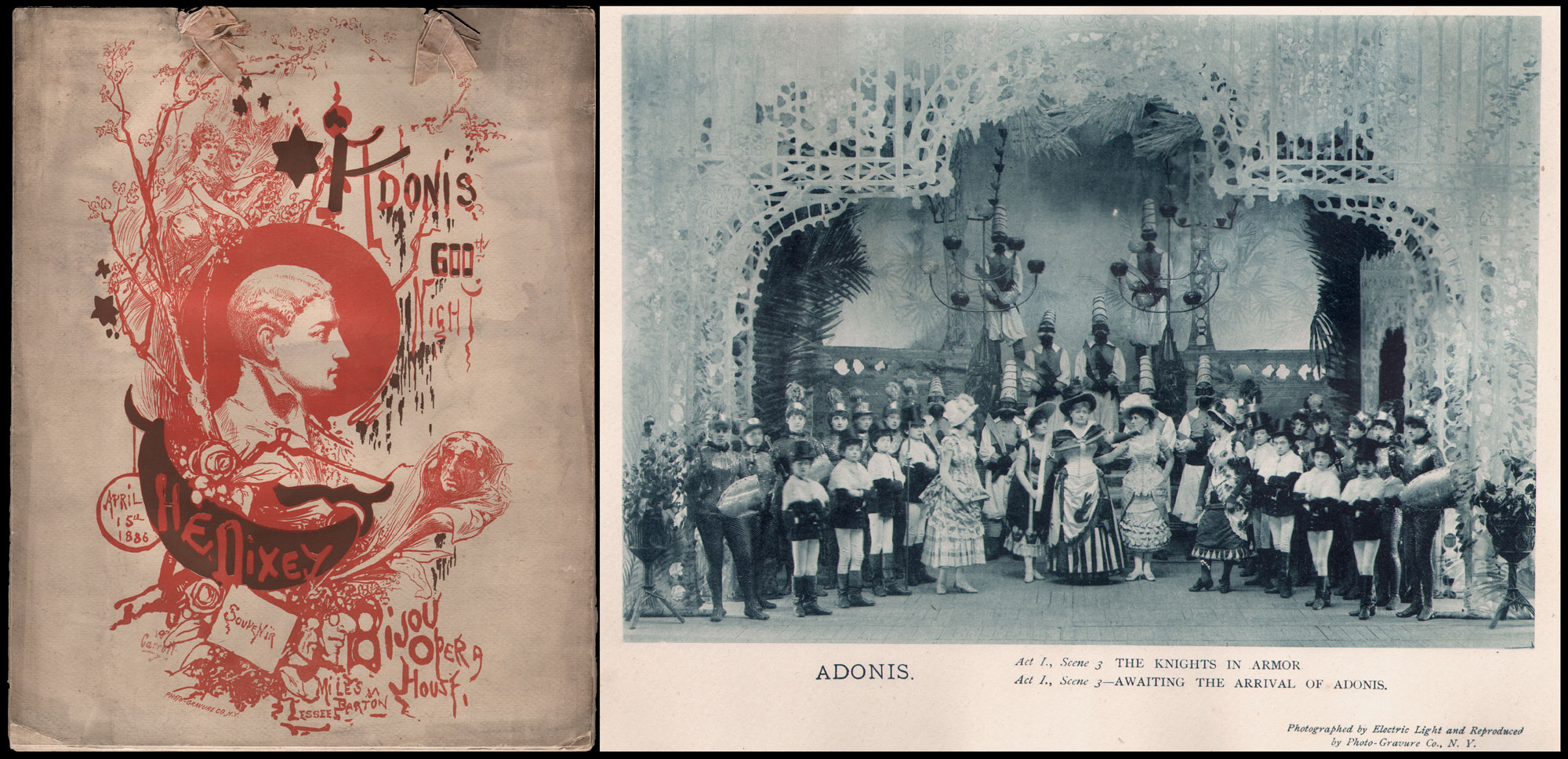
Theatrical Souvenir Program by Photo-Gravure Co.: “Adonis, 600th Night, April 15th 1886, H.E. Dixey.” The burlesque musical Adonis celebrated the 600th consecutive performance by Boston’s Henry E. Dixey in the lead role at Bijou Opera House in New York City, a record at the time. Ribbon-tied program, 35.0 x 27.5 cm, 20 pages. Front and rear covers with six stage photographs (on 3 plates) “Photographed by Electric Light”. Additional plates in monochrome—mostly featuring Dixey—credited to W. Carroll. (possibly British artist William Joseph Carroll, 1842-1902) Left: Cover, two-color lithograph with cameo drawing of Dixey at center & Photo-Gravure Co. N.Y. credit at LL margin. Right: Act 1., Scene 3: “Awaiting The Arrival of Adonis“, blue-tinted photo-gelatine print, 13.8 x 20.1 cm: Photographed by Electric Light and Reproduced by Photo-Gravure Co., N.Y. A stream of “bread & butter” print jobs that paid the bills—including theatrical show cards and playbills—were a mainstay for the Heliotype Printing Company under Edwards. A particularly nice example was a program celebrating the grand opening of the Boston Bijou Theatre, Dec. 11, 1882, now held at the Victoria & Albert Museum. With Edwards’ move to New York City in 1885, his income stream from theatre productions would increase for his Photo-Gravure Co. in the U.S. theatre capitol. His art periodical Sun & Shade later commissioned portraits of prominent American players. Perhaps not surprisingly, Henry Dixey also featured in the role of Lord Chancellor in the 1882 Bijou opening. From: PhotoSeed Archive
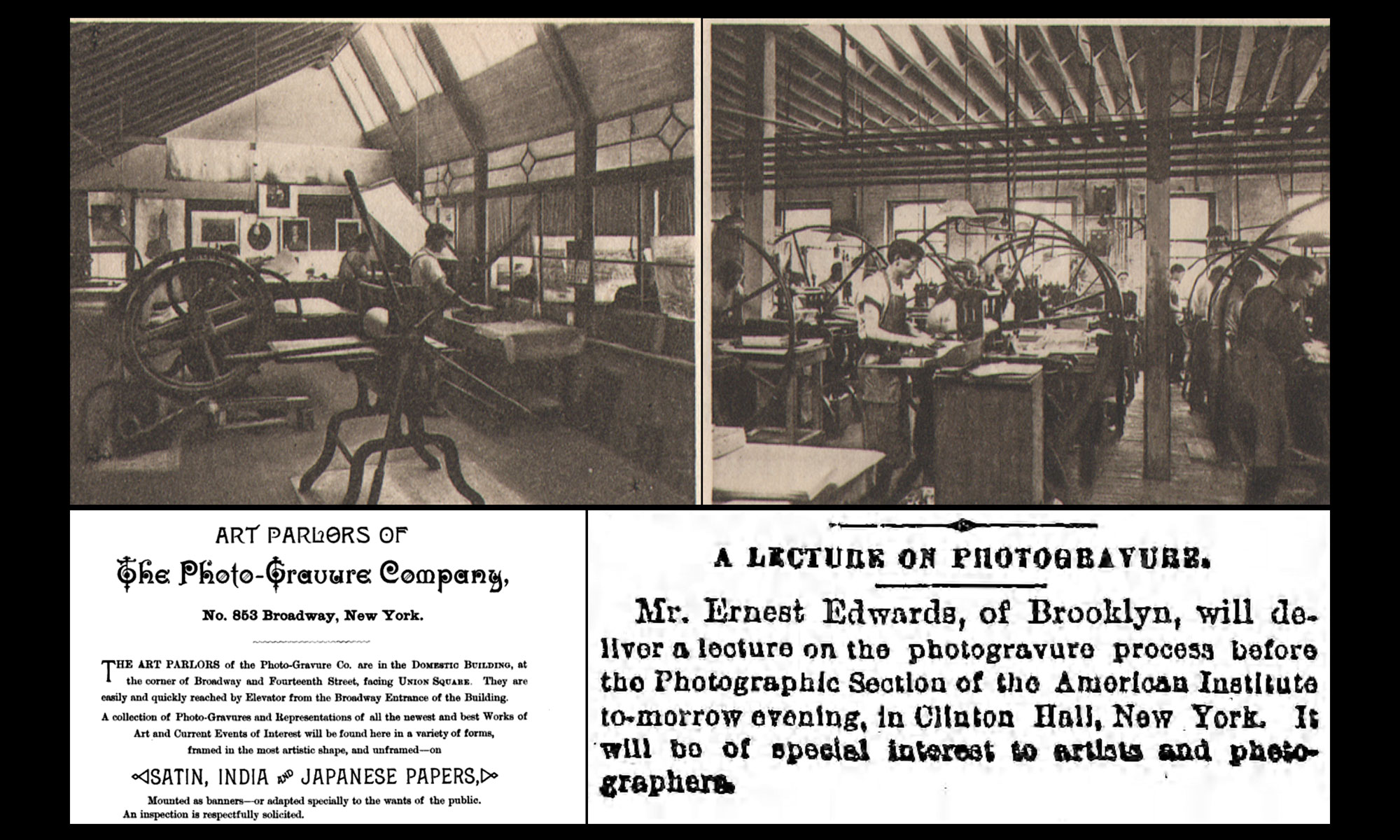
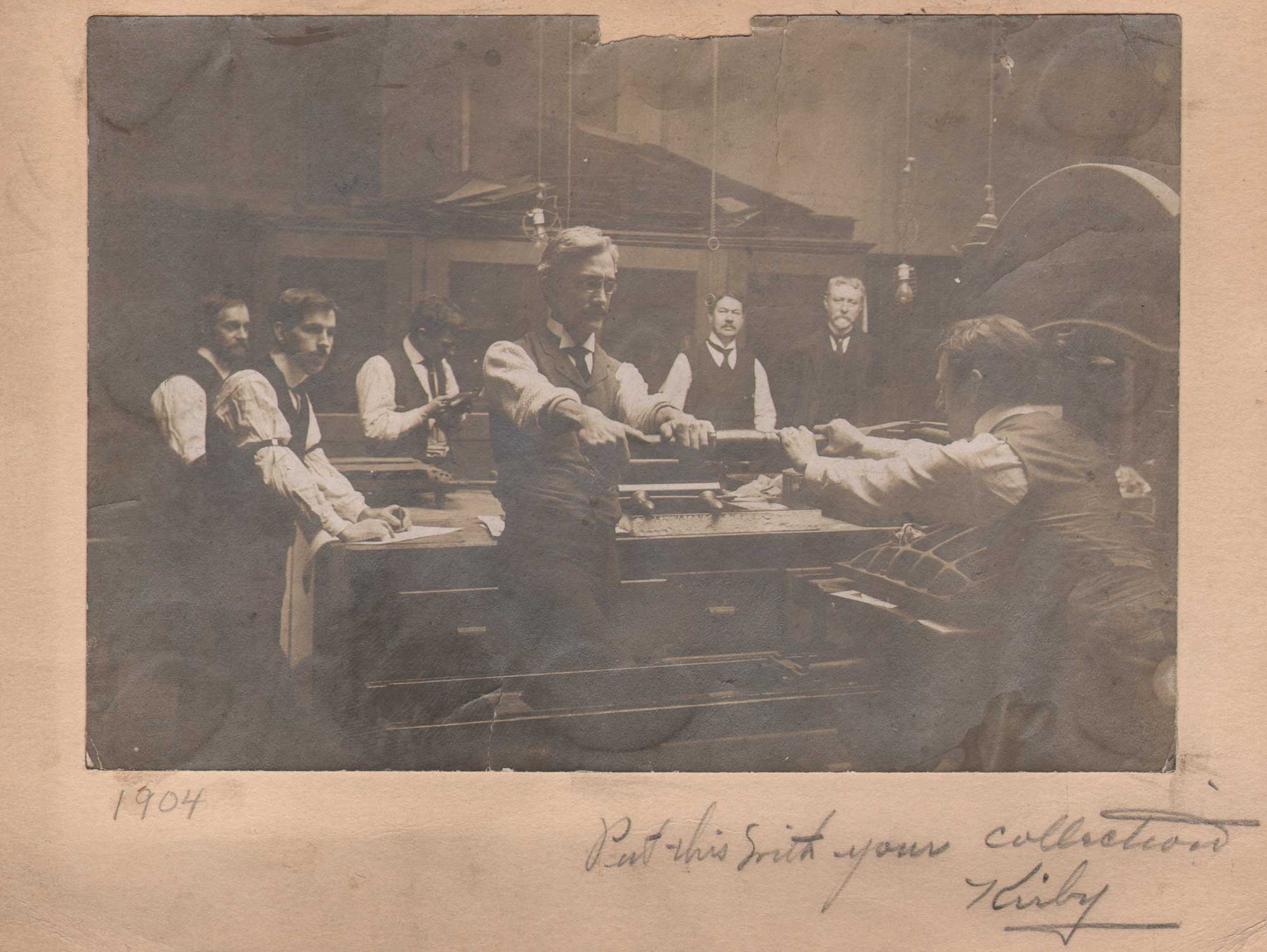
Advocate for Photogravure: Ernest Edwards was a keen promoter of the Photogravure process, his New York City namesake printing business, coming on the earlier public demonstrations of his Heliotype process in London and Boston. On June 7, 1887 he gave the lecture “The Art of Making Photo-Gravures” to The Photographic Section of the American Institute in New York City, remarking: “And nothing in the world can beat the special qualities of photo-gravures—qualities which photo-gelatine prints do not possess.” Top Left & Top Right: photographs showing working 19th Century photogravure ateliers during Edwards time are rare. These examples, from 1904, show similar spaces that would have been part of Edwards business. At left, work in a Proving Room; (where gravure proofs are finalized before steel-facing) at right: in the Press Room, workers stand alongside rows of hand presses while printing photogravures. Location: Belmont, MA & Boston ateliers for A.W. Elson & Company. (from: The Making and Printing of a Photogravure, 1904). (Alfred Walter Elson, 1859-1938) (credit: PhotoSeed Archive) LL: This 1888 advertisement for the Art Parlors of the Photo-Gravure Company gave patrons the chance to inspect and purchase fine plates in a gallery setting, described as: “A collection of Photo-Gravures and Representations of all the newest and best Works of Art and Current Events of Interest will be found here in a variety of forms,”…LR: Notice of public lecture to be given by Edwards appeared on front page of the Brooklyn Eagle newspaper, Monday, June 6, 1887. (Brooklyn Public Library)
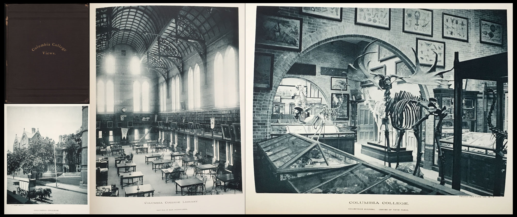
Indotint Collotypes: Shown are the cover & three of 23 cyan plates from 1886 quarto volume Views of Columbia College, (Library Bureau of Boston) with plates by the Photo-Gravure Company. This collection of architectural views showcase fine examples of “Indotint” collotype printing of interior and exterior views of the former New York City campus of Columbia College. (since demolished) Collotype as a process was continually refined after its 1855 invention by Alphonse Poitevin. Also known as the Autoglyph process, the Indotint is believed to have been patented around 1881 or slightly before by one of Edwards friends, noted Civil War photographer Thomas C. Roche. (c. 1826-1895) From the June, 1892 American Amateur Photographer: “His old friend, Mr. T. C. Roche, made a further improvement by coating a sheet of copper with the sensitive gelatine film instead of glass. Prints made from this were called indotints. The prints are made in a steam-press the same as with the artotype.” (p. 257) E. & H. T. Anthony & Co. of New York filed for trademark “The word-symbol” Indotint under subject heading for Photographic Prints, #8,974, Dec. 6, 1881. The Inland Printer in October, 1900 further described indotints as “A collotype process in which a sheet of copper roughened by sand-blast is used as a support for the gelatin film.” (p. 77) From: PhotoSeed Archive
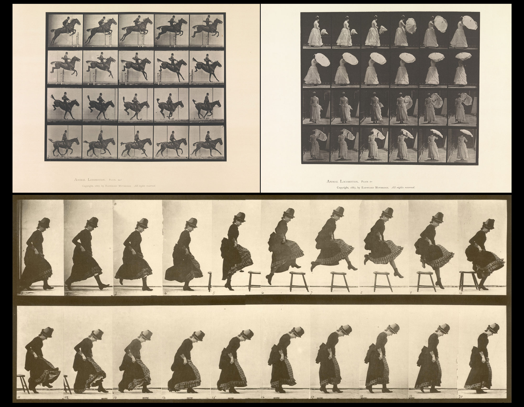
Groundbreaking Work Initiated by the Heliotype: Heliotypes printed by Edwards first featured in the 1882 volume “The Horse in Motion“, by J.D.B. Stillman, with photographs by Eadweard Muybridge, and were published in Boston by James R. Osgood and Company. The commission introduced Muybridge to Edwards, which bore fruit five years later in New York City where he printed 781 individual photo-gelatine plates (in collotype-a heliotype variant) making up the monumental series “Animal Locomotion. An Electro-Photographic Investigation of Consecutive Phases of Animal Movements, 1872-1885“. Shown are three examples from “Animal Locomotion” gathered from online sources: Upper Left: Plate 637 (Volume IX, Horses); Upper Right: Plate 38, “Woman Opening Parasol” (Vol. VII. : Males and Females (draped) and Miscellaneous Subjects); Bottom: Plate 156 (Volume VII, Men and Woman (Draped) Miscellaneous Subjects)
Those 781 plates were printed in collotype by Edward’s New York Photo-Gravure Company, in a process he called photo-gelatine. Years before, when he invented a derivative of the carbon transfer process late in 1869 he called Heliotype, the full-page advertisement for this cost-effective photo-mechanical reproduction process warranted a full page in The Publishers’ Circular in 1871. The chosen headline became a summary of why the invention was significant: “Photographs Printed in Printers’ Ink At A Printing Press”, along with the word PATENT placed underneath even larger type font spelling out the name: THE HELIOTYPE PROCESS. This latter headline meant to catch the reader’s attention was separated by lined rules arranged diagonally across the ad itself. The copy continued: “These pictures are produced with great rapidity, and independently of light; they are as permanent as engravings; they require no mounting, but come from the press clean, finished, and ready for binding or framing, for the portfolio or album.”
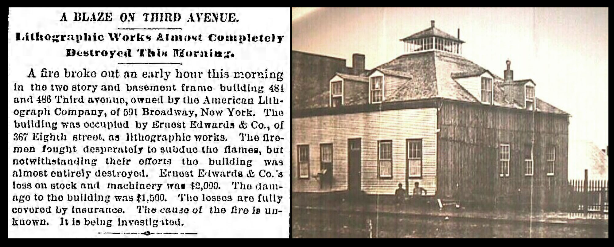
Yet Another Conflagration: Left: Headline and news item from the Brooklyn Eagle, March 21, 1888 reported fire “almost entirely destroyed” a Brooklyn building housing the American Lithograph Company, leased by the Photo-Gravure Co. “Ernest Edwards & Co.’s loss on stock and machinery was $2,000.” Fortunately, insurance covered the loss, and by the end of the following year, Edwards company was on the move again— consolidating all their business offices and printing plant and moving to a new Manhattan building. (Brooklyn Eagle Archives) Right: At the time of the fire, the Photo-Gravure Co. printing plant in Brooklyn was described as a “two story and basement frame house” located at Nos. 484 and 486 Third avenue. This building, seen in period photograph, was earlier reported in the Nov. 5, 1886 Photographic Times & American Photographer: “Part of the building was a private dwelling , other parts formed the winter quarters for a circus-a place now a court between the buildings.” On closer inspection, part of the sloping glass-paned roof for the “printing shed” can be seen to the immediate rear, just to the right of the lower level windows. (Credit: Thomas Yanul)
For the target audience of publishers looking to place orders from Edwards & Kidd, he and partner John William Kidd included some of the technical details of the new process lauded by the Queen’s commissioners for the 1871 International Exhibition. Here, Heliotype is explained in depth: the printed results are achieved through a double inking process treating the highlights and shadow areas of the printing plate using lighter and heavier grades of ink. Left out of the ad copy was more proprietary: the firm was able to print large Heliotype editions fast and economical because instead of traditional glass printing matrixes used in collotype-type processes, (planographic) the firm first created a tougher gelatin matrix by adding alum and then removing these resulting “skin” films which were later attached to pewter plates for placement and printing on a manual Albion-style hand press.
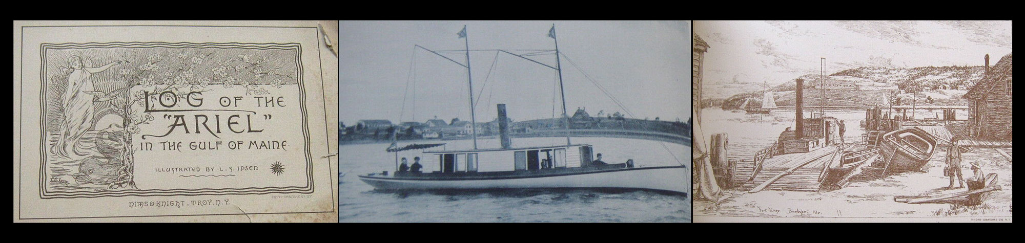
Photo-Lithographs, with Side of Mystery: An early volume featuring plates by the Photo-Gravure Co. was The Log of the “Ariel” in the Gulf of Maine, published by Cupples, Upham & Co. in Boston in late 1885. This second edition appeared in 1888. It was published in Troy, N.Y. by Nims & Knight, a frequent collaborator on many volumes with Edwards NYC firm. The book, reputedly of the steam launch “Ariel”, chronicled her summer voyage down the Maine coast, featuring lithographic plates by Danish-American artist Ludvig Sandöe Ipsen. (1840-1920) The photographic frontis shows the “Ariel”, although a great mystery exists: a review by The American Bookseller of the first edition on May 1, 1886 noting…”The yacht was that of Ernest Edwards, now of the Photo-Gravure Company, New York.” (In April, 1878, he purchased a 45’ open (steam) yacht he named Puck) Left: Title page for 2nd 1888 Nims & Knight edition, The Log of the “Ariel” in the Gulf of Maine. Middle: cyan Indotint collotype of steam yacht “Ariel”. Right: Scene titled in plate Fort Knox, Bucksport, ME. Sepia Lithograph by L. S. Ipsen. (Credit: web)
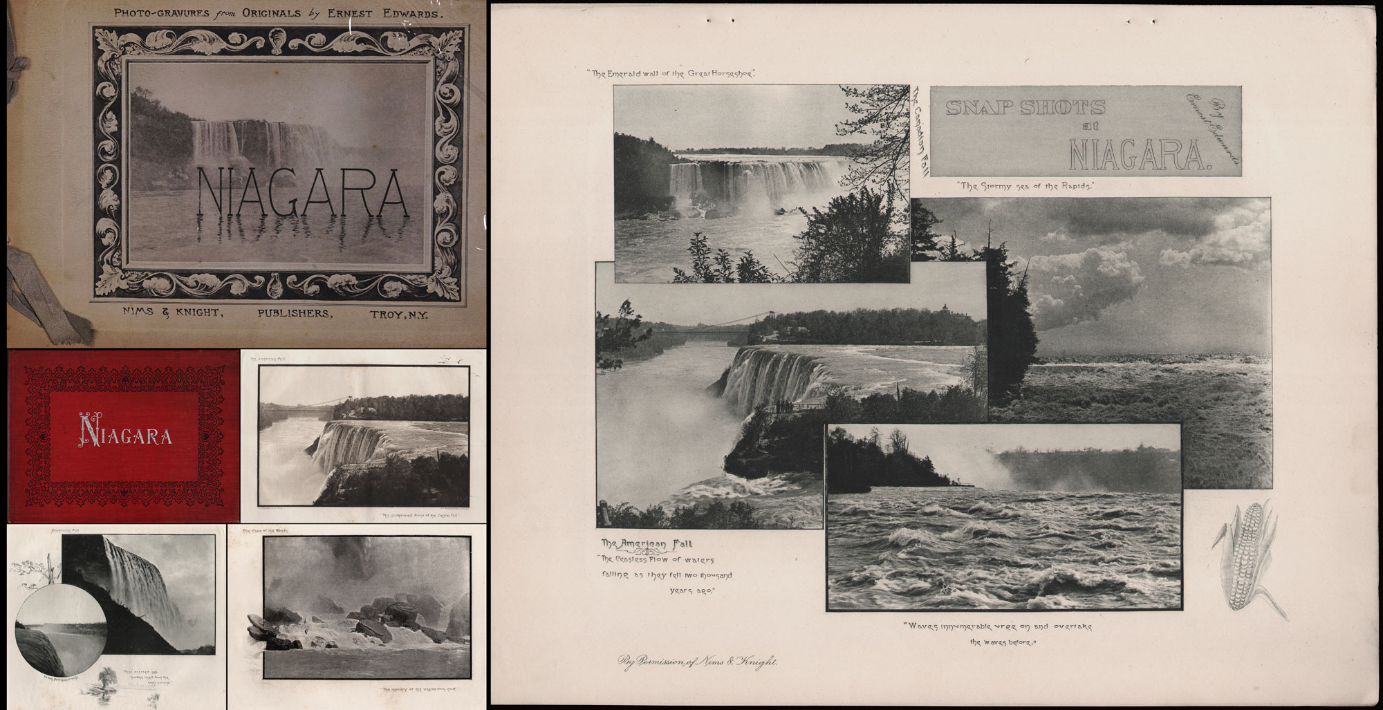
The Great American Cataract, in Two Editions: Hanson informs us the volume Niagara was “one of the few works that Edwards signed as photographer after he came to America.” Published in 1890, the first edition (Cover at Upper Left) was described in an advertisement in the August issue of Sun & Shade that year: NIAGARA. | BY ERNEST EDWARDS. | Twelve Photogravure Plates, comprising about Twenty Views. | Bound in Fancy Tinted Board, with Photogravure Design on side. Size, 9½ x 11½. $1.50. | NIMS & KNIGHT. PUBLISHERS, Troy- N. Y. (Hanson Collection) Middle Left: Niagara, red cover, stamped in silver, 2nd edition, 1893, 7¾ x 10½, text by M. F. Sweetser, Joseph Knight Company, Boston. + three plates shown here. (PhotoSeed Archive) Right: SNAP SHOTS at NIAGARA. By Ernest Edwards. Photogravure featuring four views from Niagara: By Permission of Nims & Knight, 27.5 x 34.8 cm, published with Sun & Shade, August, 1890, No. 24. Edwards used his own publication to promote the first edition Niagara volume. From: PhotoSeed Archive
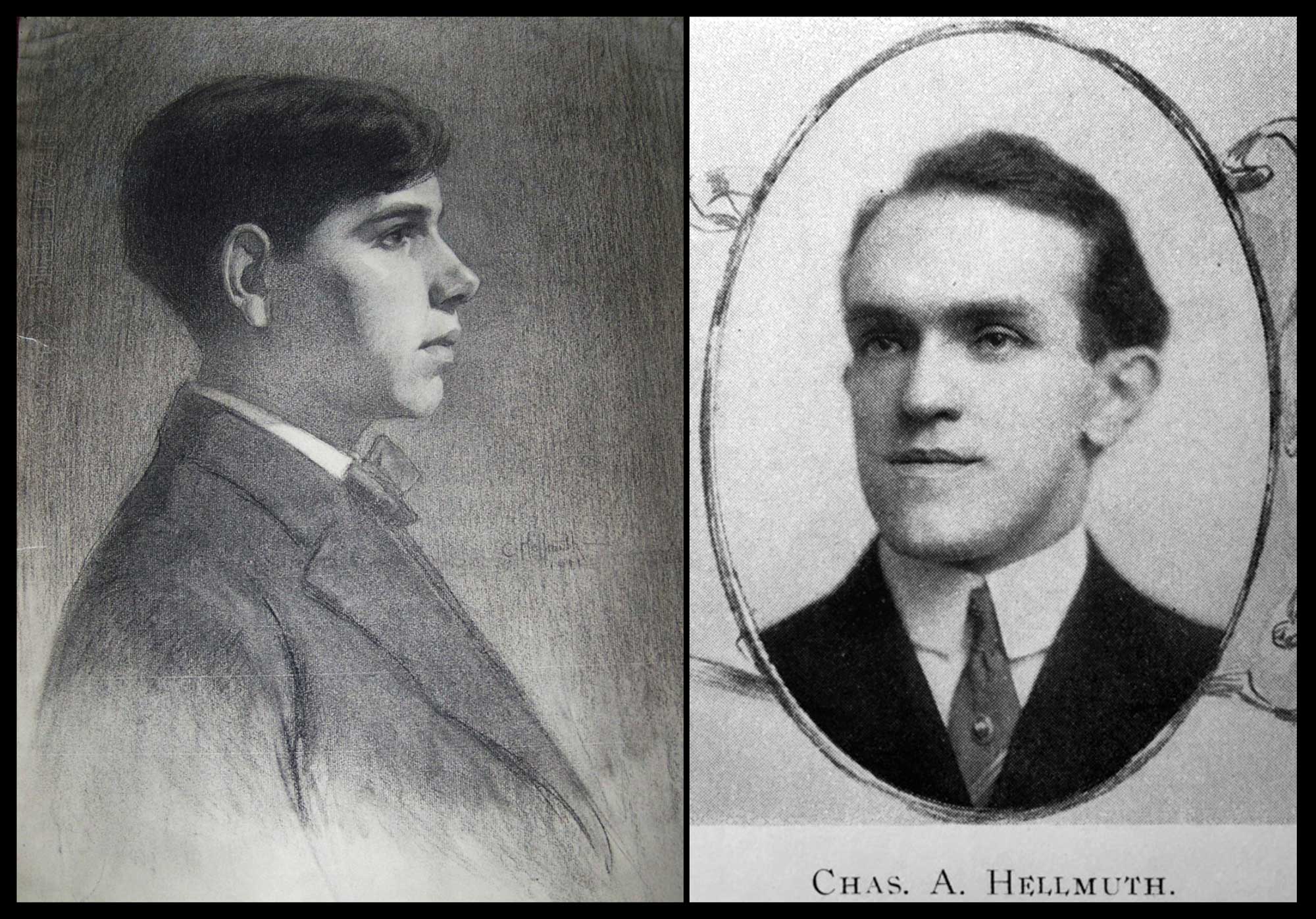
The photographic historian in me could however not do this deep-dive on Ernest Edwards without a proper likeness of the man. This had been a futile journey for the past 15 years or so, mostly dead ends. I came across and purchased a hand-colored cdv featuring a gentleman bearing his London, Baker St. studio imprint about ten years ago, but alas, it did not include the name of the sitter. I’ve gone ahead and included it anyway along with a sampling of the photographer’s mid 1860’s studio work with this post, pairing it next to Charles Darwin, who sat for him several times. As it would turn out, this photo bears an interesting likeness— as a younger version to a definitive portrait of Edwards I later discovered in an unusual place— the 1896 New York University Violet yearbook.
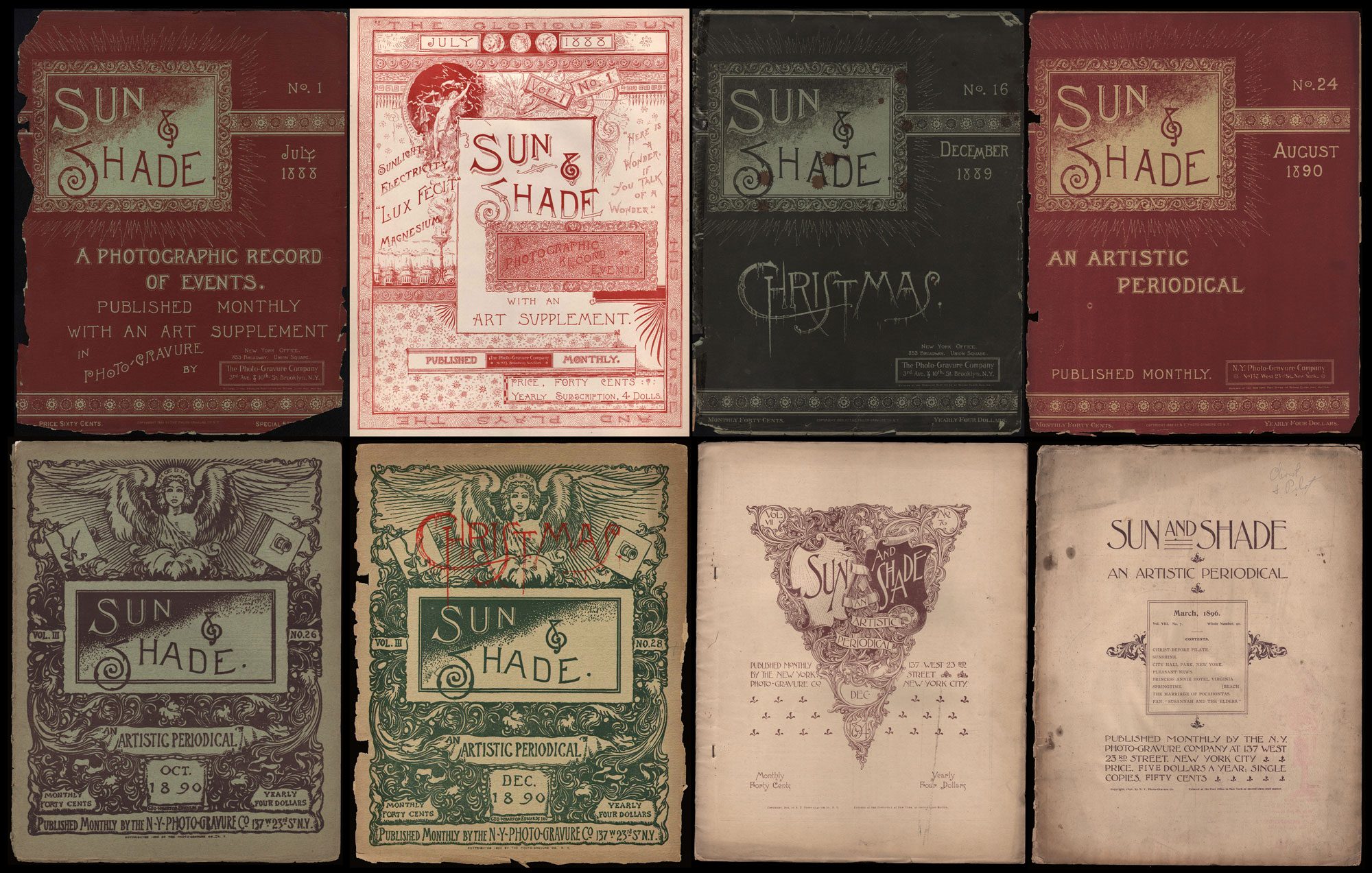
Sun & Shade: A Photographic Record of Events & An Artistic Periodical: In July, 1888, Edwards launched a new folio-sized monthly called Sun & Shade: A Photographic Record of Events. Published with separate letterpress and advertisements, it featured lovely oversized hand-pulled photogravures, plates printed in photogelatine, (collotype) and halftones. Earlier issues might feature as many as 12 plates, with later ones averaging 8 plates. Subject matter included the work of leading amateur and professional photographers, as well as works of art-many then from the holdings of The Metropolitan Museum of Art in Manhattan. Success was swift. The first issue sold 1000 copies “in a fortnight”. Within the first year, Sun & Shade quickly increased circulation to 4000 copies a month. With a public demand for reprinting earlier issues, this success lead to a rebranding, and beginning with the September, 1889 issue, the magazine was renamed Sun & Shade: An Artistic Periodical. Ninety-one issues were published over eight years, the final appearing in March, 1896. Shown: Cover Progression for Sun & Shade 1888-1896. Each issue roughly 35.8 x 27.8 cm. Top row, Left-Right: No. 1, July, 1888; Title page, No. 1, July, 1888; No. 16, Christmas issue, December, 1889; No. 24, August, 1890. Bottom row, Left-Right: No. 26, October, 1890 (new cover art incorporates feminine representation of Sun God Phoebus, (Apollo) by American artist George Wharton Edwards (1859-1950); No. 28, Christmas issue, December, 1890; No. 76, Christmas issue, December, 1894 (one-time cover design by American artist John Thomson Willing, 1860-1947; No. 91, March, 1896 (final issue featuring different cover design) All: PhotoSeed Archive
The volume had included a colored photographic portrait “frontis” of the school’s sixth chancellor, Henry Mitchell MacCracken, (1840-1918) printed in the three-color “chrome-gelatine” process by Edward’s New York Photogravure Company. In an article titled The Progress of Photography, in which the achievements of NYU chemistry professor John William Draper (1811-1882) showcased his research on the action of sunlight on various chemical substances, Edwards achievements in color photography were also highlighted:
“The means employed is known as the three color process and its successful application in this country is due largely to the incessant labor and energy of Mr. Ernest Edwards, president of the New York Photogravure Company. Mr. Edwards is not connected with the University, but the editors of the VIOLET take pleasure in here recognizing the good work he has done in advancing photographic methods.”
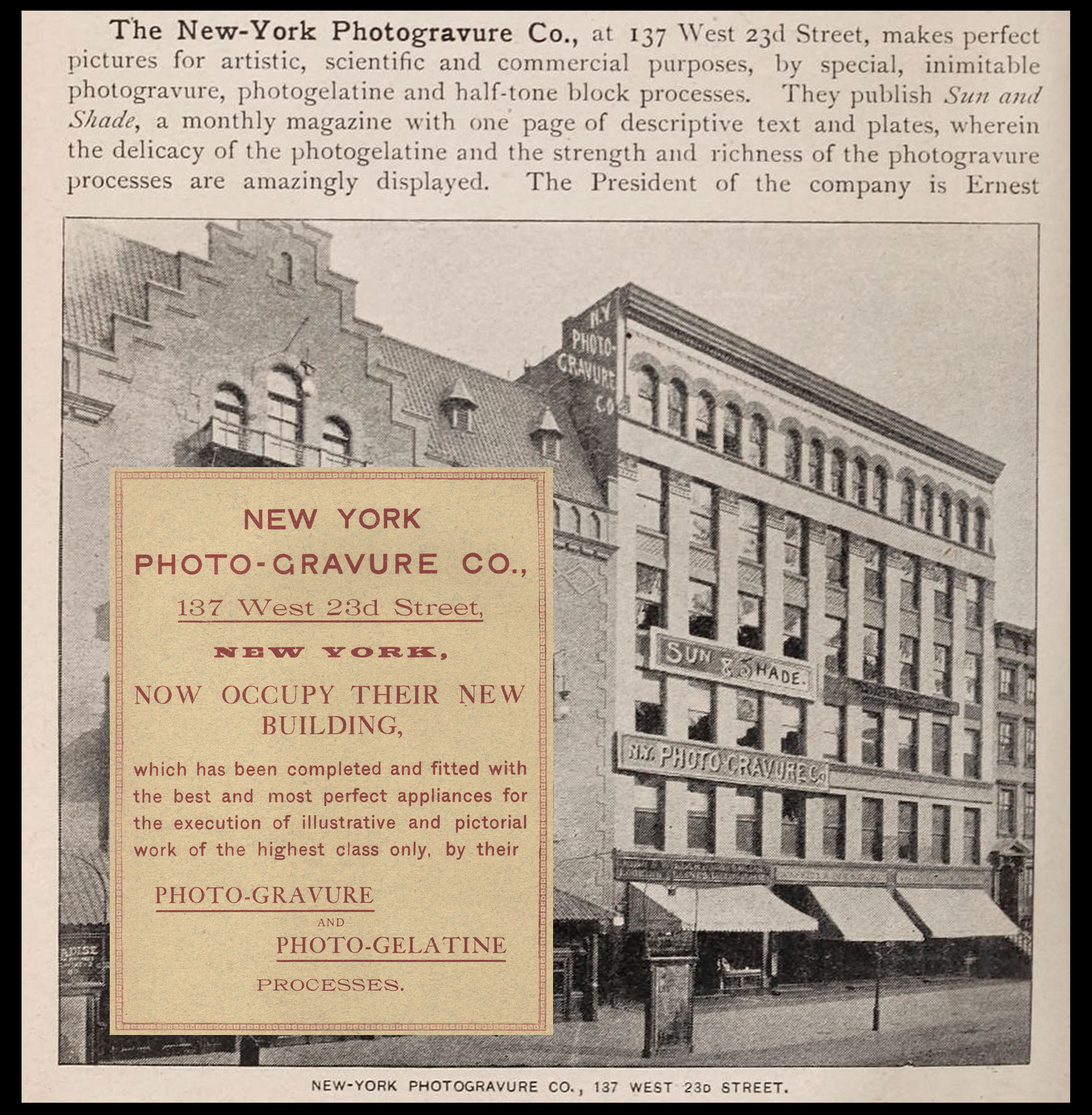
New Fireproof Building for New York Photo-Gravure Company: In November, 1889, Edward’s firm moved into a new leased building, located at 137 West 23rd Street, New York City, that had been “especially adapted for their use.” Located next to Proctor’s Theatre, they would occupy the top five floors of the six-story building, with the basement and first floor store areas leased out. (building is no longer standing) Right: Building features, in a photograph shown here from the 1893 edition of King’s Handbook of New York City, were outlined by Photographic Times editor Washington Lincoln Adams for the issue of Oct. 25, 1889: “The company will have five stories with windows on three sides, and a roof, which is by no means the least available space for a photographic establishment. On the top floor a commodious operating room is arranged, with a northwestern exposure, and is supplied with four good-sized and well ventilated dark rooms. There are separate rooms for gelatine printing and photogravure work, also for carrying on the various stages of work in both printing methods. On the second floor will be the offices and show rooms.” Inset: Full-page advertisement from Sun & Shade in early 1890, noting the new building…”has been completed and fitted with the best and most perfect appliances for the execution of illustrative and pictorial work of the highest class only, by their PHOTO-GRAVURE and PHOTO-GELATINE PROCESSES.” (photograph: Hathitrust; advertisement: PhotoSeed Archive)
Could this have been a partially paid promotion by him and his last great publishing firm? Either way, a prominent photo of the bearded Edwards sporting a suit and polka-dotted tie feature prominently in the Violet, my search concluded.
Other than our introductory spread, this post is arranged thematically, with the majority of the illustrations showing the chronological development of Edward’s different companies. His own photographs are featured, along with examples of these firms published work under his management, supervision and ownership.
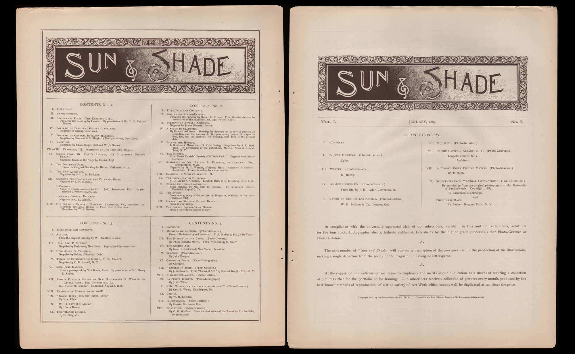
Sun & Shade Contents Pages: Left: In the early years of Sun & Shade, Edwards included individual letterpress listing all plates from past issues, giving subscribers the knowledge and opportunity to complete yearly runs, should they be interested. This Contents page lists plates from the first four issues that came out in 1888. Right: Contents page for No. 5, January, 1889 issue of Sun & Shade, with further editorial correspondence: “In compliance with the universally expressed wish of our subscribers, we shall, in this and future numbers, substitute for the four Photo-Lithographic sheets, hitherto published, two sheets by the higher grade processes, either Photo-Gravure or Photo-Gelatine.” | “The next number of ” Sun and Shade,” will contain a description of the processes used in the production of the illustrations, making a single departure from the policy of the magazine in having no letter-press.” (note: his definition of letterpress was fluid, to say the least) | “At the suggestion of a well-wisher, we desire to emphasize the merits of our publication as a means of securing a collection of pictures either for the portfolio or for framing. Our subscribers receive a collection of pictures every month, produced by the best known methods of reproduction, of a wide variety of Art Work which cannot well be duplicated at ten times the price.” From: PhotoSeed Archive
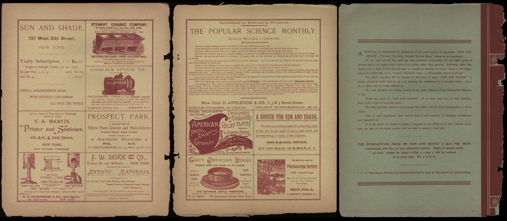
Advertising & Commentary, Sun & Shade: Left & Middle: Examples of typical advertising content from inside cover pages, including subscription info, “A BINDER FOR SUN AND SHADE”, “PHOTOGRAPHIC OUTFITS FOR AMATEURS—Rochester Optical Co.”, etc. (from No. 24, August, 1890) Right: From the back cover late in 1889 one year after it debuted, editorial commentary on where Edwards was planning to venture for the future: “A YEAR ago we commenced the publication of our novel venture in journalism “SUN AND SHADE, A PICTURE PERIODICAL WITHOUT LETTER PRESS” almost as an experiment. | In our rapid growth the wish has been indicated unmistakably for the higher grade of pictures and of the higher class–always for quality rather than quantity. Following rather than leading such a wish we feel that we make no mistake in marking the future career of the Magazine to be rather that of an “Artistic Periodical” than “a Photographic Record of Events.” | Our efforts therefore will be directed in the future to make “SUN AND SHADE” an artistic periodical which shall be not only pleasing but educational in its broadest sense. Some of our plans may be briefly referred to. | We shall reproduce the leading pictures in the great collection of the Metropolitan Museum of Art. | Within the covers of “SUN AND SHADE” will be found from time to time, reproductions of the works of American artists. | We shall especially endeavor to encourage the artistic side of direct photography in all its phases. | And we shall supplement these special features with examples of Sculpture, Architecture and Industrial Art. | If, in the future, we receive as hearty a response to our efforts as we have received in the past, our task will be indeed pleasant and our road to success a royal one.” From: PhotoSeed Archive
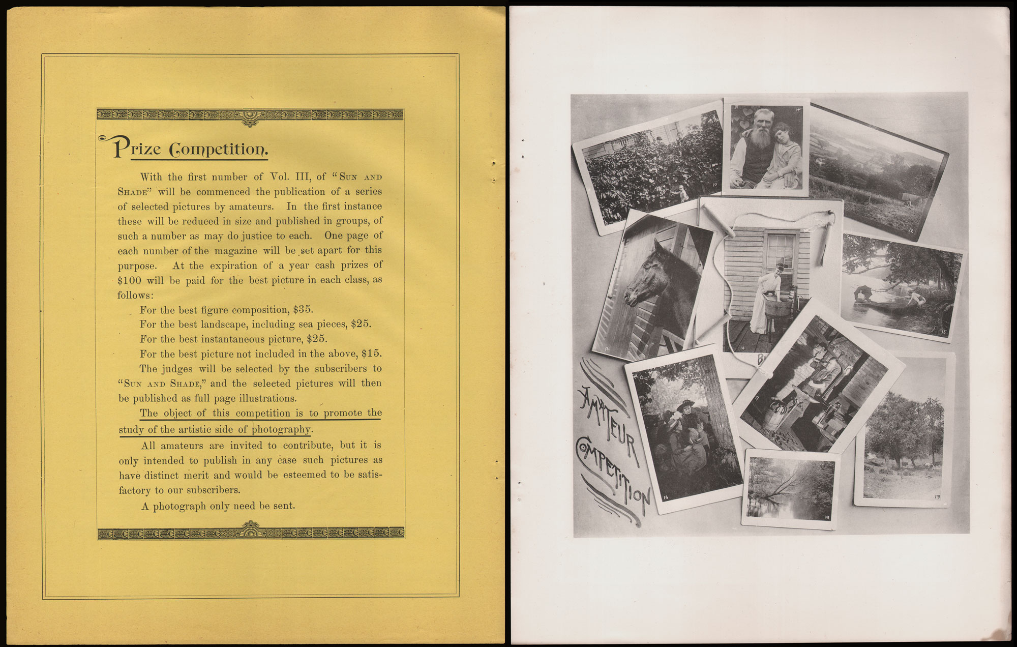
Amateur Photography Competitions: Left: Sponsored by Sun & Shade, this full-page letterpress notice—35.2 x 27.5 cm—appeared in the No. 24, August, 1890 issue advertising a new amateur photography competition: “The object of this competition is to promote the study of the artistic side of photography.”Prize money in various categories were listed. Right: “Amateur Competition“: This composite of prize-winning photos, printed in collotype, appeared in the No. 26, October, 1890 issue. For a time, these amateur plates were a recurring monthly feature of the magazine. Some of the winners were also reproduced as full-page photogravure plates in Sun & Shade, and select examples like #15 (woman with parasol in stern of boat by E.C. McDonald) were reproduced in affiliated publications like The Photographic Times and Camera Sketches from Life and Nature, by Troy, N.Y. publisher Nims & Knight. From: Photoseed Archive
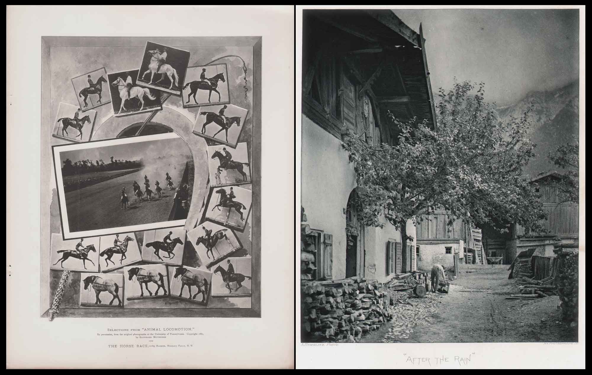
Famous Photographers & Landmark Revisited: Left: “Selections from “Animal Locomotion” by Eadweard Muybridge, featured in this composite plate with artwork of whip, horseshoe and inset photograph “The Horse Race”, by George Barker. (photo-gelatine: plate IX, 26.7 x 21.0 | 35.2 x 27.7 cm, No. 5, January, 1889 Sun & Shade.) Edward’s firm had produced the collotype plates for the landmark work Animal Locomotion less than two years earlier. Right: “After The Rain”, Alfred Stieglitz, photogravure, 20.0 x 16.7 | 34.7 x 27.4 cm, plate XL from No. 41, January, 1892 issue. Taken in 1886 when he was 22 and still living in Germany, the following appeared with the contents page: Mr. Stieglitz writes: “This view is in Mittenwald, in the Bavarian Highlands, and was taken after a three days rain had ceased and the heavy leaden clouds were gradually rising, permitting one to see that the mountains were in the vicinity. The subject was an extremely difficult one to take, as you can see for yourself, inasmuch as I wanted to reproduce without retouching what I really saw in nature. Mittenwald is famous for its violin and cello builders, who constitute nearly the whole village. Steinheil Aplanat 19” lens, Vogel Obernetter Orthochromatic plates, developed with Hydroquinone and Carbonate of Potash. No retouching.” The image was reproduced as a tissue photogravure the following year by Edwards— part of the Nims & Knight volume Bits of Nature: Ten Photogravures of American Scenery. From: PhotoSeed Archive
A prolific public speaker to the end of his life—perhaps the affable clergyman that was never to be still animating the passions he believed in—Ernest Edwards never lost his love for the medium of photography. In 1902, a year before his death in his adopted home town of Brooklyn, he gave a public lecture at the Carleton Club, a social club he belonged to in Park Slope entitled: The Wonders of Photography. The Brooklyn Eagle newspaper dutifully reported on the talk for their edition of February 1, an excerpt:
…”and throughout Mr. Edwards’ discourse, which began at 8.30 o’clock, there was no let-up whatever in attention on the part of any one present, and the speaker’s remarks were listened to with that quiet carefulness which is more of a compliment on the part of an intelligent audience than would be what is commonly termed “uproarious enthusiasm.”
There were a number of photographs of landscape scenes, all of which were very realistic and illustrated what may he done with the camera by a capable artist. There were also marine picture and snow scenes and portraits of individuals, all of which were reproduced with such a degree of truthfulness that the audience was more than pleased.”
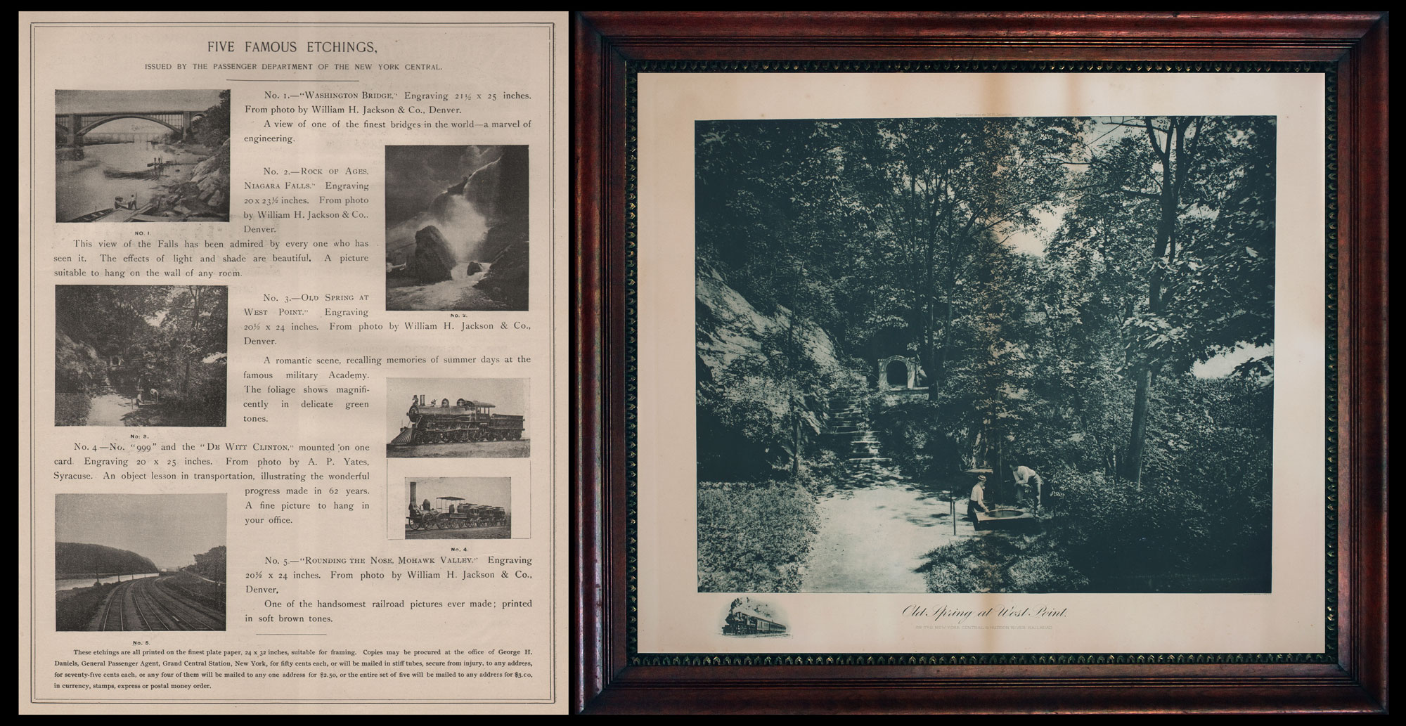
Display Worthy “Etchings” by Photo-Gravure Co. for New York Central: Left: In what are believed to be the largest commercially attempted, hand-pulled photogravures published up to that time, Edwards firm contracted with the passenger department of the New York Central Railroad in 1894 to produce gravures for their passenger waiting rooms. Subscribers to Sun & Shade could also order these “etchings” for personal use: the set of five rolled in a tube with mailing for $3.00. This full-page advertisement for “Five Famous Etchings” was included in No. 65, January, 1894. The photographs were by American photographers William Henry Jackson (1843-1942) and Arthur P. Yates, (1841-1924) then the official photographer of the New York Central and Hudson River Railroad. Right: “Old Spring at West Point” was etching No. 3 from the series, described as: “A romantic scene, recalling memories of summer days at the famous military Academy. The foliage shows magnificently in delicate green tones.” The work, by Jackson with locomotive remarque by Yates, is shown in its’ original frame. From: PhotoSeed Archive
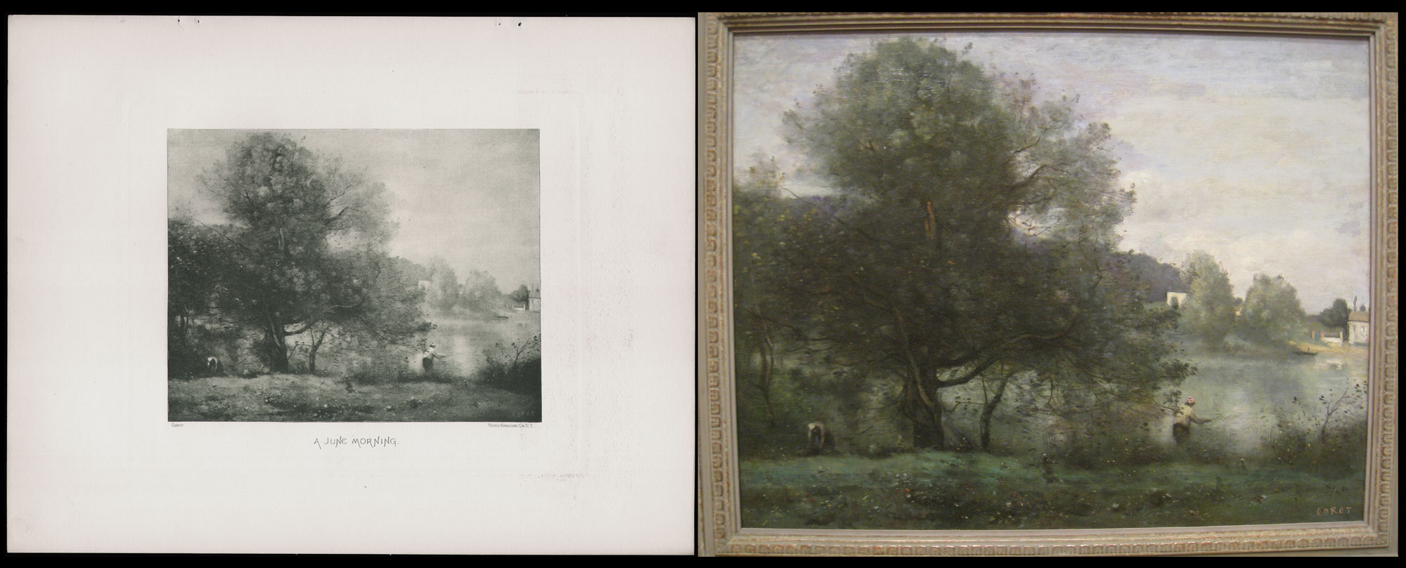
Paintings Reproduced in Photogravure: Left: “A June Morning”, Jean-Baptiste-Camille Corot, France, (1796-1875) photogravure copy printed in light green. From No. 5, January, 1889, Sun & Shade, plate II, 14.9 x 18.9 | 27.3 x 34.9 cm. Original artwork, typically paintings, frequently appeared in the magazine. (PhotoSeed Archive) Right: “Une Tempé à Ville-d’Avray—Un Pêcheur au Bord de L’étang”, (An Idyllic Spot at Ville-d’Avray—A Fisherman on the Banks of the Pond) original oil painting by Corot ca. 1865-70 now held by the Worcester Art Museum in Massachusetts. Object Number 1935.45, Label Text: “Although Corot’s training began in traditional landscapes, he developed his own style, distinct from the historical and classicizing mode that characterized the genre for the previous generation. Corot’s practice was grounded in sketching en plein air (outdoors). Among the many places Corot painted, including Italy where he traveled several times, was Ville-d’Avray, a village ten miles to the west of Paris, where his family had a country house. Throughout his life, Corot returned there during the warm seasons. In the late 1860s, Corot suffered from gout, a form of arthritis, so it is likely that this painting was executed in his Paris studio. The composition was probably derived from his memories of earlier visits.” (Worcester Art Museum)
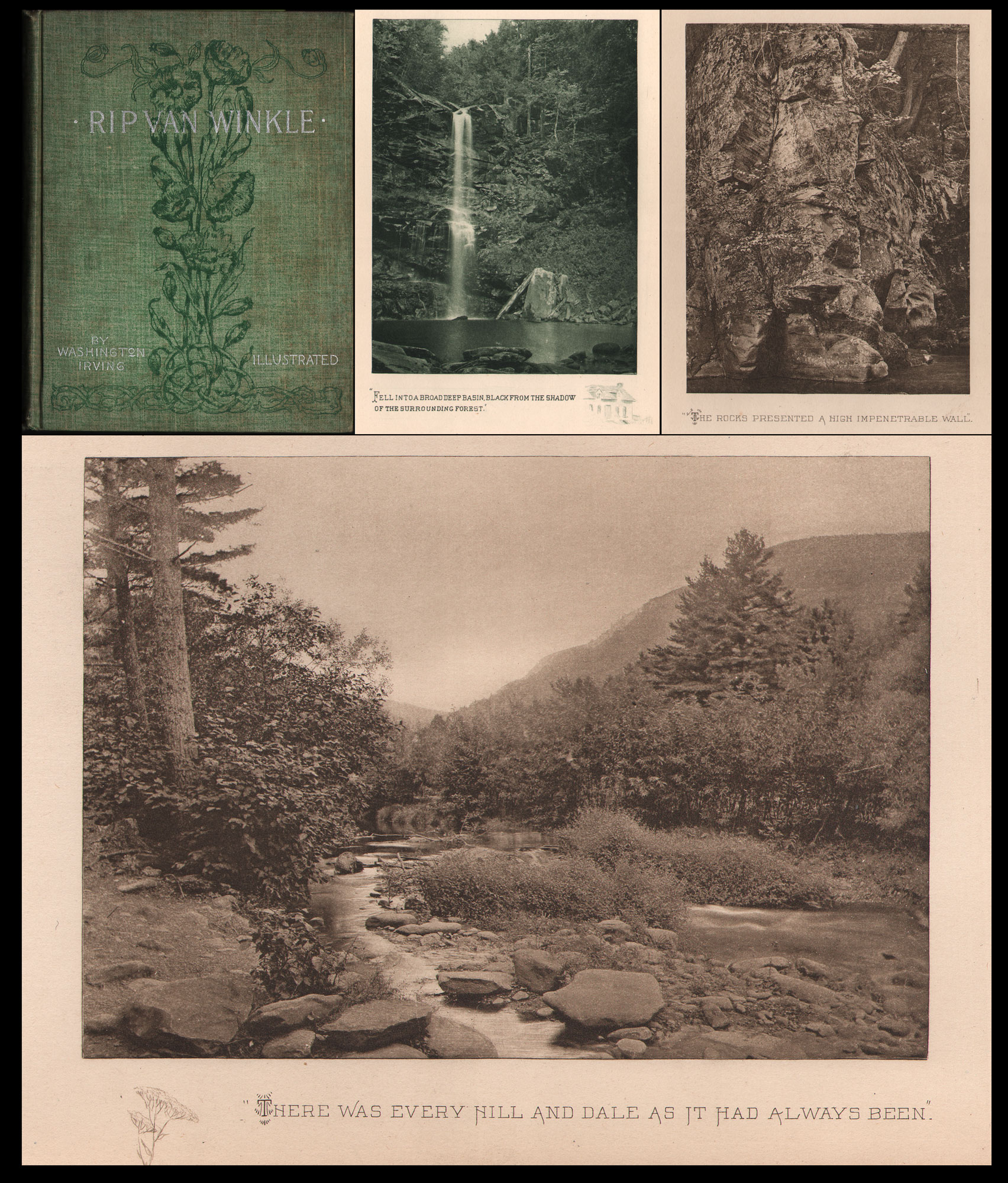
Uncredited Masterworks of Catskill Mountain Scenery: Rip Van Winkle, by Washington Irving, with illustrations by American artist and illustrator Frank T. Merrill (1848-1936) and 24 uncredited photogravure plates by Ernest Edwards. Boston, Joseph Knight Co., 1894, 8vo. Shown: book cover at upper left along with three plates attributed to Edwards. Inspiration for these New York state Catskill views were certainly inspired by Edward’s love of the outdoors first shown in his Alpine views of Switzerland’s Bernese Alps taken nearly 30 years before. Hanson notes a credited view by Edwards from this edition of Rip Van Winkle appears in Sun & Shade, with another appearing in the Photographic Times in 1894. A surviving trade card ca. 1890 from this archive is a detail from the larger Rip Van Winkle plate This Lonely And Unfrequented Place, indicating Edwards most likely made several trips to Catskills years before this edition of Washington Irving’s masterpiece was published. From: PhotoSeed Archive
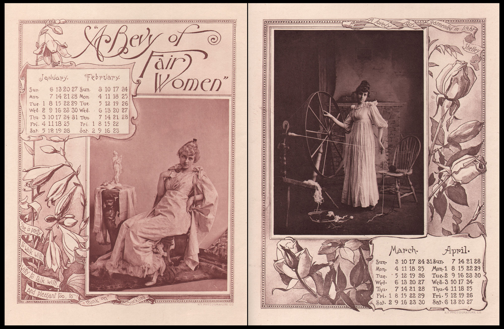
A Calendar for the Year 1895: The December, 1894 Christmas Number issue of Sun & Shade featured a novel idea for the time: an illustrated calendar for the following year consisting of six portrait and genre photographs of women taken in the studio, each representing two months of the calendar year. These are ornamented within borders illustrated by American artist John Thomson Willing. (1860-1947) The whole, described by the magazine as “A Bevy of Fair Women”, featured the photographic talents of New York’s Fifth Avenue studio of Davis & Sanford, considered one of “the most artistically acclaimed and financially successful studios of the Gilded Age era.” (Charles Henry Davis (1862-1929) & E. Starr Sanford (1861-1917) Left: January & February, 1895: from border: “She is pretty to walk with, Witty to talk with, And pleasant too, to think on.” —Suckling. 21.3 x 16.3 | 35.0 x 27.4 cm. Right: March & April, 1895: from border: “A Lovely Lady Garmented in Light”—Shelley. 21.0 x 16.3 | 35.0 x 27.4 cm. From: PhotoSeed Archive
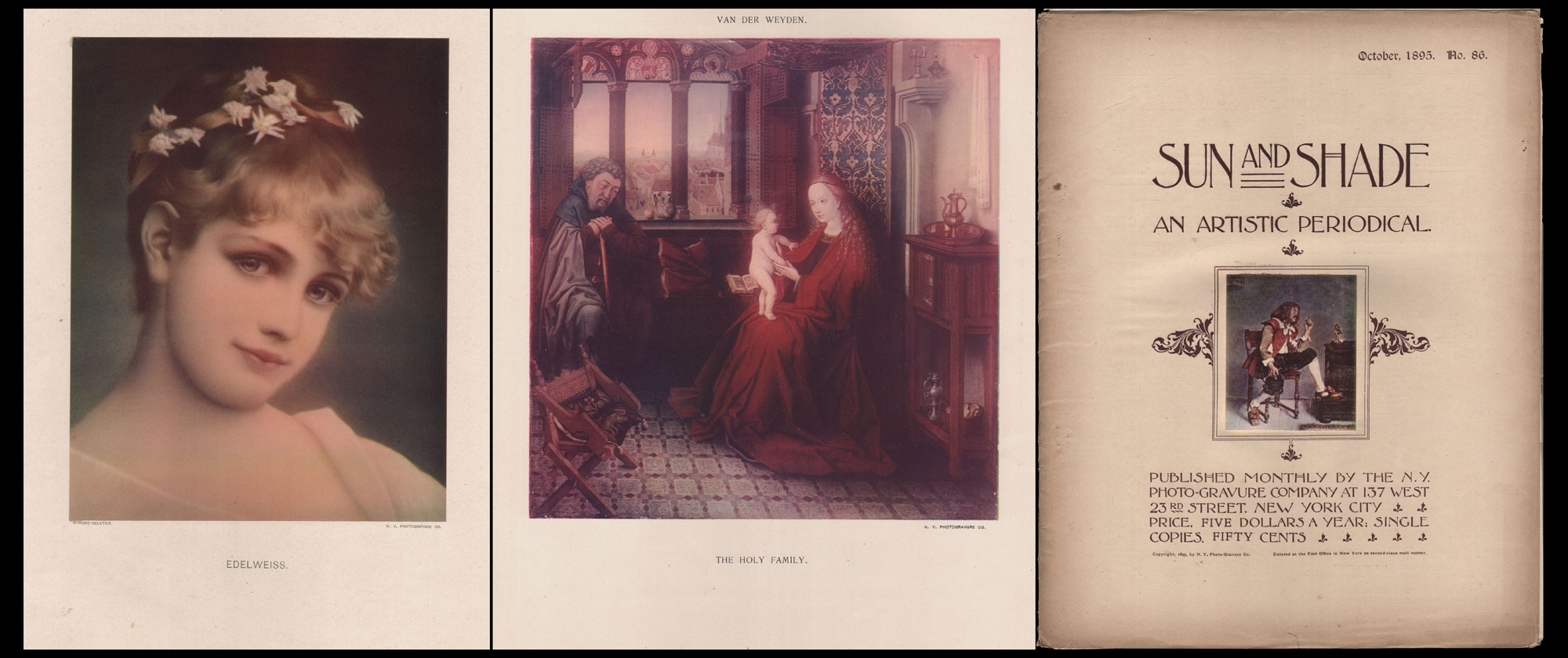
A New Color Printing Process: Chrome-Gelatine: Left: Edelweiss, chrome-gelatine, Alfred Seifert, Czech-German, 1850-1901, No. 76, Sun & Shade, December, 1894, 20.0 x 15.6 | 35.0 x 27.4 cm. “Edelweiss—The simple Alpine flower, which grows beneath the snow, is charmingly embodied by the portrait of a fair girl, so delightfully presented by the new color process.” Middle: The Holy Family, chrome-gelatine, possibly Rogier van der Weyden, Netherlandish, 1399 or 1400 –1464, No. 77, Sun & Shade, January, 1895: A Monograph of Flemish Art From Original Paintings, 17.8 x 17.3 | 35.0 x 27.5 cm. Portraying the Virgin Mary with infant Jesus upon her knee, editorial comment from S & S: “The details of the picture are exquisite, and its reproduction in Chrome-gelatine is a marvel of accurate duplication and another proof, if such were needed, of the value of the process in fac-simile of color-effect.” Right: “A Note of Color“, miniature by Ernest Meissonier, France, 1815-1891, glued, inset chrome-gelatine plate— part of cover design for No. 86, October, 1895, Sun & Shade. These paintings are some of the very first chrome-gelatine color plates published by the N.Y. Photo-Gravure Co. (The first was “The Fête Champêtre”, an 1893 oil painting by German artist Walter Petersen, 1862-1950, plate LXXXVI, No. 71, July, 1894) The very first color print of a photograph in Sun & Shade appeared even earlier: Residence of Mr. Arthur L. Fennessy, At Crescent Hill, Springfield, Mass., an architectural study of a mansion described as “printed in colors by a new process” for issue No. 2, dated October, 1888. (see timeline) Advertisements in the magazine from the period described the process, as “a perfected modification of the three-color printing process. It is so named from the Gelatine process of printing being used to produce the resulting pictures, which are allowed to be really wonderful. …The results, in all cases, are produced from three color negatives. Artists whose works have been reproduced by this method, express their satisfaction of the results in the highest terms, without qualification.” Ernest Edwards claimed he was the inventor of the process whereby “subjects to be reproduced are first photographed on three of the chromatic plates with suitable color-screens, and from the resulting negatives, three gelatine printing plates are made, from which the prints are obtained.” From: PhotoSeed Archive
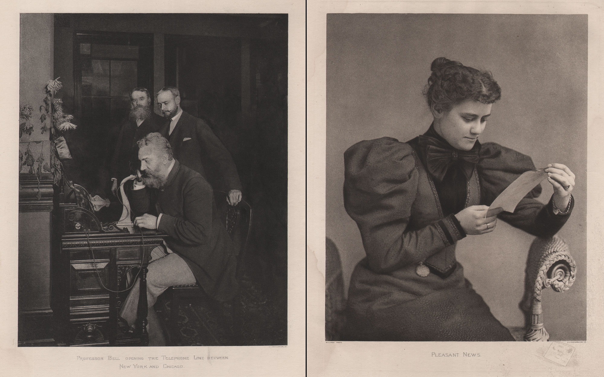
19th Century Communication in Sun & Shade: Long Distance and Old Reliable: Left: Professor Bell Opening the Telephone Line Between New York and Chicago, October 18, 1892. Photogravure plate in Sun & Shade, No. 80, April, 1895, 23.0 x 18.6 | 35.1 x 27.4 cm. (uncredited) “The flash-light picture, from which our plate is made, represents the professor whispering his distant message. In the background stands Mr. Hudson, president of the New York Metropolitan Co., and near him his assistant, both deeply anxious about the success of the professor’s invention.” Heavily retouched from the original held by the The National Portrait Gallery in Washington D.C., who credits this photo to E.J. Holmes. A more likely candidate may be Edwin Thomas Holmes, credited on the web as having “entered into an innovative symbiotic relationship with Alexander Graham Bell. Bell had already strung telephone wires around the greater Boston area. Bell and Edwin T. Holmes reached an agreement: during the day the wires would be used for telephones, and at night they would be used for alarm systems. Edwin T. Holmes quickly assembled a 700-alarm network using telephone wires in Boston, which his father then copied in New York City.” Right: Pleasant News, Photogravure, W.C. Chase, of Boston, plate in Sun & Shade, No. 91, March, 1896, 21.6 x 17.2 | 35.0 x 27.54 cm. “The failure of securing the right kind of aspect in a sitter is, more often than not, the fault of the camerist. We all know the well meant, insidious request to “look pleasant,” with the general result of an appearance of acute martyrdom. Mr. Chase never, we may be sure, says “look pleasant,” but when his model looks as he desires, he captures the counterfeit presentment before it can vanish.” Both: PhotoSeed Archive
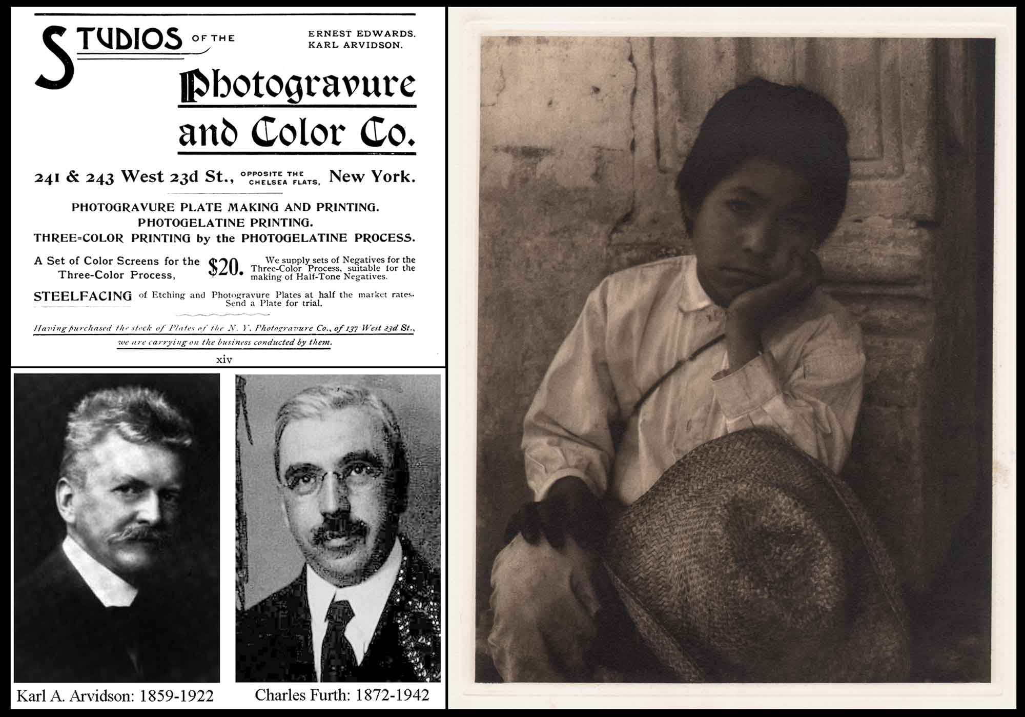
Edwards Last Printing Concern: The Photogravure and Color Company: Left: Advertisement for the New York City Studios of The Photogravure and Color Company from The 1897 American Annual of Photography and Photographic Times Almanac. Bottom Left: Karl A. Arvidson, 1859-1922, was the first co-owner of the firm with Edwards. Charles Furth, 1872-1942, took over when Arvidson died. After the N. Y. Photogravure Co. declared bankruptcy in 1896 and shortly reorganized the same year as the Photogravure and Printing Co., Edwards founded The Photogravure and Color Company with Karl Arvidson in 1897. The company continued into the 1960’s. Right: Boy – Uruapan, (1933) photogravure plate VII from Photographs of Mexico, Paul Strand, 1940, New York, Virginia Stevens, 25.7 x 20.6 | 40.4 x 31.7 cm. From Photogravure.com: “This portfolio is one of the most potent and impressive collections of fine photogravure ever produced. Strand’s photographs, taken during an extended stay in Mexico in 1932, (and 1933-editor) sensitively depict the country’s streets, architecture, religious statuary and inhabitants. Such post-revolutionary subjects also appeared in the work of contemporaneous Mexican painters such as Diego Rivera. The photogravures in Photographs of Mexico were hand printed with great skill by Charles Furth of the The New York Photogravure and Color Company in an edition of 250 copies. Strand customized the inks, fine tuning the color depending on the image, almost as if he were printing them in his darkroom. Strand also experimented with and personally applied a Damar varnish to the prints making them prone to darkening but ultimately warming and enhancing them.” From: PhotoSeed Archive
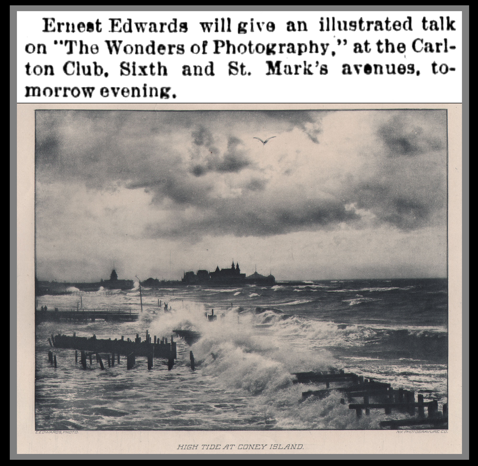
A Full Life Through his Love of Photography: A prolific public speaker to the end of his life—perhaps the affable clergyman that was never to be still animating the passions he believed in—Ernest Edwards never lost his love for the medium of photography. Top: Notice of public lecture at the Carleton Club in Brooklyn. (The Brooklyn Daily Times, Jan. 30, 1902) Bottom: High Tide at Coney Island, Ernest Edwards, born England, 1836-1903, photogravure from No. 65, Jan., 1894, Sun & Shade, 14.2 x 18.3 | 27.7 x 34.8 cm. “A snap-shot picture, made from the Brighton Beach Hotel, by Mr. Ernest Edwards, is a remarkably picturesque and accurate view of the tremendously high tide which swept away a large portion of the Beach and destroyed a great deal of property last fall at Coney Island.” From: PhotoSeed Archive
Should you be so inclined after our “picture show”, I’ve included a deep-dive into the rich career of Ernest Edwards, arranged as a timeline spanning his early life in England and achievements in photography in America through the early 20th Century. Sources where his own work can be found as well as other published examples of photo-mechanical work by his English and American printing companies are included. This archive holds examples by the photographer here as well as a continually growing body of work from his N.Y. Photogravure Company. —David Spencer— April, 2026
- Rear cover: Sun & Shade, January, 1894, No. 65
Beginnings: Ernest Edwards: 1836-1903
1836: Ernest was the youngest of six children, born November 6 in London, “within the sound of Bow Bells”, to a middle class family, according to his March 16, 1903 obituary in The Brooklyn Eagle. Traditionally, anyone born within earshot of the bells was considered to be a true Londoner, or Cockney.
He was one of four sons of clergyman Rev. Joseph Edwards, (ca. 1803-1875) Second Master at King’s College School, London, 1831-53 (1.) who had graduated from Trinity College, Cambridge. Rev. Edwards spouse was Elizabeth Mary Spunier or Spurrier, and they married June 19, 1827 at Semer, Co. of Suffolk, England. (Ernest’s other brothers were Rev. Roland Kenrick Edwards, (B.A. Trinity College: 1829-1871); Rev. William Walter Edwards, (1832-1896-noted as one of the tallest clergymen in London ) admitted pensioner at Peterhouse, July 2, 1856 & William Joseph Edwards, (b. 1846) admitted pensioner (age 20) at Magdalene, July 1, 1866 but did not proceed to a degree.
- F.J.C. Hearnshaw, The Centenary History of King’s College, London, 1828-1928. (1929) Rev. Edwards was elected second master to the junior department of the college (today—King’s College School) on April 15, 1831. (p.91) He resigned after 22 years in 1853 because he was “vigorously opposed some of the recent changes in the school, which had altered his position for the worse, and he was glad to get away.” (p. 193)
1856: Ernest Edwards initially intended to follow his father into the ministry after admitted a pensioner (commoner) to Peterhouse College at Cambridge on August 25. Before this time, he briefly studied medicine with William Miller Ord, (1834-1902) and then served in the Crimean War beginning in late 1853 as secretary to Dr. Duncan McPherson, (1812-1867) an army surgeon, writer, and Inspector General of the Madras Presidency during the British Colonial era. McPherson had found time during wartime for archeological excavations in Ukraine, which certainly gave his sidekick an unusual penchant for exploration while traveling far from those Bow Bells. Later, after matriculating at the University of Cambridge, it does not seem surprising Ernest Edwards decided to become a photographer, his camera becoming another way to explore the world.
Photographic Influences
—Although his father had retired as Second Master of King’s College School by 1853, it’s probable Edwards interest in amateur photography expanded socially through associations made in the late 1850s with members of London’s Photographic Exchange Club founded in 1855. Although not a member himself, the club’s honorary secretary and treasurer—the Reverend J. R. Major Jr.— was a teacher at King’s College School, and his father, the Rev. John Richardson Major, (1797-1876) was school headmaster there and also a member. (1.) The club’s purpose was to allow photographers the means by which they could trade and distribute their pictures among themselves and an interested public. In another likely association, the work of photographer Francis Bedford, a member who took part in the second “exchange” of prints to club members in 1856, appeared along with Edwards photographs in the 1860 volume Memorials of Cambridge.
- Grace Seiberling, Carolyn Bloore, Amateurs, Photography, and the Mid-Victorian Imagination, 1986, University of Chicago Press, p. 11, Introduction.
But another stronger influence on Edwards taking up the camera comes after his 1856 enrollment at Peterhouse. As cited in Mellby, (1.) Edwards had no sooner matriculated there but soon departed. He had accepted an offer as teaching instructor at Cambrian House School in Ryde, on the Isle of Wight, where his eldest brother, the Rev. Roland Kenrick Edwards, (1829-1871) was school headmaster.
Mellby writes: “Ernest stayed for several years, teaching, serving with Ryde’s volunteer Rifle Corps and refining his skills as a photographer. During the 1850s, the Isle of Wight was a hotbed of photographic activity, where amateur photographers included members of the royal family.” (p. 134)
- “Ernest Edwards and the Permanent Photograph.” Julie Mellby: Journal of the Printing Historical Society, 3rd series, 6 (2025): 133–54.
1859: In January, his photograph described as “Study of Clouds” was exhibited as part of the Sixth Exhibition of The Photographic Society of London at the Suffolk Street Gallery. What is really interesting is that at the same time, examples of the early photo-mechanical process known as photogalvanography, patented by Paul Prestsch in 1854, were also displayed, and they undoubtedly made an impression (pun intended) on Edwards, who would go on to make his career as a printer:
“There are several fine specimens of photogalvanography, the invention of Pretsch, which will give great satisfaction to the intelligent visitor, and examples of instantaneous productions in the Exhibition; among them are the ‘Waves,’ and some other subjects by Cundall and Downe; ‘Study of Clouds,’ Ernest Edwards.”—The Photographic Journal, January 21, 1859, p. 150
Example of an early photogalvanograph by Oscar Gustave Rejlander at PhotoSeed.
From 1859 to ca. 1861, Edwards pursued stereo photography, with examples including “A Statue of Silence,” taken at the Fitzwilliam Museum at the University of Cambridge (shown with post) and other university views published in the Stereoscopic Magazine from 1861-2. An additional four stereo mounted works, taken while he worked in Ryde, featuring views of Shanklin, Isle of Wight, are recorded by a listing in the National Stereoscopic Association’s Photographers of the World, updated in 2003.
1860: Albumen photographs appear with those of Francis Frith in volume: Memorials of Cambridge, by Charles Henry Cooper. Online bookseller description of plates: Cambridge: William Metcalfe, 1860. New Edition. 8vo…3 volumes, 138 steel engravings, 90 wood engravings, 17 etchings, and 31 pasted photographs. (by Frith and Ernest Edwards)
1861: Edwards becomes a member of the Amateur Photographic Association in London. … “it had for its purpose… the interchange and publication of the productions of Amateur Photographers, in order, on the one hand, that they may realise the full value of every negative which they possess, and on the other, that the thousands of interesting and valuable negatives, now buried in the plate-boxes of Amateurs, may be brought before the notice, and placed within the reach, of the general public.
This association, perhaps the first of its kind, lasted until 1905 and included some of the most surprisingly sensitive photographers of Victorian England. Among many others, Captain Bankhart, the Earl of Caithness, F. C. Curry (or Currey), Ernest Edwards, Major F. Gresley, F. H. Lloyd, the Countess of Uxbridge, and Virginia Waters all produced pictures that are perfect distillations of the British romantic sensibility.” — Robert A. Sobieszek, British Albumen Printing: 1850-1880, in: British Masters of the Albumen Print: A Selection of Mid-Nineteenth-Century Victorian Photography. International Museum of Photography at George Eastman House & The University of Chicago Press, Chicago & London, 1976
— Edwards makes the acquaintance of the Prince Albert Edward (1841–1910), the future King Edward VII, while both attended Trinity College, Cambridge. “In 1861, (Prince Albert Edward) transferred to Trinity College, Cambridge, where he was tutored in history by Charles Kingsley, Regius Professor of Modern History. The photographer would later take formal photographs of the Prince and his mother, Queen Victoria. In Edward’s 1903 obituary it was stated that one of his “most interesting lectures was his “Reminiscences of the Prince of Wales.”
1862: Elected a member of the London Photographic Society at their regular meeting on December 2 after exhibiting during the summer at the South London Photographic Exhibition: “Mr. Ernest Edwards sends some exceedingly fine pictures, of which we may mention one of King’s College Cambridge, and another of Netley Abbey, as especially fine and worthy of attention.”—The Photographic News, June 13, 1862, p. 278
—A Series of Pictures contributed to the Photographic Association by Ernest Edwards BA Cambridge.
Elsewhere it has been our pleasing duty to refer to the progress and good doings of the Amateur Photographic Association. We have now to notice the present contribution. A very good interior of Trinity College Library; Statue of Silence and Shield of Achilles from the Fitzwilliam Museum, Cambridge; King’s College, Cambridge; Whippingham Church, Isle of Wight; an Instantaneous View at Ryde; a very good Landscape View on the Hamble, Bursledon; two views of Anchor Church, Derby, one a remarkably good one; and three views of Nettley Abbey, one of which especially would do credit to any photographer, professional or otherwise. —The Photographic Journal, Aug. 15, 1862
— A series of 109 images by Edwards: Photographs of Various Views, is published in London by McLean, Melhuish and Haes for the Amateur Photographic Association. (Mellby noting no copies have been located)
—In late December, he marries Charlotte Eliza Cottee (Edwards) 1841-1922 in London. There are no children. (Mellby noting Edwards also completes his studies at Cambridge this month.)
1863: Attained the degree of Bachelor of Arts from Cambridge. (During this period he often used the professional designation B. A. Cantab—Latin for Cantabrigienses, meaning “of or pertaining to Cambridge”) By this time Ernest had already established his own photographic studio in the fashionable Marylebone neighborhood of London at 20 Baker St.
— The National Portrait Gallery in London currently holds 154 works by Ernest Edwards in their collection, with most being cdv’s engraved with his 20, Baker St W. studio address. These photographs were mostly taken between 1863-69.
— “Photographic Portraits of Men of Eminence in Literature, Science and Art. With Biographical Memoirs” 24 pasted albumen photographs by Ernest Edwards in each of six volumes. First issued 1863-64 by Messrs. Lovell Reeve and Co., it was then published by Alfred W. Bennett from 1865-67 in London after Reeve’s passing. For this series, Edwards photographed hundreds of eminent personages of his day in his Baker St. studio, including women of mark.
1864: “Shakespere, his Birthplace, Home, and Grave : A Pilgrimage to Stratford-on-Avon in the Autumn of 1863“, J.M. Jephson ; with photographic illustrations by Ernest Edwards. London: Lovell Reeve. 15 pasted albumen photographs by Edwards: “…these images are among the first to bring realistic images of Shakespeare’s birthplace and memorials into the public eye.”—State Library, NSW
1866: “The Oberland and its Glaciers: Explored and Illustrated with Ice-Axe and Camera.” By H.B. George, M.A., F.R.G.S., with twenty-eight photographic illustrations by Ernest Edwards, B.A. And a map of The Oberland. London: Alfred W. Bennett, 1866. “In 1866 appeared ‘The Oberland and its Glaciers,’ the account of a tour made in the autumn of 1865 by a party which included two ladies and a photographer. Mr. George was himself no mean photographer, and practised the art for years in its wet-plate and early dry-plate stages,* but the views in this book were taken by Mr. Ernest Edwards, B.A. The subjects were skilfully chosen, and it is a pleasure even now to look at the frontispiece, the noble upper ice-fall of the Ober Grindelwald Glacier seen from the Gleckstein, unfaded after forty-five years. The objects of the book were to popularise the glacier theory of Tyndall, which is very lucidly stated, and to show how much of the pleasure of the upper regions is within the reach of a mixed party.”—In Memorian, H.B. George, The Alpine Journal, May, 1911, p. 533
1867: “Photographs of Eminent Medical Men, of all Countries”, published by John Churchill & Sons in London, 1867-68 in 2 volumes. It contains the portraits of 48 leading Victorian doctors by Ernest Edwards, each accompanied with a biography. Note: 47 photographs are “from life” and a copy of a painting of the late Dr. Thomas Hodgkin.
—Before he purchased along with other investors the British carbon process invented by Joseph Swan the following year, Edwards was already thinking how the carbon process could be altered for financial gain. On March 23, he made application for British patent no. 849: “Improvements in Photographic Pictures and in Apparatus for Producing Them”, his own variation of carbon transfer whereby metal and paper supports are substituted for the traditional carbon transfer from a glass matrix printing plate.
—On August 8, a photographic map of Switzerland (presumedly printed in autotype): “Reduced from the Federal Map” by Edwards & Bult, advertised for sale in The Saturday Review of London.
—Circling back to Edward’s financial problems, Mellby’s research shows he was ultimately forced out of the company. (by 1870) This was primarily instigated by a family friend of Edwards, William Henry Benyon-Winsor. (1831-1879) Mellby writes that Benyon-Winsor, “who either gave or loaned him £750 to further develop the business. Over the next four years lawsuits and countersuits were filed, charging both Edwards and Winsor with various offences. As early as the summer of 1868, Winsor claimed Edwards was unfit to run the company and demanded he step down, with the understanding that he could continue printing as long as he did not interfere with the business of Autotype Printing and Publishing.” (p. 141)
William James Stillman’s The Acropolis of Athens: Illustrated Picturesquely and Architecturally in Photography was published in London in 1870. The volume, bound in red leather and measuring 530 by 340 mm, contained 25 carbon prints on paper, with simple captions opposite. Imposing in size and striking in style and execution, Stillman’s book has since been recognised as among the more important photographic publications of its period. It is included in Gerry Badger and Martin Parr’s seminal three-volume survey, The Photobook, where it appears between Julia Margaret Cameron and Peter Emerson, represented by three double-page spreads. The book is claimed as a ‘precursor of the twentieth-century modernist photobook’, by virtue of the aesthetic properties of the photographs themselves, but also because of the telling effect to which image, text and blank space are combined (Parr and Badger 2004: 68). The manner of its presentation in The Photobook draws attention to these formal qualities: opened on successive spreads, the book is photographed as an object. We appreciate it from first principles, as a physical artifact with a palpable impact. —MacManus, D. and Campbell, H., 2015. ‘Illustrated Picturesquely and Architecturally in Photography’: William J. Stillman and the Acropolis in Word and Image. Architectural Histories, 3(1), p.Art. 22. DOI link.
The Heliotype Process Invented & Patented by Edwards
1869: “On December 8, English photographer Ernest Edwards took out a patent that made a virtue of gelatin’s inherent difficulty in adhering to a surface. This process he called the “heliotype.” Edward’s technique was to add chrome alum to the gelatin as a hardening agent. Once exposed and washed, the gelatin could be removed from a waxed support and then adhered to a pewter plate. The advantages were that the hard gelatin could produce many impressions while the pewter backing would not break on the press as glass would. The major disadvantage was that the plate needed to be dampened before each impression.”—Denis Defibaugh: The Collotype: History, Process, & Photographic Documentation, from his 1997 thesis (note: Edwards secured additional patents for Heliotype on 5 September 1870, 20 October 1871, & 9 January 1872)
—England Patent Law Notice #3543 Ernest Edwards, 6 Lincoln Terrace, Willesden Lane, Middlesex, photographer, “improvements in photo mechanical printing and reproduction of designs.” Patent dated Dec. 8, 1869. Patent being altered, no details.
—Fortuitously, earlier in the year, Edwards had already applied for and received a United States patent on May 25, for Improvement in Photographic Printing. (Letters Patent No. 90, 514) This was for his alteration of the gelatine (collotype) process he would call Heliotype. It was a shrewd legal hedge in his overall design to protect his claim to the process in the U.S., which James Osgood eventually purchased as part of the American rights in late 1872. An excerpt of this patent:
“Be it known that I, Ernest Edwards, of the Firs Willesden, in the county of Middlesex, and Kingdom of Great Britain, have invented “An Improved Method of Preparing Surfaces for Receiving, during the Process of Washing, and Developing and Permanently Retaining Gelatine Photographs.” …What I claim, is— Gelatine, gum, albumen, fibrine, and such like organic substances, prepared and rendered insoluble substantially as herein described, when employed for the purpose of receiving, during the process of washing, and of subsequently permanently retaining gelatin photographs.” Ernest Edwards
—As a licensee to the Autotype Company, Edwards now forms a new printing company along with John William Kidd (1.) (dates unknown): “Edwards & Kidd“, specializing in carbon & Heliotype printing. Their offices were at 22 Henrietta Street in London, with the works in Lincoln Terrace, Willesden. The partnership ended in late 1871 when his patents were sold to a new company: The Heliotype Company, Limited.
- Secondary sources mistakenly cite Kidd as Robert Leamon Kidd, (1859-1894) also involved in photography.
HELIOTYPES.
PHOTOGRAPHS PRINTED IN PRINTER’S INK AT A PRINTING PRESS.
These pictures have all the delicacy and half-tone of silver or carbon photographs. They are produced with great rapidity, and independently of light (200 to 300 prints may be printed in a day from one plate, and the plates may be multiplied indefinitely from a single negative), their permanence is absolute, as they are composed neither of the gelatine of the Carbon and Woodbury prints, nor the fugitive salts of the silver photograph, But SOLELY OF PRINTING INK. They may be printed from one plate in two or more tints or colours. The process is equally adapted for line, wash, or photographic half-tone, and the size is only limited by the size of the negative.
HELIOTYPE PRINTS REQUIRE NO MOUNTING,
But come from the press clean, finished, and ready for binding or framing,
FOR THE PORTFOLIO OR ALBUM.
The Process may be seen at work daily, in the Scientific Inventions Department of the International Exhibition, where specimen prints may be obtained.
EDWARDS & KIDD,
22, HENRIETTA STREET, LONDON. W.C.
In the June 1 issue of the British journal Nature: A Weekly Illustrated Journal of Science, technical details for Heliotype were revealed by correspondent William H. Harrison, who paid a visit to Edward & Kidd’s factory works at Willesden, adjoining Edward’s home outside London-the former premises where he had first briefly established the Autotype Company in 1868.
THE HELIOTYPE PROCESS
A Tone of the recent soirées of the Royal Society given by General Sabine at Burlington House, Messrs. Edwards and Kidd exhibited at work the new heliotype process, whereby photographic pictures can be very rapidly copied in by the aid of the printing-press. The process is very inexpensive, and so rapid that if one of the pages of NATURE were sent to the works, it could be copied by photography, and within two or three hours after receipt, pictures could be turned out as fast as the printing-press could work them off. A few days ago I went over (to) the works to examine the process, and a gentleman, who brought an engraving to the proprietors just as I arrived, saw the press printing off very good copies before I left, the interval being about two hours. The works are at some distance out of London, free from the smoke and dust.
The following is an outline of the history of the process: -Mr. Mungo-Ponton, of Clifton, discovered some years ago that if a dried film of gelatine and bichromate of potash be exposed to light, the film is afterwards insoluble in warm water. M. Poitevin afterwards noticed that where light had acted upon such a film, it took greasy ink just like a lithographic stone, whereas those parts on which light had not acted, absorbed water.
In the attempt to produce pictures on this principle, he poured a mixture of warm gelatine and bichromate of potash over a lithographic stone, or plate of metal, and when the film was dry he exposed it to light under a negative. Where the light had acted the film became water-proof, and where it had not acted the gelatine swelled up like a sponge. This surface of hills and valleys prevented him from getting good pictures when he attempted to print from it on the lithographic principle.
Messrs. Tesse du Motay and Marechal tried the process just mentioned, and by carefully selecting their subjects, choosing those only in which there was little contrast of light and shade, they reduced the elevations and depressions on the surface of the film to a minimum, and thus obtained some very fair pictures, but after a very few had been printed off, the gelatine printing surface broke up.
The next man who took up the process was Albert of Munich. Before his time, whenever a sufficiently thick film of gelatine to stand wear and tear had been used, the elevations and depressions were so great that the film could not be inked. Albert took a plate of glass about half an inch thick, covered it with a thick coating of bichromated gelatine, and after it was dry exposed it all over to light to make it insoluble. Afterwards he covered the surface thus prepared with a very thin coating of sensitive gelatine, on which the picture was printed from the negative. By this process he obtained some exceedingly beautiful and perfect pictures, and he is producing them by this plan at the present time.
Mr. Ernest Edwards took up the process at this point about a year ago. He made a thick leathery film at the outset by adding alum to the warm gelatine solution. He found that films so prepared still retained the lithographic-stone-like property; they will scarcely swell up in water at all. They are insoluble, and they resist the wear and tear of the printing-press very satisfactorily.
The working details of the heliotype process are as follows. The films are prepared upon large sheets of accurately levelled finely ground glass, technically known as “greyed glass”: about 22 inches by 18 inches is a convenient size. The surface of the glass is first polished by means of a clean piece of rag, with a little solution of wax in ether; the exceedingly thin film of wax thus left upon the glass permits the dried gelatine film to come off easily. The glass plates after being waxed are levelled, and then a measured quantity of a warm mixture of gelatine, bi-chromate of potash, chrome alum, and water, is poured upon each plate from a jug with a piece of muslin tied over its mouth. The temperature of the solution in the jug is about 150° Fahrenheit, and after it is poured over the plate it sets in a very few minutes, but it requires a much longer time to dry. Curiously enough, until it is dry it is not sensitive to light; this fact was found out accidentally, for at first this part of the operations was carefully carried on in yellow light.
After the film has set, the plates are taken into a dark room to dry. If any of the fumes given off by burning gas escape into this room, they act upon the film just as light would do, therefore although a gas stove is used to dry the plates, the products of combustion are very carefully carried off. The gas stove used in the works was invented by Mr. George, a dancing master at Kilburn. It is a closed iron cylinder, into which air is admitted by one pipe coming from outside the house, and the products of combustion are carried off by another. A third iron air pipe enters the bottom of the stove, curves round its sides in a spiral, and then emerges through the iron plate forming the top.
Air from outside the house is warmed in this spiral, after which it escapes into the drying-room, which is kept at a temperature of from 90° to 120°. At a temperature of 90° the films take about twenty-four hours to dry. As they dry they contract slightly, and thus separate themselves from the glass. These dried films are technically termed “skins”; they are of an orange colour, and about one-tenth of an inch thick.
The picture is printed on them from a negative, and a faintly visible image is formed; when this image is fully out the films are removed to a dark room. Here each skin is floated in water, and caught upon the surface of a thick plate of zinc; a flat piece of wood, edged with india-rubber is then scraped with considerable pressure over the film, so as to squeeze out all the water between the skin and the zinc.
As the film still continues to absorb moisture, it is thus fixed to the zinc with the whole pressure of the atmosphere. After this the zinc with its attached film is left for half an-hour at least in a large vessel of water, for the superfluous bichromate of potash to soak out, and then the film is no longer sensitive to light. If the film be thus soaked for several hours, or even days, it does not suffer. The film, upon its zinc plate, is now ready for the printing press. It is damped between each impression, just like a lithographic stone. Then it is inked, and the best roller for the purpose is found to be one made of india-rubber, backed inside with ” india-rubber sponge ” to give additional softness. Ordinary lithographic ink is used. if stiff lithographic ink be employed, the surface will only “bite” where light has acted most; if thin ink be used, the leathery surface will only bite in the half tones of the picture: hence each picture is produced by at least two inkings, and advantage is taken of this circumstance to use two colours, and get warm shades in the half tones.
It is very interesting to see the picture gradually growing under the inking process. By this method double printing is executed with a single pull at the press. Ordinary Albion hand printing presses are used. The negatives worked from in this process have to be “reversed,” and they may either be reversed at the time they are taken, or afterwards. In the former case, instead of the lens of the camera being pointed direct at the object or picture to be photographed a mirror silvered on its front surface, is interposed at an angle of 45°. Another method of reversal is to take an ordinary unvarnished negative, and coat it either with a solution of india-rubber, or a solution of gelatine and alum. When the film is dry the plate is accurately levelled; it is then coated with a pool of collodion as thick as it will hold, and this collodion is then allowed to dry. Next the film is cut through with a penknife near the edges of the picture, and the plate is placed in water, where the negative soon floats off the glass, after which it is dried between blotting paper. The flexible negatives thus obtained are very durable, except when bad india-rubber is used in reversing them.
When a batch of pictures has been printed from any particular skin, the film is taken off the zinc plate, and put away until wanted again. Mr. Edwards says the skins will stand a vast amount of wear and tear, and he showed me one from which he said 1,500 pictures had been printed, the last impression being as good as the first, and the skin ready for further work if necessary. By this process many of Mr. Nasmyth’s lunar pictures have been copied, and while on the premises I saw some work then being executed for Mr. Ruskin, and others known in the world of art and science.
Bones, and some descriptions of anatomical specimens, are very easily photographed and printed by this process, which is also well adapted for landscapes and architectural subjects. If it be desired, a glaze is given to the finished prints in a very simple way. A little powdered magnesia is sprinkled over the surface of the print, and it is then placed on a smooth board and rubbed with a pad of flannel. Magnesia belongs to the soapstone family, and when used in this way it very readily gives a surface polish to paper. —WILLIAM H. HARRISON (pp. 85-7)
THE HELIOTYPE PROCESS.
Patented 8th Dec., 1869; 5th Sept., 1870; and 20th Oct., 1871.
THE Pictures produced by this process are, in effect, Photographs printed in Printers’ Ink at an ordinary Printing-press. They are produced with great rapidity, and independently of light; they are as permanent as engravings; they require no mounting, but come from the press with clean margins, finished and ready for binding or framing.
The HELIOTYPE COMPANY, Limited, having acquired the Patents above enumerated, together with the Works, Stock, and Business lately carried on by Messrs. EDWARDS and KIDD, are now prepared to undertake work for Publishers and others desiring to avail themselves of this valuable invention, on exceedingly Moderate Terms.
1872: With his patents sold, this new company, The Heliotype Company, Limited (which had been officially registered June 22, 1871) did however retain Edwards to run the company works in Kilburne. This was fortunate because a commission to provide heliotype plates for a famous Charles Darwin volume had been secured the previous year: “Edward’s heliotype plant had grown to 72 employees by 1872. They produced the first book of illustrations in heliotype, The Expressions of Emotions in Man and Animals. 1* The photographs by O. G. Rejlander were used to illustrate the book.”—Denis Defibaugh: The Collotype: History, Process, & Photographic Documentation, from 1997 thesis
—Ironically, Mellby notes Expressions was at the binders and had not been released to the public until November of this year, after Edwards had already departed for America. The great success of the volume gave credibility to the Heliotype—aided by the Darwin association—to publishers as a viable way of book illustration. (The first edition of 7000 copies published by John Murray in England came out November 26, 1872.)
—Besides the Darwin volume, the new company continued to highlight Heliotype under Edward’s guidance, publishing the volume: The Heliotype Process Described and Illustrated with Twelve Specimens, London: The Heliotype Company, Limited, 221 Regent Street W. (1872)
— Partnership Dissolved: Although Edwards had already departed Edwards and Kidd, the legal notice as to the others involved in the business partnership did not legally take effect until April 24:
“Notice is herby given that the Partnership lately subsisting between us the undersigned, Herbert Montague Wright and John William Kidd, trading under the firm of Edwards and Kidd, at 22, Henrietta-street, Covent Garden, and 6 and 7, Lincoln-terrace, Willesden lane, both in the county of Middlesex, has been dissolved by mutual consent, as from the 24th day of April, 1872.” — Dated this 1st day of May, 1872.—The London Gazette, May 3, 1872
Ernest Edwards Moves to America
1872: Along with wife Charlotte, Ernest Edwards arrived in Boston aboard the steamer Siberia on October 16. From his 1903 obituary: “In 1872 James R. Osgood of the Ticknor, Osgood & Fields publishing house of Boston, bought the process for America, with the understanding that Mr. Edwards would come and start the business here. In the fall of the same year he went to Boston and started a factory, intending to return to England again, but Mr. Osgood made him a generous offer, which he accepted, and remained with the firm for several years.” —Brooklyn Eagle, March 16, 1903 (note: by 1872 the company had restructured as James R. Osgood & Co.)
—Drama in the form of the largest fire in the history of Boston, which struck on November 9, impacted Edwards settlement in the city, precluding any chance he had in quickly establishing the new Heliotype division at Osgood & Co. News accounts recorded 776 buildings destroyed in the conflagration, mainly in the financial district. However, the Osgood publishing house, then located at 124 Tremont Street at the eastern edge of the Boston Common, was not affected, other than the inevitable downturn in business and impact to suppliers the fire had caused. A silver lining of sorts gave the new Bostonian and his firm a “breaking news” type opportunity for sales once the smoke and streets were finally cleared. The very first publication the new Heliotype company was a bound collection of plates priced at 50 cents titled: HELIOTYPE PICTURES of the GREAT FIRE IN BOSTON, Giving Views of the Burnt District.
As it turned out, with Edwards writing in 1876 for his volume The Heliotype Process, he accomplished this feat at the very outset of the Heliotype firm in Boston, in one room, with one press set up at 124 Tremont St.: “notwithstanding the interruptions to business caused by the great fire and subsequently by the panic”… he wrote.
Ernest Edwards set up his first press in America to print heliotypes in this building at 124 Tremont St. in Boston, home of James R. Osgood & Co.
A rare example of the second series is held by the Gardner Museum in Boston. An oversized map dated 1873 was additionally printed later by the Heliotype Company: Plan of BURNT DISTRICT …Showing Street Improvement as adopted by Board of Street Commissioners and City Council.
1874: In January, James R. Osgood & Co. and the Heliotype company moved into the first floor and basement of the newly constructed Franklin Building, at 131 Franklin St. in Boston. From The Publishers’ Weekly, January, 17: “When everything within and around is reduced to order, the new establishment of James R. Osgood & Co., on the corner of Franklin and Federal streets, will be one of the pleasantest places in Boston, or anywhere else. …The publishing business has a quarter more space than it had in Tremont street, and there is an immense heliotype room besides.” (p. 48)
Boston Illustrated in 1875 wrote the move was: “from their former quarters in Tremont Street, which had become quite inadequate to the demands of their business and their constantly growing list of publications. Their present situation is in the very heart of the wholesale trade, and has become a sort of trade centre for bookmaking and book-makers’ supplies, as before the fire it was for the dry-goods business. This house has recently acquired the valuable and interesting heliotype process for making photographic reproductions in permanent ink.” (p. 85)
—The 1874 & 1875 Boston City Directories show Edwards living at a house at 8 Hancock Street, in the Charlestown section of Boston.
“It is to be remembered that the Heliotype is not an originating process. There must be in the first place an original, suitable for reproducing. Unlike painting or sculpture, it cannot originate, it cannot idealise, – it can only realise. There must be originals, and they must be suitable.”—Ernest Edwards, 1876
1876: This year, the Heliotype firm moved again to 220 Devonshire Street, (corner of Franklin Street) to the top floor of the Cathedral Building, a prominent commercial building described in 1878 as a “handsome iron structure on Winthrop Square, occupying the consecrated site of the ancient Cathedral of the Holy Cross”.
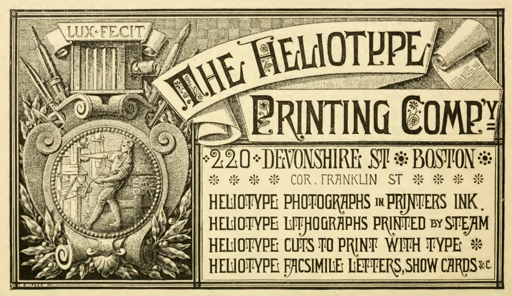
Advertisement: The Heliotype Printing Company, from: Boston Illustrated, 1878
—The Boston City Directory for 1876 shows Ernest with a home address at Downer’s Landing, Hingham. (MA) However, this was most likely a summer address as Downer’s was a popular harbor resort on Boston’s South Shore.
“It may be interesting to note the rapid development of the process in this city where it has found its home. Established in one room in Tremont Street towards the end of 1872, — notwithstanding the interruptions to business caused by the great fire and subsequently by the panic, — it already occupies premises covering over twenty thousand square feet of floor. In place of the one press with which operations were commenced, nearly fifty are now at work, and a steam-press is in course of construction—a growth which has been, indeed, in some respects too rapid, for so much work involves of necessity the instruction of a large number of men in an entirely new trade, and the organization of machinery to meet the requirements of an entirely new business. By slow degrees the number of employees has reached above a hundred, and every week adds to the number. By slow degrees, also, but still steadily, the process of improvement is going on, — the improvements that only can come of time and the experience gained by those employed in printing.” —The Heliotype Process, by Ernest Edwards, 1876, Boston: J. R. Osgood and company, pp. 11-12
“The range of subjects covered by the process is only limited by the limit of what can be secured in the photographic negative; whatever can be obtained in the negative can be printed at the printing-press, whether it be a portrait from life, a view from nature, an artist’s or architect’s drawing, a statue, a coin, a botanical specimen, a surgical case, -any subject that can possibly be photographed comes within its reach. The short description that I have often used as my text perhaps describes what I would say in the fewest words: “The pictures produced by the Heliotype process are, in effect, photographs printed in printer’s ink at an ordinary printing-press. They are produced with great rapidity, and independently of light; they are as permanent as engravings; they require no mounting, but come from the press with clean margins, finished, and ready for binding or framing.”—Ibid, p. 12
1877: The Boston City directories for 1877-79 show Edwards living at the Hotel Brunswick. Directly beneath this listing shows: Edwards E, Mrs. chiropodist, 130 Tremont, h. do. If this is his wife, it would appear Charlotte Edwards treated foot disorders.
1878: From Boston Illustrated: “On the upper floor of the Cathedral Building are the press-rooms and offices of the Heliotype Printing Company, which is conducted under the auspices of Houghton, Osgood & Co., and carries on a large business in the reproduction of engravings, the illustration of books, and commercial printing.
The heliotype process was invented in London in 1870, by Ernest Edwards, who coined the word “Heliotype” to express the results of his discovery. The process was introduced into the United States in 1872 by James R. Osgood & Co.; and Mr. Edwards, the inventor of it, has been from that date its superintendent. The pictures produced by this method are, in effect, photographs printed in printer’s ink, at an ordinary printing-press.
They are produced with great rapidity, and independently of light; they are as permanent as engravings, and require no mounting, but come from the press with clean margins, finished, and ready for binding or framing.”—Boston Illustrated, James R. Osgood & Co., 1878, p. 82B
—Edwards took delivery in April, 1878 of a 45’ open (steam) yacht he named Puck. She was built by Herreshoff Manufacturing, Bristol, Rhode Island. The Puck later featured in an article on marine photography for the August, 1881 issue of The Photographic Times. (see below)
—Edwards applied to become a naturalized U.S. citizen, presenting himself at the clerk of the circuit court in Boston on July 6. One discrepancy on the form: he was one year younger, writing his birthdate as November 6, 1837.
1879: The English press visits The Heliotype operation in Boston: from The British Journal of Photography, Nov. 21, 1879:
“A short time back, when in Boston, I called upon Mr. Ernest Edwards, and found that gentleman at the head of the photo-illustrative department of the large printing and publishing house of Houghton, Osgood and Co. The quantity of illustrative work turned out by Mr. Edwards and his numerous staff of assistants is very great, and the process of “heliotyping” there is carried on in all its possible ramifications, steam power being applied to several of the larger presses. I was shown much that interested me greatly, but which I cannot here describe. I may state, however, that the transferring of negative films, even those of large dimensions, is effected with a celerity and certainty I never saw equalled elsewhere. The development having been completed and the plate washed, the surface is rinsed with acidulated water, a sheet of gelatine, rendered flaccid by soaking, is squeegeed upon the wet film, and after a few minutes the whole is removed from the glass. In this way a film of about eighteen inches by fifteen was removed from the plate in less than three minutes, Mr. Edwards keeps up an intimate acquaintance with English photographic journalism, and appears to be not slow in availing himself of the suggestions therein to be found. His friends will be glad to know that “his shadow has not grown any less” since he came to reside in America.”—New York Correspondence, p. 560
Another Fire: The Heliotype Printing Company Burned Out
1879: On Sunday, December 28th, a much smaller fire took place in Boston. But this time, the Heliotype Printing Company, run by Edwards as part of the larger and short-lived Houghton, Osgood & Co. publishing house, was completely destroyed.
The American Bookseller, for their article The Fire in Boston on January 1, 1880, gave an extensive report on the fire, leading with the news the Heliotype firm and others were covered by insurance:
“Messrs. Houghton, Osgood & Co. have new quarters at 47 Franklin street, over Lee & Shepard, and on the 30th were filling orders with fresh stock received from the Riverside Press. …The fire originated in one of the upper stories of the five-floored Miller building, 91 Federal street, occupied on the first floor by Rice, Kendall & Co.: on the second, by Dwight Faulkner, wool; on the third, by T. Y. Crowell and Adams & Baker, bookbinders; on the fourth, by S. K. Abbott, bookbinder; and on the fifth, by the Heliotype Printing Company. Where or how the fire originated is and doubtless will remain a mystery. …
A connecting room. built for the convenience of the Heliotype Printing Company, united the upper story of the Miller building with that of the Cathedral building, occupied by Houghton, Osgood & Co., S. D. Warren & Co., the North National Bank, the New York and Boston and other Express Companies, and through this the fire was carried to the latter building. … The loss of the Heliotype Printing Company is complete, their valuable negatives, plates, stones, and presses being all destroyed; yet they are ready to receive orders for new work.” (pp. 5-6)
The publication followed up on February 2, reporting: “Among the heaviest losers by the late fire in Boston was the Heliotype Printing Company. All of their negatives, lenses, cameras, and various tools and appliances, the accumulation of seven years, were swept away in an hour. The Company, however, lost no time in resuming their extensive business, but, with a most creditable energy, they have fitted up the large building, Nos. 124 and 126 Pearl St., and are working night and day to repair their loss in machinery and fill their orders.” (p. 96)
And this report, from The Publishers’ Weekly, on January 31, which includes a deep-dive into the extensive printing processes the Heliotype firm was using at the time:
THE HELIOTYPE PRINTING ESTABLISHMENT.
One of the chief losses by the Boston fire was that of the entire plant of the Heliotype Printing Co., which has for seven years been bringing together from all parts of the world the processes and machinery and negatives which formed its being. Twenty-five thousand negatives, some forty to fifty specially designed hand and power presses, twenty or thirty lenses and cameras of all the best known makers, carefully devised appliances of all sorts, original engravings, works of art, designs, drawings, in fact every implement that went to make up its working whole, says the Boston Journal, was destroyed. Five dollars would more than cover the value of what has been recovered from the ruins.
It is the best proof of the success of this company that those interested, among whom Mr. Jas. R. Osgood is foremost, have determined to replace the plant as fast as can he done, and have already put a new establishment in working order. This is at 124 and 126 Pearl Street, Boston, and the company is already filling some orders.
It is curious enough that the first pictures offered for sale from this company’s presses were views and a map of the Burnt District caused by the fire of 1872. The first pictures now produced by the company in its new printing-office are views of its own Burnt District.
The heliotype process was introduced into this country by Mr. Osgood in 1872, when he secured both the patents for America and the services of Mr. Ernest Edwards, the inventor, as superintendent. The company has been very successful in the character of its work, and has had much to do with promoting the present art interest in the department of engraving.
The reproduction of some 200 or 300 of the leading subjects of the “Gray Collection of Engravings” was its tour de force in this direction. The bound volumes of heliotype reproductions from the great masters and from modern artists on the Houghton, Osgood & Co. list, are well known to the trade and to the art public.
Of the last of their heliotype publications, Darley’s outline illustrations of Hawthorne’s “Scarlet Letter,” a second edition was in press at the time of the fire. Among other issues for which the company furnished the plates were Woodward’s “Medical and Surgical History of the War,” Lieut. Wheeler’s “Annual Reports,” “The State Geological Survey of New Hampshire,” numerous local, military and family histories, the Harvard, Yale, Princeton, and College books, and indeed this whole class of photographic volumes. The amount and variety of commercial work meanwhile executed would be a surprise to many.
The company had acquired, beside the original heliotype patents, a large number of others, including a direct transfer patent, well known as the means of producing letters in facsimile, Edwards’ dye patent for printing from gelatine with colors soluble in water, the patent for the Woodbury process, Woodbury’s photo-gravure patent, Rye’s Lichtdruck patent and many others. They use a still larger number of processes, including heliotype, photo-lithography, relief plate work of all kinds, including zine etching and photo-engraving: also the latest forms of photo mechanical printing practised by Obernetter of Munich and other European experts.
In its new quarters the company takes a new lease of life, with the double benefit of old experience and new facilities. The former has led especially to the procuring of two large fire-proof vaults for the storage of negatives and valuable originals. The pluck which has thus put the company on its feet again may be trusted to make its future record an entire success. (pp. 86-7)
1880: The Heliotype Printing Company moves again to 211 Tremont St. in Boston, and Edwards is now living at the Hotel Vendome in the city. (City Directory) Although written nine years later, the following account in King’s Handbook of Boston gives an idea of business at this final premises for the firm: “The Heliotype Printing Company has its offices in the handsome white granite building at No 211 Tremont Street one square south of Boston Common. The upper floors of this structure are occupied by the varied works of the company and their extensive plant for almost all varieties of illustrative printing About sixty workmen are employed in this establishment The business was founded in the year 1872 by Ernest Edwards of London in connection with the publishing house of James R Osgood & Co and for many years and up to the present time the beautiful heliotype and gelatine prints of The American Architect now published by Ticknor & Co have been made here.
In the year 1880 the establishment was moved to its present locality having previously occupied part of the Cathedral Building in Winthrop Square.—King’s Handbook of Boston, 1889, pp. 366-67.
—Although not mentioned directly, The article gives an account of the 1885 restructuring of the Heliotype Company, after Ernest Edwards departed to New York City:
“Five years later its connection with James R Osgood & Co was severed and the Heliotype business became an independent concern. It is now owned by Donald Ramsay and Charles F Brown, the former of whom is the active manager and director of the works. Mr Ramsay had been connected with similar enterprises in his native city of Glasgow and in 1876 he entered the Heliotype Printing Company of which he is now the head.”
— Edwards elected President of the Boston Draughtsmen’s and Artists’ Association on Nov. 4, 1880. Located at 227 Tremont St., Boston, the Association was for those interested in landscape drawing and painting. —The American Art Review, 1881, p. 86
BOSTON DRAUGHTSMEN’S AND ARTISTS’ ASSOCIATION.
It is announced that this Association will hold monthly exhibitions of the work of its members during the winter season. The rooms are to be supplied with periodicals and magazines relating to art matters, and the teaching in the classes is to be supplemented by a series of lectures, which Messrs. Ernest Edwards, Dr. B. Joy Jeffries, Mr. W. J. Scandlin, Mr. William H. Baldwin, Mr. George F. Hammond, Mr. A. V. S. Anthony, and Mr. W. H. Partridge have volunteered to deliver.—The American Art Review, 1881, p. 130
In addition to being a photographer, Edwards apparently was also an amateur artist. It could rightly be argued his role as president gave him professional connections with established New England artists whose work might feature in future Heliotype Co. publications.
1881: The following appeared in The Photographic Times & American Photographer, for August, featuring Edwards in the role as skipper of his steam yacht Puck while hosting photographers taking pictures in Boston Harbor:
“Since writing the article “Shooting Yachts on the Wing,” which appeared in our July number, we have had an opportunity of going still more thoroughly into this pleasant kind of photo-marine warfare. About a week ago, when on a visit to Boston, we had the pleasure of a few hours’ dash through Boston harbor in the small but exceedingly swift, steam yacht of Mr. Ernest Edwards, the chief of the Heliotype Printing Company, Mr. Edwards himself acting for the nonce as chief engineer. Having with us a camera, the lens of which was fitted with an extremely simple trigger movement which we shall be glad to show to such as feel interested, we considered that it would be a photographic feat worthy of special notice if from the floor (we cannot say deck) of the smart little Puck we could secure transcripts of the ships under full sail as she was tearing along among them. To photograph passing ships from the deck of a large steamer is mere child’s play compared with doing the same from a small boat of the same class fitted with double engines, indeed a miniature edition, as regards the engines, of one of the ocean steamers. Every shot was a success whether the object aimed at was a passing steamer, a yacht, or one of the fore and aft rigged two and three masted schooners so characteristic of the Boston marine. The difficulty of making captures was enhanced by the fact that the swell rendered it necessary for us, on one or two occasions, not to trust to the insecure footing of the camera legs on the floor, but to almost catch it up and support it in our left arm, while with the right hand we pulled the trigger string at the fitting moment. Those who have not yet tried this kind of photography have a great treat in store.” (p. 270)
—His home address continues to be at the Hotel Vendome in Boston.
1882: Most likely during the summer months, he’s now listed again in the Boston City Directory as living at Downer’s Landing in Hingham, MA. (today known as Crow Point) He continues to live there through 1884.
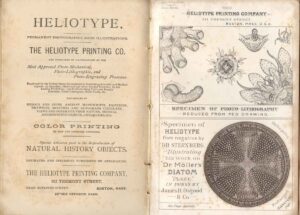
Double-page advertisement for HELIOTYPE & THE HELIOTYPE PRINTING COMPANY in “The International Scientists’ Directory, compiled by Samuel E. Cassino, Boston, 1882. At right are two examples of work by the firm: a photo-lithograph from a pen drawing and Heliotype from a photomicrograph of a diatom. “The advertisement is directly aimed at the illustration of scientific and especial attention [is] paid to the reproduction of natural history objects.” (Courtesy David A. Hanson Collection of the History of Photomechanical Reproduction/Clark Art Institute Library)
1885: In January, Edwards retired from his partnership with the Heliotype Printing Company. From The Paper Trade Journal, May 9:
“James R. Osgood & Co.. publishers, No. 211 Tremont street, Boston, and the Heliotype Printing Company, at the same place, have failed and assigned to Robert M. Morse, Jr., and the creditors of the two concerns will meet next Tuesday. The Heliotype Company and Osgood & Co. are very intimately related, the former consisting of Osgood & Co. and Samuel D. Sargent, of Cambridge, the latter being the treasurer. Until recently Ernest Edwards was a member of the Heliotype Company, but he retired from the partnership some time in January. The two firms being so closely connected, the Heliotype Company was carried down by the failure of Osgood & Co.” (p. 241)
—The Boston City Directory lists Ernest Edwards as having “removed to New York City“.
Reinvention: The Photo-Gravure Company of New York City
1885: Although retiring from the Heliotype company sometime in January, Edwards may have already left for New York City by late 1884. And with good reason. Even with a reported surplus, the Heliotype company failed, caused by the insurmountable debts of the parent Osgood Co. by May. Now, without the usage of the American patent rights for Heliotype retained by Ticknor and Company, Osgood’s successor, Edwards would have to reinvent himself, but now in a much larger city. With professional contacts made in Boston and New York over his 12 year tenure at the Heliotype Co., (they had operated a long-standing N.Y.C. branch) he went on to form a brand new company. This new printing & publishing concern was primarily dedicated to the intaglio Photogravure process. With name recognition in a crowded publishing landscape paramount, he named it after the process itself: The Photo-Gravure Company. It commenced business March 1st at 853 Broadway in the Domestic Sewing Machine Building, at 14th St. in Union Square.
—As soon as April, a portrait titled “From Life”, by American photographer Benjamin J. Falk, (1853-1925) is believed to be the very first photogravure plate published by the new Photo-Gravure Company. It was included in the The Art Union, The Official Journal of the American Art Union, Vol. 2, No. 2, April, May, June, 1885. Editorial comment by the Art Union:
PHOTO-GRAVURE IN AMERICA.
WE present with this issue a plate by the Photo-Gravure Company, of this city. It is a reproduction of a photograph from life. Of its quality it bears better witness than could any commendations of ours. The enormous strides made by the various processes of mechanical reproductions in this country during the past five years are too well known to need any special comment here. Such a plate as that of the Photo Gravure Company is the best guarantee that we have not ceased to advance. The secret processes of the French art printers have ceased to be secrets. The education of our workmen has progressed in proportion to the advancement of our knowledge of the mechanical arts of reproduction. We have not yet arrived at the fine artistic perfection of the French, it is true, but we are not far behind them, and are gaining on them every day. (p. 39)
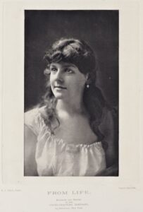
This study of an unknown woman, perhaps an aspiring New York City actress, is believed to be the very first photogravure plate published by Edward’s new Photo-Gravure Company. (credit: HathiTrust)
Thomas Yanul (1940-2014) a photographer and historian from Chicago who had begun early research on Edwards (encouraging PhotoSeed) before his passing, wrote:
“And also noteworthy, Edwards locates his company in the same office building (853 Broadway) as Edward L. Wilson, the publisher of the Philadelphia Photographer magazine (and later Wilson’s Photographics). The two worked often in concert, Edwards making gravures of images to be included in Wilson’s magazine, and Wilson editorializing about Edwards’ work and company.”
1886: Yanul continues: “In the Nov. 5, 1886 issue of the Photographic Times & American Photographer it was reported:
“We recently visited the works of the Photo-Gravure Co. in Brooklyn at the invitation of the President Ernest Edwards. Part of the building was a private dwelling, other parts formed the winter quarters for a circus-a place now a court between the buildings.” These buildings originally belonged to the American Photo-Lithographic Co. and were now the photographic, platemaking and printing operations for the Photo-Gravure co. They were located at Third Ave. & Tenth St., Brooklyn. (or 3rd Av. & 10th St.) The company was originally formed to do high grade printing, lithography, gelatin and gravure plate making.”
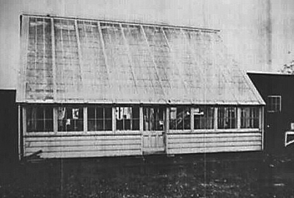
Glass-roofed printing shed identified as being associated with the Photo-Gravure Co. located at Third & Tenth Sts., Brooklyn, N.Y. Photograph probably ca. 1880-1900, courtesy Thomas Yanul & Osborne Collection, Div. of Graphic Arts, Smithsonian Institution.
1887: The Photo-Gravure Co. received perhaps the one commission it’s best known for today: the printing of 781 collotypes, which Edwards called photogelatine plates, (printed on copper) making up the monumental 11-volume publication: Animal Locomotion. An Electro-Photographic Investigation of Consecutive Phases of Animal Movements, 1872-1885, with the landmark sequenced motion study photographs taken by British photographer Eadweard Muybridge.
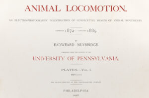
—Correspondent W.K. Burton, writing in The British Journal of Photography, was one of the first to review the Animal Locomotion plates-even while they were still being printed. In his article E. Edwards’s Photo-Mechanical Works, Brooklyn, New York for the June 24, 1887 issue he writes: “The thing most notable and interesting to me, however, was a series of reproductions of recent photographs by Muybridge. All readers will remember well his photographs of the horse in motion, &c. These, wonderful as they were, were defective, inasmuch as they showed no modelling —were, in fact, mere silhouettes. They were taken on wet plates; although when they were first published, at just about the time when gelatine dry plates were becoming popular, there was a general misconception that they came as one of the early examples of the wonders that could be wrought by the aid of the new dry plates.
In the new series the modelling is as good as could be desired, and the subjects are particularly interesting. There are animals of various kinds —a series showing most accurately a complete cycle of the flying of a bird, for example—but the majority of the subjects are human. They show almost every kind of motion conceivable. Walking, running, jumping, ascending and descending stairs, turning somersaults, bowling, batting, throwing and putting weights, &c. &c. The figures are male and female, nude and clothed. Wherever possible, two series have been taken to show the same cycle of motions, one nude, the other clothed, so that the positions taken by the clothing may be accurately observed. As, however, a number of the photographs represent different phases of dressing and undressing, this cannot be carried out in all cases. Some of the photographs–especially those of children -are, as pictures, quite beautiful. I do not know whether these new efforts of Muybridge’s genius have yet reached England, but it is to be hoped they soon will, as I can conceive of few things likely to be more useful to artists and others.” —pp. 389-390
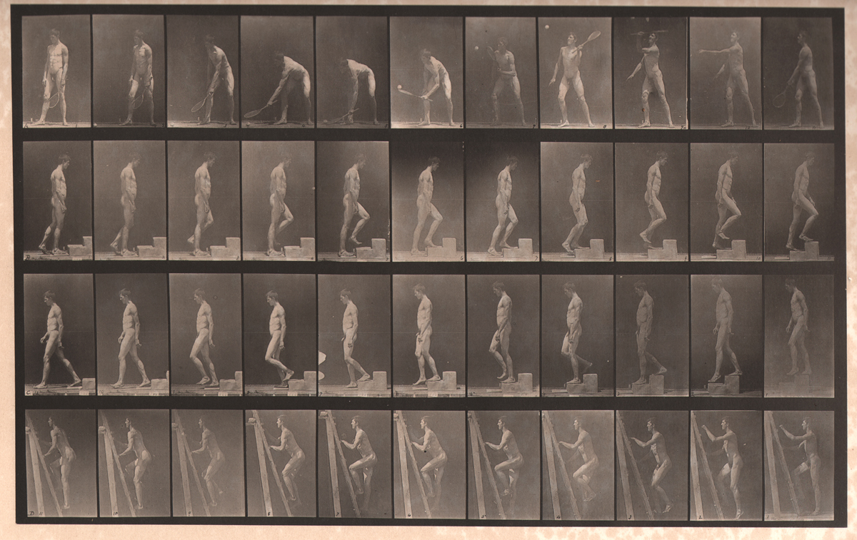
Photo-Gelatine Plate #486, Animal Locomotion, by Eadweard Muybridge: Top row—Bottom row, left to right: A: Lawn Tennis, B: Ascending a Step, C: Descending a Step, D: Ascending a Ladder. From: PhotoSeed Archive
Embracing Photogravure & Raising Photography to an Art
— Proselytizing for the photogravure process two years after setting up his new printing firm in New York City, Edwards spoke and gave a demonstration of the process on a hand-press at Clinton Hall to The Photographic Section of the American Institute. His June 7th lecture: “The Art of Making Photo-Gravures” was soon reprinted over multiple weekly issues in Anthony’s Photographic Bulletin & The Photographic Times and American Photographer. The following excerpt is notable as Edwards compares the advantages and disadvantages of photo-gelatine (collotype) plates with those of photogravure, and further criticizes the common practice then of publishers misattributing both:
“But I would like to say a word as to the advantages of photo-gravure as a method of photo-mechanical printing. It is not a cheap process. It cannot be printed with type. But just as a steel or copperplate print has qualities which are not possessed by a wood-cut, a photo-gravure has qualities-qualities which go without saying, not possessed by any method of typographic photo-engraving. What is known as the photo-gelatine process also produces results superior to the type method. But, although photo-gelatine work has a quality of its own and is in some respects unexcelled, photo-gravure, in other respects, has advantages over it. A photo-gravure can be improved and altered as much as may be desired after the plate is made till just the result needed is obtained, and when obtained the printing ceases to be a source of anxiety, as the edition printed should always be uniform. The plate is good for subsequent editions–which are exactly like the first–whenever desired, and they are made without the further action of light. There is a strength and robustness, and the blacks are more nearly velvet in a good photo-gravure plate than in any other photographic method. And there is room for far greater artistic development in photogravure than in any other photographic method. I cannot forbear in this connection from adverting to an unfortunate tendency that exists among some manufacturers and some publishers to call photo-gelatine work by the name of photo-gravure. What is the sense of this? Nothing in the world can beat the special qualities of gelatine printing-qualities which photo-gravures do not possess.
And nothing in the world can beat the special qualities of photo-gravures—qualities which photo-gelatine prints do not possess. To my mind it is as much an outrage on photo-gelatine as on photogravure work to reverse the names. Yet the tendency is to do just this thing—a serious mistake that will become, if not checked, a serious mis-fortune. Would there be any sense in calling a lithograph a steel-engraving? It would be just about the same as calling a photo-gelatine print a photo-gravure, and, though the result might benefit the producer for the moment, it would be otherwise when the deception was discovered.
In going through all the ancient, yet modern, history of the development of photo-gravure, one can but ask that old, old question, “What is there new under the sun? “
With the story before us of Fox Talbot’s process and the process of Pretch, of Woodbury’s process, and of aquatint engraving, of steel-facing and all the other tricks and turns, what is there new in what we are doing to day? Nothing, absolutely nothing. These men played the same play that we are playing, knew the words and the cues just as well as we do, only in one respect, one grand re-spect, is the situation changed. They played to empty benches. We have an audience–largely in this vast new world—an audience ready to applaud and to support all those results and efforts which tend to raise photography into art.”—Ernest Edwards, The Photographic Times & American Photographer, July 15, 1887, pp. 361-2
—See also: Photogravures and Photogravures by Ernest Edwards in The Philadelphia Photographer, Feb. 19, 1887, pp. 101-2: “It is to be regretted that recently a number of meritorious productions have been put on the market under the name of photogravures, which, in reality, have no claim to that title.”
1888: On March 21, fire destroys the Brooklyn plant leased to the Photo-Gravure Company:
Fire broke out at 1:50 o’clock on Wednesday morning in the two story and basement frame house, Nos. 484 and 486 Third avenue, Brooklyn, which is leased by Ernest Edwards & Co. as a lithograph works. The flames caused a damage of $2,000 to stock and machinery and $1,500 to the building, which is owned by the American Lithograph Company, No. 59 Broadway. (sic) (1.)
- The American Stationer: March 22, 1888. The correct address was 591 Broadway
Birth of Sun & Shade
“Within the covers of Sun and Shade…We shall especially endeavor to encourage the artistic side of direct photography in all its phases,”—Ernest Edwards, president & publisher, 1889
1888-96: Even with the story headline in the Brooklyn Daily Eagle newspaper declaring: “Lithographic Works Almost Completely Destroyed This Morning“, the firm apparently managed to rise from the ashes in the same location. (1.) In July, a new folio monthly began publication called Sun & Shade: A Photographic Record of Events. Published with letterpress and advertisements, it featured lovely oversized hand-pulled photogravure plates as well as plates printed in photogelatine, (collotype) and halftone. Subject matter included the work of leading amateur and professional photographers, as well as works of art-many then from the holdings of The Metropolitan Museum of Art in Manhattan. Success was swift. The first issue sold 1000 copies “in a fortnight” (2.) Within the first year, Sun & Shade quickly increased circulation to 4000 copies a month. With a public demand for reprinting earlier issues, this success lead to a rebranding, after which, beginning with the September, 1889 issue, the magazine was renamed Sun & Shade: An Artistic Periodical. The magazine would publish until at least March of 1896. (3.) In May that year, the N.Y. Photo-Gravure Company would close after declaring bankruptcy.
- Besides the business offices for the company at 853 Broadway, the address of 3rd Ave. & 10th St., Brooklyn, N.Y. appears on the September, 1888 issue of Sun & Shade.
- Sun & Shade: October, 1888. The August and September issues did not appear.
- Notice: The March, 1896 issue of Sun & Shade states the April 1, 1896 issue would feature “seven high-class, copper plate Photogravures of M’lle Calvé (French opera singer Emma Calvé-1858-1942) in Operatic characters, besides a dashing Color Plate of her as “Carmen,” reproduced from Chartrau’s Painting.” It’s unclear if this issue was ever published or the one for May, 1896 before the bankruptcy.
—The following is a typical review of Sun & Shade: “Number Three of Sun and Shade comes to hand, and meets with the hearty welcome which its two predecessors have prepared. The first plate in this number is an exquisite one in brown, a copperplate engraving of Mr. Hamilton Gibson’s “Autumn.” The portraits of vice presidential candidates, Morton and Thurman, are excellent as is also that of Mme. Jane Hading, the French actress. The “Examples of Modern Artists, No. Ill,” is a characteristic one of Carl von Piloty. It is a suggestive study for any photographer. Then there are the bronze portrait statue of Gen. Gouverneur K. Warren, on Little Round Top, Gettysburg, and the Tower of Catherine de Medici, at Blois, France, which are of great historical as well as pictorial interest. Altogether this number is an improvement on the two preceding issues. Where this progress will take us, in the course of the twelve numbers which its publishers advertise, if it continues at all as it has begun, it is impossible to conjecture. Perhaps Mr. Edwards knows. The price remains the same, 30 cents per copy; twelve numbers, $3. New York: Photogravure Company.” —The Photographic Times and American Photographer: Nov. 2, 1888, p. 528
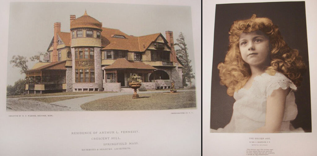
First Color Photographs in Sun & Shade: Left: “Residence of Mr. Arthur L. Fennessy, At Crescent Hill, Springfield, Mass.”, Milan P. Warner, American, 1848-1903. An architectural study of a mansion described as “printed in colors by a new process”, No. 2, dated October, 1888. Right: “The Golden Age”, portrait of girl with red hair by George G. Rockwood of New York. From Christmas issue, No. 4, dated December, 1888. Both photos are probably color prints, or possible collotypes. Ernest Edwards would later describe his invented color process “chrome-gelatine”. (both: unknown private collection)
1889: In November, The Photo-Gravure Company moved into a new leased building, located at 137 West 23rd Street, New York City. Located next to Proctor’s Theatre, the top five floors of the six-story building were taken over by Edward’s firm, with the basement and first floor store areas leased out. The Publisher’s Weekly in Oct. 1889 declared the store area “admirably suited for publisher book or art store”. A street-level photograph of the building appeared in the 1893 edition of King’s Handbook of New York City along with a two-page profile. Excerpt: “The New-York Photogravure Co. has a gallery fitted to produce negatives of all sizes up to 24 x 30, by the best orthochromatic methods. From this department to the packing room there is not a phase of any work, however trivial apparently, not carefully attended with the most zealous supervision. It seems easy, it is extremely difficult; but it is intensely fascinating. Mr. Edwards has yielded the energy, the incessant labor of a life-time, to that fascination. It is due to him that if the reproduction of paintings made in the United States may be matched abroad, the reproduction of landscapes from original negatives remains an unequalled and unapproachable American art. The New-York Photogravure Co. gives of it extraordinary models.
Sun and Shade reproduces not only the most notable paintings and portraits, but the best work of amateur and professional photographers. If it gave nothing but the latter work it would be deserving of the most liberal patronage that it receives; but it is an admirable record of the greatest paintings at the Metropolitan Museum of Art, of living American players, of portraits of celebrated Americans, of great American painters with reproductions of their work, and it is a monumental production of the New-York Photogravure Co.” p. 965 (King’s also noted for their own Handbook: “the designs for the cover linings and the series of bird’s-eye views were made by the New-York Photogravure; Company”)
—Before their new building was occupied, Edwards and Washington Lincoln Adams, the Photographic Times editor, toured the new building on 23rd St.:
“The Photo-Gravure Company of New York, makers of the excellent photo-gravures which embellish the weekly issues of THE PHOTOGRAPHIC TIMES, will shortly be the fortunate occupants of a most approved building in this city, especially adapted for their use. Some time next month they will move into the new building on Twenty-third Street which has been especially constructed for their purposes. The editor of this magazine, accompanied by Mr. Ernest Edwards, President of the Photo-Gravure Company, recently made an inspection of the building and greatly admired its accommodations. The company will have five stories with windows on three sides, and a roof, which is by no means the least available space for a photographic establishment. On the top floor a commodious operating room is arranged, with a northwestern exposure, and is supplied with four good-sized and well ventilated dark rooms. There are separate rooms for gelatine printing and photogravure work, also for carrying on the various stages of work in both printing methods. On the second floor will be the offices and show rooms. With such accommodations, the Photo-Gravure Company ought to largely increase their productiveness, and improve the quality of their work-if such a thing were possible. We shall go through the building again when it is completed and the Photo-Gravure Company is established in it, at which time our readers may look for a more detailed account of this model establishment for photo-gravure work.” —The Photographic Times, Oct. 25, 1889, pp. 529-30
—In Sun & Shade, a full-page advertisement from 1890 noted the new building…”has been completed and fitted with the best and most perfect appliances for the execution of illustrative and pictorial work of the highest class only, by their PHOTO-GRAVURE and PHOTO-GELATINE PROCESSES.”
1890: Because of capital expenditures, the likely result of the move to their new building, Edwards restructured his company, bringing on board additional trustees: “There has just been filed in the office of the Secretary of State at Albany the certificate of incorporation of the New York Photogravure Company. Objects: photomechanical printing and publishing. Capital, $50,000, and trustees, Ernest Edwards, Myrick Plummer, Walter B. Moore, August Fellheimer, William R. Stanbury, Isaac M. Cook and Morris J. Hirsch.”—The American Stationer, August 21, 1890, p. 403
1891: “It may be conceded that for the reproduction of paintings, Goupil’s results have not been excelled, but in the domain of printing from original landscape negatives, nothing has been done anywhere which at all equals that done in the United States. This has been brought about by the almost life-long labors of Mr. Ernest Edwards of the New York Photogravure Company, the pioneer of the process in this country.” —Wilson’s Photographic Magazine: Nov. 21, 1891: p. 681
1894: The state of the art: “An exhibition of photo-mechanical work, of unusual interest to all engaged in illustrative or reproductive processes, whether photographic or otherwise, was held at the Rooms of the Society of Amateur Photographers of New York, December 4th to 15th inclusive.” Excerpt:
“In completeness and interest the exhibit of the N. Y. Photogravure Co. (New York) may fairly be said to have surpassed any other. It included specimens of the ordinary photogravurc process, photo-gelatine prints, chrome-gelatine prints (reproductions of water colours, pastels, oil paintings, industrial objects and art subjects, printed in three colours by Ernest Edwards’s new process), examples of photogravures in colour (in which the photogravure plate is locally inked in with the desired colours as indicated in the original), and an instructive display of the method employed in producing photogravures and gelatine prints, from the securing of the original negative to the completion of the print in each process. The attractiveness of this exhibit was emphasised by daily demonstrations of printing photogravures and the presence of Mr. Ernest Edwards, who personally explained the processes operated by his company.
In the display of chrome-gelatine prints here mentioned was afforded the only opportunity given at the exhibition for the visitor to compare the original subject With the coloured reproduction. This consisted of a frame of variously coloured and figured oil cloths, attached to which was the chrome-gelatine reproduction.
The catalogue of the exhibition was also embellished with a chrome-gelatine picture, by this firm, from a pastel portrait by Mr. J. Wells Champney.” —The Photographic News, Jan. 25, 1895
1895: On June 10, Edwards files a lawsuit against Eadweard Muybridge, then affiliated with the University of Pennsylvania at Philadelphia for failure to pay bills plus interest due the N. Y. Photogravure Co. The suit was in connection with printing work affiliated with Muybridge’s 1887 Animal Locomotion series. Edward’s claim of $4,869.15 represented two separate actions, for $896.44 & $3972.71. The lawsuit claimed, in legal parlance, that Edwards as the plaintiff had “performed work, furnished material and expended moneys at the request of the defendant in and about the manufacture, storing, preserving and shipping certain prints or pictures pursuant to contract…”
Muybridge pushed back hard. In Sarah Gordon’s 2015 volume, Indecent Exposures : Eadweard Muybridge’s Animal Locomotion Nudes, he “disputed the claims of the Photogravure Company, deeming them “fraudulent designs, and refused to take credit for the financial losses. On August 5, 1895, he wrote to Jesse Burk, secretary of the university, “I have done my best and if I did not succeed in making the work pay for itself I cannot bring myself to believe that I am to blame.” (p. 32)
The lawsuit was settled the following June: “In the end, in a document dated June 9, 1896, and signed by Muybridge, Samuel Dickson, Charles Harrison, and Edward Coates, Muybridge signed over all interest in the Animal Locomotion plates, which were at that time in possession of the New York Photogravure Company, in exchange for Pepper paying the amount due and enough to properly pack and store the plates.” (p. 33) (Dr. William Pepper was the former University Provost. See more at Eadweard Muybridge Collection)
—Yet Another Fire: No. 77, January, 1895 issue of Sun & Shade carried a full-page publishers notice: “The proprietors of Sun & Shade greatly regret that, owing to a recent fire, the plates prepared for this—the January number,—were injured to the extent of necessitating re-making. Hence the production of the picture and monograph of “Christ in the Temple,” have been temporarily delayed. They will be presented in an early number of the magazine.”
—In May, 1895, Ernest Edwards is profiled for his advancements in color photography in the pages of The Violet ’96—yearbook for New York University—published by the Junior class. In a double-page spread titled The Progress of Photography, It first paid tribute to the school’s former professor of Chemistry John William Draper, 1811-1882, who “spent many years in investigating the action of sunlight on various chemical substances, and as early as 1834 used a sensitive paper made with bromide of silver to map the visible lines of the spectrum, but failed so to do.” Wikipedia states Draper “is credited with pioneering portrait photography (1839-40) and producing the first detailed photograph of the moon in 1840.” (he was a founder of the NYU School of Medicine) The VIOLET then segued to Edwards: “The part played by the Drapers makes every member of N.Y.U. interested in every real advancement in photography; and the class of ’96 takes a pardonable pride in presenting to its friends through the VIOLET an example of the nearest approach to the ideal of photography in colors. The means employed is known as the three color process and its successful application in this country is due largely to the incessant labor and energy of Mr. Ernest Edwards, president of the New York Photogravure Company. Mr. Edwards is not connected with the University, but the editors of the VIOLET take pleasure in here recognizing the good work he has done in advancing photographic methods.
In the following description of this process we frequently quote from a lecture delivered in December, 1894, by Mr. Edwards, before the Society of Amateur Photographers. There are, as we all know, three primary colors, yellow, red and blue; varying combinations of which give all the colors in nature or in art. By means of colored screens it is possible to exclude any one of the three primary colors in the object to be photographed from acting in the formation of a negative. The three color process is based on this power, and though in its infancy, has reached a high state of perfection in this country by the efforts of Mr. Edwards, the inventor of the photo-gelatine process called heliotype.” (p. 163, continues)
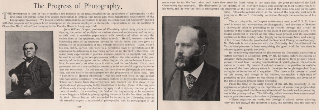
Pioneering New York University Chemist John William Draper, (1811-1882) left, and Ernest Edwards for his advancements in color photography are profiled in the NYU VIOLET 1896 yearbook. (PhotoSeed Archive)
1896: In the weekly trade journal The American Stationer for May 21, it was reported the company had gone into receivership:
The New York Photogravure Company, at No. 137 West Twenty-third street, has gone into the hands of a receiver, Henry M. Denton having been appointed by Judge Pryor, on the application of the directors. Ernest Edwards is president and principal stockholder, having 274 out of 500 shares of stock. The embarrassment of the company is ascribed to the prevailing depression in trade, which has particularly affected business in the artistic line, poor collections and lack of capital. The company has a capital stock of $50,000, and the business has been established eleven years. Besides photogravure work the company also published a magazine called Sun and Shade. The liabilities are $30,180. The assets consist of plates, prints, machinery, materials, &c., estimated worth $6,074, and book accounts nominally $14,644. out of which the officers think that only $2,500 will be realized. (1.)
- The American Stationer: New York: May 21, 1896: p. 886
A New Company
1896: Bankruptcy did not prevent Ernest Edwards from, as a short mention in the Process Photogram and Illustrator tell it soon after-to rise from the ashes, and in the same building no less:
The N. Y. Photogravure Co. has recently been broken up, but only for re-construction, for out of its ashes has sprung the Photogravure and Printing Co., 137 West Twenty-Third-street, New York, which takes over the work of the late Company, and which is under the management /of Ernest Edwards, the president of the late Company. (1.) The old accomodations would prove to be only temporary however, and the business soon found itself on the move again.
- The Process Photogram and Illustrator: unknown 1896 issue: p. 158 (November?)
The Photogravure and Color Company
1897: The firm moves to new quarters, 241 and 243 W. 23rd St. in New York City, opposite “The Chelsea”, changing its name again to The Photogravure and Color Company. Edwards is now co-owner, along with Karl Arvidson, (1859-1922) who formerly worked with Edwards at Boston’s James R. Osgood Co. (1)
- Advertisement: The Publishers’ Weekly: May 15, 1897, p. 834
— Edwards past association with Muybridge spurred a continued interest in the medium of moving pictures: “Mr. Ernest Edwards, President of the Photogravure and Color Co. of this city has perfected a very compact camera for the making of animated photographs, and is taking up this line of work with much enthusiasm. The Edward’s camera spool will accommodate 150 feet of film, and is fitted with many ingenious devices for its efficient operation. Its bulk does not exceed 15 x 15 x 8 inches, which is much less than the size of some of these instruments. The negative strips taken with this camera, shown to us by Mr. Edwards, are remarkable for their clearness and abundant detail in the images, resulting from facilities for ample exposure. The film perforating machine, also perfected by Mr. Edwards for this work, is a wonderful piece of mechanism, giving absolutely true perforations, the necessity of which is well understood by those familiar with the making of movement pictures.”—Personal Paragraphs: in: Wilson’s Photographic Magazine: June, 1897: p. 272
1900: At some point after the turn of the century, Edwards was believed to have ceded controlling interest in The Photogravure and Color Company to Arvidson, although at his death he was listed as senior partner in his obituary. In 1900, his occupation was listed as engraver while living in Brooklyn at his longtime home at 367 Eighth St. (1.)
- See: Brooklyn Ordinances, Resolutions, Etc, Volume 4 (1900)
1903: Died on March 10 of a cerebral tumor at 8:15 pm, according to his State of New York death certificate. He was 66 years, 4 months and 4 days old. Cremated, the certificate shows he was buried on March 12, although a final resting place is unknown. His wife Charlotte survived him, and she passed in 1922.
—Obituary: The Brooklyn Daily Eagle, March 16, 1903, p. 3:
Ernest Edwards.
Ernest Edwards, recently deceased, was a son of the Rev. Joseph Edwards, who was master, at one time of King’s College, In London, England, was born in London in 1837, within the sound of Bow Bells, was schooled in Leicester and afterward studied medicine for a time under Dr. Ord, at Bristol. He finally took a position under Dr. McPherson, serving in the Crimean War, becoming his secretary, and continued service until the end of the war. Returning home, he determined to take a course in Cambridge and went to PeterHouse, intending to become a clergyman, and passed the degree of B. A. He finally changed his mind, however, and took photography as a profession. During his career as a photographer in London he became one of the most distinguished members of the profession and made pictures of many of the noted men of that day, among them Darwin, Froude, Browning. the Prince of Wales, Queen Victoria and many others. He also invented the heliotype process, which created such a revolution in the art of Illustrating books, both is England and this country. He wrote many papers for the trade journals on the art of photography and the processes depending on it.
He frequently delivered lectures on the art of photography and engraving and the process work. One of his most Interesting lectures was his “Reminiscences of the Prince of Wales.” Mr. Edwards attended college at the same time with the Prince of Wales.
In 1872 James R. Osgood of the Ticknor, Osgood & Fields publishing house of Boston, bought the process for America, with the understanding that Mr. Edwards would come and start the business here. In the Fall of tho same year he went to Boston and started a factory, intending to return to England again, but Mr. Osgood made him a generous offer, which he accepted, and remained with the firm for several years. He then came to New York and started the photogravure business.
At the time of his death he was the senior partner of the Photogravure and Color Company of New York.
1872-1885: The Heliotype Printing Company of Boston
“The photomechanical revolution was truly the single most important contribution since the invention of moveable type“—David A. Hanson
Although not comprehensive by any means, we are indebted to the David A. Hanson Collection of the History of Photomechanical Printing for the following descriptions of works which include plates by the Heliotype Printing Company of Boston. The list spans 1872-1885, when Ernest Edwards was plant superintendent.
Flagg, Wilson
THE WOODS AND BY-WAYS OF NEW ENGLAND, James R. Osgood and Company, Boston, 1872. 8vo, 442 pages.
22 Heliotype illustrations from photographs of scenery. Ernest Edwards, England, moved to the United States when Osgood bought the Heliotype rights in fall of 1872. James R. Osgood, one of Boston’s most respected publishers, saw the Heliotype process in England during the summer of 1872, bought the American rights and induced the inventor, Ernest Edwards, to come to America and set up business in Boston. Edwards arrived in the fall of 1872 and apparently produced this book before the Christmas season because it still bore an 1872 copyright. The plates vary from somewhat rough to nearly perfect. No other publication has appeared with Heliotypes bearing a publication date of 1872 in the United States. (note: Heliotype Pictures of the Great Fire in Boston does include an 1872 date)
1873: Higginson, Thomas Wentworth
OLDPORT DAYS, With Ten Heliotype Illustrations, From Views taken in Newport, R.I., expressly for this work James R. Osgood and Company, Boston, 1873. 8vo, 268 pages. 10 Heliotype illustrations from photographs around Newport. This second book by the Heliotype process in the United States shows that the plant had developed the ability to produce excellent results. One of the reasons that so few books appear during the first year of Heliotype production might be because Osgood was preparing to print the Gray Collection of engravings from Harvard, a project that was to be an important art historical and educational project in the United States.
1874:1 B.Y.M.C.A. BAZAAR OF THE NATIONS. REPORTS AND ACKNOWLEDGEMENTS. Boston, 1873/74. 12mo, 64 pages. 9 Heliotype illustrations from photographs of tableaux of national costumes at the Bazaar. “Special acknowledgment is due to Messrs. J. R. Osgood & Co., for a liberal contribution toward the cost of the heliotypes illustrating this report, which are specimens of a new and valuable application of the photographic art; ..” page 61. The images include a group of lovely Heliotypes of grouped tableaux of people from Europe in native costumes.
1874:3 Drake, James Adams
HISTORIC FIELDS AND MANSIONS OF MIDDLESEX, James R. Osgood and Company, Boston, 1874. 8vo, 442 pages.
21 Heliotype illustrations, 1 map and 20 photographs of scenery. This is the third Heliotype book published in the United States by Osgood.
1874:5 Hitchcock, C.H.
THE GEOLOGY OF NEW HAMPSHIRE. Volumes 1 & 2 of 3. Edson C. Eastman, Concord, 1874/77/78. 8vo, 667 pp.
Vol. I, 21 Heliotype Plates, some with multiple images from photographs in the White Mountains, + 3 Albert-type Plates from drawings. Vol. II, 13 Heliotype Plates, some with multiple images from photographs in the White Mountains. This book is the earliest publication of a scientific nature in Heliotype and it is noteworthy that Hitchcock chose this process.
1874:8 Lowell, James Russell
THE COURTIN’, James R. Osgood and Company, Boston. (Copyright limitation 1873), 1874. 8vo, unpaged, 7 Heliotype illustrations from silhouettes by Winslow Homer. One of these plates also in THE HELIOTYPE PROCESS, 1876. Winslow Homer illustrated only two books. One of the plates in this volume is used as an illustration to Osgood’s HELIOTYPE book that was prepared for the World’s Fair in Philadelphia in 1876.
1875:3 Bonnemaison, The Chevalier F.,
A SERIES OF STUDIES DESIGNED AND ENGRAVED AFTER FIVE PAINTINGS BY RAPHAEL. American Edition reproduced by the Heliotype Process. James R. Osgood and Company, Boston, 1875. Folio, 59 pages, +24 plates. 24 Heliotype illustrations from engravings after paintings and details. “The reproductions in this edition have been made by the HELIOTYPE PROCESS; and the prints are about one-third the size of the original engravings.” This example, one of many produced at this time by Osgood, shows the company’s interest in disseminating art reproductions on a large scale. This folio volume is typical of the Gray Collection work as well as the numerous other art volumes to have come out of the Heliotype shop in the 70s.
1875:6 Coolidge, George A., compiler
BROCHURE OF BUNKER HILL with Heliotype Views. Revised edition with account of the Centennial. James R. Osgood and Company, Boston, 1875. 12mo, oblong, Printed paper wrappers, 38 pages, + 5 pages of ads. 10 Heliotype plates, 5 Autographic Heliotypes, 11 Heliotype Relief plates. From photographs, art, documents, signatures, etc. Autographic Heliotypes, Heliotype Relief Plates by James R. Osgood and Company, 131 Franklin St., Boston. Interesting in the number of processes that Edwards had spun off from the Heliotype, basically line work either planographic or relief. This little souvenir was originally published one year earlier and may be one of the earliest of this type of work.
1875:8 Flagg, Wilson
THE BIRDS AND SEASONS OF NEW ENGLAND. James R. Osgood and Company, Boston, 1875. 8vo, 457 pages. 12 Heliotype illustrations from photographs of scenery. The second Flagg book to include Heliotypes and still one of the earliest productions in book illustration by the company.
1875:9 Gilbert, G.K., A.M.
REPORT UPON GEOGRAPHICAL AND GEOLOGICAL EXPLORATIONS AND SURVEYS WEST OF THE ONE HUNDRETH MERIDIAN, etc., volume III GEOLOGY. (Wheeler Surveys) Government Printing Office, Washington, 1875. 4to, 681 pages, + 14 plates. 7 Photolithographs from photographs (5) and maps (2), 6 Heliotypes from photographs of
scenery and rock specimens. Heliotypes by James R. Osgood and Company, Boston; Photolithographs by The Graphic Company, New York. At this time Osgood started to develop government contracts and from now on a good part of his production in books came from these contracts. These photographs by Timothy O’Sullivan are striking and one or two are well known.
1875:10
THE HARVARD BOOK. 2 volumes. Welch, Bigelow and Company, Cambridge, Mass., 1875. Folio, Vol. I. 347 pages, Vol. II. 447 pages. Vol. I, 90 Heliotypes, 33 views and 57 portraits from photographs. Vol. II, 50 Heliotypes from photographs of views. James R. Osgood and Company, Boston produced the Heliotypes. A major production by Osgood and a lavish one as well. Probably one of the first photomechanical coffee table books, and nearly a coffee table itself.
1875:11 Massachusetts Normal Art School
THE ANTEFIX PAPERS. Papers on Art Educational Subjects, read at the weekly meetings of the Massachusetts Art Teachers Association, etc. Printed for private circulation, Boston, 1875. 8vo, 239 pages, ads, + 3 plates.
3 Heliotype illustrations after drawings. The note on page 239 details the plates and the chapter on “The Application of Photography to Engraving.” pgs. 162-7, quotes Ernest Edwards. The plates are by James R. Osgood and Company, Boston. This group of lectures, before the Art Teachers Association, points to the value of these methods for the dissemination of knowledge. The photomechanical revolution was truly the single most important contribution since the invention of moveable type.
1876:3 Curtis, Benjamin Robbins
DOTTINGS AROUND THE CIRCLE. 2nd Edition. James R. Osgood and Company, Boston, 1876. 8vo, 329 pages, + 12 plates. 12 Heliotype illustrations from photographs gathered around the world. A very good example of an illustrated travel book published in the United States from photographs purchased along the way. The frontispiece is by Watkins and some of the inside images are by Thomson.
1876:4 Edwards, Ernest
THE HELIOTYPE PROCESS, James R. Osgood and Company, Boston, 1876. 4to, 19 pages, + 28 plates. History and description of the process as well as a short list of publications of the Gray Collection of engravings from Harvard. 28 Heliotype illustrations from a number of methods, each designed to highlight various applications of the process; engravings, drawings, paintings, maps, etc. 5 plates are directly from photographs. This book was prepared in conjunction with Osgood’s display at the Centennial in Philadelphia. All of the plates are from prior publications and Edwards wrote the description of the process. This is one of the most lavish presentations executed by a printing firm as a form of advertisement and only Osgood would have such funds available. This book is one of the most significant photomechanical display books in the United States in the nineteenth century.
1876:5 Etting, Frank M.
AN HISTORICAL ACCOUNT OF THE OLD STATE HOUSE OF PENNSYLVANIA. NOW KNOWN AS THE HALL OF INDEPENDENCE. James R. Osgood and Company, Boston, 1876. 8vo, 204 pages. 28 Heliotype illustrations, some folding, with 29 images after art, documents, and 11 from photographs. It is possible that this heliotype production was to serve also as a special book for the Centennial. It contains illustrations from many different sources related to the building as well as exterior and interior views of how the halls were laid out for exhibition.
1876:16 Stillman, W. J., editor
POETIC LOCALITIES OF CAMBRIDGE, James R. Osgood and Company, Boston, 1876. 8vo, 41 pages. 12 Heliotype illustrations from photographs of scenery around Cambridge, Mass. (Some copies have different masking of one or two images, perhaps indicating a second, undated printing.) The noted painter and photographer William Stillman’s only book illustrated with collotypes. His photographs prefigure images by such masters as Emerson and Strand.
1878:1
THE BOSTON HERALD AND ITS HISTORY, Boston, 1878. 8vo, 93 pages. 7 Heliotype plates with 10 illustrations, 1 from art and 9 from photographs of the exterior and interior offices and rooms of the paper. Heliotype Printing Co., Boston, did the plates. A very nice self-published piece by the newspaper with excellent views of the various interiors including offices, the printing rooms and the newsboy’s room.
1878:5 Richardson, Charles F., and Clark, Henry A.
THE COLLEGE BOOK, Houghton, Osgood and Co., Boston, 1878. 4to, 394 pp. 61 Heliotype illustrations from photographs of college campuses. Plates by the Heliotype Printing Co., Boston. Here we see that Osgood has split off the Heliotype operation into its own branch, apparently so that the publishing arm could siphon off monies from the Heliotype business, by this time a major source of income. This aspect of the business is discussed below in the Osgood biography (listed under Later References).
1878:8
VIEWS IN THE WHITE MOUNTAINS, C. R. Chisholm and Brothers, Portland, Me., 1878. 12mo, 20 pages, + 12 plates. 12 Heliotype illustrations from photographs of White Mountain scenery. First publication in this series, no stars. The process is Heliotype (not credited, all subsequent Chisholm “White Mountains” refer to plates as “Heliotypes”). This small publication was the first of what is one of the best groups of heliotype books published. After this first attempt, Chisholm Brothers, who had the monopoly of selling in train stations and on board trains in the area, created a suite of White Mountains books that ran to three sets of books each in three different sizes, plus two compendium volumes in two sizes; a large group of these books is collected together below. (1879:11-19).
1879:12 Sweetser, M. F.
VIEWS IN THE WHITE MOUNTAINS (no stars), Chisholm Brothers, Portland, Me., 1879. Folio, unpaged. Compendium volume utilizing views from all three of the editions of the book. 22 Heliotype illustrations from photographs in the White Mountains. In 1880 Chisholm advertised this volume with 23 plates. This is by far the most lavish of all the White Mountains books. All in the folio size are extremely scarce, none more so than this compendium volume.
1880:8 Dutton, C.E., Captain of Ordnance, U.S.A.
REPORT ON THE GEOLOGY OF THE HIGH PLATEAUS OF UTAH Government Printing Office, Washington, 1880. 4to, 307 pages. 11 Heliotype illustrations from photographs of Western scenery, one plate is folding. The Heliotype Printing Co. Boston, executed the plates from photographs by John K. Hillers, (uncredited.) By this date the Heliotype Printing Co. has grown to be the most important photomechanical printer in the United States. The shear volume of production outstrips their nearest competitor. This volume of landscapes shows the company at its best. The quality of work is second to none.
The following titles produced from new quarters at 220 Devonshire St., after the Heliotype firm was burned out of the Cathedral Building in Winthrop Square.
1880:14
THE HELIOTYPE PRINTING CO. STARTING ANEW AFTER THE GREAT FIRE, From the Boston Journal, Jan. 17, 1880 Compliments of Heliotype Printing Company, [ca. 1880]. 8vo, 3 page flyer (single folded sheet). Flyer, important for the historical and technical information it contains about the history and operations of the company. A very important piece of ephemera describing in detail what was contained in the company when the fire destroyed it.
1881:14 Shaler, Nathaniel, and Davis, William
ILLUSTRATIONS OF THE EARTH’S SURFACE, GLACIERS, James R. Osgood and Co., Boston, 1881. Folio, 198 pages, 25 plates. 25 Heliotype plates with 33 illustrations, 3 of maps, the rest photographs of Glacial scenery, some two to a page. Plates by the Heliotype Printing Co., Boston, from photographs by W. H. Jackson, Braun, Frith, Knudsen, Bourne & Shepard. A major example of Heliotype printing and the first of what was to be a series. This seems to have been the only publication to make it to press.
1881:15 Shedd, Mrs. J. A.
FAMOUS SCULPTORS AND SCULPTURE, James R. Osgood and Co., Boston, 1881. 8vo, 319 pages. 13 Heliotype Illustrations by the Heliotype Printing Co., Boston, from photographs of sculpture. The image of Power’s THE GREEK SLAVE in this book is a fine example.
1881:16 Sigsbee, Charles D. Lieut.-Commander, U.S. Navy
DEEP-SEA SOUNDING AND DREDGING. A DESCRIPTION AND DISCUSSION OF THE METHODS AND APPLIANCES USED ON BOARD THE COAST AND GEODETIC SURVEY STEAMER, “BLAKE”, United States Coast and Geodetic Survey, Washington, 1880-81. 4to, 221 pp. 43 Plates. 25 Heliotype Plates showing the ship, Sigsbee’s sounding machines and various deck photographs of how to place it in operation. Plates are marked by The Heliotype Printing Co., 220 Devonshire St., Boston. An example of a lavishly illustrated report. The industrial photography in this book is of the highest quality and is striking in its directness.
1882: The Horse in Motion, J.D.B. Stillman; Eadweard Muybridge, Boston: James R. Osgood and Company, 1882. [ii]-viii, 127 pp., 107 plates, including 9 chromolithographs, 5 heliotypes, and 98 lithographs. The 5 heliotypes show 3 of the Muybridge camera set-ups & 2 show composite images of horses from life: “Mohammed in Running Stride” (20 photos) & “Edgerton,—Trotting Stride”. (24 photos) “In the spring of 1872, Eadweard Muybridge photographed a horse. He did so to settle a debate for Stanford about whether or not a trotting horse ever had all four feet of the ground. Although the photograph was blurry, it confirmed that horses did, in fact, have all feet off the ground while trotting or galloping, but unlike most artists’ depictions — with the front legs extended forward and the hind legs extended to the rear — the legs were brought in under the torso. From this initial experiment, Muybridge had captured aspects of motion whose speed had made them invisible. He was on the verge of revolutionizing photography and needed money and resources to continue. For this, he turned to Stanford.”—J. Willard Marriott Library Blog, Oct 19, 2021 (not in Hanson)
1882:4 Norman, Henry
AN ACCOUNT OF THE HARVARD GREEK PLAY, James R. Osgood and Co., Boston, 1882. 8vo, 129 pages. 15 Heliotype plates of photographs of the cast and the play in rehearsal. “The groups were photographed on the stage of the Sanders theater with the electric light;..are believed to constitute the most extensive piece of photography of this kind which has yet been attempted,..” were done by James Notman of Boston and Pach for plate Il. This early use of electric light for photography is interesting but the portraits of the actors in their costumes are far more entrancing.
1883:10
THE RAJAH. Madison Square Theatre, Tues. Sept. 11, 1883. “This Souvenir is presented in commemoration of the 100th Performance of THE RAJAH,” Madison Square Theatre, New York, 1883. 4to, cover with 8 plates, single punched hole with loose silk string tie. 8 Heliotypes of scenes from the Play. “The plates forming this Souvenir are reproductions, by the Heliotype Printing Co., Boston, of photographs taken in the Theatre by electric light by Falk, 949 Broadway, N.Y.” An interesting theatrical souvenir produced by the Heliotype Printing Co.
1883: Photo-Micrographs and How to Make Them : illustrated by forty-seven photographs of microscopic objects, photo-micrographs, reproduced by the heliotype process / by George M. Sternberg, Boston : James R. Osgood and Company. xv, [2], 204 pages, XX plates : illustrations (heliotypes) ; 24 cm. Volume includes 20 heliotype (collotype) plates. The frontispiece is a photograph of the apparatus used in the photomicrography process. Sternberg notes in this volume that he uses dry plates produced by the Eastman Dry-Plate Co.. Dry plates were first introduced in 1880. This volume is also advertised in ” The international scientists’ directory”. (Clark Art Institute Library copy: gift of David A. Hanson.)
1885:7
THE GARDENS AT MAGNOLIA-ON-THE-ASHLEY, [ca. 1885]. 8vo, oblong, Chromolitho wrappers with string, 1 page, +12 plates. 12 Heliotype plates from photographs of the gardens and bridges at Magnolia-on-the-Ashley, near Charleston, S.C. Another Heliotype view book and interesting because the cover of this and the cover of the Portland book (1885:21) use identical chromolithographs. View books from the South are much less common than from any other area of the country. (editor: this title may have been published after Edwards left the Heliotype firm)
1885-1896: The New York Photogravure Company of New York City
Works including plates by the New York Photogravure Company of New York City, courtesy of the David A. Hanson Collection of the History of Photomechanical Printing. The list spans 1885-1896, when Ernest Edwards was president.
1885:8 Goodrich, Lieut. Commander Caspar F., : U.S.N. REPORT OF THE BRITISH NAVAL AND MILITARY OPERATIONS IN EGYPT, 1882, Government Printing Office, Washington, 1885. 8vo, 340 pages, + 79 plates. 32 Collotypes from photographs of ravages of bombardment. The type style for plate identification here is identical to those in the edition published in 1883, where the plates are identified as being by the Heliotype Printing Co., Boston. The collotype method, patented by T. C. Roche and called Indotint and Photo-Gelatin, was the one Ernest Edwards stated (cf.. Philadelphia Photographer, vol. XXIII, No. 276, June 19, 1886) that the N.Y. Photogravure Co. used. Ernest Edwards left the Heliotype Printing Co. to found the N. Y. Photogravure Co. in the same year that the man that brought him to America, James R. Osgood, died. (sic: it was 1892) This seems to be the earliest dated book thus far located to have been produced by the N.Y. Photogravure Co. This company chose many different ways to identify themselves: NY Photo-gravure Co., Photogravure Co., etc.
1885: Log of the “Ariel” in the Gulf of Maine, illustrated by L. S. Ipsen. Log of Mr. Elson’s steam yacht, written by Mr. Parson, the “parson“. Published by: New York, Press of the Photo-gravure co.; Boston, Cupples, Upham & co. Volume: 18 x 28 cm with lithographed plates by the New York Photo-Gravure Co. The possibility exists the yacht was not the Ariel but the Puck, owned by Ernest Edwards, who summered on Boston’s south shore at Downer’s Landing in the early 1880’s. If he was also the “parson”, it may be a sly reference to his early aspirations for the clergy : “Among the recent books of Cupples Upham & Co are … The Log of the Ariel, a copiously illustrated record of a steam launch’s summer voyage down the Maine coast with many drawings by our Danish-American artist L.S. Ipsen. The yacht was that of Ernest Edwards, now of the Photo-Gravure Company, New York.”—The American Bookseller, May 1, 1886, p. 237 (not in Hanson)
Background on the Ariel, review of book in The Literary World, May 29, 1886: “she was built to the owner’s order in East Boston in 1881, to meet the requirements of a boat that should be reasonably seaworthy, reasonably fast, draw little water, be free from danger of explosion, call for a minimum of fuel and attendance, and have a day accommodation of from 6 to 12, with sleeping accommodations fro 2 or 3. The result was a boat 45 feet long, 8 feet beam on deck, with a standing-room of 5 feet, and a draught of 3 feet when the two-bladed propeller is in motion.” continues — p. 179
The Elson surname in the title is also suspect: although only about 25 at the time of publication, could this be the same Elson as Alfred Walter Elson? (1859-1938) If true, his profession aligned perfectly with Ernest Edwards, as Elson was an American photographer, printer, and lithographer based in Boston, and would go on to found A.W. Elson and Company. Active from roughly 1894 to 1925, this printer specialized in the making of fine photogravure plates.
1886:27: VIEWS OF COLUMBIA COLLEGE. Madison and Park Avenues, 49th and 50th Streets, New York, Library Bureau, 32 Hawley St., Boston, 1886. 4to, title page, +23 plates. 23 Collotypes (Indotints) from photographs of the college buildings both exterior and interior. The Photo-Gravure Co., New York, executed the plates and had purchased rights to T. C. Roches’ Indotint collotype variant. Even though this book makes no reference to the process used, Edwards, in other publications, made reference to this being the method adopted by his company.
—Also known as the Autoglyph process, the Indotint is believed to have been patented around 1881 or slightly before by Thomas Roche and later trademarked in December, 1881 by E. & H. T. Anthony & Co. of New York. An advertisement listing the processes of the Photo-Gravure Company from the 1887 Photographic Mosaics annual gives credit to Roche for their Photo-Gelatine prints: PHOTO-GELATINE PRINTING.—“The results produced by this process are similar to what is known as Albertype, Artotype, Heliotype, Autoglyph, Phototype, Lichtdruch, etc. The particular method used is that patented by Mr. T. C. Roche, and is believed to give the best results at the least cost. The Photo-gravure Company has in this department the best staff of printers in the country, and a most extended experience of the treatment of gelatine for the purposes of printing. All classes of subjects are suitable for reproduction by this process, and it is especially suitable for portraits, views, architecture, art catalogues, scientific and natural objects, book illustration, town, county, and family histories, theatrical and general advertising, reproductions of engravings, machinery, animals, and still life, copies of deeds, instantaneous effects, scientific records, mill labels, etc.”
1887:1 Burbank, Rev. W. H.: PHOTOGRAPHIC PRINTING METHODS: A PRACTICAL GUIDE, etc., Scovill Manufacturing Company, New York, 1887. 8vo, 221 pages, +2 plates, + ads. 1 Photogravure illustration from two photographs of Catskill scenery, “At The Catskills”. 1 Bromide print from a photograph of a Spanish cottage in Santa Barbara, Calif. An article by Ernest Edwards on Photogravure is in the book. The Photogravure Company, New York did the photogravure. Link to tissue gravure of plate from 1888 publication.
1887:7 Haynes, F. Jay: THE YELLOWSTONE NATIONAL PARK, Photogravures from Nature. F. Jay Haynes, Fargo, Dakota, 1887. 4to, oblong, Title and index pages, +25 plates. 25 Photogravure plates with 32 illustrations, by the Photo-Gravure Co., New York, from photographs of Yellowstone scenery by F. Jay Haynes, Fargo. These photogravures, from Haynes negatives, are much moodier and deeper in tone than the subsequent printings from them in other view books. It is interesting to compare these views with the later Haynes Yellowstone album in this collection printed in St. Paul in collotype (1896:3).
1887?: United States Naval Academy, Annapolis, Md, New York : Published by E. H. Hart, No. 248 East 23rd St., New York, 1887?, 49 unnumbered leaves : chiefly illustrations, plates ; 28 x 36 cm. 65 Collotypes on 45 leaves including a title page vignette … [executed by] The Photo-Gravure Co., N.Y., using T.C. Roches’ Indotint patent. … The photographs are by E.H. Hart, New York. This large view album by Hart is typical of his output as a photographer and as a publisher. It is interesting to compare this book with the West Point album that he did with Stoddard [CAI NE2698 S869w].”–Hanson Collection catalog, p. 91
1887: Animal Locomotion. An Electro-Photographic Investigation of Consecutive Phases of Animal Movements, 1872-1885. This landmark in the history of photography is comprised of 781 individual photo-gelatine (collotype) plates printed on copper by the Photo-Gravure Company of New York from sequenced motion study photographs taken by British photographer Eadweard Muybridge.
1887: The Land of Sleepy Hollow and The Home of Washington Irving: A Series of Photogravure Representations, With Descriptive Letter-Press by J.L. Williams, large quarto, original blue cloth over bevelled boards, upper cover gilt-lettered and with inset gravure, t.e.g., limited to 600 copies, G.P. Putnam’s Sons/The Knickerbocker Press, New York, 1887. Photogravure plates by the Photo-Gravure Company of N.Y.: Views of Tarrytown and the Hudson after photographs by Williams; and reproductions of drawings by F.O.C. Darley. “The present volume contains some thirty large photo gravure views and the mechanical execution text and illustrations is believed to be in keeping with the associations which hallow the spot where Irving lived and died.” Featuring about 30 gravure plates and priced at $15.00, this holiday book in 2026 dollars would be worth approximately $516.00 (not in Hanson)
1888: Edwards produces tissue gravure plates for: Bits of Nature: Ten Studies in Photo-Gravure. Three of the plates bear his credit, and others unidentified may also be by his hand. link here
1888: “A sort of landmark comes for (C.D.) Arnold via the elegant 1888 self-published book of 20 architectural views entitled “Studies in Architecture – At Home And Abroad”. A most curious and interesting fact here is the printer – “The Photo-Gravure Company” of New York. These plates were made by a company whose founder and president, Ernest Edwards, was already a legend in the photographic and printing trades.—Thomas G. Yanul. More on Charles Dudley Arnold 1844-1927
Cover for Studies in Architecture At Home & Abroad, 1888. Self-published by C.D. Arnold. Courtesy Thomas Yanul.
—The Log of the Ariel. A Summer Yachting Cruise on the Coast of Maine. New Edition, NIMS & KNIGHT, Troy, N. Y. 1888, 1 vol., oblong, quarto, $1.00. (not in Hanson)
1888-1896: Sun & Shade, an art periodical spanning 91 issues over 8 volumes, is published by Edward’s N.Y. Photo-Gravure Co. (several issues in Hanson with many plates at PhotoSeed)
1889:13 Peabody, Henry G. : THE COAST OF MAINE, Henry G. Peabody, Boston, 1889. 4to, oblong, unpaged. 48 (out of 50) Collotype plates, two never bound in, of photographs of the Maine shore. The Photogravure Co., N.Y, printed the plates from Henry G. Peabody’s negatives. Henry Peabody was a marvelous photographer and the landscape views in this large album are beautiful. The collotypes are also some of the richest, equal to the best of the Lithotype Co. or any other company working during this time. See our blog post “Reverie” from February, 2012 showing cover of volume with background on Peabody’s photographic practice.
1890: The Photographic Times And American Photographer: “Alfred Stieglitz was a subscriber and kept his set in his /library. This periodical and its plates was very likely his inspiration for producing the plates in Camera Notes and Camera Work.”Edward’s N.Y. Photogravure Company had been printing many of the plates for this journal since at least 1887.
1890:1: Adams, W. I. Lincoln, Editor: THE PHOTOGRAPHIC TIMES AND AMERICAN PHOTOGRAPHER Vol. XX, Part 1, The Photographic Times Publishing Assoc., New York, 1890. Folio, 314 pages, + ads, +27 plates. 16 Photogravure illustrations from photographs. 9 Phototype illustrations from photographs, 1 Half-tone from a photograph. P.C. Duchochois’ article “The Origins and Processes of Photo-Engraving” May 2-July 11 pgs. 212-14, 220-222, 256-59, 282-283, 294-96, 305-308, 318-321, 331-33. pgs. 331-33 in Vol. XX, Part 2. Alfred Stieglitz was a subscriber and kept his set in his library. This periodical and its plates was very likely his inspiration for producing the plates in Camera Notes and Camera Work. Link to all plates in PhotoSeed Archive
1890:12 Burbank, A.S. : GLIMPSES OF PILGRIM PLYMOUTH, Burbank, Plymouth, Massachusetts, 1890. 12mo, oblong, paper wrappers, +15 plates with printed descriptions on tissues. Reduction of large edition. 15 Photogravure plates with many composites from art and photographs. Photo-Gravure Co., New York produced the plates. An interesting comparison to the more common larger edition of this book.
1890:21 :Edwards, Ernest : NIAGARA, Photo-Gravures from Originals by Ernest Edwards, Nims & Knight, Troy, New York, [ca. 1890]. 4to, oblong, paper wrappers with Photogravure title, +13 plates. 13 Photogravure illustrations from 18 photographs of Niagara scenery. The plates are by the Photo-Gravure Co., New York. This is one of the few works that Edwards signed as photographer after he came to America. This book also is more usually found in hard covers with a text by M. F. Sweetser.
1890:29: Jackson, William Henry: GORGE OF THE NIAGARA RIVER. On the New York Central and Hudson River Railroad. Single large print by W. H. Jackson, n.p., 1890. Single Leaf, print size 16 3/8″ X 20 3/4″. 1 Photogravure from a photograph of the Niagara River. 1 small photogravure “Remarque” from a photograph of a railway engine and cars. Plate executed by the N.Y. Photogravure Co., New York. This is one of a series of large display photogravures that William Henry Jackson executed for the New York Central, for their passenger waiting rooms. This plate size has to be one of the biggest used commercially during this time period. Larger plates have not been noted in any bibliographies or histories. See another example showing a landscape at West Point from our archive.
1890:46: SOUVENIR OF AUSABLE CHASM, W. H. Tracy, Proprietor, Ausable Chasm, New York, [ca. 1890]. 12mo., paper wrappers, title page, 1 page text, +12 plates. 12 Photogravure illustrations from photographs of Chasm scenery. Printed by the New York Photogravure Co., New York, photographs attributed to S. R. Stoddard, uncredited. This souvenir and the one above are companions to the one published by Stoddard mentioned earlier (1890:42). These plates also have lovely remarques drawn next to each on the page.
1891:9 ST. AUGUSTINE IN PHOTO-GRAVURE. Chisholm Bros, Portland, Maine, 1891. 8vo, Oblong. 40 Photogravure plates of St. Augustine views, + Pictorial title page with photogravures. Many of the plates in this are duplicated in Bierstadt’s St. Augustine book. The plates were produced by the N.Y. Photo-gravure Co., 137 West 23rd. St, New York, B.F. Upton of St. Augustine, Florida, is credited with the negatives. This book compares more than favorably with Bierstadt’s venture of the same time period. Where Bierstadt’s Artotypes appear flat and lifeless, these photogravures are full of contrast and a rich and detailed tonal range.
1891:12: Whitney, Ernest (poems). Sanford, W. H. (pictures) PICTURES AND POEMS OF THE PIKE’S PEAK REGION, Ernest Whitney, Colorado Springs, Colorado, 1891. 8vo oblong, Title page, 12 Plates +12 Tissues with poems printed. 12 Photogravure illustrations from photographs of scenery in the Rocky Mountains. The photographs by Stanford are not at all like Jackson’s and offer a refreshing change from the same views usually encountered. The photogravures are by the NY Photogravure Co., this time cited as Photo-Gravure Co.
1891:13 Williams, Dr. J. L.: GRAY’S ELEGY AND ITS AUTHOR, Nims and Knight, Troy, New York, 1891. 8vo, oblong, 41 pages, +16 plates. 16 Photogravure plates with 18 illustrations from photographs of English scenery and Genre scenes. Numerous Half-tones from photographs. Printed by the New York Photogravure Co., New York, and by Kurtz, New York. This James Leon Williams book is the smallest of the three with photographs that he published. His appropriation of P. H. Emerson’s style becomes evident in this publication. Some of the gravures are very nice and one or two are extremely beautiful.
1891: Appleton, Jeannette M., Photogravures of Manchester-by-the-Sea, Beverly Farms, Prides Crossing. Oblong folio, Original grey sugar-paper covered boards, title printed in black within decorative border (the whole designed by J.E.H.) 18 tissue photogravures printed by the New York Photogravure Company., published by J. Eastman Chase, Boston, 1891.(“Original Negatives By Jeannette M. Appleton: Copyright, 1890, Jeannette M. Appleton) (not in Hanson)
1892: Old Friends with New Faces / photographic illustrations by Mrs. N. Gray Bartlett, Boston, Mass. : Joseph Knight Company, 1892. “Ten pages of tissue photogravures with text and photographs illustrating nursery rhymes. Mrs. Gray Bartlett is shown in Mother Goose costume holding her camera. Photogravures by the NY Photogravure co.”–Hanson collection catalog. Link to online version at the Clark.
1893:4: Bartlett, Mrs. N. Gray: MOTHER GOOSE OF ’93. Joseph Knight Company, Boston, 1893. 4to oblong. 10 Photogravure plates on tissue. Title page and intro have photo vignettes, and the 8 rhymes with photographs are hand lettered. The NY Photogravure Co. produced the plates and are identified on the Miss Muffett plate. This is possibly the most exquisite use of tissue photogravure in the United States. This extremely delicate volume could never have been handled by children because they would destroy it. It can hardly be looked at today, considering the gravures are only tacked down on the binding edge. The luminosity of these plates is superb. The photographs by Mrs. Bartlett are wonderfully charming and not at all cloying. Her abilities as a photographer of children are perfectly demonstrated in these re-enactments of Mother Goose rhymes.
1894:2: Irving, Washington: RIP VAN WINKLE, Joseph Knight Co., Boston, 1894. 8vo, 49 pages, +24 plates. 24 Photogravure illustrations from photographs of Catskill Mountain scenery. Plates are uncredited, but by the Photo-Gravure Co., New York. See SUN AND SHADE Vol. 5 for image from this book reproduced. This very fine group of Catskill photographs was very likely photographed by Ernest Edwards. A small photogravure of his is published in The Photographic Times (1894) that clearly is from this series. This book is interesting from another point of view: the photogravures are not listed in the plate list, many of the plates listed are not in the book, and the edition seems rather stitched together. All examined copies of this book are like this one. Many of the best photomechanical books of this time period were productions of the Joseph Knight Co.
1894:8; Williams, James Leon: THE HOME AND HAUNTS OF SHAKESPEARE. STRATFORD EDITION, Charles Scribner’s Sons, New York, 1894. Folio, XIX +120 pp. + plates. This is the second edition, the first having 45 photogravures. 15 Chromolithographs from watercolors, 30 Photogravure illustrations from photographs. No printing company is credited, but the other Williams books were done by the New York Photogravure Co. Williams produced three very fine books of photogravures from his photographs. This book is his most commanding work, with large and lush photogravures. The other two books were printed by the NY Photogravure Co., but no printer has ever been identified for this book. The photogravures in this book are some of the best commercial plates done in the 1890s.
1895:3: CATALOGUE OF MR. LOUIS R. EHRICH’S COLLECTION OF PAINTINGS OF THE DUTCH AND FLEMISH SCHOOLS, Fifth Avenue Art Galleries, 366 Fifth Ave., New York, 1895. 4to, Paper over boards, unpaged. Sales catalogue for 94 paintings on January 22 and 23, 1895. 1 Three-color Collotype, 12 (out of 13) photogravure illustrations from paintings all by the New York Photogravure Co., New York. This example of an auction catalogue has a reproduction of a Dutch painting done in three-color collotype which shows again the state of this art in its earliest stages. Though not at all prefect it makes the photogravure reproductions in tone look totally useless. Color in art reproduction, was only possible before this by creating multiple masked plates printing in multiple colors. This plate represents early attempts to reproduce paintings through color photography.
1895:15: Stoddard, S. R.: CAMP LIFE, Twelve Photogravures from Original Photographs by S. R. Stoddard, Joseph Knight Company, Boston, 1895 (ca.). 4to, oblong, Photogravure title on cover, +12 plates. 12 Photogravure plates with 18 illustrations from photographs of Adirondack scenery. 1 Photogravure from a photograph pasted down to cover as title. Printed by the N.Y. Photo-Gravure Co., N.Y. This, by far, is Seneca Ray Stoddard’s most important book: it contains most of his best examples, and the photogravures are wonderfully printed. It shows that he was more interested in capturing the actual feel of the place and its people than in presenting the standard tourist fare that most other photographers would produce. Few copies of this remarkable book are known, which leads one to believe all of his books were produced in very small editions.
1895: The VIOLET ’96, Vol. VI, annual yearbook of New York University published by the Junior Class, with color frontis of a portrait in oil of chancellor Henry Mitchell MacCracken, reproduced by the chrome-gelatin process; & several collotype & halftone plates of select faculty & student groups by the N.Y. Photogravure Co., 191 pp, xvii, 8vo, printed & bound by WM. A. Baker, Newark, N.J. (inside back cover ad for Sun & Shade states “Illustrators of this annual.” (not in Hanson)
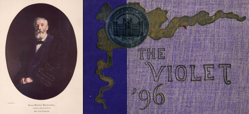
Left: Frontis plate from oil painting of Henry Mitchell MacCracken, 1840-1918, 6th Chancellor of New York University, reproduced by Edward’s chrome-gelatine color process. The University claimed it was “the first college publication to employ this latest and most remarkable development of the heliographic processes.” Right: Cover detail of The VIOLET ’96, Vol. VI, containing the plate. (PhotoSeed Archive)
1901: Ernest Edwards, Photo-Mechanical Processes in Common Use, Brooklyn, New York, Eagle Press, Pamphlet, [4] p. 24 cm, OCLC Number: 37953930 (not in Hanson)
Works including plates by Photogravure & Color Company of New York City: 1896-1940, when Ernest Edwards & Karl Arvidson, and later Charles Furth owned the company.
1896:9 Woodbury, Walter E., (Editor) : THE AMERICAN ANNUAL OF PHOTOGRAPHY AND PHOTOGRAPHIC TIMES ALMANAC FOR 1897, The Scovill & Adams Company, New York, 1896 8vo, 370 pp. 1 Photogravure from life, 1 Tinted Half-tone from Nature, 2 Three-Color Half-tones I from nature and one from art, 1 Collotype from nature, 1 “Wood-cut Finish” Half-tone from nature, + numerous half-tones by many companies. Ad for the PHOTOGRAVURE AND COLOR COMPANY, 241 & 243 West 23rd St., New York. Ernest Edwards and Karl Arvidson proprietors. “Having purchased the stock of Plates of the N.Y. Photogravure Co., of 137 West 23d St., we are carrying on the business conducted by them.” Photogravure plate making and printing, Photogelatine printing, Three Color printing by the Photogelatine process, color screens, steelfacing. Article of photomechanical interest: “Half-Tone Blocks With Wood-Cut Finish” by Alfred Stieglitz with 2 examples with and without. The various companies producing plates were E. C. Meinecke NY, Photo Colortype Co. Chicago & NY (one with Trade Mark), Providence Heliograph Co.
1898:3 : Johnson, Richard L.: NIAGARA: ITS HISTORY, INCIDENTS AND POETRY, Richard L. Johnson, Walter Neale, General Book Publisher, Washington, D.C., 1898. 4to oblong, 85 pp. 1 Three Color Collotype (on cover) from a painting by Church, 8 Photogravures, numerous half-tones. Some of the photogravure plates were used in the View Book NIAGARA by Ernest Edwards, published by Nims and Knight, [ca. 1890]. The color collotype and the photogravures produced by the Photogravure and Color Co., New York. This is the point at which Edwards and Karl Arvidson, his partner, closed shop and started over as the Photogravure and Color Co. From the title page: Illustrated by a Reproduction in Original Colors of F. E. Church’s Famous Painting, ” Niagara Falls,” (in The Corcoran Gallery of Art), by the Photogravure & Color Co.; by Photogravures in Tint from Original Photographs by Ernest Edwards, made by The Photogravure & Color Co., New York ; by Half-Tones from Original Photographs by Soule, Ernest Edwards and The Mathews-Northrup Co., made by Gatchel & Manning, Philadelphia ; The Mathews-Northrup Co., Buffalo; The Maurice Joyce Engraving Co., Washington. Note: this volume includes an 1888 plate by photographer John E. Dumont shown in our archive here.
1898: Schenk, Charles, Artistic studies of the human body, a monthly publication, complete in 10 parts, hundreds of photographs of the human body, parts of male, female and children taken from life, each part containing 6 plates with about 30 subjects, Charles Schenk New York, 1898, Paper folder, Part 7 in ink over 1 only. 6 Collotype plates of male poses, plate numbers, 23, 24,25,36,46,47 – as found. 3 plates in brick color and three plates in black ink. Three printers are listed, the Photogravure and Color Co., the Albertype Co., and H. A. Rost Printing and Publishing Co.
1908:2: PUBLICATIONS OF THE LICK OBSERVATORY, Vol. VIII. PHOTOGRAPHS OF NEBULAE AND CLUSTERS MADE WITH THE CROSSLEY REFLECTOR BY JAMES EDWARD KEELER, DIRECTOR OF THE LICK OBSERVATORY, 1898 – 1900, University of California, Sacramento, 1908. 4to, 46 pp., + 70 Plates. 70 “Heliogravure” Photogravure plates of photographs of the heavens taken between 1898 and 1900. The Photogravure and Color Company, New York did the plates. Discussion is made in a special note accompanying the book that some of the plates exhibit rings around the bright stars that were not visible before the plates were steel plated. The book was issued as such anyway because too much time would have been required to remake the plates. Where scientific accuracy is required small details that wouldn’t matter in another context could lead to errors not warranted.
—Dinner card from the White House, ca. 1920 (not in Hanson)
1937: Adolf Fassbender (1884-1980) Pictorial Artistry: The Dramatization of the Beautiful in Photography, 40 hand-pulled photogravure plates, spiral-bound in a cloth-covered folio 16 x 13-1/4 x 1 inches (40.6 x 33.7 x 2.5 cm) Signed, with a limited edition of 1,000 examples. Published by B. Westermann Company, Inc., New York, printed by William Bradford Press, New York, gravure plates by The Photogravure and Color Company, New York (not in Hanson) More information here.
1940: Paul Strand. Photographs of Mexico. The very beautiful and historic first edition, limited to 250 copies in all, signed in ink by Strand at the end of his acknowledgments– far rarer than the reprint of 1967. 20 hand-pulled photogravures mounted on B.F.K. Rives paper, each numbered sequentially in green ink on the verso. Sheet size: 403 x 318 mm. Print size varies, from 162 x 127 mm. to 257 x 203 mm. Original tissue guards. Strand very carefully oversaw the production of this portfolio, published by his wife Virginia Stevens, and notes that “these hand gravures mark a step foreword in the art of reproduction processes. Without the close cooperation of Mr. Charles Furth of the Photogravure and Color Company, and his staff of skilled craftsmen, the approximation of these reproductions to the qualities of my original prints could not have been achieved.” Sales description: Ars Libri Ltd. (not in Hanson) More background
The Photogravure and Color Company survived Charles Furth, with better known examples of plates appearing in various editions published by The Limited Editions Club from the 1940’s, 1950’s & 1960’s.
Further Reading & Viewing
Article: “Ernest Edwards and the Permanent Photograph.” Julie Mellby: Journal of the Printing Historical Society, 3rd series, 6 (2025): 133–54. (Mellby is graphic arts curator emeritus, Firestone Library, Princeton University)
Video: “What Did Muybridge and Darwin Have in Common? The Heliotype“. Mellby originally delivered this talk at the University of Pennsylvania’s Workshop in the History of Material Texts on September 23, 2024. Link on YouTube. Overview: “During the nineteenth century, publishers, printers, artists, and chemists struggled to make fugitive photographic images permanent. Ernest Edwards solved this problem by developing the heliotype, a method of printing photographic negatives in ink, without a screen or need for cropping, making it the ideal solution for illustrated books and journals. Among the most important publications to use this process were Charles Darwin’s seminal 1872 The Expression of the Emotions in Man and Animals, followed by Edward Muybridge’s massive eleven volume Animal Locomotion begun in 1883. This is an overview of the Edwards process and how it was used.”
Book: No longer in business, the Meriden Gravure in the US was one of the most important collotype printers in the U.S. It employed the process from its founding in 1888 until discontinuing it for offset printing in 1967, when its’ presses were cut up and sold for scrap. An interesting read is William J. Glick’s In the Service of Scholarship: Harold Hugo & The Meriden Gravure Company, Oak Knoll Press, New Castle Delaware, 2017. I found Glick’s explanation of the very technical process of collotype well informed, and for a layman like myself, understandable. An excerpt:
“Although collotype was theoretically a planographic process, in actual fact it had some of the characteristics of an intaglio process. The recessed image areas held a depth of ink that transferred richly to the printed sheet. This transfer could only take place under heavy pressure; the weight of the press impression cylinder had to squeeze the paper slowly and laboriously into the plate on the bed of the press as it passed under the cylinder.”(p. 2)