Featured Entries from the Photoseed Blog

Engraving
7 Entries

Belief in Relief: The Art & Craft of Letterpress

Oct 2025 | Advertising, Alternate Processes, Engraving, PhotoSeed, Publishing, Typography

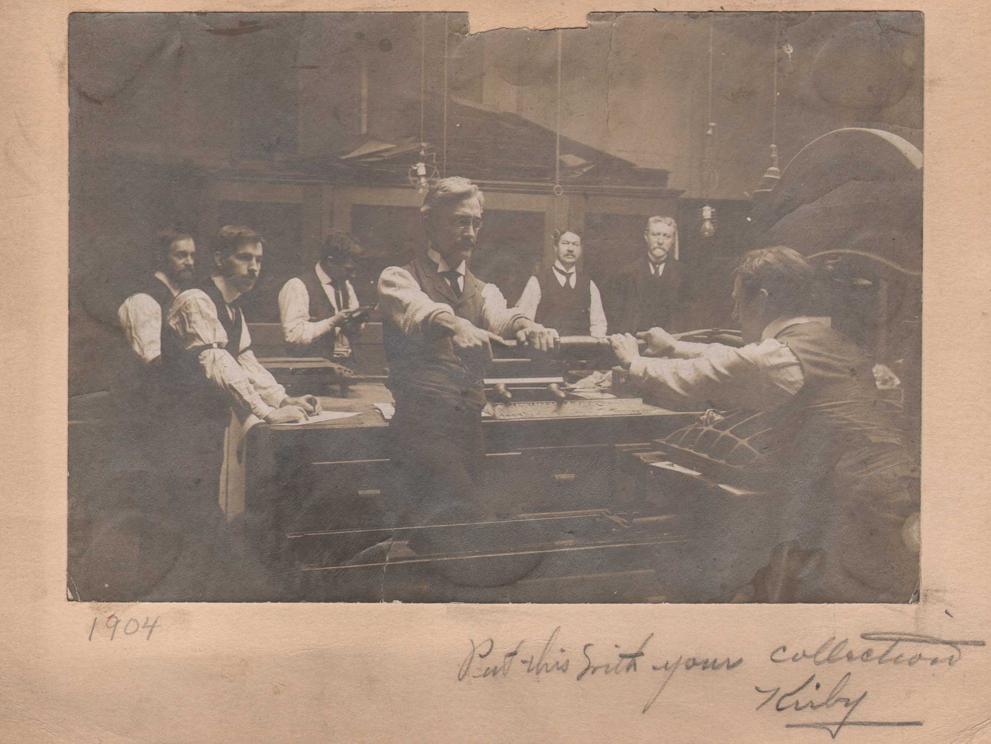
Put this with your Collection Kirby”, 1904, unknown American photographer, mounted gelatin silver print on card, 11.1 x 16.1 | 16.1 x 20.4 cm. Two men at foreground right work as a team while operating a Washington style, iron hand letterpress in an unknown American printing shop. Featuring an “acorn” style frame armature and large honeycomb-style platen which was lowered by a toggle gear activated by the lever, shop employees look on during a printing session in background. The site Letterpress Commons states: “The Washington Press was by far the most popular iron hand press in America, a position it held from the 1820s until the end of the hand press era. The press was invented during the 1820s by Samuel Rust, a New York printer nearly unknown today.” The distinctive platen may indicate this press dates to the 1890s, possibly manufactured by the Chicago’s Ostrander-Seymour Company. From: PhotoSeed Archive

Unconsciously, we’re all born into the world leaving remnants of ourselves as we travel through it: our fingerprints in things we touch and footprints on the paths of our travels. Technically, those remnants, via bodily oils from our fingers and tracks from our shoes, are unconscious ephemeral examples of letterpress impressions. But from a machine perspective, print itself: letterpress impressions on paper emanating from Johannes Gutenberg’s (c. 1400-1468) mid-15th century invention of the printing press which lasted until (photo) offset printing largely supplanted it in the mid 20th Century, forms an indelible record of the achievements of human history accurately recorded.
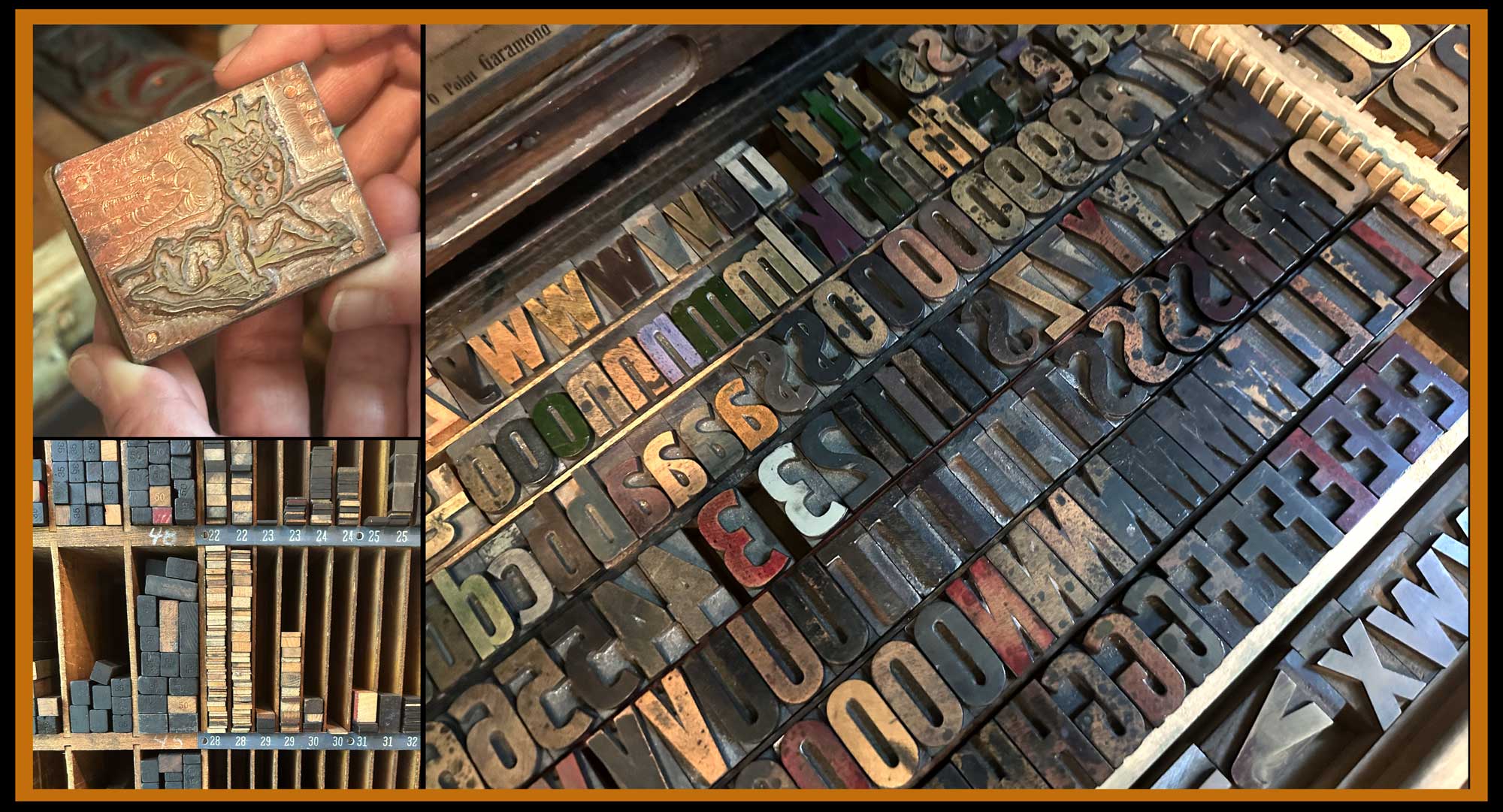
Right: At Igloo Letterpress in Worthington, OH, a large assortment of individual letters, made from oversized wood and metal type, await ink and new projects while stored in a print studio drawer. UL: owner Allison Chapman holds one of the very first antique metal design cuts she printed: a baby whose crown spells out Happy Birthday. LL: letterpress “furniture” is stored by size. These individual pieces of wood (or metal) are used to fill up spaces and lock up type within a metal frame, or chase, before printing. Photographed Summer, 2025 by David Spencer for PhotoSeed Archive.

Today’s post is divergent from the sites primary focus of historical photography but entirely symbiotic in that the art and craft of letterpress printing derives from the perfect marriage of words and pictures, otherwise known as type and design. Although modern and even historical photographs and images printed in ink: think lithographs, ink-jet prints, newspaper photos and others are by the planographic process, intaglio printed images (copper plate engravings, gravures, etchings, etc.) are from recessed printing matrixes. Letterpress printing by itself is a relief process.
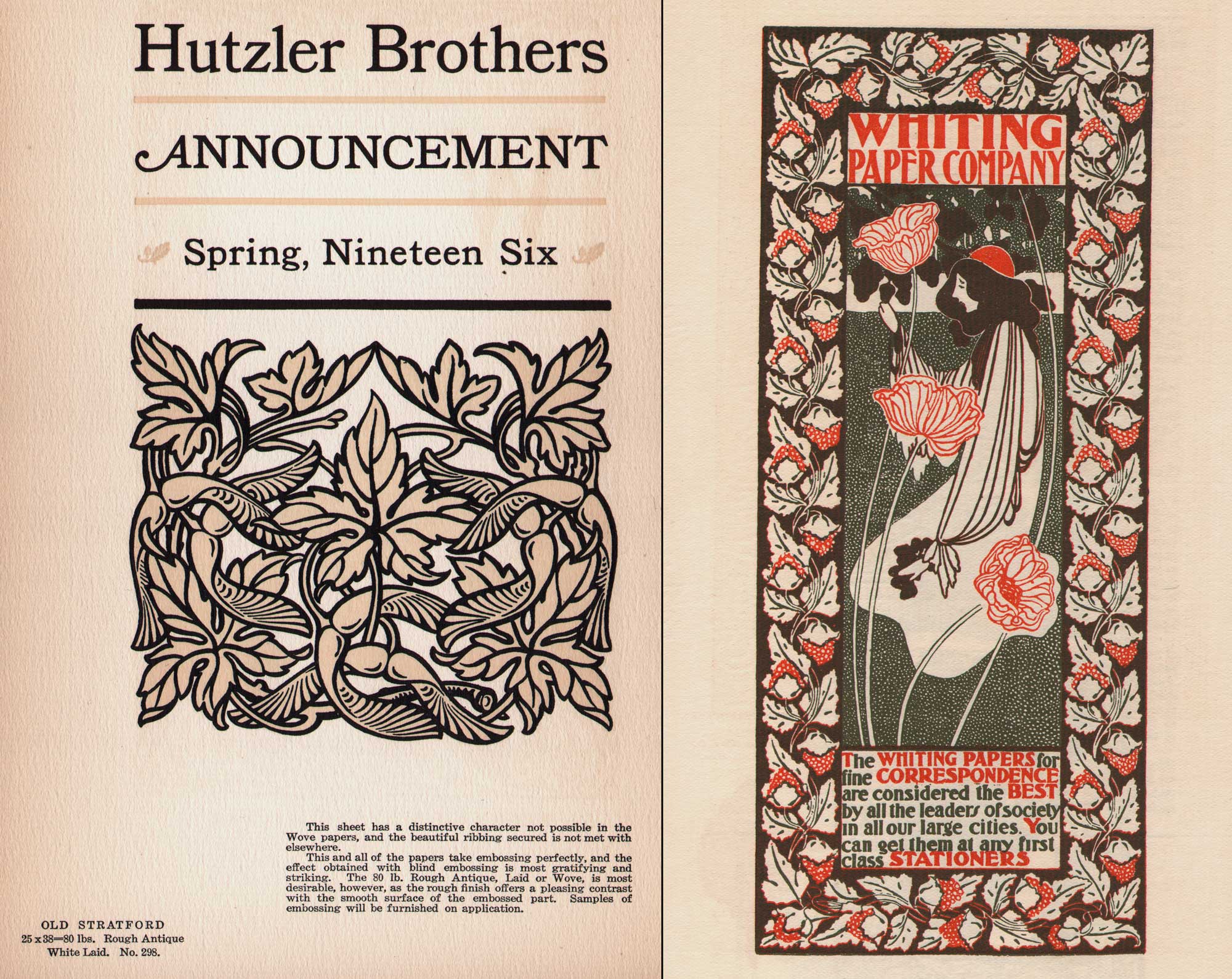
Beautiful papers for Letterpress: Left: page from 1906 promotional volume “The Strathmore Quality Deckle Edge Book Papers”, 23.5 x 15.5 cm published by The Mittineague Paper Company, which became the Strathmore Paper Company in 1914, a company still in business today. Page features letterpress design most likely by Will Bradley for Hutzler Brothers, a department store in Baltimore. It’s printed on antique “Old Stratford” laid paper: “This sheet has a distinctive character not possible in the Wove papers, and the beautiful ribbing secured is not met with elsewhere.Right: “The Acorns”, 19.0 x 8.0 | 25.8 x 12.9 cm, 1896, Will H. Bradley (1868-1962), American. Originally issued as a lithographic poster by the artist, its been repurposed here as a full-page letterpress advertisement for the Whiting Paper Company in the first issue of Bradley His Book, published in 1896. In the 1987 volume “American Art Posters of the 1890s, in The Metropolitan Museum of Art” the work is described: “The small poster had nothing to do with paper in the literal sense; it showed only an Art Nouveau design of a woman with poppies within a border of oak leaves and acorns. But it implied that the fine quality of Whiting paper was essential for fine printing.” The Whiting Company owned a paper mill in Holyoke, Ma, known as “Paper City”. From: PhotoSeed Archive
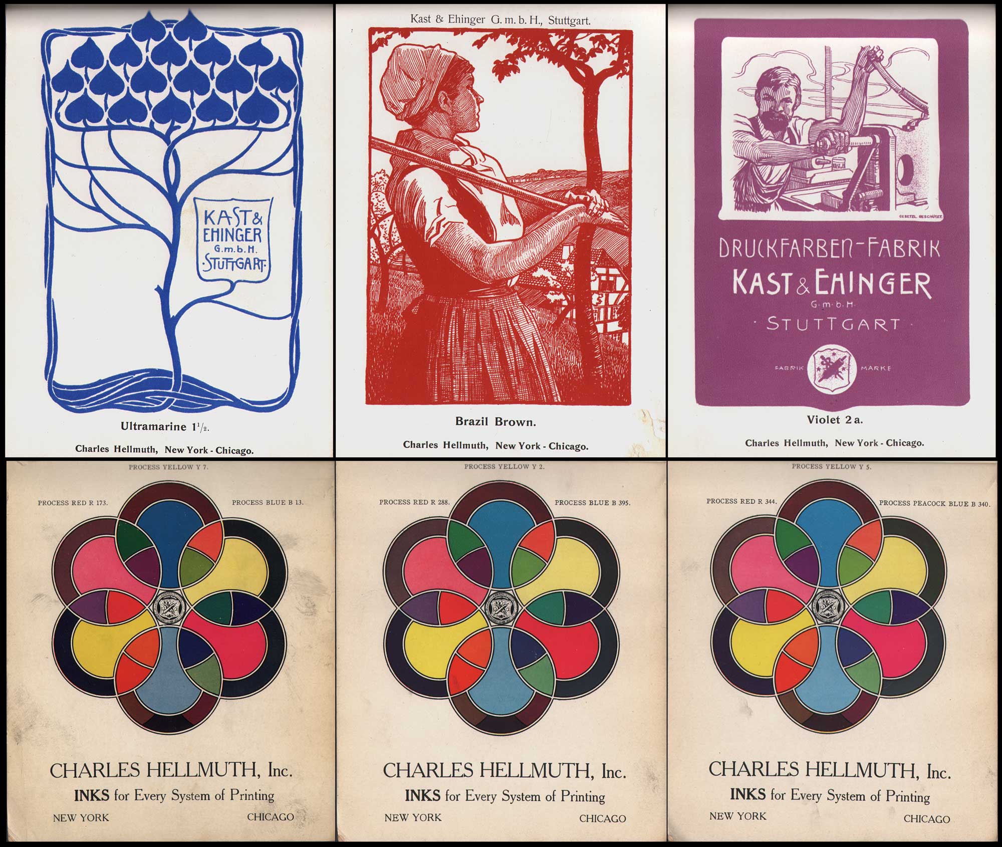
Top Rows: Inks for Letterpress & Lithography: Art-Nouveau woodcut designs by Hellmut Eichrodt, 1872-1943, German, ca. 1910. Printed in one color, they were designed as posters for the Stuttgart-based Kast & Ehinger ink manufacturers around 1900 and repurposed as advertisements for Charles Hellmuth, New York & Chicago, the US division for this German company. From a rare 80 pp. color ink swatch book marketed to book publishing (letterpress) and lithography firms. L-M-R: Ultramarine 1½, Brazil Brown, Violet 2 a. Bottom Rows: Color wheel page advertisements showing Kast & Ehinger ink shades manufactured by Charles Hellmuth Inc. “Inks for Every System of Printing”. From a Charles Hellmuth Inc. Process Inks catalogue ca. 1906, the year the firm built a factory at 154 W. 18th St. in New York City. Charles Hellmuth the trade name was believed to have been named after a bookkeeper at Stuttgart-based Kast & Ehinger ink manufacturers, first opened in 1865. (14to42.net) The New York division opened around 1892 in New York and Chicago as early as 1901. During WWI, their assets were seized by the US Government, later reorganizing as Sleight and Hellmuth. It vacated the 18th St. location in 1973, and went out of business around 1980. From: PhotoSeed Archive

When I look back at my own professional arc of newspaper photojournalist and now historian and collector: a fortunate byproduct of being someone “of a certain age”, one vivid childhood memory still springs forth from my past leading me to believe my life would be informed by a bit of pre-destiny. This took the form of my ten-year-old self accompanying my mother on an appointment to collect a print order of musical programs for a club she was involved in. The rendezvous point was a small print shop located in the basement of a Connecticut suburban home the next town over. It was then when I experienced for the first time the wondrous smell of pungent ink and sounds of what I now surmise was a vintage Heidleberg Platen Press clacking away, puncturing the darkness and triggering my wonderment in that dimly lit basement so many years ago.
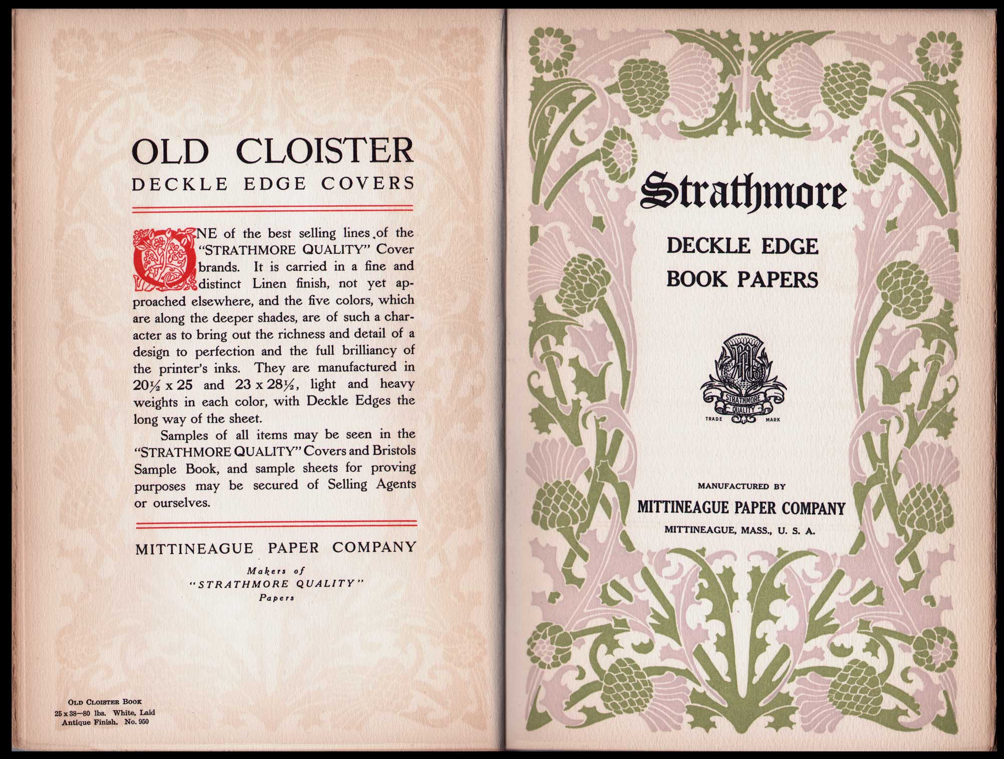
More beautiful papers for Letterpress: two-page-spread from 1906 promotional volume “The Strathmore Quality Deckle Edge Book Papers”, raised capitol and thistle design by Will H. Bradley (1868-1962), American, each page: 23.5 x 15.5 cm. Published by The Mittineague Paper Company, which became the Strathmore Paper Company in 1914, this company is still in business today. Check out this film “Making High-Grade Paper” released by Strathmore in 1914. Left: page printed on Old Cloister Book laid paper in Antique Finish: “It is carried in a fine and distinct Linen finish, not yet approached elsewhere, and the five colors, which are along the deeper shades, are of such a character as to bring out the richness and detail of a design to perfection and the full brilliancy of the printer’s inks.Right: Bradley’s border design features thistles which company founder Horace Moses saw blooming in the Valley of Strathmore in Scotland around the time he opened the Mittineague mill in 1892. He used the thistle as symbol for the firm and Strathmore name to denote the quality art and printing papers they manufactured. From: PhotoSeed Archive
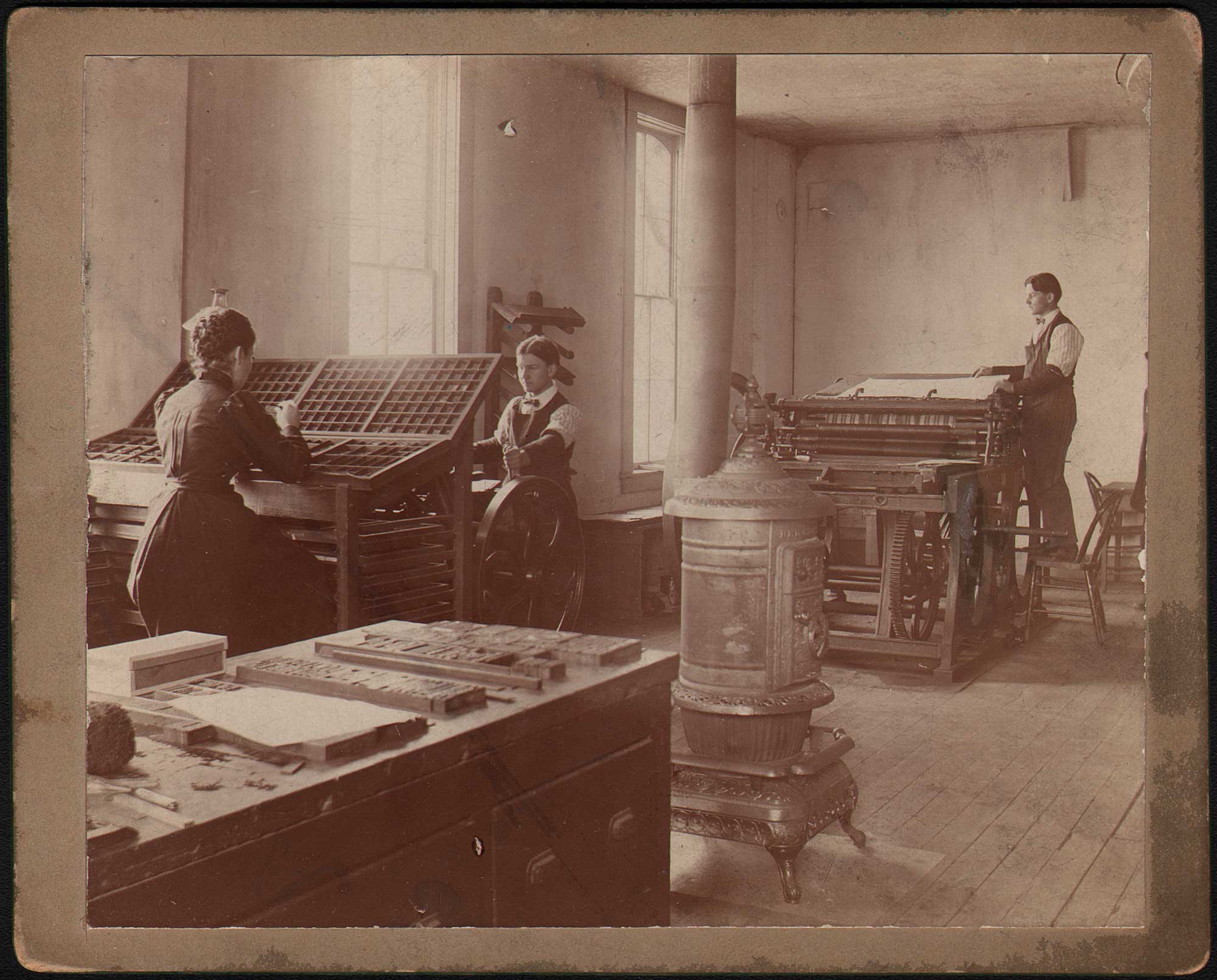
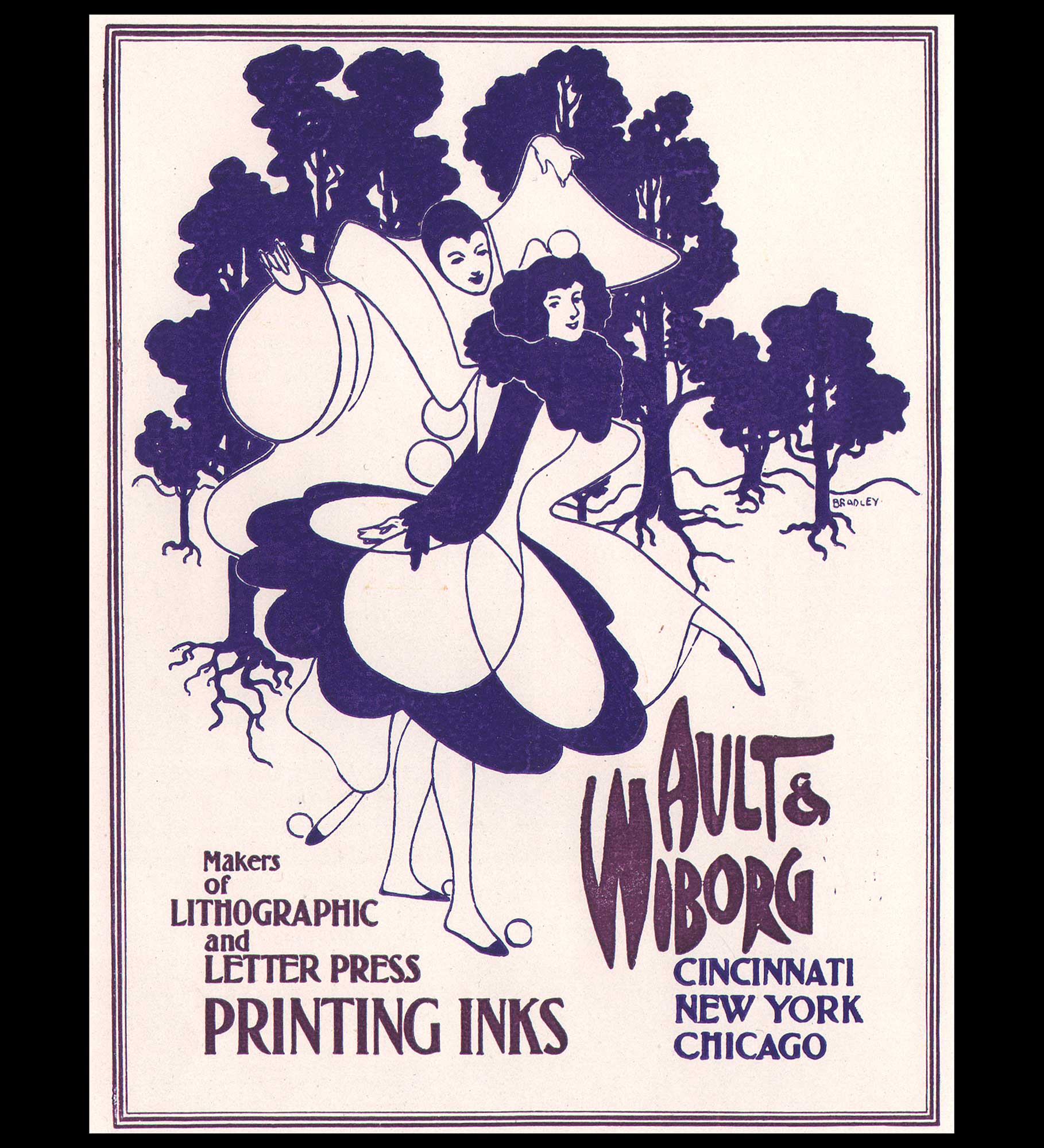
Ault & Wiborg, Makers of Lithographic and Letter Press Printing Inks”, 1896, Will H. Bradley (1868-1962), American, letterpress printed advertisement 13.4 x 10.1 cm, coated paper. This poster design by Will Bradley features a Pierrot character he would rework in successive designs. Printed in two ink colors, it was published in the first issue (May, 1896) of Bradley His Book. Ad copy: “The Ault & Wiborg Inks sell on their merits. Letterpress, Steelplate, Copperplate and Lithographers’ Inks. Unequalled in Quality. Possessing the Largest and Most Complete Printing Ink Works in America, Ault & Wiborg give the Most Careful Attention to the Requirements of the Trade, and their superb Equipment enables them to best fill the wants of Ink Consumers in every department of the Graphic Arts.” From the Gordon A. Pfeiffer Collection at the University of Delaware: “The Ault & Wiborg Company was a manufacturer of printing inks based in Cincinnati, Ohio. They engaged Will Bradley to create his first advertisement for the company in April 1895.” From: PhotoSeed Archive

A good working definition of Letterpress can be found in the 2008 volume The Printed Picture by Richard Benson, (1943-2017) American photographer, printer, educator and dean of the Yale School of Art from 1996 to 2006:

Letterpress: “Relief printing from metal type and image-bearing halftone cuts in copper or zinc. Also the actual press used for relief printing.” (1.)
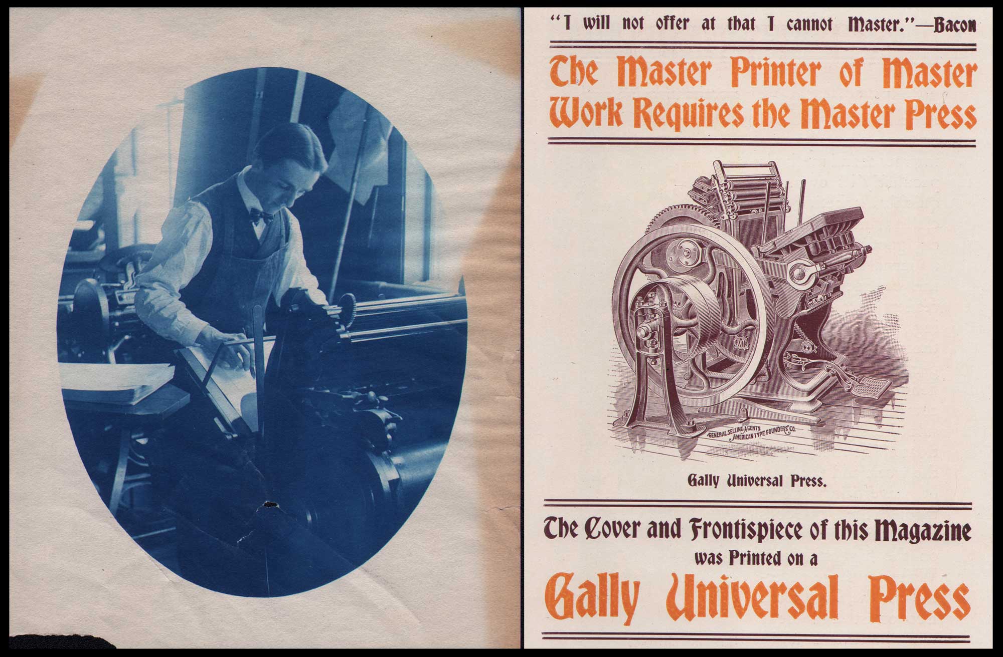
Revolution in Letterpresses: Letterpress printing came into its’ own with the invention of the platen style press which spead up the printing process. Also called a jobbing press, “A platen press is one that has a platen (a flat metal plate) to apply the needed pressure against the paper and bed of type to form the impression”. Left: American printer Charles Edward Bittinger, 1874–1956, operates a platen press at his family’s business, The Cohos Steam Press in Woodsville, N.H. ca. 1895-1900. Vintage cyanotype print, 10.3 x 8.0 | 12.5 x 10.0 cm. The Bittinger family also published the Weekly News beginning in 1890, a merging of the Woodsville Enterprise and The Grafton County Register newspapers. Right: An advertisement for the Gally Universal Press, a platen press invented by Merrit Gally in 1869, in Bradley His Book, May, 1896. The ad was for the American Type Founders’ Co., a trust and general selling agents for the Gally whom Bradley promoted and had designed type fonts for. The Cary Graphic Arts Collection at Rochester Institute of Technology describes the Universal as “the first of its type of press, having a stationary bed and a platen that rolled to a vertical position before gliding forward so that right before the impression, the platen was parallel to the bed and moved perpendicularly towards it.” Bittinger may also be operating a Colt’s Armory Press, a variation of the Gally Universal and subject of a fascinating rivalry. From: PhotoSeed Archive

Technically, the foundational Relief process is best defined as “printing from the high parts”, with Wikipedia summarizing: “The non-recessed surface will leave ink on the paper, whereas the recessed areas will not.”
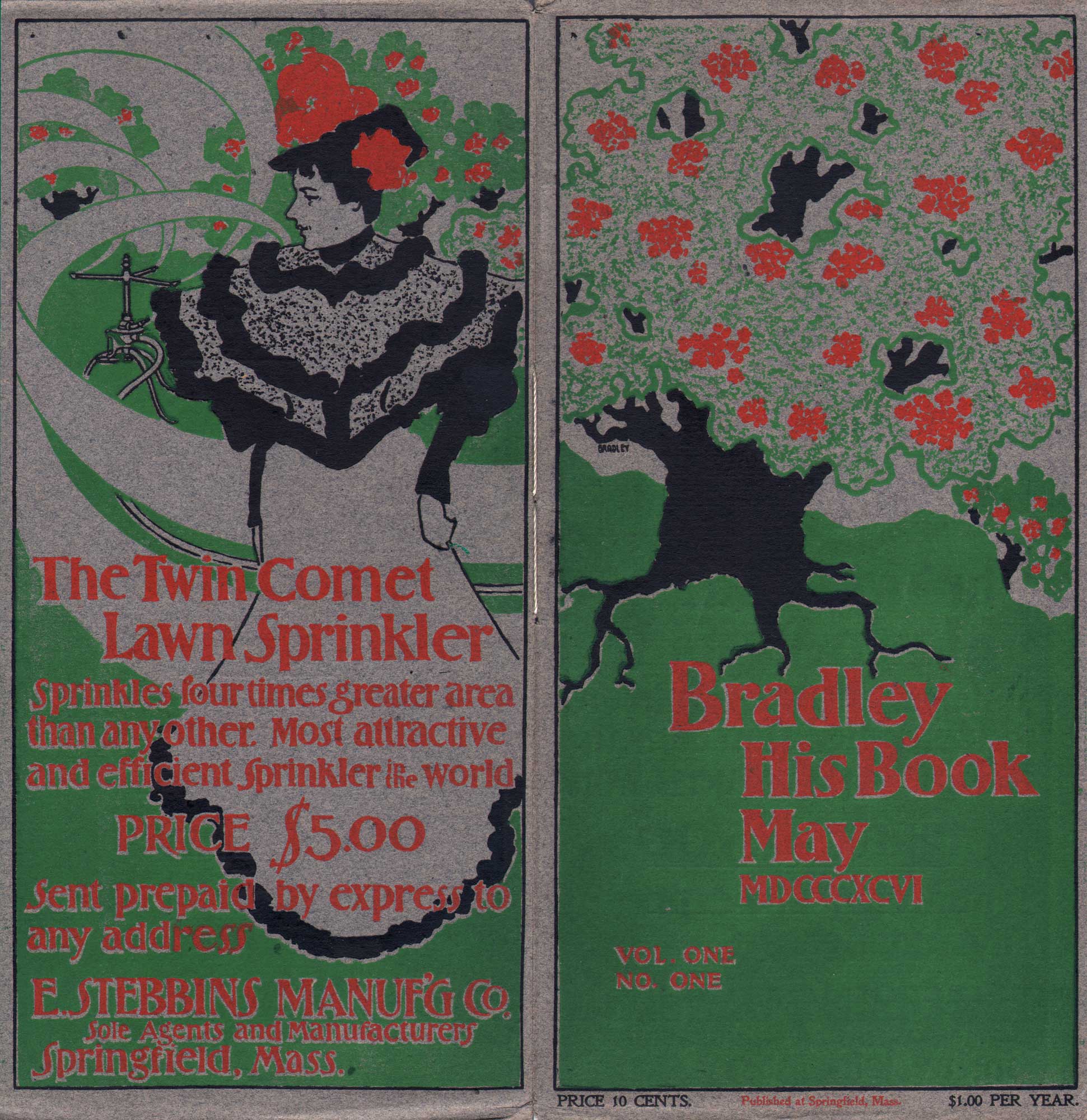
Front and rear covers: Bradley His Book, May, 1896, letterpress printed in three colors, Will H. Bradley (1868-1962), American, 26.7 x 25.7 cm, (opened) Strathmore Deckle Edge Buff Cover. There were 10,000 copies of this first issue sold out before being published, with the front and rear covers printed on a single sheet of grey paper by a Gally Universal platen press, indicated later in the issue. On the front, the design of a large tree with clusters of red flowers blends into the rear cover advertisement, where a woman in fancy dress is seemingly swept up within swirling lines made by the revolving arms of the Twin Comet Lawn Sprinkler for sale by the E. Stebbins Manufacturing Co. of Springfield: “Sprinkles four times greater area than any other. Most attractive and efficient sprinkler in the world Price $5.00”. The slim periodical was written, designed and printed by Bradley at his Wayside Press in Springfield, MA., with his aim to “produce work that was “attractive and out of the ordinary.” From: PhotoSeed Archive

Let me tell you, those “high parts”, inked on paper, are a joy to behold, especially as ornament and text, the aforementioned “perfect marriage” within volumes I’ve collected over the years featuring (intaglio) photographic plates from the mediums artistic era spanning the late 1880s through the first several decades of the 20th century. But let’s skip ahead hundreds of years from Gutenberg’s era to the late 19th Century, when newly formed arts & craft societies in Europe and America made a new argument that hand-crafted work was far superior to the dreck of mass consumer products that were the output of the Industrial Revolution. As a collector interested in beautiful photography and design, the material output from this era is particularly satisfying to procure and reflective of the era in which it was made. 
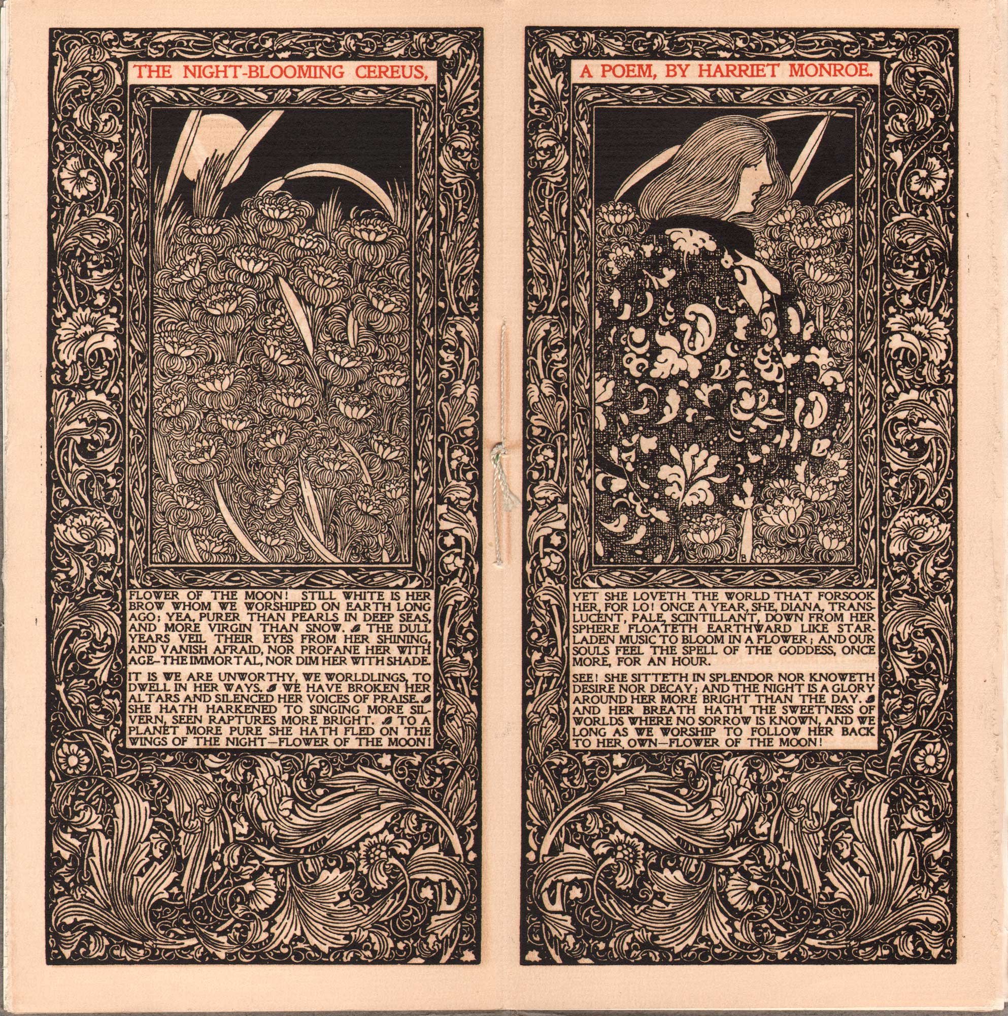
Kelmscott Press inspired Masterwork, printed by Letterpress: “The Night-Blooming Cereus, A Poem, By Harriet Monroe”, Will H. Bradley (1868-1962), 1896, American, center-spread: Bradley His Book, letterpress printed in black ink with rubricated title, Strathmore deckle edge paper, 25.7 x 25.1 cm. Unlike the original Kelmscott Press illustrations by William Morris and his circle, photographically transferred onto woodblocks and then engraved by hand before printed on a letterpress, this original artwork by Bradley, drawn on paper, was first photo-engraved and then electrotyped on metal by the Phelps Publishing Company of Springfield, MA before printing. In her 2018 volume American Little Magazines of the Fin de Siecle, Kirsten MacLeod writes Bradley His Bookwas also a vehicle for his own work, which included elaborate illustrations and decorations for the literary and artistic content, such as his black-and-white Kelmscott-inspired design for Harriet Monroe’s poem, “The Night-Blooming Cereus” …”In many respects, however, Bradley’s greatest artistic achievement was his conception of Bradley His Book as a print gesamtkunstwerk (total work). He oversaw every aspect of the magazine’s design and production and each issue was a unique work of art in itself.” American poet Harriet Monroe, 1860-1936, was founder and editor of Poetry: A Magazine of Verse, “who became instrumental in the “poetry renaissance” of the early twentieth century by managing a forum that allowed poets and poetry to gain American exposure.”(PoeMine online) From: PhotoSeed Archive

Consider the first issue of an 1896 masterwork: Bradley His Book, with several pages scanned to accompany this post. This slim periodical was American artist and illustrator Will Bradley’s (1868-1962) art-nouveau letterpress-printed love affair “dedicated to the promotion of fine typography, design, paper, and printing”. (2.) The underpinnings for this new approach was inspired by some of the new thinking on art proposed by Oscar Wilde and his circle as well as ideas of social and design reform propagated by John Ruskin in England. When English textile designer, poet, artist, writer, and socialist activist William Morris (1834-1896) launched his Kelmscott Press in early 1891, the resulting volumes featuring this new era in design inspired Bradley. The proverbial torch passed, Bradley His Book was published the same year Morris died, and was:
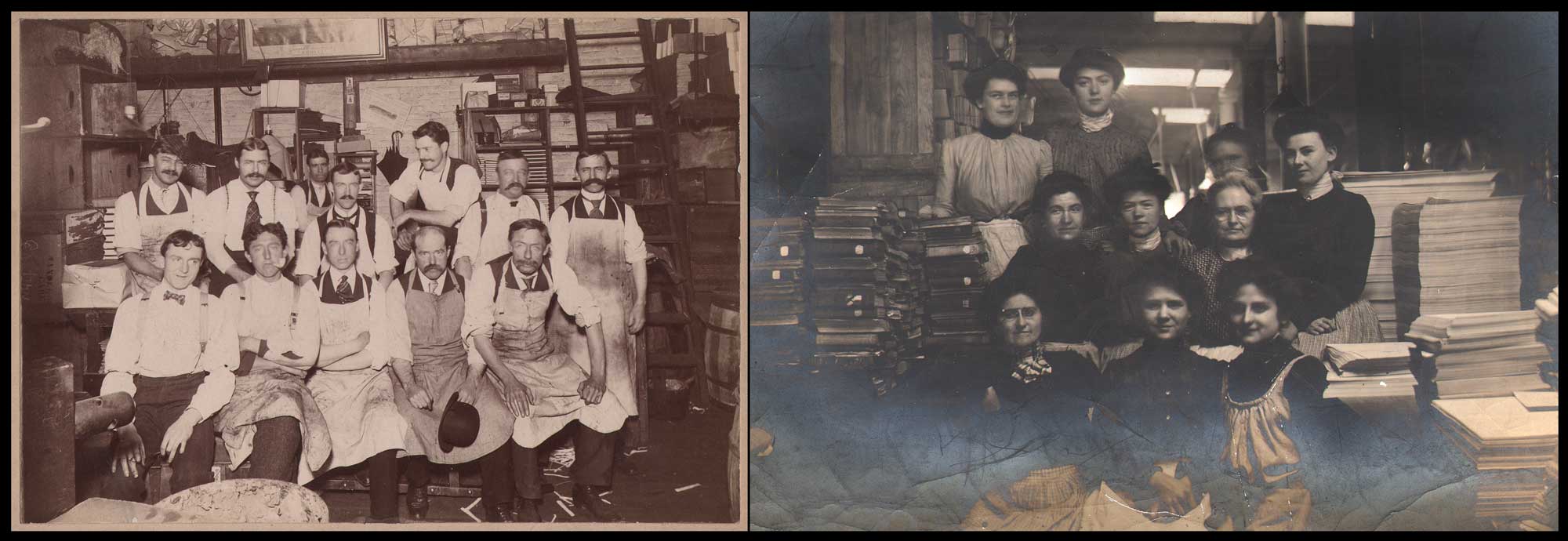
Economic Force: The Golden Age for Letterpress:  By the end of the 19th Century, rapid improvements to the speed of cylinder letterpresses first developed earlier in the Century by electrification augmented with platen presses which enabled the printing of newspapers and books faster and more efficiently. One company that became a giant in the New England area was Boston’s H.M. Plimpton Company. Originally a bookbinding and printing firm founded by Herbert Mosley Plimpton (1859-1948) in 1888, it expanded, moving to Norwood, MA in 1897 where it became the Plimpton Press. Plimpton learned his trade in 1878 in New York City, where he gained “experience with typesetting and using a printing press”. By the 1920s, the firm, with all aspects of book production and publishing done in a series of massive buildings on its Norwood campus employed 1025 workers and produced 50,000 books a day, and closed in 1973. Left:Men of the H.M. Plimpton Co., Hecht Building, Boston”, 1903, Commercial Photo Co., Boston, mounted gelatin silver print, 12.8 x 18.2 | 18.3 x 24.3 cm. Twelve men sit for a group portrait, with a notation on the card verso they worked in the “Extra Bindery”, a deluxe hand bindery founded in 1892 that moved to Norwood in 1905. Right: “Plimpton Girls in the Boston Shop- Hecht Building”, 1903, Arthur Hill, (Plimpton employee) unmounted gelatin silver print in masked frame, 12.6 x 17.6 cm. These women also worked in the “Extra Bindery”, although their duties perhaps extended to other jobs such as packaging and shipment of finished books. Notice the large reams of paper piled at right side of frame. Historical Note: from 1911-1930, the Plimpton Press printed the individual book and portfolio letterpress for volumes VI -XX of The North American Indian, the photographic masterwork by Edward Sheriff Curtis. From: PhotoSeed Archive

distinguished by the outstanding decorative illustrations that enriched the text and advertisements. Bradley himself wrote several short stories for the magazine, again following the example set by William Morris, who once said, “If a chap can’t compose an epic poem while he’s weaving tapestry he had better shut up; he’ll never do any good at all.” (3.)
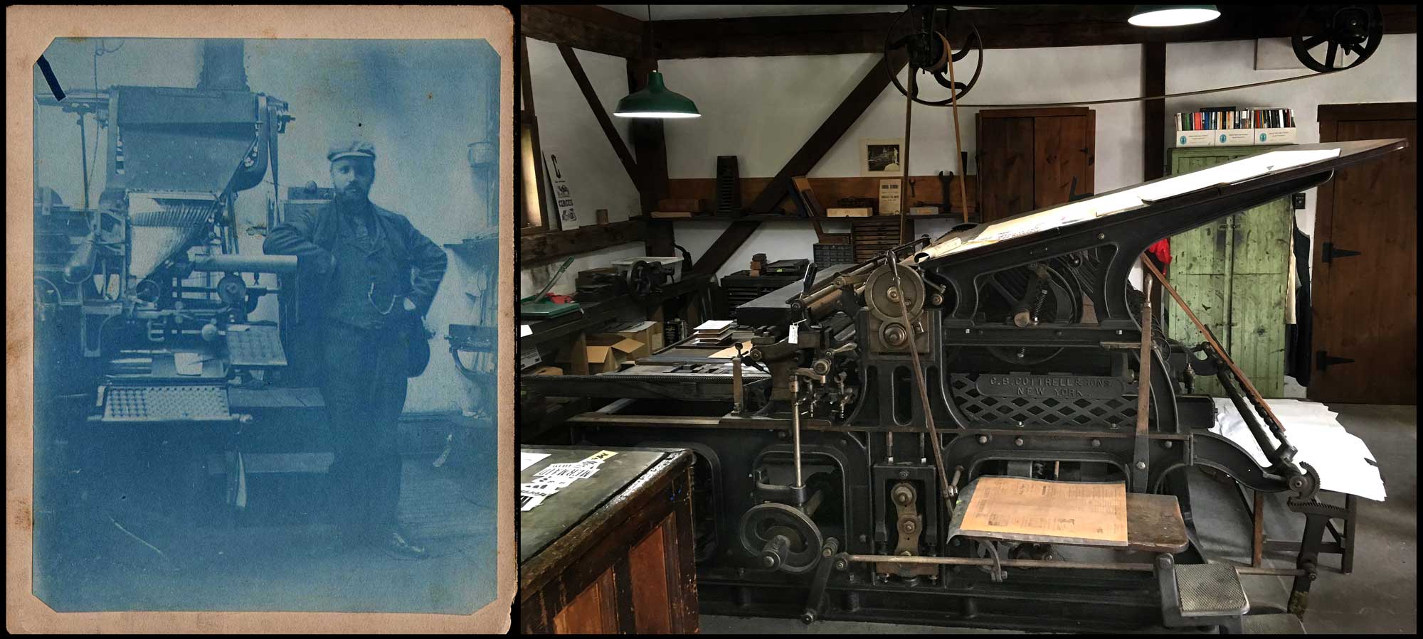
Letterpress Advances in Typesetting & Printing: Left: “Man Standing Next to Linotype Machine”: unknown American photographer: cyanotype: ca. 1895-1905: 11.9 x 9.6 | 13.2 x 10.6 cm. The mass commercialization of letterpress printing in the form of newspapers, magazines and book publishing (Bibles and textbooks in particular) began in earnest in the late 19th Century with the 1884 invention of the Linotype machine by German immigrant Ottmar Mergenthaler. (1854-1899) From: PhotoSeed Archive. Right: “Cottrell Flatbed Cylinder Press, 1871” This letterpress was manufactured in New York by C.B. Cottrell & Sons sometime after 1880 when the partnership was formed. (Calvert Byron Cottrell: 1821-1893) Its displayed in the Print shop at the Shelburne Museum in VT and described: “cylinder presses such as this Cottrell were extensively used by printers from the 1860s well into the 20th century. The large sheet capacity and printing speeds up to 1600 impressions per hour made them ideally suited for book and newspaper work.” The placard noted this press was used by the Democratic Press Company of Concord, NH for newspaper printing until 1897 and then sold to the Hardwick Publishing Co. of Vermont to print the Hardwick Gazette until it was finally retired in 1972. Photo by David Spencer for PhotoSeed Archive

Letterpress as Living History

At least in America, should we care enough or have reason to experience firsthand places bringing the past alive, our only contact with historical letterpress printing can indeed be found. Think Colonial Williamsburg, VA, Old Sturbridge Village in MA or the Shelburne Museum in VT. Here are places where a shop (many also dimly lighted!) oftentimes feature a vintage iron hand press. (letterpress) Invariably, these places might impart an American history lesson for tourists looking on, with a resident reenactor recalling American founding father and printer Benjamin Franklin’s role in publishing The Pennsylvania Gazette beginning in 1729. A newspaper man dear to my own heart, Franklin’s broadsheet promoted lively public discourse at the time-one of the factors leading to the eventual overthrow of the English King who ruled the American colonies-and with it, the founding of the United States which became a Constitutional Republic with Democracy as its’ backbone: something we do hope endures as I write this in the turbulent present. How’s that for the power and importance of letterpress?
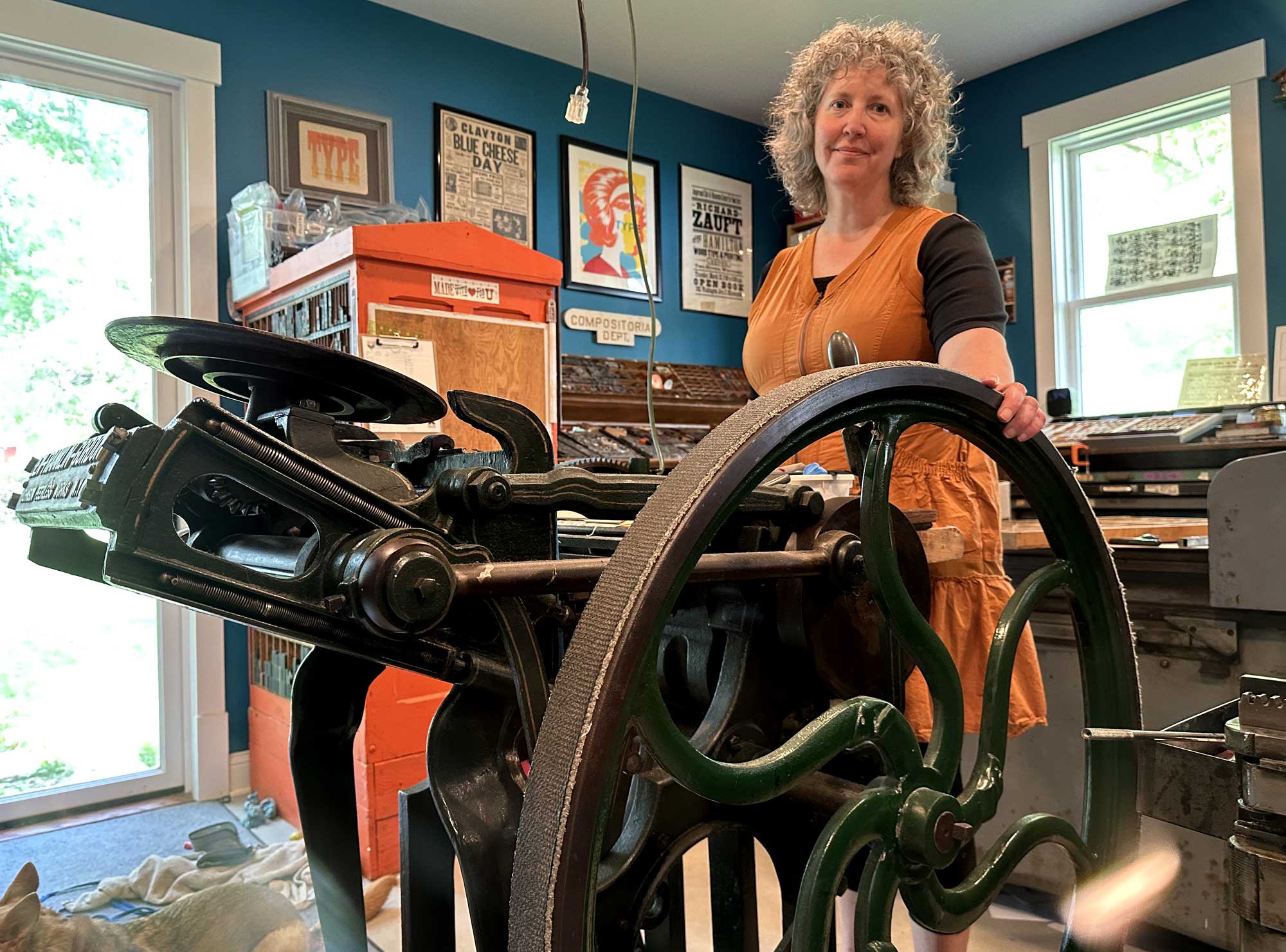
Allison Chapman, along with husband John and daughter Ava, run Igloo Letterpress from their home studio in Worthington, OH. Its been an active venture fueled by some well loved vintage presses like this flywheel-powered Ben Franklin Gordon jobber press since 1996. When new, this platen-style letterpress with its “clam-shell” mechanism- used for smaller print jobs- was advertised in the pages of the June, 1891 Inland Printer and was described: “Is The Very Best Old Style Gordon Ever Built by Anybody”. Letterpresses like this one were named after George Phineas Gordon, (1810-1878) an American inventor, printer and businessman who developed the basic design of the most common printing press ever, the Gordon Letterpress. Photo taken 2025 by David Spencer for PhotoSeed Archive

Papermaking & Typography

With apologies to Bradley and the rest, the Industrial Revolution in America was key in producing the matrix for letterpress: paper, and in huge amounts. I live in New England and specifically Massachusetts, where the remains of hulking mill buildings can still be found most everywhere, but particularly alongside rivers, where they drew their power. Many have fallen to the wrecking ball, but in present-day Holyoke, MA, some of those buildings that were part of the 25 companies producing paper during the late 19th and early 20th centuries still stand: some vacant but others repurposed.

Known as “Paper City”, Holyoke would surpass even Berkshire county in Massachusetts, which was the largest producer of paper in the US through the Civil War. An interesting tidbit? Berkshire-based Crane Currency in Dalton, MA, initially founded by Zenas Crane (1777–1845) in 1801, is still in business today, continuing to provide the U.S. Bureau of Engraving and Printing with specialized paper for U.S. currency since 1879. Another later figure to explore in the arts & craft aesthetic: Dard Hunter, 1883-1966: “American authority on printing, paper, and paper making, especially by hand, using sixteenth-century tools and techniques.” 
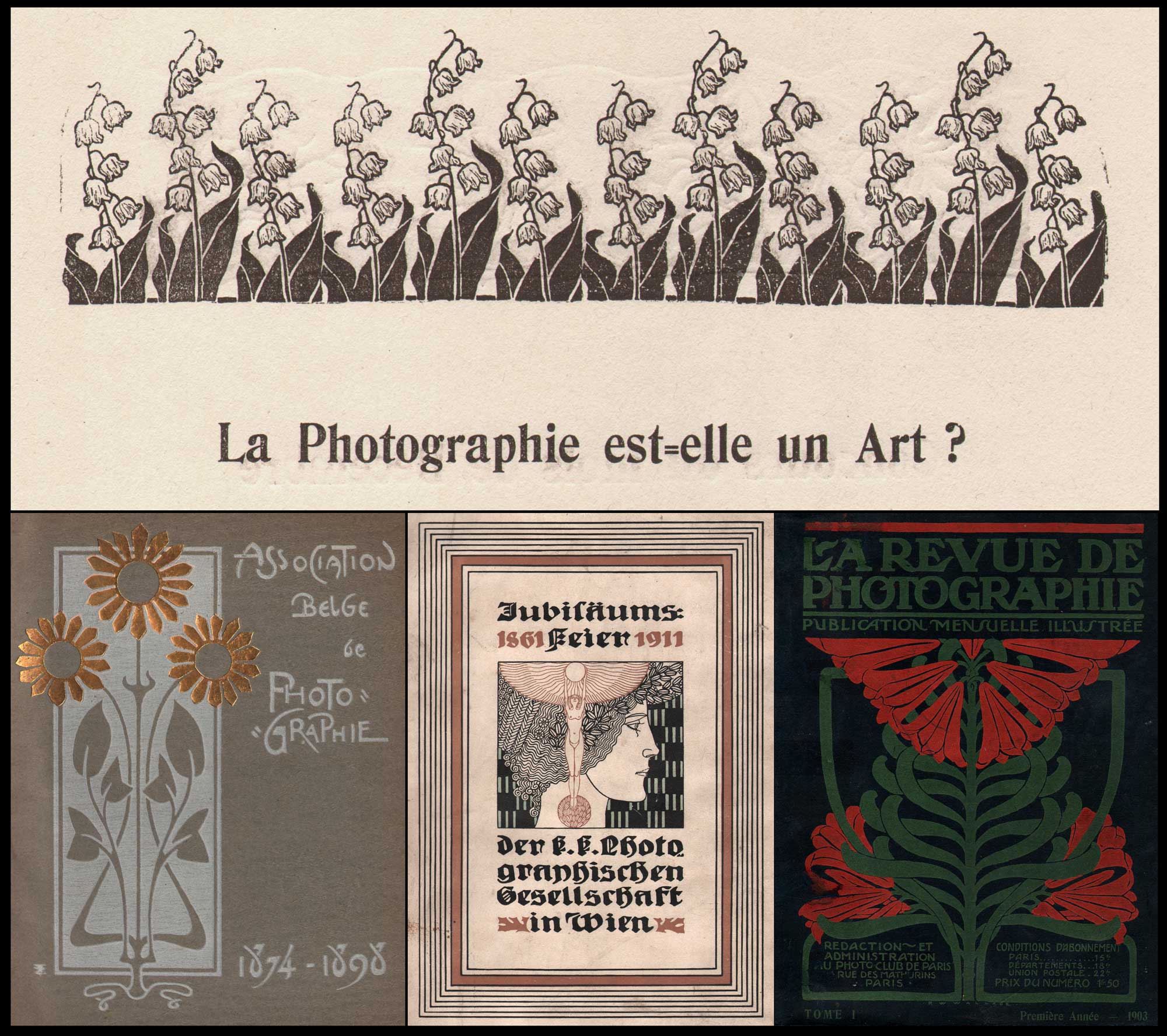
Photography & the Art of Letterpress: Some of the most beautiful objects featuring photographic plates printed in intaglio such as hand-pulled photogravure and mounted halftones can be found in volumes such as these examples combining ornament and text, the perfect marriage of words and pictures from photography’s artistic era spanning the late 1880s through the first decades of the 20th century. Top: La Photographie est=elle un Art? (Is Photography an Art?) Elegant letterpress woodcut embellishments such as this design for Lily of the Valley, (Convallaria majalis) published in February, 1899, illustrating a page in the Belgian photographic journal Sentiment D’Art En Photographie, (1898-1901) are a feature commonly found in the best designed European photographic journals, portfolios and volumes. Unknown artist. Printer: Brussels: Xavier Havermans. Bottom, Covers: Left: This inner cover, bound in boards, is printed in one color, with a woodcut design hand-embossed in gold foil. A “Jubilee Album”, it was published in 1898 to mark the 25th anniversary of the founding of the Belgian Photography Association in Brussels in 1874. Unknown artist. Printer: Brussels: Émile Bruylant. Middle: This intricate letterpress-printed Art-Nouveau design in three colors features on the cover of another album published in 1911 marking the 50th anniversary of the founding of the Austrian Publishing House of the Imperial and Royal Photographic Society in Vienna: Jubiläumsfeier der k. k. Photographischen Gesellschaft in Wien 1861-1911. Unknown artist. Printer: Wien: Friedrich Jasper. Right: A floral organic design, printed in two colors, dominates this 1903 first annual volume of French journal La Revue De Photographie, (The Photography Review) published by the Photo Club de Paris. Unknown artist. Printer: Paris: Draeger Freres. From: PhotoSeed Archive

Print is Dead Egon Spengler, Ghostbusters-1984

Thank goodness Egon was a fictional character. While print in the physical form continues to thrive in the 21st Century, modern typesetting is now mostly digital. Mass commercialization of letterpress printing in the form of newspapers, magazines and book publishing (Bibles and textbooks in particular) began in earnest in the late 19th Century with the 1884 invention of the Linotype machine by German immigrant Ottmar Mergenthaler. (1854-1899) These machines cast entire lines of type (words & sentences) at once, known as “slugs”: stereotypes of cast metal formed from the contact of assembled brass type matrices that had been locked into position before a molten mixture of lead, tin, and antimony was injected over them from the linotypes’s heated alloy reservoir. Discontinued by the 1970s, linotypes were used almost exclusively in the production of American newspapers. At several of which I worked for, these machines were on display in the corner of the front public lobby: dusty relics that once revolutionized letterpress publishing in the “hot-type” era.
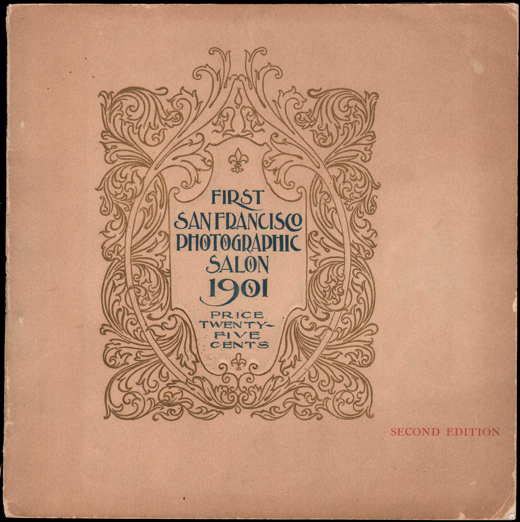
Another Cover, but from America: First San Francisco Photographic Salon 1901, Second Edition, 1901, staple-bound paper catalogue, 19.2 x 19.1 cm. This striking ornamental letterpress design, printed in gold and blue, was published by the western photographic periodical Camera Craft. The design as well as internal letterpress and halftone photographic plates were photo-engraved by the Sunset Photo-Engraving Co. of San Francisco and printed by the Sunset Press. An advertisement in the rear for the firm states … “this catalogue ⎯both in engraving and printing ⎯is a good specimen of our ability to design and execute high-grade work.” From: PhotoSeed Archive
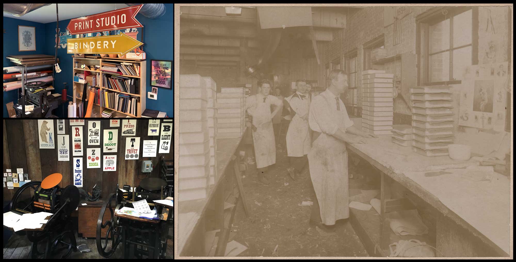
Business Models: Present & Past: Top Left: At Igloo Letterpress in Worthington, OH, directional signs point to the print studio and Bindery, the latter essential for gathering finished work into printed volumes & brochures. Lower Left: public education, especially for younger visitors, is perhaps the foremost intent behind living history museums. In the Print shop at the Shelburne Museum in Vermont, where several platen-style presses are displayed at bottom, letterpress broadsides are tacked to the wall beyond, featuring enlarged alphabet letters from wood type embellished with metal design cuts. Both: David Spencer for PhotoSeed Archive. Right: “Full Sheep Books Being Bound”, 1895, unknown commercial photographer, albumen print laid down on card, 15.3 x 20.2 | 19.5 x 25.0 cm. At Boston’s H.M. Plimpton Company, men wearing ties and aprons lend a professional look as they work in the bindery between stacks of books piled on work tables at left and right. The volumes were being bound in sheepskin, indicating these were of the very highest quality Plimpton published. From: PhotoSeed Archive

Similar to the old Eastman Kodak Company, essentially a monopoly which became a trust in 1901 and controlled 90% of the marketplace, the companies that produced the actual metal type for letterpress printing decided to fight back, now that the Linotype and Monotype machines threatened their own near monopoly in the market. In 1892, the American Type Founders Company, a business trust, was formed. Collectively this entity was made up of 23 type foundries “representing about 85 percent of all type manufactured in the United States at the time.” From Columbia University Libraries we learn the ATF trust was formed “in order to compete with the new typesetting machines, the Linotype and Monotype” and would be  the dominant American manufacturer of metal type from its creation in 1892 until at least the 1940s.” (4.) Interestingly, from 1914-1959, the trust was also in the businesses of manufacturing their own letterpresses for industry, with the popular Kelly series presses selling 11,000 units by 1949. (5.) Besides designer Will Bradley, who created many different type fonts for the ATF, another designer who worked for the trust became more famous: Frederic Goudy: 1865-1947, “one of the most prolific of American type designers” whose “self-named type continues to be one of the most popular in America.” (6.)
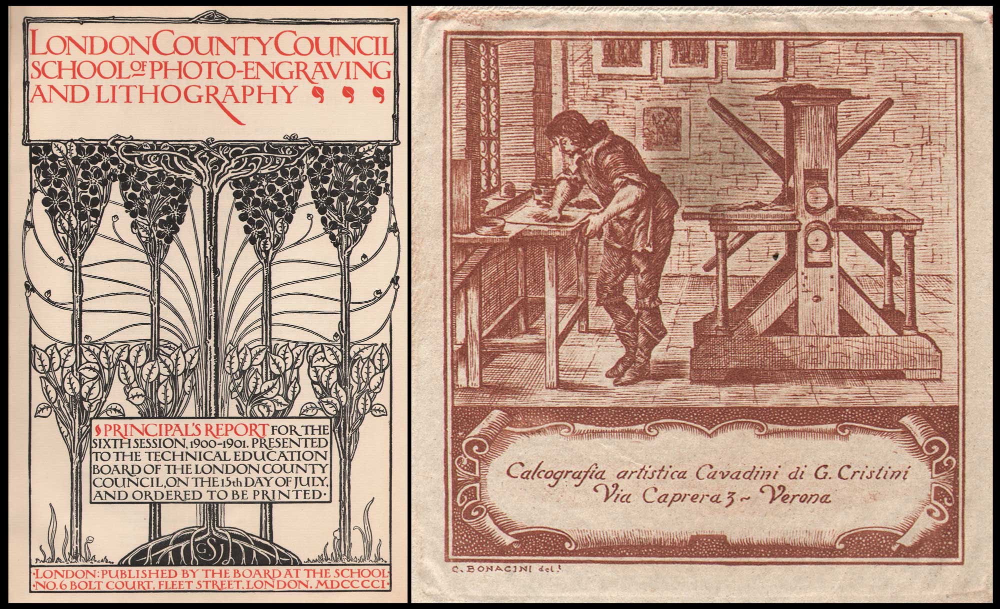
Teaching & Business: Letterpress & Engraving Arts: Left: Title Page: “London County Council School of Photo-Engraving And Lithography: Principal’s Report for the Sixth Session, 1900-1901.” Design by Gertrude J. Sabey, British, dates unknown: letterpress on watermarked laid paper with rubricated title, subtitle & publishing attribution, 29.6 x 19.3 | 33.7 x 24.0 cm. A synopsis in the report stated “The object of the school is to provide instruction in certain branches of the craft of producing surfaces for printing. The school is open to all those who are genuinely engaged in business in the actual work of any branch of the photo-engraving, photographic, lithographic, engraving, designing, and printing crafts.” The compiled volume notes the title page was “designed and given to the School by Miss Gertrude J. Sabey, a former student, and was reproduced by A.J. Jackson (negative) and W.C. Hardy (line block). Letterpress printed by Messrs. Charles Whittingham and Co. at the Chiswick Press, Tooks Court, Chancery Lane, E.C.” Little is known of designer Sabey, although a 1913 reference said she was affiliated with the Central School of Arts and Crafts in London. Historical Note: Alvin Langdon Coburn learned copperplate photogravure while a student at this school in 1906. Right: Re-worked design in the manner of “The Etcher’s Press – The Printmaker’s Shop” by French artist and engraver Abraham Bosse, 1604-1676, c. 1940-1960, Claudio Bonacini, Italian, (d. 1968) intaglio etching from wood engraving design on thin, hand-made paper, 6.1 x 6.0 | 9.5 x 10.0 cm, Verona: Calcografia artistica Cavadini di G. Cristini. In this reworked design from the 1642 Bosse etching, modern designer Bonacini emphasizes the shop worker applying ink to a plate at left with a 17th Century “Star” intaglio press at right. This press was used principally for copper-plate engravings, with early shops like this also using traditional Gutenberg style hand letterpresses. From: PhotoSeed Archive


What’s Old is New Again

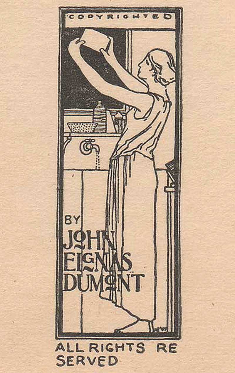
I’ve been without business cards for many years now, after running out of an initial batch of beautiful letterpress cards designed by Kirsten O’Loughlin. This was actually the inspiration for this post. “Get yourself some updated cards” I told myself and you can do a bit on letterpress for the blog. I’ve now got the updated cards in hand (free card with any Ebay purchase!) so deadline met. I’ve featured letterpress printing in oblique ways before on the site, although never in depth. In 2014, I featured a wood-engraved copyright label designed in 1897 by the important American furniture designer Harvey Ellis for amateur American photographer John Dumont. In 2018, as part of the  conference “PhotoHistory/PhotoFuture” held at the Rochester Institute of Technology in New York state, I visited the Cary Graphics Arts Collection where I saw the famed Kelmscott/Goudy iron hand-press featured among other working presses in the Arthur M. Lowenthal Memorial Pressroom.
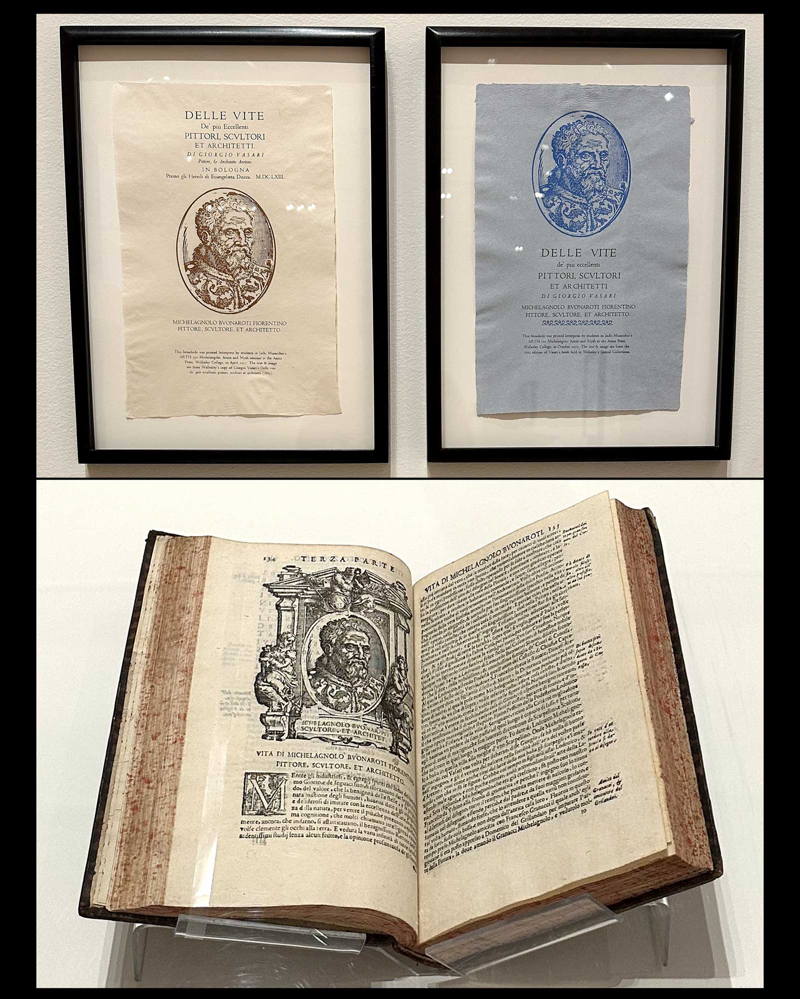
Book Arts & Letterpress: Academic & Museum Worthy: Top: Letterpress Broadsides, left & right, 2017, 2023, after “Delle Vite De’ più Eccellenti Pittori, Scultori, Et Architetti by Giorgio Vasari, 1663” (From the Lives of the Most Excellent Painters, Sculptors, and Architects) Katherine Ruffin, American, b. 1972. At the Davis Museum at Wellesley College, these modern broadsides are displayed as part of a faculty exhibition. (the artist is Director of the Book Studies Program at Wellesley and Lecturer in Art) Printed on hand-made paper, they feature an original 16th century rendering by an unknown artist of a wood-engraved portrait of sculptor and architect Michelangelo, 1475-1564. Repurposed, along with the title from the original 17th century volume in which it appears, they feature in that volume by Vasari published in 1663- displayed in the separate case at bottom. Ruffin comments: “Over the years, we have printed multiple versions, or editions, of some broadsides. In this pair, variations in layout and the addition of type ornaments create a distinct look and feel. The white and cream paper made in the Papermaking Studio typically contains a blend of cotton, flax, and abaca fibers. One year, we created another variation using blue paper made from blue jean rag. Blue paper was common in the Renaissance, offering artists a contrast between lights and darks-and thus provided another teaching opportunity.” A team effort, the broadsides were printed by Ruffin and students in Professor Jacki Musacchio’s first year seminar course “Michelangelo: Artist and Myth” at the school’s Annis Press. Universities and other academic institutions the world over are important incubators offering courses and degree programs in the book arts, often under the umbrella of a studio arts discipline. Giving new life to the historical past may combine courses such as papermaking, type design and printing in conjunction with a liberal arts degree, although trade schools and the web provide plenty of opportunities for those seeking a community of learners or wanting to go it alone in learning the rich history of printing and related disciplines. Learn more: Book Arts Lab at Wellesley. Photographed October, 2025 by David Spencer for PhotoSeed Archive
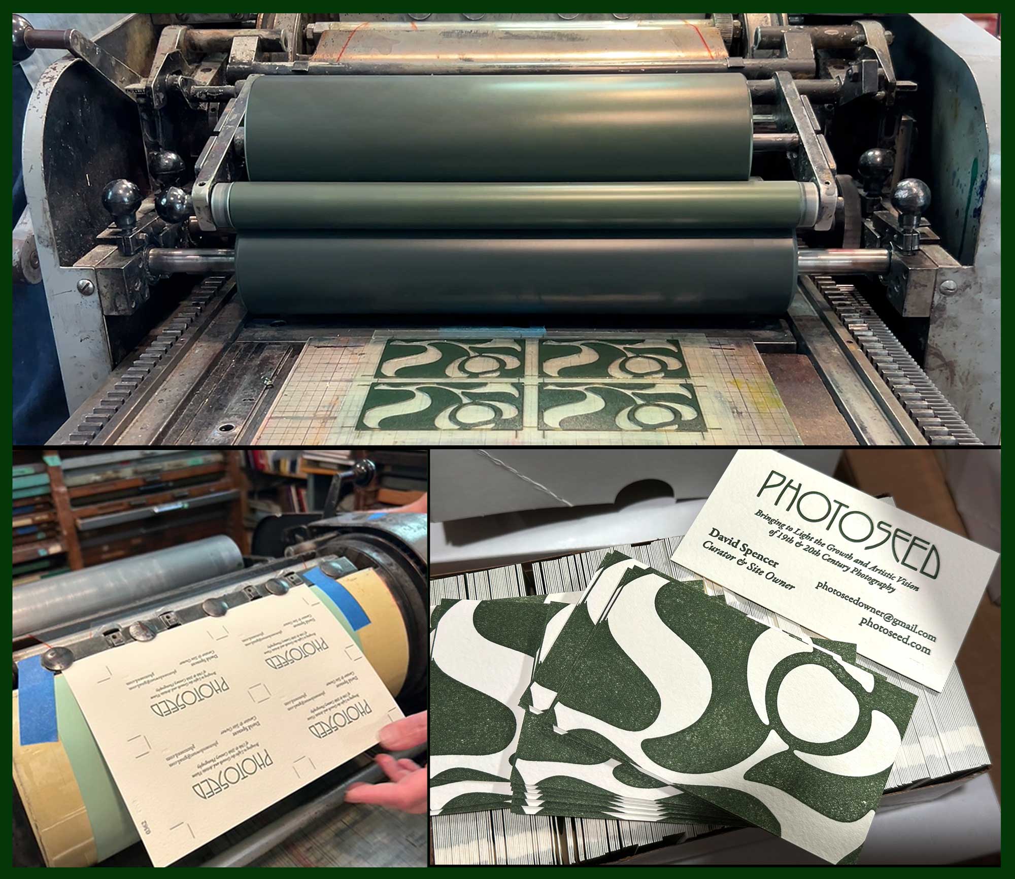
And Now, a Word from our Sponsor: PhotoSeed gets a new business card printed by letterpress. We’re decidedly old-school, with a card to match. Top: At Igloo Letterpress in OH, the raised photopolymer plate “cut” featuring our Lotus leaf design is inked and ready to make contact with paper. The matrix of four cards (one side of card) was being run through a vintage Vandercook cylinder press in September, 2025. Lower Left: Owner Allison Chapman holds paper (Arturo soft white, an Italian mould-made paper) just off the press with the card’s other side: the business particulars, held in place by the Vandercook’s gripper heads. Both: photos courtesy Allison Chapman. Lower Right: Trimmed and individually cut from the larger sheet, the new cards wait to be sent out to the world. Photo by David Spencer for PhotoSeed Archive

The second-generation cards again feature the arts & craft inspired lotus flower which has become one of this site’s signature branding efforts. It’s by the hand (or rather computer mind) of designer Jay David, (responsible for the design of PhotoSeed) and takes up all the real estate of the new card’s verso- or recto- you decide. The one absolute change for me was to make “PhotoSeed” all one word, as my impression the old site design lead to some confusion in that words Photo and Seed were stacked on top of each other.

Letterpress printer Allison Chapman to my rescue. Shop local is something we try to adhere to, and although she lives in the middle of the country the argument can be made anyone hanging their letterpress shingle is local and worthy of your business, as no “big box” stores are ever anticipated to get in on the action. Along with husband John and daughter Ava, they run Igloo Letterpress from their home studio in Worthington, OH. Its been an active venture fueled by some well loved vintage presses since 1996. Like many old-time endeavors made new again, with examples including the resurgence of the wet-plate collodion photographic process and wet darkrooms in general in the 21st Century, Letterpress printing became a “thing” a bit earlier, in the 1990s. Here, Wikipedia informs us “renewed interest…was fueled by Martha Stewart Weddings magazine,  which began using pictures of letterpress invitations in the 1990s.” I’m not too sure on that one as small-press “craft” printers have always been part of the underground economy- in all parts of the world. In the present century, one thing is for certain: all those letterpresses not cast aside or sold for scrap in the 1970s for new-fangled photo-offset presses are still being sought out from their (presumably) dimly lit warehouses and basements in the present.

Wonderfully, for those adventurous enough, especially of the younger persuasion, risk takers will be rewarded by rejecting the modern-instantaneous for the slower and satisfying embrace of the tactile, hands-on approach in making something permanent and truly tangible: Letterpress: ink by type on paper.
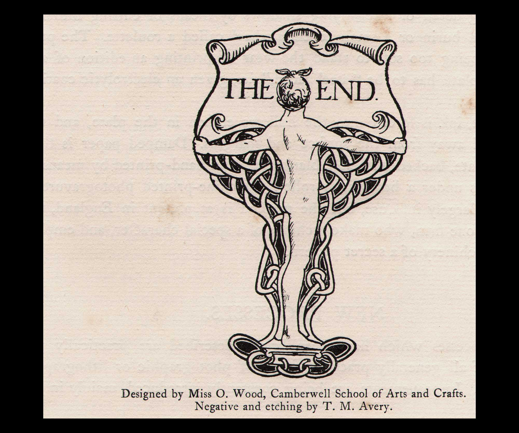
Finis:The End”, book design, (c. 1904-05) printed 1905, Olive Wood, British, 1883-1973, watermarked laid paper, 9.7 x 5.9 | 30.5 x 24.5 cm, negative & etching by T.M. Avery, typographic line etching by Mr. B.A. Newton (School letterpress printer) for London County Council School of Photo-Engraving & Lithography, Principal’s Report for the Tenth Session, 1904-5. Wood was a student at the Camberwell School of Arts and Crafts in London when this was designed. From Liss Llewellyn Fine Art, Wood “lived and worked in Dulwich Village, London. She exhibited illustrations and pen and ink page designs at the Royal Academy and at the Society of Women Artists Royal Miniature Society and ARMS from 1914 through to 1968. Her early designs incorporate art nouveau motifs.” From: PhotoSeed Archive

Letterpress Resources to Explore: Academic

Champaign, IL: Skeuomorph Press & BookLab is an experiential studio for teaching and researching the history and art of the book at the University of Illinois Urbana-Champaign. 

Boston, MA: Huskiana Press:  experiential letterpress studio for students, faculty, and community members at Northeastern University. 

Rochester, NY: Rochester Institute of Technology Cary Pressroom in the Student Hall for Exploration and Development (SHED

Letterpress Resources to Explore: Public

Two Rivers, WI: Hamilton Wood Type & Printing Museum: “the only museum dedicated to the preservation, study, production, and printing of wood type. With 1.5 million pieces of wood type and more than 1,000 styles and sizes of patterns, Hamilton’s collection is one of the premier wood type collections in the world.” 

Carson, CA: The International Printing Museum: “a dynamic museum devoted to bringing the history of printing and books to life for diverse audiences. The Museum is home to one of the world’s largest and most comprehensive collections of antique printing machinery and graphic arts equipment.”  

Haverhill, MA: Museum of Printing: “dedicated to preserving the history of printing, graphic arts, and typography while showcasing their continuing influence on our culture. In addition to many special collections and small exhibits, the Museum contains hundreds of antique printing, typesetting, and bindery machines, as well as a library of books and printing-related documents.”

Atlanta, GA: Robert C. Williams Museum of Papermaking:melds art, history, technology and industry from historical and global perspectives. Museum visitors follow the path of paper from the earliest examples of writing materials, to the Chinese discovery of how to make paper, to the paper mills of Europe, and the high-tech machinery of today’s modern paper industry.” 

Nashville, TN: Hatch Show Print: “From 1879 through most of the twentieth century, Hatch Show Print’s vibrant posters served as a leading advertising medium for southern entertainment, ranging from members of the Grand Ole Opry like Bill Monroe, Minnie Pearl and Ernest Tubb, to rock & roll impresarios such as Elvis Presley and Chuck Berry.”  

Chillicothe, OH: Dard Hunter Studios: (The Mountain House and Dard Hunter Studios are open for tours. The Dard Hunter Library and Archives are also available for research. Please contact us for more information.) 


  1. p. 323. The glossary including the definition for letterpress comes from Benson’s 2008 volume The Printed Picture, published to accompany the exhibition of the same name in the Edward Steichen Photography galleries at New York’s Museum of Modern Art in the fall of 2008 through the Spring of 2009.
  2. Excerpt: American Art Posters of the 1890s, in The Metropolitan Museum of Art, including the Leonard A. Lauder Collection Catalogue by David W. Kiehl Essays by Phillip Dennis Cate, Nancy Finlay, and David W. Kiehl: The Metropolitan Museum of Art distributed by Harry N. Abrams, Inc., New York, 1987, p. 16
  3. Will H. Bradley Biography: from the online resource nocloo.com, celebrating the Golden Age era of children’s book illustrations, 1890-1930.
  4. ATF, from Wikipedia accessed 2025
  5. ATF, Ibid
  6. Frederic Goudy, from Wikipedia accessed 2025
Addition & Subtraction: The Norfolk Broads

Sep 2025 | Alternate Processes, Composition, Engraving, History of Photography, New Additions, Significant Photographs
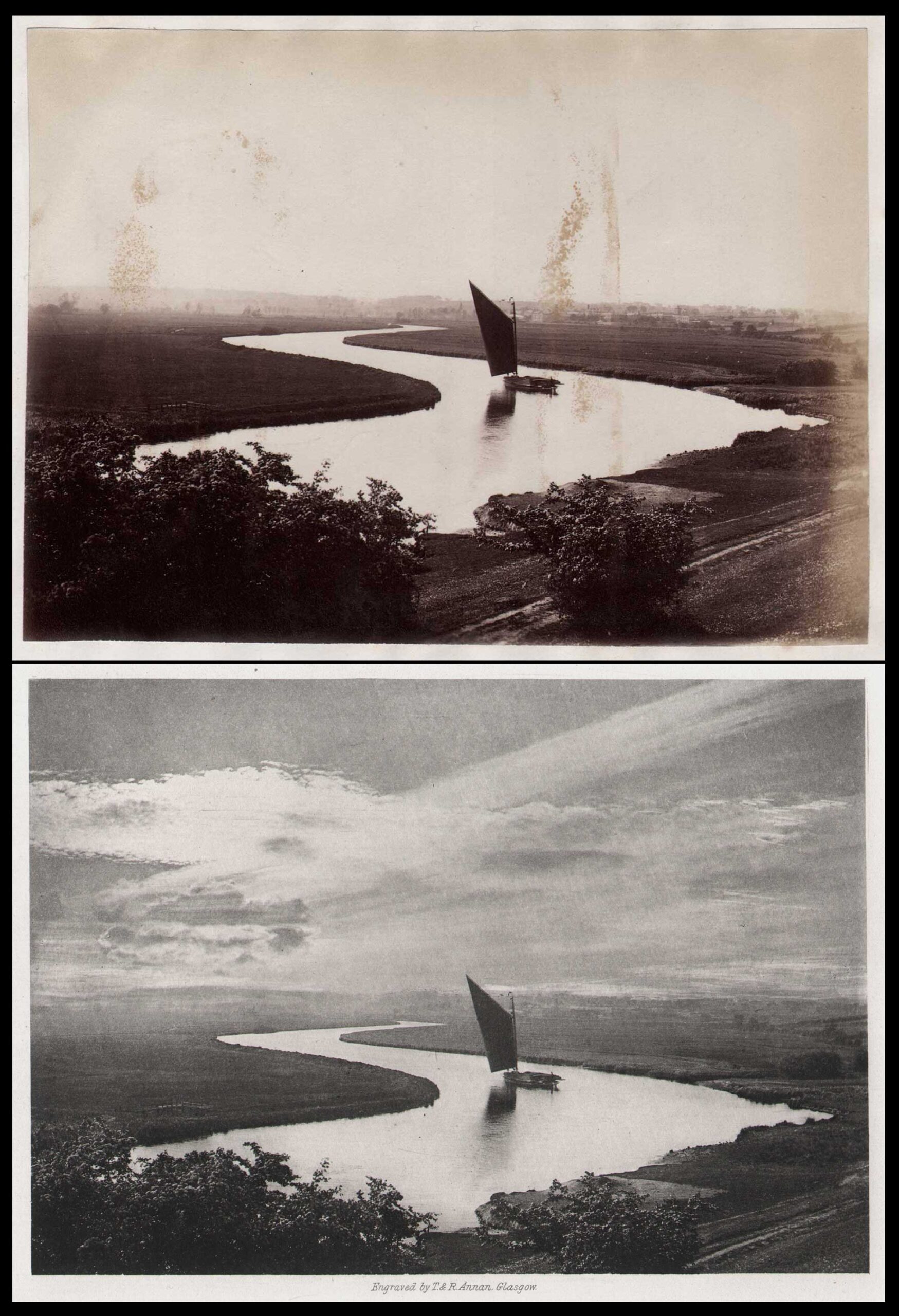
Top: “The Broads ⎯ Postwick Grove”, George Christopher Davies, English, 1849-1922, albumen print laid down on album leaf, 1882, 11.2 x 15.4 | 30.5 x 20.0 cm. The artist, writing in his 1882 book The Handbook to the Rivers & Broads of Norfolk & Suffolk, describes the scene: “Well, the view from Postwick was worth seeing. The curving reaches of the river, animated with yachts, wherries, and boats, lay beneath us, and the green marshes were bounded by the woods of Thorpe, Whitlingham, and Bramerton, while the ruined church of Whitlingham stood boldly on the brow of the opposite hill.” Bottom: “Whitlingham Vale (from Postwick)” 1883, hand-pulled photogravure on etching paper, T & R Annan, Glasgow, from original negative. Plate X from The Scenery of the Broads and Rivers of Norfolk & Suffolk, Second Series, published by Jarrold & Sons, London & Norwich. Both from: PhotoSeed Archive

Three years ago I purchased an original albumen print by the great Norfolk photographer George Christopher Davies. (1849-1922) As you can see in the top photo, it has some condition issues, but luckily for me, it depicts probably his most famous image: a work he titled Whitlingham Vale (from Postwick). In 1883, it appeared as a photogravure plate- one of 24- in the Second Series folio The Scenery of the Broads and Rivers of Norfolk & Suffolk. (1.) 

Dating to 1882, it was purchased along with seven other views, also believed to be by Davies, six of which I’ve uploaded to this archive. On the original album leaf it was pasted on, the print was simply titled: The Broads ⎯ Postwick Grove.

But what is really unusual is seeing a comparison of these two photographs side by side. A rare example to see a “before & after” working up from the same photographic negative printed in two different mediums.

Shown above, the hand-pulled photogravure print: the “after” version by Glasgow firm T. & R. Annan, in what Photogravure.com notes “would be some of the earliest by the firm”, (2.) is radically different. The addition of an array of complex clouds- stripped into the sky by the atelier- gives the scenic view an otherworldly dimension, one that gives a more continuous flow between the large highlighted areas of the surface of the River Yare, the wherry boat, and overexposed sky above.

Continuing down to the distant horizon? Subtraction galore. The city of Norwich, where buildings that can be seen in a magnified view of the albumen print, along with the surrounding countryside, are now completely smoothed over, with many features erased. The memorable results made real by artistic license and a steel etching needle altering the original copper printing plate. 


  1. Both the first and second series featured “24 PHOTO ENGRAVINGS by G. Christopher Davies – Price One Guinea, Jarrold & Sons 3, Paternoster Buildings, London; And London Street, Norwich.”
  2. James Craig Annan, Thomas Annan’s son, had traveled to Vienna to study photogravure with the inventor Karl Klic in 1883. More background.

19th Century Game Theory

Oct 2020 | Alternate Processes, Cameras, Engraving, Games, History of Photography, New Additions, Publishing

19th Century amateur photographers faced trials and tribulations in mastering their new found craft, put into the spotlight after photography itself became a growing mass medium with the marketing of Kodak’s #1 box camera in late 1888.

In 1889, taking advantage of this new large audience-by giving them a fun diversion- the Milton Bradley company of Springfield, Massachusetts produced what is believed to be the world’s first card game on photography, one they called “The Amateur Photographer”.  So now, the agony and ecstasy experienced by those dedicated amateurs who owned more advanced cameras and maintained wet darkrooms while embracing art and science could be enjoyed by all. PhotoSeed recently acquired 24 cards of this game from the original set of 36.

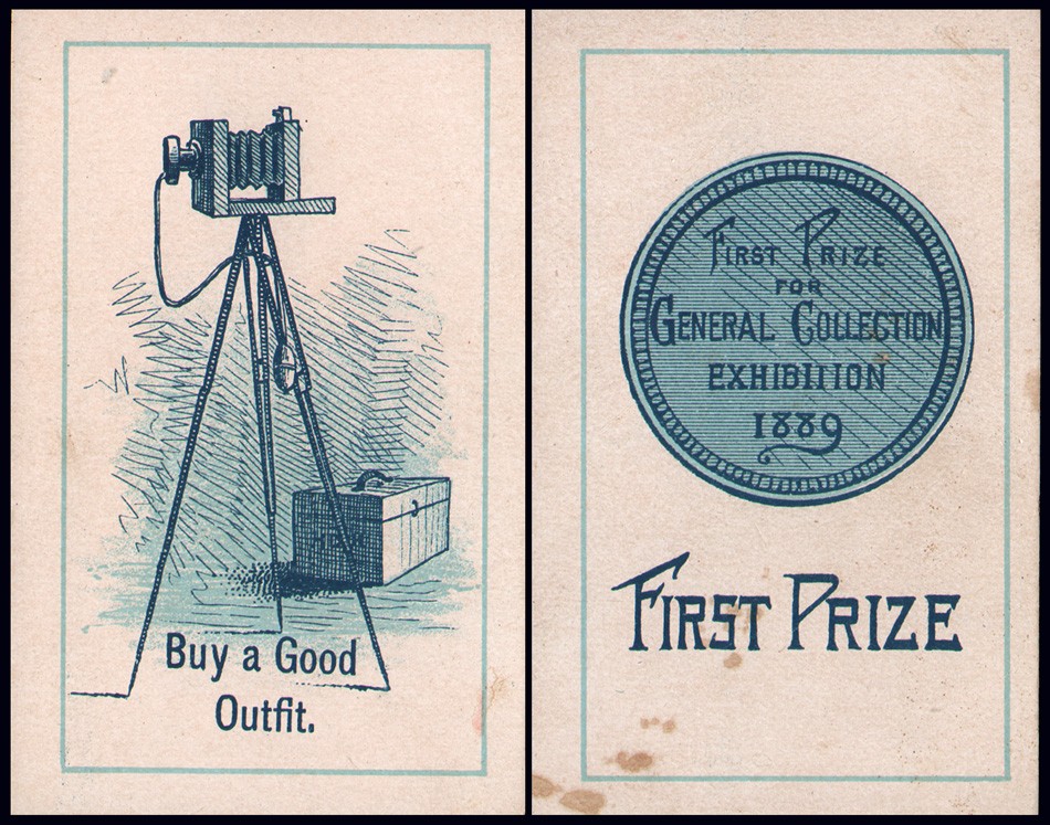
Left: “Buy a Good Outfit” : Right: “First Prize”. 1889. Individual coated-paper lithographic playing cards measuring 8.9 x 5.6 cm (3.5 x 2.25”). Milton Bradley Company, Springfield, MA. The cards making up the game “The Amateur Photographer” were illustrated to show “the triumphs and “hard luck” of an amateur photographer in a way that no member of the craft can fail to appreciate”. From: PhotoSeed Archive

The directions for this Victorian card game can be seen printed below in a vintage advertisement for the 1889-90 Milton Bradley Company “Catalogue of Games, Sectional Pictures, Toys, Puzzles, Blocks and Novelties”. 

For the most part up to the present day, physical card and board games have never featured the character of the photographer, although video games beginning in the 1990’s have included many, including: “Polaroid Pete” (1992), “Pokémon Snap” (1999), “Dead Rising” (2006): excerpt: “gamers play photojournalist Frank West, who somehow got stuck in a shopping mall in Colorado during the zombie apocalypse. Frank has to fight his way out through hoardes of zombies and uncover the truth with his camera.” and “Spiderman 3” (2007).

Instead, popular culture has taken the lead, with the larger than life character of the photographer (for good and bad) celebrated in films taking hold in our collective imaginations. Some that come to mind by this writer include James Stewart’s character spying out his apartment window using a telephoto camera lens in Alfred Hitchcock’s masterful film “Rear Window”, (1954) and Peter Parker’s more recent alter-ego occupation sans Spiderman suit. Enjoy the following select game cards from this surviving set.

Left: Title Page from “Catalogue of Games, Sectional Pictures, Toys, Puzzles, Blocks and Novelties Made by Milton Bradley Company”. Right: Catalogue listing for card game “The Amateur Photographer” in same volume, 1889-90. (p. 10) Courtesy: Internet Archive

Left: “Try an Instantaneous Shot” : Right: “Film Comes Off”. 1889. Individual coated-paper lithographic playing cards measuring 8.9 x 5.6 cm (3.5 x 2.25”). Milton Bradley Company, Springfield, MA. The cards making up the game “The Amateur Photographer” were illustrated to show “the triumphs and “hard luck” of an amateur photographer in a way that no member of the craft can fail to appreciate”. These two negative value cards show two common problems: film emulsion sensitivity or improper camera settings on left card reveals the amateur’s error of not being able to “stop” the action of a race horse while the chemical darkroom problem of a peeling film emulsion (washing too vigorously perhaps?) ruining the masterwork of a sailboat photograph at right. From: PhotoSeed Archive

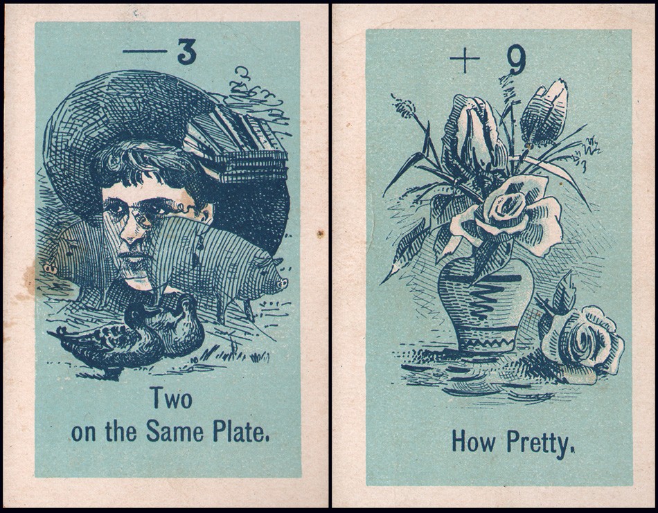
Left: “Two on the Same Plate” : Right: “How Pretty”. 1889. Individual coated-paper lithographic playing cards measuring 8.9 x 5.6 cm (3.5 x 2.25”). Milton Bradley Company, Springfield, MA. The cards making up the game “The Amateur Photographer” were illustrated to show “the triumphs and “hard luck” of an amateur photographer in a way that no member of the craft can fail to appreciate”. The negative value card at left shows the common problem of exposing the same photographic plate twice for two different scenes while at right, a positive value card shows a seemingly perfect picture of a bouquet of flowers. From: PhotoSeed Archive

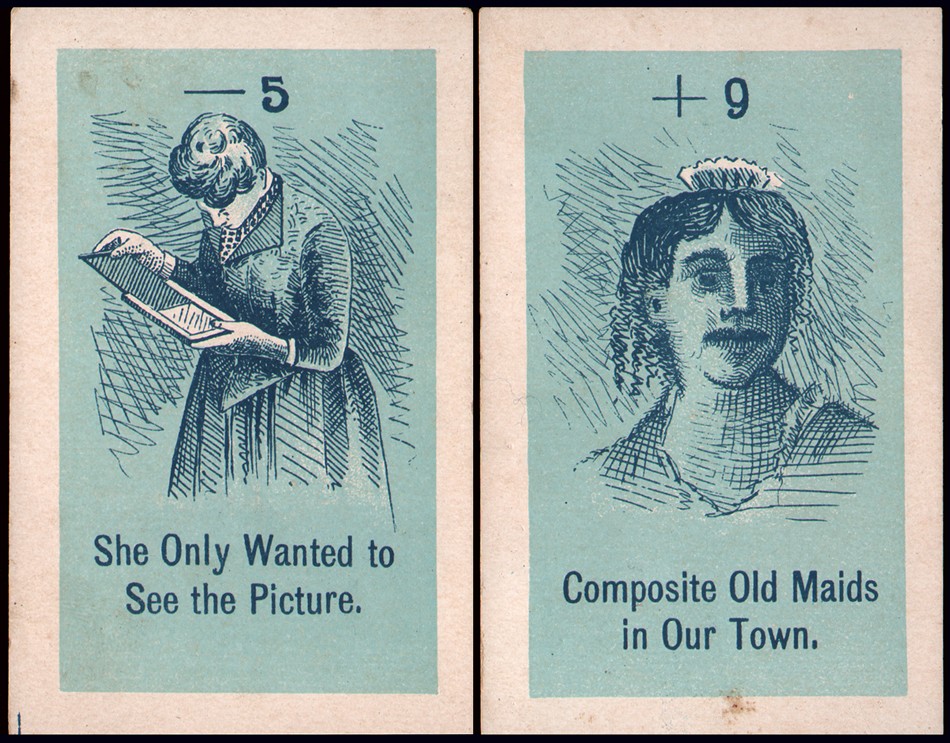
Left: “She Only Wanted to See the Picture” : Right: “Composite Old Maids in Our Town”. 1889. Individual coated-paper lithographic playing cards measuring 8.9 x 5.6 cm (3.5 x 2.25”). Milton Bradley Company, Springfield, MA. The cards making up the game “The Amateur Photographer” were illustrated to show “the triumphs and “hard luck” of an amateur photographer in a way that no member of the craft can fail to appreciate”. Gender sexism depicting the foibles of the female sex was alive and well when Amateur Photography first came into fashion- evidenced by the negative value card at left of a woman peeking at the results of an exposed photographic plate before the negative was properly fixed in the darkroom. Owing to the fact Photography was then a very expensive hobby and career opportunities for women in general were completely lacking, the majority of practitioners were men. But this would soon change, particularly after the dawn of the 20th Century, when Photography actually became one of the few occupations women were encouraged to pursue outside the home. At right, in a twist of this same gender sexism, a positive value card reveals itself in the form of this photographic portrait of an “old maid”, complete with mustache and tiara? or hair comb- with comparisons to later portraits of Queen Victoria by the card artist possibly being the so-called “humorous” intent. From: PhotoSeed Archive

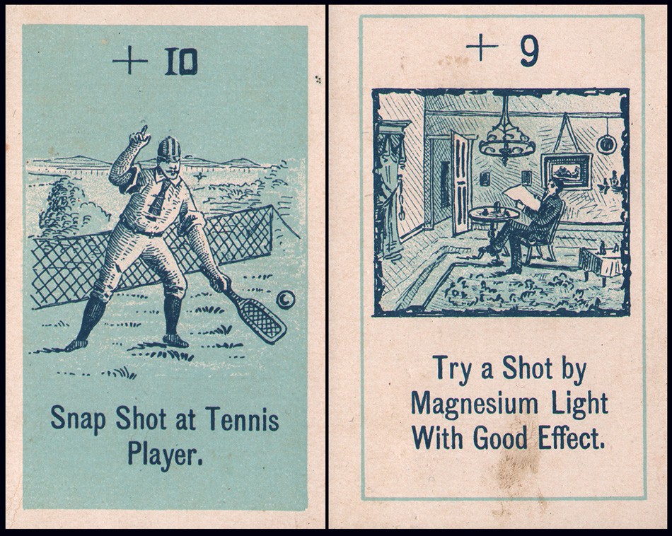
Left: “Snap Shot at Tennis Player” : Right: “Try a Shot by Magnesium Light With Good Effect”. 1889. Individual coated-paper lithographic playing cards measuring 8.9 x 5.6 cm (3.5 x 2.25”). Milton Bradley Company, Springfield, MA. The cards making up the game “The Amateur Photographer” were illustrated to show “the triumphs and “hard luck” of an amateur photographer in a way that no member of the craft can fail to appreciate”. These two high value cards reveal the very tricky technical goal of freezing sports action at left- something rarely attempted at the time- and at right, the undertaking of a so-called “flashlight” photograph. This was achieved on a photographic plate through the intense illumination given off during the ignition of flash powder made up of a mixture of nitrate and magnesium held off camera by the photographer. From: PhotoSeed Archive

One exception found online by this website is the 2016 Japanese card game  “Wind the Film!”, a half-frame camera photography themed card game for 2-4 players.

A Merry Christmas to All

Dec 2015 | Engraving, Painters|Photographers, PhotoSeed, Publishing, Typography
.

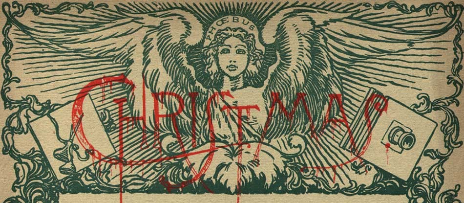
Detail: “Phoebus”: by George Wharton Edwards: American 1859-1950: multiple-color woodcut used as part of cover illustration for periodical “Sun & Shade”: New York: December, 1890: whole #28: N.Y. Photo-Gravure Co.: 32.1 x 25.3 cm | 35.3 x 28.0 cm: from: PhotoSeed Archive

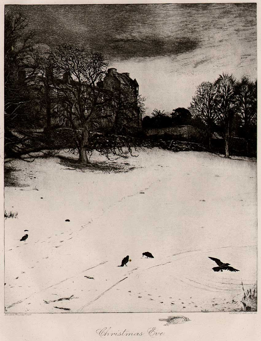
“Christmas Eve”: by Sir John Everett Millais: English 1829-1896: photogravure published in periodical “Sun & Shade”: New York: December, 1890: whole #28: N.Y. Photo-Gravure Co.: 19.2 x 15.7 cm | 34.9 x 27.2 cm: from: PhotoSeed Archive

Detail: “A Merry Christmas”: Emilie V. Clarkson: American 1863-1946: photogravure published in periodical “Sun & Shade”: New York: December, 1890: whole #28: N.Y. Photo-Gravure Co.: 20.1 x 14.5 cm | 34.9 x 27.2 cm: from: PhotoSeed Archive

Detail: “We Praise Thee O Lord” (“Sang with many a change Christmas carols until morn.”: Emilie V. Clarkson: American 1863-1946: photogravure published in periodical “Sun & Shade”: New York: December, 1890: whole #28: N.Y. Photo-Gravure Co.: 20.0 x 15.5 cm | 34.9 x 27.2 cm: from: PhotoSeed Archive

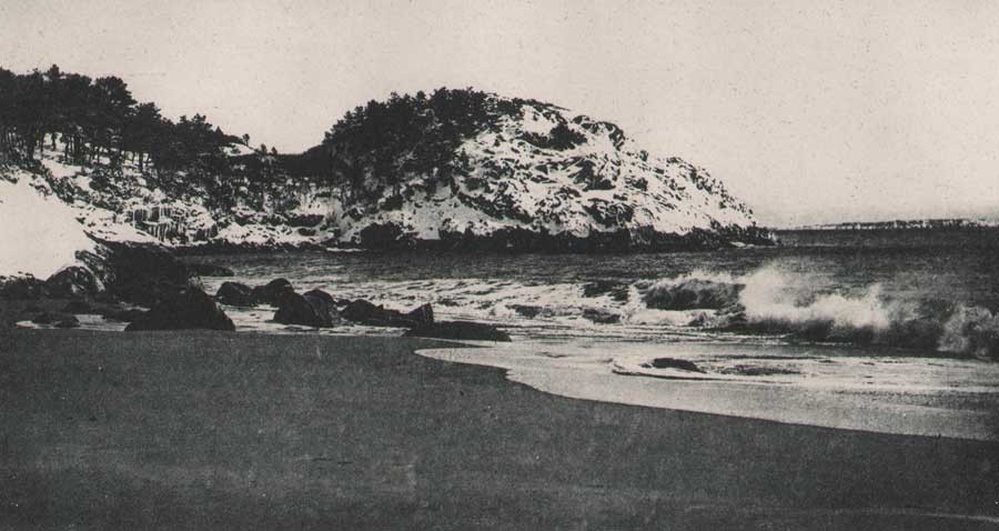
Detail: “Christmas Morning by the Sea” (alt: Winter’s Touch on Land And Sea”: Mrs. J.M. Appleton: American: photogravure published in periodical “Sun & Shade”: New York: December, 1890: whole #28: N.Y. Photo-Gravure Co.: 10.5 x 16.1 cm | 34.9 x 27.2 cm: from: PhotoSeed Archive

Needle in a Haystack

Mar 2015 | Advertising, Childhood Photography, Engraving, Publishing, Significant Photographers, Typography

Surreal would be a good word for it. On the evening of Friday, November 4, 1904, the touring company of the Broadway flop Eben Holden made its way to a performance at a building called the Auditorium on S. 2nd Street in downtown Newark, Ohio.

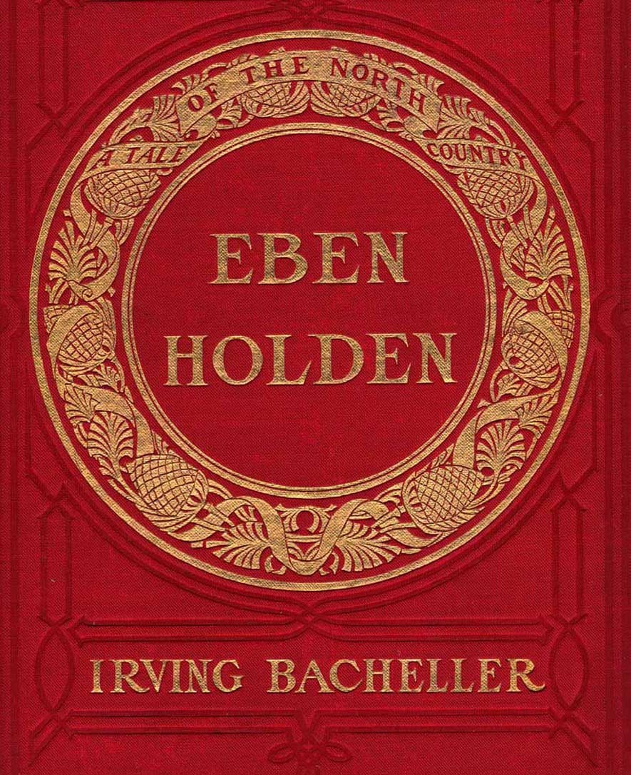
Detail: Cover for “Eben Holden: A Tale of The North Country”: Edition de luxe by Irving Bacheller. Lothrop Publishing, Boston: 1903. Gilt-engraved decorative cloth with circular design featuring a design of a ribbon interlaced with pinecones and leaves: 21.0 x 14.2 cm: One of the best selling novels from the very beginning of the 20th Century, this edition features 12 photogravure plates by photographer Clarence Hudson White. from: PhotoSeed Archive

Most likely in attendance that night? Clarence Hudson White, (1871-1925) the world-renowned pictorialist photographer who was a recent founding member of the American Photo-Secession and current Newark resident.  Only two years earlier, he had taken a series of photographs using his Newark neighbors as models for a special edition of Eben Holden that had been made into this very play.

Written by American journalist and author Irving Bacheller, (1859-1950) the story is a classic rags to riches tale that captivated the masses in the new American century when first published in July of 1900, eventually selling over 1 million copies. The setting at the beginning of the novel is the “North Country” of Northern Vermont , the Adirondack’s and St. Lawrence River Valley of the 1840’s and 1850’s. It tells the coming of age story of William Brower, orphaned at the age of six after his parents and older brother accidentally drowned as well as his relationship with Eben Holden, a farm hand who rescued “Willy” from the cruel fate of an orphanage

But this post is part collecting story, a kind of hunt for treasure, or  “spondoolix” as “Uncle Eb” would say in one chapter-his country ways and lack of education brought into sharper focus for the reader by Bacheller’s liberal usage of Holden’s spoken dialect.

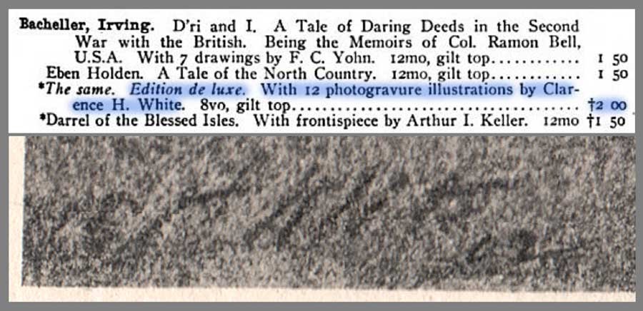
Detail: Top: listing for works by American author Irving Bacheller showing Edition de luxe of Eben Holden highlighted in blue: from: Illustrated Catalogue of Books Standard and Holiday 1903-1904: Chicago: A.C. McClurg and Company: 1903: p. 217 (the † denotes it is a work of fiction, published since November 1, 1902, under the rules of the American Publishers’ Association. (from: Hathi Trust)Bottom: close-up detail showing autograph for CH White 02 at bottom left corner of representative photogravure plate from the Edition de luxe: from: PhotoSeed Archive

The Hunt is on

I consider myself a newbie collector, but one of the first things I put on my list 15 years ago when I first started out was one particular impression of Eben Holden rumored to have been illustrated by hand-pulled photogravures by White, the aforementioned famous photographer.

My curiosity had been piqued after seeing the volume listed in several bibliographies, typically stating the 1900 date. One such entry in author Christian A. Peterson’s Annotated Bibliography on Pictorial Photography did give me hope the work existed, even though finding one in the internet age would prove to be quite the challenge:

The Museum of Modern Art, New York, holds what is probably a unique copy of this book, comprised of the Lothrop text pages bound in leather, with an inscription by White and ten photogravure illustrations by him, including the portrait of Holden. (1.)

Because the novel had been such a success a century earlier, the reality of upwards of 500 vintage copies for sale on the web at any one time was daunting. My course of action however was simple, and eventually effective: send out a mass number of emails to every bookseller in the U.S. listing a copy from a suspect 1901 edition I had honed in on inquiring if it contained any photographic illustrations. 

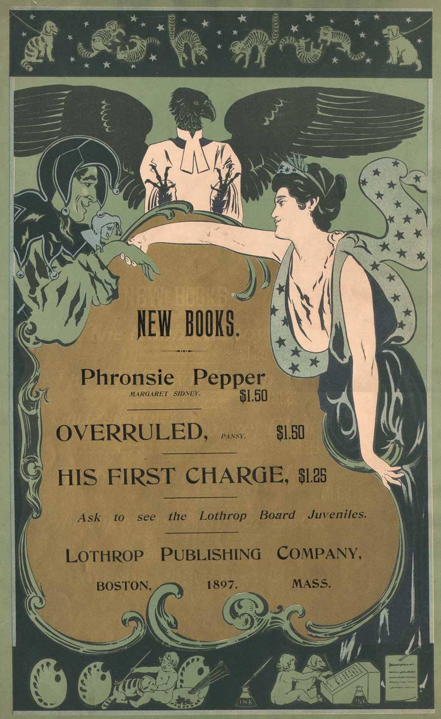
Broadside advertising poster for Lothrop Publishing Company of Boston: 1897: artist: William Schumacher: American: (1870-1931) multiple-color lithograph printed on wove paper: 52.7 x 34.0 cm. Speaking of the beginnings of Eben Holden in the year 1897, author Irving Bacheller said “had unsuccessfully offered the first ‘Eben Holden’ as it then stood to two juvenile publications; but as I happened to be just starting off on a vacation at that time, I determined myself to see the Boston firm, which was the Lothrop Publishing Company. I met the editor, Mr. Brooks, at the Parker House, and told him the story as I had written it. He immediately saw the possibilities in it and declared I had a big thing if I could carry it out as it should be.” (excerpt: “The Critic”: Oct. 1904) vintage broadside (trimmed) from: PhotoSeed Archive

And so eventually luck prevailed. In 2007, a bookseller in Idaho finally said yes, and a bucket item was now on my library shelf. But that was not the end of it, as Alice would say, things got Curiouser and Curiouser!  Because collectors never stop looking, I soon stumbled upon a CT bookseller who knew exactly the significance of the White-illustrated impression, with an astronomical asking price. An excerpt from his description of the work stated:

Elusive and highly desirable work, absent from almost all museum and library collections devoted to photography, and one of only a very few photographically illustrated books produced by a leading member of the Stieglitz circle at the height of the Photo-Secession. (2.)

Top: detail: 1891 advertisement for The Estes Press (Dana Estes & Company) from “The American Bookmaker”. The woodcut shows the brand new Estes Press Buildings located at 192 Summer St. in Boston first occupied around 1890. The firm housed many different companies involved in the bookmaking process, including: “The celebrated engravers, John Andrew & Son have their studios in the upper story…”; J.S. Cushing & Co., (book composition) Berwick & Smith, (presswork) and E. Fleming & Co. (binding). These last three firms left Estes in 1894 and became part of the Norwood Press. (from: Hathi Trust) Bottom: detail: exterior photograph of Norwood Press from the 1897 volume “Boston Massachusetts” by George W. Englehardt. The original caption noted the firm was located “Fourteen Miles from Boston, on the New England Road” and “as a whole employing nearly three hundred hands.” This is where the Eben Holden Edition de luxe was printed. (from: Hathi Trust)

And so I sucked it in and didn’t purchase the second copy, which he told me he had originally purchased in Marlborough, NH.  Eventually he sold it to a European collection, but I’ve since visited him several times and made a few purchases over the years, something I highly recommend rather than doing everything through e-commerce.

But then lighting struck again five years ago, when I purchased a second copy which had been personally inscribed by the author in 1911 to John A. Dix, then governor of New York state.

Curiouser? The first copy, fourth edition imprint stated Two Hundred and Sixty-fifth Thousand, March 12, 1901 and the second copy was for Two Hundred and Seventieth Thousand, September 18, 1903.

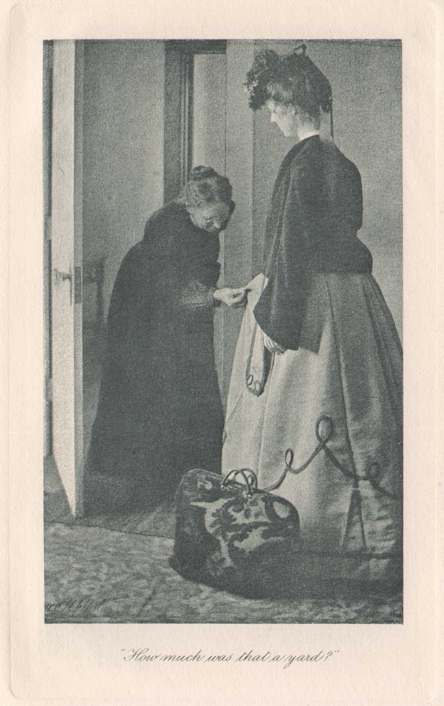
Detail: Clarence H. White: American: “How much was that a yard ?” Hand-pulled photogravure plate printed by John Andrew & Son (image: 12.2 x 7.5 cm | support: 20.0 x 14.0 cm ) from: Edition de luxe impression of Eben Holden: Lothrop Publishing, Boston: 1903. The Library of Congress states the model at right is Ann Fulton and the woman examining the dress is the photographer’s mother Phoebe Billman White (1845-1920) : from: PhotoSeed Archive

Knowing the book now existed in multiple impressions with the Clarence White photogravures was perplexing to me at first, but I’m certain the inclusion of the White photographs was intended by the publisher Lothrop for a more discriminating audience, so its assumed they had the monetary incentive to publish more than the one impression-even with the fickleness and extra work necessary to bind an edition with hand-pulled gravures.

To this end, my research in preparing this post discovered 1901 to be the year Clarence White was first commissioned by the Boston publisher to illustrate a new edition of Eben Holden. The intended publication date of very late 1902 was designed to coincide with the lucrative holiday sales season. Even with the move to e-books in our modern age, publishers earn good money issuing ornate and extra-illustrated editions during this time of year catering to the once a year book buyer and bibliophile alike.

Known as the Edition de luxe, this edition of Eben Holden with the White photogravures priced at $2.00 somehow managed to miss the late 1902 holiday sales season. The curious fact of the inclusion of the imprint for March 12, 1901 on the limitation page and White’s signature including the year 02 on many of the 12 plates in the published work was basic economics for publisher Lothrop-they simply used existing leaves, including the old limitation pages from current stock when it was eventually released for sale to bookstores in 1903. 

Top: detail: 1896: advertisement for John Andrew & Son from the “Boston Blue Book”. (from: Hathi Trust) Bottom: detail: typical example of the firm’s engraved credit appearing at lower right corner of image margin on plate recto from the 1903 Photographic Times-Bulletin. The John Andrew firm was established in Boston in 1852. from: PhotoSeed Archive

This was by no means unprecedented by Lothrop, or other large publishing houses of the era, as they would have set aside a certain number of unbound sheets from a best-selling work for limited impressions featuring artwork.  The first illustrated edition of Eben Holden featured halftone photographs taken by Joseph Byron from the Broadway production of the same name hadn’t even debuted until Oct. 28 of 1901. This also used the March 12, 1901 imprint date. Known as the Dramatic Edition, it was described in the trade monthly The Bookseller:

An illustrated edition of Eben Holden has been recently published called the Dramatic edition. It contains seven pictures of the play as it appeared in New York and a fine portrait of the author.” (3.)

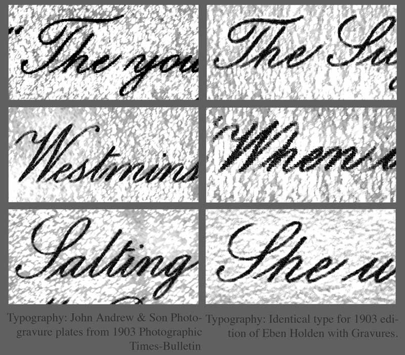
Details: with manipulations in PhotoShop to highlight typography: In order to show Boston’s John Andrew & Son atelier printed the photogravure plates uncredited in the de luxe edition of Eben Holden, it is useful to analyze the script font typeface used for photographic plate titles. Column at left, top to bottom shows known examples from the Andrew atelier taken from the 1903 Photographic Times-Bulletin. Column at right shows plate titles from the Eben Holden volume. all from PhotoSeed Archive.

Published in 1903

Finally, with the eventual tenth imprint of the fourth edition stating Two Hundred and Seventieth Thousand, September 18, 1903, (6.) the makeup of the Edition de luxe was that of a small 8vo Octavo instead of the common edition, a 12mo Duodecimo. The inclusion of 12 fine, hand-pulled photogravure plates by White seen here is another matter altogether.  For one, other than White’s autograph-appearing often (and faintly) in the lower left hand corner of each plate image as CH White 02, the Edition de luxe  neglects to give him any printed credit  for the photographs nor the atelier who printed them.  This is very surprising for a special edition. Typically, there would at the very least be a separate illustrations page noting titles and page numbers at the front of a similar volume, but for whatever reason they were not included.

Stieglitz plays Go Between


With Eben Holden’s great success, the dramatization of the novel on the Broadway stage was logical for its day-especially since the Cinema was not an option because of the infancy of the medium. Lothrop’s piggy-backing of the work through this Dramatic edition, even by the “flop” standard of 49 performances, was but one way of keeping the work “fresh”- even a full year after initial publication.  At some point late in 1901, a result perhaps of someone seeing the play on Broadway or believing White’s work would lend itself nicely to a series of photographic illustrations, the Boston publisher-perhaps through an association with Fred Holland Day (who lived in nearby Norwood where the Norwood Press printed books for Lothrop) or Alfred Stieglitz in New York-gave White the commission for its second illustrated edition of the novel.

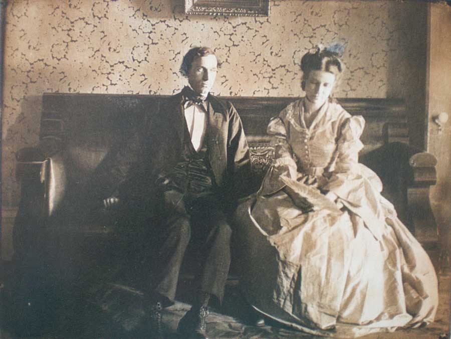
Clarence H. White: American: 1902: “She was still looking down at the fan”: vintage Platinum or gelatin silver print: Showing typical retouching by White, the models are Alfred Dodge Cole, (1861-1928) a professor of Chemistry and Physics at Denison University and his wife Emily Downer Cole. (1865-1957) They play the roles of William Brower and Hope, whom Brower eventually marries in the novel Eben Holden. The photograph was reproduced as a photogravure plate and included in the Edition de luxe. Curators at the Robbins Hunter Museum where this and other White photographs are held stated the photographer had taken family photographs of the Downer family on the lawn of the home in the late 1890’s and so he “would have been familiar with the house and furnishings from that commission.  It was common for Clarence White to ask acquaintances to pose for photographs, often in costumes that he would provide. The photographs for Eben Holden were staged with costumes from the Civil War era.”  Photograph courtesy: Collection of the Robbins Hunter Museum in the Avery Downer House, Granville, OH.

Ultimately, Stieglitz’s publishing background, connections and established relationship with White through his editorship of Camera Notes, his new involvement with Camera Work,  as well as his having his own work exhibited in an early salon of pictorial photography in Newark Ohio in late 1900 and other exhibitions made Stieglitz a believer in White’s potential as an illustrator:

“What is especially fascinating, however, is what occurs when White is commissioned, as he was in 1901, to take up literary illustration himself. Through the assistance of Stieglitz, White received the commission to illustrate a new edition of the novel Eben Holden by Irving Bacheller. ( 4. )

And much later, the photographer’s grandson Maynard Pressley White commented about a bit of reluctance on his grandfather’s part in dealing with Lothrop as part of his Ph.D. dissertation in 1975:

“The correspondence with Stieglitz concerning the illustrations for Eben Holden is revealing of his character as well as Stieglitz informed him that he suffered from no such timidity and would–and indeed did–handle the matter with the publishers, as it turned out, to the advantage of White.” (5.)

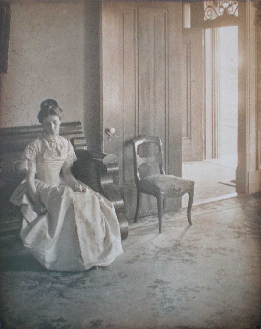
Clarence H. White: American: 1902? : vintage untitled Platinum or gelatin silver print: The model Emily Downer Cole (1865-1957) poses wearing a different dress than seen in the published Eben Holden photogravure “She was still looking down at the fan” taken on the same settee in the front parlor of the Downer family home. This was likely an alternate study Clarence White took for consideration for his series of Eben Holden illustrations. Photograph courtesy: Collection of the Robbins Hunter Museum in the Avery Downer House, Granville, OH.

John Andrew & Son: founded in Boston: 1852


In giving credit to White and the firm that printed his photographs as gravures, a bit of elucidation seems in order to set things straight. Upon close inspection of these plates along with many others by Boston’s John Andrew & Son from the same time frame, I feel confident giving the Andrew firm credit for printing them. This is based on a near exact match in the script font used for the plate titles in the de luxe edition of Eben Holden as well as those plates credited to the firm appearing in the Photographic Times Bulletin from 1902-04.

I’ve included examples of the font as a comparison with this post. Another exact match is the same plate paper was used for both publications: this is very revealing especially on the plate verso where a very fine stipple pattern can be seen on the paper surface of the cream-colored plate paper. Perhaps the strongest association with the John Andrew atelier and the Norwood Press (which printed the de luxe edition) emerged in my research on business associations with some of the individual companies that came together in 1894 when that press was formed. These included J.S. Cushing & Co., (for composition and typesetting) Berwick & Smith Co., (for presswork) and E. Fleming & Co. (for binding). Beginning around 1890, all of these firms along with John Andrew were under one roof as part of the brand new Dana Estes & Company publishing house buildings on Summer Street in Boston.

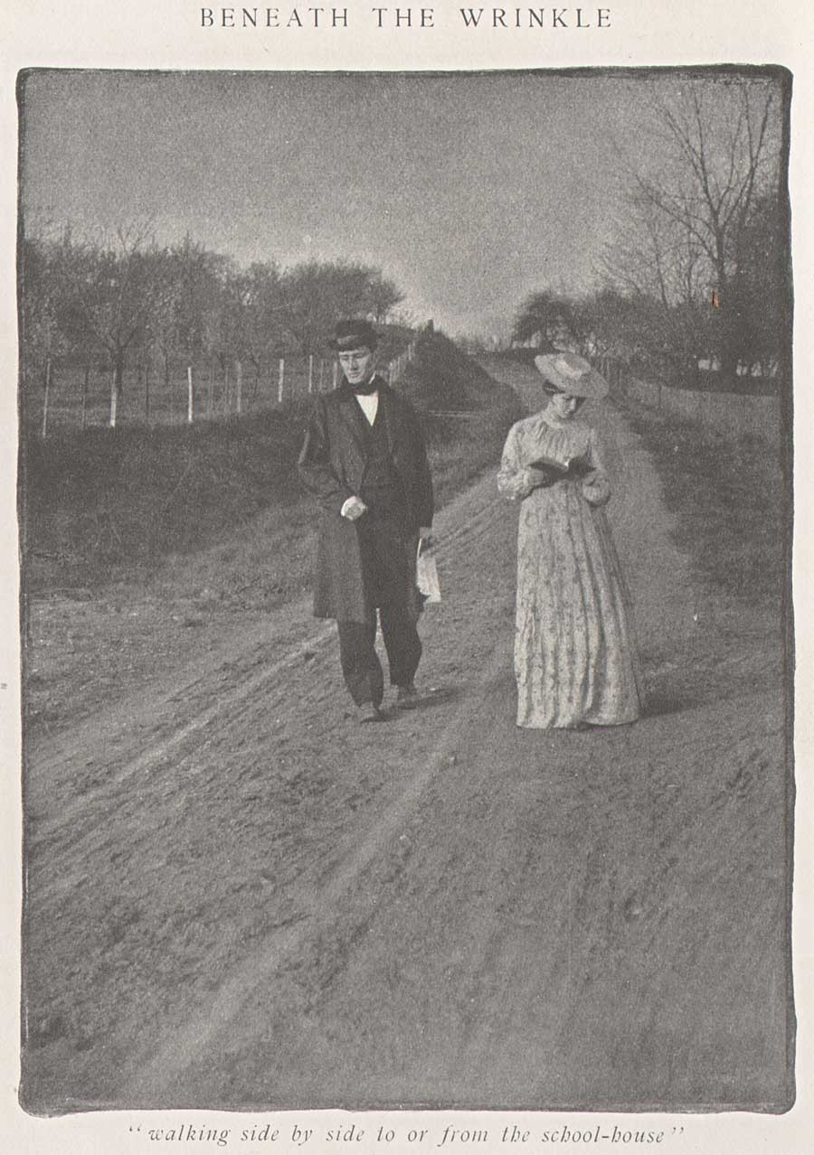
Clarence H. White: American: 1903: halftone: “Walking side by side to or from the school-house” was one of three photographs published to illustrate the Clara Morris story “Beneath the Wrinkle” published in the February, 1904 issue of McClure’s Magazine. (12.8 x 9.5 cm) published: p. 430. From: PhotoSeed Archive

With the move to Norwood in 1894, the Andrew atelier stayed behind in Boston at 196 Summer St. but continued to provide fine photo engraving work to the major publishing houses in Boston and New York. Known today for printing many of the photogravure plates beginning in 1907 for the monumental Edward Sheriff Curtis work The North American Indian, the firm sometime in the first decade of the 20th Century became a department of the Suffolk Engraving & Electrotyping Co. of Boston with offices at 394 Atlantic Ave.

Named after John Andrew, (1815-1870) a wood engraver born in England who immigrated to Boston where he worked with fellow engraver Andrew Filmer, the firm eventually made the transition to photo engraving, including the half tone and photogravure processes. Andrew’s son George T. Andrew succeeded his father at the business, located at 196 Summer St. An 1892 overview of the firm from the volume Picturesque Hampden gives some background:

JOHN ANDREW & SON COMPANY.
ENGRAVERS AND MAKERS OF FINE BOOKS, BOSTON MASS.


If we go back a few years, we find that in illustrating books and magazines wood and steel engraving were about the only methods available. Nor could steel engraving have any wide use on account of the great expense of printing. Ever since its start, in 1852, the firm, now styled the John Andrew & Son Company, has held a prominent place among illustrators, especially in work of the finest grades. Their reputation was made in the first place as engravers on wood, but the discovery of delicate chemical and mechanical processes has in later years led them to also take the photo-engraving and half-tone work which has at present such wide use and popularity. In this field they do work for some of the best magazines and books published in this country. In what they undertake they strive not so much to do the cheapest work in price as the best work in quality. Quite recently the firm has taken up the photo-gravure process in addition to those spoken of above. The industry we describe is not located in Hampden county, but the mention here is not inappropriate as the engraving of our pen and ink pictures was done almost wholly by this firm. Their address is 196 Summer street, Boston.

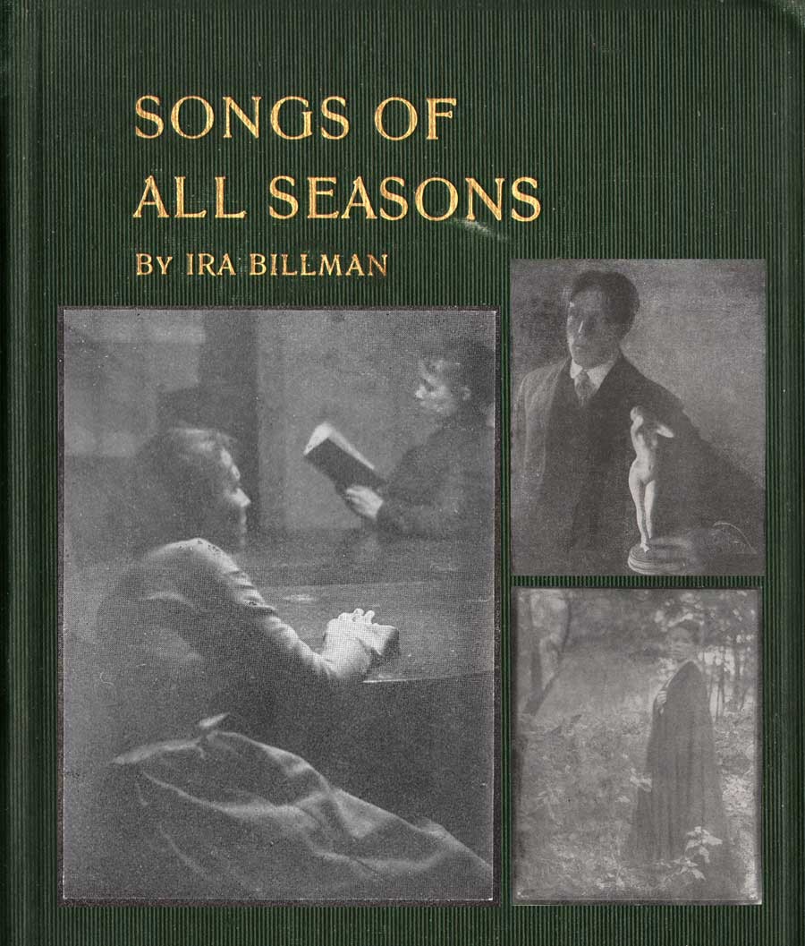
Detail: Cover for “Songs of All Seasons” by Ira Billman. The Hollenbeck Press, Indianapolis: 1904. Gilt-engraved stamped cloth: 20.4 x 13.6 cm: shown inset with representative photographs taken by Clarence White reproduced in halftone in the volume. Photo left: “The Book Lovers” (p. 181); top right: untitled man with statuette illustrating poem “The Twin Flower” (p.137); bottom right: “The Gloaming” (p. 199). Billman was Clarence White’s uncle and was “one of his earliest artistic influences in his life”: From: PhotoSeed Archive

Photographic Illustration: a New Outlet


A newspaper clipping, believed to be from the Newark Daily Advocate in the Clarence Hudson White clipping file at the Newark, OH public library, includes the following undated (but 1903) story discussing Eben Holden in passing while concentrating on a new commission that inevitably came from it: costume-piece photographs by White similar to those he did for Lothrop for author Clara Morris’s story published in McClure’s magazine in February, 1904 entitled “Beneath the Wrinkle“:

PICTURES    From Real Life by Clarence White
Forwarded On Order to a New York Magazine-Local Artist’s Latest Work.


Mr. Clarence White received a command last fall from the art department of McClure’s Magazine to illustrate Clara Morris’ new story, entitled, “Beneath the Wrinkle,” that will appear in that magazine presumably in the near future. Mr. White was to have been given all the time he wanted, but in view of the change of art editors, Mr. White was notified about three weeks ago that the illustrations would be required immediately. Mr. White at once notified the publishers that he would use all his efforts to complete them immediately, and would forward them when completed. Today the set comprising six, were forwarded and as equaly as clever and well executed as the ones made for the illustrating of the holiday edition of Eben Holden that was to have made its appearance last Christmas, but was not completed in time for that season. The ones now in progress are all local personages, done in quaint, old-fashioned garb and surroundings, recalling vividly to mind the characteristics in dress and decorations then in vogue. They show the fine and beautiful artistic temperament of Mr. White in his striking correct interpretation of dress and customs of the period in which the characters live. Mr. White deserves the honor the illustrations will surely bring to him, as he is always conscientious and painstaking in whatever he undertakes in his profession.

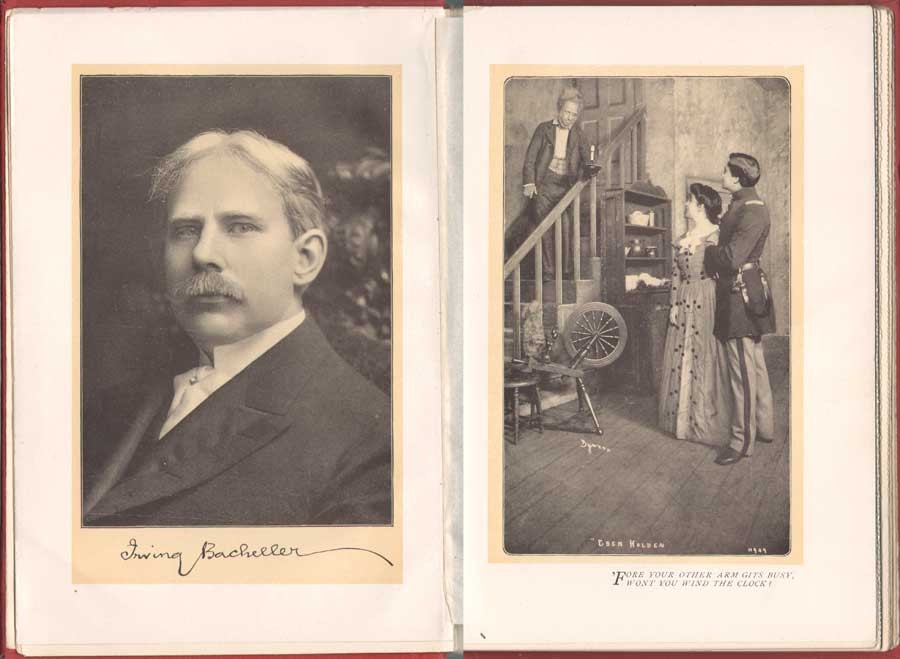
Left: Irving Bacheller, (1859-1950) American journalist and author, wrote the novel Eben Holden which sold over 1 million copies. This portrait with facsimile autograph by an unknown photographer appeared as the frontis (13.3 x 9.1 cm) to the Dramatic Edition of the book-the first illustrated edition featuring photographs of the Broadway stage production that debuted Oct. 28, 1901 and ran for only 49 performances. Right: ” ‘Fore your other arm gits busy, wont you wind the clock?” (14.1 x 8.4 cm) Actor E.M. Holland at left plays the role of Eben Holden, Lucille Flaven plays Hope and Earle Ryder as an American Civil War officer plays William Brower. The important New York commercial photographer Joseph Byron, (1847-1923) founder of the Byron Company (currently, the 7th & 8th generations runs Byron Photography) took stage photographs of the play at New York’s Savoy Theatre with plates published in the Dramatic Edition. from: PhotoSeed Archive

White Family Connections: Songs of all Seasons


During the time he received the commission for illustrating Beneath the Wrinkle in 1903, a more intimate family connection developed which allowed White the opportunity to take another series of photographic illustrations, 42 in all, published in 1904 within a slim volume of poetry titled Songs of All Seasons.

The author was nationally known poet Ira Billman, Clarence White’s uncle,  the brother of his mother Phoebe Billman White. In the volume Symbolism of Light: The Photographs of Clarence H. White published in 1977 which accompanied an exhibition of White’s work at the Delaware Art Museum and International Center of Photography, White’s grandson Maynard P. White, Jr. describes Ira Billman as a major influence on Clarence and Songs:

Among the gathering of aunts and uncles that gave meaning and context to the artist’s early life was Ira Billman, his mother’s brother. “Poetic” is the word most often used to describe White’s photography, and his Uncle Ira, a poet by avocation, was one of the earliest artistic influences in his life. …Billman’s work celebrates rural America; his poems are songs to people and to nature, and they are imbued with the deep religious sentiments of his Lutheran heritage, without being mawkish or even faintly cloying. What is important for the purpose of my discussion is that Clarence White made the photographic illustrations for Songs of All Seasons, and Billman dedicated the volume to him. (7.)

“To Governor John A. Dix with many good wishes from Uncle Eb an’ me Irving Bacheller N.Y. Feb. 22 1911.” This personal inscription by Bacheller to John A. Dix, then Governor of New York State, appears in a volume of Eben Holden with the imprint of Two Hundred and Seventieth Thousand, September 18, 1903, the actual year the novel was released for sale. In a 1901 newspaper article, Bacheller said the character Eben Holden was based on “a composite of my father and his hired man-a very jolly old fellow”. from: PhotoSeed Archive

Ninety-one poems and sonnets are included in the volume. Here, The Test,  a representative poem from the work:

The Test

Not what I felt will be the test
When song and fragrance filled the hour,
And all the sunshine of the blest
Unfolded me to perfect flower.


Not what I aid will be the test
When by sweet waters wound my way,
And white-haired, thoughtful hills all guessed
The word I was about to say.


Not what I did will be the test
When stunned by cry of human needs
I dreamed I was myself oppressed,
And woke to passion of great deeds.


Not what I chose will be the test
When first I saw one world in hand
Is worth two in the bush-the best
Of which it is to understand.


O! none of these will be the test,
But what God knows I would have done,
Had I been nurtured in the nest
Of one, I now condemn and shun. (8.)

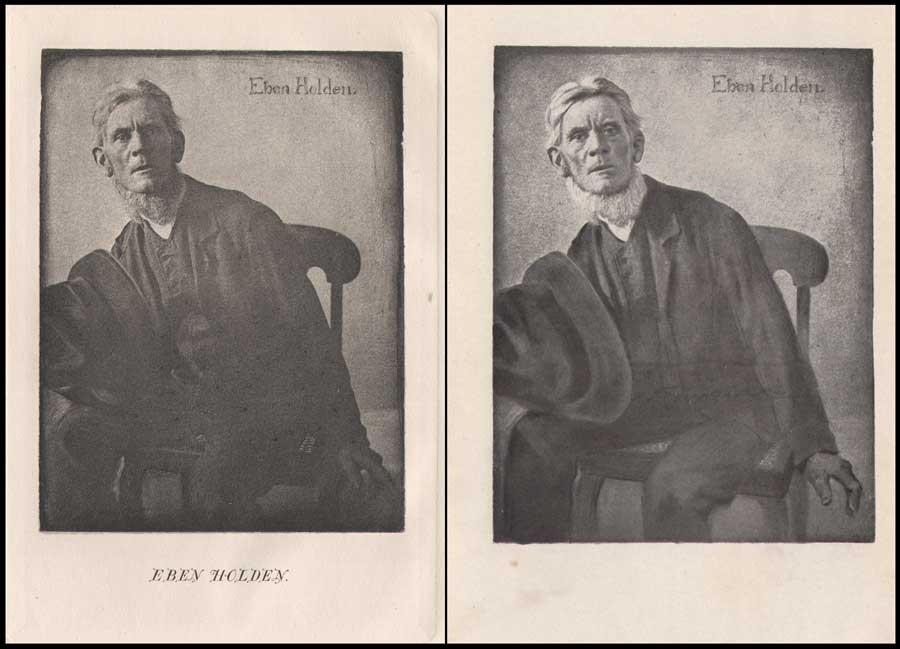
Left: Clarence H. White: American: 1902: hand-pulled photogravure: (9.7 x 7.3 cm) in: Eben Holden: A Tale of the North Country: Boston: Lothrop Publishing. (1903) Appearing as the frontis portrait in the Edition de luxe, this unknown subject was the novel’s namesake: a fictional character who was a former farm-hand and main father figure for the newly orphaned William Brower serving as the narrator in the work. Right: Clarence H. White: American: 1902: halftone: (12.0 x 9.2 cm) in: Eben Holden: Harper & Brothers Publishers. (1914) Part of the Pine Tree Edition of Irving Bacheller’s (Collected) Works. This heavily manipulated portrait from the original photograph by Clarence White of Eben Holden published 11 years earlier also appeared as the frontis for the first volume in the Pine Tree series. From: PhotoSeed Archive

Pictorial Illustration for Photography a Growing Field


By 1904, esteemed critic Sadakichi Hartman, writing in Leslie’s Weekly, weighed in on the growing use of photography for book illustration:

…and Clarence H. White, of Newark, O., has found a new opening for photography in the illustration of books. His illustrations for “Eben Holden” have attracted wide and deserved attention.” (9.)

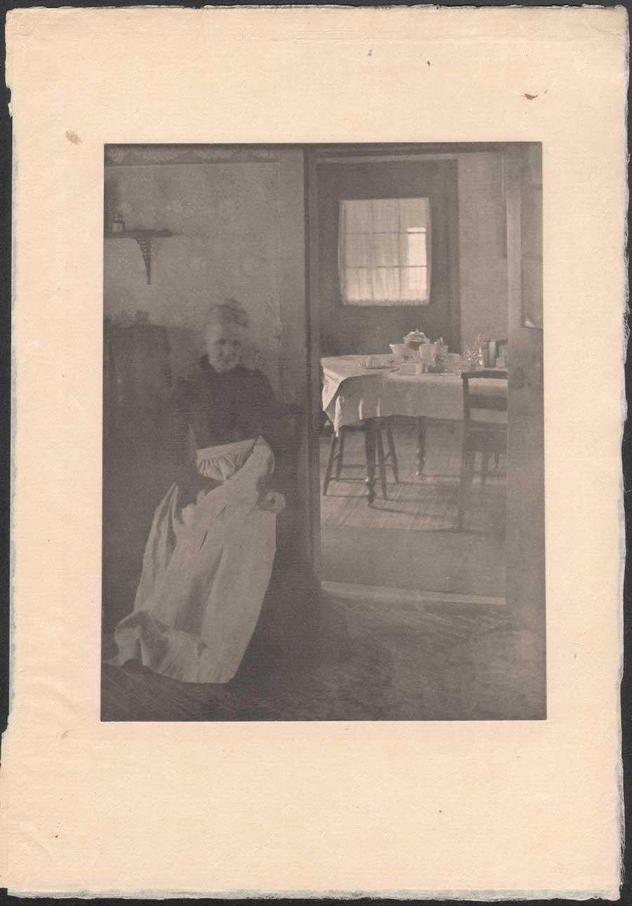
Clarence H. White: American: 1902: “Illustration to “Eben Holden”” (1903) hand-pulled photogravure: (tipped image:19.7 x 15.0 cm | Japan paper support: 30.5 x 21.0 cm) in: Camera Work III. (1903) Two plates in the Edition de luxe of Eben Holden: “How much was that a yard ?” (seen in this post-CW IX: 1905) and this one: “Mother was living in the old home alone”-an interior portrait of the photographer’s mother Phoebe Billman White (1845-1920) were also published as photogravures in Camera Work. From: PhotoSeed Archive

And later that year, citing White’s involvement with Eben Holden while writing in the Photographic Times Bulletin, Hartman brought up the potential financial rewards possible for pictorial photographer in this new field:

“The only way to approximate a market value of pictorial prints is to investigate how much they might bring on the average, if offered for sale as illustrations. There is lately a decided demand for photographic illustrations, and consequently a certain standard price in vogue. The pictorialist, of course, and perhaps with some right, aspires to illustrator’s prices (i.e., $50-$100 for the full page of a magazine), but he has never reached it, with the one exception of Clarence H. White, who is said to have received several hundred dollars for his series of “Eben Holden” illustrations.” (10.)

Detail: “Tucked some cookies into my pocket” : Clarence H. White: American: 1902: hand-pulled photogravure plate (11.9 x 7.3 cm) included with Edition de luxe of Eben Holden (1903): Lothrop Publishing, Boston. The young orphan William Brower is possibly modeled here by the photographer’s son Maynard Pressley White (b. 1896) and his wife Jane Felix. (1869-1943) The scene shows Brower preparing to head out into the wilderness in a dog-pulled cart with Eben Holden at right. From the novel: “Our hostess met us at the gate and the look of her face when she bade us good-by and tucked some cookies into my pocket, has always lingered in my memory and put in me a mighty respect for all women.” From: PhotoSeed Archive

This additional source of significant money to Clarence White and his young family through these illustration commissions invariably gave him additional confidence in his abilities as a photographer and financial peace of mind to eventually make his way to New York City, leaving Newark in 1906. It is also not a stretch to infer White’s own life mimicked the storyline of hard work that can earn the “American Dream” found between the pages of Eben Holden. Although the critic for the New York Times reviewing the play at New York’s Savoy theater didn’t care too much for the acting:

As an exhibition of dramatic craft “Eben Holden” is hardly worth serious consideration“…

he did, a few paragraphs later, write the production had a few redeeming qualities:

But, despite its defects, the play is wholesome; it is redolent of the woods and the fields, and it provides the opportunity for an evening of entertainment that need not be looked back upon with regret.  (11.)

No doubt Clarence White, had he been in attendance watching the play inside Newark’s Auditorium that 1904 November evening, would have agreed with these last sentiments of the big city critic, marveling and grinning to himself in the darkened hall while taking in the surreal juxtaposition that art imitating life can bring about.

Notes:

1. (White, Clarence H.) excerpt: An Annotated Bibliography on Pictorial Photography: Selected Books from the Library of Christian A. Peterson: Laurence McKinley Gould Library: Carleton College: Northfield, Minnesota: 2004
2. ABE listing: 120407. Besides multiple copies held by PhotoSeed, other known copies are in the Library of Congress, MOMA and Photogravure.com.
3. The BooksellerDevoted to the Book and News Trade:  Chicago: January, 1902: p. 28
4. Peter C. Bunnell: Inside the Photograph: writings on Twentieth-Century Photography: Aperture Foundation: 2006: p. 47
5. Clarence H. White : a personal portrait: Maynard Pressley White: Ph.D. dissertation, University of Delaware, 1975: pp. 79-80
6. see Beaumont Newhall’s Photography: A Short Critical History, from 1938, lists Eben Holden with the White illustrations as being published in 1903 on p. 215
7. excerpt: see Symbolism of Light: 1977: p. 7
8. Songs of All Seasons: Ira Billman: Indianapolis: The Hollenbeck Press: 1904: p. 65
9. excerpt: Advances in Artistic Photography: Sidney Allan: in: Leslie’s Weekly: April 28, 1904: New York: p. 388
10. excerpt: from: What is the Commercial Value of Pictorial Prints?: Sidney Allen: in: The Photographic Times Bulletin: December, 1904: p. 539
11. excerpt: review: “Eben Holdenat the Savoy: The New York Times, October 29, 1901

Genre meets Genius

Nov 2014 | Engraving, New Additions, Painters|Photographers, Significant Photographers, Typography

Although long forgotten, amateur photographer John E. Dumont (1856-1944) figures prominently in the early years of American pictorial photography. However, a professional and better known acquaintance of his may change our understanding after my discovery of a small label on the back of a Dumont print made its’ way into the archive.

Left: “Hard Luck”, showing a monk playing a losing hand of cards, was most likely taken by John E. Dumont in 1890. Shown here as the cover illustration of Frank Leslie’s Illustrated Newspaper for Feb. 7, 1891, it is reproduced as a wood engraving from the original photograph, and earned Dumont a second place award and $100.00 in Leslie’s Amateur Photographic Contest which closed in January, 1891. Dumont went on to copyright “Hard Luck” in 1892. (original from Pennsylvania State University) Right: Halftone portrait of photographer John E. Dumont of Rochester, New York by unknown photographer. 6.3 x 4.7 cm. Reproduced as part of a series of portraits of “Prominent Amateur Photographers” in the Nov., 1893 issue of the American Amateur Photographer journal. (p. 513) : from: PhotoSeed Archive

Established in business beginning in 1881 in Rochester, New York as a wholesale merchandise and grocery broker specializing in items like sugars, teas, and coffees, Dumont took up photography in 1884 and was soon entering and winning awards in photographic salons around the world.

Taken in 1887, photographer John E. Dumont of Rochester, New York made this series of genre portrait photographs of a gentleman he described as “an old man who used to peddle oranges around the streets and offices in this city”. Left: “A Quite Pipe”: woodcut engraved from a copyright photograph from Leslie’s Illustrated Newspaper Amateur Photographic Contest: published Jan., 17, 1891. Middle: “The Old Shaver”: woodcut engraved from a copyright photograph from Leslie’s Illustrated Newspaper Amateur Photographic Contest: published Jan., 24, 1891. Right: “The Toiler’s Good-Night” : woodcut engraved from a copyright photograph illustrating a poem from Leslie’s Illustrated Weekly: published Dec., 14, 1893: originals from Pennsylvania State University

Specializing in genre scenes, his photographs were published frequently, reaching a high point when his well known study of a monk playing a losing hand of cards titled Hard Luck was published as the cover illustration (converted to a wood engraving) for Frank Leslie’s Illustrated Newspaper in early 1891, the same year he won a grand diploma at the groundbreaking Vienna Salon of Photographic Art, the highest accolade awarded for the very few American entrants whose work was even accepted, including the now venerable Alfred Stieglitz, who had only come back to America from Europe the year before.

Artist: Harvey Ellis, American: 1897: medium: wood engraving: subject: copyright label for amateur American photographer John Eignas Dumont. Plate intended to represent “the genius of photography surrounded by the accessories of the “dark room.” Design: 3.4 x 1.3 cm | Label: 7.0 x 4.5 cm. Label is a variant of an ex libris bookplate Ellis designed for Dumont. from: PhotoSeed Archive

It was therefore a delightful discovery which took place for me recently after a signed Dumont carbon print of The Dice Players  exhibited in the Royal Photographic Societies‘ annual salon the same year as the Vienna exhibition was acquired for the archive. But what makes it special for the confluence of art photography and evidence a new incarnation of the English Arts & Crafts movement had taken hold after arriving on American shores was a later 1897 copyright label affixed to the rear of the mounted print. A design featuring an Art-Nouveau style woodcut engraving of a woman in a darkroom holding up a glass plate, I soon discovered it was the work of noted American artist, architect and designer Harvey Ellis.  (1852-1904)

Photographic portrait of American artist, architect and designer Harvey Ellis. (1852-1904) unknown photographer: reproduced as halftone and published in the Dec., 1908 issue of The Architectural Review illustrating article on Ellis by Claude Bragdon titled Harvey Ellis: A Portrait Sketch: p. 173. Original from The University of Michigan

Never heard of him? Today, Ellis seems only to be remembered for the brief work he did in the last months of his life in 1903 for among other things, designing mission-style furniture and interior renderings of Craftsman homes in the Syracuse, New York-based architecture department for his American employer, Gustav Stickley, (1858-1942) the leader of the nascent American Arts and Crafts movement. But this is far from a full portrait of Ellis. A contemporary- architect, author, and theater designer Claude Bragdon– (1866-1946) gave a fuller account of Harvey Ellis in a posthumous outline for the December, 1908 issue of The Architectural Review. A few excerpts:

HARVEY ELLIS was a genius. This is a statement which  may excite only incredulity in the minds of the many who never heard his name or knew him only by his published drawings, but it will have the instant concurrence of the few who knew well the man himself. There is the genius which achieves, and the genius which inspires others to achievement. Had it not been for the evil fairy  (alcohol-editor)  which presided at his birth and ruled his destiny, Harvey Ellis might have been numbered among the former; that is, he might have been a prominent, instead of an obscure, figure in that aesthetic awakening of America, now going on, of which he was among the pioneers; but even so he exercised an influence more potent than some whose names are better remembered.  (p. 173)

Although many designs by Harvey Ellis were never realized in the physical form, there are notable exceptions. The Compton Hill Water Tower in Reservoir Park, St. Louis, MO, is one landmark still standing. Topping out at 179 feet, (55 m) the structure was designed by Ellis in 1896 or 97 while employed by the St. Louis architectural firm of George R. Mann and Edmond J. Eckel, and built in 1898 in the French Romanesque style of rusticated limestone and buff brick and finished in terra cotta. The tower was decommissioned in 1929 and placed on the National Register of Historic Places in 1972. Photographer: Leo Kraft, American: ca. 1915: gelatin silver prints pasted in album: left: 12.1 x 6.9 cm | right: 9.8 x 6.3 cm : support: 17.6 x 25.2 cm. from: PhotoSeed Archive

…  “There’s one type of mind,” Harvey remarked, “which would discover a symbol of the Trinity in three angles of a rail fence; and another which would criticize the detail of the Great White Throne itself.” Symmetry (the love of which is a sure index of the Classic mind) was his particular abhorrence. “Not symmetry, but balance,” he used to say.  (p. 175)

Transient, and an unconventional architect and designer for his day, Ellis moved about the country working for firms in Minneapolis and St. Louis before returning to his native Rochester in 1893. It was sometime after this period that he most likely encountered and made the friendship of Dumont. In 1897, both became founding members of the Rochester Arts and Crafts Society, with Ellis serving as first president. That year, Dumont commissioned Ellis to design an ex libris book plate for him which was reworked slightly and reduced in size for use as a photographic copyright label-an example of which I found affixed to the verso of The Dice Players.

Details: Harvey Ellis: 1897: wood engraving: Ex Libris bookplate and Copyright label for American amateur photographer John Eignas Dumont : Left: bookplate: 9.4 x 4.1 cm: Jensen Tusch Collection- Frederikshavn Kunstmuseum & Exlibrissamling- Denmark: Right: copyright label: 3.4 x 1.3 cm | 7.0 x 4.5 cm : from: PhotoSeed Archive

In 1899, the original bookplate was described in the pages of the London Journal of the Ex Libris Society:

DUMONT  BOOK-PLATES.

By the kindness of a member we are enabled to give an illustration of the book-plate of Mr. John E. Dumont, of Rochester, N.Y., designed by Mr. Harvey Ellis, of the same city.  Mr. Dumont is a leading photographer in America, and his works are well known in England.  The plate represents the genius of photography surrounded by the accessories of the “dark room.”  Mr. Ellis, the designer, is a prominent architect and a water-colour artist of repute.  The plate, here given, is graceful in design and execution. (p. 128)

The friendship between Dumont and Ellis extended to 1903. Now serving as president of the Rochester Camera Club, (founded 1889) Dumont was joined by Ellis and future American Photo-Secession member and club member Albert Boursalt while acting as judges for the club’s inaugural photographic exhibition in the newly erected Eastman Building on the campus of the Mechanics Institute. (which became RIT) From March 30 to April 11, over 200 framed photographs were displayed in a building made possible by Rochester philanthropist and Kodak head George Eastman. An account of the exhibition was published, along with the role of Ellis as judge, in the May, 1903 issue of the American Amateur Photographer. An excerpt:

It is stated by Mr. Dumont, who is most familiar with all of the photographic exhibits ever held here, that this of the Rochester Camera Club is by far the best, largest and most meritorious of any ever held in Rochester. Harvey Ellis, whose ability as an art critic is recognized by all, says that there are just as good pictures shown by the local exhibitions as any from out of the city, and that more than one half of the pictures hung are as good as those shown in any of the salons in the country, not excepting New York and Philadelphia, which rank among the highest in merit. (pp. 223-24)

Detail: “The Dice Players”: 1891: print ca. 1897 or later: John E. Dumont: carbon print: 29.2 x 25.1 cm (flush mounted to board) : This classic genre photograph by Dumont showing a group of men playing dice (possibly the con game “chuck-a-luck”) was first shown in the annual exhibition of the Royal Photographic Society in 1891 and further earned him a gold medal in another contest the same year sponsored by the English journal the Amateur Photographer. From: PhotoSeed Archive

But what immediately followed in the new Eastman Building from April 15-25, 1903: an “Exhibition of Art Craftsmanship“, featuring work from Gustav Stickley’s Craftsman Workshops, (1.) would turn out to be more significant in the overall advancement of the American Arts and Crafts movement compared to the photographic exhibition. A motivating factor perhaps? As it turned out, Harvey Ellis organized the Craftsman show, joining the Stickley firm a month later where he finished a remarkable career.

1. Historical Background: R.I.T. online resource accessed Nov., 2014: “In 1902 the Department of Decorative Arts and Crafts was established at Mechanics Institute under the leadership of Theodore Hanford Pond. An “Exhibition of Art Craftsmanship”, featuring the work of Gustav Stickley’s Craftsman Workshops, was presented in the Mechanics Institute’s Eastman Building, 15-25 April 1903.”
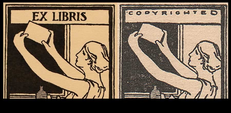
1 2