At PhotoSeed, we celebrate the life of Ann McElroy Spencer, 1929-2021, one of our most profound influences.
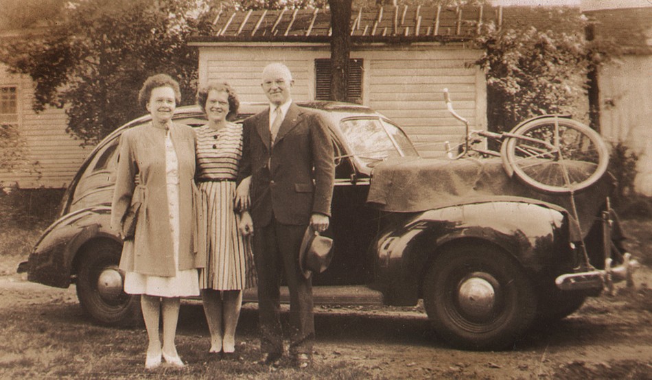
Detail: “Day Ann left for College, Sept. 1946” Jane Ross, American: gelatin silver print: 1946: 9.0 x 15.0 cm. At center, the author’s mother, Ann McElroy, 17, is shown outside her home on South Main Street in Orange, MA flanked by parents James Ernest McElroy (1900-1961) and Edna Sawyer Blanchard (1901-1961). My mom’s bicycle (the color was red) can be seen strapped to the hood of the family car, ready to take her on new adventures and freshman year at the University of Massachusetts at Amherst. Growing up in Orange, my mom was fortunate to have the life-long love of a little sister, my Aunt Jane, and her parents, who were both active and civically engaged in their small New England town. Edna was known by everyone there by her nickname “Happy,” and my grandfather James, recently discharged as a Lieutenant, who served in the United States Navy Reserve in WWII, was the town’s assistant postmaster. Tragically, their lives were cut short in an automobile accident, an event that impacted and shaped the young lives of my mother and aunt. From: Authors family archive.
Words often fail at times like these, but I wanted to take a few moments to recount one remembrance in the very rich life of my mother, Ann McElroy Spencer, 1929-2021, who passed last week. And it has a photography angle! On a late spring day about 20 years ago, I discovered the true secret of her selfless character, qualities reaffirmed to me in her final years by her fellow residents at the assisted living facility she called home.
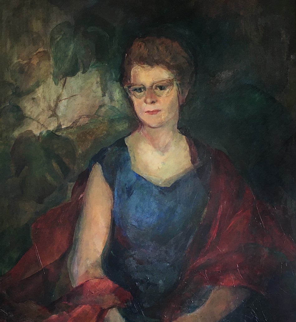
Detail: “Portrait of Ann McElroy Spencer”: Sieglanide “Sissi” Shattuck, American, born Austria: oil on canvas: 1962: 38” x 30” Artist Sissi Shattuck of New Hampshire was a friend of my mother and father in the late 1950s and 1960s. This portrait of my mom, done in her early 30s, always inspired me and it hung for years in the living room of our Connecticut home- the author of this post also had the great fortune to sit for the artist in 1969. From: family collection (artwork © by SissiStudio: sissistudio.com)
On that day, she suggested we take a walk around my old neighborhood, where I had grown up but had long since departed for a career in newspaper photojournalism and, in my mind, greener pastures. To my surprise, the walk this day took us up a long steep hill, a bit distant from the route I was expecting. After reaching the summit and turning left, I was hesitant about where the journey would ultimately lead, but she seemed intent, and I did not question, happy to be sharing some good one-on-one time with her.
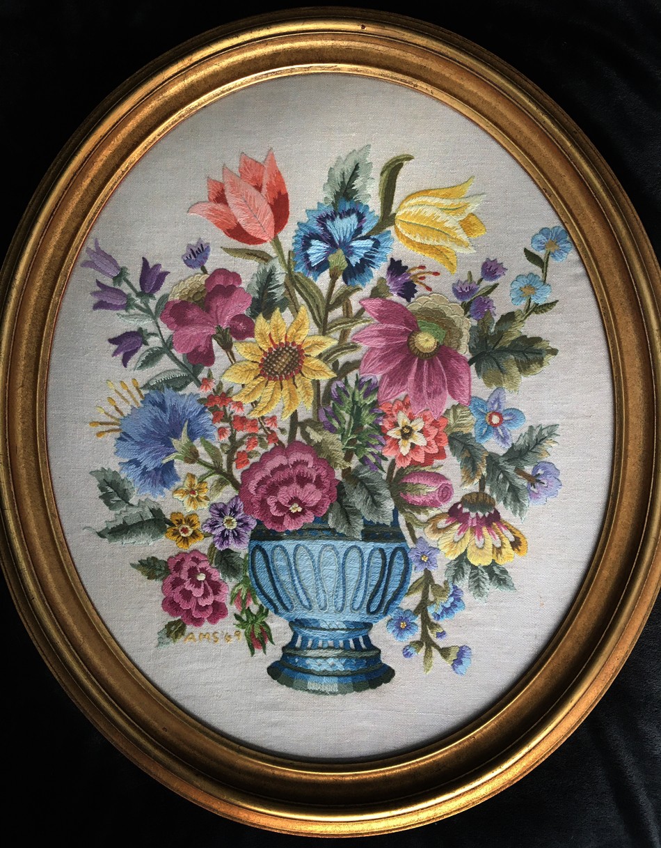
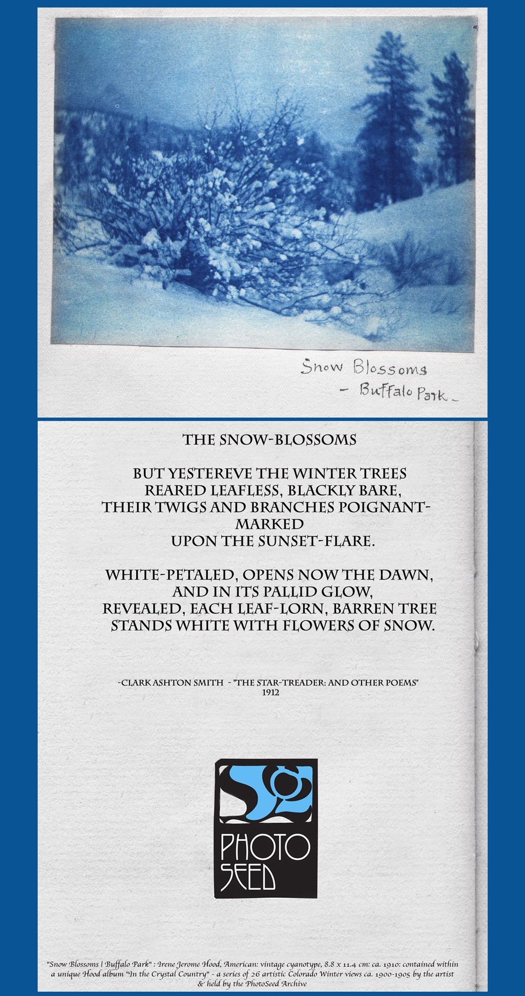
“Crewel Embroidery Flowers in Vase”: Ann McElroy Spencer, American: 1969: 28.25” x 24.25” : dyed wool thread stitched onto linen ground from pattern kit, framed in gilt oval wood frame. My mother learned to sew from her mother at a young age, making her own clothes and things for my brother and me. (Sometimes from the same pattern!) One of my earliest memories as a child was sometime in late 1967, when my mom took on this complex crewel work piece. I found a photo stating it took her 1 1/2 years to finish it, my young self intently following her needle as she worked on the orange and yellow tulips sprouting from the top of the bouquet. From: Authors family collection.
Shortly, we found ourselves in front of an unknown mailbox, in front of a house that was also unknown, at least to me. It was in the next moment, however, that she produced an envelope from somewhere, and proceeded to open the mailbox and deposit the letter within. I casually asked what she was doing and she matter-of-factly stated that earlier that spring, on a previous journey past this mailbox, she had made a mental note to bring along her camera in order to take pictures of flowers growing near it. “A very beautiful display,” or something to that effect, is my recollection of her intent, and reason enough to capture their beauty for eternity, thanks to photography’s magic. She had made prints and placed them in that envelope, intent on sharing them with whomever retrieved the mail at that address—folks that, to the best of my knowledge looking back these many years, were complete strangers. That was my mom. David Spencer-
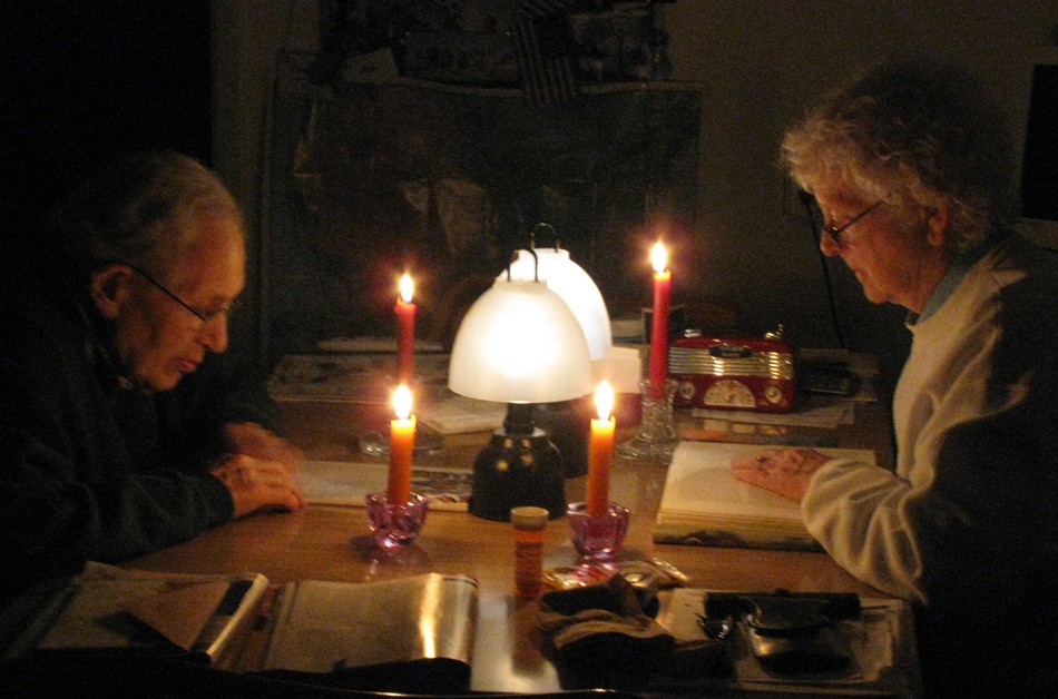
“Ann and Charlie Spencer Reading by Battery & Candlelight”: Photograph by my wife Shannon O’Brien, 2012. During a power outage, my parents keep busy at the kitchen table of their Connecticut home in a favorite pursuit: reading. A long time public educator, one of my mom’s former students wrote this touching condolence: “Mrs Spencer was my 7th grade English teacher who inspired me to become a poet and the love of poetry. We were required to memorize selected poems which to this day I still can recite aloud. She was strict but kind. As a result of her love of the educational world, I also became a teacher of elementary students in Fairfield where we began each day with a poem to read and copy in script.” From: Authors family collection.
The Piano Lesson
by Ann Spencer
She was always there, waiting, just inside the door. I came lingeringly up the walk, book-bag bumping against my leg. She opened the door and I sidled past into the dim hall that seemed to smell of old things. “Five minutes late!” she said. I smiled weakly. I followed her into the living room, brushing against the heavy brown velveteen portieres, which helped keep the room warm in winter. She waited silently while I took off my coat and dropped it on the horsehair sofa. The armchairs, each with their antimacassars, stood guard, like sentinels, in their appointed places. Somewhere a clock chimed the quarter hour. It was risky to be late. It was rude to allow her to wait, in expectation, behind the etched glass window of the front door. Promptness was a virtue.
Ida Conrad Babb was Conservatory trained and was one of the two piano teachers in our small New England town. It was the depths of the Depression, and the money she made by giving lessons provided for her groceries: she had no car. She was tenacious of her pupils and held herself stiffly, as if the loss of even one student would cause her to crack and send her to the poor farm on East River Street. I recall her across the gulf of the years, not unkindly, but with some trepidation. She was one of the few adults in my life at the time who evaluated my work. I felt sorry for her- in my way. She was my first piano teacher.
We approached the piano which was housed in an alcove off the living room- a large instrument tucked into a little space, almost like an afterthought. Pulling out the music from my bag, I put Henri Hertz- Scales and Arpeggios on the piano rack. “Well,” she said, “let’s commence with the scales. We have to warm up the fingers first,” and she’d smile so that her slightly protruding teeth showed. I started off, thinking to myself that yesterday when I had practiced scales, I’d said to mother, “Henry Hertz when I do these!” and she had laughed. Now I dutifully sawed through the music- not much facility there- certainly no joy. I was sure she’d give me a “Fair” this week on my report card.
A dog barked somewhere in the back of the house, and I ploughed on through the other studies. “Mind your fingering.” “Commence again- play it at half-tempo.” And again: “You’re not practicing this étude as you ought,” she’d say, reproachfully. Never any praise. It was a relief when she said, “Get that folder, Ann, on top of the piano.” I moved carefully- not much space- and tentatively set aside the framed photograph of her brother killed in World War I. The street she lived on bore his name. I took the folder which contained the pieces. She leafed through the contents and selected one. Now I could sit in her seat by the window and she would sit at the piano and demonstrate how the piece should be played. Spare, erect, hand held above the keyboard- never would she allow them to droop- she played the short composition with fluidity and grace. “Your turn now, “ she said. She seemed happy to restore the piano to me. Never once did I hear her in recital.
After the lesson and after she had meticulously graded my report card- “Fair” for scales and arpeggios, “Very good” for the memorized piece- she told me to go to the kitchen- would I see the dog? to get a note for my parents which would be on the kitchen table. Entering the room, I was suddenly aware of her husband, smoking a pipe in the failing light of a winter’s afternoon. He knew my father, yet he spoke no greeting: a dusty plant, neglected, in a dark corner. I was a little afraid. “Hello,” I said, grabbed the note and didn’t wait for a response.
The tree at the end of her front walk still bore its leaves- sere, clicking against each other in the January wind. “That tree wun’t lose its leaves until spring,” she said. I stumbled back home across the frozen ruts of the two fields which separated our house from hers.
The following week, I commenced piano studies with the other teacher in town. He was a jolly man who emphasized popular tunes over études.
“Coburnesque”, or, in the style of American master pictorialist Alvin Langdon Coburn, (1882-1966) was how the work of now forgotten American photographer Henry Ravell (1864-1930) was described in 1908 by London’s Amateur Photographer & Photographic News.
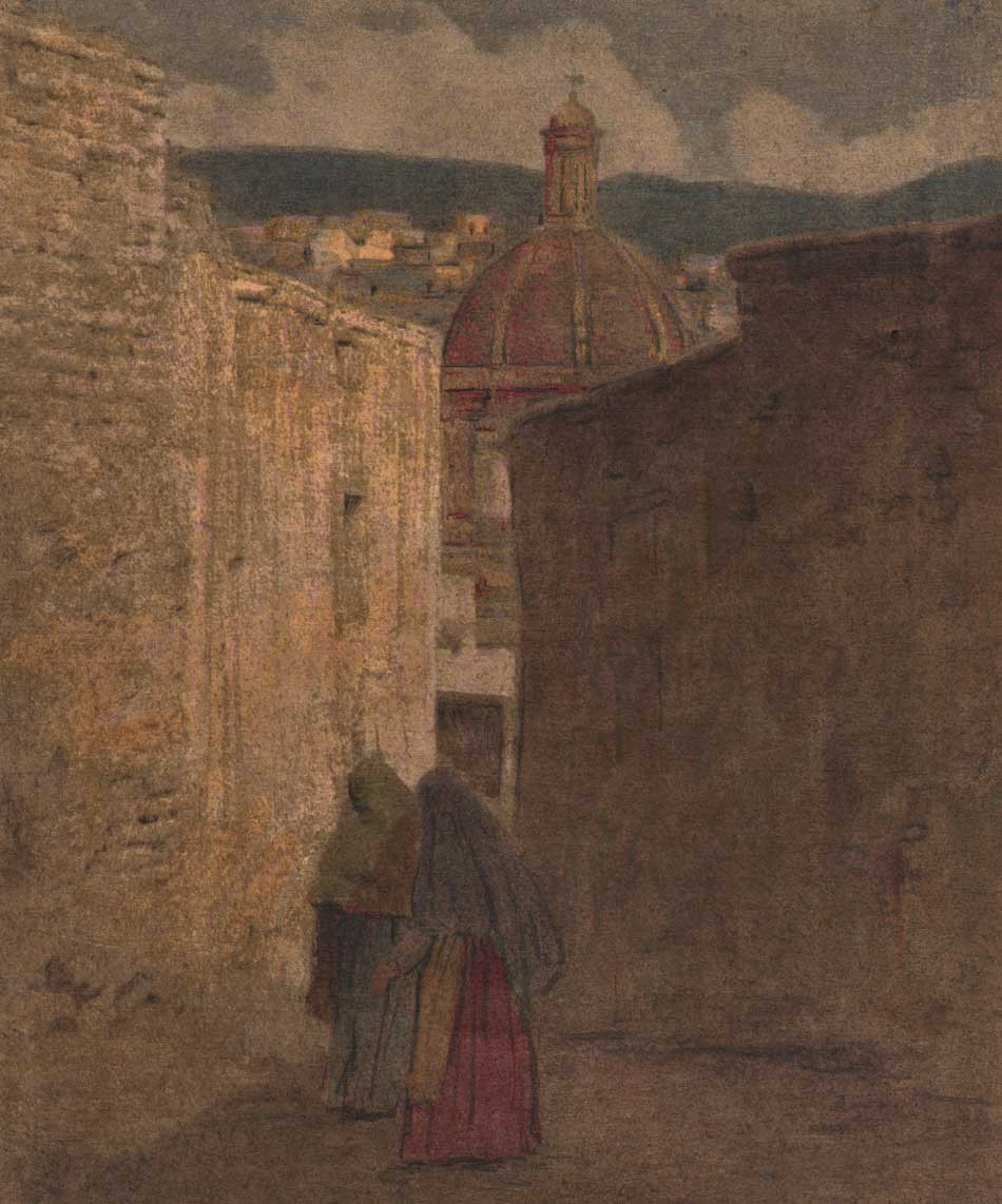
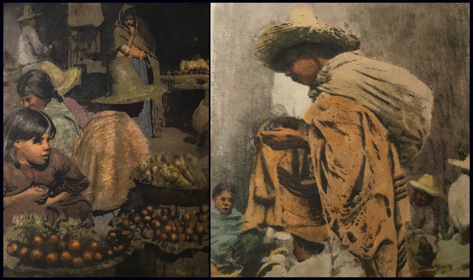
Detail: “A Narrow Street-Guanajuato”: Henry Ravell, American: 1864-1930. Vintage multiple color gum print c. 1907-14. Image: 33.1 x 23.5 presented loose within brown paper folder with overall support dimensions of 39.8 x 58.8 cm. In central Mexico, with the dome of a church framing the skyline at center in background, two native women make their way along one of Guanajuato’s narrow streets. Henry Ravell perfected the gum bichromate process to a very high level. Probably in 1906-07, he began experimenting in multiple color gum. In Germany, around this same time, similar examples were being done by the brothers Theodor (1868-1943) and Oscar Hofmeister, (1871-1937) as well as Heinrich Wilhelm Müller. (1859-1933) From: PhotoSeed Archive
Under the headline “Local Colour.” by journal critic “The Magpie”, a discussion of the merits around Ravell’s new color multiple gum printing process was considered for their large readership. Commenting on a series of his Mexican church photographs published in the May issue of the Century Magazine, “Magpie” writes:
“Who is this Mr. Ravell, and what is his wonderful colour process, which is not “on the negative”? Multiple-gum, one may surmise- and one may also venture to guess that Mr. “de Forest” (Lockwood de Forest- editor) has, notwithstanding this flourish of trumpets, nothing very much to tell us. The Ravell photographs, illustrating “Some Mexican Churches,” are Coburnesque, and the pictures are, in their very Yankee style, fine and strong- which is more than can be said for those in our English monthlies. Couldn’t Mr. Ravell be induced to send some examples of his work to the R.P.S. or Salon? We badly need some new American exhibitors.” (June 16, p. 600)
A reassessment of Ravell’s output is long overdue in elevating him back to his rightful position as one of the more important practitioners of pictorialism in the early 20th Century canon of American artistic photographers.
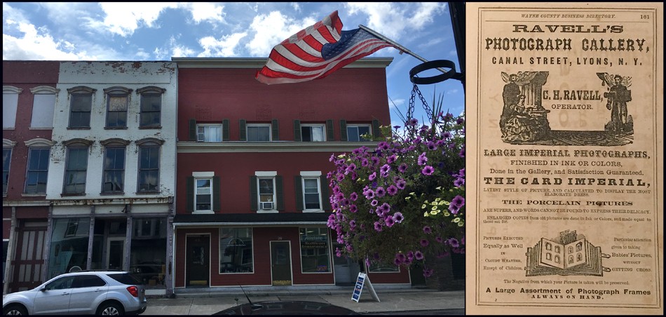
Left: Henry Ravell was only a toddler when his father Charles Henry Ravell (1833-1917) opened a skylight photographic studio on the third floor of this brick building painted red located on Canal Street in Lyons, New York around 1865-66. Shown here in the summer of 2019, the entrance was at the present day 36 Canal street (on the far right of the photo-presently an insurance office) but was numbered #30 Canal before the turn of the 20th Century. It was here that Henry was “brought up in photography from childhood and became an expert in all processes before he was twelve years old”. Right: A full-page advertisement for “Ravell’s Photograph Gallery” operated by C.H. Ravell at the Canal street building appeared in the 1867-68 Wayne County (New York) Business Directory. At the time, Charles Ravell would have been using the wet-plate process, and the ad highlights “Large Imperial Photographs finished in Ink or Colors”… “Pictures Executed Equally as Well in Cloudy Weather Except of Children”… “Particular attention given to taking Babies’ Pictures, without Getting Cross”. Left: David Spencer for PhotoSeed Archive; Right: courtesy Museum of Wayne County History.
Undoubtedly, “Magpie” would have been pleased to know Henry Ravell sprung from fine English photographic stock. His father Charles Henry Ravell (1833-1917) emigrated to the U.S. from Boston, England and was known to have been active as a Daguerreotypist as early as 1857, (1.) his trade shingle set up early in the New York state village of Chittenango. By 1860, U.S. Census records show he had moved to Wolcott, New York, where he was a commercial photographer. Surviving cdv photographs from here bearing his C.H. Ravell back-stamp reveal some of his clients were young men heading off to fight in the American Civil War.
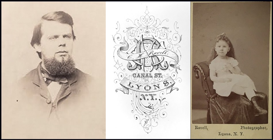
Left: This is the only known portrait of commercial portrait photographer Charles Henry Ravell, father of Henry Ravell. The carte de visite albumen portrait shows him most likely in his early 30’s, after he had settled in Lyons, New York. Born Charles Herring Ravel in Boston, England, he emigrated to the U.S. as a young man, with an early notice of his Daguerreotypist skills from 1857 showing he was living in Chittenango, New York State. By 1860, he had settled in Wolcott, where son Henry was born in early 1864. By 1867 or earlier, he and wife Cornelia Dudley Ravell (1840-1908) and Henry had moved permanently to nearby Lyons. Middle & Right: This elaborate backstamp engraving for C.H. Ravell’s Canal Street skylight studio in Lyons is ca. 1865-80, with the albumen portrait subject (Right) a young girl posing on a commercially available chair. Both: courtesy Museum of Wayne County History
Born in early January of 1864 in Wolcott, Henry Ravell is known to have embraced photography from a very young age. As a boy, he became his father’s apprentice. Lockwood de Forest, (1850-1932) an important influence on Henry for the rest of his life in the 20th Century and important American painter and furniture designer, wrote in 1908 that Henry:
“was born and brought up in photography from childhood and became an expert in all processes before he was twelve years old.” Through a fascinating confluence of sons starting out in their father’s professions, Henry Ravell graduated to having an interest in art, and he studied water-color painting with the noted American artist and Tonalist Henry Ward Ranger, (1858-1916) probably in his late teens or early 20’s. The artist and student had much in common. Like Charles Henry Ravell, who had established his own Canal Street photo studio in Lyons, N.Y. by 1867, (Wayne County Business Directory) Ranger’s father Ward Valencourt Ranger (1835–1905) had opened his own commercial studio in 1868 in Syracuse, N.Y., 55 miles east of Lyons, almost at the same time. Like Henry Ravell working for his father at an early age, Henry Ranger was also known to have worked in his father’s establishment as a young man.
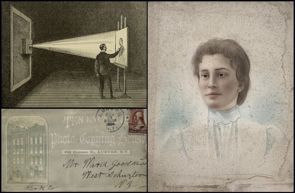
Upper Left: “Negative Outline-Dark Chamber”: woodcut from 1892 volume “Crayon Portraiture: Complete Instructions for making Crayon Portraits on Crayon Paper and on Platinum, Silver, and Bromide Enlargements” by J.A. Barhydt. In the early 1880’s, Henry Ravell worked in a similar capacity as the artist shown here for the Photo-Copying House Ten Eyck & Co. of Auburn, New York. Woodcut shows an enlarged and enhanced crayon portrait being made freehand on the easel at right. A photographic negative from a sitter has been placed inside a large box camera at left while mounted in front of a scrimmed-off window. This provides the light source for the projection within a darkened room while the artist goes over the outline and shadow lines of the projection in a first step. Other variations of crayon portraits began with an artist working in a lighted studio with charcoal and pastels after the initial projected outline on crayon, gelatin, bromide, etc. papers had been chemically fixed. Ten Eyck advertised on cover stationary from 1884: “Fine Portraits in India Ink, Water Colors and Crayon, By the Association of Celebrated Portrait Artists…” (From: Internet Archive) Lower Left: December, 1884 postmarked cover (envelope) from Ten Eyck & Co. Portraits located at 108 Genesee St., Auburn, N.Y. (8.5 x 15.0 cm-right margin perished) Ravell worked at the firm about this time, making a living combining his skill of photography and art. In the late 1880’s to early 1890’s, he became an agent for Ten Eyck after moving to Mexico. From: PhotoSeed Archive. Right: “Crayon-style Portrait” ca. 1890-5: (50.9 x 40.5 cm) enhanced water-color or India inks applied by hand to unknown (bromide?) photographic emulsion fixed onto light grade cardboard matrix. Henry Ravell produced similar crayon-style portraits for Ten Eyck, with this example from an unknown artist featuring Mary Carruthers Tucker (1877-1940) as subject, then living in Provo-City Utah. She was the spouse of C.R. Tucker, whose work is featured at PhotoSeed. From: PhotoSeed Archive
Sometime in the early 1880’s after Henry had finished this “apprenticeship”, he moved to nearby Auburn, New York, about halfway to Syracuse from Lyons, to a job crafting Crayon and Pastel portrait photographic enlargements for Ten Eyck & Co. At the time, this firm is said to have been the largest of its’ type in the world. This gave Henry additional artistic skills, combining his interest in photography and art, an important and influential confluence indeed. He kept at this profession until either 1883, according to Lockwood de Forest, or as late as 1892, in a posthumous biography of Henry by sister Florence.
“Portrait of John Lee Cole”: Henry Ravell, American: 1864-1930. Ca. 1885 Gouache and or Oil? on paper, mounted within period wood frame bearing inscription “John L. Cole to Jason Parker, 1918”. This very rare example of a surviving painting by photographer Henry Ravell is now owned by the Museum of Wayne County History in Lyons, New York. Cole was a 1859 graduate of Yale and grandson of the Rev. John Cole, a founder with John Wesley of the Methodist Church in the U.S.. In 1862 he was admitted to the bar and later became a banker in Lyons for Mirick & Cole. An earlier 1882 notice of Henry’s artistic pursuits was published in The Democrat and Chronicle newspaper of Rochester, New York: “Henry Ravell, of Lyons, was in this city last night, on his return from Medina, (New York-editor) where he disposed of two of his latest paintings for $70.” (November 26) Photo by David Spencer for PhotoSeed Archive- artwork courtesy Museum of Wayne County History, Lyons N.Y.
At this time, Henry is said to have moved to Cuernavava Mexico, south of Mexico City, where he became a far-flung agent for the Ten Eyck & Co. firm, although a certain amount of traveling back and forth to the U.S. and the family home was probably the reality. To wit, the Minnesota State Census for 1895 lists his occupation as “artist”, claiming an American residence while living with his father, mother and younger brother, Charles Ravell Jr. in the city of St. Paul. Here his father finished out his career running a photo studio on Western Ave. from 1890-92.
During the mid 1880’s back in Lyons, a fascinating yet presently unsubstantiated account of Henry’s involvement with the development of the first Kodak camera is relevant for background on his future career as a master photographer who became a striver with his own agenda. This event is worthy of historical contemplation in the present from reminisces provided in the aforementioned posthumous biography published in 1940:
“George Eastman of Rochester, New York, was a family friend. During a visit of three or four weeks, Mr. Eastman worked on and developed his famous Kodak, with the help of my father and brother.” “Their workshop was the basement of our former home at 70 Broad Street, Lyons. Mr. Eastman offered my father stock in the Kodak Company, which he often regretted not accepting.” (2.)
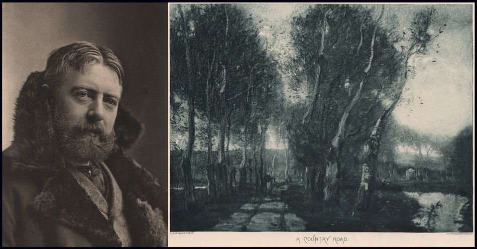
Left: “H.W. Ranger” (Henry Ward Ranger): Napoleon Sarony, American: born Quebec. (1821-1896) Photogravure published in periodical “Sun & Shade”: New York: May, 1894: whole #69: N.Y. Photo-Gravure Co.: 22.4 x 15.2 | 34.9 x 27.6 cm. Like Henry Ravell assisting in his father’s studio, American artist and Tonalist Henry Ward Ranger (1858-1916) worked in his own father’s studio as a young man. Later, Ranger taught Henry water-color painting, probably when Ravell was in his late teens or early 20’s. The “Sun & Shade” periodical noting of Ranger: “His work in Lower Canada won him great repute, and as a water-color painter, before taking to oil-painting, he was undeniably excellent.” Right: “A Country Road”: Henry Ward Ranger, American. (1858-1916) Photogravure published in periodical “Sun & Shade”: New York: May, 1894: whole #69: N.Y. Photo-Gravure Co.: 17.1 x 22.7 | 27.6 x 34.9 cm. Ranger’s bucolic painting style reveals itself in this simple country scene of a roadway lined with trees, probably done in Holland. Scenes like this would have undoubtedly made an impression on Henry the fledgling art student, assuming he had access to reproductions or the originals of his teacher’s work. On Ranger in the periodical: “He is an admirer and follower of the best Dutch school of art, and has made it his pleasure and his duty to pay many visits to Holland, in order to be perfectly au fait with the excellencies of its best masters.” On “A Country Road”: “It is seldom that so simple a subject becomes so important in form and color-so full of air and freedom, and so admirably harmonious in its proportions.” Both from: PhotoSeed Archive
Memories can sometimes be suspect, but several details of Florence’s biography are important and worth following up on, with this website happy to accept the challenge. By tracking down old street addresses, the Ravell family home as published in the 1886-87 Lyons residential directory was actually found to be located as 40 Broad Street. (William Smith, whose occupation was Express Transfer Agent, lived at 70 Broad St. as published in the same directory) Coupled with the knowledge that Lyons street addresses had been renumbered, probably in the early 20th Century, and cross-referencing with a 1904 Sanborn Fire Insurance Company map found online at the Library of Congress, the former and still standing Ravell home built in 1850 revealed itself to be the present day 64 Broad Street. All of this effort, if somehow confirming a claim George Eastman had actually spent time in Lyons was true, could result in a potentially fascinating footnote to the development of one of the most important inventions of the 19th Century- The Kodak No. 1 Camera which debuted in 1888: “By far the most significant event in the history of amateur photography”, according to the Met Museum in New York City.
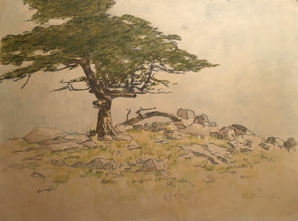
“Cypress Tree -Pebble Beach”: Henry Ravell, American: 1864-1930. Vintage watercolor drawing on paper: ca. 1915-20. (Museum of Wayne County History accession #Pi 176f with verso sticker additionally listing number 148 and $30.00) One of the few known examples of a watercolor drawing by Ravell is this delicate landscape featuring a lone cypress tree springing from a rock outcropping in Pebble Beach on California’s Monterey Peninsula. It may depict the world famous “Lone Cypress”, an approximately 250 year-old Monterey Cypress standing today on a granite hillside off the famed 17-Mile Drive. Courtesy: Museum of Wayne County History, Lyons N.Y.

This panel reveals the artistic styles of two distinct artists signing their work nearly identically. It’s presented with the hope a distinction can be made for a larger audience. The reality at present: nearly every painting returned on web searches is misattributed to being by photographer/artist Henry Ravell. Left Diptych: Top: “Cypress Trees at Pebble Beach”: Henry Ravell, American: 1864-1930. Vintage watercolor drawing on paper: ca. 1915-20. (Museum of Wayne County History accession #Pi 176e with verso sticker additionally listing number 147 and $20.00) This is one of three rare watercolor drawings by Ravell. Showing a stand of cypress trees in Pebble Beach on California’s Monterey Peninsula, the signature of “H.Ravell” in graphite has been enlarged in separate bottom panel. Courtesy: Museum of Wayne County History. Right Diptych: Top: “The Ripers” (The Reapers): Henry Etienne Ravel, American, born Naples Italy to French citizens. (1872-1962) Oil on artists board: ca. 1946: 20.5 x 15.4 presented within wood frame (not shown) 24.5 x 19.4 x 2.0 cm. Two field workers harvest wheat, a small landscape most likely depicting the Italian countryside. Henry Ravel immigrated to America in 1906 and became a naturalized US citizen in 1920. A transportation clerk by trade in the early 1920’s, his paintings- many done in Europe- date from ca. 1930’s-1950’s. Enlarged signature at bottom panel: “H. Ravel”. From: PhotoSeed Archive
The earliest published references to Ravell’s photographic work in the popular press is found around 1905, when Boston’s Photo-Era, writing for their December issue, pronounces him “A new star of the first magnitude”, although noting his two pictures: “Pleasant Valley” and “Viga Canal”, “do not represent him at his best.” This assessment also including listing him on the journal’s noteworthy list of exhibitors whose work had been accepted for the Second American Photographic Salon which ran from 1905-06.

Upper Left: This quote by Henry Ravell’s older sister Florence Ravell Lothrop appeared in The Lyons Republican & Clyde Times on March 21, 1940 stating Henry and their father Charles Henry Ravell had worked with a young George Eastman in developing the world’s first Kodak camera from 1888 in the basement workshop of their Lyons home. Clipping courtesy Museum of Wayne County History. Lower Left: An original Kodak No. 1 camera from 1888 shown with its lens cap and original documents appeared as Lot 0238 and sold by Auction Team Breker of Cologne, Germany on September 30, 2006. The Metropolitan Museum of Art in New York states: “By far the most significant event in the history of amateur photography was the introduction of the Kodak #1 camera in 1888. Invented and marketed by George Eastman (1854–1932), a former bank clerk from Rochester, New York, the Kodak was a simple box camera that came loaded with a 100-exposure roll of film”. Courtesy Auction Team Breker. Far Right: Built in 1850, the former Ravell family home in Lyons, New York was actually located at 64 Broad Street-seen here: not 70 Broad Street as stated in the clipping. The actual address was confirmed by this website using Sanborn fire insurance maps and a Lyons residential street directory from 1886-7. Home exterior courtesy 2018 online real estate sales listing.
Florence Ravell, quoting Lockwood de Forest for her 1940 article on Henry, expanded on her brothers new found respect in the profession, particularly in his mastery of the gum print, which would soon establish him as a major talent:
“Henry Ravell was recognized as one of the leading artists in his profession, both in this country and in Europe where he had exhibited, and has been a contributor to many of the photographic magazines, where a description of his technical processes are given. He succeeded in making a gum print in one printing with results far beyond the finest etchings and very similar in character.”

Left: “Mexican Peon”: Henry Ravell, American: 1864-1930. Vintage gum print ca. 1900-15. Alternately titled “A Mexican Peon” as listed in the catalogue of a 1978 retrospective of the artist at the Museum of Wayne County History, although an uncropped variant titled “Mexican Charro” (Mexican Cowboy)- is a more accurate description based on his fancily embroidered sombrero- is held by the California Museum of Photography, Riverside. Right: “Eating Tent-Taxco, Mexico”: Henry Ravell, American: 1864-1930. Vintage gum print ca. 1900-15. These photographs are part of a grouping of 18 singular gum prints featuring Mexican scenes and subjects held in the collection of the Museum of Wayne County History, Lyons N.Y.
Henry perfected the gum bichromate process to a very high level. Probably in 1906-07, he began experimenting in multiple color gum. In Germany, around this same time, similar examples were being done by the brothers Theodor (1868-1943) and Oscar Hofmeister, (1871-1937) as well as Heinrich Wilhelm Müller (1859-1933) (3.) The following quote in the December,1908 issue of Boston’s Photo-Era encapsulates the admiration these gum prints received:
“It will be remembered that last summer Henry Ravell, of Mexico, exhibited in New York and Boston his results in multiple gum-bichromate printing in color. They excited considerable interest at the time, especially among our painters, who were very cordial in their praise of Mr. Ravell’s beautiful work, for it showed, in an eminent degree, the artistic possibilities of the gum-process.” (p. 300)

Left: “Chapel of the Holy Well near Mexico City”: Henry Ravell, American: 1864-1930. Vintage gum print ca. 1900-15. Right: “Church, Mexico”: Henry Ravell, American: 1864-1930. Vintage gum print ca. 1900-15. Museum of Wayne County History accession #Pi 176p with verso sticker additionally listing number 2 and $5.00) Featuring church architecture, these are part of a grouping of 18 singular gum prints of Mexican scenes and subjects held in the collection of the Museum of Wayne County History, Lyons N.Y.
Again writing in 1940, Florence wrote of her younger brother: “but his favorite work was photography, and the gum print process. This process was original with an Austrian who refused to make it known, but Henry experimented until he developed it, and later gave the formula to the world.” The conjecture of this website is the possibility Henry originally gleaned and modified his own multiple gum color process from the earlier work of Austrian photographer Heinrich Kühn. (1866-1944) An 1897 example of a three-color gum print by him can be found in the collection of the Museum für Kunst und Gewerbe in Hamburg Germany.
Left: “Mexican Vegetable Seller”: Henry Ravell, American: 1864-1930. Vintage multiple color gum print c. 1907-14. Right: “Mexican Youth”: Henry Ravell, American: 1864-1930. Vintage multiple color gum print c. 1907-14. These are two of the three rare multiple color gum prints by Henry Ravell held in the collection of the Museum of Wayne County History, Lyons N.Y.
In 1908, Henry’s champion Lockwood de Forest gave a fuller explanation of the technical details for this color process, as part of copy included with a series of Mexican Church studies published in the May issue of the Century Illustrated Monthly Magazine:
“Last summer he started experiments in color-printing. His process is simple. Instead of introducing colors on the negatives, as in the lumière process, he is using the colors in the sensitizer of the printing paper. The specimens he has sent me are printed in three or four colors. Each print is finished, recoated all over with the sensitizer with the next color, and again printed. This is done for each color separately, the black print coming last, as in the regular color-printing process.”
“An Ox Cart” (Mexico): Henry Ravell, American: 1864-1930. 1905: Vintage halftone tipped to mount: 16.6 x 21.4 | 17.4 x 22.2 | 45.0 x 30.5 cm “This mount is Sultan Bokhara and Royal Melton Egyptine Made by the Niagara Paper Mills”. Taken in Mexico ca. 1900-05, this is one of the earliest published examples of a Ravell photograph to appear in the popular press. It was included in the luxury portfolio publication “Art in Photography” issued by the Photo Era Publishing Company of Boston. From: PhotoSeed Archive
Ravell continued to work in Mexico until about 1914, when it is believed he moved back to the Los Angeles area of California in order to escape the Civil War (Mexican Revolution) then engulfing the country. A short biography included in the 1978 volume Pictorial Photography in Britain 1900-1920 gives 1916 as a slightly later date, although it was likely he was traveling back and forth from Mexico to the U.S. several times during this tumultuous time:
“In 1916 an article entitled “Cathedrals of Mexico”, illustrated by his work, was published in Harper’s magazine. About this time he left Mexico, almost as a refugee. His studio in Cuernavaca was destroyed by rebels. He moved to California where he began to photograph near Carmel and settled at Santa Barbara.”
Now that this American born “refugee” was back in his home country for good, he immediately set out photographing the beauty of the southern California coastline, with an emphasis on capturing the numerous entanglements of old cypress trees set against the landscape and Pacific Ocean. Conveniently, and perhaps not coincidentally, Lockwood de Forest had moved permanently to Santa Barbara in 1915 after wintering in the area since 1902, with his professional connections to the world of art giving Henry and his work credibility and entrance to a larger audience. These included retrospective exhibitions of nearly 100 framed works of his Mexican and California subjects at major American institutions. These began in October, 1918 at the Pratt Institute Art Gallery in Brooklyn and continued into 1919 at the Albright Art Gallery in Buffalo, New York followed by shows the same year at the newly opened Cleveland Museum of Art and then at the Chicago Art Institute.
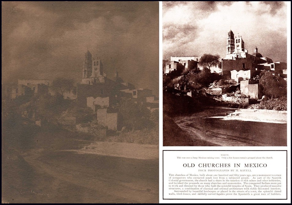
Left: “Marfil: Templo De Marfil De Arriba”: Henry Ravell, American: 1864-1930. Vintage gum print c. 1900-10: 37.4 x 29.0 cm. Still standing today, this church constructed in the Baroque style is located in Marfil, a suburb of the central Mexican city of Guanajuato. The church is colloquially known as “La Iglesia de Arriba”, or the “Church up Top”. From: PhotoSeed Archive Right: Four photographs of Mexican churches by Henry Ravell, including the Templo De Marfil De Arriba photograph, were published in the February, 1914 issue of Century Magazine for a picture spread titled “Old Churches in Mexico”: “The churches of Mexico, built about one hundred and fifty years ago, are a monument to a race of conquerors who extracted much loot from a subjected people. As part of the Spanish Colonial government, the church had a share in the taxation of rich mines and other industries, and lavished the proceeds on many churches and monasteries. The conquered Indians were put to work and directed by those who built the splendid temples of Spain. They produced massive structures, a combination of classical and oriental architecture with richly decorated interiors. Surrounded by beautiful landscapes or placed in the streets of a town, the splendid tinted walls, tiled domes, and skilfully carved facades prove the Spaniards a great race of builders.” From: Internet Archive
Henry Ravell would continue to exhibit his work late into the 1920’s at smaller venues, one example being a tri-colored gum print titled “Mexican Peon Boy” shown at the 1927 Los Angeles Salon and remarked on by Camera Craft, his gum prints deemed “for which he has gained a warranted renown”. Gum printing was indeed so important to the artist that he listed “Gum Printer” as his occupation for the 1920 U.S. Census.
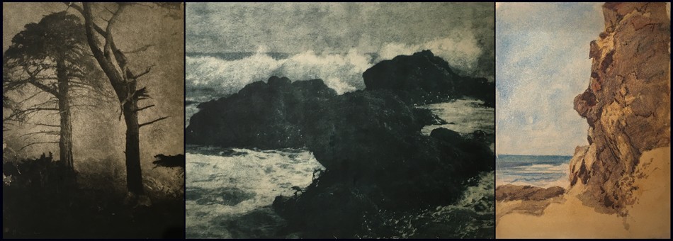
Left: “Pine and Cypress, Pebble Beach”: Henry Ravell, American: 1864-1930. Vintage gum print ca. 1915-20. (Museum of Wayne County History accession #Pi 176a with verso sticker additionally listing number 17 and $3.00) Middle: “Big Splash” (California coastline) Henry Ravell, American: 1864-1930. Vintage gum print ca. 1915-20. (Museum of Wayne County History accession #Pi 176m with verso sticker additionally listing number 122 and $12.00) Right: “Untitled Marine Landscape” (Mexico or California): Henry Ravell, American: 1864-1930. Vintage multiple colored gum print ca. 1907-1920. (Museum of Wayne County History accession #Pi 176n with verso sticker additionally listing number 156 ) All: Courtesy Museum of Wayne County History, Lyons N.Y.
The Albright Art Gallery was an important venue for Ravell’s work, considering the groundbreaking exhibition it previously hosted in November, 1910: the International Exhibition of Pictorial Photography. Organized by the Photo-Secession under the direction of Alfred Stieglitz, it was “the first exhibition held at an American museum that aimed to elevate photography’s stature from a purely scientific pursuit to a visual form of artistic expression.” Even nine years later, in 1919, at a time when museum shows devoted to the work of a singular photographer anywhere in the world were still few and far between and remained so decades later, it’s refreshing in the present to read observations by one curator remarking on Ravell’s 93 framed photographs displayed at the Albright gallery for Academy Notes, the mouthpiece for The Buffalo Fine Arts Academy:
“THE collection of photographs by H. Ravell—which was on view in the gallery during the last week in February and all of March—is very unique and valuable. These photographs are technically known as gum-prints and have all the painter’s quality in their execution. They do not impress one as photographs but rather as work directly from the artist’s brush. The photographs were made by H. Ravell who is now in Santa Barbara. Many of the pictures were taken near Carmel, California, a seashore of much variety where the fantastic cypress trees with their twisted dramatic forms produce wonderful compositions against sea and sky.” …This is but a short description of the remarkable exhibition of photographs shown at the Albright Art Gallery. It was seen by many art lovers and appreciated especially by all of those interested in artistic photography.” (4.)
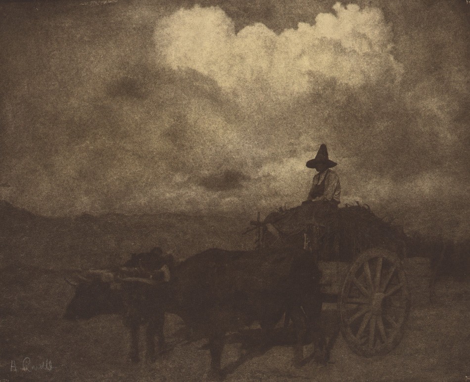
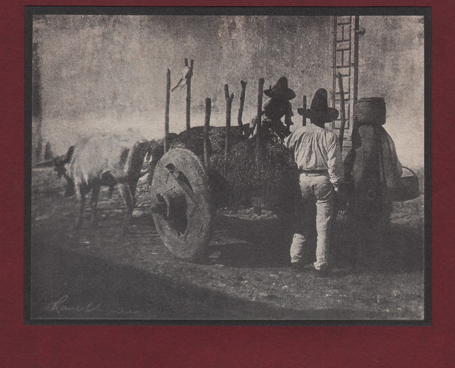
“Ox Cart- Sunset”: Henry Ravell, American: 1864-1930. Vintage gum print ca. 1900-10. Image: 27.0 x 32.6 cm presented loose within dark brown paper folder with overall support dimensions of 58.8 x 36.7 cm. Wearing a traditional sombrero hat, (Sombrero de charro) the driver of this ox or bullock cart pauses atop a full load of what looks like hay or silage. This Mexican scene may date to around 1905-consistent with a different view by the artist of an ox cart published that year in “Art in Photography” by the the Photo Era Publishing Company of Boston. From: PhotoSeed Archive
A reevaluation of Henry Ravell’s body of work is important to consider in the present given the broad acknowledgement of his talent by major institutions and the popular press for the benefit of many large audiences over 100 years ago. An important pictorialist photographer who was also a painter, Henry Ravell was a striver and apprentice graduate inspired by his father’s steady trade in the New York state village of Lyons who embraced a love for craft and mastery of art. Together, these skills gave him the passion to embrace adventure in capturing the beauty in far-off Mexico and southern California for the ages.
Four original gum prints in the PhotoSeed Archive can be seen here, each listing an expanded biography, timeline and major institutional holdings for the artist.
Afterword | Notes
A conundrum on internet research into Henry Ravell’s artistic output reveals itself quickly. The bottom line is that most every painting on the web attributed to Henry Ravell the photographer is not by him. Instead, through PhotoSeed’s research and purchase of the small painting: “The Ripers”, (The Reapers) the true identity of this artist can now be revealed as Henry Etienne Ravel. (1872-1962) Born in Naples Italy to French citizens, Henry Ravel immigrated to America in 1906 and became a naturalized US citizen in 1920. A transportation clerk by trade in the early 1920’s, his paintings- many done in Europe- date from ca. 1930’s-1950’s. What causes the confusion is that like Henry Ravell the photographer, who signed his photographs “H. Ravell”, Henry Ravel the painter also signed his work similarly, but as “H. Ravel” Numerous examples of his paintings show up on Google searches-unlike the real and quite rare examples of watercolors done by Ravell the photographer. I’ve included links to some of these paintings on the page showing “The Ripers”. As always- buyer beware and do your homework!
1. C. Ravel won a $3.00 premium for “Best Daguerreotypes” during the Annual Fair of the Madison County Agricultural Society held at Morrisville, (N.Y.) on the 15th, 16th and 17th days of September,1857 according to a newspaper account in the Cazenovia Republican. Shout out to the Pioneer American Photographers 1839-1860 website. Langdon’s List of 19th & Early 20th Century Photographers additionally list Ravel working in Manlius, New York in the 1859 N.Y. State Business Directory.
2. See: The Lyons Republican & Clyde Times: Lyons, N.Y. Thursday, March 21, 1940. Article excerpts: HENRY RAVELL: “Resided in Lyons for twenty-eight years, died in Los Angeles California, January 20, 1930. This account was written by his sister, Mrs. Florence Ravell Lothrop, of 721 Fifth Street North, St. Petersburg, Florida.: “Henry had no special training in any school or under any masters except my father, Charles Herring Ravel, who was born in Boston, England, and became one of the first photographers in the United States. His forbears came over with William the Conqueror to England, which accounts for the one “L” in the name. My mother was annoyed because most people called her Mrs. Rav’-el and persuaded my father to add “L”, so the family adopted that spelling of our name.…Henry studied and experimented all his life. His photographic subjects were portraits, landscapes, street scenes, trees, cloud and moonlight effects. His Mexican Cathedrals were especially noteworthy. He used both oils and water colors, but his favorite work was photography, and the gum print process. This process was original with an Austrian who refused to make it known, but Henry experimented until he developed it, and later gave the formula to the world. I remember seeing around his studio, pans of water about three inches deep. The photo-print was put into the water and pigments of paint dropped on it, this gave the effect when completed of a soft beautiful painting. My description to an artist will seem crude but that is as I recall it.…Henry never taught, that is, acted as a teacher in any school, and I do not know what societies he belonged. He exhibited in the Pittsburgh, Pennsylvania, Salon about 1907. From the thousands of photographs submitted, three of his were among the 237 accepted. His work was exhibited at the Salmagundi Club, New York City; Thurber’s and Anderson’s Galleries in Chicago, Los Angeles, California, and many, many other places. Fifteen of his photographs are at the Metropolitan Museum, New York City. Seven are Mexican subjects and eight are California trees. These were selected by Forest Lockwood.(sic) After Henry’s death at Los Angeles, California, in 1930, a request came for him to send an exhibit to the Fifth International Photographic Salon of Japan held at Tokyo and Osaka in May, 1931.”
3. In the December, 1908 issue of Boston’s Photo-Era, a short article titled “Gum-Prints In Colors” appeared, linking Ravell’s gum prints as being similar to “a collection of prints by the same process, probably with modifications” to work done by the Hofmeister brothers and Müller. These German works were shown at the offices of The British Journal of Photography in London’s Strand from September 28- October 24, 1907.
4. See: Academy Notes: The Buffalo Fine Arts Academy: Albright Art Gallery: Buffalo, New York: vol. XIV: Jan.-Oct. 1919, p. 67
Herein a summer interlude, if you will, of still, trickling and gushing streams from years past. And if they inspire and beckon for the present, find your own peace or wonderment in the mountains, valleys or pastures of summer wherever your own stream flows.

“Dorothy Tucker Gathering Ferns”: Charles Rollins Tucker, American (b. 1868): ca. 1910: mounted brown-toned platinum print: 9.4 x 7.7 cm | 31.2 x 16.0 cm. Born in August, 1899, Dorothy Tucker, a constant photographic subject for her father, then a high school physics teacher at Curtis High School on Staten Island, New York state, holds a spray of freshly-picked ferns while investigating the edge of a stream in the woods. From: PhotoSeed Archive
“Stream or Pond at Prospect Park”(Brooklyn, New York): ca. 1910-20: Unknown Brooklyn photographer: hand-colored gelatin silver print: 11.7 x 8.9 cm | 12.4 x 9.3 cm: From: PhotoSeed Archive

“Before Retiring”: ca. 1910-20: Margaret Bauks, British- (possibly Margaret Florence Bauks: b. 1872?) : hand-colored gelatin silver print: 11.6 x 15.9 cm | 27.8 x 22.8 cm: From: PhotoSeed Archive

“A Stream of Savoy”: ca. 1927: this print exhibited 1935: Frank Roy Fraprie, American (1874-1951): vintage Bromide print: 24.0 x 18.6 cm | 30.5 x 25.4 cm: As noted in the 1946 American Annual of Photography, (p. 170) Fraprie had been taking photographs in June of 1926 in Eastern France. The area, located in the Haute-Savoie, or Upper Savoy, is a mountainous region of spectacular beauty which includes Lake Annecy, one of France’s largest freshwater lakes. Photographic historian Christian Peterson’s biography of Fraprie gives some background on this important photographer and editor: “Fraprie was the most influential author/publisher of American pictorial photography during the period following the Photo-Secession. From the 1910s to the 1940s, he wrote books and countless articles on all aspects of pictorialism. He edited photographic monthlies and annuals for nearly the entire first half of the twentieth century. In addition, he created his own highly successful pictorial photographs and exhibited them extensively.” From: PhotoSeed Archive
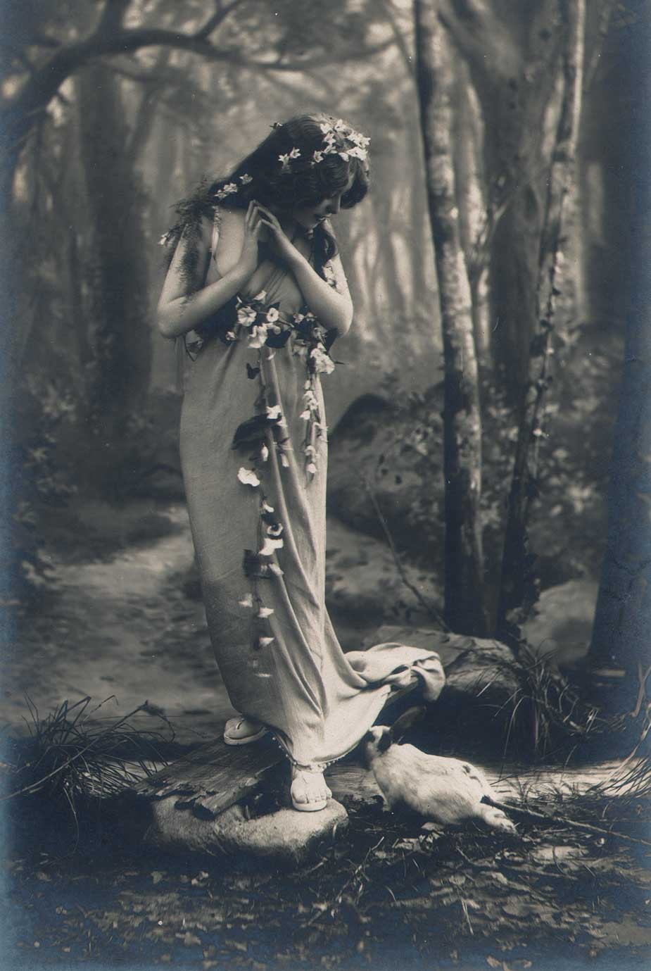
Detail: “Les Fleurs Dans Le Bois” : Léopold-Émile Reutlinger: French (1863-1937): vintage Bromide photograph, ca. 1905. 22.3 x 14.1 | 34.0 x 24.2 cm. Featuring a painted backdrop and wood board placed over a “stream”, this studio photograph features a white rabbit investigating the Belle Epoque era model identified from other variants as “Miss Doll”.(proper identification of this model would be of interest as she has remained a popular subject seen in countless vintage postcards, many hand-tinted) This example was printed by the Milan atelier Maison Tensi and included as a full-page plate in the February, 1905 issue of “La Fotographia Artistica”, a French/Italian photographic journal. From: PhotoSeed Archive
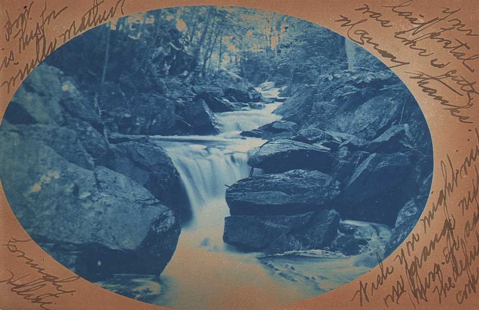
“A Rocky Brook” (New England?) : ca. 1906: Unknown American photographer: vintage cyanotype rppc: 8.9 x 13.8 cm. This idyllic cascading waterfall may depict the Minnewawa Glen in Marlborough, New Hampshire. Signed on the recto: “Lovingly Helen” in the lower left corner, it’s postmarked November 15, 1906 from Marlboro, N.H. addressed to Miss Nettie A. Hastings of East Sullivan, N.H. From: PhotoSeed Archive

“John Robert Tucker Skinny Dipping”: Charles Rollins Tucker, American (b. 1868): ca. 1915: unmounted platinum print: 3.8 x 5.2 cm. Born in March, 1914, John Robert Tucker, was the second of three children born to the former Mary Carruthers and photographer Charles R. Tucker. Here, the young boy plays in a woodland stream, with the photograph most likely taken in New England. John, according to his 1941 marriage certificate, was an electrical engineer by training. He died in 1991 in La Habra, Orange County, CA. From: PhotoSeed Archive
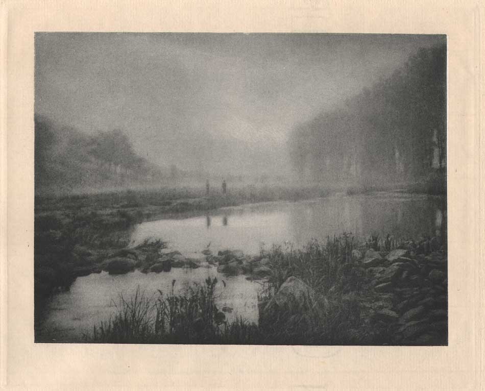
“Brume après la Pluie”: (1906) 1908: Gustave Marissiaux, Belgian (1872-1929) Photogravure on Van Gelder Zonen laid paper: 13.4 x 17.6 | 28.4 x 39.9 cm. Plate XXVI from Marissiaux’s tour-de-force gravure folio “Visions D’Artiste” comprised of 30 plates dating 1899-1908. Translating to “Mist after the Rain”, two figures in the distance stand looking out over an enlarged pond or stream located in “La Terre Wallonne” as identified in the portfolio index: more commonly known today as Wallonia- the southern region of Belgium. From: PhotoSeed Archive
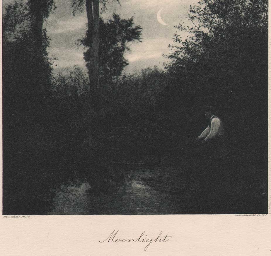
Detail: “Moonlight”: James C. Stodder, American: (1838-1917). 1890. Hand-pulled photogravure published in periodical “Sun & Shade”, New York: November, 1890: whole #27: N.Y. Photogravure Co.: 18.3 x 11.9 | 35.0 x 27.4 cm. A crescent moon rises above a wooded landscape at dusk while a gentleman fishes from the banks of a pond or stream. Stodder graduated from Rensselaer Polytechnic Institute in 1859 and moved to Bangor, Maine, where he first learned the wet-plate process of photography. A lawyer, he was son of a Boston jeweler, (obit) and financially well off. In 1876, he accompanied famed Hudson River School painter Frederic E. Church to the Mount Katahdin region of Maine. From: PhotoSeed Archive
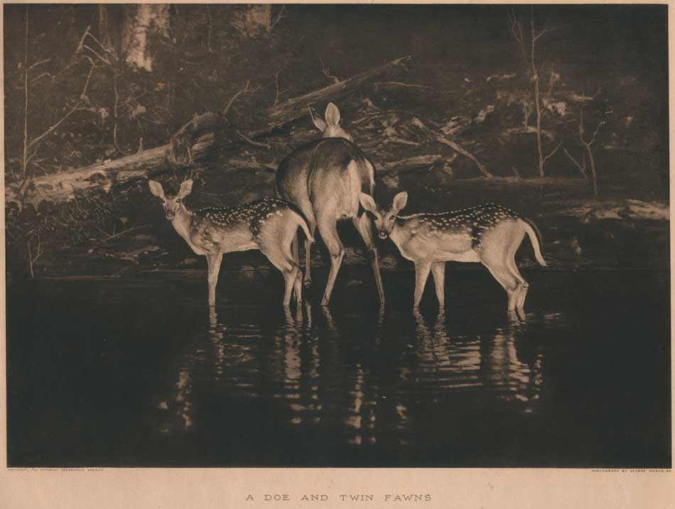
“A Doe and Twin Fawns” (taken 1896) 1916: George Shiras 3rd, American (1859-1942) Vintage photogravure published by the National Geographic Society, Washington, D.C. : 21.2 x 30.3 | 40.5 x 50.8 cm. A pioneer of using flashlight photography to record wildlife in their natural environments at night, Shiras used the method of “Jacklighting”, a form of hunting using a fixed continuous light source mounted in the bow of a canoe to draw the attention of wildlife: in this case three deer, while then utilizing magnesium flash-powder to freeze the scene in-camera. His series of twelve midnight views, including “A Doe and Twin Fawns”-also known as “Innocents Abroad” would earn Shiras international acclaim and many important awards. A one-term Congressman for the state of Michigan, (his father George Shiras Sr. was a former Justice of the U.S. Supreme Court) he was also an important naturalist who helped placed migratory birds and fish under Federal control. (The eventual 1918 Migratory Bird Treaty Act had groundings in legislation Shiras introduced to Congress in 1903 as the first comprehensive migratory bird law not voted on.) For additional background, see article by Matthew Brower in the journal History of Photography, Summer,2008: “George Shiras and the Circulation of Wildlife Photography”. From: PhotoSeed Archive
Detail: “A Corn Roast” Oliver Patterson Watts, American: (1865-1953). 1892. Hand-pulled photogravure published in periodical “Sun & Shade”, New York: June, 1892: whole #46: N.Y. Photogravure Co.: 14.7 x 23.2 | 34.6 x 27.4 cm. The index for the issue of Sun & Shade in which this photograph appears states: “Mr. Watts writes us that while wandering with his camera along “The Green,” a favorite picnic ground near Thomastown,(sic) Maine, he came upon this group of boys roasting corn and potatoes. At the sight of the camera they immediately grouped themselves, anxious to be “took.” The negative was made with a Scovill Favorite Camera, Waterbury lens, with an exposure of five seconds on a seed plate. It was developed with Pyro and Sodium Carbonate.” Dr. Oliver Patterson Watts was born in Thomaston, Maine, and graduated from Bowdoin College in 1889. Interestingly, in 1890, Potts and Dr. Julius Stieglitz, the brother of Alfred Stieglitz, were fellow scholars in chemistry at the newly opened Clark University in Worcester, MA. He later entered the University of Wisconsin in 1905 and took charge of the Carnegie Research on Electrolytic Iron under Dr. Charles F. Burgess. According to an Oct. 2009 article on Potts for the online resource Plating & Surface Finishing, the most important of his fifty-nine papers on plating and corrosion is probably “Rapid Nickel Plating,” presented before the Electrochemical Society in 1915. From: PhotoSeed Archive

“Mutu Bridge”: Donald Mennie, Scottish (1875-1944) 1922: Vintage unmounted bromide print: 24.2 x 34.6 cm. This picturesque Chinese river scene first appeared as a full-page plate variant in the 1914 volume “My Lady of the Chinese Courtyard” (between pp. 254-5) by author Elizabeth Cooper and then as Plate #7 “Mutu Bridge” in the photographer’s ca. 1914 work “Picturesque China: A Series of Vandyck Photogravures illustrating Chinese Life and Surroundings”. From: PhotoSeed Archive

Detail: “Stepping Stones” George Bacon Wood Jr., American: (1832-1909). 1894. Hand-pulled photogravure published in periodical “Sun & Shade”, New York: January, 1894: whole #65: N.Y. Photogravure Co.: 20.5 x 11.7 | 34.9 x 27.5 cm. The index for the issue of Sun & Shade in which this photograph appears states: “To the meditative woman crossing the brook with careful steps upon the projecting stones, Oliver Wendell Holmes’ words, in his “Professor at the Breakfast Table,” can be appropriately applied: “The wisest woman you talk with is ignorant of something that you know, but an elegant woman never forgets her elegance.” With no eye to see her, as she crosses the woodland stream, the figure in the picture appears reposeful, full of thought, and unconsciously elegant in pose. This is a charming photograph from nature, simple, truthful and artistic.” From: PhotoSeed Archive

“Derniers Rayons Dans la Forêt”: Guglielmo Oliaro, Italian: (1874 -1936) vintage Bromide photograph, ca. 1900? 1907: 16.6 x 22.5 | 23.5 x 32.7 cm. Translating to “Last Rays In The Forest”, this bucolic scene at dusk features a rushing stream and footbridge bisecting a a silhouetted line of Pollarded Willow trees. From Turin, amateur photographer Dr. Guglielmo Oliaro was very interested in the arts, founding a medical publishing house that survives to this day: From the InterFairs online resource: “Minerva Medica was the brainchild of a Turin GP (General Practitioner -ed.) Dr. Guglielmo Oliaro, a scientist with a passion for literature, art and music. It was on December 8 1925 that Dr. Oliaro got together with a small group of partners to set up the original company, Tipografia Editrice Minerva based in Turin. The creation of that company was a response to the growing success both in Italy and abroad, of Minerva Medica, a weekly journal for the general practitioner that first came out in 1909. Edizioni Minerva Medica S.p.A. was set up as a limited company by Dr. Guglielmo Oliaro on June 9 1934, for the purpose of supplying the Italian medical profession with text-books and scientific journals.” This example of Oliaro’s work was printed by the Milan atelier Maison Tensi and included as a full-page plate in the April, 1907 issue of “La Fotographia Artistica”, a French/Italian photographic journal. From: PhotoSeed Archive
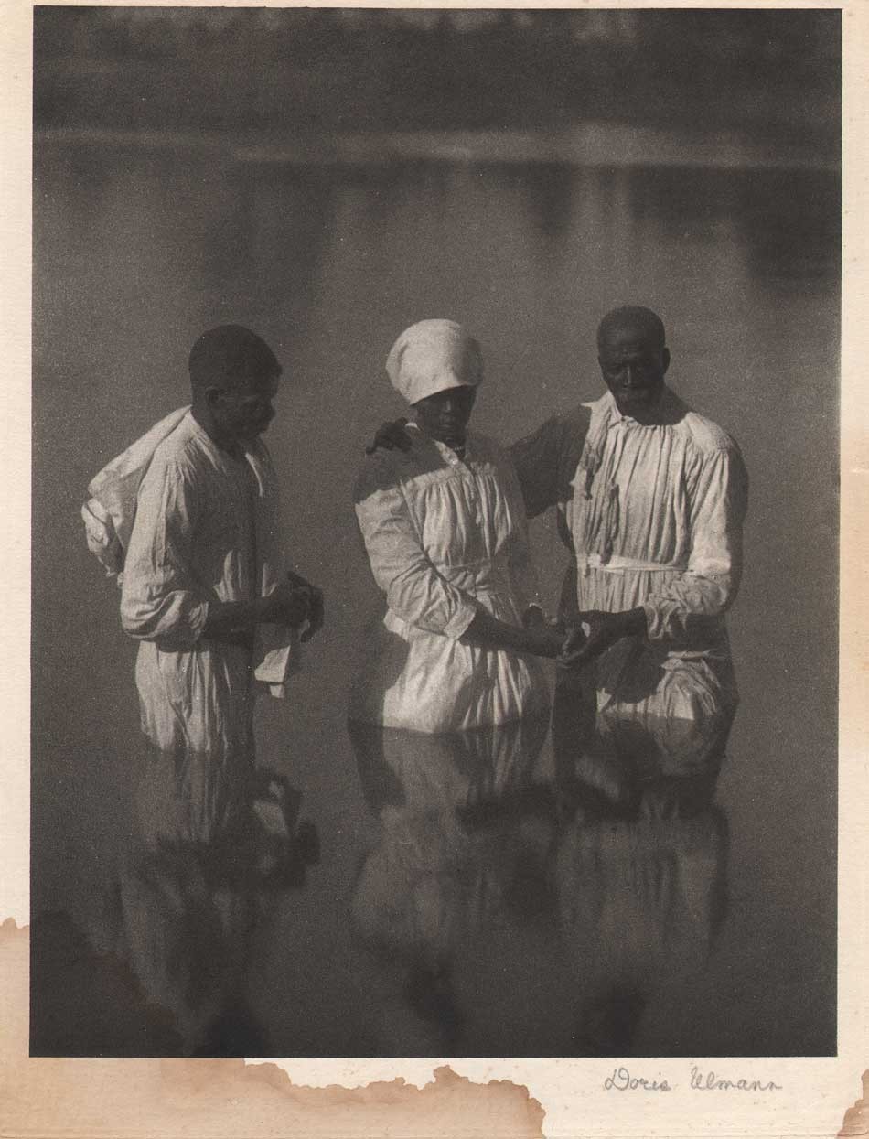
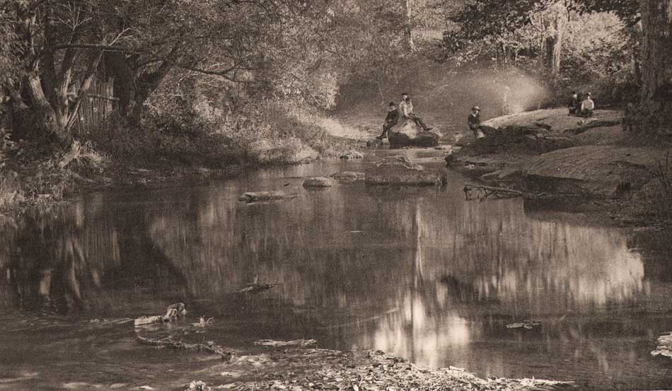
“Baptismal Scene” : Doris Ulmann, American: (1882 –1934) 1933: Signed, hand-pulled photogravure included as additional loose plate from deluxe edition of “Roll, Jordan, Roll”: 21.3 x 16.4 | 28.3 x 20.7 cm. In a rather interesting coincidence, this particular example of a summer stream showing a well-known river baptism by Ulmann has been partially immersed by moisture along the lower margin. From p. 116 of the volume: “A candidate for admission into the church must first be baptized. The Methodists have water sprinkled on their heads, but Baptists must be publicly immersed. These “baptisms” attract large crowds of onlookers. The candidates all arrive at the “pool” dressed in long white robes, which are carefully put away after the ceremony to serve as their shrouds some day. When they are assembled, the preacher and the leader, also dressed in white robes, lead the first candidate down into the water, where he is dipped three times, once in the name of the Father, once in the name of the Son, and once in the name of the Holy Ghost. As he is lead up out of the water, all his sins are left behind, drowned and buried in a watery grave. His soul is cleansed white as snow and he is ready to be received into full church membership. Unless he “falls” into sin and gets “turned out” of the church, he will some day be received into fellowship with God’s holy angels up in heaven.” The following review of Roll, Jordon, Roll comes from Steve Watson and was included on the Amon Carter Museum of American Art website, first published in 2016: Photographer Doris Ulmann came from an affluent white New York City family. She took teacher training with photographer Lewis Hine at the Ethical Culture School and subsequently studied psychology and law at Columbia University. She also studied photography with Clarence H. White, a founding member of the Photo-Secession movement known for teaching the Pictorialist style. Ulmann collaborated with novelist Julia Peterkin on a book project titled Roll, Jordan, Roll(New York: R.O. Ballou, 1933). The book focuses on the lives of former slaves and their descendants on a plantation in the Gullah coastal region of South Carolina. Peterkin, who won the Pulitzer Prize for her novel Scarlet Sister Mary (Indianapolis: Bobbs-Merrill, 1928), was born in South Carolina and raised by a black nursemaid who taught her the Gullah dialect. She married the heir to Lang Syne, a 2,000-acre cotton plantation, which became the setting for Roll, Jordan, Roll. Ulmann began photographing there in 1929. Roll, Jordan, Roll is titled after the spiritual written by English Methodist leader Charles Wesley in the 18th century which became well-known among slaves in the United States during the 19th century. Appropriated as a coded message for escape, by the end of the American Civil War it had become known through much of the eastern United States. In the 20th century it helped inspire the blues, and it remains a staple in gospel music. Roll, Jordan, Roll was illustrated with 90 photogravure plates made from Ulmann’s large-format negatives. Although they comprise an amazing ethnographic study, today Ulmann’s Pictorialist aesthetic seems a strange choice for making documentary images. The hazy, soft-focus photographs lend a sentimental, nostalgic impression that belies the underlying exploitative history of her subjects. From: PhotoSeed Archive

“Niagara Falls”: attributed to Arthur Hammond, American: born England: 1880-1962: hand-colored gelatin silver print mounted to album leaf, ca. 1930-1940: 19.2 x 24.2 | 25.0 x 32.7 cm. To conclude our post is a view of the ultimate Summer Stream: a view showing the Niagara River’s Horseshoe Falls from the Canadian side. From a personal album of nearly 100 photographs attributed to Hammond dating from around 1910-1940. Born in London, photographer Arthur Hammond arrived in America at Ellis Island in New York Harbor on July 31, 1909 and established himself with his own studio in Natick, MA outside Boston by 1912. In 1920, he authored the foundational book “Pictorial Composition in Photography” and became a leading voice for pictorialism in America through his position as associate editor of American Photography magazine that lasted 30 years from 1918-1949. From: PhotoSeed Archive
By the Stream
Paul Laurence Dunbar (1872-1906)
By the stream I dream in calm delight, and watch as in a glass,
How the clouds like crowds of snowy-hued and white-robed
maidens pass,
And the water into ripples breaks and sparkles as it spreads,
Like a host of armored knights with silver helmets on their heads.
And I deem the stream an emblem fit of human life may go,
For I find a mind may sparkle much and yet but shallows show,
And a soul may glow with myriad lights and wondrous mysteries,
When it only lies a dormant thing and mirrors what it sees.
I recently trekked to the New Hampshire seacoast to investigate the origins of two cyanotype photogram albums recently posted to this site. There, botanical specimens gathered by Helen Chase Gage when she was a child on her family’s country estate known as “Sagamore Farm” in Rye, New Hampshire were compiled during the summer months of 1929 and 1930.

At Odiorne Point State Park in Rye, New Hampshire, remnants of foundation walls belonging to “Sagamore Farm” can be seen in this view looking west towards the seacoast photographed October 1, 2018. Helen Chase Gage (Miller) 1917-1982 was a schoolgirl when she roamed near here during the summers of 1929 & 1930 collecting botanical specimens used to make two albums of cyanotype photographs. The estate, a grand sixteen-room summer home built in 1892 by Dr. William Duncan McKim, (1855-1935) was purchased by Helen’s parents in 1918 and eventually condemned and demolished by the US Federal Government in 1942 with other homes in order to build Fort Dearborn, which provided a coastal defense for the United States on the Atlantic seaboard during and after the World War II era. Photo by David Spencer for PhotoSeed Archive.

A surviving photograph of “Sagamore Farm” located in Rye New Hampshire, the summer country home where schoolgirl photographer Helen Chase Gage made her cyanotype albums during the summers of 1929-30. A sixteen-room home originally built in 1892 by Dr. William Duncan McKim, (1855-1935) it’s described in the 1994 volume Footprints in Time: A Walk where New Hampshire Began as: “This was a large house with two matching sides separated by a porte cochere (a carriage drive-through) which went through the house to the large barn behind.” Notice the stone wall in front of the home, indicating the presence of farm fields that criss-crossed the future Odiorne Point State Park property. Photo courtesy Seacoast Science Center.
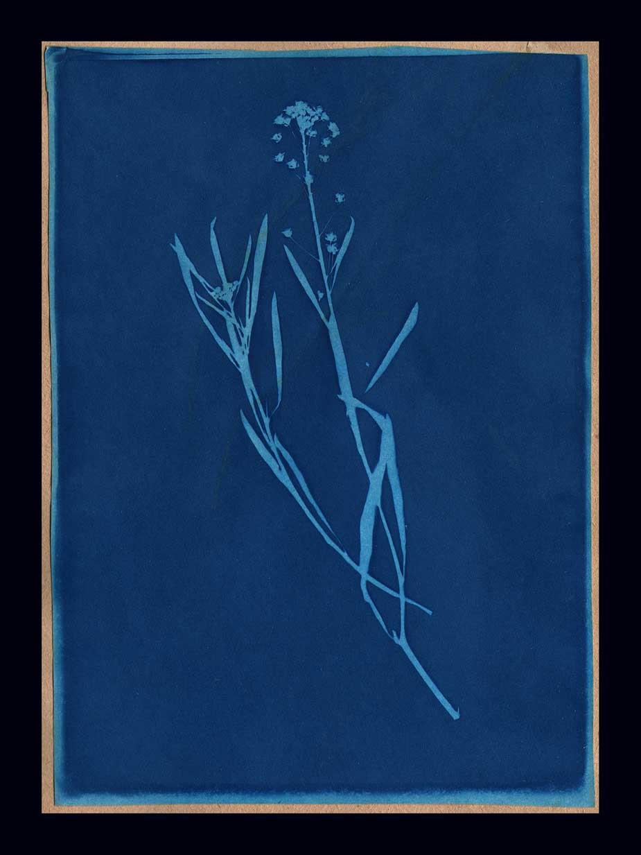
“Sweet Alyssum” (Lobularia maritima) Helen Chase Gage- American: 1917-1982; Cyanotype: 1930: (18.0 x 12.9 | 21.6 x 14.6 cm) Inscribed on opposite album page: Sweet Alyssum Blue Print made August 17, 1930 At Sagamore Farm, N.H. By Helen C. Gage. From: PhotoSeed Archive
Known today as Odiorne Point State Park, Helen’s family summer home was located on land at Frost Point at the mouth of the Piscataqua River and Gulf of Maine. In 1942 during World War II, the US federal government appropriated nearly 265 acres making up the future park boundaries through eminent domain, including the Sagamore Farm estate and other properties owned by 24 families. (11 homes are said to have been demolished) This was done in order to build Fort Dearborn, a coastal outpost manned by large gun emplacements designed to protect the nearby Portsmouth Naval Ship Yard on the Piscataqua.
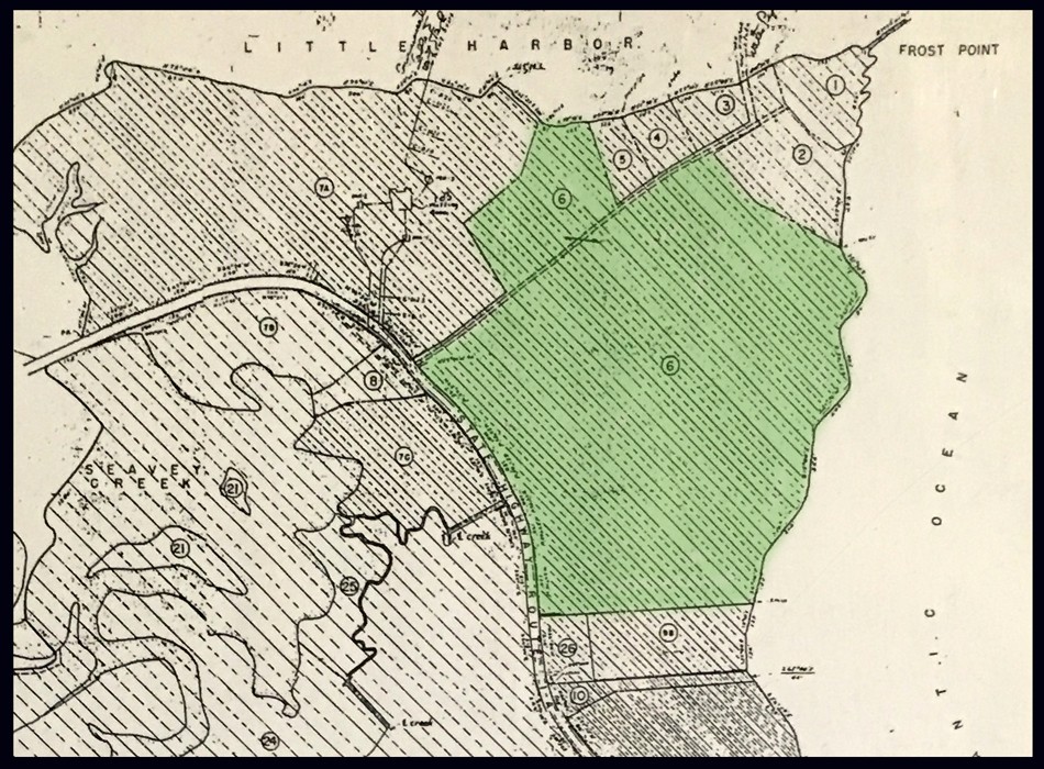
This ca. 1942 US War Department map shows the future area of Odiorne Point State Park in Rye, New Hampshire. Using the color green, this website has shaded the parcel belonging to photographer Helen Chase Gage’s family- 43.6 acres. The US Government appropriated nearly 265 acres owned by 24 families through eminent domain in order to build Fort Dearborn, which took three years to complete. Graphic courtesy Seacoast Science Center.
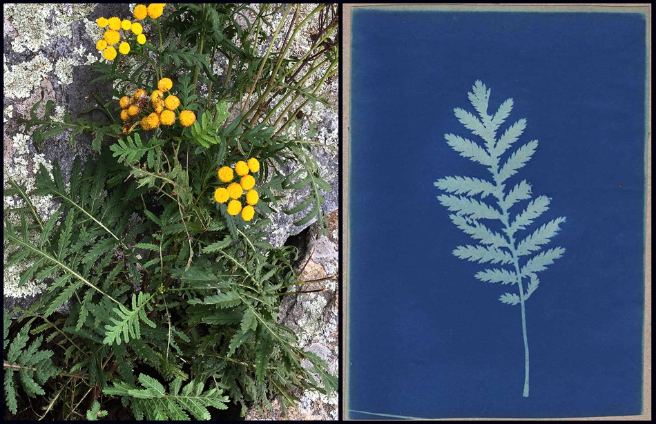
Left: Tansy flowers in bloom at Odiorne Point State Park in Rye, New Hampshire photographed October 1, 2018. Photo by David Spencer for PhotoSeed Archive. Right: “Tansy” (Tanacetum vulgare) Helen Chase Gage- American: 1917-1982; Cyanotype: 1929: (17.6 x 12.5 | 30.0 x 22.8 cm) Inscribed on same album page: Tansy: Blue Print made on July 17, 1929 at Sagamore Farm By Helen C. Gage. From: PhotoSeed Archive
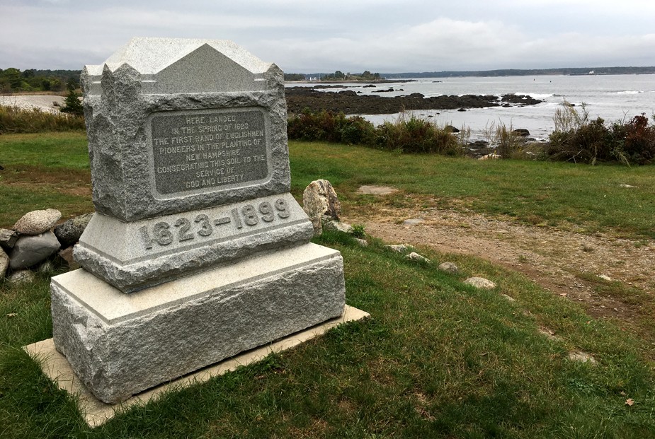
This granite marker on the coastline at Odiorne Point State Park marks the location in the Spring of 1623 where English immigrant David Thomson (1593-1628) of Plymouth, England established the first European settlement on land that would become the future American state of New Hampshire. Originally installed in 1899, the marker was eventually moved but re-installed and re-dedicated in its’ original spot in 2007: “Here Landed In the Spring of 1623 The First Band of Englishmen. Pioneers in The Planting of New Hampshire. Consecrating This Soil to The Service of God and Liberty. Photographed on October 1, 2018 by David Spencer for PhotoSeed Archive.
The area is rich in American history: at Odiorne Point within the present-day state park, a large granite marker (installed 1899 |rededicated 2007) marks the location in the Spring of 1623 where English immigrant David Thomson (1593-1628) of Plymouth, England established the first European settlement on land that would become the future American state of New Hampshire.
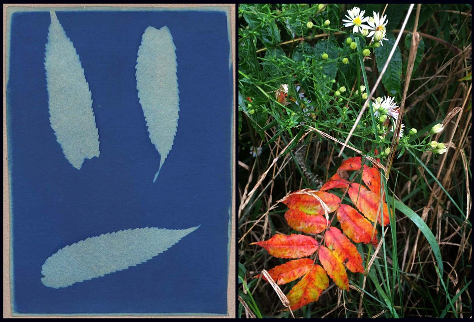
Left: “Sumack” (Rhus coriaria?) Helen Chase Gage- American: 1917-1982; Cyanotype: 1929: (18.0 x 13.0 cm | 21.6 x 14.6 cm) Inscribed on album page: Sumack: Blue Print made on July 23, 1929 at Sagamore Farm By Helen C. Gage. From: PhotoSeed Archive. Right: Sumac leaves from a shrub showing off their fall colors at Odiorne Point State Park in Rye, New Hampshire photographed October 1, 2018. Photo by David Spencer for PhotoSeed Archive.

Helen Chase Gage hand-drawn calling card inserted within 1930 Blue Print album of botanical specimen photograms: Helen Chase Gage- American: 1917-1982: This hand-made album is shown opened with the front pastedown made from blue art paper extending full width of opened volume. Overall dimensions: 23.0 x 30.0 cm : Calling card: 7.6 x 15.1 cm. Helen Chase Gage spent her early childhood at 2 Avon Road in Bronxville, New York but assembled this album and another in 1929 at Sagamore Farm in Rye, New Hampshire. From: PhotoSeed Archive

“Larkspur” (Scientific name: Delphinium; Family: Ranunculaceae) Helen Chase Gage- American: 1917-1982; Cyanotype: 1930: (17.7 x 12.6 cm | 21.6 x 14.6 cm x2) Inscribed on opposite album page: Larkspur: Blue Print made August 10, 1930 At Sagamore Farm By Helen C. Gage. This representative album spread from Helen’s 1930 collected cyanotypes is unusual because the original collected botanical specimens are featured as part of the volume. Thirty-one individual prints are included within the album closed by means of cloth ties, seen at far right of frame. From: PhotoSeed Archive
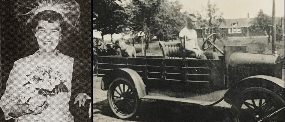
“Big Sister, Little Brother” Left: This cropped photograph of Helen Chase Gage Miller accompanied her 1970 wedding announcement in the Bronxville (New York) Review Press and Reporter newspaper. A graduate of Bronxville High School and Pratt Institute in Brooklyn earlier in life, she also attended Ursinus College. Later, the young photographer is known to have worked at Lord and Taylor, a department store in New York City, and was a member of the Reformed Church in Bronxville, the Anne Hutchinson Chapter of the Daughters of the American Revolution and the League for Service. Right: In 1935, Helen’s younger brother Edward Augustus Gage (1919-2007) is shown behind the wheel of a 1918 Model T Ford depot wagon, along with his dog Ski at rear, in a photograph believed to have been taken near the family’s summer property in Rye. The caption for this photograph which appeared in the volume “Footprints in Time” states: “Edward Gage later played an important role in trying to get the government to sell Odiorne land back to its pre-war owners.” His 2007 obituary mentions he was a pilot and flight instructor in World War II and finished in the Naval Reserves at the rank of lieutenant commander. Trained as a lawyer, in 1970 he was appointed to serve as judge of the Exeter District Court in New Hampshire until his retirement in 2003. Photo courtesy Seacoast Science Center.
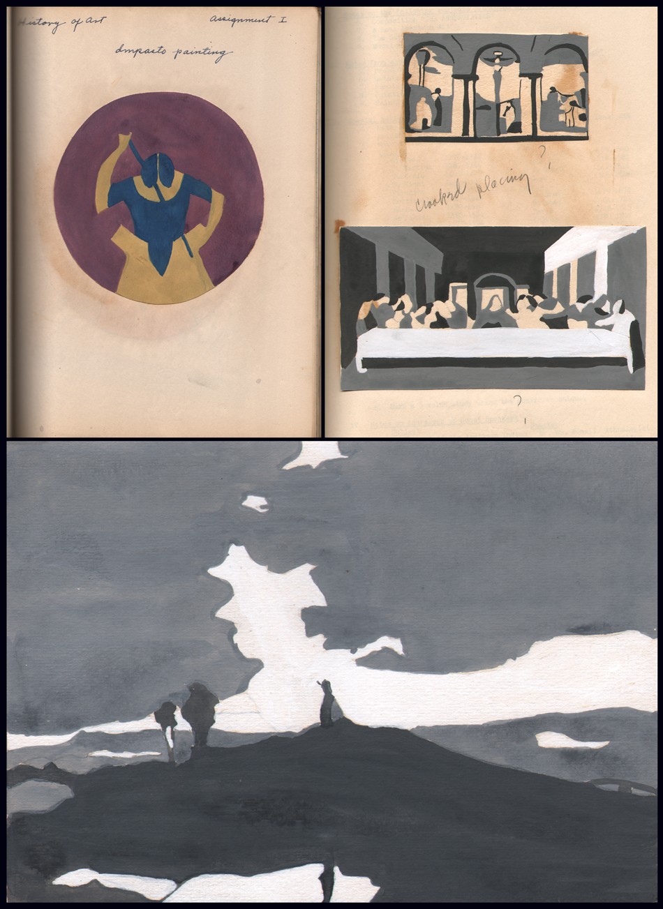
The pursuit of art was evident for Helen Chase Gage after early childhood. Although it’s not known if she pursued it in any professional capacity later in life, Helen did attend Pratt Institute-School of Fine and Applied Arts in Brooklyn, New York from 1939-40, graduating in June, 1940. Above are several examples of original artwork by Gage used in her Art History course she was enrolled in as part of a series of lessons on painting presented by school Director James C. Boudreau kept in a notebook held by the PhotoSeed Archive. Top left: a tondo (13.8 cm) female form frontal view by Helen Chase Gage as an example of Impasto painting done using tempera paint. Top right: tempera study (5.5 x 9.5 cm) by Helen Chase Gage of the fresco “Pazzi Crucifixion” by Pietro Perugino; bottom: tempera study (8.4 x 15.9 cm) by Helen Chase Gage of Leonardo Da Vinci’s “Last Supper”. Bottom: tempera study (12.9 x 18.1 cm) by Helen Chase Gage of a painting by English artist Joseph Mallord William Turner titled “A Heath Scene” in the Gage notebook. From: PhotoSeed Archive
Jumping to the present day, the focal point of the park is the Seacoast Science Center, a non-profit marine science education organization. When I visited on October 1st recently, I had the pleasure of speaking with the center’s president Jim Chase, who gave me a brief history of the property and was helpful with directions to the area where Sagamore Farm was once located. He told me of the park’s efforts in clearing out some of the invasive plants on the property and about one of Seacoast’s more popular activities- BioBlitz, described as a “daylong species scavenger hunt…..where families explore alongside scientists and field experts to find and record data on as many different species in the Park as possible in one day.”
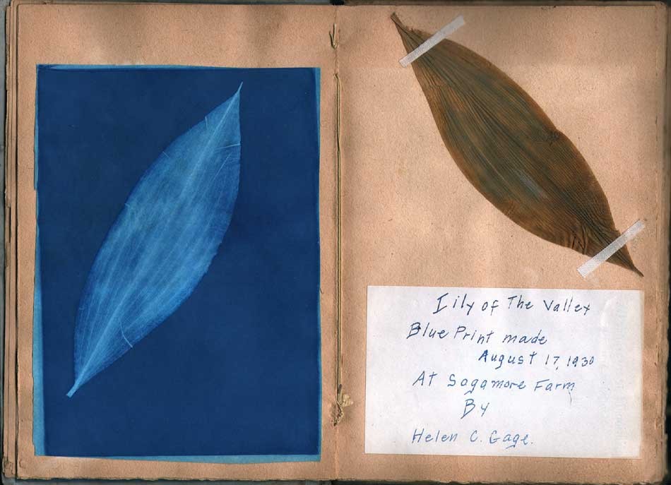
“Lily of The Valley” (Convallaria majalis) Helen Chase Gage- American: 1917-1982; Cyanotype: 1930: (18.1 x 13.0 cm | 21.6 x 14.6 cm x2) Inscribed on opposite album page: Lily of The Valley: Blue Print made August 17, 1930 At Sagamore Farm By Helen C. Gage. This representative album spread from Helen’s 1930 collected cyanotypes is unusual because the original collected botanical specimens are featured as part of the volume. Thirty-one individual prints are included within the album. From: PhotoSeed Archive
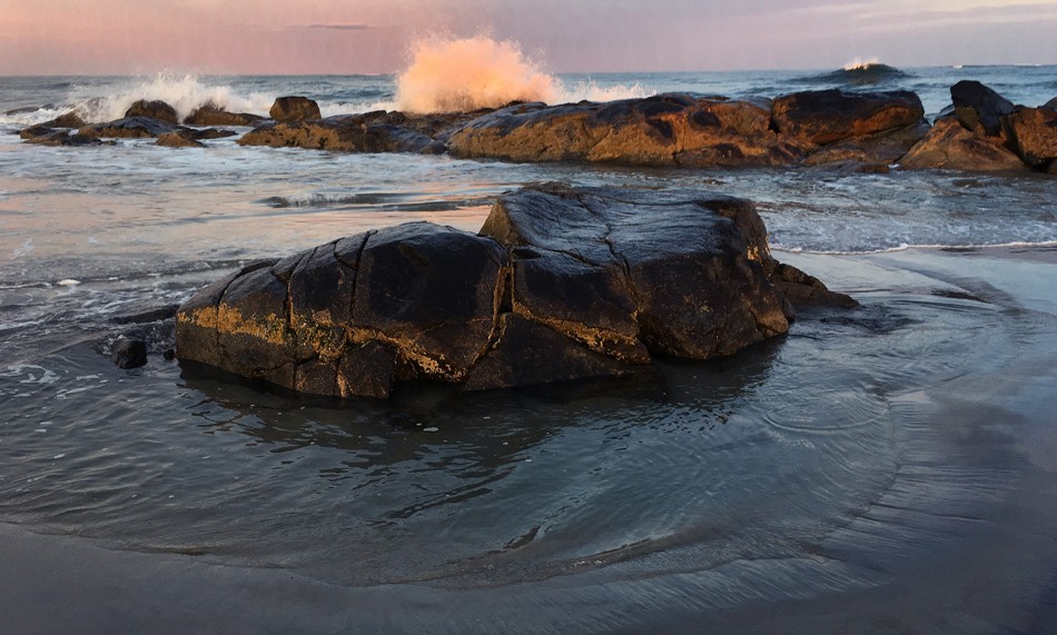
At dusk, waves crash on a rock outcropping at Hampton Beach, New Hampshire on September 30, 2018. Located twelve miles south of the present day Odiorne Point State Park along New Hampshire Route 1A, the popular summer destination spot for tourists is known for its’ scenic beauty on the New Hampshire coastline, which measures in at 18.57 miles, the shortest ocean coastline of any US state. (or 235 miles of “estuarine shoreline!) Attractions and geographical proximity such as this give ample reason for visitors to visit both locales. Photo by David Spencer for PhotoSeed Archive
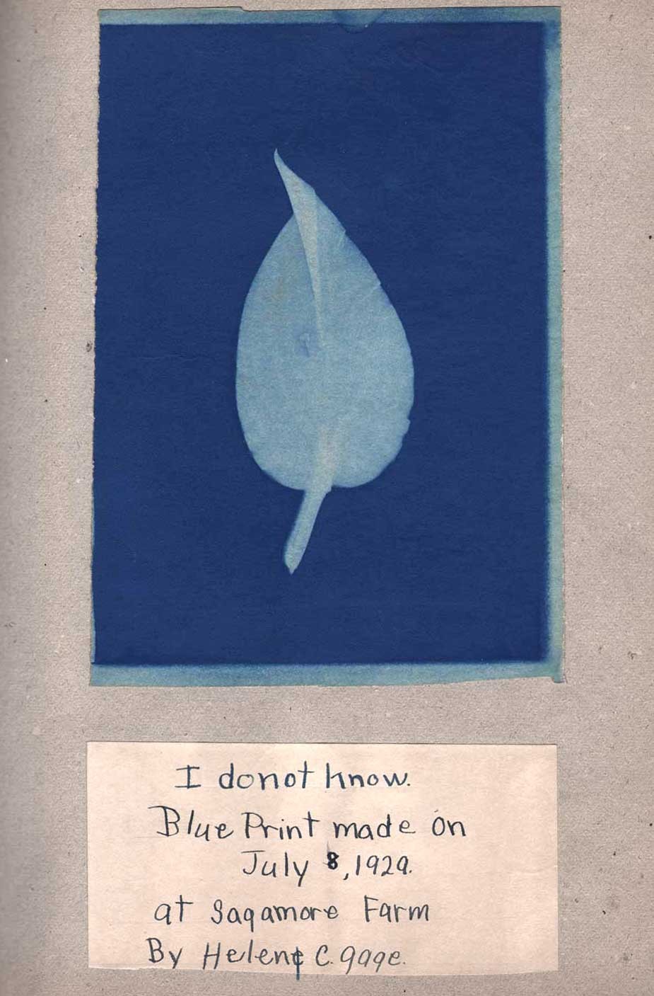
“I Do Not Know” Helen Chase Gage- American: 1917-1982; Cyanotype: 1929: (18.0 x 12.5 cm | 30.0 x 22.8 cm) Inscribed on same album page: I do not know.: Blue Print made July 8, 1929 At Sagamore Farm By Helen C. Gage. Perhaps one of the most interesting cyanotypes in both albums is this unidentified leaf specimen-endearing because the young artist who collected it was just being honest with her knowledge and told us so. As I’ve mentioned previously with these overall works, a few of the specimens may not be “right” botanically and possibly misidentified in some cases. Your expertise is welcomed! From: PhotoSeed Archive
Feeling like a kid myself, I used my phone to show Jim one of the many fine botanical specimens Helen had made into a cyanotype from the 1930 album and realized she could have been rightly called one of the first BioBlitz scavenger hunters. As I left and walked outside the Seacoast Center, I found confirmation for Helen’s love of place on the New Hampshire seaboard all those years ago: a large group of school children getting ready to set out on their own happy discoveries.
David Spencer- October, 2018

A Special Place Indeed: a poignant reminder of the property where Helen Chase Gage collected her plant specimens in order to make precious blue prints so many summers ago yields some new opportunities in the form of fall leaves and Goldenrod resting on this granite bench dedicated to the memory of the McKim and Gage families inside Rye’s Odiorne Point State Park where “Sagamore Farm” once stood. Photographed October 1, 2018 by David Spencer for PhotoSeed Archive
Afterword
An interesting segment from New Hampshire Public Radio from 2016 reports on how Odiorne Point State Park in New Hampshire was developed in the aftermath of World War II. The voice of Helen’s younger brother Edward Gage, (1919-2007) who went on to become a lawyer and spent decades trying to reclaim his family’s property is included in the report. To the credit of the park in not glossing over the loss to the Gage family and others-specifically the namesake Odiorne family who had owned property here since the 1660’s, signage outlining this history can be seen inside the Seacoast Science Center:
“In 1942,when the U.S. government took over Odiorne Point, homeowners were given short notice to vacate their beloved vacation homes and, in the case of the Odiornes, a farm that had been in their family almost three hundred years.
After the war, a debated legislative technicality at the federal level prevented Odiorne Point landowners from regaining their property. In ensuing years, discussion over what would become of the land covered the full range of development and preservation schemes.
In the end, thanks to preservation activist Annette Cottrell and the interest of New Hampshire Park Director Russell B. Tobey, the state-owned land became a park. The park is now the site of the Seacoast Science Center.
The story of Odiorne Point continues. Visitors and students from around the world are making new use of the park through the Seacoast Science Center and its educational programs. This little point of land seems destined to make more history.”
Additional Reading
-Footprints in Time: A Walk where New Hampshire Began. Compiled by Howard S. Crosby, Wendy W. Lull, and Richard T. MacIntyre: Arcardia Publishing, 1994
-Writer Anna Soper contributes additional scholarship on these albums in her article These Stunning Botanical Images Are Blueprints of the Past found on the Atlas Obscura website published October 8, 2019.