Merry Christmas!
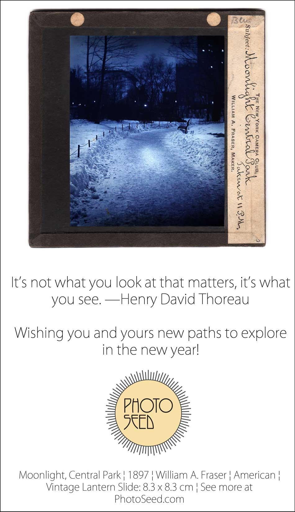
Detail: “An Old-fashioned Winter”: Henry Stevens, (1843-1925) 1892, English, Woodbury Gravure: 18.3 x 12.8 | 39.0 x 28.3 cm. Vintage plate from salon portfolio: “Photographs of The Year. Descriptive Notes and Critical review of The Photographic Society’s Exhibition, 1891, by H.P. Robinson.” Published in their salon catalogue by the Photographic Society of Great Britain, Robinson comments on this photograph originally taken in 1890 from the letterpress, which features the photographer’s pet Jack Russell terrier at the front of the sleigh: …This delightful sleighing picture is good enough to make the success of the Christmas number of any illustrated paper, and we are pleased to give a reproduction of it. There is life and motion; the sleigh flies over the snow; the young lady behind, on skates, moves; and the dog in front thinks it is all done for his enjoyment. We may perhaps venture to congratulate the artist on having such charming models in his daughters.” From: PhotoSeed Archive
Happy Halloween!
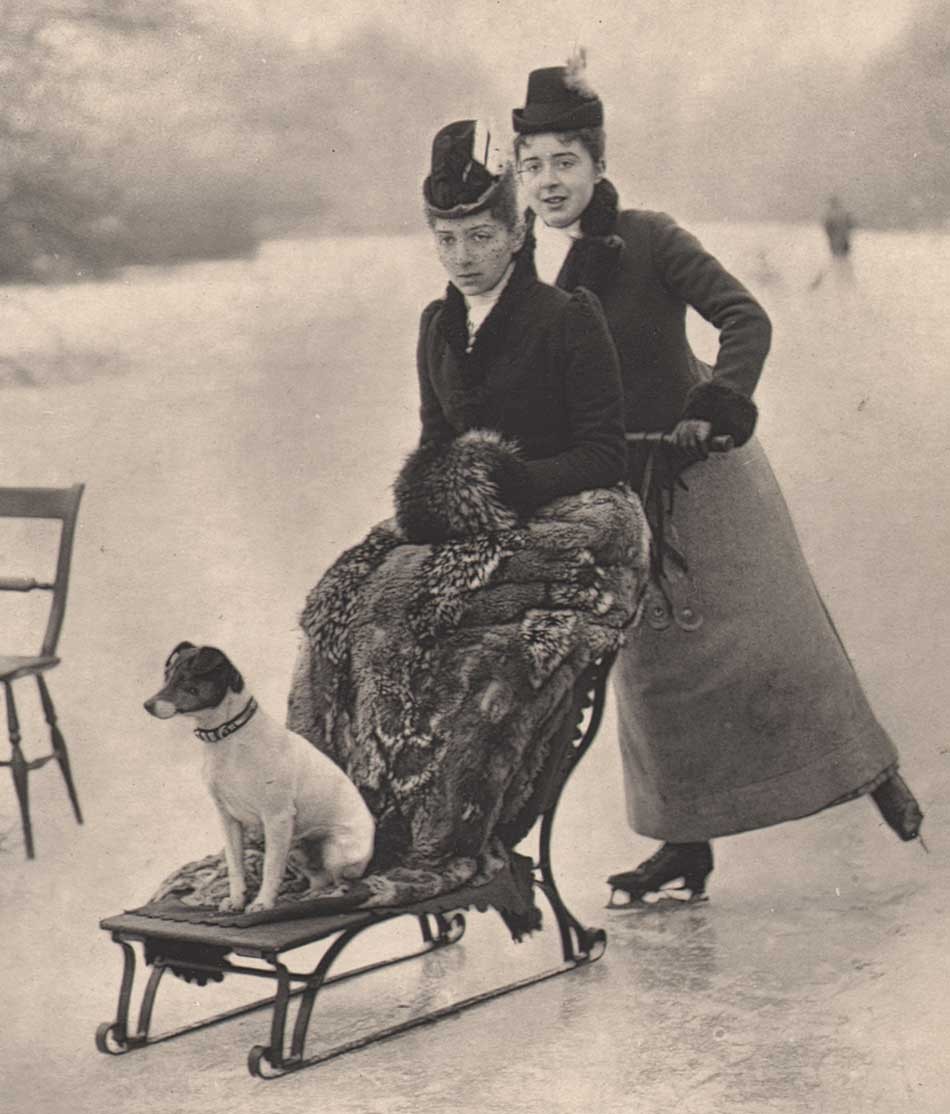
Detail: “Paddy and the Ghost — Dec. 9 1899”: Henry Byett, (ca.1870-1949) English: 1899: vintage cyanotype mounted on card album leaf: (6.9 x 9.5 | 8.3 x 10.8 | 12.1 x 15.0 cm) This rare cyanotype “spirit” photograph is the lone blueprint in a small album of carefully composed, mounted and captioned gelatin silver photographs attributed to the English amateur photographer, who was for many years a railway clerk for the Swindon works of the Great Western Railway in England. Byett is best known today as having been a close friend of the celebrated English poet Alfred Williams, (1877-1930) Swindon’s “Hammerman Poet ” whom he met there in 1905. From: PhotoSeed Archive
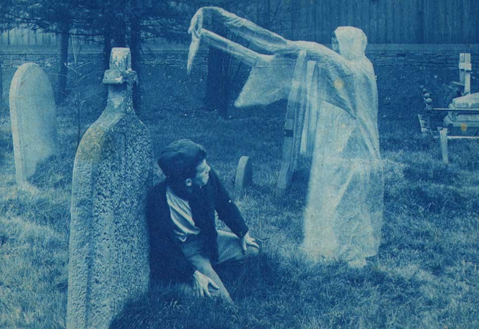
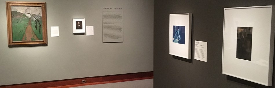
The following are a few snaps from my recent attendance at the symposium: Rethinking “Pictorialism” held in conjunction with the exhibition now playing at the Princeton University Art Museum in New Jersey: Clarence H. White and His World: The Art & Craft of Photography, 1895-1925. On exhibit at Princeton through January 7, 2018, the show will then travel to the Davis Museum at Wellesley College (MA) from 02-07-18 to 06-03-18; The Portland Museum of Art in Maine from 06-30-18 to 09-16-18 and the Cleveland Museum of Art in OH from 10-21-18 to 01-21-19.
A visitor enters the exhibit “Clarence H. White and His World: The Art & Craft of Photography, 1895-1925” at the Princeton University Art Museum during the October, 2017 weekend in which a symposium devoted to Rethinking “Pictorialism” in context with White’s work and those of his contemporaries was discussed. Photo by David Spencer for PhotoSeed Archive.

Two men from two very distinct photographic worlds: Seen at center ca. 1900 at around 25 years of age, Clarence H. White, with hair slightly unkempt as befitting one whose energies were certainly taxed for familial obligations combined with lofty personal ambitions related to the nascent field of art photography, (and the necessity of keeping his day job) was compared with a mentor at left: Alfred Stieglitz, during a symposium paper. Sarah Greenough, far right, senior curator and head of the department of photographs at the National Gallery of Art in Washington, D.C., compared both as part of her keynote address: Alfred Stieglitz, 291, and the Nursery of Genius: 100 Years Later. The symposium- Rethinking “Pictorialism” American Art and Photography, 1895 to 1925, was held at Princeton University on October 20-21, 2017 in conjunction with the in-progress exhibition on Clarence White at the University art museum. Photo by David Spencer for PhotoSeed Archive.
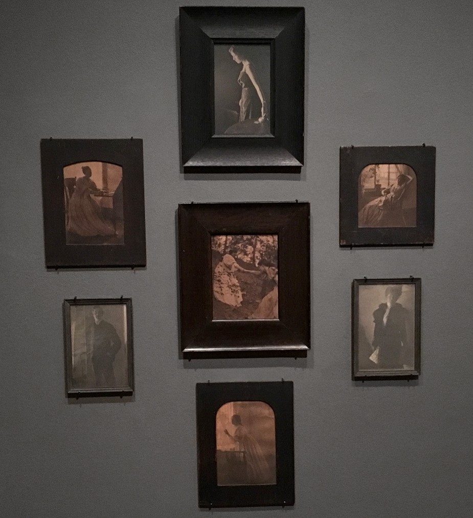
A wall grouping of original Clarence H. White photographs in their original wood frames are on display as part of the exhibit: “Clarence H. White and His World: The Art & Craft of Photography, 1895-1925” now at the Princeton University Museum of Art through early 2018. An excerpt of the wall label: “These photographs are among the few pictorialist works from the late 1890s that survive in their original exhibition frames. Photo by David Spencer for PhotoSeed Archive
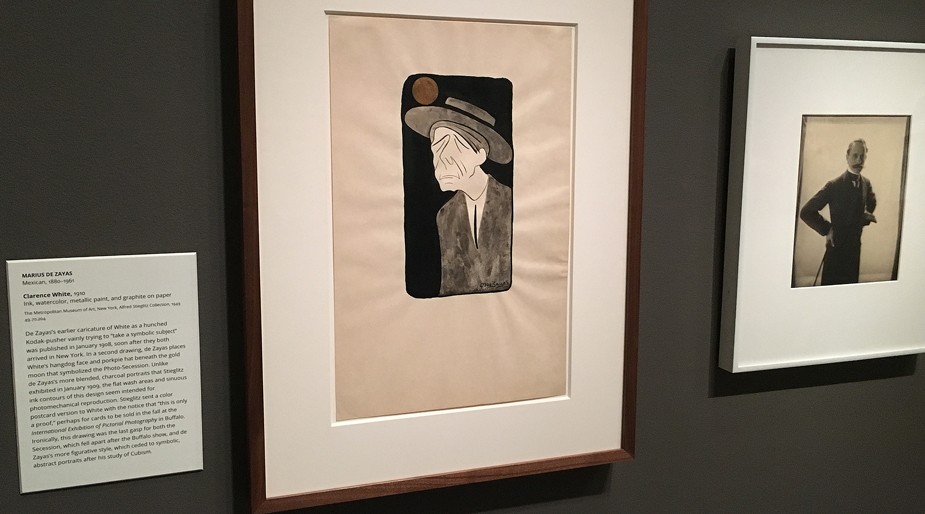
A caricature drawing of Clarence White done in 1910 by Mexican artist Marius De Zayas (1880-1961) is included in the exhibit on loan from the Metropolitan Museum of Art. Accompanied by a vintage portrait of the artist by White at far right, an excerpt from the wall caption reveals: “…de Zayas places White’s hangdog face and porkpie hat beneath the gold moon that symbolized the Photo-Secession. Unlike de Zayas’s more blended, charcoal portraits that Stieglitz exhibited in January 1909, the flat wash areas and sinuous ink contours of this design seem intended for photomechanical reproduction.” Note: caricature drawings by the artist appeared in the journal Camera Work XXIX in 1910 and CW XLVI in 1914. Photo by David Spencer for PhotoSeed Archive.
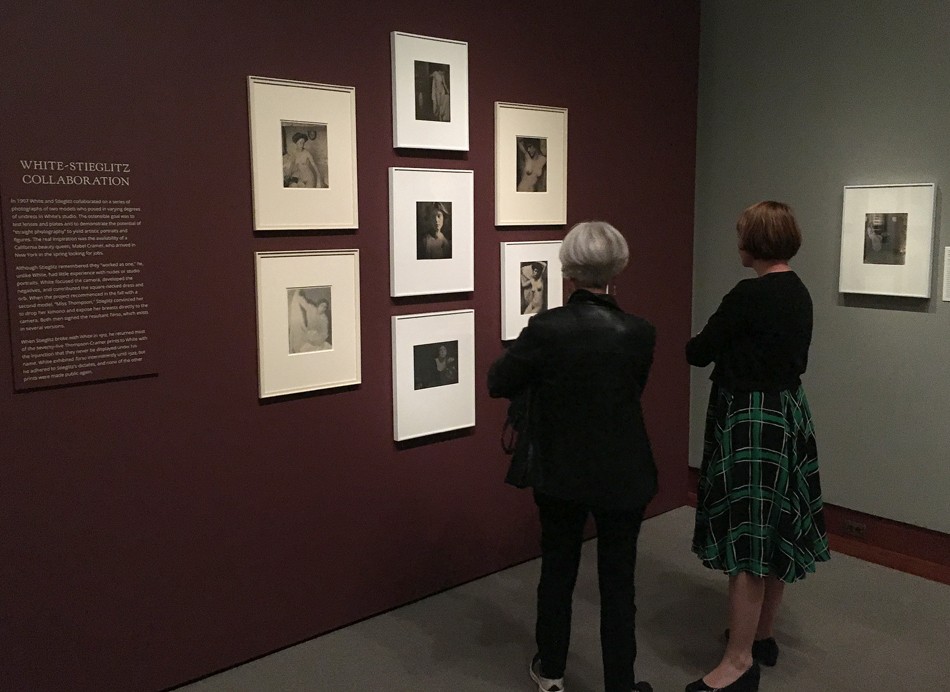
Visitors take in a select grouping of vintage photographs taken in 1907 by Clarence H. White and Alfred Stieglitz in White’s New York City studio that are part of the exhibit “Clarence H. White and His World: The art & Craft of Photography, 1895-1925” now at the Princeton University Museum of Art. An excerpt from the wall label: “In 1907 White and Stieglitz collaborated on a series of photographs of two models who posed in varying degrees of undress in White’s studio. The ostensible goal was to test lenses and plates and to demonstrate the potential of “straight photography” to yield artistic portraits and figures. The real inspiration was the availability of a California beauty queen, Mabel Cramer, who arrived in New York in the spring looking for jobs.” Photo by David Spencer for PhotoSeed Archive.
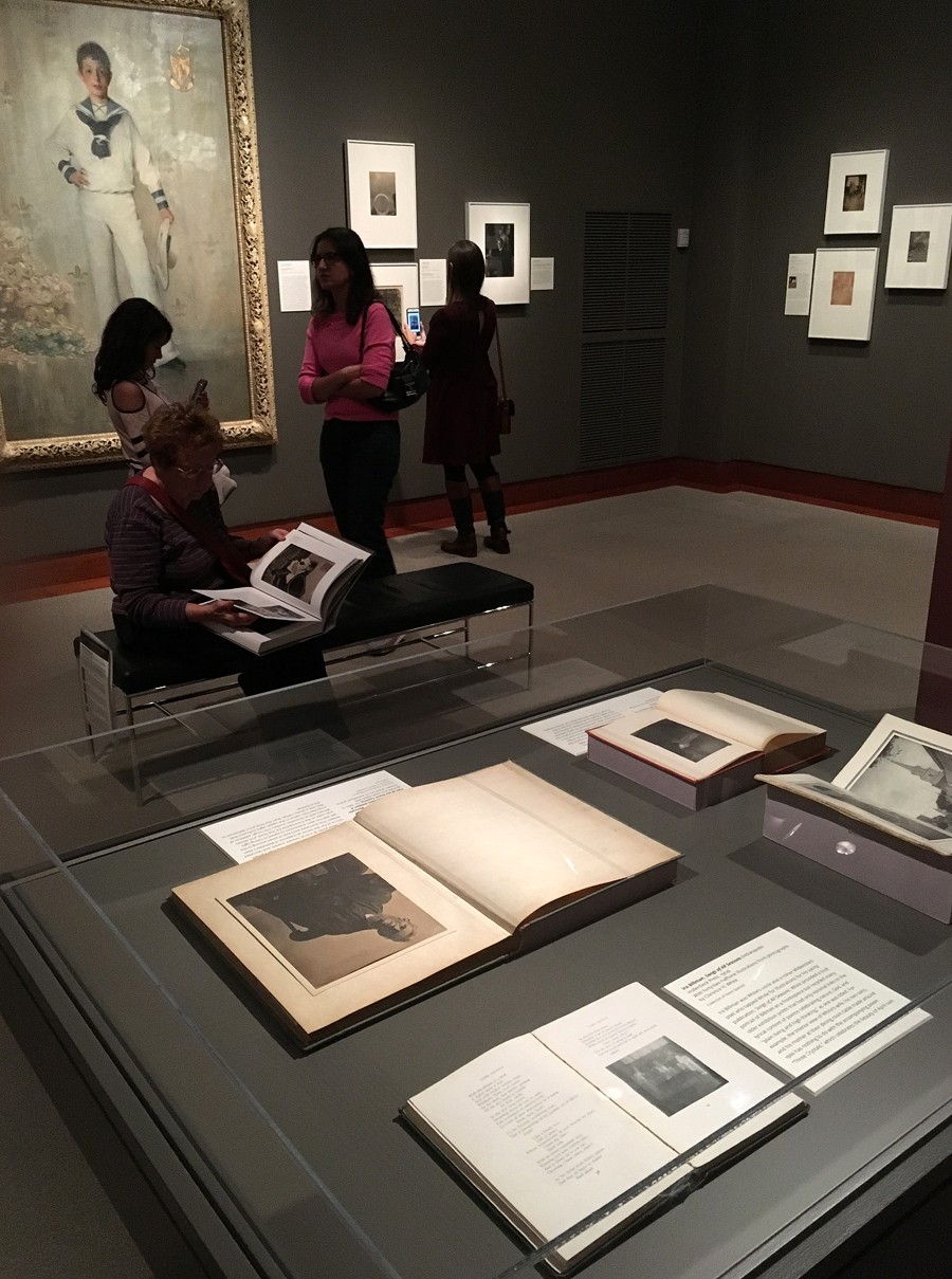
In one exhibit gallery, a display case seen at bottom contains examples of Clarence White’s published work. In the early 20th Century, his interest in commercial illustration lent itself to the publication of several articles as well as volumes featuring staged genre photographs, including a photogravure-illustrated edition of the best-selling Irving Bacheller novel Eben Holden published by the Lothrop in 1903 and Songs of All Seasons in 1904. The latter volume, lent by this website for the exhibit and written by White’s uncle Ira Billman contained the following label excerpt: “White provided a bust portrait of Billman as a frontispiece but recycled many older exhibition prints that had only minimal links to the lyrical content of poems celebrating nature, God, and “Plain living and high thinking,” as one was titled.” On another label, for a bound collection of work prints for Eben Holden and the article “Beneath the Wrinkle”, we learn White recruited a bearded gent named John Miles Jones at a Newark, Oh market who served as the “heroic protagonist of Bacheller’s Eben Holden”. (seen at far left at frame bottom) Photo by David Spencer for PhotoSeed Archive.
Perhaps Clarence White’s greatest legacy was his teaching career. On the exhibit wall at center, a portrait of the American painter Arthur Wesley Dow taken by White around 1908 is shown with an original painting by Dow at far left showing the influence of Japanese design. White’s transition from Newark to New York City in 1906 began a new chapter of teaching by the photographer, who soon made the acquaintance of artist and arts educator Arthur Wesley Dow, (1857-1922) who hired White as an instructor at Columbia University’s Teachers College in 1907. White would go on to found his own groundbreaking schools of artistic photography utilizing a modern pedagogy learned from Dow among others: first in Maine beginning in 1910 and then in New York City in 1914. Photo by David Spencer for PhotoSeed Archive.

In the final gallery exhibition display case, an original letter to Clarence White’s widow Jane White by Alfred Stieglitz is displayed, with this modern-day reader struck by the author’s self importance revealed in the letter’s conclusion at an inopportune time: writing from Lake George, New York, the elder statesman of American pictorial photography pens a belated note of condolence dated September 25, 1923: “My dear Mrs. White: I have refrained from writing to you before this. Life has taught me that words mean little in days like ours. But I want you to know that it did shock me to hear of Clarence’s sudden death-so far away from home. He died in harness. A man can wish no more. Naturally my thoughts of him go back to the “early” days- when I think he was happier- He followed his lights-as I suppose we all do for we seem to have no choice. – I look at Camera Work & am glad it exists. – Photo by David Spencer for PhotoSeed Archive.
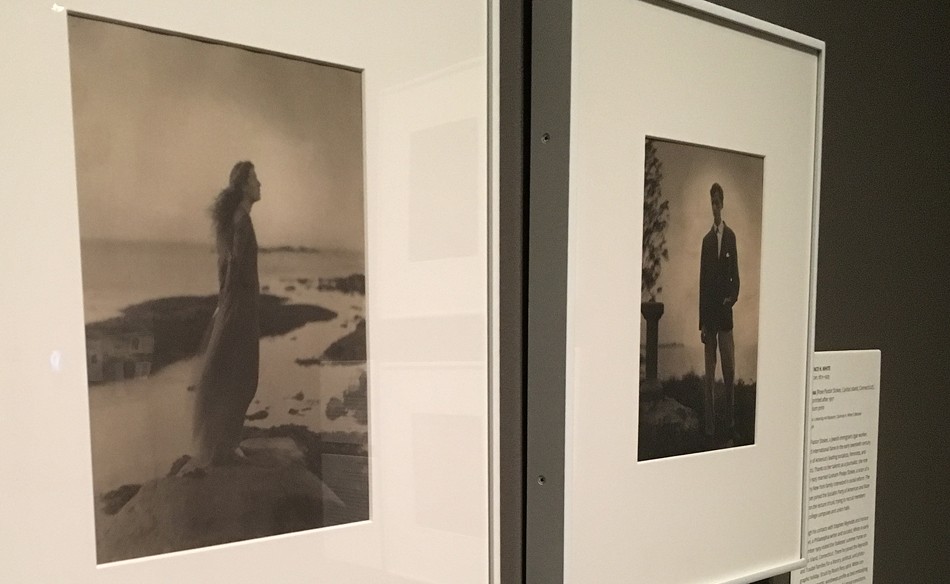
The exhibit features marvelous images by Clarence White held in the Clarence H. White Collection at the Princeton University Art Museum, like this stunning full-length portrait titled The Sea taken of socialist, feminist and activist Rose Pastor Stokes in 1909 and printed after 1917 as a Palladium print. A committed socialist himself, White photographed Stokes during a visit to her and husband Graham Phelps Stokes (portrait of him at far right of frame by White) summer home on Caritas Island, CT. A label excerpt: “Struck by Rose’s fiery spirit, White conceived this romantic, windswept profile as best embodying her fierce independence and powerful moral convictions.” Note: this portrait used as the cover illustration for the exhibit’s accompanying monograph volume. Photo by David Spencer for PhotoSeed Archive.

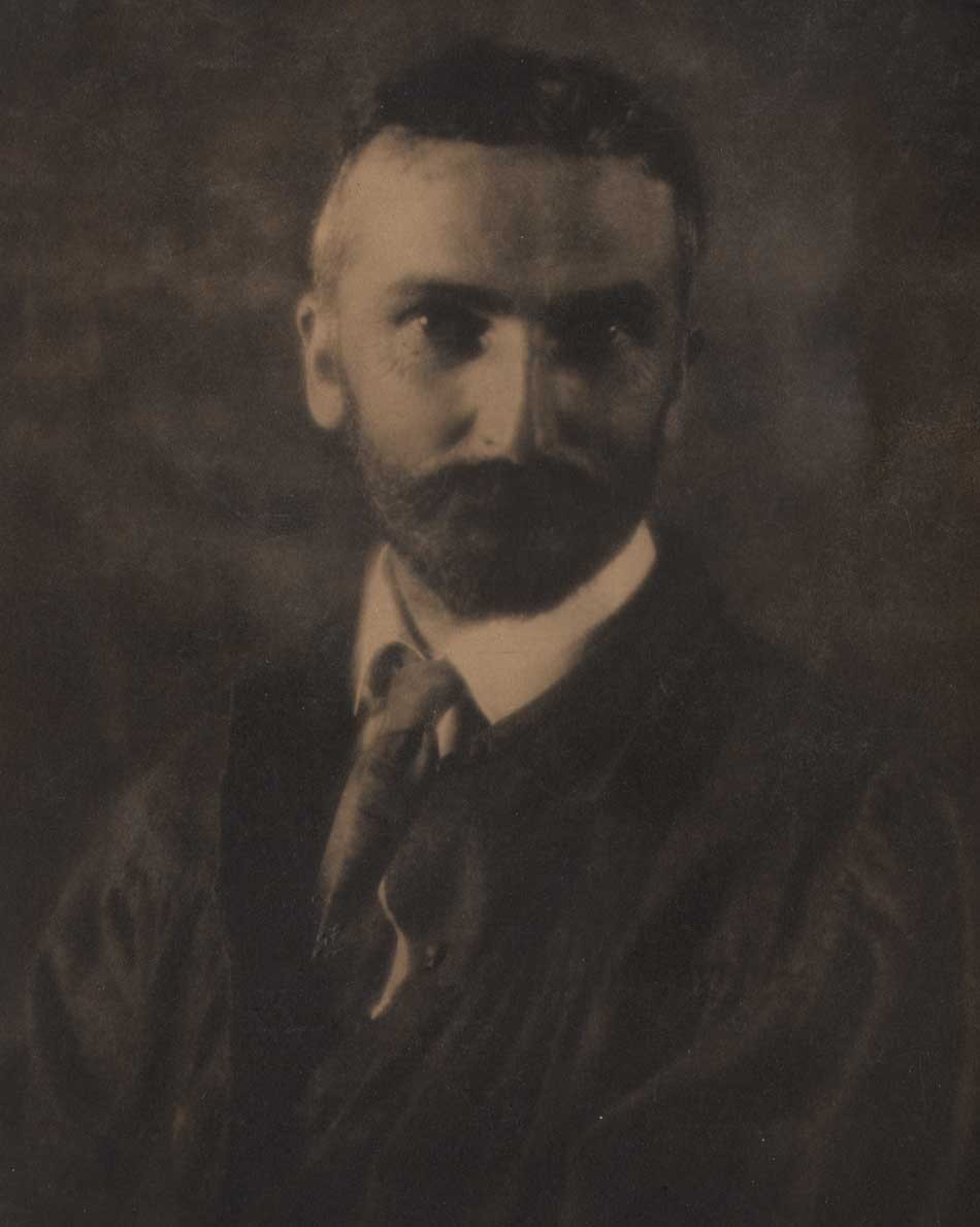
“Clarence H. White Autograph”: Black ink, 1916. By his own hand, White autographed a manilla card-stock mount (36.2 x 28.6 cm) featuring a portrait photograph of himself taken by student Ruth Anthony Davis during the Seventh Summer Session of the School of Photography at Stevens Farm in East Canaan, CT that year. Please see portrait below. From: PhotoSeed Archive
When I remarried a dozen years ago, an obscure bit of farce entered the equation leading up to the “I do” moment. The fateful convolution? My beloved hailed from Newark, OH: the same Midwestern US city where pioneering art photographer Clarence Hudson White (1871-1925) had spent his formative years before leaving permanently along with his family to New York City in 1906.
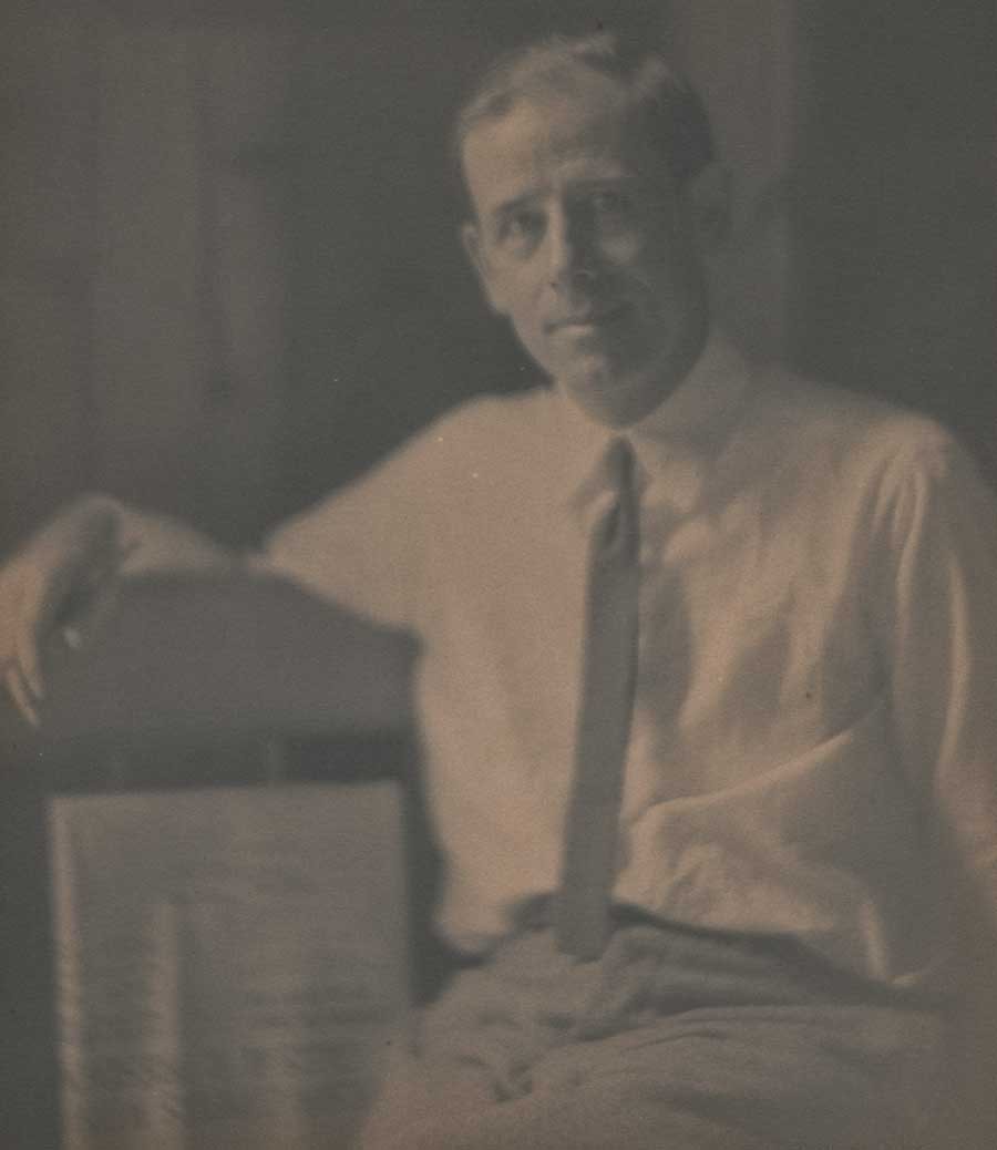
Detail: “Portrait of Clarence H. White”: Ruth Anthony Davis, American (1880-1979): 1916: vintage platinum print: 24.2 x 19.3 cm | 29.0 x 21.5 cm Japan paper | 36.2 x 28.6 cm manilla card-stock: Davis, an early member of the Providence Camera Club, photographed her instructor Clarence Hudson White while she attended the Seventh Summer Session of the School of Photography at Stevens Farm in East Canaan, CT. A description of the school’s location with emphasis on potential photographic subjects for students appeared in the March, 1916 issue of the International Studio: “The seventh summer session of the Clarence H. White School of Photography will be held at East Canaan, Connecticut, instead of Sequinland, Maine, as heretofore, during July and August. East Canaan is situated in a beautiful valley in the Berkshire Hills of Northern Connecticut, at an elevation of eight hundred feet above the sea level, and is surrounded by hills rising another eight hundred feet above the floor of the valley. The country furnishes abundance of photographic material, comprising, within easy walking distance, farms, rolling uplands, streams, rugged mountains and architecture of typically New England character, many of the buildings dating from Colonial times. Numerous industries, such as iron furnaces, lime kilns, and the like, afford abundant opportunity for pictorial work. The neighbourhood is by no means thickly settled, and those persons who enjoy the seclusion of country life will find it here. Not least among the attractions of this portion of Connecticut are the delightful climate and the practical freedom from mosquitoes.” From: PhotoSeed Archive
But this aside is merely an excuse for the real purpose of this post: today is the official public opening of an exciting and ground breaking new exhibit on Clarence White at the Princeton University Art Museum in Princeton, New Jersey. Clarence H. White and His World: The Art and Craft of Photography, 1895-1925 will be on display there from October 7, 2017 to January 7, 2018. But don’t despair if you can’t make it right away, because the show travels to an additional three US museums through early 2019. Venue details along with additional links including one for the first comprehensive monograph on White published in conjunction with the show and authored by Anne McCauley, David Hunter McAlpin Professor of the History of Photography and Modern Art at Princeton University, concludes this post.

Detail: “Clarence H. White and His World: The Art and Craft of Photography, 1895-1925”: composite gatefold brochure for exhibit at Princeton University Art Museum which runs from October 7, 2017-January 7, 2018. Photographic illustrations by White left and middle: The Sea (Rose Pastor Stokes, Caritas Island, Connecticut) (detail), 1909, printed after 1917. Palladium print. Princeton University Art Museum, Clarence H. White Collection; middle: In the Orchard, Newark, Ohio (detail), 1902, printed after 1917. Palladium print. The Museum of Modern Art. Gift of Jane Felix White, 1941. Courtesy: Princeton University Art Museum
Several years before, I had taken a deep-dive into the remarkable life of White, whose arc resonated with me on many levels, especially his love for breaking the rules as applied to photographic lighting. To wit: what do you mean I can’t photograph my subject backlit? A simple optical concept today perhaps but in the late 1890’s? Revolutionary. I kid you not.
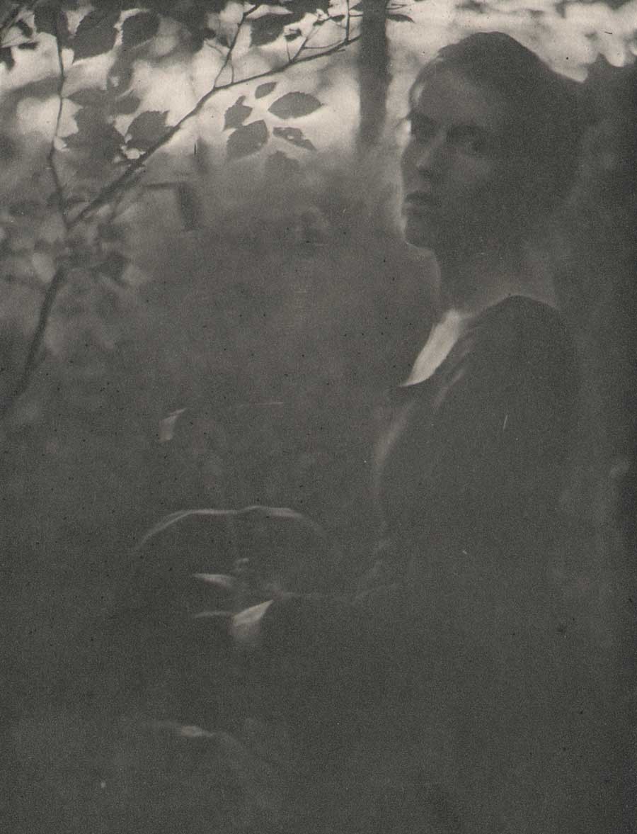
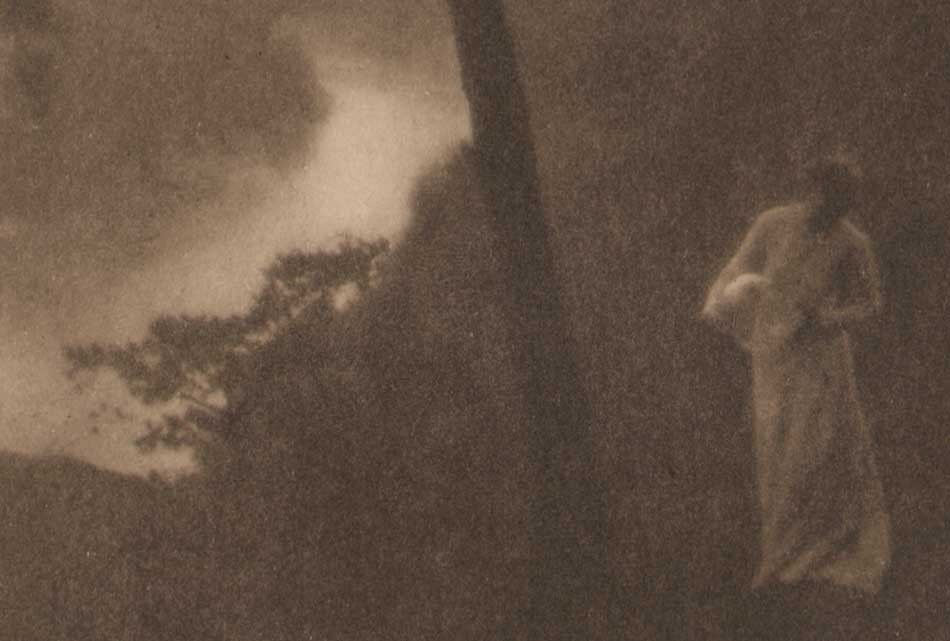
Detail: “At the Edge of the Woods Evening”: Clarence H. White, American (1871-1925): Chine-collé photogravure from Camera Notes, Vol. IV, April 1901: 14.4 x 10.1 cm | 28.6 x 19.6 cm uncut: The photographer’s sister-in-law, Letitia Felix is shown at twilight in a wooded setting. Alternately titled as In the Woods; Evening, the photograph was first exhibited in the Third Philadelphia Photographic Salon the same year. (cat.# 202) Later that year, it was exhibited as part of the Newark Camera Club’s exhibition in the town’s Association Building from November 28-December 1, 1900 where it was titled as Edge of the Woods Evening. The catalogue issued for the exhibit reproduced the photo as the frontis gravure for the publication. From: PhotoSeed Archi
In groundbreaking photographs by White such as his brooding landscape figure study At the Edge of the Woods Evening (1900), a remarkable twilight composition showing his sister-in-law Letitia Felix emerging from a thicket with just a hint of light on the horizon became just one example of his early output. White’s decidedly masterful reinterpretation of the possibilities of light and the photographic medium done with artistic intent was quickly getting accolades in the press, and his work was soon honored in salons the world over beginning at the end of the 19th century.
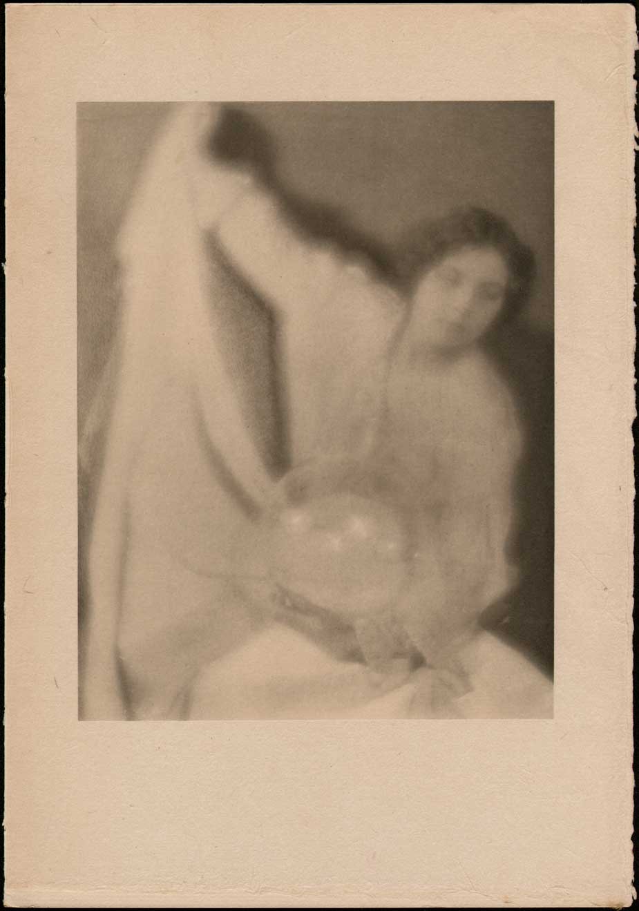
“Experiment 28”: Alfred Stieglitz 1864-1946 & Clarence White 1871-1925, Americans: vintage japanese tissue photogravure published in Camera Work XXVII: 1909: 20.6 x 15.9 | 30.2 x 21.1 cm: In 1907, the year after Clarence White arrived in New York City, he collaborated with Photo-Secession founder Alfred Stieglitz on a series of portraits featuring two models. Shown here holding a glass globe, California model Mabel Cramer poses in a portrait later reproduced as a plate in Camera Work. Said to be a friend of the German American photographer Arnold Genthe and possessing a face worthy of Cleopatra, Cramer and a woman known only as a Miss Thompson, posed for a series of photographs intended to promote photography as an equivalent medium to painting. It was the only time Stieglitz would ever work in tandem with another photographer and shows the extent to which the photographers were allied aesthetically and technically. From: PhotoSeed Archive
Not bad for a man with limited means and a high school education. Employed as a bookkeeper in 1890’s Newark nearly seven days a week for the same wholesale grocery firm his father worked at, (the family had moved there in 1887 from nearby West Carlisle, OH), White first took up amateur photography a year after his 1893 marriage to Jane Felix, with the young photographer diligently saving weekly spare change from his salary for camera and darkroom supplies. Reportedly, his reality of only being able to afford the exposure of several glass plates a week necessitated lots of planning in order to make successful photographs. With outdoor locations previously scouted throughout Licking County and interiors often taken in the darkened homes of family and friends, these same subjects were further cajoled into wearing fashions from the American Civil-War era or earlier in order to evoke feelings of times gone by for the compositions.
Detail: “Portrait of Arthur Wesley Dow”: Clarence H. White, American (1871-1925): vintage waxed platinum print, unmounted: 22.1 x 16.6 cm. From the Princeton University Museum website: “White was hired by Arthur Wesley Dow at Teachers College in 1907 and shared Dow’s philosophy that students of the fine and the applied arts should have the same fundamental training based on design principles (anticipating the approach of the Bauhaus in the 1920s).” from: PhotoSeed Archive
A founding member of the American Photo-Secession movement begun in 1902 by Alfred Stieglitz, White’s transition from Newark to New York City in 1906 began a new chapter of teaching by the photographer, who soon made the acquaintance of artist and arts educator Arthur Wesley Dow, (1857-1922) who hired White as an instructor at Columbia University’s Teachers College in 1907. White would go on to found his own groundbreaking schools of artistic photography utilizing a modern pedagogy learned from Dow among others: first in Maine beginning in 1910 and then in New York City in 1914. Besides emphasizing pictorial photographic technique as well as numerous technical processes as part of the school curriculum, modern composition as espoused by Dow was taught along with art history through lecture format in classes by artists including early American cubist painter Max Weber (1881-1961) and later by artists including Charles James Martin (1886-1955) in the early 1920’s.
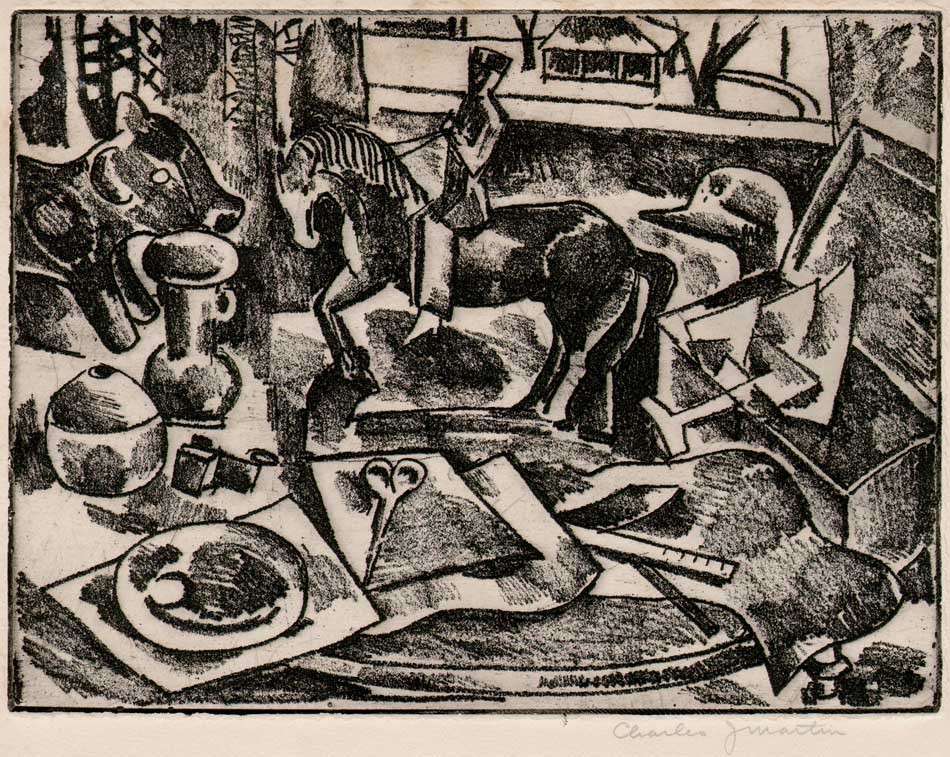
“Interior Composition with Figurines”: Charles James Martin, American (1886-1955): vintage etching on plate paper ca. 1915-20: 15.1 x 20.1 | 18.8 x 24.8 cm (trimmed): Martin studied with Arthur Wesley Dow, and later taught alongside him at Columbia University Teachers College. At TC, he also studied photography with Clarence H. White, and became an instructor at White’s School of Photography in 1918. Martin began teaching at the Art Students League of New York in 1921. The following background on Martin and his involvement with the White school appeared in the February, 1921 issue of “The Touchstone and the American Art Student Magazine”: “The Clarence H. White School of Photography announces a course of instruction in Print Making by Prof. Charles J. Martin of the Department of Fine Arts, Columbia University. The purpose of the course is to develop an appreciation of prints through a study of fine examples and particularly through practice in etching plates, cutting blocks and printing. There will be also an opportunity to do photo-engraving such as the line cut and photogravure. The course will consist of twenty sessions. The earlier sessions are now under way, and the response to this announcement gives evidence that the student of the Photographic Arts is endeavoring to gain practical knowledge as well as artistic reproduction.” p. 406: from: PhotoSeed Archive
At 54, Clarence White died of a heart attack while accompanying photo students during a summer session of his school in Mexico City in 1925. Besides his important contributions as a ground-breaking photographic artist in the late 19th and early 20th century, his legacy as a teacher is perhaps more important as we finally begin to reevaluate his importance in the larger history of early artistic photography. The Princeton exhibition and accompanying monograph-the first truly comprehensive volume on White ever published, will further our understanding and appreciation for this gentleman.
PhotoSeed is honored to have played a small role in the exhibition showcasing Clarence White’s talents at photographic book illustration. A slim volume loaned for the show, Songs of All Seasons, published in 1904 with prose by his uncle Ira Billman and photographs by White, will be included in an exhibit display case. An additional rare illustrated copy of Irving Bacheller’s best-selling novel Eben Holden from 1903, with photogravure plates by White, will also appear after it was acquired by Princeton from this archive. This site further intends to publish additional posts over the next several years chronicling White’s groundbreaking schools of photography as well as other aspects of his early and later life in Newark, OH and New York.
Detail: “Morning”: Clarence H. White, American (1871-1925): 1905: vintage photogravure published in the volume “The Artistic Side of Photography” by A.J. Anderson: London, Stanley Paul & Co., 1910. 11.9 x 9.3 | 22.5 x 15.1 cm. The plate, titled “A Landscape”, from a platinotype in the collection of A.L. Coburn, appears on p. 155. This moody landscape photograph with figure was taken by White on the bluffs in Newark, Ohio overlooking the Licking River, a location that appears in several of the photographer’s compositions. From the Metropolitan Museum of Art Website, which holds an original platinum print dated to 1905 bequeathed by Alfred Stieglitz: “Morning perfectly embodies the tenets of Pictorialism: expressive, rather than narrative or documentary, content; craftsmanship in the execution of the print; and a carefully constructed composition allied to Impressionist and American Tonalist painting and to popular Japanese prints. His photographs from the period before he moved to New York in 1906 signaled a remove from the modern urban world. Neither genre scene nor narrative tableau, this photograph is a retreat into domesticized nature.” From: PhotoSeed Archive
EXHIBITION SCHEDULE: Clarence H. White and His World: The Art and Craft of Photography, 1895-1925
Princeton University Art Museum (10/07/17–01/07/18)
Further link to the exhibit at Princeton
Video: Breaking down photographic processes used by Pictorialist photographers: a collaboration between the Princeton University Art Museum and the Yale Institute for the Preservation of Cultural Heritage.
Davis Museum, Wellesley College (02/13/18–06/10/18)
Portland Museum of Art, Maine (06/22/18–09/16/18)
Cleveland Museum of Art (10/21/18–01/21/19)
Book link:
October 31, 2017 408 pages, 10 x 11 1/2346 color + b/w illus. ISBN: 9780300229080 Hardcover
Distributed for the Princeton University Art Museum
PhotoSeed celebrates the life of one of its profound influences on the recent passing of my father Charles Edward Spencer 1925-2017.
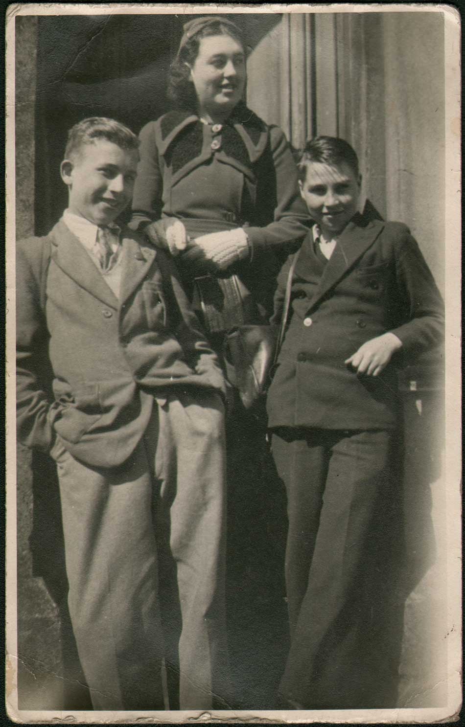
“Charlie Spencer and WWII Classmates” : unknown English photographer: gelatin silver K(odak) Ltd postcard ca. 1940: 13.8 x 8.7 cm : The author’s father, about 15, is seen at far left striking a pose in Workington, on the west coast of Cumbria England (Cumberland county) during the early part of World War II. Born in Holyoke, Massachusetts in 1925 to English parents who sought their fortune in the United States, the American Depression forced the family back to their native Newcastle upon Tyne by 1933. A favored German aerial target during the war because of its important shipbuilding industry, Charlie was evacuated along with over 800,000 English school age children from Newcastle and other large English cities beginning in late 1939 as part of the British government’s Operation Pied Piper, which eventually displaced 3.5 million people in the UK. Late in the war, he returned to Newcastle, (Benwell) reuniting with his parents Charles and Jane (Garland) Spencer and graduating there from Atkinson Road Technical School. An American by birth, he soon found himself serving in the U.S. Army of Occupation in Germany, where he was a reporter for the Stars and Stripes newspaper among other duties. His first eight years in America had certainly made an impression however, and he returned to the states for good in early 1949 aboard the troop ship USNS General Maurice Rose. Settling in the greater Bridgeport, CT area, he went on to become an advertising and sales promotion specialist for the General Electric Company in their small appliance division for fifteen years and later in the same capacity with other business ventures in CT. Married 61 years to Ann, he passed away in September, 2017. Note: girl in photograph is daughter from Workington family with whom Charlie stayed with during his billet. After Workington, he was billeted with another family in Siddick England. From: Authors personal family archive.
The call would come, I had convinced myself, for years. But it waited patiently. I reassured myself I was prepared, but for naught. When it did, from my brother Will, it was from his childhood voice over 50 years gone: punctuating his cries through the distance, he gasped for breath: “Dad did not wake up” he somehow forced through his cracking voice, cries and tears. My own response immediate: a shuddering to my core equal to his-helpless feelings not revisited since my toddler days-cries my father was now unable to comfort as he did throughout my entire life the finality of it all.
But goodness had shined its light, in this most profound form of sudden loss: my dad was now truly free of any miseries real for him in the physical present, and ones our family perceived in him during his long and noticeable decline. Vanquished. He was now free, and on his journey to the beautiful beyond.
David Spencer-