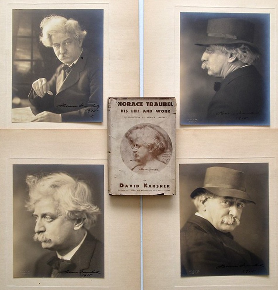
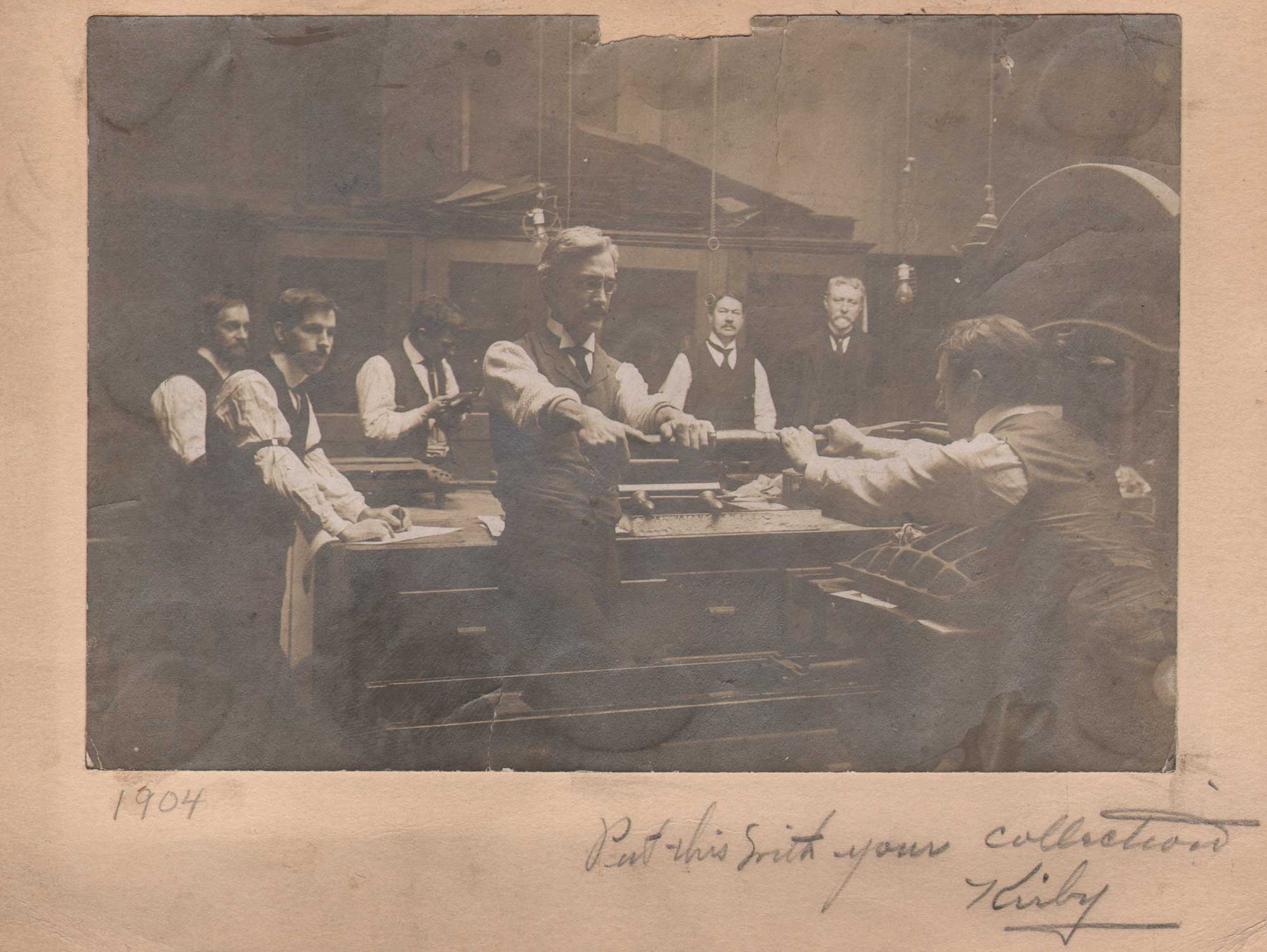
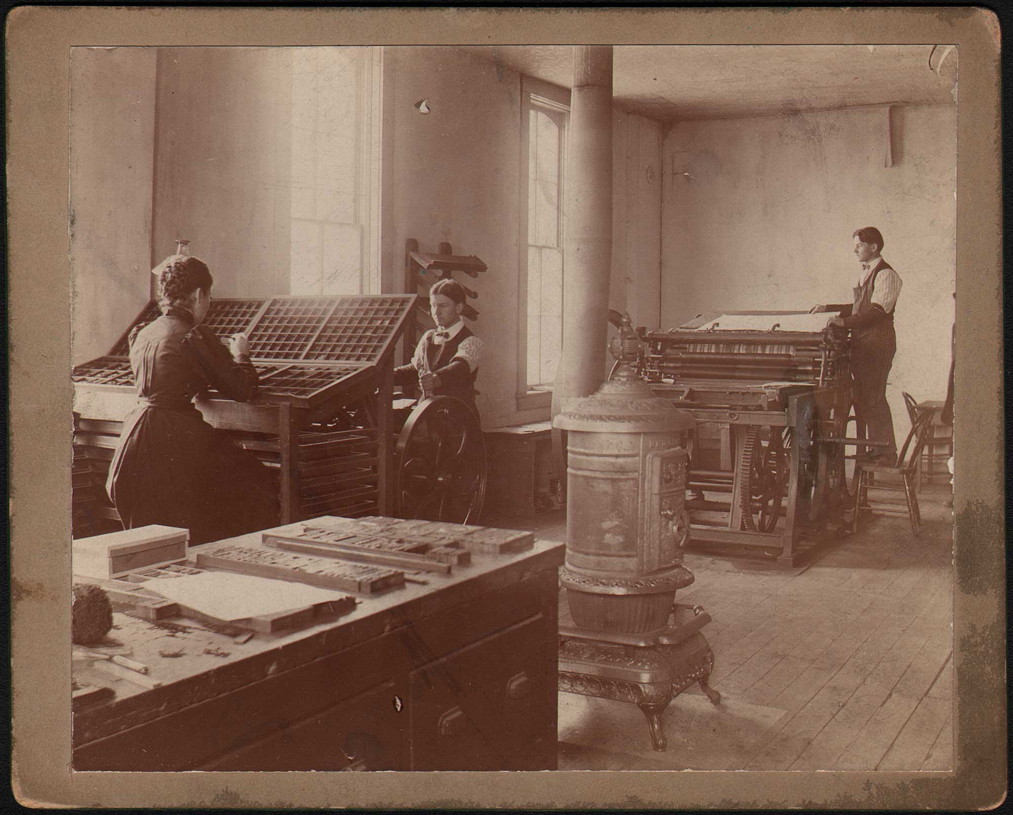
“Put this with your Collection ⎯Kirby”, 1904, unknown American photographer, mounted gelatin silver print on card, 11.1 x 16.1 | 16.1 x 20.4 cm. Two men at foreground right work as a team while operating a Washington style, iron hand letterpress in an unknown American printing shop. Featuring an “acorn” style frame armature and large honeycomb-style platen which was lowered by a toggle gear activated by the lever, shop employees look on during a printing session in background. The site Letterpress Commons states: “The Washington Press was by far the most popular iron hand press in America, a position it held from the 1820s until the end of the hand press era. The press was invented during the 1820s by Samuel Rust, a New York printer nearly unknown today.” The distinctive platen may indicate this press dates to the 1890s, possibly manufactured by the Chicago’s Ostrander-Seymour Company. From: PhotoSeed Archive
Unconsciously, we’re all born into the world leaving remnants of ourselves as we travel through it: our fingerprints in things we touch and footprints on the paths of our travels. Technically, those remnants, via bodily oils from our fingers and tracks from our shoes, are unconscious ephemeral examples of letterpress impressions. But from a machine perspective, print itself: letterpress impressions on paper emanating from Johannes Gutenberg’s (c. 1400-1468) mid-15th century invention of the printing press which lasted until (photo) offset printing largely supplanted it in the mid 20th Century, forms an indelible record of the achievements of human history accurately recorded.
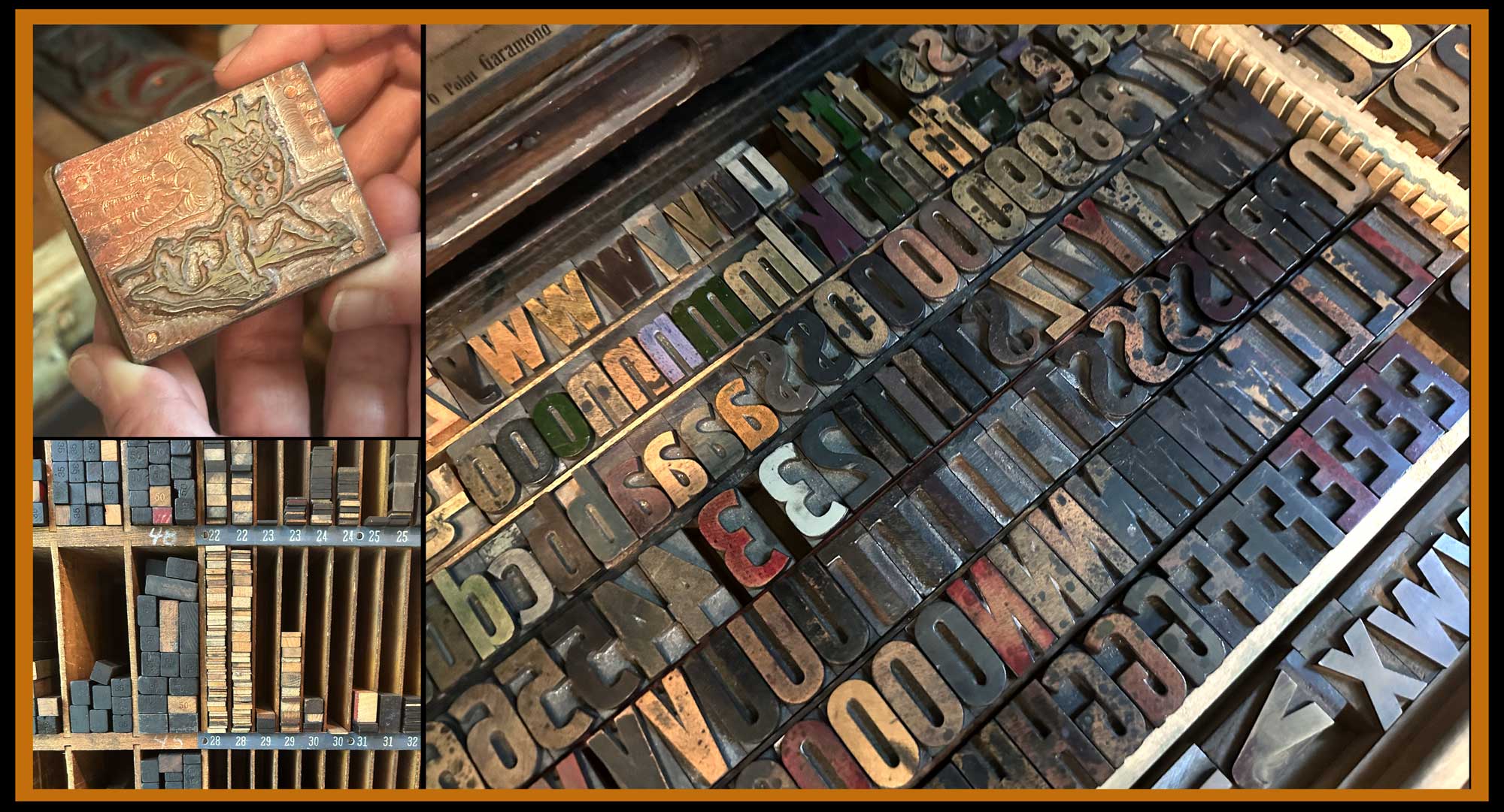
Right: At Igloo Letterpress in Worthington, OH, a large assortment of individual letters, made from oversized wood and metal type, await ink and new projects while stored in a print studio drawer. UL: owner Allison Chapman holds one of the very first antique metal design cuts she printed: a baby whose crown spells out Happy Birthday. LL: letterpress “furniture” is stored by size. These individual pieces of wood (or metal) are used to fill up spaces and lock up type within a metal frame, or chase, before printing. Photographed Summer, 2025 by David Spencer for PhotoSeed Archive.
Today’s post is divergent from the sites primary focus of historical photography but entirely symbiotic in that the art and craft of letterpress printing derives from the perfect marriage of words and pictures, otherwise known as type and design. Although modern and even historical photographs and images printed in ink: think lithographs, ink-jet prints, newspaper photos and others are by the planographic process, intaglio printed images (copper plate engravings, gravures, etchings, etc.) are from recessed printing matrixes. Letterpress printing by itself is a relief process.
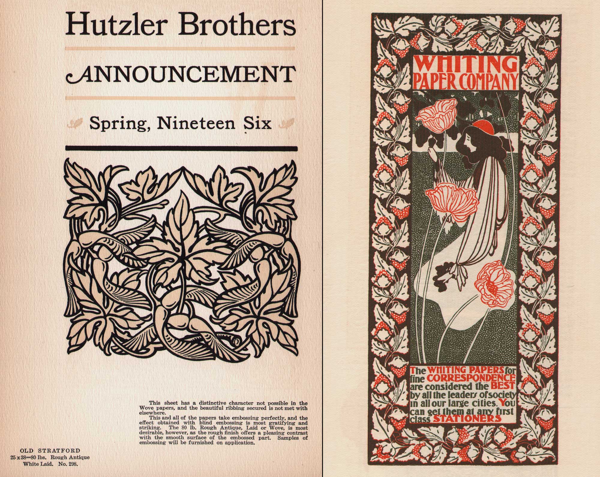
Beautiful papers for Letterpress: Left: page from 1906 promotional volume “The Strathmore Quality Deckle Edge Book Papers”, 23.5 x 15.5 cm published by The Mittineague Paper Company, which became the Strathmore Paper Company in 1914, a company still in business today. Page features letterpress design most likely by Will Bradley for Hutzler Brothers, a department store in Baltimore. It’s printed on antique “Old Stratford” laid paper: “This sheet has a distinctive character not possible in the Wove papers, and the beautiful ribbing secured is not met with elsewhere.” Right: “The Acorns”, 19.0 x 8.0 | 25.8 x 12.9 cm, 1896, Will H. Bradley (1868-1962), American. Originally issued as a lithographic poster by the artist, its been repurposed here as a full-page letterpress advertisement for the Whiting Paper Company in the first issue of Bradley His Book, published in 1896. In the 1987 volume “American Art Posters of the 1890s, in The Metropolitan Museum of Art” the work is described: “The small poster had nothing to do with paper in the literal sense; it showed only an Art Nouveau design of a woman with poppies within a border of oak leaves and acorns. But it implied that the fine quality of Whiting paper was essential for fine printing.” The Whiting Company owned a paper mill in Holyoke, Ma, known as “Paper City”. From: PhotoSeed Archive
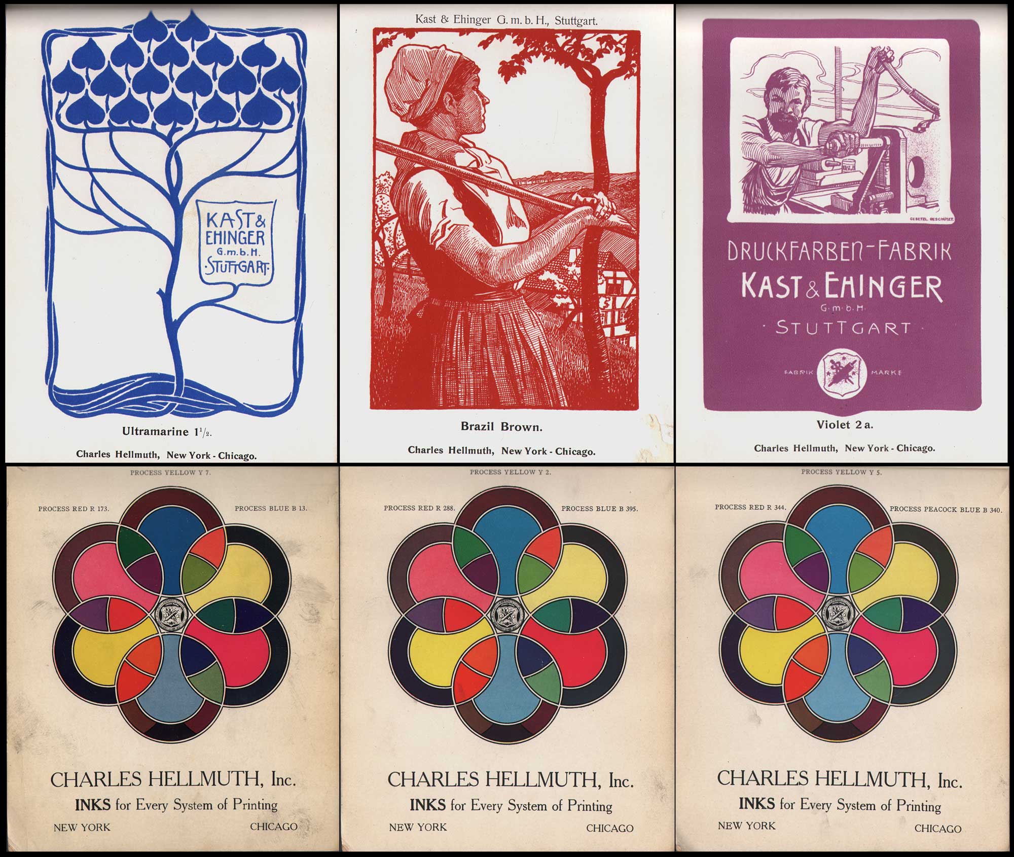
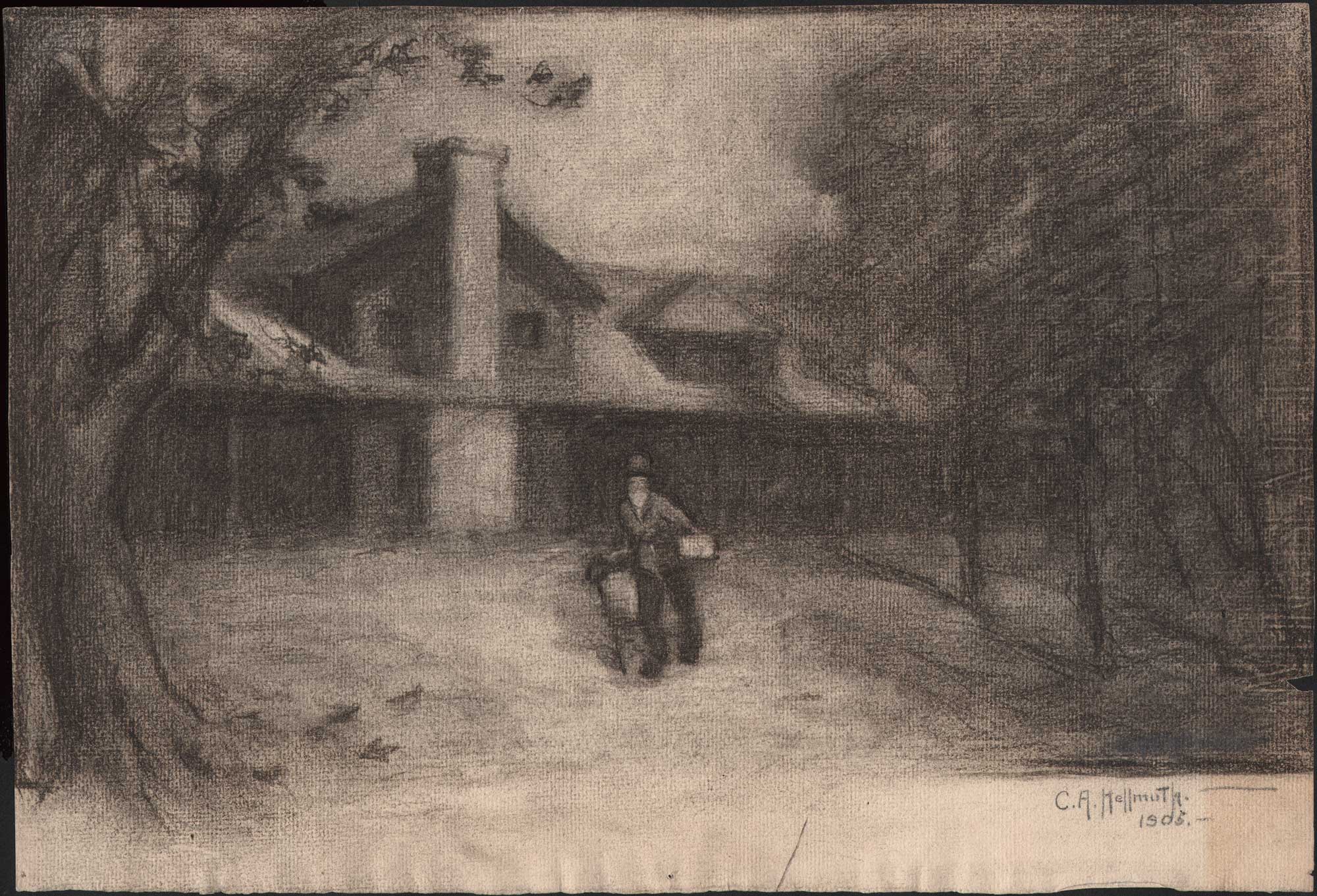
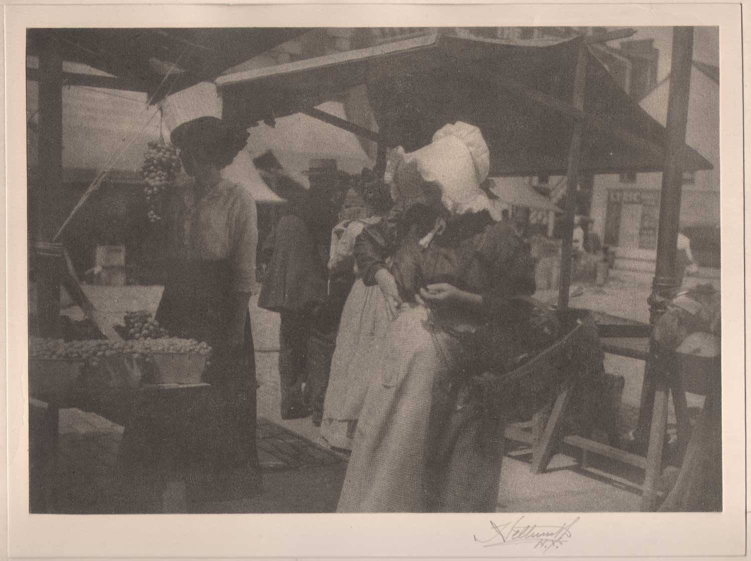
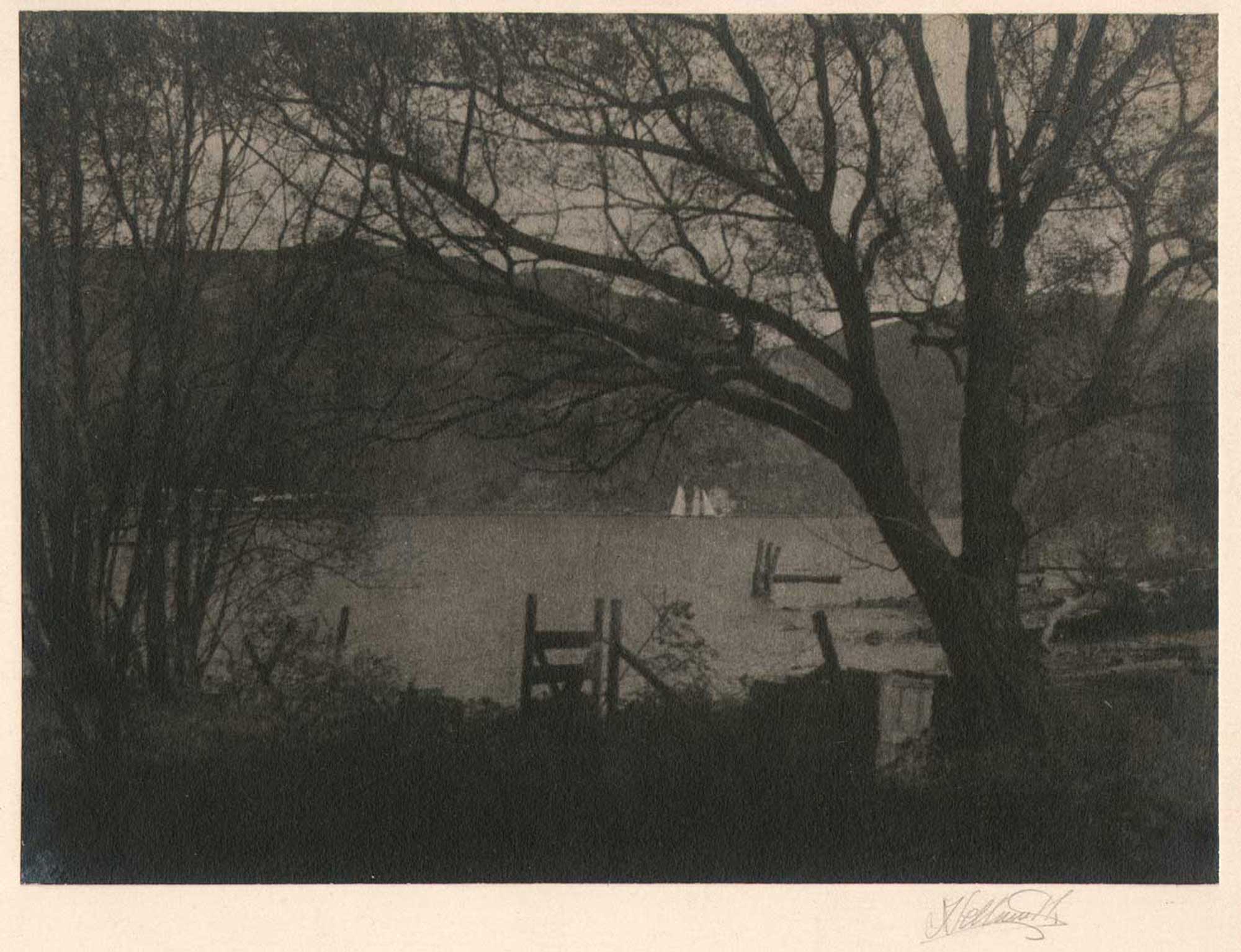
Top Row: Inks for Letterpress & Lithography: Art-Nouveau woodcut designs by Hellmut Eichrodt, 1872-1943, German, ca. 1910. Printed in one color, they were designed as posters for the Stuttgart-based Kast & Ehinger ink manufacturers around 1900 and repurposed as advertisements for Charles Hellmuth, New York & Chicago, the US division for this German company. From a rare 80 pp. color ink swatch book marketed to book publishing (letterpress) and lithography firms. L-M-R: Ultramarine 1½, Brazil Brown, Violet 2 a. Bottom Row: Color wheel page advertisements showing Kast & Ehinger ink shades manufactured by Charles Hellmuth Inc. “Inks for Every System of Printing”. From a Charles Hellmuth Inc. Process Inks catalogue ca. 1906, the year the firm built a factory at 154 W. 18th St. in New York City. Charles Hellmuth the trade name was believed to have been named after a bookkeeper at Stuttgart-based Kast & Ehinger ink manufacturers, first opened in 1865. (14to42.net) The New York division opened around 1892 in New York and Chicago as early as 1901. During WWI, their assets were seized by the US Government, later reorganizing as Sleight and Hellmuth. It vacated the 18th St. location in 1973, and went out of business around 1980. From: PhotoSeed Archive
When I look back at my own professional arc of newspaper photojournalist and now historian and collector—a fortunate byproduct of being someone “of a certain age”—one vivid childhood memory still springs forth from my past leading me to believe my life would be informed by a bit of pre-destiny. This took the form of my ten-year-old self accompanying my mother on an appointment to collect a print order of musical programs for a club she was involved in. The rendezvous point was a small print shop located in the basement of a Connecticut suburban home the next town over. It was there when I experienced for the first time the wondrous smell of pungent ink and sounds of what I now surmise was a vintage Heidleberg Platen Press clacking away, puncturing the darkness and triggering my wonderment in that dimly lit basement so many years ago.
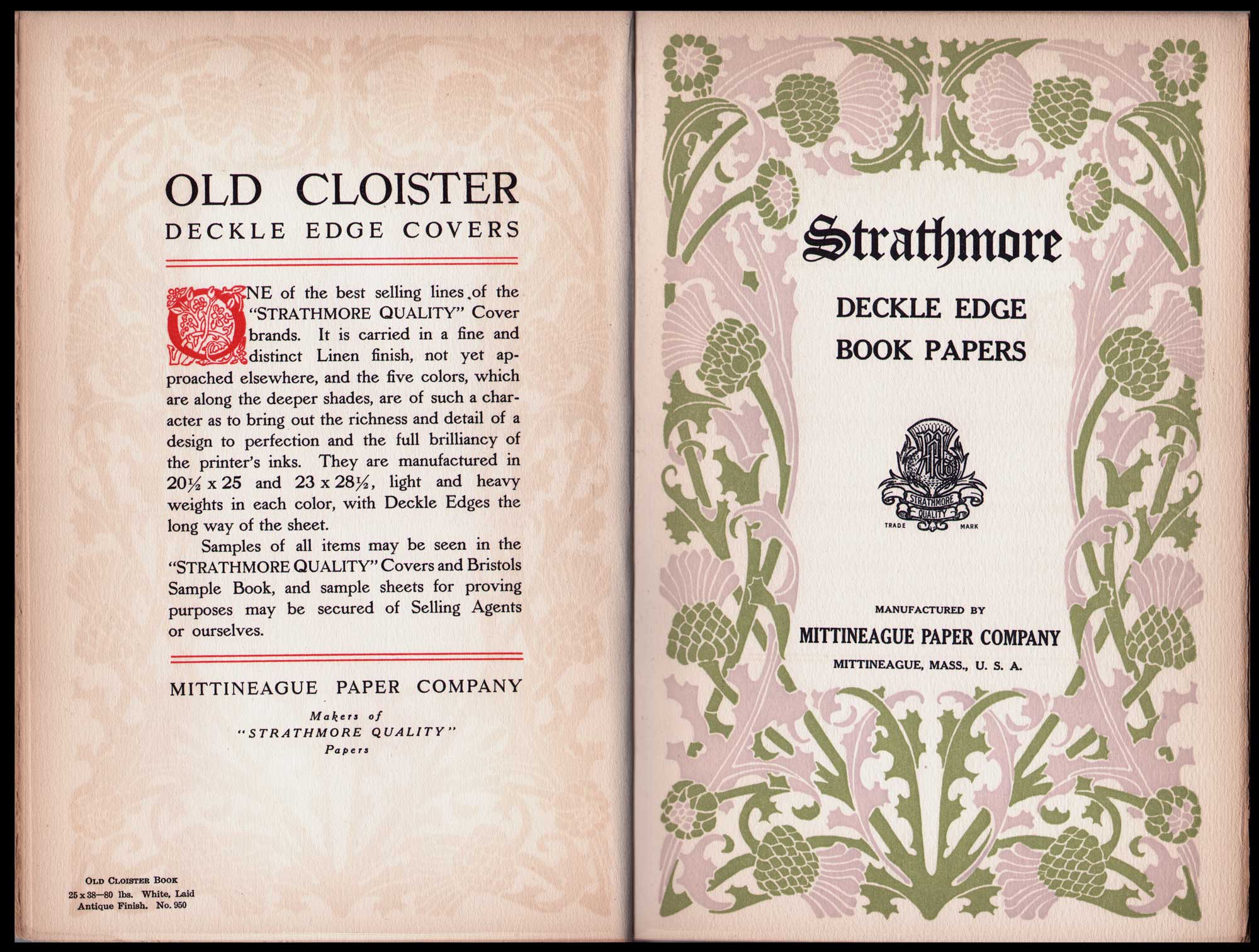
More beautiful papers for Letterpress: two-page-spread from 1906 promotional volume “The Strathmore Quality Deckle Edge Book Papers”, raised capitol and thistle design by Will H. Bradley (1868-1962), American, each page: 23.5 x 15.5 cm. Published by The Mittineague Paper Company, which became the Strathmore Paper Company in 1914, this company is still in business today. Check out this film “Making High-Grade Paper” released by Strathmore in 1914. Left: page printed on Old Cloister Book laid paper in Antique Finish: “It is carried in a fine and distinct Linen finish, not yet approached elsewhere, and the five colors, which are along the deeper shades, are of such a character as to bring out the richness and detail of a design to perfection and the full brilliancy of the printer’s inks.” Right: Bradley’s border design features thistles which company founder Horace Moses saw blooming in the Valley of Strathmore in Scotland around the time he opened the Mittineague mill in 1892. He used the thistle as symbol for the firm and Strathmore name to denote the quality art and printing papers they manufactured. From: PhotoSeed Archive
“The First Print Shop”, c. 1885-90, unknown American photographer, gelatin silver print mounted on card, 9.7 x 11.9 | 10.7 x 13.2 cm. All the elements of an early American letterpress print shop come together in this historical photograph that may originate from the greater Denver, Colorado area, where it was purchased. The three employees in the photo are identified on card verso: “Harve (?) at the big press. Harry at the job press. Allie setting type. The first print shop.” The larger flatbed cylinder press at far right appears smaller than the Cottrell press in this post, while at center, the platen jobber style press is similar to the Ben Franklin Gordon jobber, seen below in this post. The Museum of Printing explains “the American platen jobber derives from that of Stephen P. Ruggles of Boston in the 1840s, in which platen and bed were hinged below their lower edges to close on each other in clamshell fashion.” This may very well be a small newspaper printing office: notice the arranged lines of type set out on the table at foreground left, in proximity to “Allie” who selects metal type by hand in the compartmentalized cases set before her. This type would then be locked up within metal chases before being placed on the press for printing. From: PhotoSeed Archive
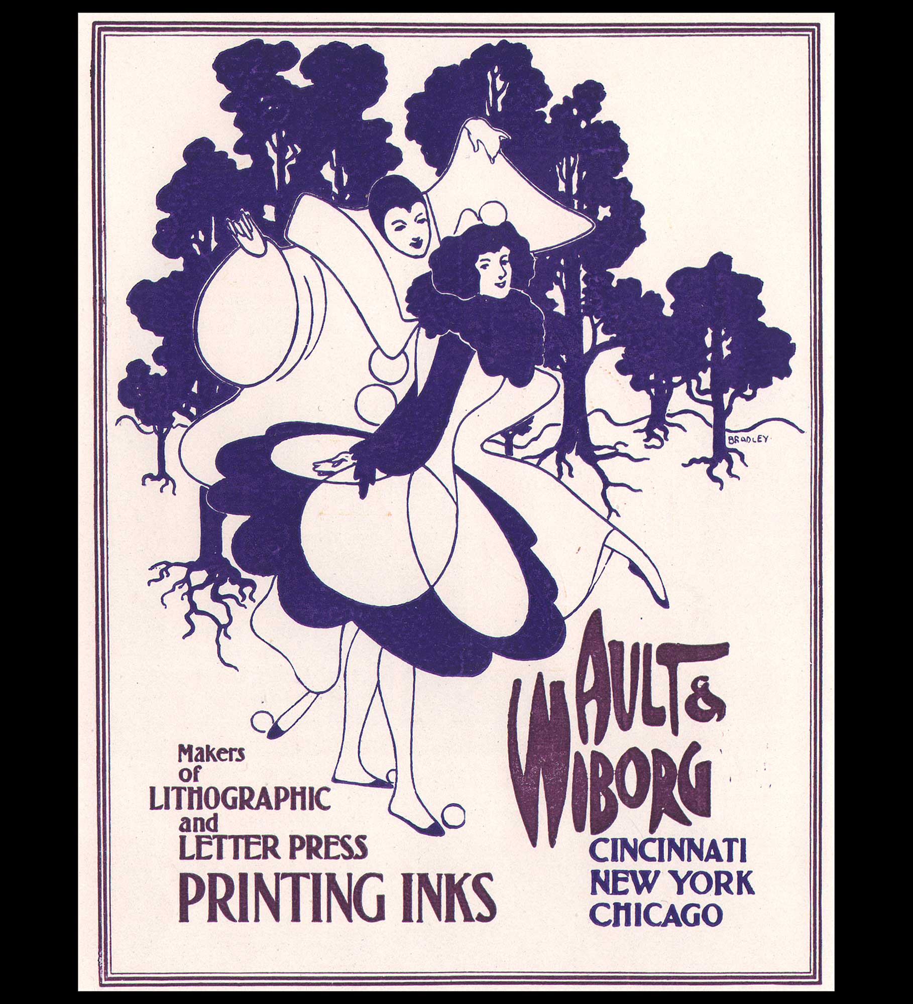
“Ault & Wiborg, Makers of Lithographic and Letter Press Printing Inks”, 1896, Will H. Bradley (1868-1962), American, letterpress printed advertisement 13.4 x 10.1 cm, coated paper. This poster design by Will Bradley features a Pierrot character he would rework in successive designs. Printed in two ink colors, it was published in the first issue (May, 1896) of Bradley His Book. Ad copy: “The Ault & Wiborg Inks sell on their merits. Letterpress, Steelplate, Copperplate and Lithographers’ Inks. Unequalled in Quality. Possessing the Largest and Most Complete Printing Ink Works in America, Ault & Wiborg give the Most Careful Attention to the Requirements of the Trade, and their superb Equipment enables them to best fill the wants of Ink Consumers in every department of the Graphic Arts.” From the Gordon A. Pfeiffer Collection at the University of Delaware: “The Ault & Wiborg Company was a manufacturer of printing inks based in Cincinnati, Ohio. They engaged Will Bradley to create his first advertisement for the company in April 1895.” From: PhotoSeed Archive
A good working definition of Letterpress can be found in the 2008 volume The Printed Picture by Richard Benson, (1943-2017) American photographer, printer, educator and dean of the Yale School of Art from 1996 to 2006:
Letterpress: “Relief printing from metal type and image-bearing halftone cuts in copper or zinc. Also the actual press used for relief printing.” (1.)
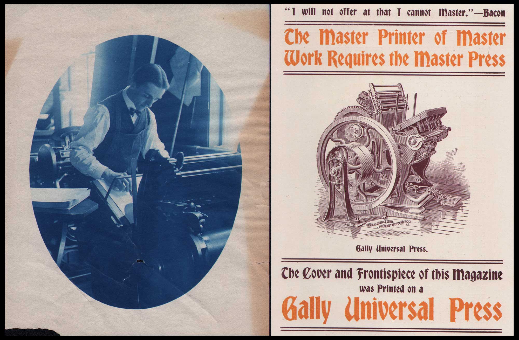
Revolution in Letterpresses: Letterpress printing came into its own with the invention of the platen style press which spead up the printing process. Also called a jobbing press, “A platen press is one that has a platen (a flat metal plate) to apply the needed pressure against the paper and bed of type to form the impression”. Left: American printer Charles Edward Bittinger, 1874–1956, operates a platen press at his family’s business, The Cohos Steam Press in Woodsville, N.H. ca. 1895-1900. Vintage cyanotype print, 10.3 x 8.0 | 12.5 x 10.0 cm. The Bittinger family also published the Weekly News beginning in 1890, a merging of the Woodsville Enterprise and The Grafton County Register newspapers. Right: An advertisement for the Gally Universal Press, a platen press invented by Merrit Gally in 1869, in Bradley His Book, May, 1896. The ad was for the American Type Founders’ Co., a trust and general selling agents for the Gally whom Bradley promoted and had designed type fonts for. The Cary Graphic Arts Collection at Rochester Institute of Technology describes the Universal as “the first of its type of press, having a stationary bed and a platen that rolled to a vertical position before gliding forward so that right before the impression, the platen was parallel to the bed and moved perpendicularly towards it.” Bittinger may also be operating a Colt’s Armory Press, a variation of the Gally Universal and subject of a fascinating rivalry. From: PhotoSeed Archive
Technically, the foundational Relief process is best defined as “printing from the high parts”, with Wikipedia summarizing: “The non-recessed surface will leave ink on the paper, whereas the recessed areas will not.”
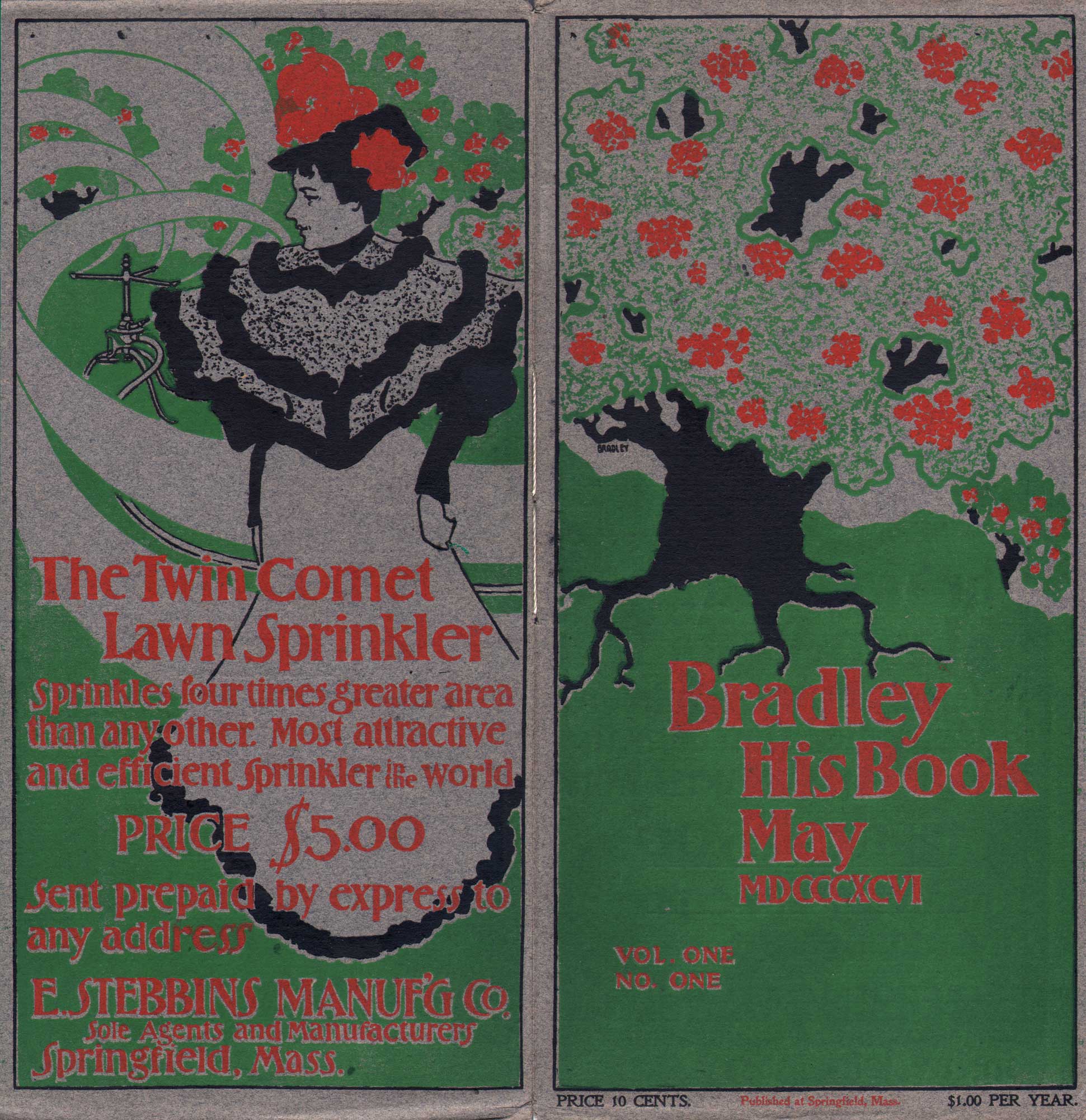
Front and rear covers: Bradley His Book, May, 1896, letterpress printed in three colors, Will H. Bradley (1868-1962), American, 26.7 x 25.7 cm, (opened) Strathmore Deckle Edge Buff Cover. There were 10,000 copies of this first issue sold out before being published, with the front and rear covers printed on a single sheet of grey paper by a Gally Universal platen press, indicated later in the issue. On the front, the design of a large tree with clusters of red flowers blends into the rear cover advertisement, where a woman in fancy dress is seemingly swept up within swirling lines made by the revolving arms of the Twin Comet Lawn Sprinkler for sale by the E. Stebbins Manufacturing Co. of Springfield: “Sprinkles four times greater area than any other. Most attractive and efficient sprinkler in the world Price $5.00”. The slim periodical was written, designed and printed by Bradley at his Wayside Press in Springfield, MA., with his aim to “produce work that was “attractive and out of the ordinary.” From: PhotoSeed Archive
Let me tell you, those “high parts”, inked on paper, are a joy to behold, especially as ornament and text, the aforementioned “perfect marriage” within volumes I’ve collected over the years featuring (intaglio) photographic plates from the mediums artistic era spanning the late 1880s through the first several decades of the 20th century. But let’s skip ahead hundreds of years from Gutenberg’s era to the late 19th Century, when newly formed arts & craft societies in Europe and America made a new argument that hand-crafted work was far superior to the dreck of mass consumer products that were the output of the Industrial Revolution. As a collector interested in beautiful photography and design, the material output from this era is particularly satisfying to procure and reflective of the era in which it was made.
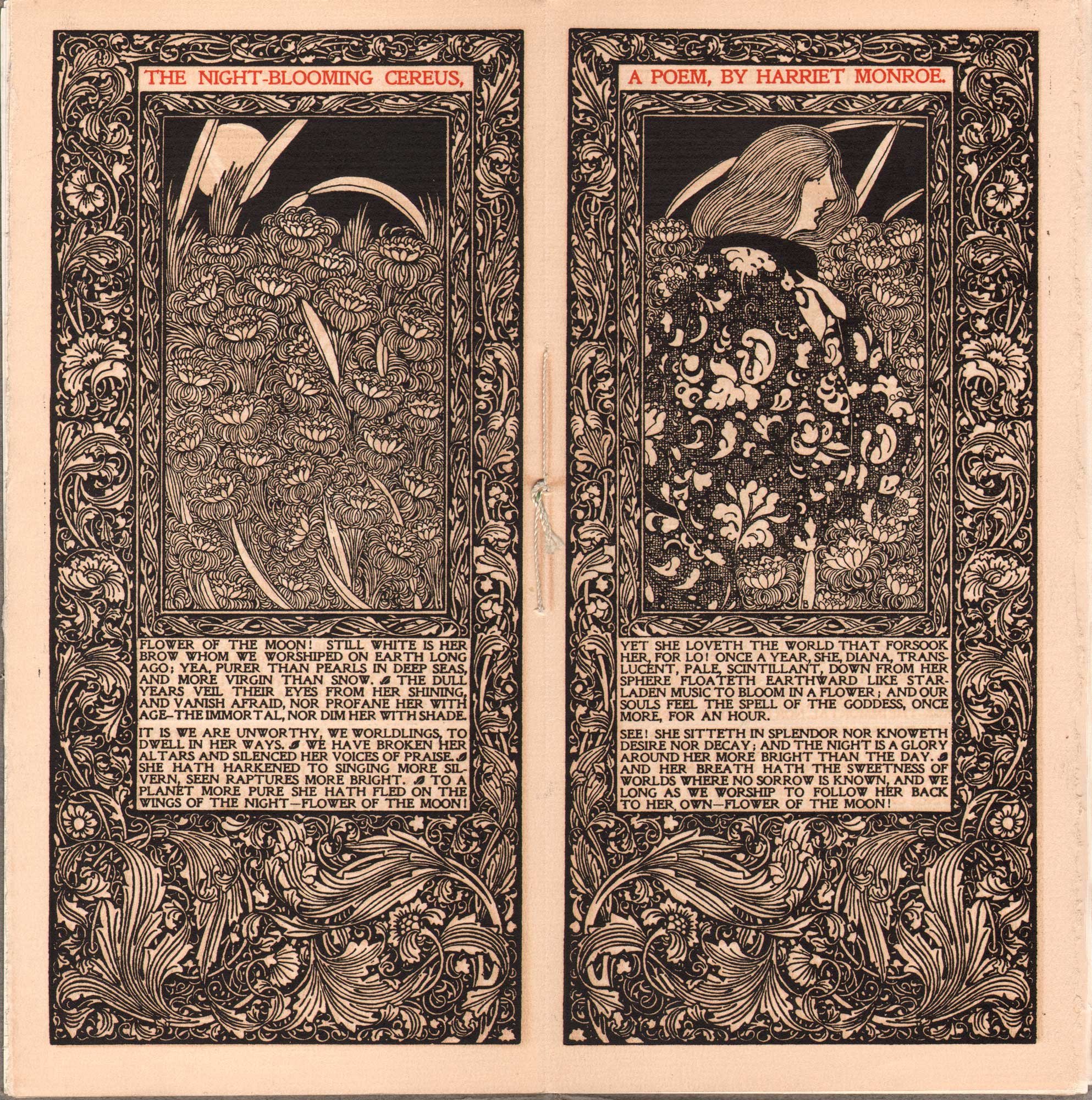
Kelmscott Press inspired Masterwork, printed by Letterpress: “The Night-Blooming Cereus, A Poem, By Harriet Monroe”, Will H. Bradley (1868-1962), 1896, American, center-spread: Bradley His Book, letterpress printed in black ink with rubricated title, Strathmore deckle edge paper, 25.7 x 25.1 cm. Unlike the original Kelmscott Press illustrations by William Morris and his circle, photographically transferred onto woodblocks and then engraved by hand before printed on a letterpress, this original artwork by Bradley, drawn on paper, was first photo-engraved and then electrotyped on metal by the Phelps Publishing Company of Springfield, MA before printing. In her 2018 volume American Little Magazines of the Fin de Siecle, Kirsten MacLeod writes Bradley His Book “was also a vehicle for his own work, which included elaborate illustrations and decorations for the literary and artistic content, such as his black-and-white Kelmscott-inspired design for Harriet Monroe’s poem, “The Night-Blooming Cereus” …”In many respects, however, Bradley’s greatest artistic achievement was his conception of Bradley His Book as a print gesamtkunstwerk (total work). He oversaw every aspect of the magazine’s design and production and each issue was a unique work of art in itself.” American poet Harriet Monroe, 1860-1936, was founder and editor of Poetry: A Magazine of Verse, “who became instrumental in the “poetry renaissance” of the early twentieth century by managing a forum that allowed poets and poetry to gain American exposure.”(PoeMine online) From: PhotoSeed Archive
Consider the first issue of an 1896 masterwork: Bradley His Book, with several pages scanned to accompany this post. This slim periodical was American artist and illustrator Will Bradley’s (1868-1962) art-nouveau letterpress-printed love affair “dedicated to the promotion of fine typography, design, paper, and printing”. (2.) The underpinnings for this new approach was inspired by some of the new thinking on art proposed by Oscar Wilde and his circle as well as ideas of social and design reform propagated by John Ruskin in England. When English textile designer, poet, artist, writer, and socialist activist William Morris (1834-1896) launched his Kelmscott Press in early 1891, the resulting volumes featuring this new era in design inspired Bradley. The proverbial torch passed, Bradley His Book was published the same year Morris died, and was:
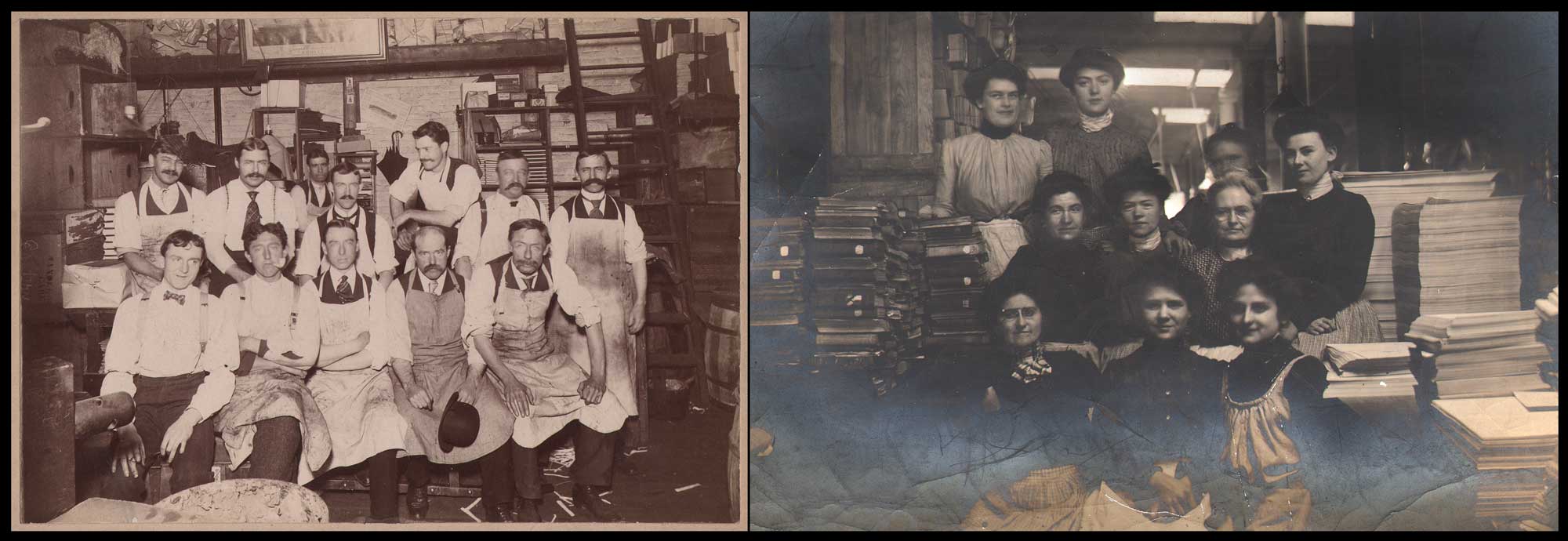
Economic Force: The Golden Age for Letterpress: By the end of the 19th Century, rapid improvements to the speed of cylinder letterpresses first developed earlier in the Century by electrification augmented with platen presses which enabled the printing of newspapers and books faster and more efficiently. One company that became a giant in the New England area was Boston’s H.M. Plimpton Company. Originally a bookbinding and printing firm founded by Herbert Mosley Plimpton (1859-1948) in 1888, it expanded, moving to Norwood, MA in 1897 where it became the Plimpton Press. Plimpton learned his trade in 1878 in New York City, where he gained “experience with typesetting and using a printing press”. By the 1920s, the firm, with all aspects of book production and publishing done in a series of massive buildings on its Norwood campus employed 1025 workers and produced 50,000 books a day, and closed in 1973. Left: “Men of the H.M. Plimpton Co., Hecht Building, Boston”, 1903, Commercial Photo Co., Boston, mounted gelatin silver print, 12.8 x 18.2 | 18.3 x 24.3 cm. Twelve men sit for a group portrait, with a notation on the card verso they worked in the “Extra Bindery”, a deluxe hand bindery founded in 1892 that moved to Norwood in 1905. Right: “Plimpton Girls in the Boston Shop- Hecht Building”, 1903, Arthur Hill, (Plimpton employee) unmounted gelatin silver print in masked frame, 12.6 x 17.6 cm. These women also worked in the “Extra Bindery”, although their duties perhaps extended to other jobs such as packaging and shipment of finished books. Notice the large reams of paper piled at right side of frame. Historical Note: from 1911-1930, the Plimpton Press printed the individual book and portfolio letterpress for volumes VI -XX of The North American Indian, the photographic masterwork by Edward Sheriff Curtis. From: PhotoSeed Archive
“distinguished by the outstanding decorative illustrations that enriched the text and advertisements. Bradley himself wrote several short stories for the magazine, again following the example set by William Morris, who once said, “If a chap can’t compose an epic poem while he’s weaving tapestry he had better shut up; he’ll never do any good at all.” (3.)
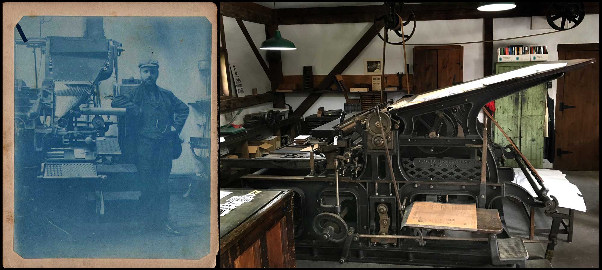
Letterpress Advances in Typesetting & Printing: Left: “Man Standing Next to Linotype Machine”: unknown American photographer: cyanotype: ca. 1895-1905: 11.9 x 9.6 | 13.2 x 10.6 cm. The mass commercialization of letterpress printing in the form of newspapers, magazines and book publishing (Bibles and textbooks in particular) began in earnest in the late 19th Century with the 1884 invention of the Linotype machine by German immigrant Ottmar Mergenthaler. (1854-1899) From: PhotoSeed Archive. Right: “Cottrell Flatbed Cylinder Press, 1871” This letterpress was manufactured in New York by C.B. Cottrell & Sons sometime after 1880 when the partnership was formed. (Calvert Byron Cottrell: 1821-1893) Its displayed in the Print shop at the Shelburne Museum in VT and described: “cylinder presses such as this Cottrell were extensively used by printers from the 1860s well into the 20th century. The large sheet capacity and printing speeds up to 1600 impressions per hour made them ideally suited for book and newspaper work.” The placard noted this press was used by the Democratic Press Company of Concord, NH for newspaper printing until 1897 and then sold to the Hardwick Publishing Co. of Vermont to print the Hardwick Gazette until it was finally retired in 1972. Photo by David Spencer for PhotoSeed Archive
Letterpress as Living History
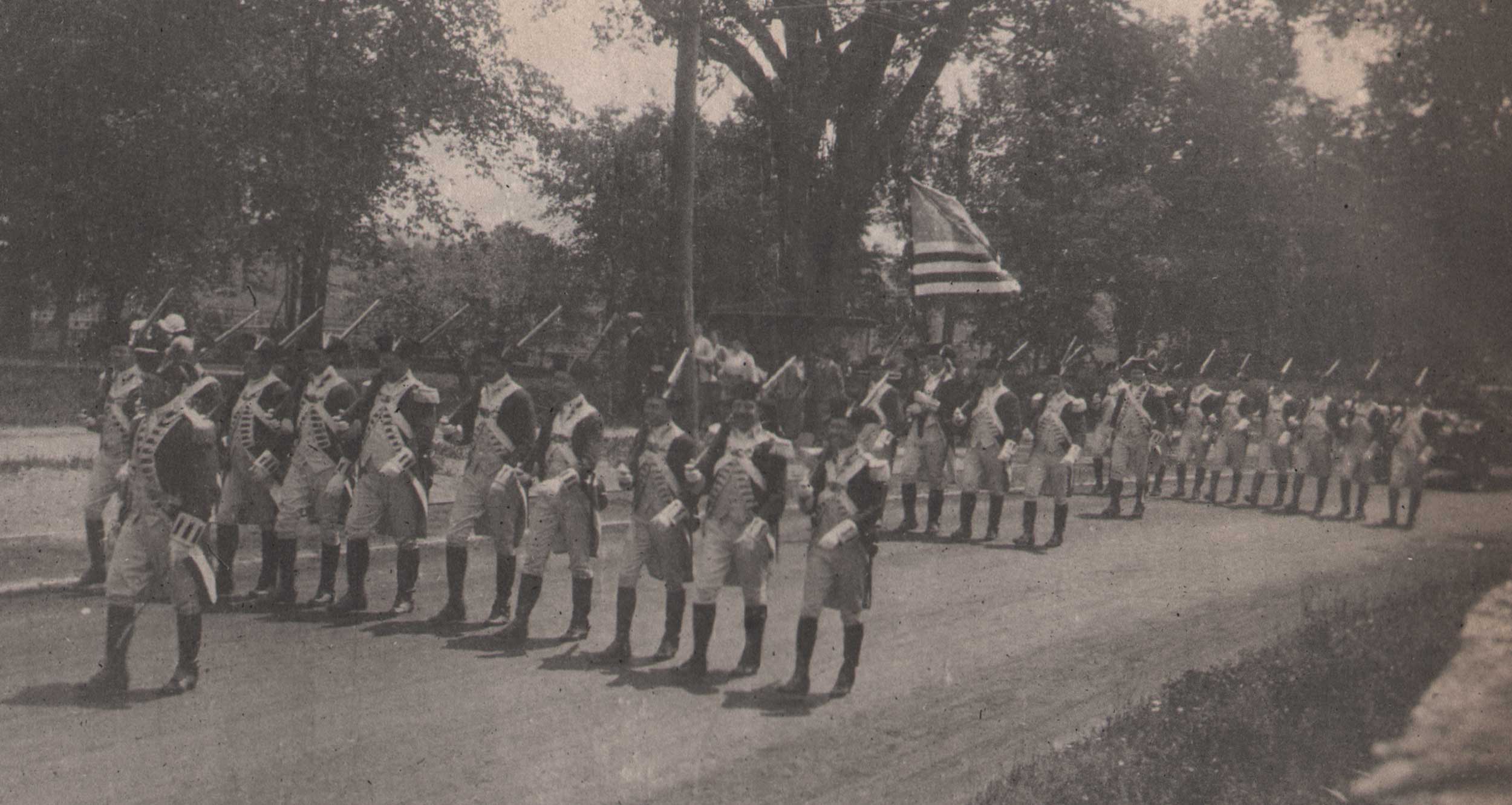
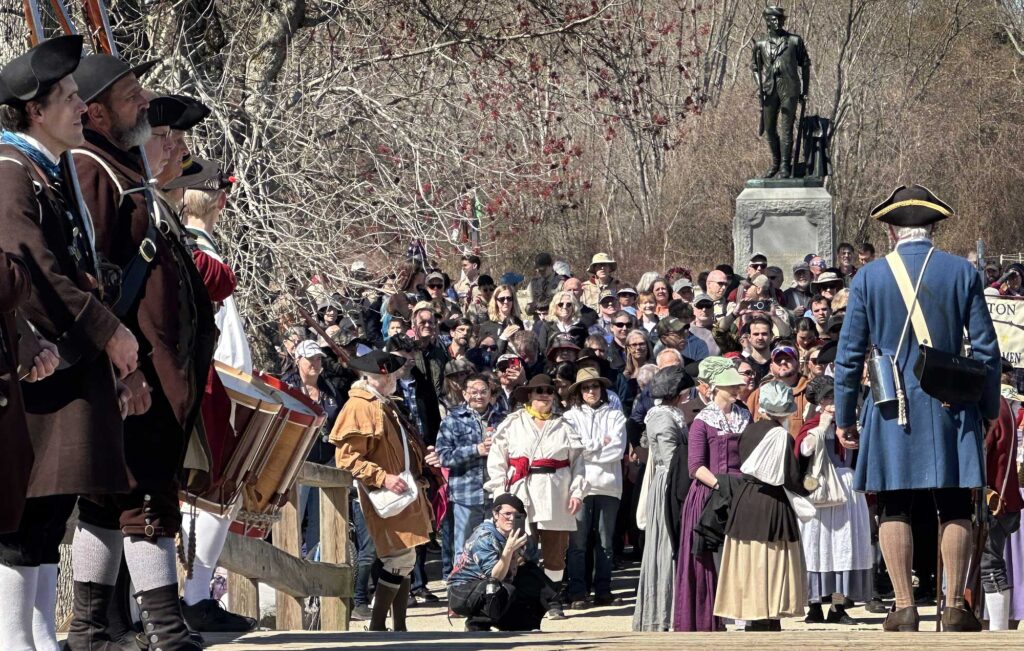
At least in America, should we care enough or have reason to experience firsthand places bringing the past alive, we can find instances of historical letterpress printing. Think Colonial Williamsburg, VA, Old Sturbridge Village in MA or the Shelburne Museum in VT. Here are places where a shop (many also dimly lighted!) oftentimes feature a vintage iron hand press. (letterpress) Invariably, these places might impart an American history lesson for tourists looking on, with a resident reenactor recalling American founding father and printer Benjamin Franklin’s role in publishing The Pennsylvania Gazette beginning in 1729. A newspaper man dear to my own heart, Franklin’s broadsheet promoted lively public discourse at the time—one of the factors leading to the eventual overthrow of the English King who ruled the American colonies—and with it, the founding of the United States which became a Constitutional Republic with Democracy as its backbone: something we do hope endures as I write this in the turbulent present. How’s that for the power and importance of letterpress?
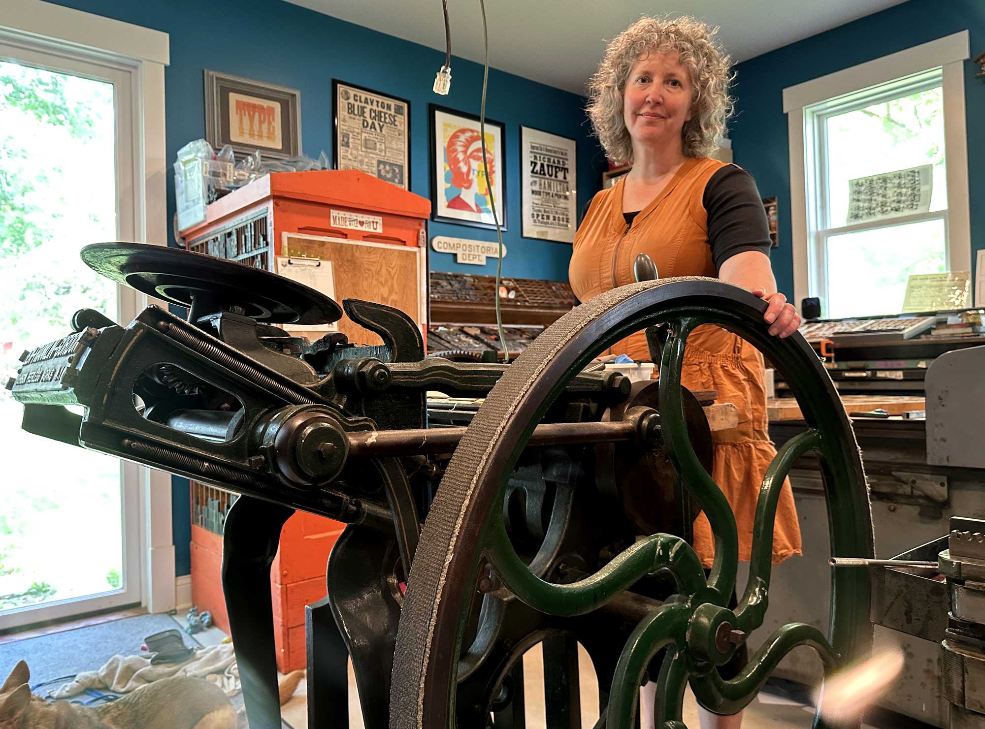
Allison Chapman, along with husband John and daughter Ava, run Igloo Letterpress from their home studio in Worthington, OH. Its been an active venture fueled by some well loved vintage presses like this flywheel-powered Ben Franklin Gordon jobber press since 1996. When new, this platen-style letterpress with its “clam-shell” mechanism- used for smaller print jobs- was advertised in the pages of the June, 1891 Inland Printer and was described: “Is The Very Best Old Style Gordon Ever Built by Anybody”. Letterpresses like this one were named after George Phineas Gordon, (1810-1878) an American inventor, printer and businessman who developed the basic design of the most common printing press ever, the Gordon Letterpress. Photo taken 2025 by David Spencer for PhotoSeed Archive
Papermaking & Typography
With apologies to Bradley and the rest, the Industrial Revolution in America was key in producing the matrix for letterpress: paper, and in huge amounts. I live in New England and specifically Massachusetts, where the remains of hulking mill buildings can still be found most everywhere, but particularly alongside rivers, where they drew their power. Many have fallen to the wrecking ball, but in present-day Holyoke, MA, some of those buildings that were part of the 25 companies producing paper during the late 19th and early 20th centuries still stand: some vacant but others repurposed.
Known as “Paper City”, Holyoke would surpass even Berkshire county in Massachusetts, which was the largest producer of paper in the US through the Civil War. An interesting tidbit? Berkshire-based Crane Currency in Dalton, MA, initially founded by Zenas Crane (1777–1845) in 1801, is still in business today, continuing to provide the U.S. Bureau of Engraving and Printing with specialized paper for U.S. currency since 1879. Another later figure to explore in the arts & craft aesthetic: Dard Hunter, 1883-1966: “American authority on printing, paper, and paper making, especially by hand, using sixteenth-century tools and techniques.”
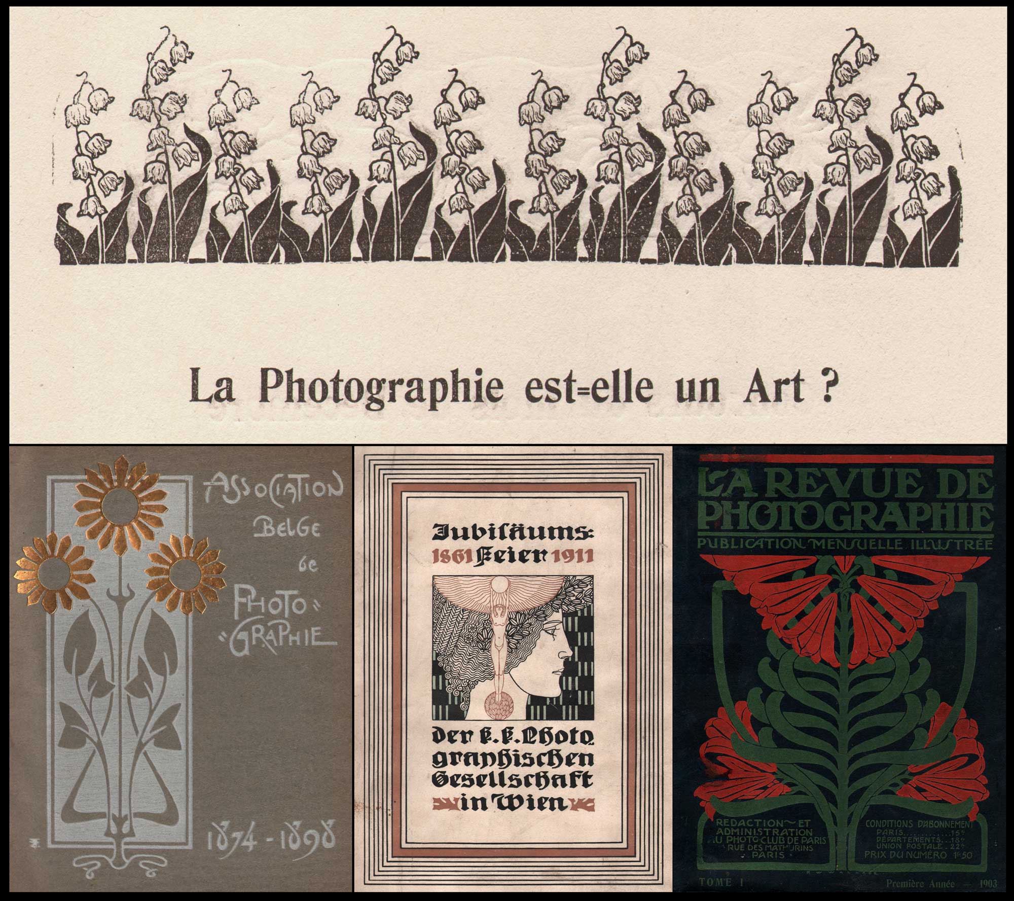
Photography & the Art of Letterpress: Some of the most beautiful objects featuring photographic plates printed in intaglio such as hand-pulled photogravure and mounted halftones can be found in volumes such as these examples combining ornament and text, the perfect marriage of words and pictures from photography’s artistic era spanning the late 1880s through the first decades of the 20th century. Top: La Photographie est=elle un Art? (Is Photography an Art?) Elegant letterpress woodcut embellishments such as this design for Lily of the Valley, (Convallaria majalis) published in February, 1899, illustrating a page in the Belgian photographic journal Sentiment D’Art En Photographie, (1898-1901) are a feature commonly found in the best designed European photographic journals, portfolios and volumes. Unknown artist. Printer: Brussels: Xavier Havermans. Bottom, Covers: Left: This inner cover, bound in boards, is printed in one color, with a woodcut design hand-embossed in gold foil. A “Jubilee Album”, it was published in 1898 to mark the 25th anniversary of the founding of the Belgian Photography Association in Brussels in 1874. Unknown artist. Printer: Brussels: Émile Bruylant. Middle: This intricate letterpress-printed Art-Nouveau design in three colors features on the cover of another album published in 1911 marking the 50th anniversary of the founding of the Austrian Publishing House of the Imperial and Royal Photographic Society in Vienna: Jubiläumsfeier der k. k. Photographischen Gesellschaft in Wien 1861-1911. Unknown artist. Printer: Wien: Friedrich Jasper. Right: A floral organic design, printed in two colors, dominates this 1903 first annual volume of French journal La Revue De Photographie, (The Photography Review) published by the Photo Club de Paris. Unknown artist. Printer: Paris: Draeger Freres. From: PhotoSeed Archive
“Print is Dead” ⎯ Egon Spengler, Ghostbusters-1984
Thank goodness Egon was a fictional character. While print in the physical form continues to thrive in the 21st Century, modern typesetting is now mostly digital. Mass commercialization of letterpress printing in the form of newspapers, magazines and book publishing (Bibles and textbooks in particular) began in earnest in the late 19th Century with the 1884 invention of the Linotype machine by German immigrant Ottmar Mergenthaler. (1854-1899) These machines cast entire lines of type (words & sentences) at once, known as “slugs”: stereotypes of cast metal formed from the contact of assembled brass type matrices that had been locked into position before a molten mixture of lead, tin, and antimony was injected over them from the linotypes’s heated alloy reservoir. Discontinued by the 1970s, linotypes were used almost exclusively in the production of American newspapers. I worked for several papers and these machines were on display in the corner of the front public lobby: dusty relics that once revolutionized letterpress publishing in the “hot-type” era.
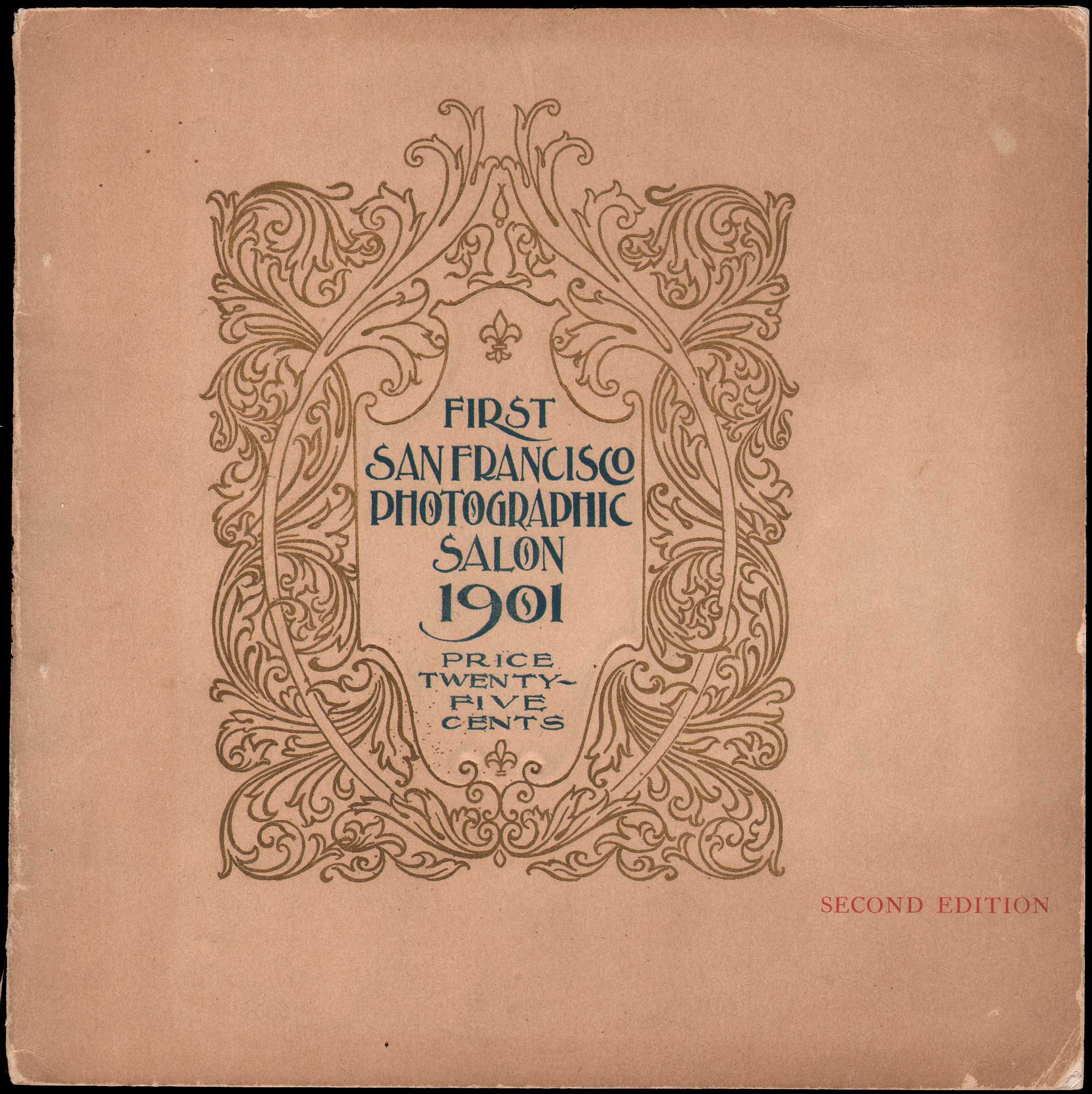
Another Cover, but from America: First San Francisco Photographic Salon 1901, Second Edition, 1901, staple-bound paper catalogue, 19.2 x 19.1 cm. This striking ornamental letterpress design, printed in gold and blue, was published by the western photographic periodical Camera Craft. The design as well as internal letterpress and halftone photographic plates were photo-engraved by the Sunset Photo-Engraving Co. of San Francisco and printed by the Sunset Press. An advertisement in the rear for the firm states … “this catalogue ⎯both in engraving and printing ⎯is a good specimen of our ability to design and execute high-grade work.” From: PhotoSeed Archive
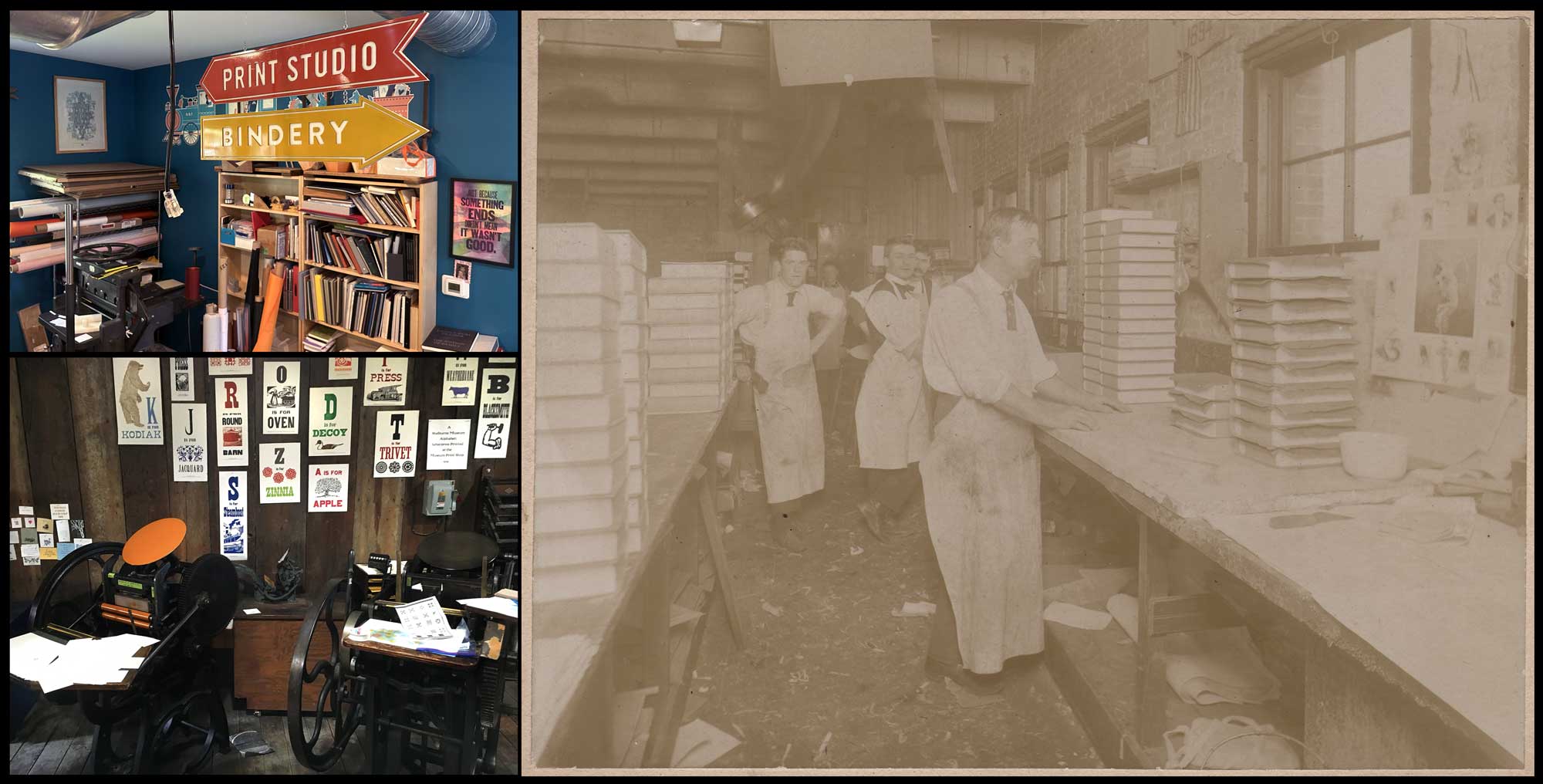
Business Models: Present & Past: Top Left: At Igloo Letterpress in Worthington, OH, directional signs point to the print studio and Bindery, the latter essential for gathering finished work into printed volumes & brochures. Lower Left: public education, especially for younger visitors, is perhaps the foremost intent behind living history museums. In the Print shop at the Shelburne Museum in Vermont, where several platen-style presses are displayed at bottom, letterpress broadsides are tacked to the wall beyond, featuring enlarged alphabet letters from wood type embellished with metal design cuts. Both: David Spencer for PhotoSeed Archive. Right: “Full Sheep Books Being Bound”, 1895, unknown commercial photographer, albumen print laid down on card, 15.3 x 20.2 | 19.5 x 25.0 cm. At Boston’s H.M. Plimpton Company, men wearing ties and aprons lend a professional look as they work in the bindery between stacks of books piled on work tables at left and right. The volumes were being bound in sheepskin, indicating these were of the very highest quality Plimpton published. From: PhotoSeed Archive
Similar to the old Eastman Kodak Company, essentially a monopoly which became a trust in 1901 and controlled 90% of the marketplace, the companies that produced the actual metal type for letterpress printing decided to fight back, now that the Linotype and Monotype machines threatened their own near monopoly in the market. In 1892, the American Type Founders Company, a business trust, was formed. Collectively this entity was made up of 23 type foundries “representing about 85 percent of all type manufactured in the United States at the time.” From Columbia University Libraries we learn the ATF trust was formed “in order to compete with the new typesetting machines, the Linotype and Monotype” and would be “the dominant American manufacturer of metal type from its creation in 1892 until at least the 1940s.” (4.) Interestingly, from 1914-1959, the trust was also in the businesses of manufacturing their own letterpresses for industry, with the popular Kelly series presses selling 11,000 units by 1949. (5.) Besides designer Will Bradley, who created many different type fonts for the ATF, another designer who worked for the trust became more famous: Frederic Goudy: 1865-1947, “one of the most prolific of American type designers” whose “self-named type continues to be one of the most popular in America.” (6.)
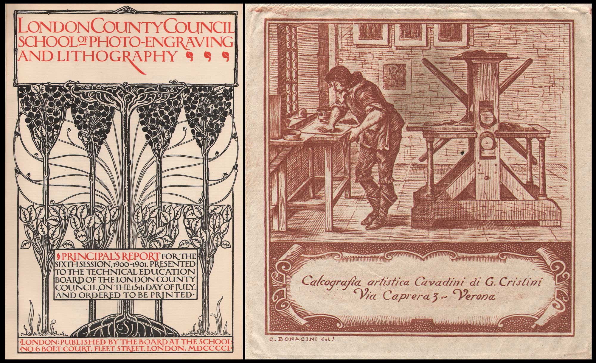
Teaching & Business: Letterpress & Engraving Arts: Left: Title Page: “London County Council School of Photo-Engraving And Lithography: Principal’s Report for the Sixth Session, 1900-1901.” Design by Gertrude J. Sabey, British, dates unknown: letterpress on watermarked laid paper with rubricated title, subtitle & publishing attribution, 29.6 x 19.3 | 33.7 x 24.0 cm. A synopsis in the report stated “The object of the school is to provide instruction in certain branches of the craft of producing surfaces for printing. The school is open to all those who are genuinely engaged in business in the actual work of any branch of the photo-engraving, photographic, lithographic, engraving, designing, and printing crafts.” The compiled volume notes the title page was “designed and given to the School by Miss Gertrude J. Sabey, a former student, and was reproduced by A.J. Jackson (negative) and W.C. Hardy (line block). Letterpress printed by Messrs. Charles Whittingham and Co. at the Chiswick Press, Tooks Court, Chancery Lane, E.C.” Little is known of designer Sabey, although a 1913 reference said she was affiliated with the Central School of Arts and Crafts in London. Historical Note: Alvin Langdon Coburn learned copperplate photogravure while a student at this school in 1906. Right: Re-worked design in the manner of “The Etcher’s Press – The Printmaker’s Shop” by French artist and engraver Abraham Bosse, 1604-1676, c. 1940-1960, Claudio Bonacini, Italian, (d. 1968) intaglio etching from wood engraving design on thin, hand-made paper, 6.1 x 6.0 | 9.5 x 10.0 cm, Verona: Calcografia artistica Cavadini di G. Cristini. In this reworked design from the 1642 Bosse etching, modern designer Bonacini emphasizes the shop worker applying ink to a plate at left with a 17th Century “Star” intaglio press at right. This press was used principally for copper-plate engravings, with early shops like this also using traditional Gutenberg style hand letterpresses. From: PhotoSeed Archive
What’s Old is New Again
I’ve been without business cards for many years now, after running out of an initial batch of beautiful letterpress cards designed by Kirsten O’Loughlin. This was actually the inspiration for this post. “Get yourself some updated cards” I told myself and you can do a bit on letterpress for the blog. I’ve now got the updated cards in hand (free card with any Ebay purchase!) so deadline met. I’ve featured letterpress printing in oblique ways before on the site, although never in depth. In 2014, I featured a wood-engraved copyright label designed in 1897 by the important American furniture designer Harvey Ellis for amateur American photographer John Dumont. In 2018, as part of the conference “PhotoHistory/PhotoFuture” held at the Rochester Institute of Technology in New York state, I visited the Cary Graphics Arts Collection where I saw the famed Kelmscott/Goudy iron hand-press featured among other working presses in the Arthur M. Lowenthal Memorial Pressroom.
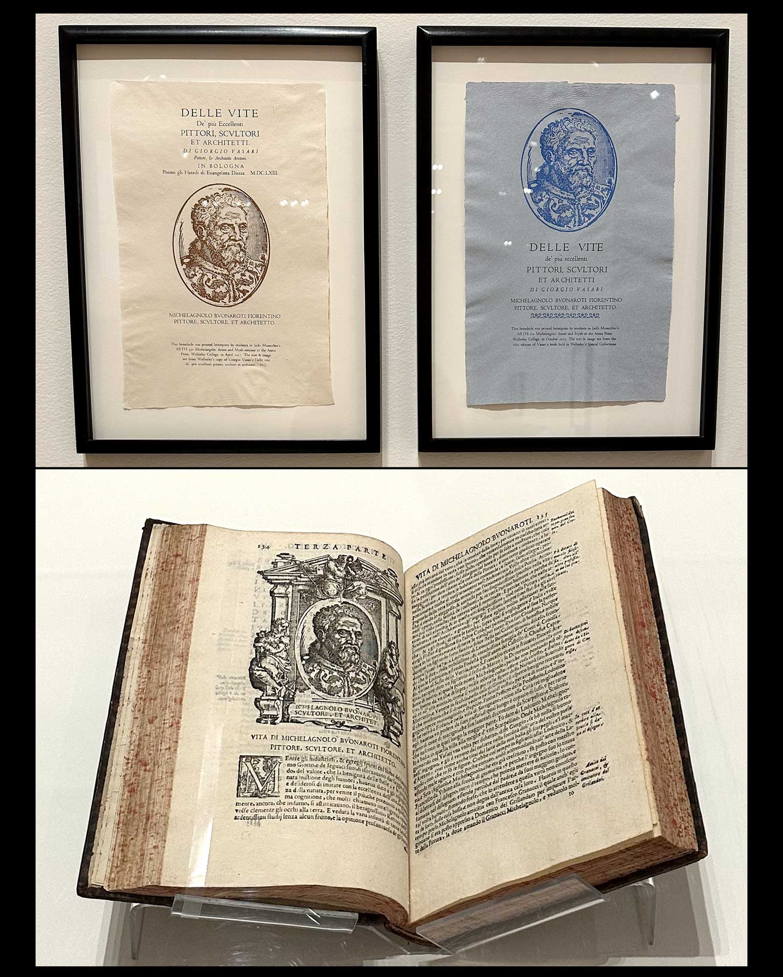
Book Arts & Letterpress: Academic & Museum Worthy: Top: Letterpress Broadsides, left & right, 2017, 2023, after “Delle Vite De’ più Eccellenti Pittori, Scultori, Et Architetti by Giorgio Vasari, 1663” (From the Lives of the Most Excellent Painters, Sculptors, and Architects) Katherine Ruffin, American, b. 1972. At the Davis Museum at Wellesley College, these modern broadsides are displayed as part of a faculty exhibition. (the artist is Director of the Book Studies Program at Wellesley and Lecturer in Art) Printed on hand-made paper, they feature an original 16th century rendering by an unknown artist of a wood-engraved portrait of sculptor and architect Michelangelo, 1475-1564. Repurposed, along with the title from the original 17th century volume in which it appears, they feature in that volume by Vasari published in 1663- displayed in the separate case at bottom. Ruffin comments: “Over the years, we have printed multiple versions, or editions, of some broadsides. In this pair, variations in layout and the addition of type ornaments create a distinct look and feel. The white and cream paper made in the Papermaking Studio typically contains a blend of cotton, flax, and abaca fibers. One year, we created another variation using blue paper made from blue jean rag. Blue paper was common in the Renaissance, offering artists a contrast between lights and darks-and thus provided another teaching opportunity.” A team effort, the broadsides were printed by Ruffin and students in Professor Jacki Musacchio’s first year seminar course “Michelangelo: Artist and Myth” at the school’s Annis Press. Universities and other academic institutions the world over are important incubators offering courses and degree programs in the book arts, often under the umbrella of a studio arts discipline. Giving new life to the historical past may combine courses such as papermaking, type design and printing in conjunction with a liberal arts degree, although trade schools and the web provide plenty of opportunities for those seeking a community of learners or wanting to go it alone in learning the rich history of printing and related disciplines. Learn more: Book Arts Lab at Wellesley. Photographed October, 2025 by David Spencer for PhotoSeed Archive
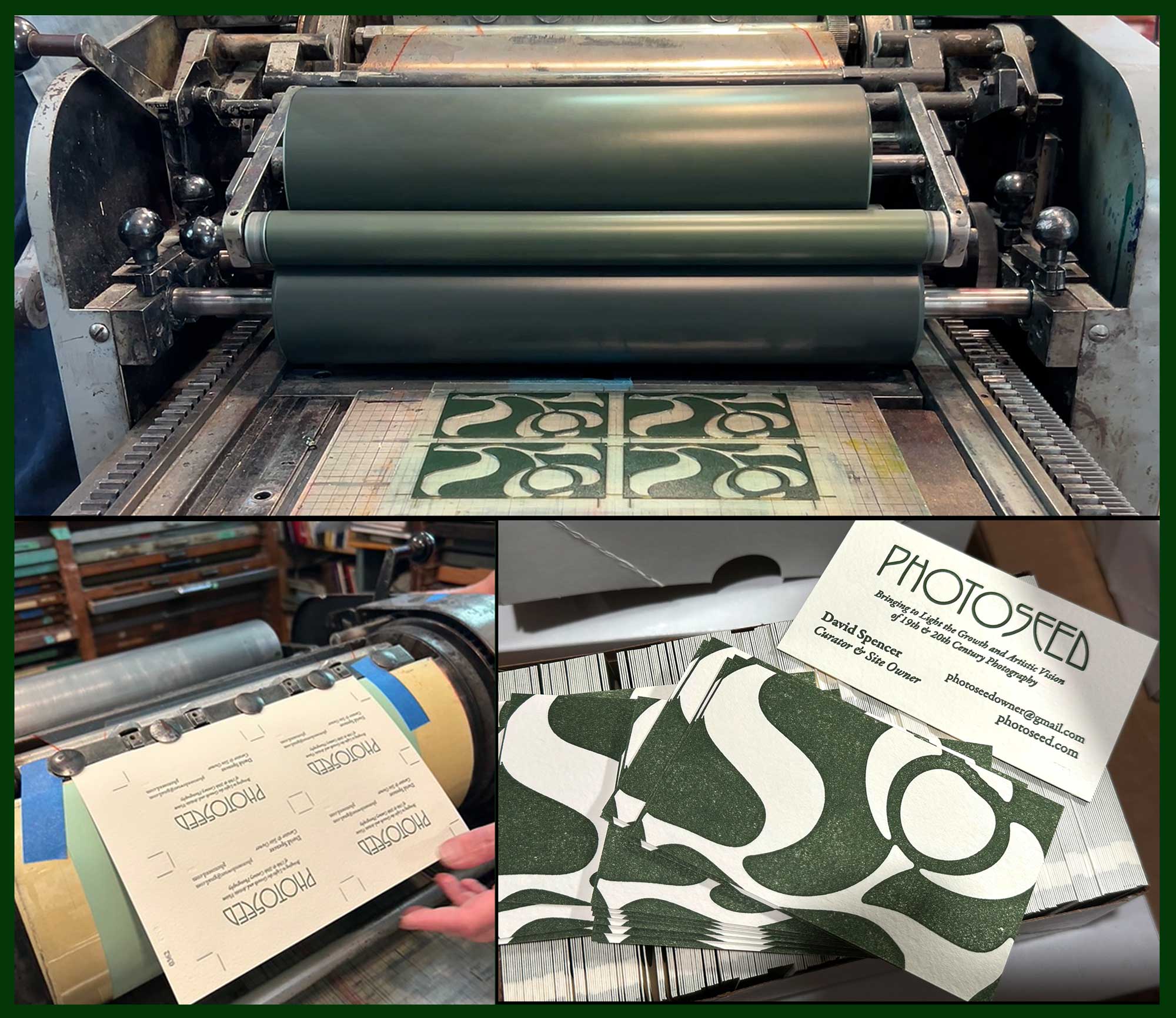
And Now, a Word from our Sponsor: PhotoSeed gets a new business card printed by letterpress. We’re decidedly old school, with a card to match. Top: At Igloo Letterpress in OH, the raised photopolymer plate “cut” featuring our Lotus leaf design is inked and ready to make contact with paper. The matrix of four cards (one side of card) was being run through a vintage Vandercook cylinder press in September, 2025. Lower Left: Owner Allison Chapman holds paper (Arturo soft white, an Italian mould-made paper) just off the press with the card’s other side: the business particulars, held in place by the Vandercook’s gripper heads. Both: photos courtesy Allison Chapman. Lower Right: Trimmed and individually cut from the larger sheet, the new cards wait to be sent out to the world. Photo by David Spencer for PhotoSeed Archive
The second-generation cards again feature the arts & craft inspired lotus flower which has become one of this site’s signature branding efforts. It’s by the hand (or rather computer mind) of designer Jay David, (responsible for the design of PhotoSeed) and takes up all the real estate of the new card’s verso- or recto- you decide. The one absolute change for me was to make “PhotoSeed” all one word, as my impression the old site design lead to some confusion in that words Photo and Seed were stacked on top of each other.
Letterpress printer Allison Chapman to my rescue. Shop local is something we try to adhere to, and although she lives in the middle of the country the argument can be made anyone hanging their letterpress shingle is local and worthy of your business, as no “big box” stores are ever anticipated to get in on the action. Along with husband John and daughter Ava, they run Igloo Letterpress from their home studio in Worthington, OH. Its been an active venture fueled by some well loved vintage presses since 1996. Like many old-time endeavors made new again, with examples including the resurgence of the wet-plate collodion photographic process and wet darkrooms in general in the 21st Century, Letterpress printing became a “thing” a bit earlier, in the 1990s. Here, Wikipedia informs us “renewed interest…was fueled by Martha Stewart Weddings magazine, which began using pictures of letterpress invitations in the 1990s.” I’m not too sure on that one as small-press “craft” printers have always been part of the underground economy- in all parts of the world. In the present century, one thing is for certain: all those letterpresses not cast aside or sold for scrap in the 1970s for new-fangled photo-offset presses are still being sought out from their (presumably) dimly lit warehouses and basements in the present.
Wonderfully, for those adventurous enough, especially of the younger persuasion, risk takers will be rewarded by rejecting the modern-instantaneous for the slower and satisfying embrace of the tactile, hands-on approach in making something permanent and truly tangible: Letterpress: ink by type on paper.
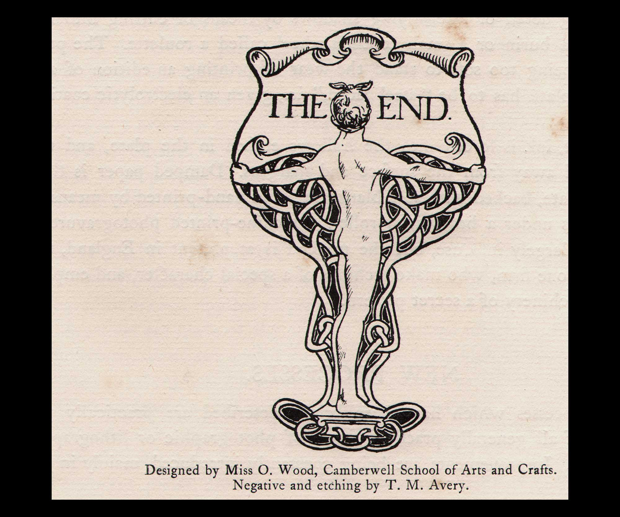
Finis: “The End”, book design, (c. 1904-05) printed 1905, Olive Wood, British, 1883-1973, watermarked laid paper, 9.7 x 5.9 | 30.5 x 24.5 cm, negative & etching by T.M. Avery, typographic line etching by Mr. B.A. Newton (School letterpress printer) for London County Council School of Photo-Engraving & Lithography, Principal’s Report for the Tenth Session, 1904-5. Wood was a student at the Camberwell School of Arts and Crafts in London when this was designed. From Liss Llewellyn Fine Art, Wood “lived and worked in Dulwich Village, London. She exhibited illustrations and pen and ink page designs at the Royal Academy and at the Society of Women Artists Royal Miniature Society and ARMS from 1914 through to 1968. Her early designs incorporate art nouveau motifs.” From: PhotoSeed Archive
Letterpress Resources to Explore: Academic
Champaign, IL: Skeuomorph Press & BookLab is an experiential studio for teaching and researching the history and art of the book at the University of Illinois Urbana-Champaign.
Boston, MA: Huskiana Press: experiential letterpress studio for students, faculty, and community members at Northeastern University.
Rochester, NY: Rochester Institute of Technology Cary Pressroom in the Student Hall for Exploration and Development (SHED)
Letterpress Resources to Explore: Public
Two Rivers, WI: Hamilton Wood Type & Printing Museum: “the only museum dedicated to the preservation, study, production, and printing of wood type. With 1.5 million pieces of wood type and more than 1,000 styles and sizes of patterns, Hamilton’s collection is one of the premier wood type collections in the world.”
Carson, CA: The International Printing Museum: “a dynamic museum devoted to bringing the history of printing and books to life for diverse audiences. The Museum is home to one of the world’s largest and most comprehensive collections of antique printing machinery and graphic arts equipment.”
Haverhill, MA: Museum of Printing: “dedicated to preserving the history of printing, graphic arts, and typography while showcasing their continuing influence on our culture. In addition to many special collections and small exhibits, the Museum contains hundreds of antique printing, typesetting, and bindery machines, as well as a library of books and printing-related documents.”
Atlanta, GA: Robert C. Williams Museum of Papermaking: “melds art, history, technology and industry from historical and global perspectives. Museum visitors follow the path of paper from the earliest examples of writing materials, to the Chinese discovery of how to make paper, to the paper mills of Europe, and the high-tech machinery of today’s modern paper industry.”
Nashville, TN: Hatch Show Print: “From 1879 through most of the twentieth century, Hatch Show Print’s vibrant posters served as a leading advertising medium for southern entertainment, ranging from members of the Grand Ole Opry like Bill Monroe, Minnie Pearl and Ernest Tubb, to rock & roll impresarios such as Elvis Presley and Chuck Berry.”
Chillicothe, OH: Dard Hunter Studios: (The Mountain House and Dard Hunter Studios are open for tours. The Dard Hunter Library and Archives are also available for research. Please contact us for more information.)
- p. 323. The glossary including the definition for letterpress comes from Benson’s 2008 volume The Printed Picture, published to accompany the exhibition of the same name in the Edward Steichen Photography galleries at New York’s Museum of Modern Art in the fall of 2008 through the Spring of 2009.
- Excerpt: American Art Posters of the 1890s, in The Metropolitan Museum of Art, including the Leonard A. Lauder Collection Catalogue by David W. Kiehl Essays by Phillip Dennis Cate, Nancy Finlay, and David W. Kiehl: The Metropolitan Museum of Art distributed by Harry N. Abrams, Inc., New York, 1987, p. 16
- Will H. Bradley Biography: from the online resource nocloo.com, celebrating the Golden Age era of children’s book illustrations, 1890-1930.
- ATF, from Wikipedia accessed 2025
- ATF, Ibid
- Frederic Goudy, from Wikipedia accessed 2025